


 Japanese
導入
When selling wireless Bluetooth headphones on オゾン, visual clarity is not optional—it is the deciding factor between scrolling past and clicking through. Buyers on Ozon make decisions fast, often within seconds, and the main image set must communicate value instantly, without relying on long descriptions.
In this project, our goal was to design a complete Ozon main image sequence for wireless Bluetooth headphones that clearly explains functionality, comfort, battery life, and usability—while maintaining a clean, premium, and trustworthy visual language. Every image was designed to answer a specific customer question, reduce hesitation, and guide the user smoothly toward purchase.
Below, we break down each image in the sequence and explain why it was designed this way, from a professional design and conversion perspective.
| 配達時間 | カテゴリ | アプリケーションプラットフォーム |
| 7日間 | Wireless Bluetooth headphones | オゾン |
| 関与するデザイナー | 料金 | 効果 |
| リン・チャン | $110 | Sales📈268% |
Image 1: Core Product Identity and Compatibility
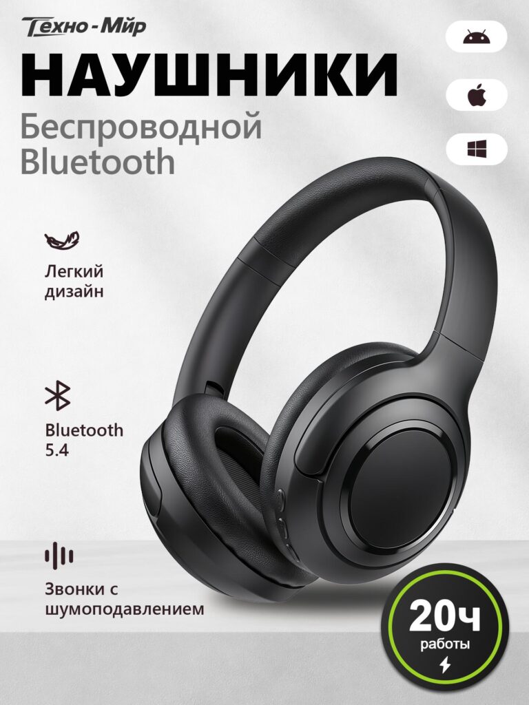
The first image introduces the product in the most direct way possible: wireless Bluetooth headphones displayed at a three-quarter angle on a clean, neutral background.
We intentionally chose a minimalist composition to avoid overwhelming the viewer. The headphones are large, centered, and sharply lit, allowing users to immediately understand the product form—over-ear, padded, foldable, and modern.
主な設計上の決定:
- Clear product naming (“Wireless Bluetooth Headphones”) ensures instant recognition
- Bluetooth 5.4 highlight establishes technical credibility without clutter
- Lightweight design callout communicates comfort early
- Noise-reduction for calls addresses one of the most common buyer concerns
Platform compatibility icons (Android, iOS, Windows) appear on the side to quickly reassure users that the headphones work across devices. On Ozon, this reassurance reduces friction and prevents users from leaving the page to check compatibility.
This image functions as a visual product summary: what it is, what it does, and who it’s for—all in one glance.
Image 2: Product Update and Sound Quality Focus
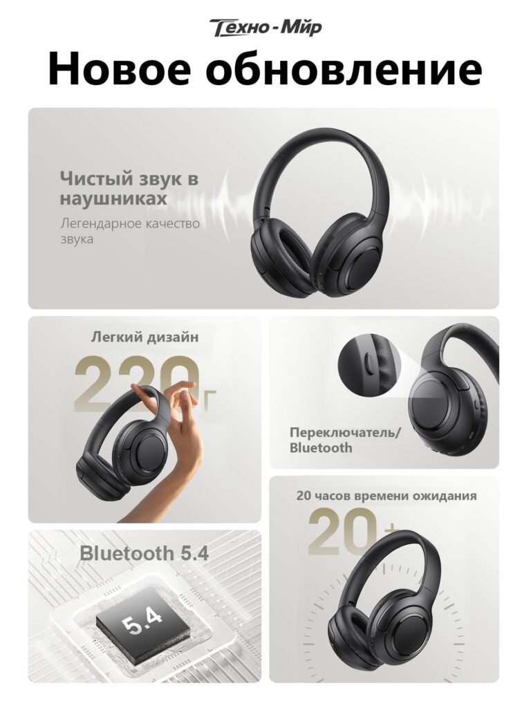
The second image shifts attention from identity to performance, introducing the product as a newly updated model.
Here, we emphasized sound quality using subtle sound-wave graphics radiating from the headphones. These visual cues help users “feel” the audio experience without hearing it.
Design strategy:
- “New update” positioning adds perceived value
- Clean layout reinforces reliability and professionalism
- Sound wave graphics remain soft and controlled to avoid exaggeration
This image reassures customers that they are not buying an outdated model. On marketplaces like Ozon, where similar products compete aggressively, signaling “updated” or “improved” makes a measurable difference in click-through and conversion rates.
Image 3: Lightweight Design and Everyday Comfort
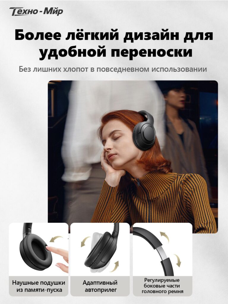
Comfort is critical for over-ear headphones, so the third image focuses entirely on lightness and wearability.
We visually demonstrate the 220g lightweight design by showing the headphones held effortlessly with two fingers. This removes doubt more effectively than text alone ever could.
Below the lifestyle image, three feature modules explain how comfort is achieved:
- Memory-foam ear cushions for long-term wear
- Adaptive auto-fit structure that adjusts naturally
- Adjustable headband arms for different head sizes
The combination of human interaction and product close-ups builds trust. Users can imagine themselves wearing the headphones during commuting, working, or relaxing—an essential emotional trigger for purchase.
Image 4: All-Day Battery Performance
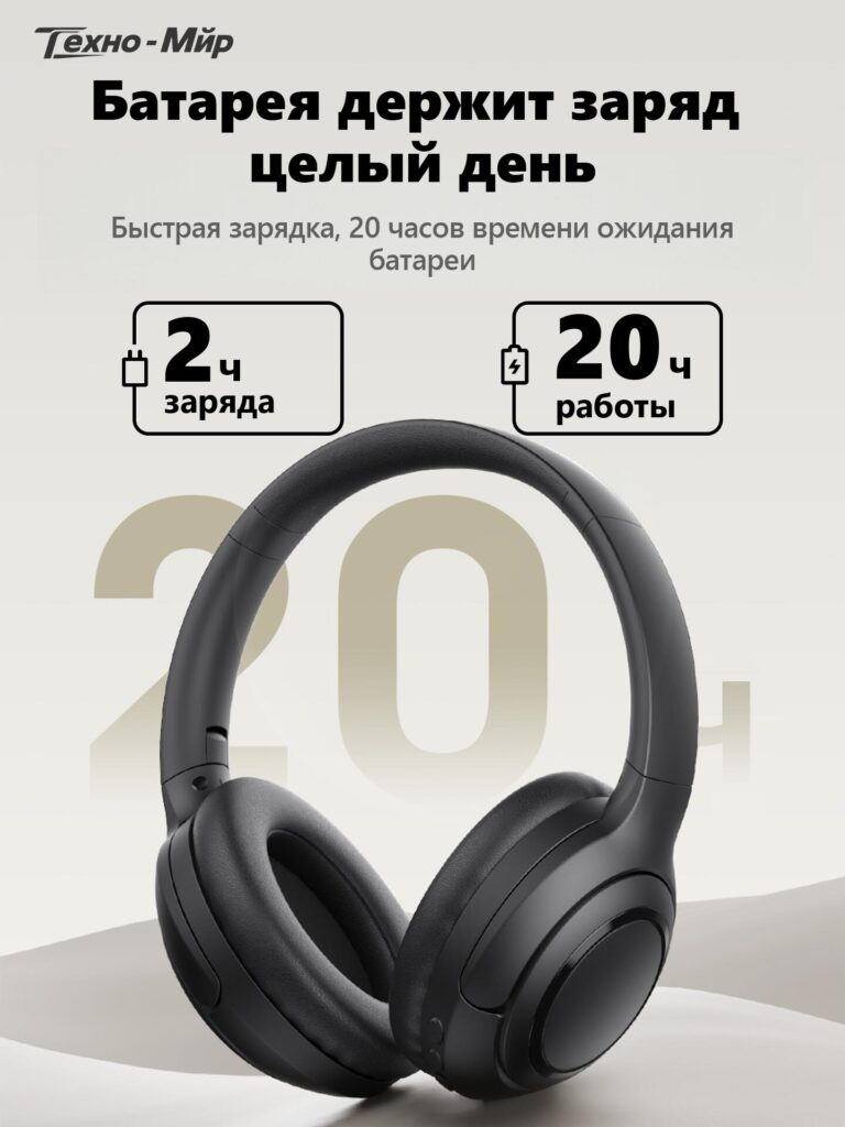
Battery anxiety is one of the biggest barriers in wireless audio purchases. The fourth image tackles this directly with a bold, numbers-first layout.
We prominently display:
- 20 hours of operation
- Only 2 hours for a full charge
Large typography ensures these numbers remain readable even on small screens. The headphones remain centered, reinforcing that battery life is a core strength of the product—not an afterthought.
From a design standpoint, we avoided excessive technical jargon. Instead, we focused on outcomes: all-day use, fewer charging interruptions, and reliable daily performance.
This image works especially well for Ozon’s mobile-heavy audience, where clarity and immediacy matter more than depth.
Image 5: Physical Button Controls Explained Clearly
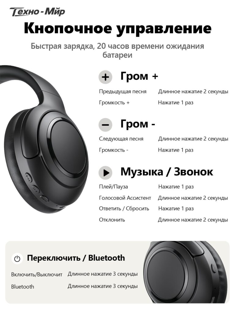
Many users prefer physical buttons over touch controls, but confusion around button functions can cause hesitation. The fifth image solves this by visually mapping every button function.
We show a close-up of the headphone earcup alongside a clean, text-based explanation:
- Volume up / down
- Track switching
- Play / pause
- Answer / reject calls
- Voice assistant activation
- Power and Bluetooth pairing
Each action is paired with press duration instructions, eliminating uncertainty. This image reduces post-purchase frustration and lowers return rates—an often overlooked but critical aspect of good marketplace design.
For Ozon buyers, this level of clarity builds confidence and signals a well-designed, user-friendly product.
Image 6: What’s Included in the Box
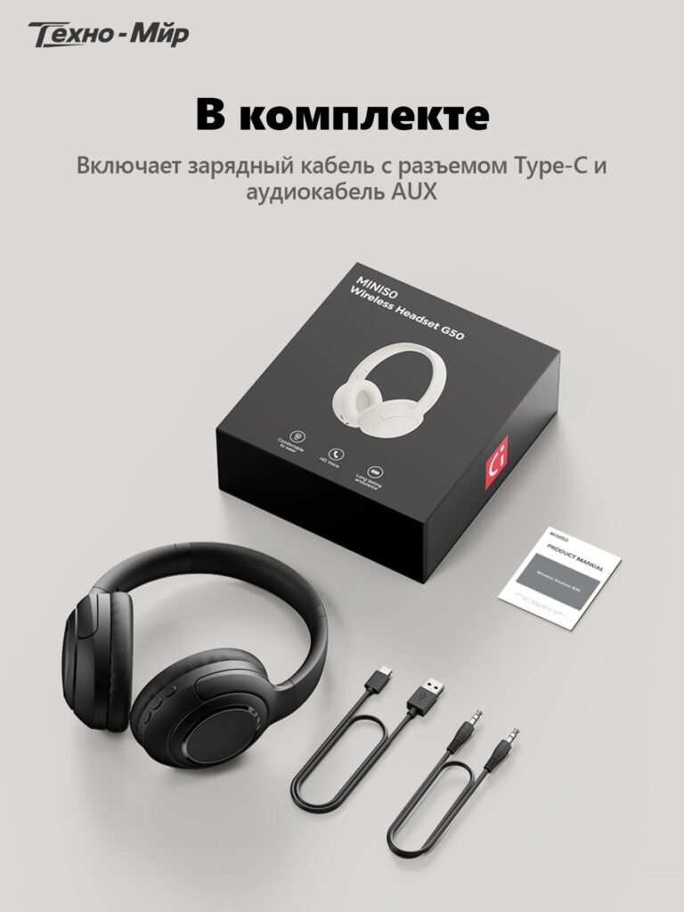
The final image completes the buyer’s mental checklist by clearly showing everything included in the package.
Displayed items include:
- Wireless Bluetooth headphones
- USB Type-C charging cable
- AUX audio cable
- User manual
- Retail packaging
We intentionally used a clean, flat-lay composition to avoid visual noise. Showing both wireless and wired options (via AUX) adds versatility to the product and subtly increases perceived value.
This image answers the last remaining questions before purchase: What exactly will I receive? Do I need to buy anything extra?
Why This Main Image Set Works on Ozon
This image sequence is not decorative—it is strategic.
Each image:
- Answers one core buyer question
- Builds logically on the previous one
- Reduces uncertainty step by step
- Aligns with Ozon’s browsing behavior and UI structure
Instead of repeating the same product angle with different slogans, we designed a narrative image flow:
- 製品とは何か
- Why it’s updated
- How comfortable it feels
- How long it lasts
- How easy it is to control
- What’s included
This approach improves engagement time, lowers bounce rates, and increases conversion—especially for electronics categories where trust matters.
最後に
効果的 オゾン main image design is not about adding more text or louder visuals. It’s about precision, hierarchy, and empathy for the buyer’s decision process.
By carefully structuring this wireless Bluetooth headphones image set, we transformed technical specifications into clear visual stories that sell without overwhelming. Each image has a purpose, and together they form a cohesive, high-converting presentation.
This is exactly how we approach cross-border marketplace design—combining platform logic, user psychology, and clean visual systems.
That design philosophy is at the core of how エアサン helps brands turn ordinary products into confident, high-performing listings.


WordPressのウェブサイトや、完全なeコマースシステムを備えたコーポレートサイトをデザイン・構築します。.
価格帯$200.00~$2,500.00custom-requirements-or-special-quotations
元価格は$2.00。.$1.00現在の価格は$1.00。. Amazonホーム理学療法機器のメイン画像デザイン解説
はじめにAmazonで家庭用治療器の信頼できるイメージを構築する Amazonで家庭用治療器のメインイメージをデザインする際、私たちが最も重視するのは...

Amazon リップスティックコンバージョンのメイン画像デザイン
はじめにアマゾンで売れる口紅のメイン画像をデザインする アマゾンの口紅のメイン画像をデザインするとき、私たちの責任は...

Amazonのリキッドファンデーションのメイン画像がコンバージョンにつながる理由
はじめに Amazonリキッドファンデーションのメイン画像デザインは、単に商品を美しく見せるだけではありません。Amazonでは、メイン画像と….

フィルターカートリッジの効果的なAmazonメインイメージのデザイン
はじめに Amazonのメイン画像をデザインする上で、商品を魅力的に見せることは決して重要ではありません。明確さ、信頼性、そして瞬時に理解できることが何よりも重要です。特に….

ペット向けWordPressテーマ5選を比較
はじめに ペット関連のWordPressテーマを適切に選ぶことは、単なるデザイン上の決定ではありません。使いやすさ、拡張性、そして長期的なビジネスの成長に直接影響します。ペットケアとペット...

科学主導のブランドのためのスケーラブルなWordPressウェブサイトの構築:AminoUSAプロジェクト
はじめに 今日のデジタル環境において、ウェブサイトは単なる製品リストを掲載する場所ではありません。規制の厳しい業界や研究重視の業界で事業を展開する科学主導のブランドにとって、ウェブサイトは….

グローバルブレードブランドのためのスケーラブルなShopifyストアの構築:CoolKatanaプロジェクト
はじめに 越境電子商取引において、Shopify の Web サイトは単なる店舗ではありません。ニッチで文化主導のカテゴリーで活動するブランドにとって、Web サイトは単なる店舗以上のものを実現する必要があります...

ポケモンカード向け高コンバージョンShopifyストアの設計
はじめに 収集可能な電子商取引の世界、特にポケモン トレーディング カード ゲーム (TCG) 市場では、Web サイトは単に製品をリストするだけでは不十分です。...

カスタムレンガブランドのための高コンバージョンShopifyデザイン
はじめに 今日の競争の激しいeコマース市場、特にパーソナライズされたギフトやコレクターズアイテムの分野では、Shopifyのウェブサイトは商品を展示する以上の機能を提供する必要があります。それは….

高級花卉ブランド向けShopifyウェブサイトデザイン事例
はじめに 今日の競争の激しいeコマース市場において、Shopifyのウェブサイトは商品を表示する以上の機能を提供する必要があります。ブランド価値を瞬時に伝え、ユーザーを誘導する必要があります….

Shopifyデザインケーススタディ:レトロゲームストア
はじめに 競争の激しいeコマース環境では、視覚的な明瞭さと感情的な繋がりが、訪問者が顧客になるかどうかを左右することがよくあります。これは特に….

Shopifyデザインケーススタディ:タクティカルレスキューブランド
はじめに 優れたShopifyウェブサイトは、商品を展示するだけではありません。ウェブサイトの目的を伝え、信頼を築き、ユーザーが自信を持って購入を決定できるよう導きます。これは特に….

電動自転車ブランド向けShopifyウェブサイトデザイン事例
はじめに 今日の競争の激しい電動自転車市場では、Shopify の Web サイトは製品を表示するだけでなく、ストーリーを伝え、信頼を構築し、ユーザーを誘導する必要があります...

クリエイティブブランドのためのスケーラブルなShopify Eコマース
はじめに クリエイティブなブランドが成長すると、ウェブサイトの維持に苦労することがよくあります。製品ラインの拡大、コンテンツの増加、トラフィックの増加に伴い、多くのビジュアル重視のブランドは….

ホームデコレーションブランド向けShopifyウェブサイトデザイン事例
はじめに 競争の激しいホームデコレーション市場において、ビジュアル・アイデンティティはもはや単なる美観ではなく、信頼、閲覧行動、そして購入決定に直接影響を与えます。例えば….

スケーラブルなWordPressサブスクリプションウェブサイトの構築事例
はじめに 現代のeコマースブランドにとって、ウェブサイトはもはや単なるデジタル店舗ではありません。サブスクリプション、コンテンツストーリーテリング、信頼構築などをサポートするエンジンなのです。.

アダルトブランド向けの高コンバージョンWordPressデザイン
はじめに 競争の激しいeコマース市場では、魅力的なビジュアルだけでは十分ではありません。成功するWordPressウェブサイトは、訪問者を明確かつ意図的なジャーニーへと導く必要があります。.

スケーラブルなWordPressセックスドールEコマースウェブサイト
はじめに 高性能な越境電子商取引 Web サイトを立ち上げるということは、製品をオンラインに掲載するだけでは十分ではありません。競争が激しく、視覚的に重視される市場で事業を展開しているブランドにとって、Web サイトは...