


カートに商品がありません。.

 Japanese
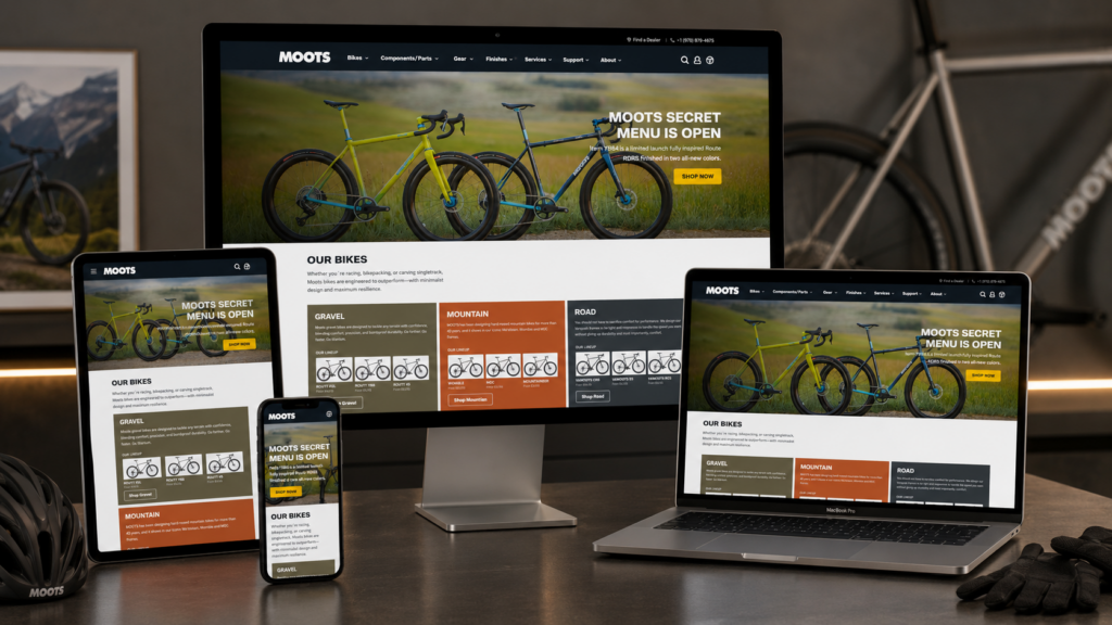
Moots presents a strong example of how an independent cycling website can turn product quality into a full brand experience. The site does not rely only on product images or technical specifications. Instead, it builds a complete journey around outdoor riding, handcrafted titanium, real makers, customer trust, and community culture. From the first hero banner to the About Us page, every section supports one clear message: these bikes are premium because they come from a real place, a real team, and a deeply rooted riding philosophy. Moots also positions its products around handcrafted titanium bikes made in Steamboat Springs, Colorado, with a focus on ride quality, durability, and long-term performance.
| 配達時間 | カテゴリ | ウェブサイトの種類 |
| 21日間 | 自転車 | Self-built website |
| 関与するデザイナー | 料金 | 効果 |
| リン・チャン | $2500 | Sales📈251% |
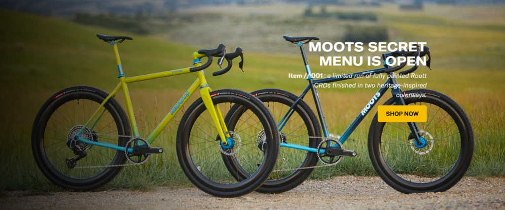
The homepage opens with a cinematic hero banner featuring two colorful bikes in a natural outdoor setting. As designers, we see this as a very intentional first impression. The site could have used a white studio product image, but that would have made the bikes feel static and commercial. Instead, the landscape background immediately connects the product with open terrain, adventure, and freedom.
The headline “Moots Secret Menu Is Open” creates curiosity before the user even understands the product details. It works because it feels exclusive. The supporting line explains that this is a limited run of fully painted Routt CRDs finished in heritage-inspired colorways, which makes the offer feel special rather than generic. The “Shop Now” button sits clearly on the right, creating a direct conversion path from desire to action.
We would design this hero with a darker overlay because the background contains many natural details. Without a subtle overlay, the white headline might compete with the grass, bikes, and distant landscape. The darker treatment creates better text contrast while making the bike colors feel more vivid.
The right-side text placement also makes sense. The bikes already dominate the left and center of the screen, so placing the message on the right balances the composition. This creates a natural reading path: the user sees the bikes first, then reads the headline, then notices the CTA button. The yellow button works especially well because it echoes the warm tones of the bike and landscape while still standing out against the darker image.
A premium bike purchase involves emotion, aspiration, and trust. The hero does not simply say “buy a bike.” It suggests that the user is entering a special product world. The phrase “Secret Menu” creates a feeling of discovery, while the outdoor setting shows the product in the environment it was made for. This type of hero section works because it sells the feeling before it sells the specification.
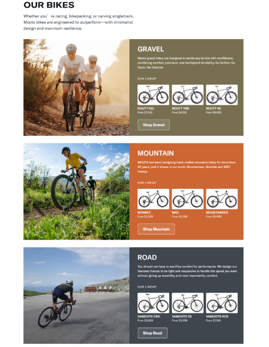
The “Our Bikes” section organizes the product range into three clear categories: Gravel, Mountain, and Road. This is a smart design choice because high-end cycling customers often browse by riding style first, not by individual model name. Moots describes its bikes as engineered for racing, bikepacking, singletrack, and other riding scenarios, then separates the lineup into clear category blocks.
We would use a stacked layout here because it gives each category enough visual and emotional space. Gravel, mountain, and road riders have different expectations, so the design gives each group its own lifestyle image, color block, short description, product preview, and CTA button.
The large image on the left creates context. Gravel appears with an open-road lifestyle feeling, mountain appears with off-road action, and road appears with speed-focused riding. This helps users quickly identify where they belong. Instead of forcing visitors to compare all bikes at once, the layout lets them choose their riding world first.
Each category includes a small lineup preview. For gravel, the section introduces models such as Routt RSL, Routt YBB, and Routt 45. For mountain, it highlights models such as Womble, MXC, and Mountaineer. For road, it presents models such as Vamoots CRD, Vamoots 33, and Vamoots RCS.
This approach reduces user effort. A visitor does not need to click into a collection page just to understand what products exist. The site gives a preview first, then invites the user to continue. From a conversion perspective, this is important because it creates confidence before the click.
The three category panels use different background colors, but the structure stays consistent. This balance keeps the section visually interesting without making it messy. We would use this method because users can scan the page faster when each product category has a distinct visual identity.
The consistent CTA button placement also matters. Once users understand the first block, they know how to interact with the next two. This improves usability while preserving a strong editorial look.
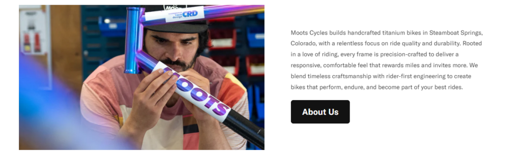
After the product categories, the site shifts from product browsing to brand storytelling. The section shows a maker working closely on a bike frame, paired with a short explanation of Moots’ handcrafted titanium approach. The copy explains that Moots builds handcrafted titanium bikes in Steamboat Springs, Colorado, and focuses on responsive, comfortable, durable ride quality.
As designers, we would never treat a premium handmade product like a generic catalog item. A real workshop image creates proof. It shows that the bike is not only designed on a screen or assembled anonymously. It comes from hands, tools, attention, and time.
The close-up maker image builds trust because it introduces the people behind the product. For expensive bikes, this is especially important. Customers want to know that the brand understands precision and care. A workshop photograph communicates those values faster than a long paragraph can.
The left image and right text layout creates a clean storytelling rhythm. The image attracts emotion first, while the text explains the brand promise. The “About Us” button gives users a deeper path, but it does not interrupt the homepage flow.
This section also gives the homepage a necessary shift in tone. After the hero and product categories, the user has seen what Moots sells. Now the site explains why the brand deserves attention. That sequence is important: inspire first, organize second, build trust third.
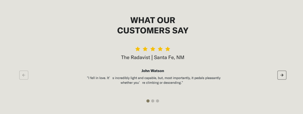
The testimonial section uses a centered layout, large headline, five-star rating, publication or location reference, reviewer name, quote, arrows, and slider dots. The homepage includes customer and media feedback, including The Radavist, Port Townsend, and CyclingWeekly references.
We would keep this section minimal because testimonials can lose credibility when they look too promotional. The neutral background, centered copy, and simple star rating make the feedback feel calm and confident.
The five stars act as an instant trust signal. The reviewer name and source detail add context. The quote then gives the emotional confirmation that users need: the bike feels light, capable, smooth, or performance-driven. This matters because cycling customers often care about ride feel as much as specifications.
The arrows on both sides and the dots below suggest that the brand has more than one endorsement. This creates depth without overwhelming the page. Instead of filling the screen with many review cards, the site gives one focused testimonial at a time.
This design choice makes the quote feel important. The user does not skim a crowded review wall. They pause, read, and absorb the message.
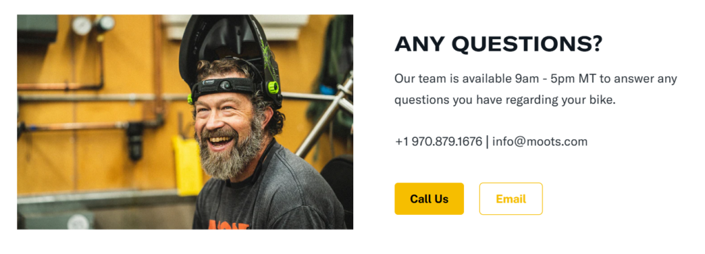
The contact section uses a warm image of a smiling team member on the left and a clean support message on the right. The site states that the team is available from 9 a.m. to 5 p.m. MT and provides both phone and email contact options.
For a high-value bike purchase, users may have questions about fit, geometry, riding style, customization, delivery, or service. A plain contact form can feel cold. A real smiling person makes the support experience feel more personal.
As designers, we would use this type of image to communicate approachability. It tells users that there are real people ready to help, not just an automated support system.
The “Call Us” and “Email” buttons give users two different communication paths. Calling feels immediate and direct. Email feels lower-pressure and more flexible. By offering both, the design respects different user behaviors.
The section also uses strong spacing and a bold headline. “Any Questions?” is simple, direct, and customer-centered. It does not over-explain. It simply removes hesitation and tells visitors what to do next.
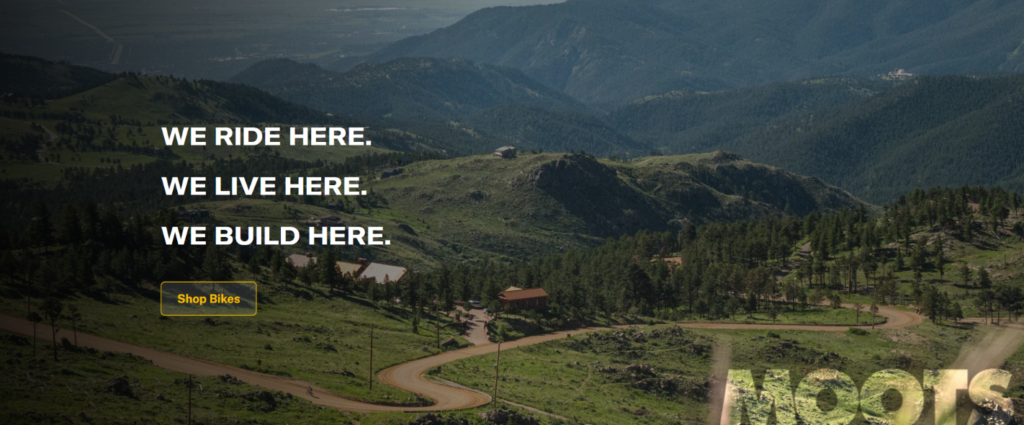
The About Us page begins with a mountain landscape and the strong statement: “We ride here. We live here. We build here.” This is one of the most important design moments on the site because it turns location into brand identity. Moots explains that its home in Steamboat Springs influences every bike it builds and that the terrain outside its door acts as a testing ground.
We would open the About Us page with landscape imagery because the brand story depends on environment. The mountains, road, and natural terrain suggest that Moots does not design bikes in isolation. The company rides in the same conditions that shape the product.
This creates authenticity. The visitor does not only learn where the brand is located. They understand why that location matters.
The three-line statement works because it uses simple repetition. It feels confident, memorable, and easy to remember. Long About Us introductions often lose impact because they try to explain too much too soon. Here, the page creates emotion first, then explains the details later.
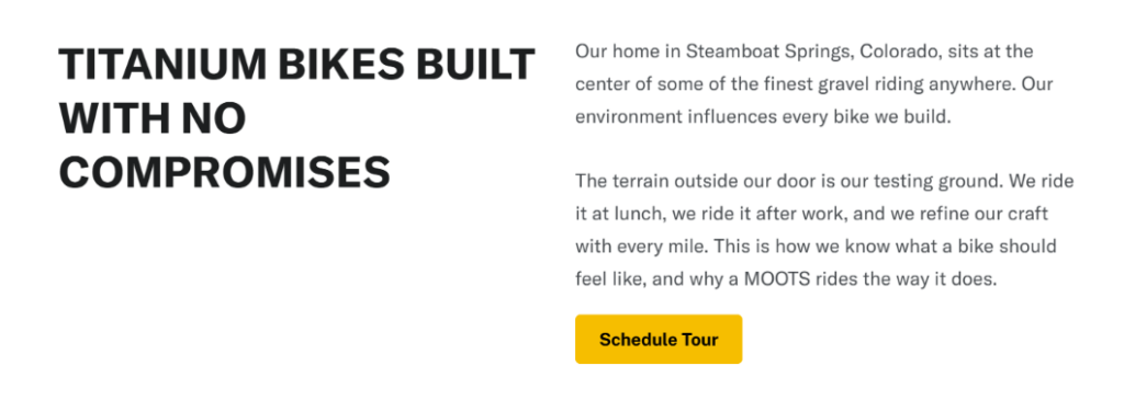
After the About hero, the page introduces a clean content section around titanium bikes and the idea of no compromises. Moots describes its Steamboat Springs environment as central to the brand and explains that the team rides the terrain outside its door to refine its craft.
We would use white space here to create seriousness and clarity. After a large scenic banner, the page needs room to breathe. The white background lets the bold headline stand out, while the supporting paragraph gives the brand philosophy more weight.
This section also establishes a bridge between lifestyle and manufacturing. The first banner says, “This is where we belong.” The next section says, “This is how that place shapes the product.” That transition makes the storytelling feel natural.
The “Schedule Tour” call-to-action is subtle but powerful. Moots also offers factory tours where visitors can see stages of the titanium-frame building process, from raw tubing to finished bike, and meet the craftspeople involved.
From a design perspective, this is a strong trust signal. A brand that invites customers behind the scenes communicates confidence. It suggests that the process can be seen, understood, and appreciated.
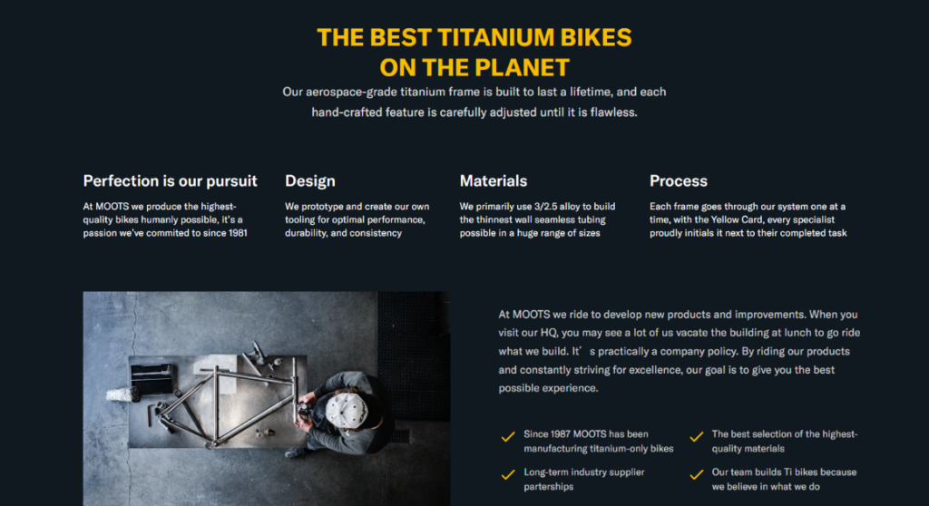
The next major About Us section uses a dark background to present craftsmanship, design, materials, and process. Moots highlights aerospace-grade titanium, hand-crafted features, its commitment since 1981, in-house tooling, 3/2.5 alloy tubing, and a one-at-a-time frame process supported by the Yellow Card system.
We would introduce a dark section here because the page needs a tonal shift. The outdoor and white sections feel emotional and open. The dark section feels technical, premium, and precise.
This contrast helps the user understand that the brand has two sides: a love of riding and a disciplined manufacturing process. The black or deep navy background makes the yellow accents feel sharper, while the workshop image reinforces the idea of craft.
The feature blocks organize complex ideas into readable parts: pursuit of perfection, design, materials, and process. This helps users absorb technical credibility without reading a dense technical essay.
The user learns that the brand prototypes tooling, selects materials carefully, and moves each frame through a controlled process. That kind of content matters for premium products because it explains why the product costs more and why the brand deserves trust.
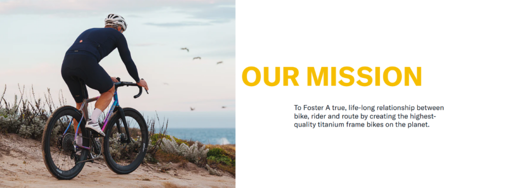
The mission section states that Moots wants to foster a true, lifelong relationship between bike, rider, and route by creating high-quality titanium frame bikes.
We would keep this section clean because mission statements lose power when surrounded by too many decorative elements. The design uses strong typography and balanced imagery to make the message feel focused.
The mission is not only about selling bikes. It speaks to the relationship between the rider and the route. That is important because serious cyclists often see a bike as part of their lifestyle, not just equipment.
By this point, the user has seen the landscape, the factory philosophy, the materials, and the process. The mission section then gives all of that information a broader meaning. It says, in effect, “This is what all the work is for.”
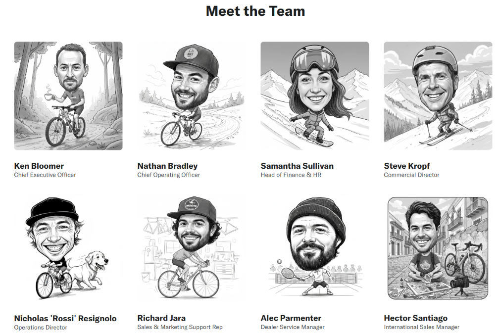
The About Us page includes a team section with portraits and roles, including leadership, sales, marketing, service, and production members.
We would use hand-drawn or illustrated team portraits because they create warmth. A standard corporate headshot grid might feel too formal. The illustrated style makes the brand feel more human, playful, and connected to cycling culture.
The team section also supports the handcrafted message. If the website says the bikes are made by skilled people, then the user should see those people. Showing names and roles makes the manufacturing promise more believable.
The team grid creates scale. It shows that the brand is not a faceless logo. It has a real group of builders, riders, service people, and leaders. This matters for community-driven brands because buyers often want to feel connected to the people behind the product.
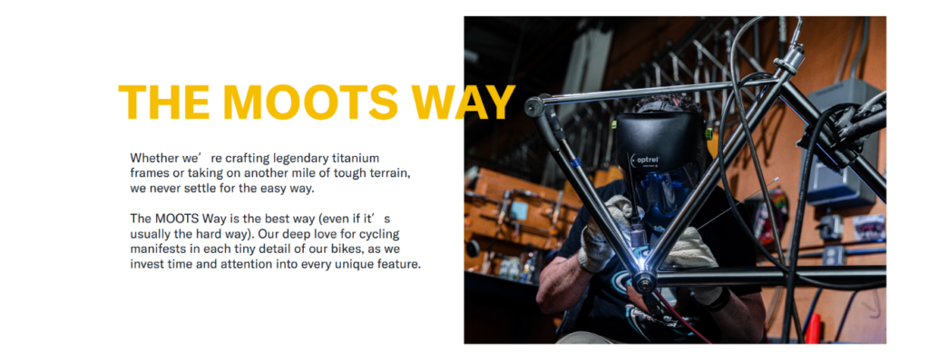
The “Moots Way” section explains that the brand does not settle for the easy way and invests time and attention into every detail.
We would design this section with an editorial layout because the content expresses philosophy more than product detail. The image and text pairing gives the page a magazine-like rhythm, which feels appropriate for a premium cycling brand.
The message also turns difficulty into a brand strength. Instead of saying “we make bikes efficiently,” the page suggests that the harder path creates better results. That aligns perfectly with the high-end handmade positioning.
Premium buyers often need more than specs. They need to believe in the process. The “Moots Way” gives them a reason to see the product as the result of care, patience, and discipline. This is exactly the kind of storytelling that supports higher-ticket purchasing decisions.
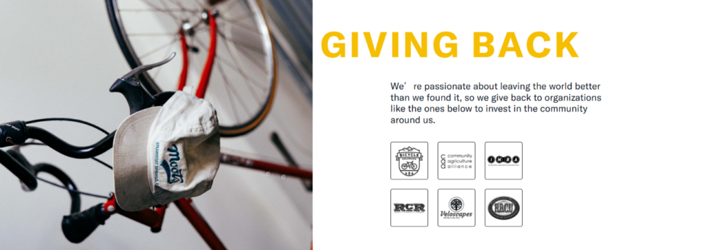
The “Giving Back” section explains that the brand wants to leave the world better than it found it and supports organizations connected to its community.
We would include this section because modern brand trust does not come only from product quality. It also comes from values. For a cycling brand rooted in outdoor culture, giving back helps reinforce responsibility, community, and long-term thinking.
The layout keeps the section simple, using supporting logos and a clear message. This prevents the page from becoming too self-congratulatory. It states the value, shows proof, and lets the user move forward.
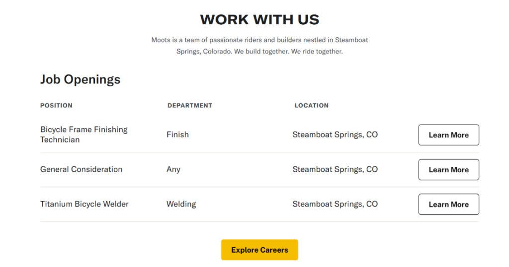
The About Us page includes a “Work With Us” section with job openings such as Bicycle Frame Finishing Technician, General Consideration, and Titanium Bicycle Welder, all tied to Steamboat Springs, Colorado. Moots describes itself as a team of passionate riders and builders that builds and rides together.
At first, a careers section may seem separate from e-commerce conversion. But from a design perspective, it strengthens the brand. It shows that the company is active, operational, and growing. It also reinforces the idea that real specialists build the products.
For handcrafted brands, the team is part of the product story. Job openings related to finishing, welding, and production make the manufacturing process feel concrete.
The job table uses position, department, location, and a “Learn More” action. This structure keeps the content practical. It does not distract from the story, but it makes the company feel transparent and organized.
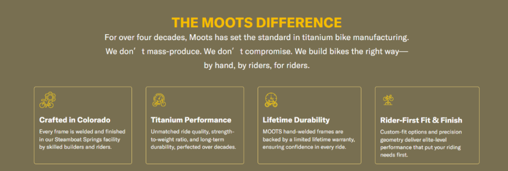
Near the end of the About Us page, the site presents “The Moots Difference.” It explains that Moots has spent more than four decades focused on titanium bike manufacturing and emphasizes that the brand builds by hand, by riders, for riders. It then summarizes the value through crafted-in-Colorado production, titanium performance, lifetime durability, and rider-first fit and finish.
We would place this section near the end because it functions like a final summary. The page has already shown the landscape, people, process, mission, and culture. Now it condenses the strongest reasons to believe the brand.
This is a strong conversion design pattern. Instead of ending with vague emotion, the page ends with clear value points. The user leaves with a simple understanding: handcrafted origin, performance material, long-term confidence, and personalized fit.
At this point in the page, users may not want another long paragraph. Small cards or icon-based blocks help them scan. Each point becomes memorable. “Crafted in Colorado” supports origin. “Titanium Performance” supports product benefit. “Lifetime Durability” supports confidence. “Rider-First Fit & Finish” supports personalization.
This section also works well for customers who skim. Even if they do not read the full About Us page, they can still understand the brand’s core advantages.
Moots’ website works because it does not separate product, story, trust, and conversion. The homepage attracts users with a cinematic hero, organizes the product range into clear riding categories, introduces the makers behind the bikes, supports credibility with testimonials, and makes customer contact feel easy. The About Us page then deepens that experience through landscape storytelling, titanium craftsmanship, mission-driven messaging, team personality, community values, career culture, and a final summary of the brand difference. As designers, we see this as a strong model for premium independent website design: every section has a purpose, every image supports the brand position, and every CTA feels connected to the user journey. For businesses that want this kind of conversion-focused, story-driven independent website experience, エアサン can help create a design system that turns brand value into a clearer, stronger, and more trustworthy online presence.


