


Aucun produit dans le panier.

Sur des marchés hautement concurrentiels comme Ozon, product success is rarely determined by specifications alone. Visibility, clarity, and trust are shaped within seconds, and the main image plays the most critical role in that decision-making process. For a product such as a car wash gun, where power, portability, and convenience must be instantly understood, visual communication becomes even more important.
This project focuses on the main image design for an Ozon car wash gun, created to clearly communicate performance, usage scenarios, and value at a glance. From lighting and composition to information hierarchy and scene selection, every visual decision was made to align with Ozon’s marketplace logic and real user behavior. Below, we break down each image and explain how the design strategy transforms product features into conversion-driven visuals.
| Délai de livraison | Catégorie | Plateforme d'application |
| 8 jours | Car wash gun | Ozon |
| Concepteurs impliqués | Coût | Effet |
| Nancy | $150 | Sales volume📈285% |
Before discussing the images themselves, it’s important to understand how Ozon users browse.
Most buyers on Ozon:
For this reason, Ozon main image design must achieve three goals simultaneously:
The car wash gun images were designed with this exact logic in mind.
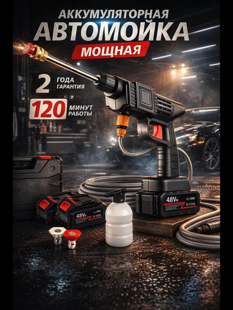
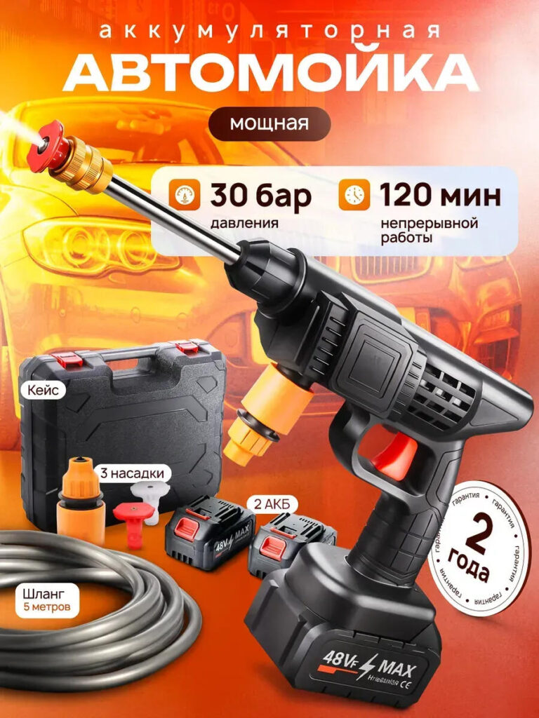
The first image establishes the product’s identity instantly.
The car wash gun is positioned centrally, angled slightly forward to create a sense of motion and strength. This angle is intentional—it avoids a flat catalog look and instead suggests active use. The dark workshop-style background contrasts sharply with the product’s black-and-orange color scheme, ensuring high visibility even in thumbnail size.
Les principales décisions de conception de cette image comprennent :
This image answers a critical buyer question within seconds:
“What exactly am I getting?”
By visually presenting the gun, batteries, hose, foam bottle, and case together, the image removes uncertainty and builds immediate trust.
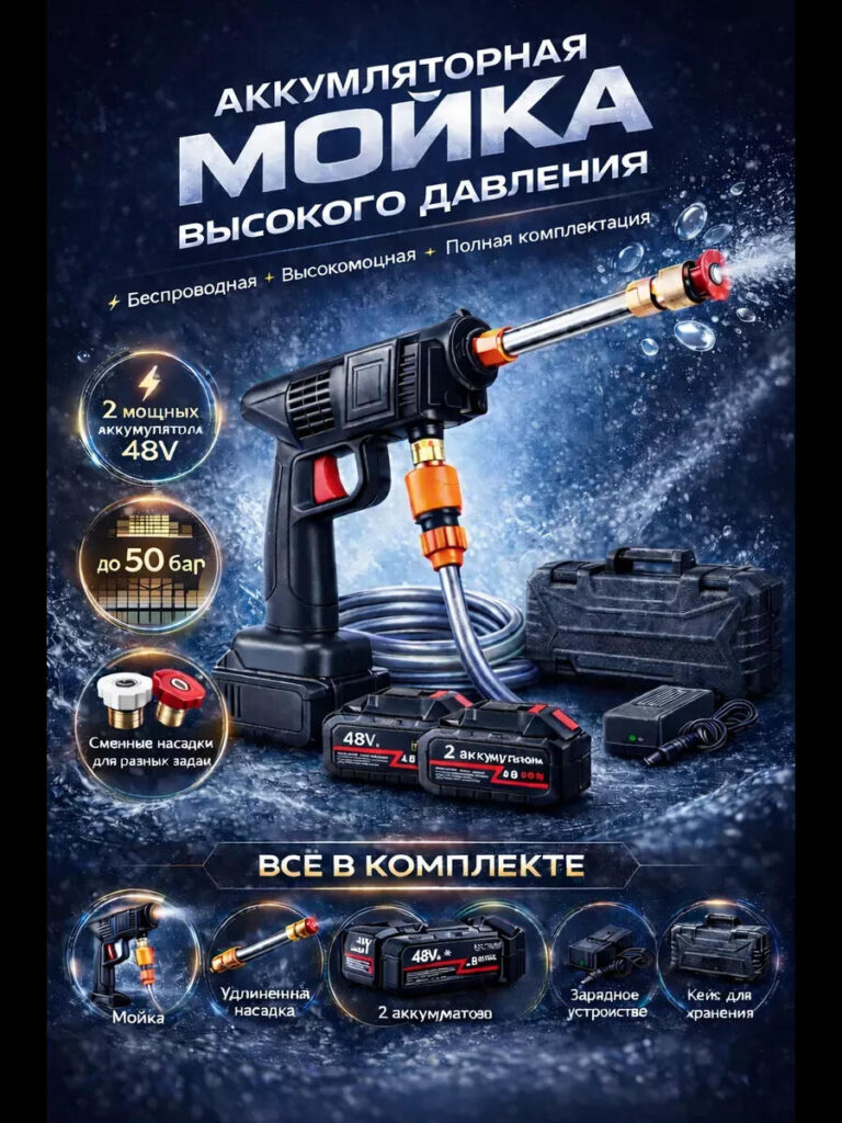
The second image shifts focus from appearance to performance.
Here, the visual environment becomes more dynamic, with water splash effects and a cooler blue color palette. This contrast from the warmer first image helps guide the viewer through a visual story rather than showing repetitive layouts.
Points forts du design :
This image is designed for buyers who already recognize the product and now want reassurance of cleaning strength. Instead of overwhelming users with numbers, visual cues communicate power intuitively.
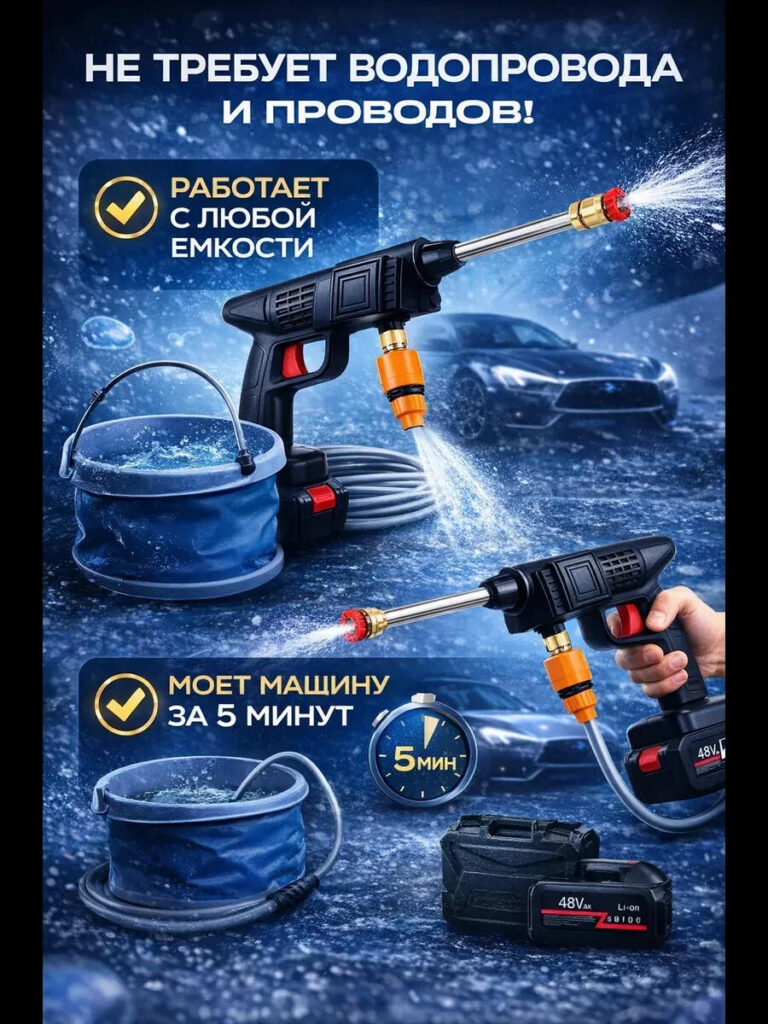
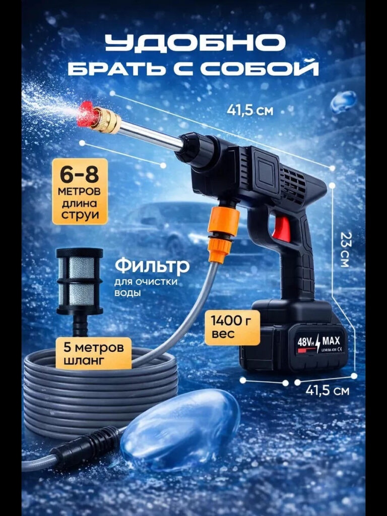
One of the biggest selling points of this car wash gun is independence from traditional water sources. This image exists specifically to address that.
The gun is shown drawing water directly from a bucket, clearly illustrating that:
From a design perspective:
This image reduces perceived usage limitations and expands the buyer’s imagination—camping, outdoor cleaning, remote washing, or emergency use all become instantly plausible.
This image adopts a more commercial, data-driven style while still remaining visually engaging.
Instead of lifestyle storytelling, it focuses on quantified benefits, such as:
The orange background creates strong contrast, ensuring the product stands out even when displayed among competing listings. Rounded labels and icons make technical information easy to digest, especially on mobile screens.
Design logic here emphasizes:
This image is particularly effective for comparison shoppers who jump between listings and rely on visible specs to make quick decisions.
Buyers often hesitate when they cannot visualize a product’s size or weight. This image eliminates that concern.
By showing measurements directly alongside the product, the design:
Les principaux choix de conception comprennent :
Instead of forcing users to read specifications in the description, this image visually answers practical questions upfront.
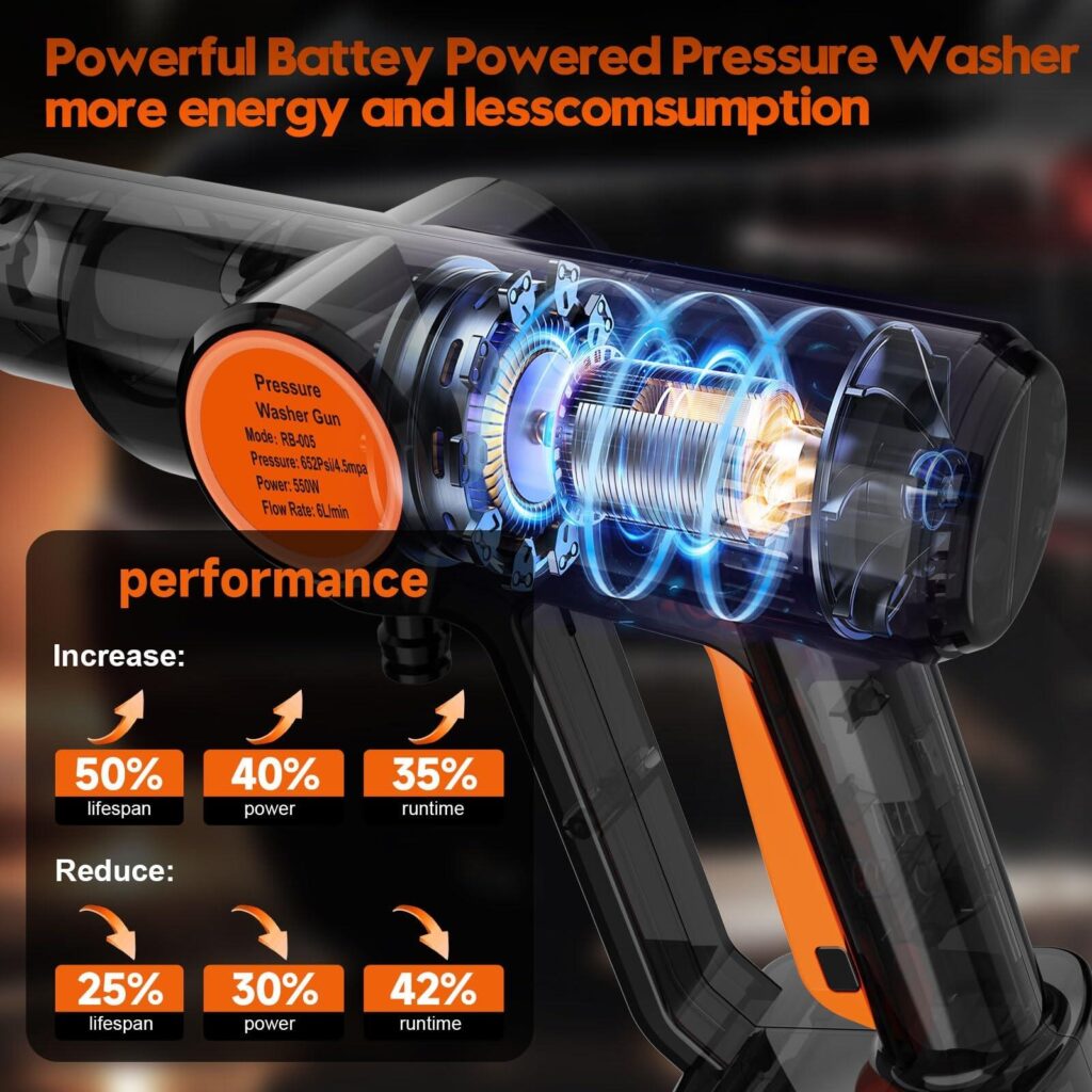
The final image uses a transparent cutaway style to highlight internal components and performance improvements.
This type of image is especially effective for technical products because it:
Design elements such as glowing energy lines and labeled performance improvements visually communicate:
Even for users who don’t fully understand the mechanics, the image creates a strong impression of advanced technology and thoughtful engineering.
While each image serves a different purpose, consistency ties them together.
Key consistency elements include:
This ensures that when images are viewed together on an Ozon listing, they feel like a cohesive system rather than unrelated graphics.
This car wash gun image set succeeds because it aligns with how Ozon users actually shop.
It:
Most importantly, the images do not compete with each other. Each one answers a specific buyer question, guiding the user step-by-step from curiosity to confidence.
Effective main image design on Ozon is not about making images look “cool.” It’s about making them work. For this car wash gun, every visual decision was driven by user behavior, marketplace rules, and conversion psychology.
By combining strong hero shots, performance storytelling, real usage scenarios, and technical clarity, the final image set transforms a functional product into a compelling, easy-to-understand offer. This is how design turns visibility into trust—and trust into sales.
This approach reflects the way we handle cross-border marketplace design projects, ensuring that products don’t just get seen, but get chosen. That is the design philosophy behind our work at AIRSANG.


