


Aucun produit dans le panier.

In the fast-growing retro gaming market, design plays a critical role in shaping user perception, engagement, and ultimately, conversion. When working on the Shopify store for LITNXT, our primary objective was to create a seamless digital experience that bridges nostalgia with modern usability.
Rather than overwhelming users with excessive features or complex interactions, we focused on clarity, emotional storytelling, and structured navigation. The result is a Shopify store that not only showcases products effectively but also builds trust and encourages purchase decisions across global audiences.
This case study explores how we approached the design of the LITNXT store—from homepage structure to product presentation—highlighting our design methodology, challenges, and outcomes.
| Délai de livraison | Catégorie | Plateforme d'application |
| 26days | console de jeux | shopify |
| Concepteurs impliqués | Coût | Effet |
| Nancy | $2800 | flow📈272% |
LITNXT operates in a niche that blends retro gaming culture with modern handheld technology. This meant the design needed to achieve two things simultaneously:
We identified early on that the site should not feel outdated or overly “retro-themed.” Instead, it needed a balanced aesthetic—modern layout with subtle nostalgic cues.
One of the most common issues in niche eCommerce stores is overloading the interface with too much content. For LITNXT, we intentionally simplified the layout to guide users through a clear journey:
We structured the page using a strong visual hierarchy:
This approach ensures users always know where to look and what to do next.
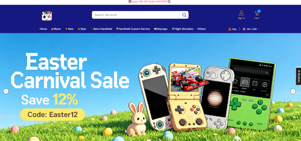
The homepage hero plays a critical role in setting expectations.
We designed the hero section to:
Rather than adding multiple sliders or distractions, we kept the hero focused and impactful.

We implemented a clean category structure that allows users to quickly browse:
Each category is visually distinct, making scanning effortless.
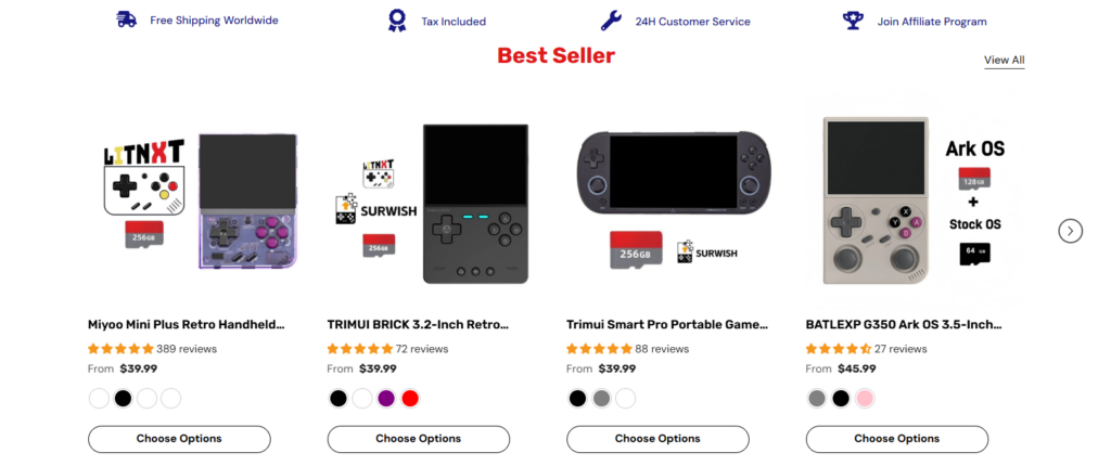
Instead of overwhelming users with all products, we curated sections like:
This reduces decision fatigue and increases conversion likelihood.
The product page is where decisions happen. Our design focused on:
We avoided clutter and ensured the most important information appears first.
To improve credibility, we incorporated:
These elements help users feel confident in their purchase.
A significant portion of traffic for gaming products comes from mobile devices. Therefore, mobile optimization was not an afterthought—it was a priority.
We ensured the mobile experience mirrors the desktop experience in quality, while being tailored for usability.
Problème: Too much retro styling can feel outdated.
Solution: We used modern layouts with subtle retro-inspired visuals, such as color accents and product imagery.
Problème: Large product catalogs can overwhelm users.
Solution: We structured content into curated sections like “Best Sellers” and “Featured,” reducing cognitive load.
Problème: Inconsistent layouts reduce trust.
Solution: We established a consistent design system for spacing, typography, and component structure.
Problème: Overusing pop-ups and promotions can harm user experience.
Solution: We relied on clean design, strong visuals, and clear CTAs instead of intrusive elements.
We analyzed:
This helped us define what works—and what to avoid.
We created structured layouts that prioritize:
This stage ensures the foundation is strong before moving into visual design.
We translated the wireframes into a polished interface:
Every design decision was made with conversion in mind.
After initial deployment, we reviewed:
We refined layouts based on real-world usage.
This project reinforces a key principle:
Good design is not about decoration—it’s about decision-making.
For Shopify stores, especially in niche markets like retro gaming, design directly impacts:
A well-structured store can outperform competitors—even with similar products.
Designing the LITNXT Shopify store was about more than aesthetics—it was about creating a focused, conversion-driven experience that aligns with both the brand and its audience.
By prioritizing clarity, usability, and emotional engagement, we transformed the store into a platform that not only showcases products but also builds trust and drives action.
At the end of the day, successful eCommerce design comes down to understanding users and guiding them effortlessly toward a purchase.
If you’re looking to build or improve a high-performing Shopify store with a strong focus on design, brand positioning, and conversion strategy, this is exactly where AIRSANG delivers value—helping brands turn ideas into results-driven digital experiences.


