










Aucun produit dans le panier.

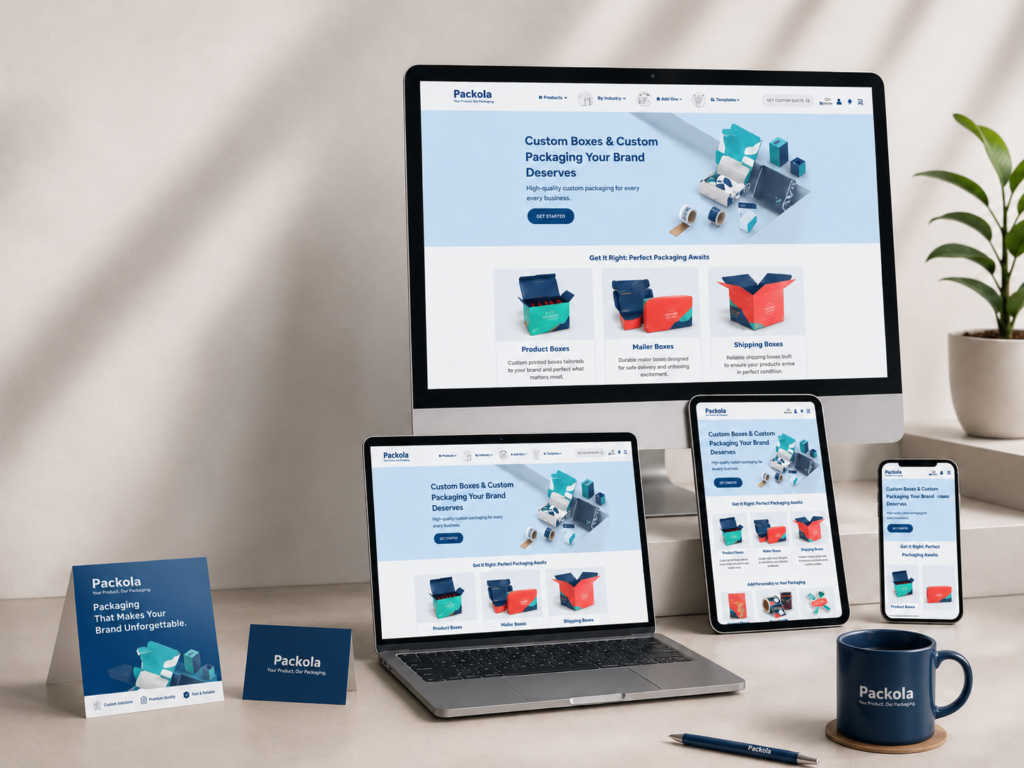
A strong packaging website must do more than display boxes. It must help visitors imagine their own brand on a finished product, understand the ordering journey, compare packaging options, and feel confident enough to take action. For a custom packaging business, visual design plays a central role in turning a practical product into an emotional brand experience.
Packola offers custom boxes and packaging solutions for businesses that want professional, brand-ready packaging. Its website focuses on custom product boxes, mailer boxes, shipping boxes, packaging options, online design, and fast ordering experiences. The challenge for a design-led website project like this is clear: the site must look creative and polished while still making complex product choices feel simple.
Our page design approach centered on clarity, product storytelling, conversion flow, and visual trust. Instead of treating the website as a basic product catalog, we shaped it as a guided customer journey. From the homepage to product pages, category sections, review areas, and supporting content, every part of the design needed to answer one key question: how can we help visitors move from curiosity to confidence?
| Délai de livraison | Catégorie | Type de site Web |
| 19 jours | Custom Packaging | Site web auto-construit |
| Concepteurs impliqués | Coût | Effet |
| Lin Zhang | $1900 | Sales📈271% |
Packaging is both functional and emotional. Customers need the right size, material, structure, print style, and quantity, but they also want their packaging to feel premium, memorable, and aligned with their brand identity. That means the website design cannot rely only on technical specifications. It must balance product education with visual inspiration.
For this project, we focused on designing pages that make custom packaging feel accessible. The website needed to support startups, small businesses, e-commerce sellers, retail brands, and established companies that want packaging with a professional finish. Each type of customer may enter the site with a different level of knowledge, so the design had to guide both first-time buyers and experienced packaging buyers.
The homepage became the main visual gateway. It needed to communicate what the business offers, why custom packaging matters, and how quickly users can begin. Supporting pages then needed to deepen trust by showing product types, customization possibilities, reviews, process details, and use cases.
The primary goal was to create a website experience that feels modern, clean, and conversion-focused. Custom packaging can easily become overwhelming because customers must make many decisions before placing an order. We wanted the page design to reduce friction by organizing information into clear sections.
We also wanted the website to feel visually aligned with the packaging industry. That meant using clean layouts, strong product imagery, bold call-to-action areas, and clear comparison-style content. The design needed to make boxes look more valuable, not simply more practical.
Our design goals included:
The homepage needed to immediately show that the brand provides custom packaging solutions. Visitors should not have to scroll too far to understand the offer.
Different packaging types need clear entry points. Users should quickly find mailer boxes, product boxes, shipping boxes, or other packaging categories.
Packaging buyers care about print quality, structure, color, material, and presentation. The page design needed strong visual proof to support these concerns.
Every page should naturally guide the visitor toward customization, product selection, quote request, or order action.
The website should not only sell boxes. It should help customers understand how packaging can improve their own brand presentation.
Boxes are practical products, but custom boxes are brand assets. One of the biggest challenges was elevating the visual perception of the product. A plain product listing would not be enough. The design had to show how packaging affects unboxing, customer trust, retail display, shipping presentation, and brand recognition.
To solve this, we treated packaging as a visual storytelling tool. We used layout direction that gives product images enough space to breathe. We also structured content so that product benefits appear alongside visual examples. This helps visitors connect features with real business value.
For example, instead of only presenting “custom mailer boxes,” the design can show how mailer boxes support e-commerce shipping, subscription products, influencer kits, beauty brands, and gift packaging. This approach turns a single product category into a range of business scenarios.
Custom packaging websites often include many options. Customers may need to choose box style, size, material, color, printing side, quantity, and artwork direction. If the design presents all of this information at once, users may feel overwhelmed.
Our design solution focused on progressive clarity. The homepage introduces the main promise. Category sections help users narrow their direction. Product pages then explain the details in a structured way. Supporting content answers common questions and reduces uncertainty.
This hierarchy keeps the experience clean. It allows users to move from broad interest to specific product decisions without feeling lost.
A packaging website should feel creative, but creativity cannot damage usability. The site must remain easy to scan, especially for business buyers who want quick answers. We avoided overly decorative layouts that would distract from the product.
Instead, we used a clean visual rhythm: strong hero sections, clear category cards, benefit blocks, product-focused imagery, concise supporting text, and repeated calls to action. This structure gives the website a polished brand feel while still keeping the user journey direct.
Before designing the pages, we reviewed the brand’s positioning and audience needs. Packola serves customers who want custom boxes and packaging that can be designed and ordered online. This audience values convenience, quality, affordability, and visual results.
We identified several user groups:
They need packaging that looks professional without making the process complicated.
They care about shipping presentation, protection, unboxing, and repeat purchase potential.
They need packaging that supports shelf appeal and product identity.
They want branded packaging for campaigns, launches, samples, and promotional kits.
Each audience has different priorities, but all of them need confidence. Our design direction therefore focused on trust, simplicity, and clear visual inspiration.
The homepage is the most important page because it sets the tone for the entire website. We planned it as a conversion-focused landing experience rather than a generic introduction page.
The homepage structure needed to answer several questions quickly:
What does the brand offer?
What types of packaging can customers order?
How does the customization process work?
Why should customers trust the brand?
Where should visitors click next?
To support these questions, we planned a clear homepage flow:
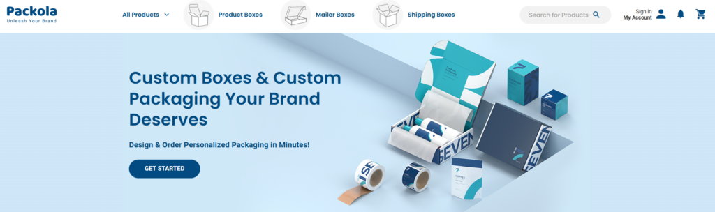
The hero section should make the value proposition instantly visible. A strong headline, supporting line, product imagery, and call-to-action button help visitors understand the offer within seconds.
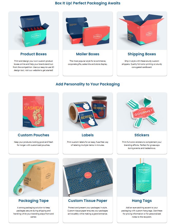
A packaging website needs clear product entry points. We designed this area to help users choose the right box type quickly.
This section explains why custom packaging matters. It can focus on brand presentation, print quality, flexible sizing, business use cases, and online ordering convenience.
A simple step-by-step ordering flow reduces uncertainty. It helps users understand that customization does not need to be complicated.
Packaging is highly visual. A gallery-style or use-case section helps users imagine their own designs on finished boxes.
Customer reviews, quality signals, and service benefits help remove hesitation.
The bottom of the homepage should push users toward the next action, such as browsing products, starting a design, or requesting packaging support.
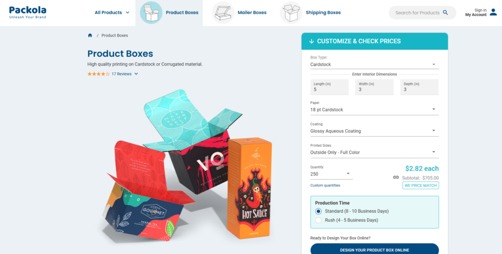
Product pages carry the strongest conversion responsibility. The homepage may attract interest, but product pages help visitors decide.
For product pages, we focused on a structure that combines product education with action. A strong product page should include clear product images, key benefits, customization options, use cases, material explanations, size guidance, and FAQ-style support.
We designed product pages to avoid clutter. Important information should appear near the top, while deeper details can appear in organized sections below. This helps both quick buyers and careful buyers.
The top section should show the box type clearly, explain its main use, and provide a direct customization or ordering action.
Short benefit cards help users quickly understand why this box type is useful.
Use-case sections help customers match the product to their industry or business need.
Packaging quality matters. Clean visual blocks can explain material choices, printing options, and finish possibilities without overwhelming the page.
Questions about sizing, artwork, turnaround, or ordering can appear in expandable sections to keep the page clean.
A complete independent website should not rely only on the homepage and product pages. Supporting pages help build trust and improve the customer journey.
For Packola-style packaging websites, important supporting pages may include:
Customer feedback helps buyers trust the quality of the product and service.
A clear process page helps first-time buyers understand how to choose, design, and order packaging.
Educational articles can answer common packaging questions and support SEO.
Category pages help users compare box types before selecting a specific product.
Pages for small businesses, e-commerce brands, retail packaging, or product launches can make the site more relevant to different audiences.
The design approach for these pages should stay consistent with the homepage. Each page needs clear hierarchy, strong headings, relevant visuals, and action-oriented sections.
We approached the project from a design strategy perspective. Instead of jumping directly into layouts, we first mapped the customer journey. A packaging buyer may move through several emotional stages: curiosity, comparison, uncertainty, confidence, and action.
The design needed to support each stage. Strong visuals create curiosity. Clear categories support comparison. Process explanations reduce uncertainty. Reviews and product details build confidence. CTA buttons encourage action.
This method helps the website feel intentional. Every section has a reason to exist.
A beautiful website does not guarantee results. For an independent website, design must support conversion. We placed strong attention on visual hierarchy, CTA placement, content order, and section rhythm.
For example, a CTA should not appear only once. It should appear naturally at important decision points. Product discovery areas should lead to product pages. Process areas should lead to customization. Trust sections should appear before final decision areas.
This type of layout helps users move forward without pressure. It creates a smooth path from browsing to action.
Packaging buyers want to know that their final boxes will look professional. The website itself must therefore feel professional. A messy or outdated page design would weaken trust.
We used a clean and polished direction with enough white space, clear typography, structured grids, and product-centered visual blocks. This makes the brand feel organized and reliable.
The design should make users think: if the website looks this clear and professional, the packaging experience will likely feel professional too.
Good website design is not only about images and layout. It also depends on how content is organized. We shaped the content to focus on benefits, clarity, and action.
Instead of long, dense paragraphs, we recommend short sections with meaningful headings. This allows visitors to scan quickly. It also helps search engines understand the page structure.
For packaging websites, useful content themes include:
Explain how custom boxes help businesses look more memorable.
Show how packaging supports safe delivery and product care.
Highlight options such as size, material, print, and design direction.
Connect packaging to industries such as cosmetics, food, apparel, gifts, and e-commerce.
Make the process feel simple and approachable.
The homepage should open with a strong message that connects custom packaging with business growth. The hero section should not feel vague. It should show the product, explain the benefit, and guide users to the next step.
A strong homepage headline for this type of website could focus on designing custom boxes that make brands stand out. The supporting text can emphasize online ordering, high-quality printing, and packaging made for modern businesses.
The visual direction should include finished boxes, clean product arrangements, or lifestyle-style packaging scenes. This helps visitors instantly understand the result they can achieve.
Packaging websites need strong category design because users often arrive with a specific box type in mind. A clear category section can show mailer boxes, shipping boxes, product boxes, and other packaging formats.
Each category card should include a clean product image, a short description, and a direct link. This reduces decision time and helps users enter the correct product path faster.
Custom packaging can feel complicated, especially for first-time buyers. A process section helps remove that fear.
A simple structure could include:
Choose your box type.
Select size and material.
Customize your design.
Review and place your order.
This kind of process design makes the website feel more approachable. It also supports conversion because users understand what happens next.
A strong packaging website should inspire. Customers want to see what is possible. We recommend using visual sections that show packaging in different industries and contexts.
Par exemple:
Beauty and skincare packaging
Subscription box packaging
Retail product packaging
Food and gift packaging
E-commerce shipping packaging
These use cases help users imagine their own brand inside the same framework. This can increase engagement and time on page.
Trust signals are essential for custom packaging. Customers may worry about print quality, material durability, order accuracy, or design results. The website should address these concerns through reviews, quality statements, process clarity, and helpful support content.
A well-designed trust section can include customer testimonials, star ratings, satisfaction messages, or service benefits. The goal is to reassure users before they take action.
A product page should not only show a box. It should explain when and why to use that box. For example, a mailer box page can explain that mailer boxes work well for e-commerce orders, subscription products, influencer kits, gifts, and branded delivery experiences.
This type of content helps users self-identify. When visitors see their use case reflected on the page, they feel more confident choosing that product.
Benefit blocks help users scan important information quickly. For custom packaging, benefit blocks may include:
Durable structure
Full-color printing
Custom sizing
Brand-ready presentation
Easy online ordering
Professional unboxing experience
These blocks should stay short and visual. They work best when paired with icons or small product details.
Some customers need help comparing box types or understanding material options. A clean comparison section can reduce confusion.
For example, the page can compare mailer boxes, product boxes, and shipping boxes based on usage, structure, and presentation style. This helps users choose without needing to contact support immediately.
FAQ sections are important because packaging buyers often have practical questions. Instead of placing all details in long paragraphs, collapsible FAQ areas can keep the page clean while still providing helpful information.
Questions may cover sizing, artwork preparation, material options, turnaround, ordering steps, and product suitability.
The design helps users understand the offer, product types, and buying process. When visitors feel informed, they are more likely to take action.
Clean layouts, polished product visuals, and organized content make the brand feel more premium. This matters because packaging itself is tied to brand quality.
Category cards, product sections, and guided content help users find the right packaging type faster.
A conversion-focused page structure supports clear next steps. Strategic CTA placement, trust sections, and process explanations all help move users toward action.
Clear H2, H3, and H4 headings help organize the article and website pages around relevant search themes such as custom packaging, custom boxes, product boxes, mailer boxes, shipping boxes, and independent website design.
Custom packaging offers many options. Without strong design structure, users may feel overwhelmed.
We organized products into clear categories and designed a guided browsing experience. This helped users move from general interest to specific product selection.
Boxes can look simple if presented without context.
We used brand-focused visual storytelling. The design connects boxes with unboxing, product presentation, and business identity.
Customers need confidence before ordering custom packaging.
We included review areas, process explanations, quality-focused sections, and product detail content to reduce hesitation.
Some users know exactly what they need. Others need guidance.
We designed pages with layered information. Quick actions support experienced buyers, while educational sections support new buyers.
The final design direction created a website experience that feels clear, modern, and business-focused. The homepage introduces the brand promise quickly. Product categories guide users into the right buying path. Product pages explain value, use cases, and customization options. Supporting pages strengthen trust and provide educational depth.
Most importantly, the design turns packaging from a simple product into a brand-building tool. Visitors can understand not only what they can order, but also why custom packaging matters for their own business.
A successful custom packaging website needs more than attractive visuals. It needs strategy, structure, clarity, and conversion thinking. By focusing on homepage impact, product page education, visual trust, and user-friendly navigation, this project shows how thoughtful independent website design can make a packaging brand feel more professional and easier to buy from.
For businesses that want a similar website experience, AIRSANG can help design independent websites that present products clearly, strengthen brand value, and create a smoother path from first impression to customer inquiry.