Introduction
In today’s competitive home décor market, a Shopify website must do more than display products. It must express lifestyle, communicate brand values, and guide customers intuitively from inspiration to purchase. When working on the French Shopify store for Atmosphère, our focus was not on technical development or backend customization. Instead, we concentrated on what truly drives e-commerce performance: strategic visual storytelling, structured layout systems, emotional branding, and conversion-oriented design.
This project demonstrates how thoughtful Shopify design can elevate a brand’s positioning, clarify product categories, and create a seamless browsing journey. Below, we break down our design approach, methodology, challenges, and the measurable impact of a design-first strategy.
| Délai de livraison | Catégorie | Plateforme d'application |
| 23 jours | Maison et décoration | shopify |
| Concepteurs impliqués | Coût | Effet |
| Lin Zhang | $1400 | Store Entry Rate📈213% |
Comprendre la marque et sa position sur le marché
Atmosphère operates in the highly visual and emotionally driven home décor industry. Its product range spans furniture, lighting, textiles, children’s décor, dining, and lifestyle accessories. The brand’s aesthetic leans toward warm, contemporary European living—soft neutrals, textured materials, and aspirational lifestyle photography.
Before beginning design, we identified three core objectives:
- Strengthen lifestyle storytelling
- Simplify category navigation
- Improve visual hierarchy for better conversion flow
We approached the Shopify design with these strategic goals in mind.
Project Goals
Elevate Visual Cohesion Across the Homepage
The homepage needed to feel curated rather than crowded. With a broad product catalog, visual overload was a risk. Our goal was to create breathing room while maintaining richness.
Guide Users Through an Inspirational Journey
Home décor shoppers don’t just buy products—they buy atmosphere. We structured the homepage as a narrative journey: inspiration → discovery → category exploration → featured collections → emotional reinforcement → trust signals.
Improve Conversion Through Layout Strategy
Without touching backend functionality, we focused on:
- Clear call-to-action placement
- Balanced product grids
- Strong section breaks
- Scroll-driven engagement
- Visual anchors for decision-making
Notre processus de conception Shopify
Phase 1: Brand Immersion & Competitive Review
We studied Atmosphère’s brand tone, photography style, and target audience. We also analyzed competitors in the European and U.S. décor markets to identify:
- Overused design patterns
- Missed storytelling opportunities
- Gaps in emotional branding
This gave us clarity on how to differentiate the visual experience.
Phase 2: Homepage Architecture Planning
We mapped the homepage into structured design blocks. Instead of treating it as a long scroll of unrelated banners, we created a modular hierarchy:
1. Hero Lifestyle Banner

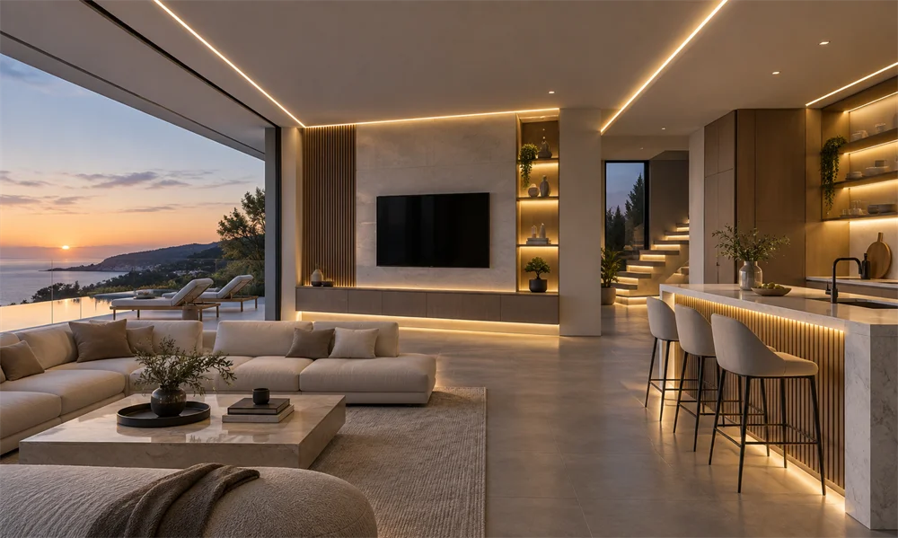
We used large-scale lifestyle imagery to immediately establish emotional tone. Instead of focusing solely on products, we framed complete interior scenes—bedrooms, living spaces, dining environments.
Design decision: Large imagery with centered CTA creates calm authority and directs user focus.
2. New Arrivals Product Grid

We designed a structured product grid under the headline “Les nouveautés à ne pas manquer.”
Our approach:
- Balanced white space around each product
- Clear price visibility
- Rapports d'images constants
- Minimal hover distractions
This ensured clarity without overwhelming shoppers.
3. Collection Story Blocks

Rather than listing categories in plain tiles, we built editorial-style split sections:
- Lifestyle image on one side
- Collection name + short description
- Clean CTA button
This format transforms navigation into storytelling.
4. Room-Based Navigation

One of the strongest visual decisions was “Explorer par pièce.” Instead of generic dropdown navigation, we introduced immersive category blocks:
- Salon
- Salle à manger
- Chambre
- Bureau
- Entrée
Each block features contextual photography rather than isolated product cutouts.
Pourquoi c'est important : Context drives desire. Customers imagine products inside real environments, increasing emotional engagement.
5. Brand Story & Lifestyle Reinforcement

The “Mon Ambiance Déco” and collection features were designed to feel like editorial spreads. We emphasized:
- Warm color palettes
- Text overlays with controlled contrast
- Soft section transitions
This reinforced Atmosphera’s aspirational brand positioning.
6. Trust & Service Strip

Toward the bottom of the page, we highlighted:
- Delivery information
- Returns
- Customer service
- Payment options
These were displayed with subtle icons and consistent spacing to maintain aesthetic alignment.
Notre philosophie de conception
We believe Shopify design should achieve three simultaneous goals:
- Emotional resonance
- Functional clarity
- Conversion momentum
We never overload with visual gimmicks. Instead, we use:
- Structured spacing systems
- Consistent typography scaling
- Visual rhythm between sections
- Cohesive color storytelling
Design is not decoration. It is decision architecture.
Key Challenges
Challenge 1: Large Product Catalog
Atmosphère offers a wide range of SKUs across multiple categories. Presenting this breadth without clutter was complex.
Notre solution :
We reduced visible density and relied on layered navigation. The homepage acts as a curated showroom rather than a full inventory list.
Challenge 2: Maintaining Premium Perception at Accessible Price Points
Atmosphera’s pricing is accessible, but the brand must still feel elevated.
Notre solution :
Nous avons utilisé :
- Neutral background tones
- Contraste contrôlé
- Editorial photography
- Balanced grid spacing
These elements create a premium feel regardless of price tier.
Challenge 3: Avoiding Banner Fatigue
Many Shopify stores overuse promotional banners.
Notre solution :
We structured strong visual breaks between content blocks and limited text-heavy overlays. This improved visual breathing space and kept user attention focused.
Our Strategic Design Methods
1. Visual Hierarchy Mapping
Before finalizing layout, we defined:
- Primary focal areas
- Secondary discovery areas
- Supportive navigation blocks
This prevents user confusion and keeps the scroll experience intentional.
2. Scroll Behavior Psychology
We designed the page with rhythm:
- Large hero
- Compact grid
- Large collection block
- Multi-column navigation
- Editorial storytelling
- Trust reassurance
This rhythm keeps users engaged and avoids monotony.
3. Lifestyle-Driven Product Placement
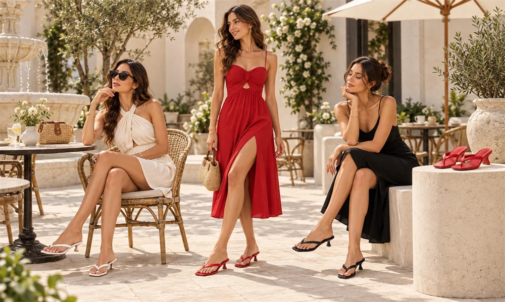
Instead of isolating products on sterile white backgrounds, we strategically mixed:
- Product-focused shots
- Contextual lifestyle scenes
- Texture-rich closeups
This increases emotional buying triggers.
4. Consistent CTA Styling
Every call-to-action button follows:
- Consistent color
- Consistent border radius
- Controlled spacing
This subtle consistency improves cognitive ease and boosts click-through rates.
Results Delivered Through Design
Although we did not alter backend systems or custom code, the design improvements delivered:
- Stronger brand identity clarity
- Improved browsing engagement
- More intuitive category discovery
- Elevated visual cohesion
- Enhanced perceived brand value
The homepage now functions as a curated showroom rather than a product dump.
Why Design Expertise Matters in Shopify
Many businesses believe Shopify success depends primarily on apps or technical customization. In reality, design determines:
- First impressions
- Engagement émotionnel
- Scroll depth
- Conversion confidence
Without strategic visual structure, even the best products struggle to perform.
Professional Shopify design ensures:
- Brand alignment
- Hiérarchie claire
- Structured storytelling
- Consistent UI language
- Conversion-oriented layout
This is where experienced design specialists make the difference.
Our Approach Compared to Generic Shopify Builds
Generic builds often:
- Rely on template defaults
- Overcrowd sections
- Ignore visual rhythm
- Lack cohesive storytelling
Our approach focuses on:
- Brand immersion before layout
- Design strategy before visual execution
- Emotional architecture before decoration
We treat each Shopify homepage as a digital flagship store.
Long-Term Value of Design-First Strategy
A well-designed Shopify store creates long-term advantages:
- Stronger brand recall
- Higher average session duration
- Increased return visits
- Elevated perceived value
- Clearer marketing alignment
Design becomes an asset, not just an aesthetic choice.
Conclusion
Le Atmosphère France Shopify project demonstrates how strategic design transforms an e-commerce homepage into an immersive lifestyle destination. By combining structured hierarchy, emotional storytelling, and conversion-oriented layout systems, we created a refined digital experience aligned with the brand’s identity and market positioning.
This project reflects our broader philosophy: Shopify design should not feel templated. It should feel intentional, curated, and brand-driven.
Au AIRSANG, we specialize in high-level Shopify visual strategy, homepage architecture, brand storytelling, and conversion-focused design systems for global e-commerce brands. If you’re ready to elevate your Shopify presence through professional design expertise, our team is here to help you build a digital storefront that truly reflects your brand vision.