


Aucun produit dans le panier.
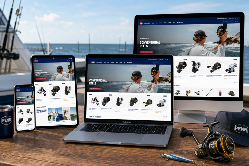
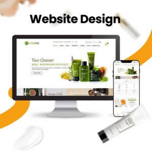
A strong fishing eCommerce website must do more than display rods, reels, and accessories. It must make anglers feel the environment, understand the product difference quickly, trust the brand’s toughness, and move toward purchase without friction. The PENN Fishing Shopify website achieves this by combining cinematic lifestyle photography, direct product navigation, structured category browsing, review-driven product cards, community content, and brand heritage storytelling.
From a designer’s perspective, this website works because every section has a clear job. The hero areas build emotion. The product grids support comparison. The category blocks simplify navigation. The adventure-based sections connect products with real fishing situations. The social gallery adds community proof. The About page turns brand history into a trust asset. Together, these design choices create a Shopify experience that feels practical, energetic, and credible for serious anglers.
| Délai de livraison | Catégorie | Type de site Web |
| 14days | Fishing gear | shopify |
| Concepteurs impliqués | Coût | Effet |
| Lin Zhang | $1300 | Sales📈256% |
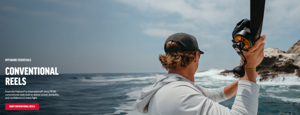
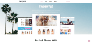
The first hero section uses a wide offshore scene to place visitors inside the fishing experience before they even browse a product. Instead of opening with a plain product image, the design shows an angler holding a conventional reel near rough water and coastal rocks. This creates instant context. Customers can imagine where the reel belongs, what kind of performance it supports, and why it matters in a demanding saltwater environment.
As designers, we choose this kind of hero image because fishing gear depends heavily on trust. Buyers do not only ask, “What does it look like?” They ask, “Will this perform when I need it?” The ocean setting answers that question visually. The waves, rocks, and active body posture communicate power, pressure, and real use.
The composition places the angler and reel on the right side, while the left side keeps enough negative space for the headline, description, and call-to-action. This is a smart layout decision because it avoids competition between image and copy. The reel remains visually important, but the text still reads clearly.
The headline “Conventional Reels” uses large uppercase typography. This gives the section a rugged, confident tone that matches the product category. The smaller copy explains the product purpose, while the red call-to-action button creates a strong contrast against the blue-gray ocean background. That red button acts as a visual anchor. It tells shoppers exactly where to go next.
For a Shopify store, the first screen must create both emotion and action. This section does both. It gives customers a reason to feel connected to the product category, then gives them a direct path to shop. The design does not waste time with abstract branding. It introduces the product, the environment, and the shopping action in one clean structure.
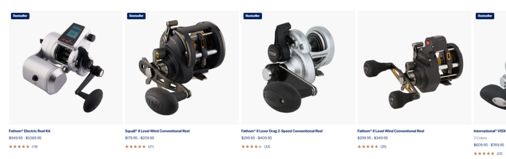
The product listing section shows multiple conventional reels in a horizontal grid. Each product card includes a large image, product name, price range, star rating, review count, and in some cases a “Bestseller” badge. This structure supports fast comparison, which is essential for fishing equipment.
Fishing reels often differ by size, drag system, gear ratio, handle structure, price, and intended use. Customers need to compare several options before choosing. By using a consistent card format, the website lets shoppers scan quickly without losing important details.
PENN’s conventional reel collection focuses on saltwater fishing and highlights strength, accuracy, and long-term performance as key product values. That makes comparison design especially important, because the buyer needs to evaluate performance-oriented products with confidence.
The product images sit on clean white backgrounds. This design choice removes distraction and makes the reels’ shapes, materials, handles, spools, and mechanical details easier to inspect. The products feel premium because they have space around them. Nothing crowds the card.
As designers, we use this kind of controlled product presentation when the item itself has strong visual value. Reels are mechanical, detailed, and highly dimensional. A busy lifestyle background would reduce clarity. A white product area makes the item the hero.
The star ratings and review counts help shoppers judge credibility before clicking. Price ranges also reduce uncertainty. Instead of forcing users into every product page, the listing gives them enough information to decide which products deserve deeper attention.
The “Bestseller” badges guide customers toward popular choices. This works especially well in categories with many similar products. When users feel unsure, popularity labels help reduce decision pressure.
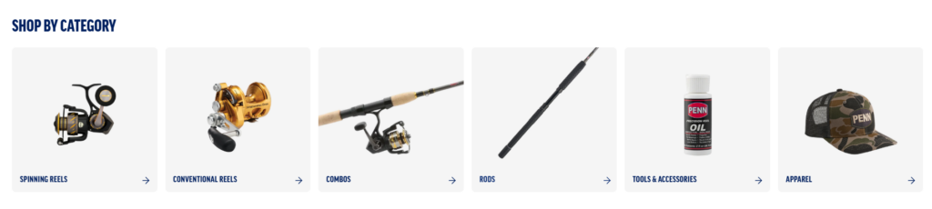
The “Shop by Category” section divides the store into clear product groups: spinning reels, conventional reels, combos, rods, tools and accessories, and apparel. This is one of the most important UX decisions on the page because it helps different types of shoppers enter the store in the way that matches their intent.
Some users arrive knowing they need a reel. Others want a rod. Some want a full combo. Others need maintenance tools or branded apparel. A single product grid cannot serve all of those needs equally. Category cards create clear entrances.
Each card uses a large product image on a light background. The images are simple, centered, and easy to recognize. The category name appears at the bottom in bold uppercase type, and a small arrow adds a clear action cue.
This layout works because the customer does not need to read much. The image gives instant recognition, the label confirms the category, and the arrow suggests movement. It is simple, but it solves a real shopping problem.
Experienced anglers can jump directly to the category they need. Newer customers can explore the product family without feeling lost. This balance matters for a brand like PENN because its audience includes both serious anglers and customers who may be buying gear as an upgrade or gift.
As designers, we want navigation to feel confident, not complicated. This section makes the store feel easier to enter.
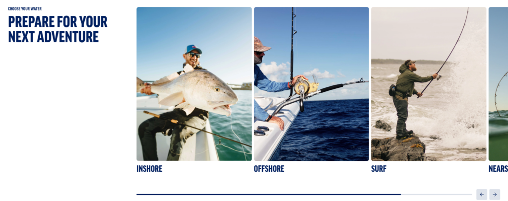
The “Prepare for Your Next Adventure” section changes the shopping logic from product type to fishing environment. It shows large lifestyle cards for inshore, offshore, surf, and nearshore fishing. This design understands how many anglers actually think. They may not begin with a technical product name. They begin with a situation: “I fish from shore,” “I fish offshore,” or “I need gear for rougher water.”
This section turns the shopping journey into a lifestyle decision. That makes the store more intuitive and more emotionally engaging.
The carousel uses large, immersive photography. Each card shows a real fishing moment: an angler holding a catch, gear in use on a boat, surf fishing near crashing waves, or action on the water. These images communicate different fishing conditions quickly.
The left-side headline gives the section an editorial feeling. The right-side carousel adds movement and discovery. The design invites users to browse by adventure instead of only by product specification.
Use-case navigation can improve purchase confidence because customers feel guided toward products that match their real fishing life. If a shopper chooses “Offshore,” they are not just browsing random reels or rods. They are entering a curated path based on their environment.
As designers, we see this as a bridge between brand storytelling and eCommerce structure. The section feels inspiring, but it also has a practical conversion purpose.
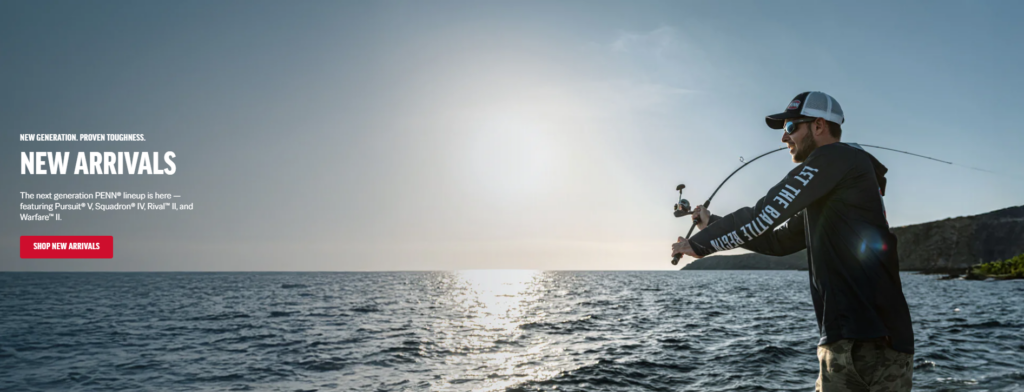
The “New Arrivals” hero section uses another wide ocean lifestyle image, this time featuring an angler actively casting near the water. The message introduces the next generation of products and presents them as tough, proven, and ready for action.
This section works because it gives new products a sense of occasion. Instead of placing new arrivals only inside a standard product grid, the site gives them a full cinematic banner. That makes the launch feel important.
The image uses open water, sunlight, and a strong human silhouette. The angler appears on the right side, while the left side holds the headline and button. This creates the same functional balance seen in the first hero, but with a different emotional tone. The first hero feels intense and rugged. This section feels brighter, newer, and more open.
The red call-to-action button again stands out clearly. The repetition of button styling builds consistency across the Shopify experience. Customers learn how action works on the site.
New arrivals can easily feel like a basic retail update. Here, they feel connected to the brand’s larger identity: toughness, performance, and battle-ready fishing. The hero image reinforces the idea that these products belong in real conditions, not just on a shelf.
As designers, we use this strategy when a brand needs to make product updates feel more emotional and more premium.
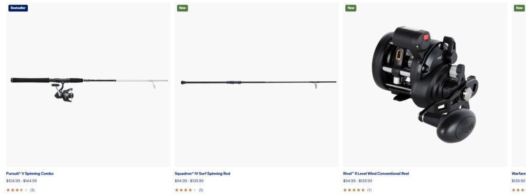
The new product row displays different product types, including combos, rods, and reels. These products have very different shapes, especially long rods compared with compact reels. The layout solves this by using large white product areas and generous spacing.
This is a quiet but important design decision. Long fishing rods can easily look awkward in a product grid. If the image space is too small or too crowded, the product becomes hard to understand. The clean white area lets each item keep its natural proportions.
The product row includes “Bestseller” and “New” labels. These small badges give shoppers quick decision signals. “New” highlights fresh releases, while “Bestseller” suggests proven demand. Both labels help users prioritize what to inspect first.
This is especially useful in a store with many SKUs. Customers do not want to evaluate every item equally. They want clues.
Below each image, the product name, price range, rating, and review count appear in a consistent order. This creates a predictable reading pattern. Shoppers can compare name, price, and social proof without changing how they scan from one card to the next.
As designers, we value this kind of repetition because it reduces mental effort. The customer should focus on choosing the right product, not figuring out how the page works.
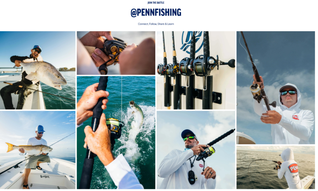
The social gallery section uses the headline “@PENNFISHING” and a collage of fishing images. This section changes the feeling of the site. After product grids and category navigation, the gallery reminds visitors that fishing is also a community, a lifestyle, and a collection of real moments.
The collage includes anglers holding catches, close-up gear shots, rods in action, boats, water, and branded apparel. This gives the brand a living presence. It feels active beyond the online store.
A uniform grid would feel clean, but it might also feel flat. The collage layout creates rhythm. Large and small images work together to create movement. Some photos show details, while others show wider lifestyle scenes. This variety keeps the section visually engaging.
As designers, we use collage layouts when we want to show energy and diversity. Fishing is unpredictable, physical, and emotional. The layout reflects that.
Customers trust products more when they see them used in real environments. The social gallery supports that trust by showing the brand in the hands of anglers. It also encourages visitors to connect, follow, share, and learn, extending the relationship beyond the website.
This matters because Shopify stores should not only convert one purchase. They should build repeat engagement. Community content helps turn a transaction into an ongoing brand relationship.
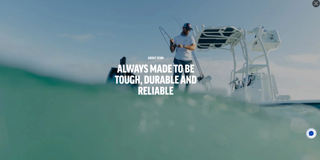
The About page begins with a full-width hero image featuring an angler and boat viewed through water. The central headline says the brand is made to be tough, durable, and reliable. This is a direct and effective brand promise.
The image choice is important. The water partially covers the view, which creates immersion. It feels as if the viewer is inside the fishing environment, close to the action. This makes the page feel more emotional than a standard company introduction.
Below the hero, the page introduces “Battle-Tested Reliability.” This section explains the brand’s long-standing focus on reel design, production, and trust among anglers. PENN states that Otto Henze founded the company in 1932, and the About page connects that history to modern product confidence.
As designers, we see this section as the credibility core of the About page. It gives visitors a reason to believe the brand promise. The copy stays centered and compact, which makes it easier to absorb. Instead of overwhelming users with a long corporate essay, the section gives them a focused statement of heritage and purpose.
The “Our History” timeline gives the page depth. It shows the brand’s development across decades, including early company milestones and product evolution. This is valuable because fishing equipment buyers often care about experience. A long history suggests the brand has survived real customer expectations, changing technologies, and competitive pressure.
Timeline design helps organize this information. Without structure, historical copy can feel heavy. With a timeline, the story becomes easier to scan.
After the history section, the page includes three visual cards: warranty and repairs, trusted resources, and careers. This is smart because the About page should not become a dead end. It should lead users toward practical next steps.
The warranty card supports confidence after purchase. The resources card helps users continue learning. The careers card opens the brand to people who want to join the company. Each card uses a strong image and a clear title, keeping the page useful as well as emotional.
The footer uses a large slogan: “Let the Battle Begin.” This final message reinforces the brand personality. It is bold, competitive, and memorable. The deep navy background and oversized white type create a strong closing moment.
For an About page, this ending matters. It does not simply list links and legal text. It leaves visitors with a brand feeling.
Across the website, the design uses a consistent color language. Navy communicates strength, heritage, and trust. White creates clarity and product focus. Red highlights action and urgency. This color system works well for a fishing brand because it feels bold without becoming chaotic.
The red buttons are especially effective. They appear against ocean blues, white product areas, and dark navigation zones. Because the button color stays consistent, customers quickly learn where to click.
The website uses heavy uppercase headings throughout the experience. This typography choice matches the brand’s rugged personality. It feels direct, strong, and easy to read at large sizes.
In a softer lifestyle category, this type style might feel too aggressive. For fishing gear, it works. It supports the language of toughness, reliability, and battle-tested performance.
The strongest design asset on this site is photography. Product photos provide clarity. Lifestyle photos provide emotion. Community photos provide proof. About-page photos provide heritage and atmosphere.
As designers, we would describe the visual strategy as a balance between “inspect the product” and “feel the experience.” That balance is what makes the Shopify store more persuasive.
The site does not force every shopper into one path. Customers can shop by category, by fishing environment, by new arrivals, by product popularity, or by brand trust. This flexibility matters because anglers make decisions in different ways.
Some buyers know the exact reel type they need. Some browse by adventure. Some respond to bestsellers and reviews. Some need to understand brand reliability before buying. The design supports all of these behaviors.
The product cards show price ranges, reviews, and ratings. Category sections clarify where to go. Lifestyle sections show real use. The About page explains history. Each design layer reduces a different kind of uncertainty.
In eCommerce, uncertainty slows purchase decisions. A strong Shopify design answers questions before the customer asks them.
Many websites create atmosphere but fail to guide users clearly. Others push products but feel emotionally empty. This site avoids both problems. It uses adventure-driven visuals while keeping calls-to-action visible and direct.
That combination is powerful. The customer feels inspired, but they also know what to do next.
Le PENN Fishing Shopify website succeeds because it treats design as both storytelling and selling. The conventional reels hero creates an immediate offshore mood. The product grids make comparison easy. The category cards reduce navigation friction. The adventure carousel helps customers shop by fishing environment. The new arrivals section gives launches more energy. The social gallery builds community trust. The About page turns heritage into credibility.
From a designer’s perspective, every section supports a clear purpose: attract attention, guide choice, build confidence, and move the customer toward action. This is the kind of Shopify design approach that works especially well for outdoor, sports, fishing, and performance-driven product brands. At AIRSANG, we use the same conversion-focused thinking to help cross-border brands build stronger independent websites with clearer visuals, better structure, and more persuasive brand experiences.