Project overview
The customer of this project is Rose Morning, a high-end floral background wall brand. It is mainly targeted at wedding planners, event design companies, photographers, interior designers and wedding users. The product has strong visual attributes and scene-based consumption characteristics. As the brand business develops, customers hope to use Shopify to build a brand website with a more advanced feel, professionalism and conversion capabilities. Therefore, they approached AIRSANG and asked us to reorganize the website’s visual style, homepage structure, product classification and user browsing flow. The project focuses on floral product display, wedding scene creation, brand story expression, spot and delivery information presentation, and trust building. While maintaining a romantic and elegant brand tone, it reduces the browsing pressure caused by a large number of products, and ultimately creates a Shopify floral e-commerce website that takes into account brand image, user experience, and sales conversion.
| Servicios | Industry | Plataforma |
| Website design and decoration | Agriculture and Horticulture | shopify |
| Project requirements | target market | design style |
| Improve the overall visual quality and brand recognition of the website | Global | Romantic high-end|natural and soft|scene immersion |
| project budget | Delivery content | Delivery time |
| ¥8300 | Website construction and full-site page design | 16 working days |
Project Challenges
The core challenge of this project is how to take into account the visual quality, product display efficiency and user purchasing experience of a high-end floral brand on the Shopify platform. Customer products are rich in styles and have strong scene attributes. If the information level is not clear, it can easily lead to cluttered pages and high user browsing costs. Before starting the project, we first sorted out the brand positioning, target customer groups and core product structure, analyzed wedding planning, event layout and individual consumers’ browsing habits, and re-planned the homepage content priority, product classification, visual movement lines and trust information display methods. At the same time, we unified the brand’s existing images, copywriting, product selling points, and delivery information to establish a clear content framework for subsequent page design and Shopify website construction.
Homepage design: Create a first impression that drives conversions
Hero above the fold: Prioritize visual impact
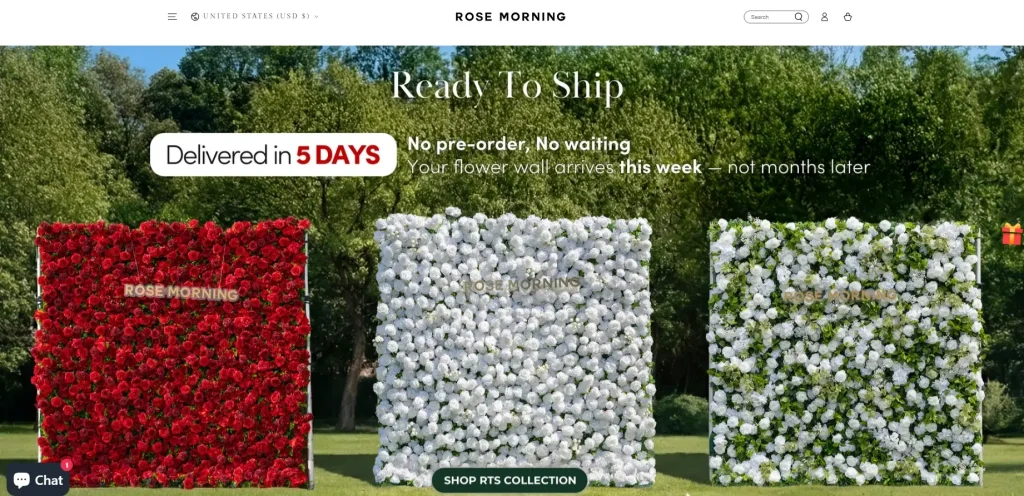
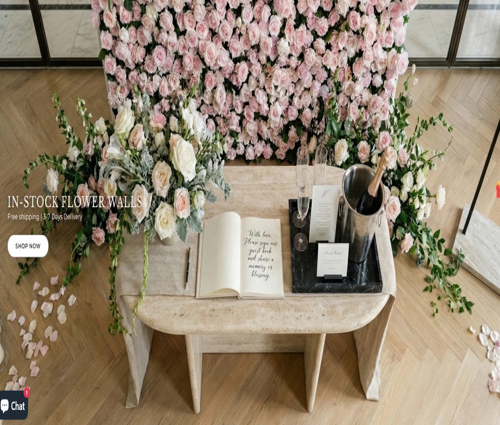
The homepage adopts a large and immersive Hero first screen design. Through a visual image with a sense of scale and high-end, users can quickly understand the brand and products after entering the website.
Rather than emphasizing complex product parameters from the beginning, we pay more attention to the following:
- Full width lifestyle scene image
- Natural outdoor environment display
- Clearly communicate spot status and delivery cycle
This design method can make users realize in a few seconds that this is a professional, mature product solution that can be purchased directly and shipped quickly, rather than a customized order with greater uncertainty.
information hierarchy design
We organize the first-screen copy in the order of the issues users are most concerned about:
Is the product in stock now?
How long does it take to ship?
How does the product perform in real scenarios?
Through short, clear copywriting and impactful visual images, the most critical information can be quickly conveyed while reducing the user’s reading burden.
Product display and category design
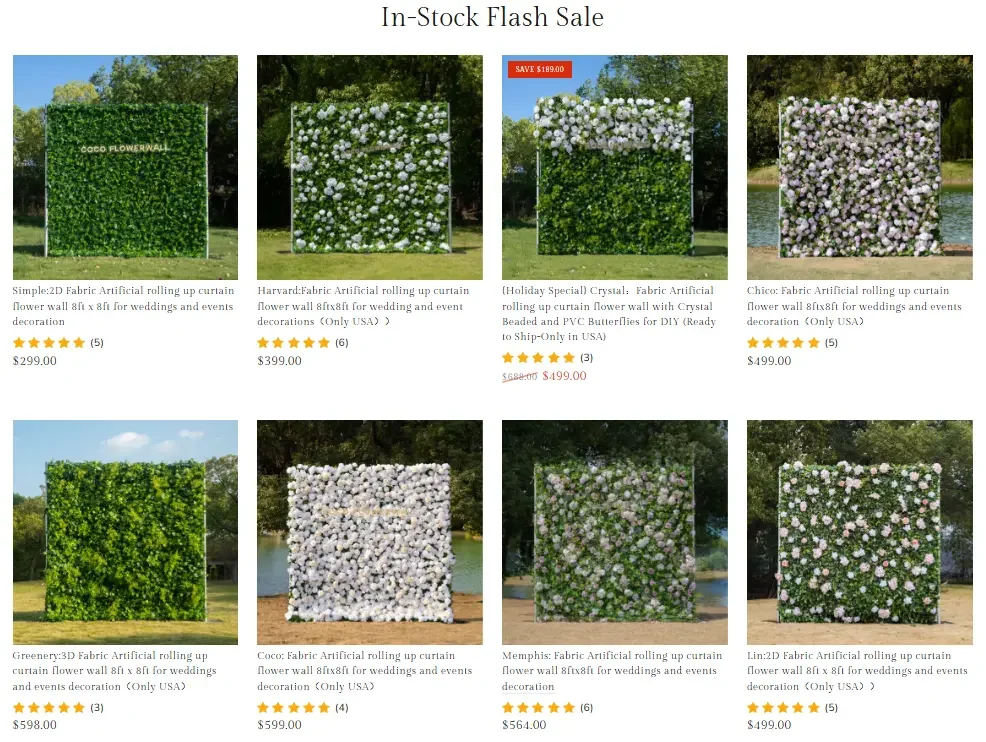
Provide users with more intuitive visual comparisons
The flower wall product itself has very strong visual attributes, so in the design of the product collection page, we focus on the following aspects:
- Supports side-by-side comparisons between products
- Maintain consistent image display proportions and composition
- Clearly distinguish the color, flower material and texture differences of different products
Instead of piling a lot of text into the product card, we let the product image be the main information, supplemented by concise labels and prices, so that users can browse and compare products more quickly.
Highlight “spot” information
In the product collection area, we added a visual reminder of “In Stock Now” to reduce users’ concerns about inventory and delivery time.
For consumption scenarios with clear time nodes such as weddings and event arrangements, whether the inventory is confirmed will directly affect purchase decisions. Therefore, this design can effectively reduce hesitation and improve users’ purchasing confidence.
Lifestyle Scenario Section: Selling not only products, but also user experience
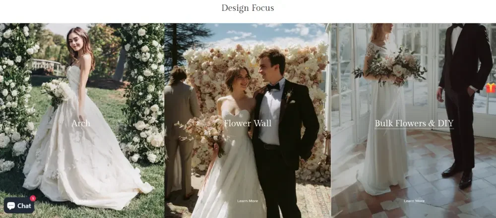
Key design directions
A very important part of the homepage is to display flower wall products through real usage scenarios, such as:
- wedding scene
- wedding ceremony flower wall
- Bride, bridesmaids and couple photography scene
These areas do not take the form of traditional product lists, but are designed as visual content sections with a sense of story and scene.
Create emotional associations through pictures
We integrate our products into emotionally appealing scenes such as weddings, celebrations, and couple interactions, so that users can more naturally imagine the effect of the product in their own activities.
Compared with simply introducing dimensions, materials or parameters, this kind of visual expression based on real scenes is easier to establish emotional connections and is more conducive to promoting users’ desire to buy.
Featured products and visual unity
Maintain overall brand consistency
The unity between product images is very important to the high-level sense of the website, so in the page design, we focus on controlling:
- uniform background color
- Balanced page spacing
- Consistent shadow and light effects
Through a unified product display method, the entire website is made more like a professionally designed brand product catalog, thereby further enhancing the brand’s professionalism and credibility.
Establish a clear path of action
Each featured product area contains:
- A visually dominant product image
- Short but clear product copy
- Action buttons that are clear and not overly prominent
Our goal is not to push users through strong promotions, but to guide users step by step into product details or the next step of browsing through a natural page structure.
Key product sections: highlight representative products of the brand
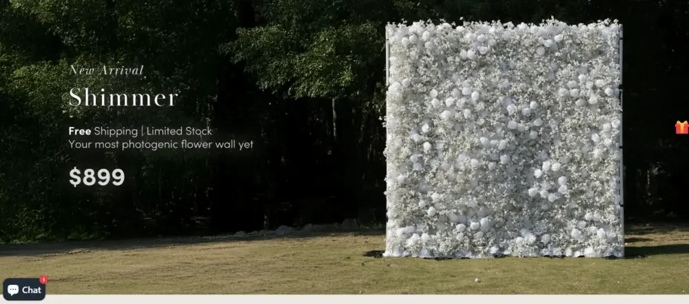
Create visual pause
In the middle of the home page, we have specially added a large key product display area to highlight the brand’s representative products.
Esta sección utiliza:
- Darker, more cinematic background image
- Lots of white space
- Stronger visual contrast between text and images
This design can form an obvious visual pause during the user’s continuous browsing process, regain attention, and further strengthen the sense of value of the key products.
Reflect price value through design
Rather than using overly aggressive low prices, discounts, or price incentives, we reinforce product value through page composition, visual proportions, and product presentation.
Let the visual performance and scene effects of the product itself naturally support its price positioning and brand value.
Build social proof through visuals, rather than relying solely on written reviews
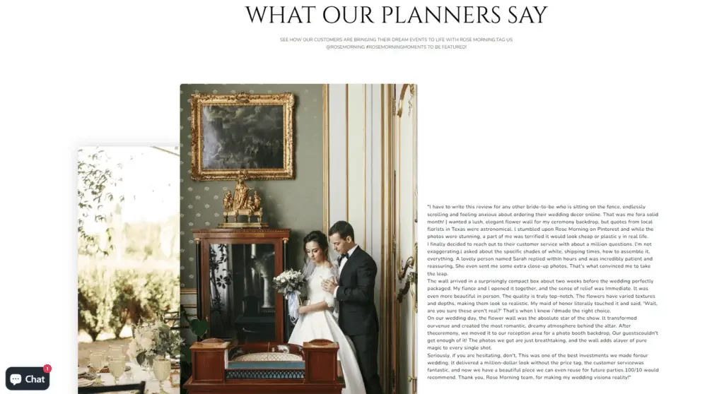
Customer case display
Rather than relying solely on text reviews, we designed a display area centered on real customer use cases, including:
- Photos of real events
- Product usage pictures uploaded by users
- Natural and realistic usage environment
This kind of social proof with visual content as the core is more natural than traditional text-only reviews, and it is easier for users to generate trust.
Event planner evaluates design
Reviews from wedding planners and event planners use a simple, editorial design style.
The page highlights:
- Good reading experience
- information authenticity
- Professional sense
At the same time, avoid overly promotional visual representations, making it easier for users to believe that these reviews come from real cooperation and use experiences.
Challenges in the design process
Strike a balance between sophistication and accessibility
An important challenge in the project was how to make the website have the high-end feel that a high-end floral brand should have, while at the same time not making users who visit the website feel alienated for the first time.
To solve this problem, we solve it in the following ways:
- Keep navigation structure simple and intuitive
- Avoid using too many technical terms
- Increase affinity through warm, natural scene images
- Avoid overly cold and minimalist visual expressions
Let the website not only have a high-end brand image, but also maintain good ease of use and purchasing experience.
Control visual information density
The flower wall product itself has rich flower materials, colors and textures, so the amount of visual information is naturally large.
If there are too many products on the page at the same time, it is easy for users to suffer from visual fatigue.
In order to avoid this problem, we focus on controlling:
- Leave the page blank
- The spacing between different plates
- Image size
- Frequency and repetition of product images
In the end, the entire website will not appear cluttered or crowded while maintaining rich visual performance, forming a browsing experience that is “rich in content but still clear and orderly”.