Project overview
The client of this project is a cross-border ecommerce brand that specializes in sports shoes, casual shoes, winter boots and trendy footwear products. It hopes to further enhance the overall visual professionalism and product attractiveness of the SHEIN store, so it approached us for store poster design. Customers hope to present clear usage scenarios, wearing atmosphere and product features for different shoe styles on the basis of a unified brand tone, while taking into account store operation needs such as new products, hot sales, and category navigation. Combining the youthful, fashionable and fast-browsing consumption characteristics of the SHEIN platform, we planned a set of visual solutions for footwear stores that take into account brand sense, product display and shopping guidance for customers.
| Servicios | Industry | Plataforma |
| shein store design | Shoes and bags | shein |
| Project requirements | target market | design style |
| Improve click-through rate | Global | Fashionable and high-end, scene-oriented, simple and elegant |
| project budget | Delivery content | Delivery time |
| ¥800 | 9 posters | 5 working days |
Project Challenges
The core challenge of this project is to maintain the overall visual unity of the SHEIN store while allowing different products to have clear positioning and differentiated expression despite the large number of shoe styles and wide range of styles. We need to solve problems such as product display being easily cluttered, scenes being repeated, selling points not being prominent enough, and the proportion of characters and shoes being unbalanced. Before starting the project, we first sorted out the customer’s existing shoe types, colors, audiences and usage scenarios, and analyzed the visual trends, layout structure and consumer browsing habits of the SHEIN platform shoe stores. Then, we unified the fonts, colors, light and shadow, and background language, and planned different scenes such as winter, street, daily, art, and new products. We then determined the product proportions, character postures, copywriting levels, and visual focus based on the functions of each poster to establish clear specifications for the entire subsequent design.
1. Winter snow boots poster: first use seasonal scenes to establish consumer demand
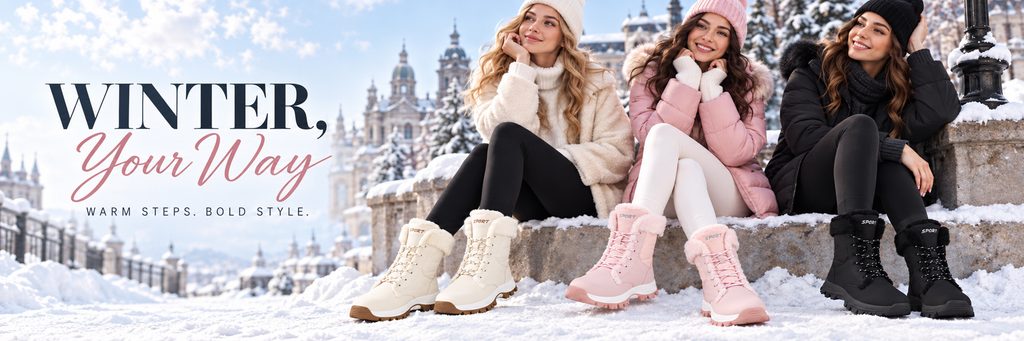
The first poster plays a very important role in displaying seasonal themes in the entire store. Instead of simply arranging winter boots in the snow, we directly constructed a complete winter outfit scene, with three female models wearing off-white, pink and black snow boots respectively sitting in front of a snowy building.
We chose the snow scene because it directly explains the environment in which the product is used. Consumers can quickly understand that these shoes are suitable for autumn and winter, low temperature and outdoor wear without having to read a lot of text.
The large area of sky and urban snow scene are retained on the left side of the screen, and “WINTER, Your Way” is placed in the visual blank area. We did not place the title near the model to avoid interference between the text, the characters, and the shoes. The large serif font is responsible for establishing a sense of fashion, while the pink handwritten font weakens the toughness of the image, making the overall design more in line with female consumers’ expectations for winter shoes that are “warm but still fashionable”.
The colors of the shoes of the three models correspond to their clothing. Off-white, pink and black also cover the three common consumer preferences for winter footwear. Through this poster, we not only display the product, but also complete the simultaneous communication of the seasonal atmosphere, dressing style and color selection.
2. Black and red sneakers poster: using strong product features to create a sense of power
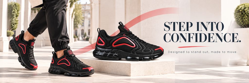
The second poster shifts to a completely different sneaker vision.
This black sneaker itself has very obvious red structural lines, so instead of using a complex background, we chose light beige architectural columns as the environment to highlight the silhouette of the shoe through the clean architectural space.
On the left side, the character’s feet are shown wearing clothing, and an enlarged independent product is placed in the middle. This layout can solve two problems at the same time: the character is responsible for showing the on-foot effect, and the independent shoes are responsible for allowing consumers to observe the product structure.
We deliberately added a red curved dynamic line, and let the color directly echo the red details of the upper. This can not only enhance the sense of movement in the picture, but also keep the entire vision unified.
“STEP INTO CONFIDENCE.” as the core title has more emotional value than simply emphasizing comfort or movement. We hope that this image conveys not only the function of the shoes, but the confidence, strength and street attitude formed after wearing them.
This method of expression is particularly suitable for the SHEIN platform, because young consumers usually not only pay attention to the function of shoes, but also whether the shoes can help them complete a certain style expression.
3. Blue casual sneakers poster: highlighting ease and daily wear
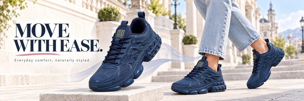
The third poster uses blue sneakers as the main body. We deliberately weakened the strong trend impact and instead strengthened the concept of “comfortable everyday”.
The title on the left “MOVE WITH EASE.” directly expresses the state of relaxed walking. The large-sized shoes in the middle adopt an inclined composition, which makes the product more visually intense than the ordinary flat method, and at the same time enhances the sense of movement through light translucent streamers.
The character on the right only shows his lower body and is color-coordinated with light blue jeans and blue shoes. We didn’t add too many clothing elements because what this picture really needs to express is how the shoes fit into consumers’ daily looks.
The scene still continues the light-colored European-style buildings, but the overall light is brighter. We maintain the brand consistency of the entire store through a unified background, and prevent each poster from looking the same through changes in product colors, character movements, and composition.
For multi-category footwear stores, this method of “unifying scene language and changing product expression” is very important. It can make the page look like a complete brand, rather than a simple splicing of different materials.
4. Black winter boots poster: Use urban daily life to strengthen the selling point of warmth
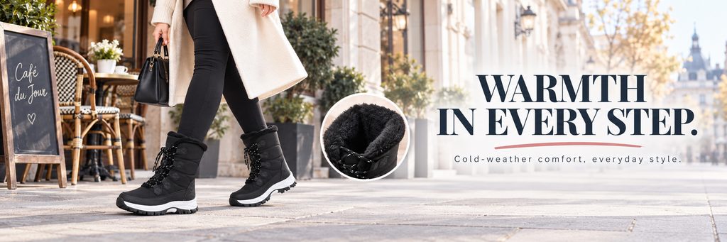
The fourth poster returns to winter shoes again, but instead of continuing to use the snow scene, we put the scene in front of a city coffee shop.
We hope to tell consumers that these black winter boots are not only suitable for snow, but also suitable for commuting, city walking and daily wear.
The model’s walking posture is used on the left side of the picture to allow the shoes to naturally enter the real use state. The character wears black tights and a long white coat, creating a clear contrast between black and white without distracting from the shoes.
In order to further emphasize the thermal insulation performance, we added a close-up of the circular part to show the plush material inside the shoe mouth. Compared with directly writing “warm” or “fur lining”, consumers can more easily understand product features through enlarged material details.
On the right side, “WARMTH IN EVERY STEP.” is used as the main title to transform “warmth” from functional parameters into usage experience. The entire poster establishes a sense of lifestyle through coffee shops, warm-colored buildings and soft sunlight, allowing the product to retain winter attributes without appearing bulky.
5. Product classification posters: Help consumers quickly find target shoes
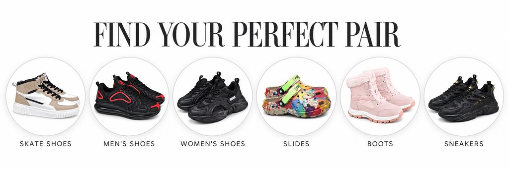
The fifth picture is responsible for the store navigation function.
Instead of continuing to use human scenes, we used a white background and six circular product cards to allow consumers to quickly browse different footwear categories.
Six categories: SKATE SHOES, MEN’S SHOES, WOMEN’S SHOES, SLIDES, BOOTS and SNEAKERS cover the main product direction of the store.
We place each type of product in an independent circular area and unify the proportions, white space and text position of the shoes. The purpose of this design is to allow consumers to directly enter the category of interest based on product type without carefully searching for the entrance.
“FIND YOUR PERFECT PAIR” at the top is not a simple function title, but guides consumers to make choices.
Compared with the previous large scene posters, this picture is obviously more restrained. We proactively reduce background decoration because the most important thing about the classification module is information recognition efficiency, not creating an atmosphere.
A mature SHEIN store vision cannot rely entirely on emotional posters, but also requires functional vision that plays the role of information organization and shopping guide.
6. Colorful Crocs Posters: Use creative life scenes to highlight youthfulness
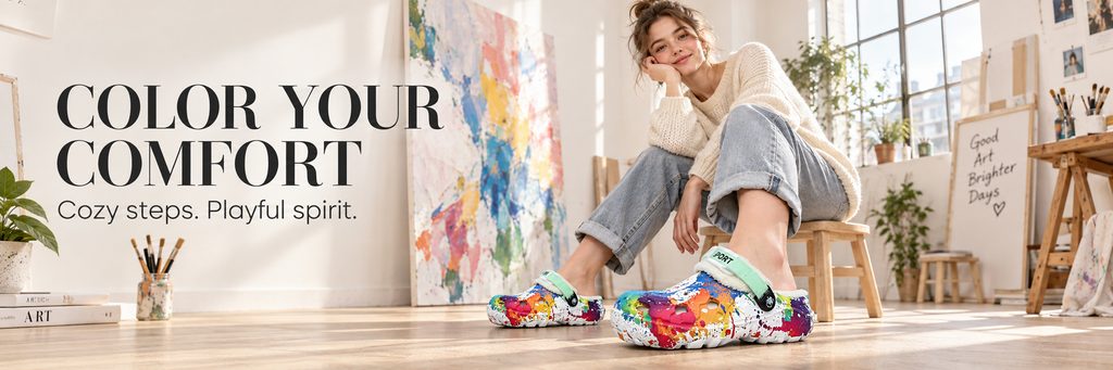
The sixth picture shows colorful Crocs.
This type of shoe itself is already very colorful. If you continue to add complex backgrounds, the product will quickly lose visual focus. Therefore, we chose a bright art studio as the scene and controlled the complexity of the background with a lot of warm white walls, wooden floors, and natural light.
The model is sitting in the studio, and the colorful shoes on her feet become the visual center of the entire picture. The background canvas, paints and brushes are not random, but are used to echo the colorful graffiti design of the shoes.
“COLOR YOUR COMFORT” not only corresponds to the product color, but also expresses the comfortable experience.
We hope to connect the product with “creativity, youth, freedom and ease” through this picture. Compared with traditional white background product pictures, lifestyle scenes are easier to establish emotional value and are more suitable for this type of shoes with obvious personality.
7. Men’s Black Sneakers Poster: Strengthening Street and Urban Attitudes
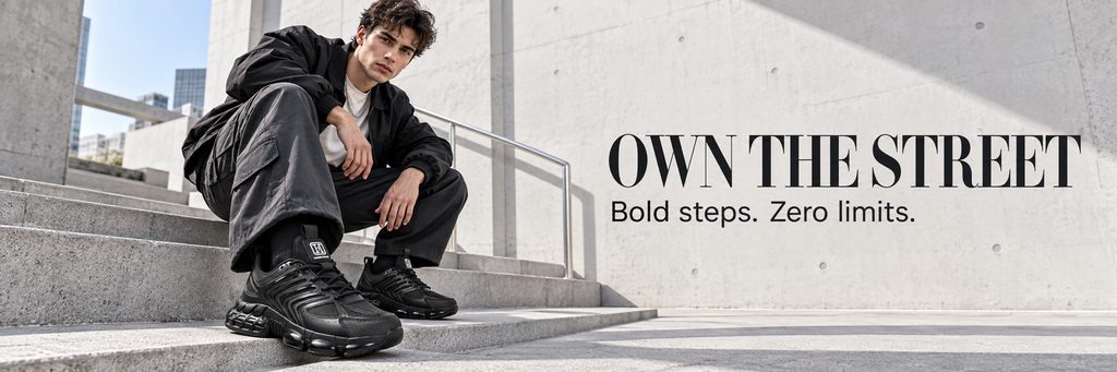
The seventh poster is mainly aimed at male consumers, so we reduced the color saturation overall and used black, gray and cement colors to create a calmer and more powerful atmosphere.
The model is sitting on the steps of a modern building, wearing black clothing and black sneakers to complete the look. We deliberately used a low camera position to clearly magnify the shoes in the foreground, allowing consumers to see the product first and then the characters.
A large area of fair-faced concrete wall is retained on the right side, and “OWN THE STREET” is used as the title. The background wall itself has few complex elements, so black text can remain very recognizable.
The point of this poster isn’t to showcase a lot of shoes, but to help establish a clear character for one of the products. For SHEIN stores, when certain shoes have obvious street, functional or sports attributes, we will further amplify product positioning through character temperament and architectural environment.
8. Best Sellers Poster: Create a sense of hot sales through multiple product combinations
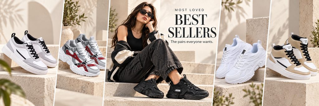
The eighth picture assumes the “hot recommendation” function.
Instead of using a traditional neat grid, we used multiple slanted partitions to combine different shoe styles and the model in the middle in the same frame.
Different styles of sneakers and high-top shoes are displayed on the left and right, and the model in the middle is sitting on the steps wearing black platform shoes. With this magazine collage-style composition, we were able to showcase multiple popular products in one banner while maintaining a strong fashion editorial feel.
The title “BEST SELLERS” is located at the top center of the screen. The serif font is used to strengthen the brand sense, and combined with “MOST LOVED” and “The pairs wants.” to create an atmosphere of popularity and choice.
We continue to use light-colored stone construction in this one, so that even if the products are different colors, we can maintain a unified background and let the shoes naturally become the focus of the picture.
What hot-selling modules really need to solve is not “showing more”, but building purchasing confidence. Therefore, we used characters, multiple shoe styles and the “Most Loved” message to create a visual impression that has been recognized by consumers.
9. New Arrivals Poster: Create anticipation for new products with a complete product lineup
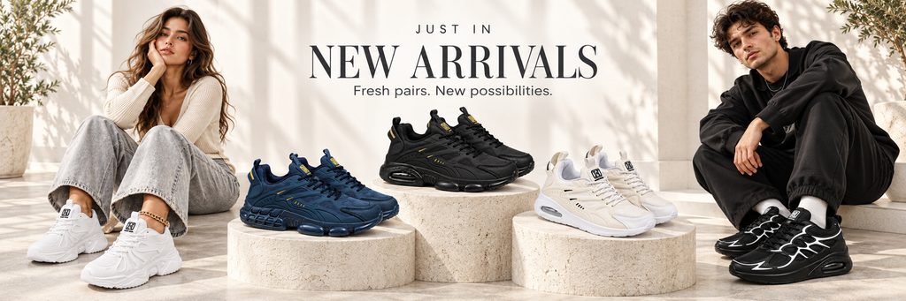
The last poster focuses on new products.
We placed the two models on the left and right of the screen, leaving the middle area completely reserved for new shoes. Blue, black, and off-white sneakers are placed on three circular stone platforms of different heights, creating a display effect similar to a new product launch platform through front and rear layers.
The models on both sides are also wearing different styles of shoes, so consumers can see both independent products and actual outfits in one picture.
“JUST IN / NEW ARRIVALS” is located in the visual center. We did not add complicated decoration because the new product module itself needs to convey clear and direct update information.
The entire picture uses a warm white environment and natural shadows to make the product look more advanced and avoid the large areas of highly saturated colors common in traditional promotional posters.
It is very important to place the new product module in the store. It can continuously convey to consumers the feeling that “the store is being updated” and create new reasons for browsing for repeat users.