


No hay productos en el carrito.

When customers browse Ozono, they do not read first — they scan.
Their decision happens in seconds, guided by structure, contrast, clarity, and visual logic rather than long descriptions. For a functional kitchen tool like scissors, the challenge is not to impress with novelty, but to communicate capability instantly.
In this project, we designed a complete Ozon main image system for multifunction kitchen scissors. The goal was clear: translate a complex set of features — cutting strength, safety, versatility, durability, and size — into a visual sequence that builds trust step by step.
Each image in this set serves a precise role. Together, they form a structured visual story that mirrors how users evaluate products on Ozon: from overall value, to functions, to usage scenarios, to technical details. Below is a detailed breakdown of every image and the design logic behind it.
| Tiempo de entrega | Categoría | Plataforma de aplicaciones |
| 7 días | Scissors | Ozono |
| Diseñadores implicados | Coste | Efecto |
| Nancy | $120 | Purchase rate📈356% |
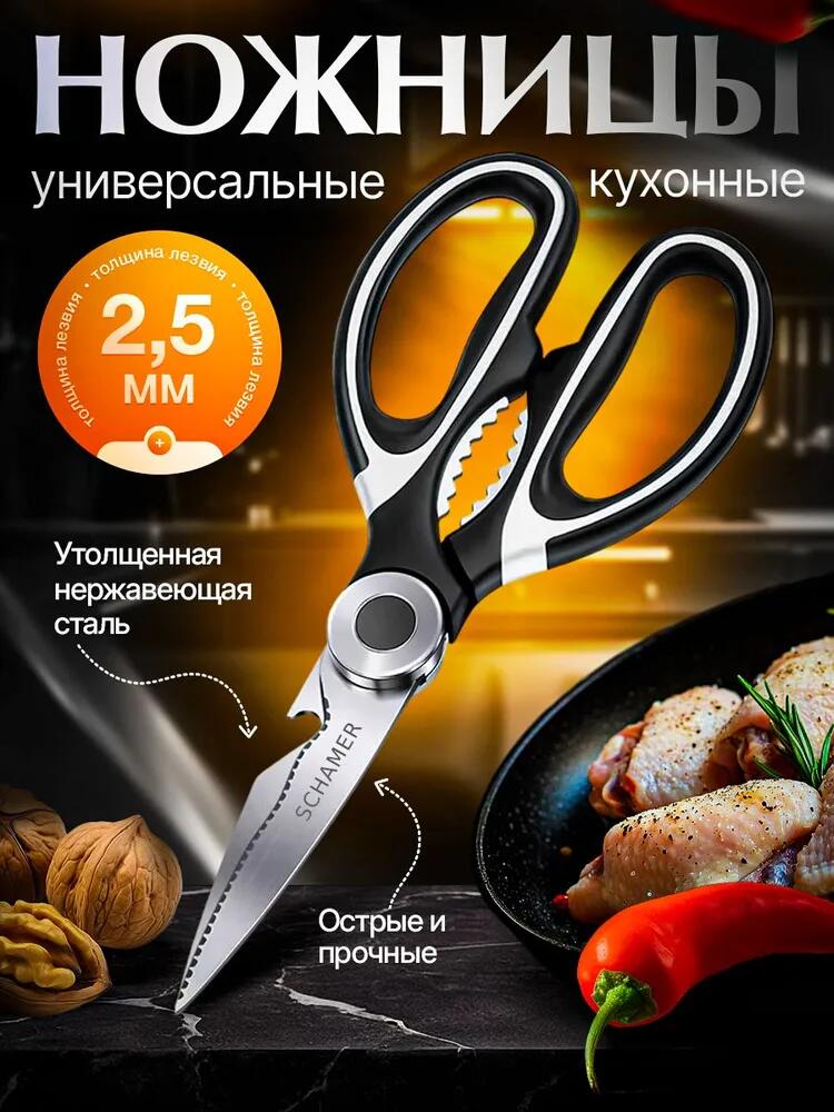
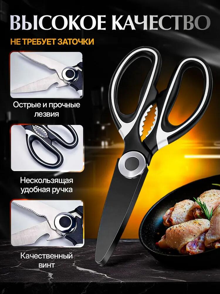
The first image establishes what the product is and why it matters.
We centered the scissors as the hero object, angled slightly to reveal both blades, the grip structure, and the integrated functions. This angle communicates functionality better than a flat, catalog-style presentation. The background uses a dark kitchen environment with warm highlights, which creates contrast and positions the product in a realistic, premium cooking context.
Key design decisions in this image:
Instead of claiming quality abstractly, the image shows weight, strength, and seriousness. For Ozon users, this visual language signals reliability immediately.
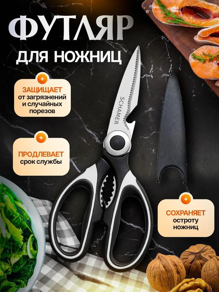
The second image introduces the protective sheath, a feature that directly addresses safety and longevity — two major concerns for kitchen tools.
We placed the scissors alongside the case in a top-down composition on a marble surface. This layout creates clarity and avoids visual clutter. The case is shown separately to ensure users understand it is an included component, not an optional accessory.
Design logic behind this image:
This image reassures cautious buyers. It answers silent questions like:
By visualizing protection and longevity, we reduce perceived risk.
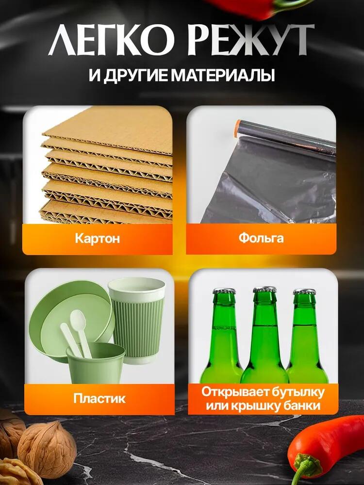
This image focuses on capability, not aesthetics.
We divided the layout into four clean modules, each representing a different task:
Each material appears isolated, photographed cleanly, and paired with a short label. This modular approach matches Ozon’s fast-scanning behavior. Users can instantly verify whether the scissors handle their specific needs.
Principios de diseño aplicados:
This image positions the scissors as a tool, not just a kitchen accessory. It broadens perceived usage and increases value without increasing complexity.
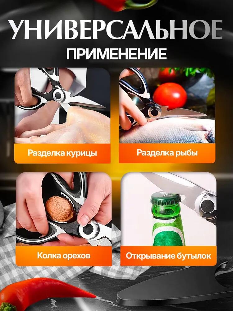
Here, we shift from materials to real-life actions.
We used close-up, in-hand shots to show the scissors in use:
Hands play a critical role in this image. They introduce scale, ergonomics, and realism. Users subconsciously test whether the grip looks comfortable and controlled.
Design intent:
This image helps users imagine the scissors inside their own kitchen routine, which is key for conversion.
This image addresses long-term concerns: durability and comfort.
We used a split layout:
Aspectos destacados del diseño:
Rather than stating “high quality,” the image lets construction details speak for themselves. This approach resonates strongly with pragmatic buyers.
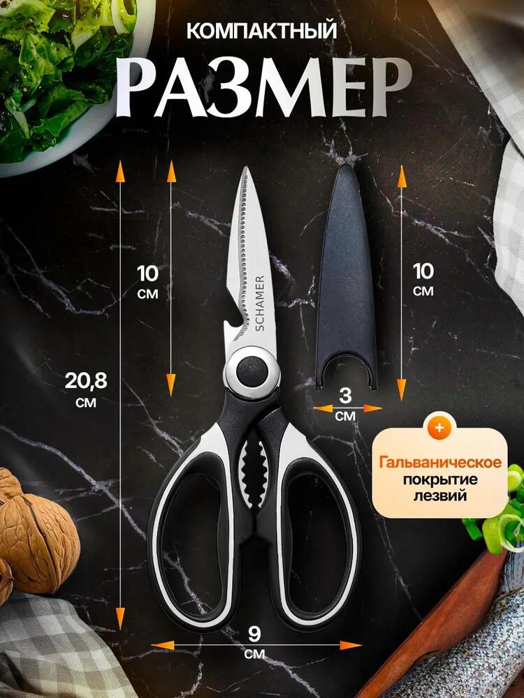
Size clarity reduces hesitation. In this image, we provided precise dimensions using arrows and measurements.
We displayed:
Design reasoning:
This image answers practical questions before they become objections:
Transparency builds confidence.
Beyond individual images, the strength of this Ozon main image design lies in system thinking.
Across all images, we maintained:
Each image flows naturally into the next. Users move from identity → safety → capability → application → quality → specifications without confusion. This structured progression mirrors how users think, not how brands advertise.
Ozon is not a storytelling platform — it is a decision platform.
This image set respects that reality by:
Instead of relying on a single “perfect” image, we built a visual argument across multiple frames. Each image answers one key question and then hands the user to the next step.
That is how effective Ozon main image design works.
Strong product images do more than look good — they sell logic.
For this scissors project, we designed every image to remove doubt, demonstrate value, and guide users toward confident decisions. From blade thickness to safety case, from cutting power to compact storage, each visual element exists for a reason.
This is exactly the type of conversion-focused, platform-specific image system we build for global eCommerce brands.
If you are looking to elevate your product visuals for Ozono or other cross-border platforms through structured main image design, this is the approach we apply every day at AIRSANG.


