When buyers enter a product detail page, they usually do not come to appreciate the layout. He may have just entered from the search results, or he may have entered from B2B official website homepage The product entrance continues to browse. At this time, he has to judge: whether the product is suitable for his project, whether the evidence given on the page supports this judgment, and how to contact the supplier if further confirmation is needed. The task of B2B product product detail page design is to make these three steps happen continuously on the page. It is different from the retail product page: many industrial products and customized products do not have fixed specifications and prices that can be settled directly. Customer inquiry, requesting drawings or explaining application conditions may be the next reasonable step.
First define the three judgments that buyers need to complete
Make a list of questions buyers will ask before designing, rather than choosing a template first. First, whether the model, size, material or working conditions of the product match the requirements; second, whether the product pictures, technical information, applicable scenarios and delivery capabilities make the information credible; third, if there are still key conditions that are unknown, whether the page provides a clear inquiry method. Different roles may focus on different evidence: engineers will check parameters and interfaces, procurement managers will look for delivery dates and customization boundaries, and project leaders want to see application scenarios. The page should allow these people to quickly find the information they need from the same entrance, without requiring everyone to read the entire text in the same scrolling order.
First sort out the verified product names, models, parameters, pictures and information; mark the missing data as “requires confirmation” and do not let the schematic numbers in the design draft become a formal commitment. Then arrange the content in the order of product identification, comparison basis, and contextual customer inquiry.
The first screen allows people to identify the product and find the next step
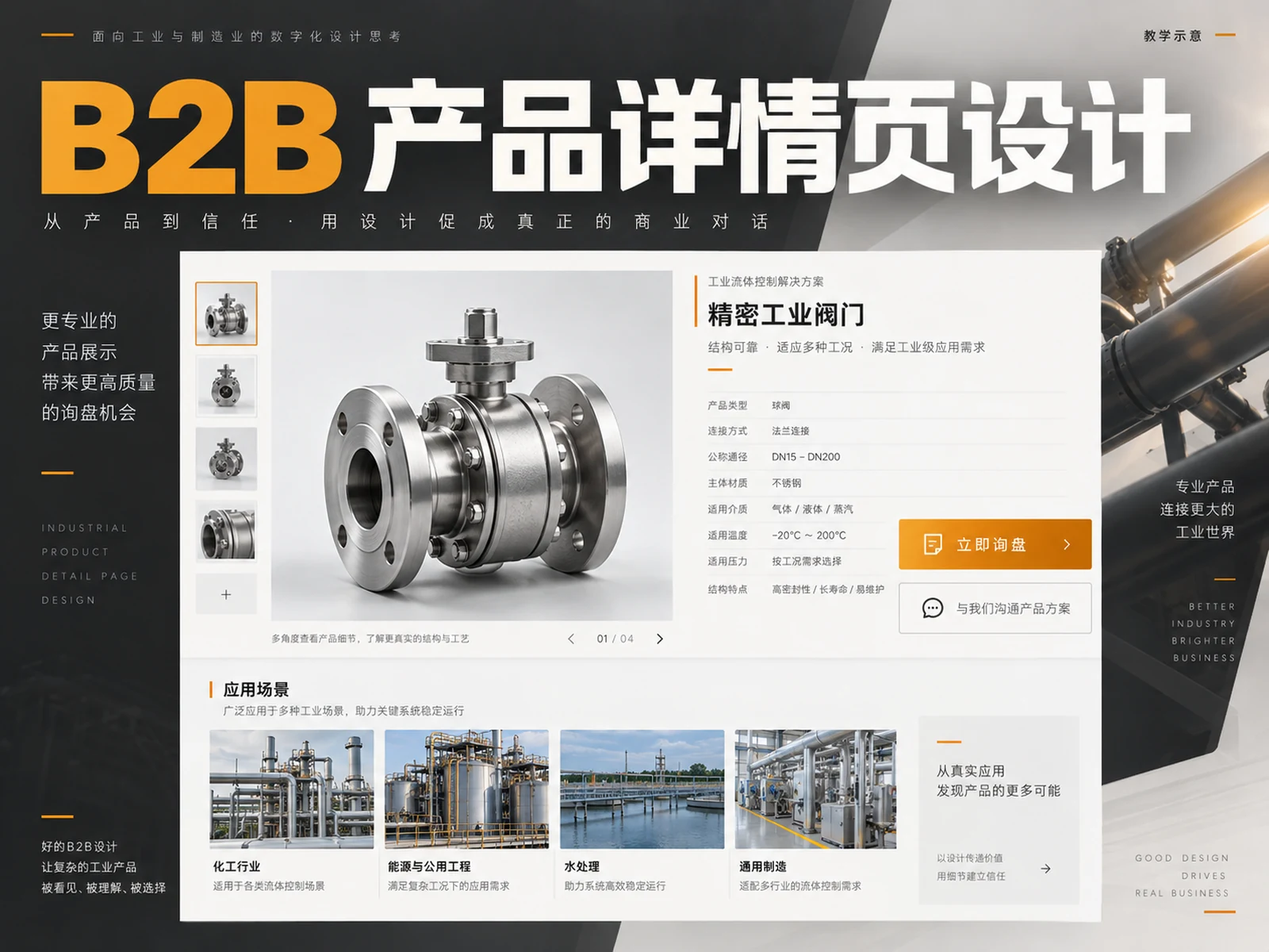
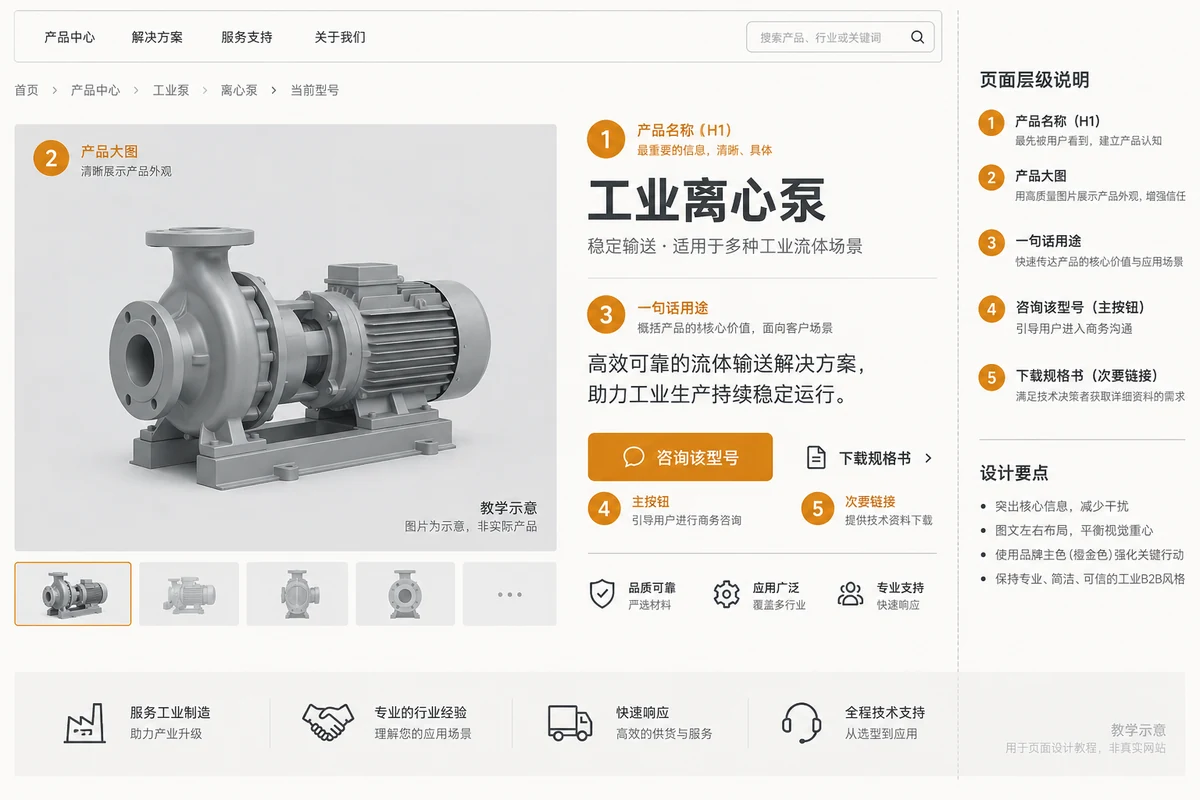
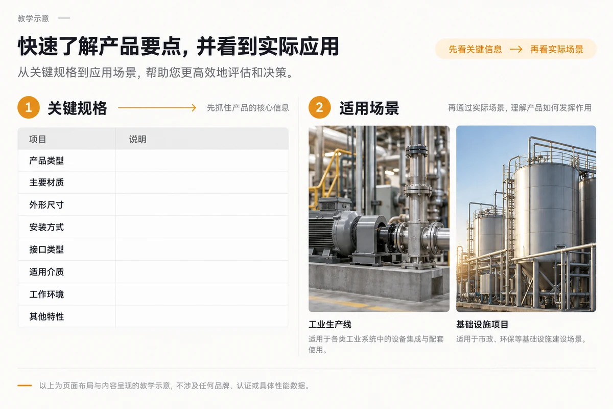
The most conspicuous things on the first screen should be the identifiable product name, the main product image that can explain the product form, a specific purpose description, and the main action that is consistent with the actual transaction method. The title “High-Quality Solution” cannot help buyers confirm which type of product they are looking at; “Stainless Steel Sanitary Centrifugal Pump, Suitable for Food Delivery Systems” provides clues about the purpose, but the actual model and usage conditions still need to be verified by the company. The main product image should allow people to clearly see the shape, key interfaces or overall proportions. Don’t just put abstract factory photos. If a product has multiple variants, the first screen should prompt the variant selection or model differences.
The main action can be “Inquire about this model” or “Request specifications”, and the auxiliary entry leads to the parameters. Use orange-gold color to highlight the main task, and let text links connect people who continue to research; do not make the four buttons of purchase, customer inquiry, download and chat equally eye-catching. The product identity and action clues can be seen on both the desktop and the first screen of the mobile phone, and the complete parameters are left below.
Photographs, drawings and scene drawings serve different tasks
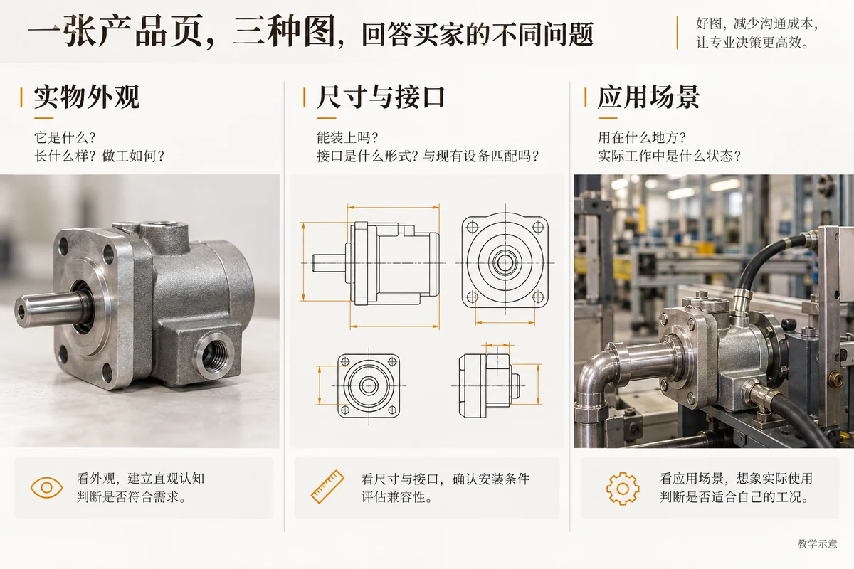
Physical photos are used to confirm the product shape, surface, interfaces and details; drawings or dimensional representations are used to check installation conditions; scene diagrams illustrate the working environment in which the product will be placed. The three should not replace each other. A beautiful application photo without clear vision of the specific product still won’t answer the model matching question. Conversely, a clear, close-up photo of the interface, even without dramatic lighting, may be more helpful to buyers. Organize the thumbnails according to “overall – details – size – scene” and clearly label the pictures; if they are teaching diagrams, clearly mark that they are not real shots of real customers or products. Baymard’s product page research It emphasizes page tasks such as product images, purchase areas, and specifications, but its research is mainly oriented to e-commerce shopping. This article only draws on the principle of “information must support judgment” and cannot directly apply the purchase process to B2B customer inquiries.
Specifications, applicable scenarios and evidence are presented in layers
Spec sheets should be scannable quickly. The few most important items for screening are shown first, and then the complete parameter list or downloadable information is provided. Parameter names, units, test conditions and applicable models must appear at the same time; adjectives such as “high temperature resistance” and “high power” cannot replace clear and confirmed values. When different models share a page, list the model differences and keep the meaning of each column consistent; do not put the power of model A and the dimensions of model B into the same unlabeled table. If there are a lot of columns on the mobile version, use a horizontally scrollable table and keep the header legible rather than shrinking the words until they are difficult to read.
Parameters tell buyers “what the product is” and applicable scenarios explain “when they should choose it”. Each scenario paragraph should best answer the operating environment, the problem to be solved, and the usage boundaries. For example, when explaining what media a certain material is suitable for, the specific tolerance conditions must also be stated and shall be subject to the official technical data. Place certifications, test reports, installation cases or download files in adjacent evidence areas, indicating the file name, version and applicable model. If there is no public certificate, do not put fictitious badges in the design drawings; you can display authorized product pictures, drawings or catalogs.
Use clear second-level and third-level headings to distinguish “technical parameters”, “applicable scenarios”, “data downloads” and “frequently asked questions”. Don’t just write numbers. W3C WAI page structure tutorial Description, clear title hierarchy helps users locate content. Buyers can find the chapters they need without having to scroll back to the first screen.
The customer inquiry entry must retain product context
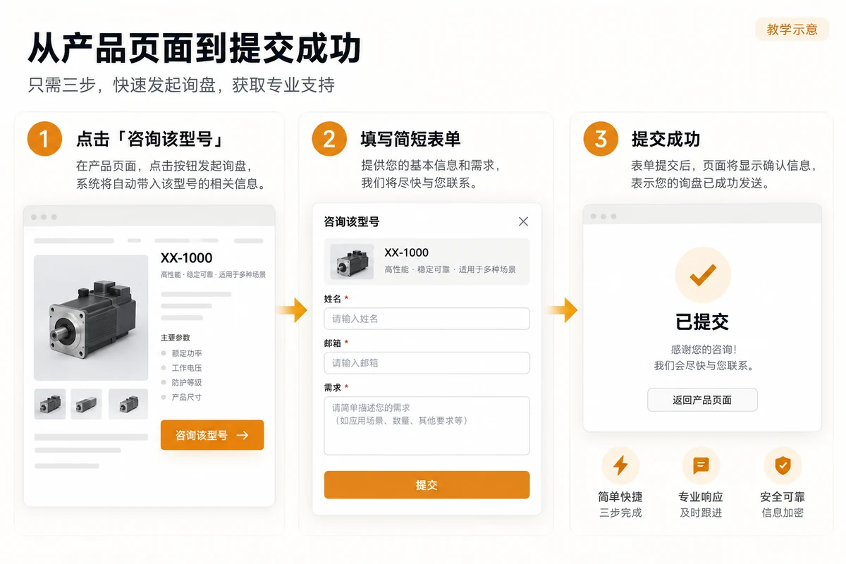
The customer inquiry button can appear once on the home screen, once after key parameters, and once at the end of the page, but it should lead to the same clear follow-up action each time. After the purchaser reads the parameters and clicks “Consult about this model”, the product name and model should be automatically included in the form to avoid the user re-entering or the supplier receiving an email with only “Please quote”. If there are multiple specification variants, display the selected variant before submission and allow changes; if it has not been selected, you can prompt “Model to be confirmed” instead of secretly substituting the default value.
The form fields collect only the information needed to carry out the next round of communication: contact person, replyable contact information, product or model, description of need. Whether the number of projects, delivery area or application environment is required should be determined by the real business process; the more fields, the better. For highly complex products, you can first let visitors choose “obtain specifications” or “submit project requirements” to explain what they will get. Each input item must have a visible label, required prompts, and error messages; W3C WAI form tag tutorial It is recommended to use labels associated with controls to help users understand the fields. Placeholder text can supplement the example, but cannot alone take care of the field names.
After successful submission, a receipt will be displayed: which product consultation was received and through which channel the follow-up reply will be received. A response time limit is only promised if it can be implemented. The backend should send the model number and page URL together with the customer inquiry to the receiving email or CRM, and conduct actual testing. The design draft should also cover three states: success, failure, and missing required fields.
Keep the same set of key content on desktop and mobile
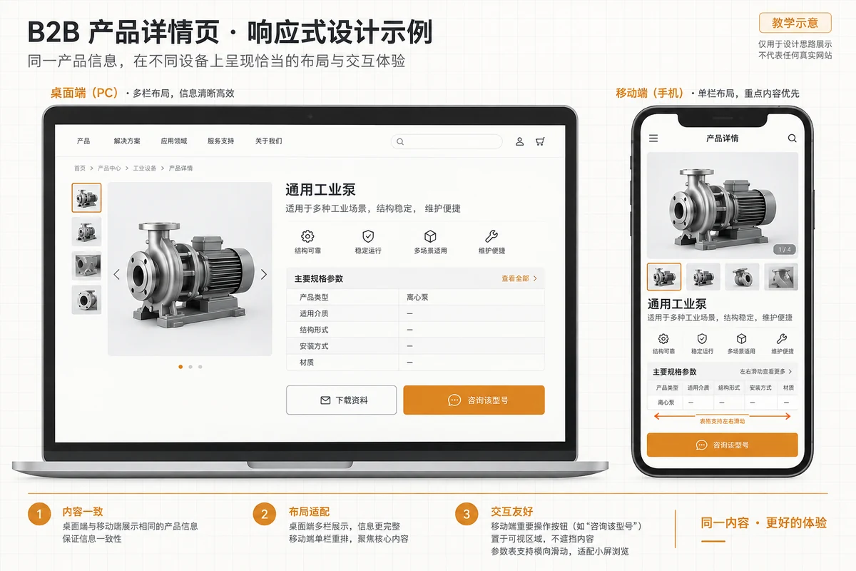
The mobile phone screen is narrow, and the arrangement is adjusted, not the basis for decision-making is deleted. The product image and summary on the desktop can be side by side, and on the mobile phone, the main product image, product name, key conditions and action buttons are in vertical order; the specification table allows scrolling within the container and prompts horizontal content. Image enlargement, data downloading and form input are all available on touch screen devices. If you use a fixed customer inquiry button at the bottom, you should avoid blocking parameters, privacy instructions or submitting feedback; you should also clearly return to the corresponding model after clicking.
Check the two formats side by side: whether the parameters on the mobile phone become long paragraphs, whether the drawing annotations are difficult to read, and whether the buttons are covered by the chat box. Check font size, contrast, click area, and form error messages. The mobile version must retain the same product facts and file versions; the design draft must specify the order after breakpoints, table behavior, and image cropping focus.
Use purchasing scenarios to determine page structure instead of using the same template
The same “product detail page” has different key issues for off-the-shelf standard parts, complex industrial products and OEM/ODM customized products. The following table is a page layout guide, which does not mean that every industry must copy it; it should be checked against the company’s actual products and sales process.
| Procurement scenario | Judgment is needed first | Prioritize display of content | The right next step |
|---|---|---|---|
| Spot standard parts | Do the model and interface match? | Dimensions, materials, variants and delivery conditions | Inquire about specific models or request a quote |
| Complex industrial products | Can it meet the working conditions and installation conditions? | Operational boundaries, drawings, test data and application notes | Submit working conditions and contact technicians |
| OEM/ODM customized products | Whether the customizable scope covers the project | Customization options, sample process, documentation requirements and restrictions | Send requirement description or apply for solution communication |
This table determines the order of modules: standard parts need to be selected higher in model selection, complex industrial products need to make working conditions and technical information easy to find, and customized products should first explain what can be customized and what information is used for evaluation. The problem cannot be solved by saying “all product pages should have five modules”. If a website sells multiple products at the same time, the design system can share layout and components, but content fields, image proportions, and customer inquiry actions should allow template variations. How many product templates, data migration and form logic are involved in the revision will also affect the scope of work; it can be combined Website revision quotation and acceptance list Check item by item.
Change common counterexamples into acceptable solutions
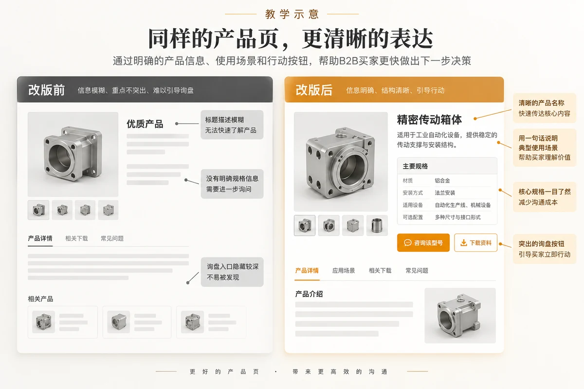
The old version of the page in the teaching diagram may look like this: an unlabeled factory photo is placed on the first screen, the title only says “Series Products”, the parameters are hidden in PDF, and there is only a “Contact Us” link at the bottom of the page. The problem is not that the photo is not good-looking, but that the user still does not know the identity of the product in the first few seconds after entering the page; even if the file is downloaded, the model correspondence between the current web page and the file cannot be confirmed. After rearrangement, first establish the identity with a clear name, main product image and key conditions, then associate the parameter summary with the complete information, and finally let the button carry the model number into the form. The before-and-after design comparison should be marked as “teaching instructions” and should not pretend to be the conversion results or success stories of real customers.
During the acceptance inspection, you can assign a task to a colleague who is not familiar with the product: “Find out whether a certain model meets certain conditions, and submit an inquiry containing the model.” Observe where he pauses, whether he can read the parameter units, whether he finds the downloaded information, and whether he sees a clear receipt after submission. Then check whether the information received by the receiving end is consistent with the page. If a colleague is unable to complete the task, give priority to correcting the information name, order and interactive feedback, and then consider adding animation or decoration. This small task test cannot represent formal user research, nor can it predict an increase in customer inquiry rates, but it can expose obvious path gaps.
Conclusion: Let each piece of content answer a purchasing question
There is no fixed template for B2B product detail page design that applies to all industries. You can first review the existing page with three questions: whether the visitor can quickly confirm whether the product is suitable, whether he can see the parameters and evidence that are sufficient to support the judgment, and whether he can complete the customer inquiry with the product context. Put the product identity on the first screen, layer specifications, scenarios and information according to procurement tasks, use customer inquiry feedback as part of the path, and check the desktop and mobile versions separately. If you are planning to revise the version, first select a representative product for content inventory and anonymous customer inquiry testing, and then decide whether to expand to a full-site template. AIRSANG can evaluate the information level and customer inquiry path of existing product pages based on this, and work with the company to clarify the priority scope of modifications.