Focusing on portable monitors, we have organized German interface instructions and office scenes into a set of German product pictures. The entire set of works adopts the visual language of ice blue and white background, bold sans serif, and suspended product composition. Through the division of labor in different pictures, the product appearance, local information and usage scenarios are gradually presented.
| Servicios | Industry | Plataforma |
|---|---|---|
| Amazon primary and secondary product images design | Digital 3C | Amazon |
| Project requirements | target market | design style |
| German interface description and office scenarios | German content display | Ice blue white background, bold sans serif, suspended product composition |
| Project quotation | Delivery content | Delivery time |
| ¥600 | 8 product primary and secondary product images | 4 days |
Design Challenge: Let different information have its place
The monitor picture needs to show the screen, interface, bracket and connection relationship. We used an ice blue scene to unify the German picture group, and then used port leads, angle indications and device connections to disassemble the functional themes, so that the information does not just stay on the screen itself.
Our design strategy
Bold sans-serif titles and light blue background create a sense of clarity for digital products.
Make connections, interfaces, placement, volumes, and accessories into independent diagrams to ensure that each diagram has a clear mission.
Product Overview: Make the screen the visual center
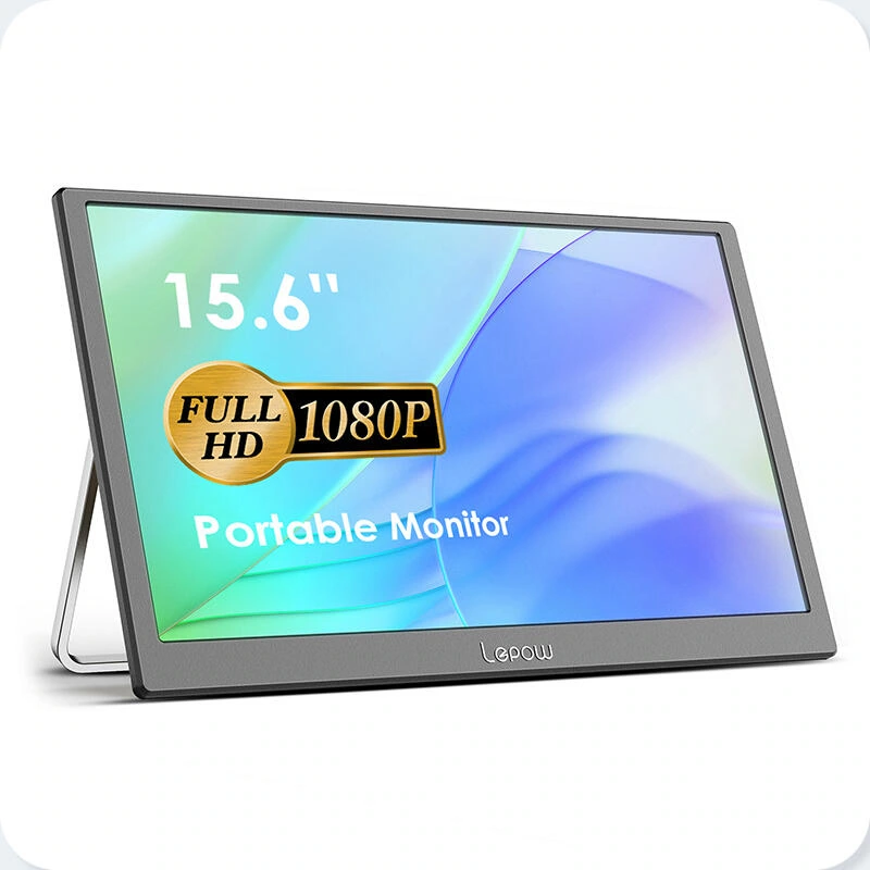
We placed the monitor on a light-colored pedestal, so that the screen content contrasts sharply with the outline of the frame. Space is reserved between the German title, specification label and the main body so that the product form can be quickly grasped even when zoomed out.
Connection relationship: Use cables to connect two devices
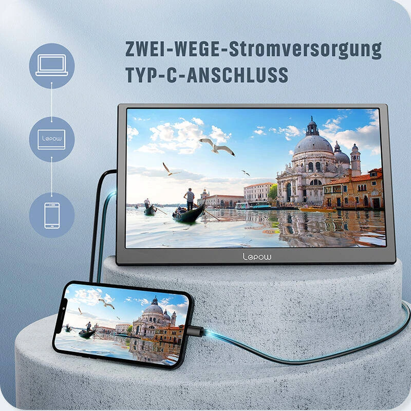
We put the mobile phone and the monitor in the same scene, use visible cables to establish connection paths, and the device icons are listed on the side. Readers can follow the cables to understand the relationship between the images, without the need to splice operating situations from long paragraphs of explanation.
Interface description: Extract annotation from side outline
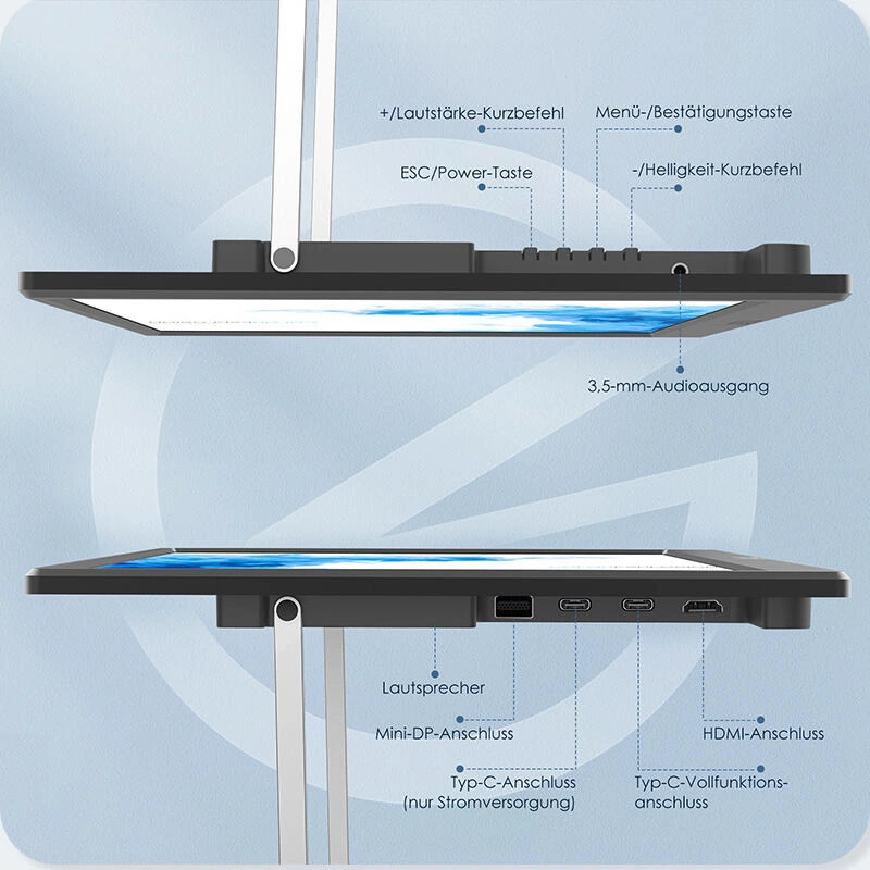
We use two sides of the fuselage to display the interfaces and buttons, with the leads facing outward to avoid covering the thin bezel. The distance and font weight are unified to keep small port information tidy.
Bracket angle: Use both arc and horizontal and vertical placements
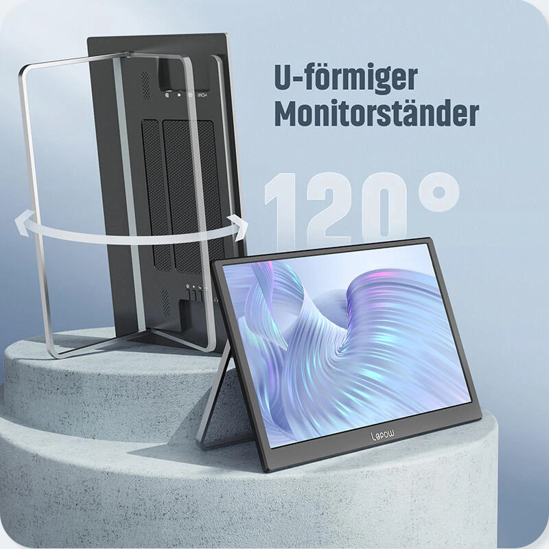
We use curved arrows to indicate the rotation direction of the U-shaped bracket, and list the placement status of the horizontal screen and the vertical screen. Each state remains independently blank, and the angle graphics only serve the corresponding product position.
Volume expression: side view combined with light elements
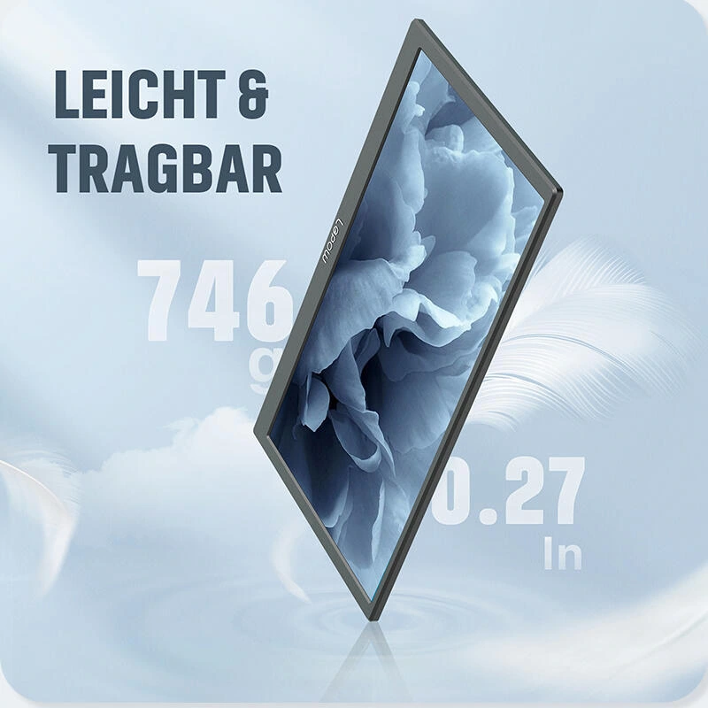
We accentuated the thin profile with a sloping body, flanked by feathers and digital information. The light-colored pedestal stabilizes the subject, and the text is concentrated on the clean background to avoid overlapping with the screen content.
Screen themes: organize comparisons within the same screen
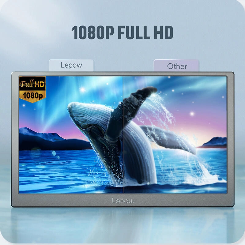
We use whale images to carry the screen display, and the partition images and large titles form a hierarchy. The background continues to be ice blue, and the visual focus always revolves around the screen itself.
Meeting scene: explaining the application using character relationships
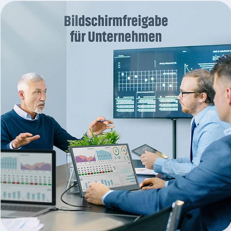
We put multiple laptops and shared screens into the meeting scene, and let the directional relationship between the devices become clues on the screen. The main product image and the title area are separated, and the characters will not crowd out the reading space of the functional theme.
Attachment list: each object corresponds to a name
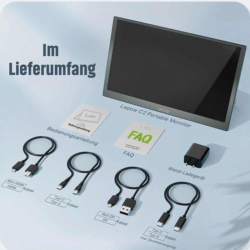
We arrange the cables, power supplies and instructions into groups, and label them close to the corresponding items. Uniform object spacing and light background allow the attachment page to assume clear list responsibilities.
Deliver and design value
This set of works contains a total of 8 product pictures. We arranged the responsibilities of different pictures around the German interface instructions and office scenes, and maintained the visual consistency of the entire set with ice blue and white background, bold sans serif, and suspended product composition. From overall identification to partial explanation, the pictures complement each other, allowing readers to find information based on their own concerns.
Develop a clear visual expression for your products
You can provide us with existing product information, physical photos and key points to be displayed. We will combine the product structure, style differences and usage scenarios to plan image content and layout suitable for Amazon product display.