


No hay productos en el carrito.

A meaningful jewelry brand needs more than a beautiful online store. It needs a digital space that feels emotional, intentional, trustworthy, and easy to shop. For a brand like Ananda Soul, the website must communicate craft, purpose, spirituality, sustainability, and product value within the first few seconds. The store presents ethical, handmade jewelry from Bali, with a strong focus on recycled materials, conscious production, blessing ceremonies, and giving back.
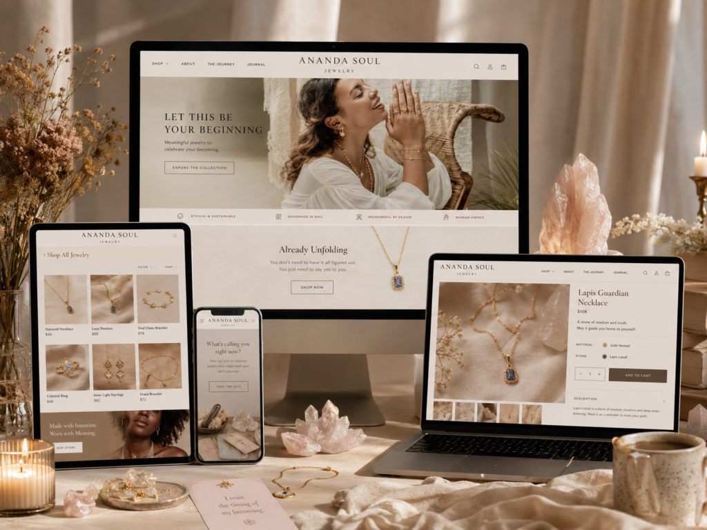
Our design goal was to shape the Shopify website into an experience that feels soft, premium, story-driven, and conversion-ready. Instead of treating the site as a simple product catalog, we approached it as a guided brand journey. The homepage became the emotional entry point, while collection pages, product pages, storytelling pages, and support pages worked together to build confidence and encourage shoppers to explore deeper.
| Tiempo de entrega | Categoría | Plataforma de aplicaciones |
| 23 días | Jewelry | shopify |
| Diseñadores implicados | Coste | Efecto |
| Lin Zhang | $2400 | Sales📈254% |
Ananda Soul is not only selling necklaces, rings, bracelets, and earrings. The brand sells meaning. Its jewelry is handmade with intention, crafted with certified recycled 925 sterling silver, natural gemstones, and ethical production values.
That gave us a clear design direction: the website needed to feel personal, calm, feminine, spiritual, and trustworthy. A standard Shopify layout with only product grids and sales banners would not fully express the brand’s deeper message.
The main objective was to create a Shopify design system that could support three things at once:
The website needed to show why the jewelry matters, not just what it looks like.
Customers needed to move easily from homepage inspiration to collections, product pages, cart, and checkout.
The design needed to feel refined enough for meaningful jewelry while still feeling warm, human, and accessible.
The homepage became the most important page because it sets the tone for the entire shopping experience. We designed it as a layered journey rather than a simple storefront.
The first screen needed to create emotion immediately. For a jewelry brand built around intention, the hero section could not feel too aggressive or overly commercial. We focused on soft lifestyle imagery, elegant spacing, warm typography, and a clear call-to-action that invites visitors to shop without breaking the calm mood.
Below the hero area, the homepage needed to balance product discovery and brand education. We arranged sections so customers could understand the brand’s world before making a buying decision. This included featured collections, new arrivals, sustainability messaging, craft details, giving-back content, and visual storytelling blocks.
A good Shopify homepage needs rhythm. If every section looks the same, users lose interest. If every section looks different, the site feels messy.
We used a repeating rhythm of:
These sections create atmosphere and help customers feel the lifestyle behind the jewelry.
These sections bring the shopper back to clear buying opportunities.
These explain purpose, materials, craft, and values.
These support credibility through sustainability, ceremony, reviews, and customer support.
This rhythm helped the homepage feel immersive without becoming confusing.
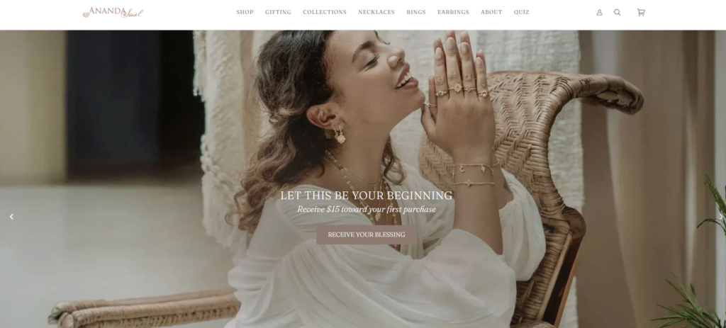
The hero section needed to do several jobs at once. It had to introduce the mood, communicate the jewelry category, and guide users toward shopping.
We avoided a crowded layout. Instead, we used a clean visual frame with a strong lifestyle image, a concise headline, and a simple CTA. The goal was not to overwhelm visitors with too many messages. The goal was to create a calm first impression and make the first click feel natural.
For this type of Shopify jewelry website, the hero should not only say “shop now.” It should express the feeling of the brand. A headline can focus on themes like intention, light, ritual, beauty, or meaningful adornment. That language fits Ananda Soul because the brand connects jewelry with inner beauty, gemstones, and personal intention.
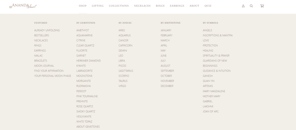
A jewelry customer may not always know the exact product they want. They may shop by feeling, occasion, gemstone, symbol, or energy.
That is why we designed collection entrances to feel more editorial. Instead of treating collections as plain category boxes, we framed them as emotional pathways. A customer can enter through necklaces, rings, bracelets, best sellers, new arrivals, or themed collections.
This approach makes the browsing experience feel more personal. It also helps the Shopify store increase engagement because visitors can quickly choose a path that matches their intention.
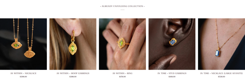
New arrivals are important for repeat customers and first-time visitors. We designed this section with clean product cards, strong product photography, readable names, visible prices, and enough white space to make each piece feel valuable.
For jewelry websites, product grids must avoid feeling cheap or crowded. The spacing, image ratio, hover behavior, and typography all affect perceived value. A refined product grid helps customers slow down and look at each piece more carefully.
Ananda Soul’s sustainability story is a major brand asset. The website explains that the jewelry uses certified recycled 925 sterling silver and avoids unnecessary mining impact.
We treated this not as a small footer note, but as a key homepage message. The design needed to make sustainability visible without feeling heavy. We used calm content blocks, natural imagery, and short value-led copy to make the message easy to understand.
This section helps shoppers feel that a purchase supports a conscious choice, not just a fashion decision.
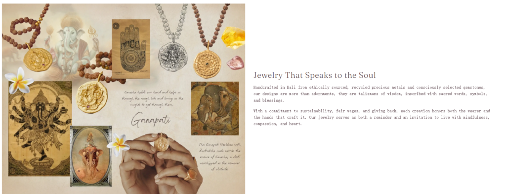
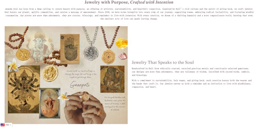
One of the strongest storytelling opportunities is the blessing ceremony. Ananda Soul explains that each piece is blessed in a traditional Balinese ceremony before it begins its journey.
From a design perspective, this gives the website a unique emotional layer. We created space for ritual-based storytelling through soft imagery, intimate copy, and section transitions that feel slower and more thoughtful.
This kind of storytelling helps separate the brand from standard jewelry stores. It gives customers a reason to remember the website and connect with the product beyond appearance.
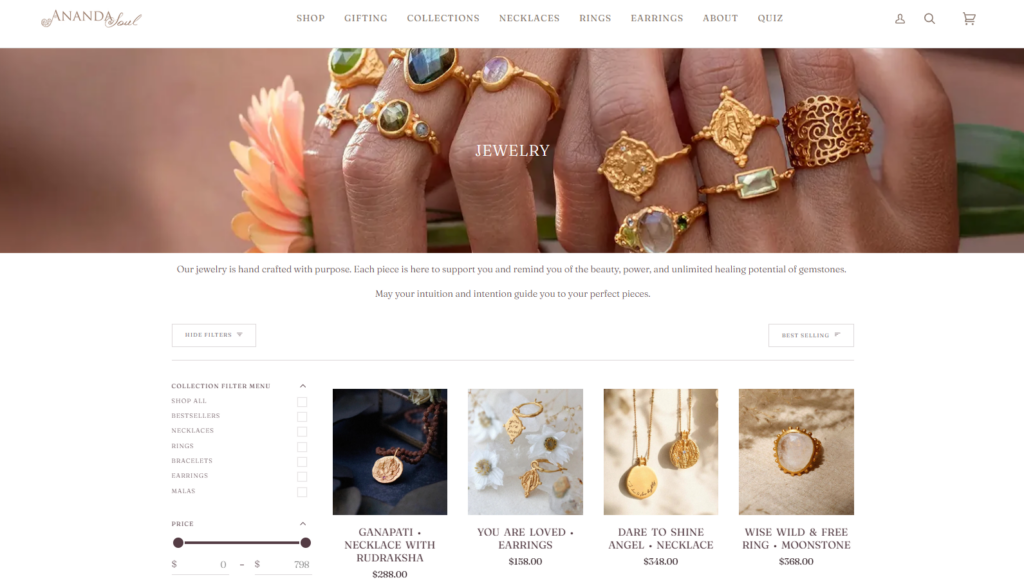
Collection pages need to be practical. Customers want to sort, filter, compare, and quickly scan products. The challenge is keeping the shopping experience functional without losing the brand’s softness.
The Ananda Soul jewelry collection page presents handmade jewelry with a purpose-driven message and product browsing tools such as filters.
Our design approach kept the collection page clean and easy to navigate. We focused on:
Each collection should open with a short emotional message that tells customers what the collection represents.
The grid should feel spacious, elegant, and easy to scan.
Filters should help customers narrow choices without making the page feel too technical.
Product names, prices, reviews, and quick actions should follow the same layout across the store.
Jewelry does not always need loud sales tactics. For this brand, the product card should feel gentle but effective. We designed product cards to support a quiet sales style: large images, clean text, subtle hover states, and enough detail to encourage a click.
A good Shopify product card should help users answer basic questions quickly:
When these answers are clear, the shopping experience becomes smoother.
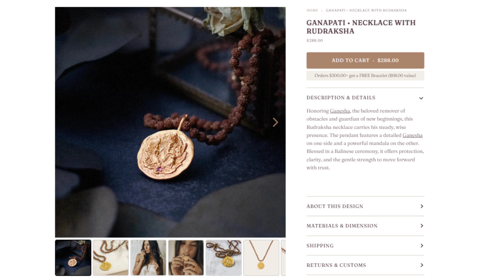
The product page is where storytelling and conversion must work together. A customer may love the design, but they still need details before buying.
For Ananda Soul, each product page should support both emotional and practical decision-making. The page design should include strong product imagery, meaningful product descriptions, material details, gemstone information, size or fit guidance, reviews, shipping information, and care notes.
Jewelry product pages need a careful image structure. We recommended a layout that includes:
These show the piece clearly and help customers inspect details.
These show scale, mood, and how the piece feels when worn.
These highlight stones, inscriptions, finishes, clasps, and handmade texture.
On mobile, images must feel easy to swipe and browse without pushing product details too far down.
The product copy should not only describe materials. It should explain intention. Many Ananda Soul pieces include symbolic meaning, gemstone energy, and emotional messages. The wholesale page also notes that many pieces include inscriptions or gentle reminders.
We designed the product description structure to feel layered:
This tells the customer what the piece represents.
This includes materials, size, finish, and gemstone information.
This explains the deeper story behind the product.
This removes hesitation before purchase.
This structure helps customers feel emotionally connected while still receiving the information they need to buy confidently.
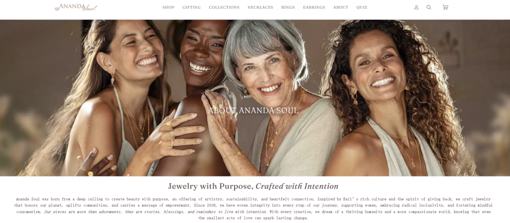
The About page is essential for a purpose-led brand. Ananda Soul presents Christina Zipperlen as the founder and designer, connecting the brand to purpose, sustainability, empowerment, and Bali.
Our design approach gave the founder story a more editorial layout. Instead of using a long text-heavy page, we would structure it with portraits, pull quotes, timeline-style storytelling, and image-text sections.
This helps visitors understand the brand’s origin without feeling overwhelmed.
Ananda Soul’s “Our World” page describes the brand’s desire to combine art, love for the planet, Bali’s culture, giving back, women’s empowerment, inclusivity, and mental health awareness.
That type of page needs a spacious design. We would use full-width visual sections, soft backgrounds, thoughtful typography, and carefully placed content blocks. The goal is to let the story breathe.
For brands with strong values, story pages should not feel like corporate profiles. They should feel like a meaningful invitation into the brand’s world.
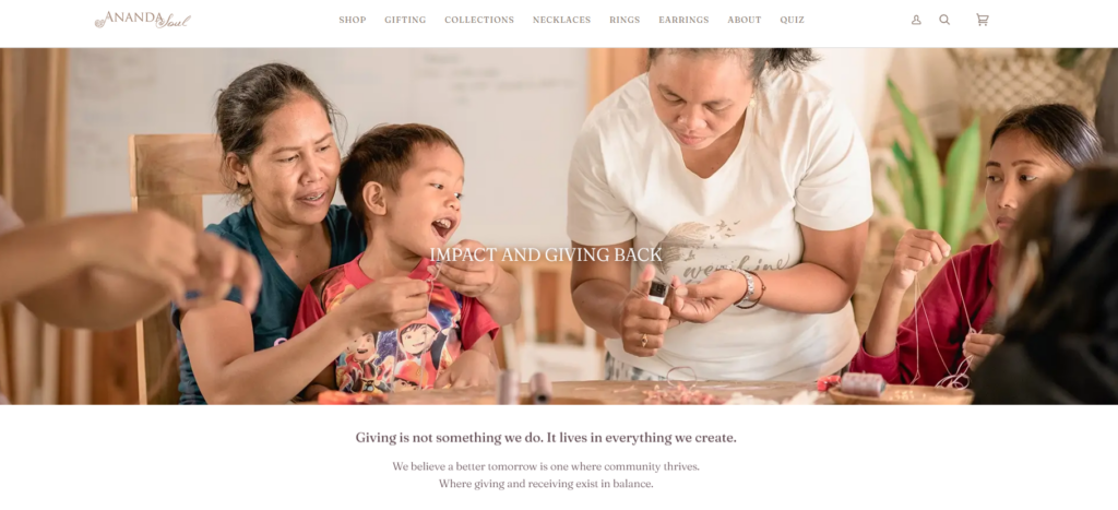
The impact page is another important part of the customer journey. Ananda Soul explains its support for Balinese mothers, children’s education, and nonprofit pieces that give profits to supported causes.
We designed this type of page around clarity and emotion. Many brands talk about impact, but customers need to understand what the impact actually means.
A strong impact page should include:
Tell visitors what the brand supports.
Show the people, communities, or real-world context behind the mission.
Use short sections to explain what customer support helps make possible.
Connect nonprofit pieces or giving-back collections directly to shopping opportunities.
This helps customers understand that their purchase can support something larger.
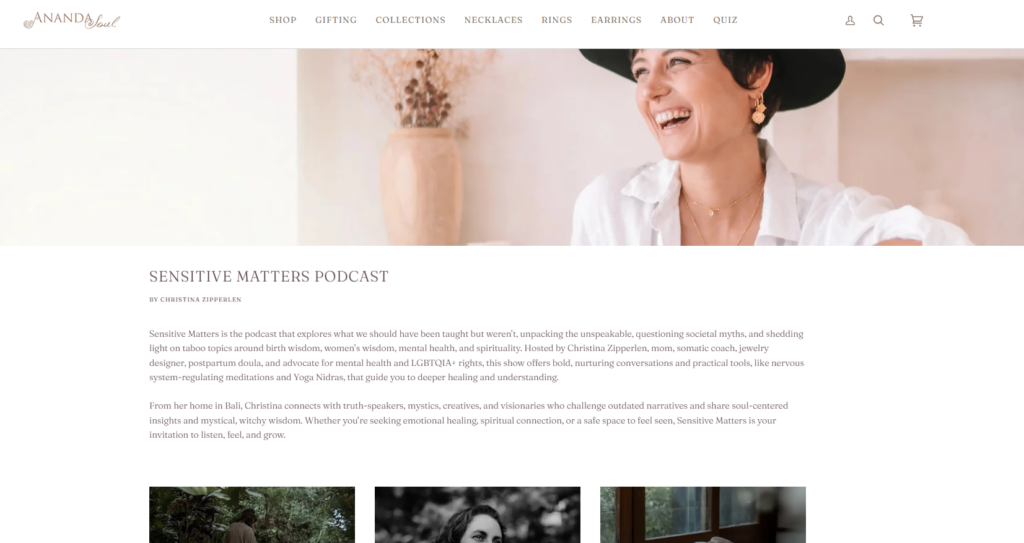
Ananda Soul’s blog introduces new collections through poetic storytelling, such as “Embracing Life” and “Tales from Within.” These posts connect gemstones, emotion, inner wisdom, and collection themes.
For a Shopify jewelry brand, blog design should not feel like an afterthought. It can support SEO, collection launches, education, and brand loyalty.
We designed the blog structure to feel more like a lifestyle journal. Each article should include strong editorial images, clean typography, scannable sections, and product pathways that guide readers back to relevant collections.
This creates a softer conversion path. Customers may first connect with a story, then explore the jewelry that matches that story.
The color direction should feel warm, natural, and spiritual. Soft neutrals, warm whites, sand tones, muted gold, dusty rose, and earthy accents all support the brand’s handmade and Bali-inspired identity.
The palette should avoid harsh contrast unless it is used for key CTAs. A calm color system helps the jewelry and photography remain the focus.
Typography plays a major role in emotional jewelry websites. We would use a refined serif or elegant display font for headlines, paired with a clean sans-serif for body text and product details.
This combination creates a premium feeling while keeping the store readable. Headlines can feel poetic, while product information remains clear and practical.
The image direction should combine:
To show quality and craftsmanship.
To show emotion, scale, and mood.
To support the brand’s origin and spiritual atmosphere.
To make product launches feel special.
This visual balance helps the Shopify store feel both shoppable and memorable.
The biggest challenge was balancing emotional storytelling with clear e-commerce flow. If the website focused only on story, customers might not shop. If it focused only on products, the brand would lose its soul.
We used the homepage as a guided journey. Story sections and product sections alternate naturally, so customers can feel the brand and still move toward purchase.
Sustainability, recycled silver, ceremony, and giving back are powerful messages, but they can become too text-heavy.
We broke those ideas into short, visual sections. Each value received its own design moment, making the message easier to absorb.
Luxury jewelry websites sometimes feel cold. Spiritual jewelry websites can sometimes feel too informal. This brand needed both elegance and warmth.
We used refined spacing, soft colors, elegant typography, and human-centered imagery. The result feels polished but still personal.
Many jewelry customers browse on mobile. If the design works only on desktop, the store loses conversions.
We designed sections with mobile flow in mind: clear image hierarchy, easy CTA placement, readable text, swipe-friendly product areas, and simplified navigation.
The final Shopify website design creates a stronger connection between brand meaning and product discovery. The homepage introduces the emotional world of the brand. Collection pages help customers browse with ease. Product pages support both practical buying decisions and deeper emotional connection. Story, craft, and impact pages build trust and give the brand more depth.
This approach helps the website achieve several goals:
Visitors quickly understand the brand’s mood, values, and product category.
Collection and product sections guide users toward relevant pieces.
Sustainability, craft, ceremony, and giving-back content give customers more reasons to believe in the brand.
The site feels distinct from ordinary jewelry stores because it expresses purpose, ritual, and emotion.
The design supports browsing, product evaluation, and purchasing without relying on complex development language.
This Shopify jewelry website shows how thoughtful design can turn an online store into a meaningful brand experience. For Ananda Soul, the design direction needed to do more than display beautiful products. It needed to communicate intention, ethical craft, emotional storytelling, and trust across the homepage, collection pages, product pages, brand story pages, and impact content.
A strong Shopify design strategy helps purpose-led brands present their products with clarity while protecting the feeling that makes the brand special. That is where AIRSANG fits naturally. AIRSANG helps brands plan and design Shopify pages that feel visually refined, conversion-focused, and emotionally aligned with the customer journey, without turning the project into a heavy technical development discussion.


