









Project overview
In JY HEALTH’s SHOPLINE website design, we focused on two needs of health care products brands: making the products easy to find, and making the brand worth knowing more about. AIRSANG connects the home page, product list, details, brand introduction and contact pages, using natural life images, light purple embellishments and clear text levels to arrange browsing, comparison and consultation in their appropriate positions.
| Dienstleistungen | Industry | Plattform |
| SHOPLINE website design | Medicine and health care | Shopline |
| Project requirements | target market | design style |
| Series demand classification, product selection, brand recognition and contact portal | Hong Kong market, mainly Traditional Chinese | Natural life images, light purple and off-white, clear white space |
| Project quotation | Delivery content | Delivery time |
| ¥7,200 | Visual and layout design of home page, product list, product details, brand and contact pages | 14 days |
design challenge
Health product websites also carry product pictures, ingredient descriptions, brand concepts and purchase operations. There is a lot of information, but each item cannot grab attention. Let’s first divide the page responsibilities: the homepage helps choose the direction, the list supports comparison, and the details are checked centrally. The brand page and contact page continue to answer who the brand is and how to communicate. Visually, consistency is maintained through fonts, colors, and spacing, allowing readers to maintain a familiar reading rhythm when switching pages.
Overall strategy: organize multiple pages into a continuous purchase path
01 Let different pages answer different questions
We first explain the product theme and demand classification on the homepage, leave product comparison to the list, and leave ingredients and purchase information to the product detail page. Brand and contact pages are expanded separately to avoid squeezing all descriptions into the homepage. Users can start from the current problem and continue to find the next step.
02 Use fonts and colors to form a unified reading level
We use Jost for English titles and Poppins to organize English text and numbers; Traditional Chinese uses coordinated system glyphs. The title is enlarged and the font weight is increased, and the description text is used with a lighter font weight to expand the hierarchy. Light purple is used for column tips and icons, off-white is used for theme background, and black is reserved for titles and operational highlights, making natural photography and product packaging more prominent.
03 Let space and interaction serve the content
We use wider upper and lower spacing between modules to separate topics, and use regular grids to organize juxtaposed information; where we need to continue browsing, we arrange horizontal product carousels, album switching, and quantity additions and subtractions. Animation effects focus on user feedback after operations, allowing the content to connect naturally and keeping the operation objects clear.
Home page above the fold: put products and themes at first glance
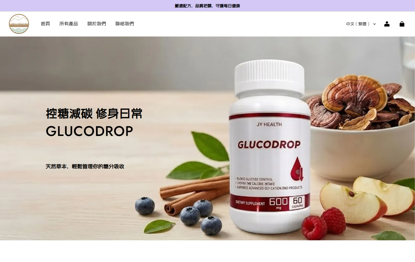
We arranged the GLUCODROP bottle on the right side, using fruits, leaves and light-colored countertops to form a natural scene, leaving the theme and product name on the left side. The light purple announcement bar at the top is separated from the white navigation. The brand, column and main visual each occupy one layer. After entering the page, you can first recognize the product and then choose the browsing direction.
In terms of font, the English product name uses Jost, which is about 48px on the desktop; the Chinese theme above is about 40px, and the font weight is increased. Large text works with wider white space to establish focus, and black text remains legible against a soft background. We let photography provide the atmosphere and text carry the information. The two form a clear division of labor on the first screen.
Home page classification: Use six cards to organize demand entry
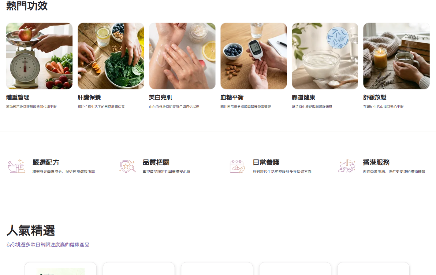
In this picture, we present “popular functions” in six columns of photo cards, allowing different needs to have independent entrances. The column title uses a bold font of about 34px; the card title and brief description are gradually reduced, forming three levels of column, classification, and supplementary explanation.
We gave this module about 72px of top and bottom padding, and about 16px of spacing between cards, giving the six groups of content room to breathe when placed side by side. The four groups of linear icons below continue to complement the brand expression, transitioning from photo classification to short descriptions, and the reading pace also slows down.
Homepage Featured: Extend Product Browsing with Smooth Panning
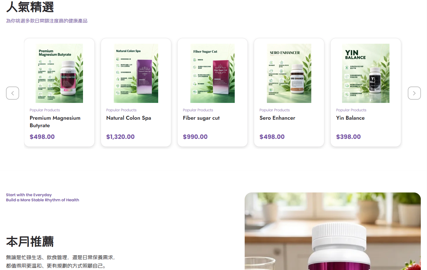
We organize the “Popular Selection” into white rounded corner product cards: the packaging image occupies the main area, and the name and purple price are arranged in sequence below. The unified container retains the color differences of the packaging itself, so users can look for the name and price along the same location when browsing horizontally.
The left and right arrows bear the function of continuing browsing. After clicking, the product track moves smoothly horizontally, and new products enter the current area. We use motion effects to connect the two sets of content before and after, making the change in browsing position perceptible; at the same time, we retain the white space on both sides and the spacing between cards to avoid filling one screen with products.
Product list: let filtering, sorting and products have their own places
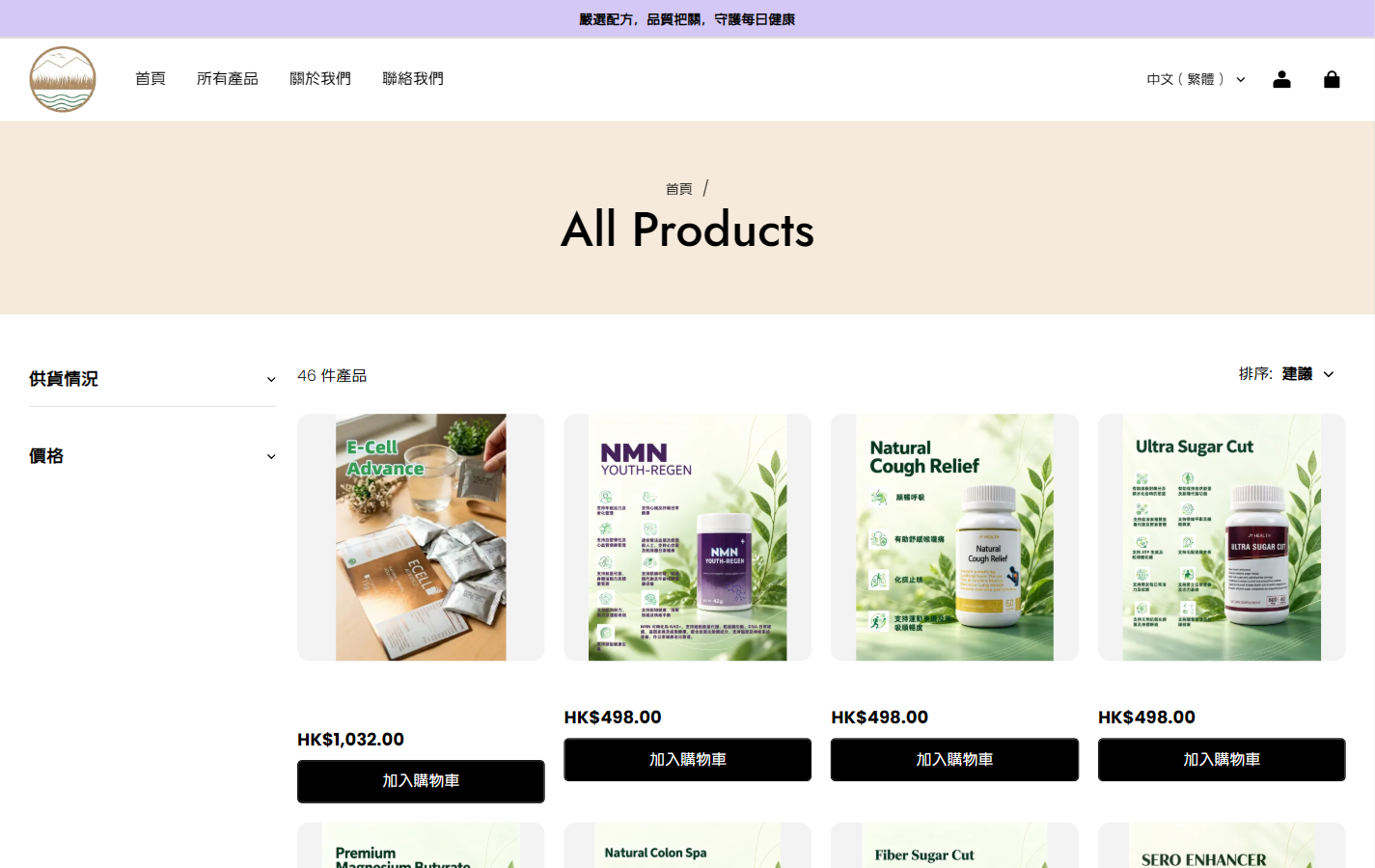
We use an off-white banner to carry the “All Products” title and breadcrumbs, and then split the lower body into a filter on the left and four columns of products on the right. There is a clear blank space between the wide title area and the product grid, making the transition from page positioning to product selection clearer.
The supply and price filters are concentrated on the left side, and the sorting is placed on the upper right of the product area; the bold Hong Kong dollar price and black button form the focus of operations under the product image. Here we strengthen the contrast between black and white to distinguish light-colored product images, filter text and operation portals from each other, helping users organize their choices according to conditions.
Product details above the fold: juxtapose images with purchase information
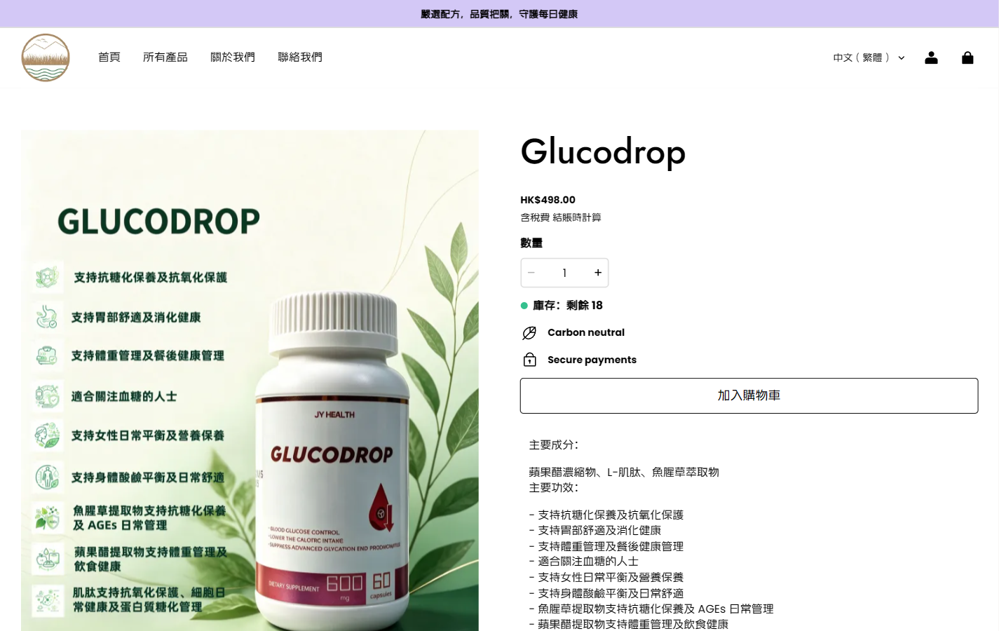
The details of Glucodrop are shown in the picture on the left and the text on the right. We give the product picture a larger display area, establish identification with a Jost title of about 50px on the right, and then arrange the price, quantity, inventory and add to the shopping cart entry in sequence. Leave a blank space between the two columns so that the graphics and text in the package and the page operations do not squeeze each other.
Quantity selection uses plus and minus controls, and the value changes immediately after adjustment; green dots are used as small-scale prompts for inventory. We made the additional purchase entrance spread horizontally, with a thin black border and a white background to distinguish the operation area, leaving space around it, so that users can complete verification and quantity selection in the same information column.
Lower section of product details: Let the photo album and the long description complement each other
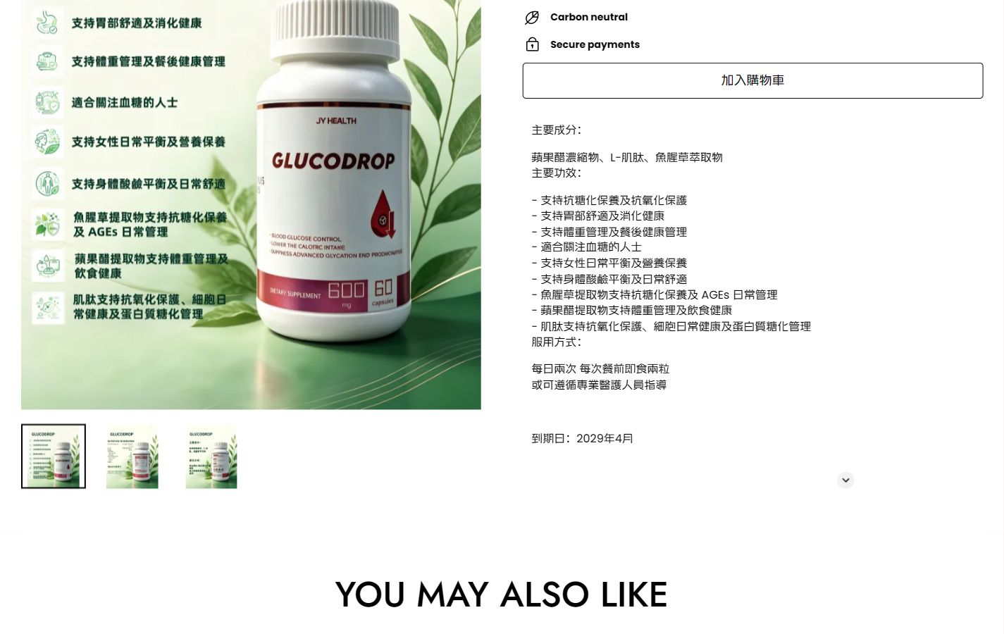
This picture shows the three thumbnails below the product image, as well as the ingredients, item descriptions, usage and expiry information that continue to expand on the right. We arrange the thumbnails next to the main product image, and the selected items are distinguished by borders; after clicking on another one, you can switch to the product screen and continue to view different illustrations on the current page.
The right side uses black text and a white background, breaks long content into subtitles, entries and short paragraphs, and adds white space between different information groups. At the bottom of the page, use “YOU MAY ALSO LIKE” in the center to open relevant recommendations. The font size is significantly enlarged, allowing a new paragraph boundary between the single product description and continued purchase.
Brand introduction above the fold: Use natural light to establish brand tone
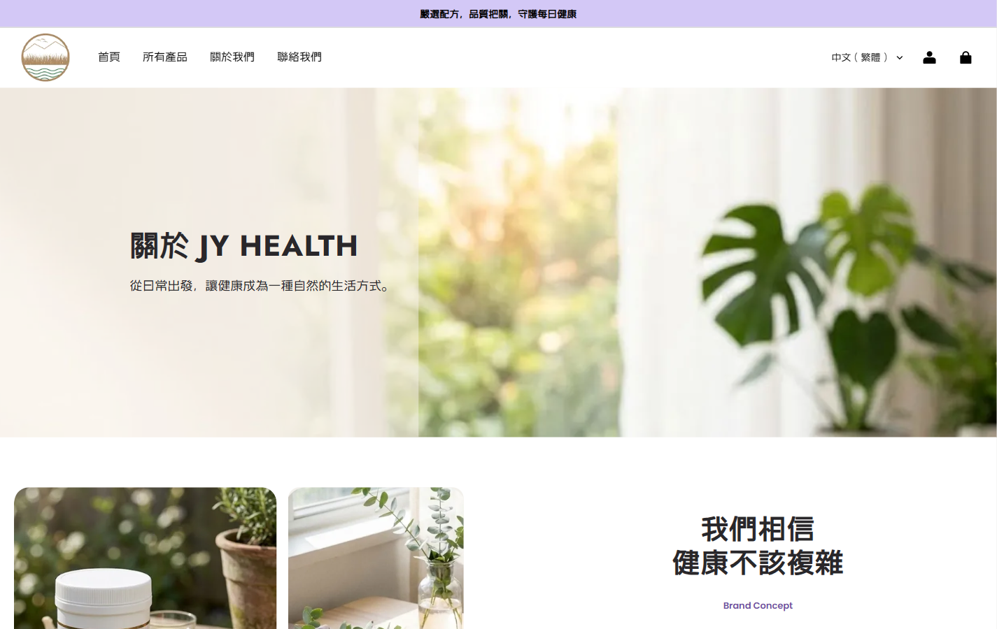
We use plants, window light and soft natural colors on the brand page to shift the visual focus from product selection to brand expression. The theme text has an independent reading area, and subsequent life photos and conceptual content continue to unfold, leaving more narrative space than the first screen of the homepage.
The layout follows the black title, light background and clear sans-serif hierarchy to prevent the brand page from suddenly switching to another visual language. We use wider module spacing to control the rhythm, allowing readers to read the topic first and then enter the graphic content; the green and beige colors in the natural images also echo the product page.
Brand value: implement four key words into picture and text cards
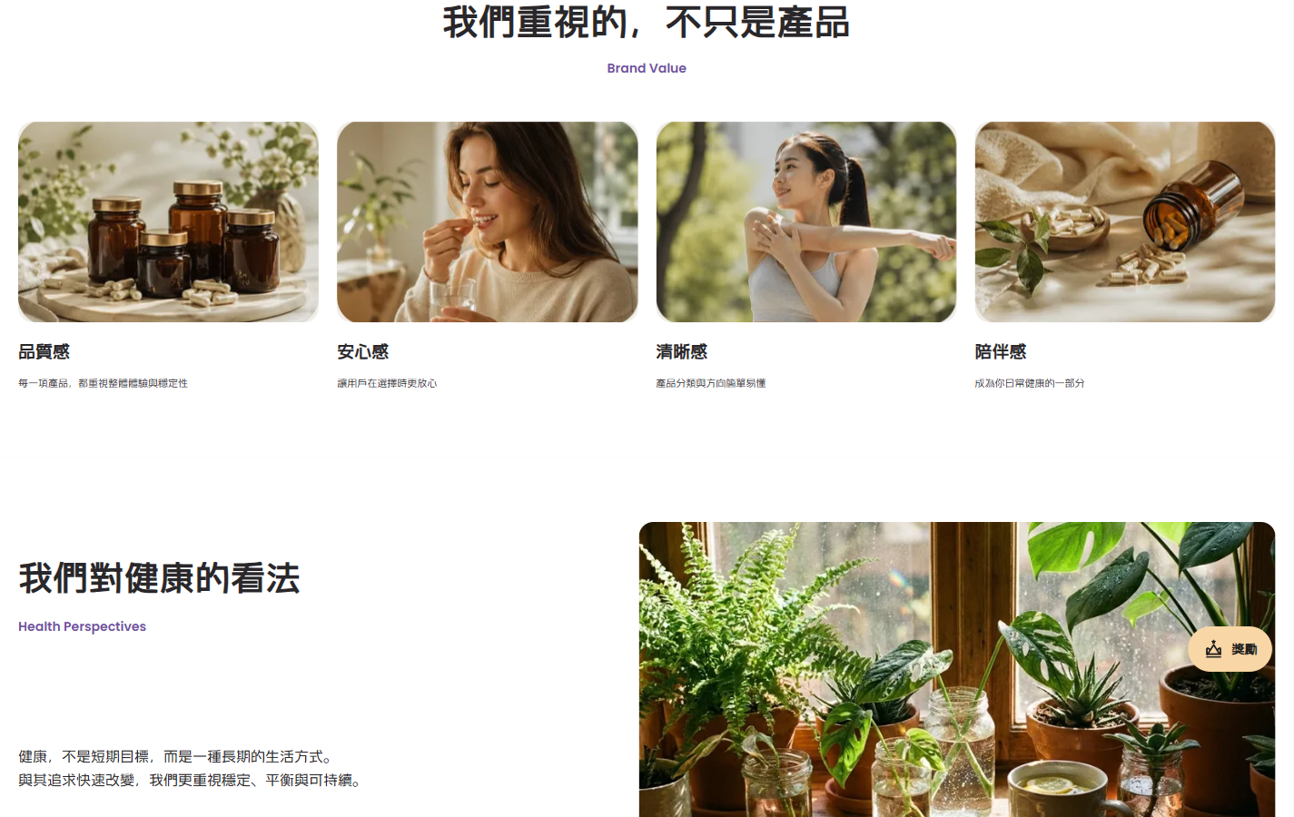
We split the “sense of quality, security, clarity, and companionship” into four side-by-side cards, which were paired with photos of products, people, and daily activities. The unified rounded-corner images, left-aligned titles and short descriptions allow each value word to have a corresponding picture, and readers can browse item by item.
The main title is centered and enlarged, and the purple English subtitle provides a lightweight reminder; the cards are evenly spaced, and a wider space is left below the module to connect “our views on health.” We use title scale and white space to distinguish the value overview and subsequent concepts, so that the two sets of content are connected and each has its own focus.
Contact page: use columns and white space to organize the communication entrance
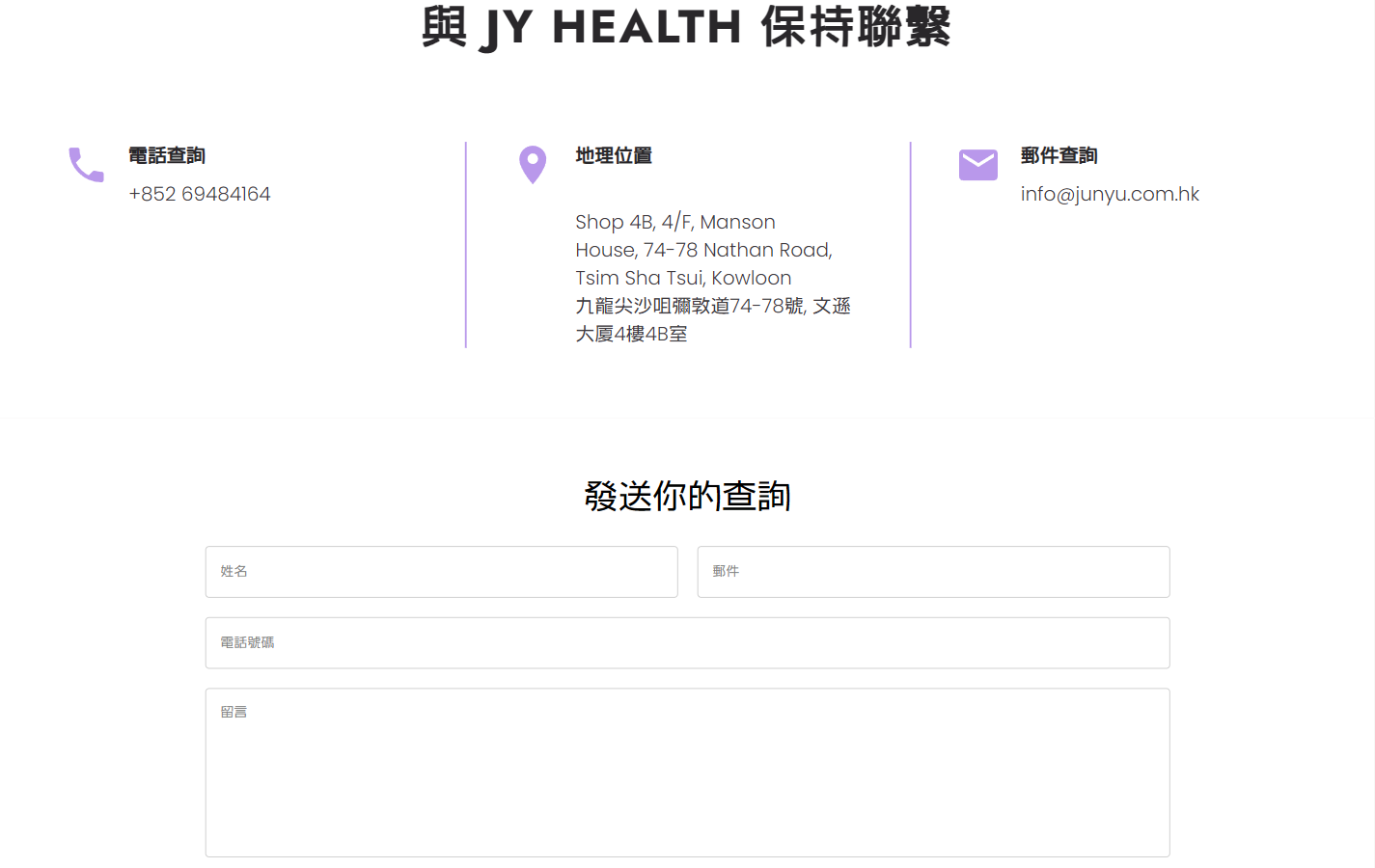
We divide the phone number, location and email into three columns, separated by light purple icons and thin vertical lines. The title should be bold, and the contact information should have a lighter font weight; the longer Chinese and English addresses in the middle should be separated into separate paragraphs to avoid mixing with the information on both sides.
The form below adopts a structure with names and emails side by side, phone numbers and messages occupying separate rows. The thin gray border makes the input range clearly visible. We reserve a wide space between the contact information and the form, and divide direct contact and sorting out questions into two steps, so that the page retains a concise reading order.
Mobile homepage: leave limited width to themes and products
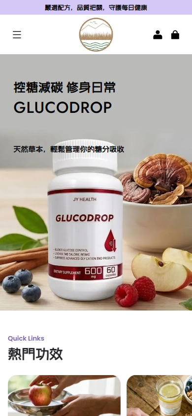
We folded the horizontal navigation on the mobile phone and used the menu icon, the brand logo in the center, and the account and shopping bag entrance on the right to form the top. The first screen reorganizes the themes and products according to a narrow screen ratio, retains product identification, and leaves independent space for text.
The small screen layout follows the light purple bulletin board and natural images, and the title and description are kept different through font size and weight. We compress the navigation occupancy and give priority to the available width for the content. Subsequent categories continue to expand vertically, allowing readers to follow the topic and enter their needs.
Mobile phone details: Look at the product first, then check the information
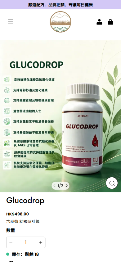
We adjusted the left and right structure of the desktop to read up and down: the product picture is displayed first, the album page number and the switching entrance are close to the picture, and then the name, price, quantity and inventory are connected. Image browsing and purchasing information appear in segments, reducing the burden of processing multiple columns of content at the same time on a narrow screen.
The font is consistent with the black and white operating language, and product names, prices, and field labels are hierarchical. We leave a gap between the picture album and the text, so that users can naturally move to the next set of information after viewing the product; controls such as quantity addition and subtraction continue to be close to the corresponding fields to keep the operation objects clear.
Design summary: Let brand expression and product selection connect with each other
In this project, we used unified font levels, light purple and off-white colors, natural photography and regular white space to connect the product page and the brand page. Each page is organized around a specific task: the homepage provides direction, the list helps with comparison, the details are checked, and the brand and contact pages continue to supplement cognitive and communication methods.
We also put interaction where it is necessary to continue browsing and adjust selections: selected products extend content through smooth horizontal movement, detailed albums support multi-image switching, and quantity controls provide instant feedback. The visuals and functions are organized around the same browsing path, making the connection between brand expression and product selection more natural.
Plan a clear SHOPLINE website for your brand
You can provide us with your existing website address, product catalog, brand materials and required page range, and communicate the content structure, website visual and implementation needs that are suitable for your products and market.