Project overview
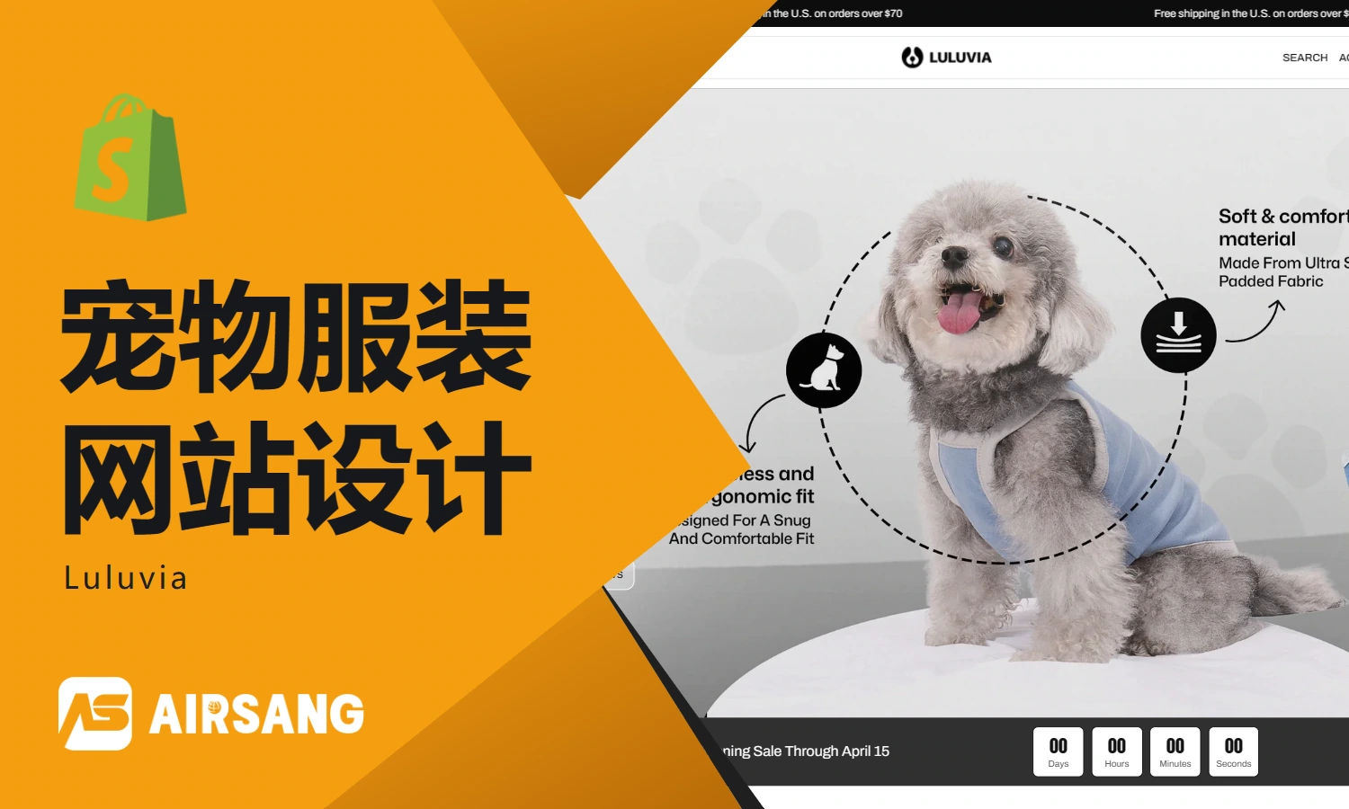
The client of this project is a pet lifestyle brand targeting overseas markets, specializing in dog walking supplies, pet toys, travel accessories and combination sets. With the gradual enrichment of brand product lines, the original online display method has been unable to fully convey the young, modern and lifestyle brand image. Therefore, customers come to us and hope to Shopify Build and optimize a brand website with more brand sense and conversion capabilities. The project focuses on homepage visual design, product classification and package display, product detail page, brand story page and mobile experience optimization. Through clear information levels, life-like pet scenes, high-quality product images and a unified color system, we have kept the shopping process simple while strengthening brand recognition and user emotional connection, upgrading the website from a simple pet supplies mall to a more complete pet lifestyle brand experience.
| Dienstleistungen | Industry | Plattform |
| Website design and decoration | pet supplies | shopify |
| Project requirements | target market | design style |
| Optimize the shopping process and improve user purchasing experience | Global | Modern simplicity, dynamic fashion, lifestyle |
| project budget | Delivery content | Delivery time |
| ¥15500 | Website construction and full-site page design | 23 working days |
Project Challenges
The core challenge of this project is how to balance the visual tonality, product information display and user purchasing experience of the pet brand on the Shopify platform. There are many types of customer products. If the page hierarchy is not clear, it will easily burden users with information during the browsing process. At the same time, it will be difficult to highlight the brand’s young, natural, and life-oriented positioning. Before starting the project, we first sorted out the client’s existing product lines, target users, brand visual materials and competing product websites, and analyzed the information relationship between the home page, category pages and product pages. Subsequently, we re-planned the page structure, content priority, visual style and image usage, clarified the main colors, fonts, white space ratio and scene map direction, and established a unified and sustainable visual system for subsequent Shopify website design.
Home Page Design Strategy
The homepage is one of the most critical pages in any Shopify store. It not only plays the role of the first impression of the brand, but also an important entrance to guide users to browse, understand the product and complete conversion.
Hero first screen design – quickly establish brand impression
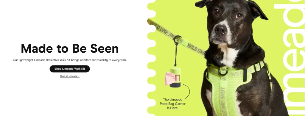
We focus on achieving the following goals in the above-the-fold area:
Lifestyle images showing pets interacting with their owners
Through real and natural pet and owner scenes, users can feel the brand’s lifestyle attributes for the first time and enhance their emotional connection.
Use soft and vibrant brand colors
The overall color scheme is consistent with the brand visual system, adding a moderate sense of vitality to the soft tone, making the page both friendly and recognizable.
Use concise, point-of-interest titles
The first-screen copy avoids complicated expressions and quickly conveys the brand’s core values through concise and direct titles.
Set up clear call-to-action buttons
Guide users to product series or key pages through clear CTA buttons to reduce hesitation in the browsing path.
This part determines the user’s first impression after entering the website, and at the same time quickly conveys the brand’s personality and overall atmosphere.
Product series display—simplifying product discovery path
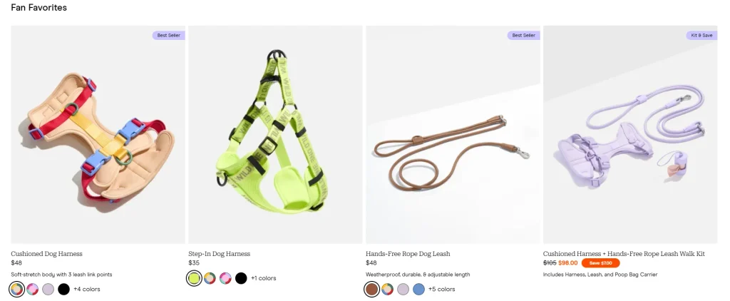
In order to avoid confusing users with too much product information, we organize products according to usage scenarios and needs, such as:
Essential supplies for walking your dog
Focus on displaying pet supplies commonly used when going out and taking walks.
Play accessories
Focus on products related to pet entertainment, interaction and daily companionship.
travel equipment
Displaying pet accessories suitable for outings, travel and travel scenarios.
Each product range is designed in the following ways:
Simple card layout
Through a unified card structure, classified information is more neat and clear.
Reduce text distractions
Keep only necessary information and avoid too many complex descriptions on the page.
Reinforce visual pictures
Use high-quality product images and lifestyle images to help users quickly understand the features of each collection.
This structure can help users find the products they need faster and reduce resistance during the browsing process.
A fusion of lifestyle images
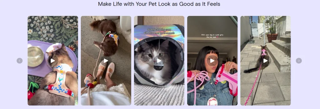
In website visual design, we use a lot of real product usage scenarios, such as:
Pets playing scene in the park
Use the natural outdoor environment to show how the product is used in real life.
Pet walking scene in urban scene
Showing the daily lifestyle of pet owners taking their pets out.
Pet travel and travel scenarios
Integrate pet accessories into travel and mobility scenarios to enhance the actual use value of the product.
This approach makes the product no longer just a commodity displayed alone, but becomes a part of the real-life experience, thereby enhancing the affinity and appeal of the product.
Product suite and portfolio design
In order to increase the unit price per customer, we have added product portfolio and package display areas on the homepage.
The main design methods include:
Display related products side by side
Display products that can be used together to help users quickly understand the relationship between products.
Highlight the advantages of combined purchasing
Through clear information presentation, users can intuitively see the value brought by purchasing the package.
Use visual groupings to enhance understanding
Use a unified image style and layout to package multiple products into a complete solution.
We did not simply design the package as a combination of multiple products, but presented it as a complete solution for a specific usage scenario.
Product product detail page design
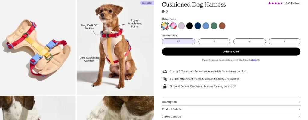
The product detail page is an important page on the website that directly affects users’ purchasing decisions, so we focus on optimizing the visual hierarchy, product images, and information presentation methods.
visual hierarchy design
We re-plan the information order of the product page according to the user’s browsing habits:
Product pictures as the first visual focus
Let users see clear and high-quality product vision immediately after entering the product detail page.
Product name and core selling points
Next to the product image, display the product name and the most critical value information.
Prices and purchasing options
Highlight price, spec selection and buy button with a clear visual hierarchy.
Supplementary product information and detailed descriptions
Place more product information in subsequent areas to avoid overcrowding the first screen with information.
Such a structure can naturally guide users from learning about the product to making a purchase decision.
Product display with pictures as the core
High-quality pictures occupy an important position in the entire product detail page. We focus on showing:
Multi-angle product pictures
Help users have a more comprehensive understanding of product appearance and structure.
lifestyle scene pictures
Show the product in use in a real environment.
Product details close-up
Highlight materials, craftsmanship and design details through close-up images.
All pictures maintain a unified visual style, making the product detail page consistent with the visual system of the entire brand website.
Simplify product information layout
In order to prevent large blocks of text from reducing user reading efficiency, we adopt an information structure that is easier to scan.
Use bullet points to showcase product features
Split core functions and selling points into short content to improve reading efficiency.
Use icons to aid understanding
Help users quickly identify different information through simple icons.
Use descriptions that are brief and highlight points of interest
Reduce complex parameter stacking and focus on the actual value that the product can bring to users.
This design makes the page cleaner and more suitable for users to browse quickly.
Navigation and User Experience Design
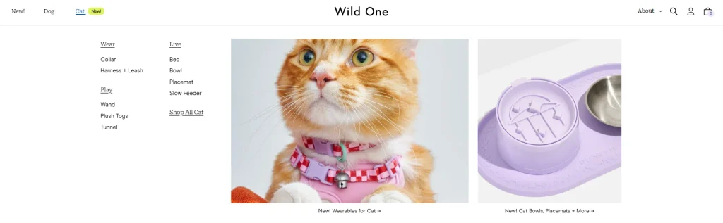
A smooth user experience is important for reducing bounce rates, extending visit times, and increasing conversion rates.
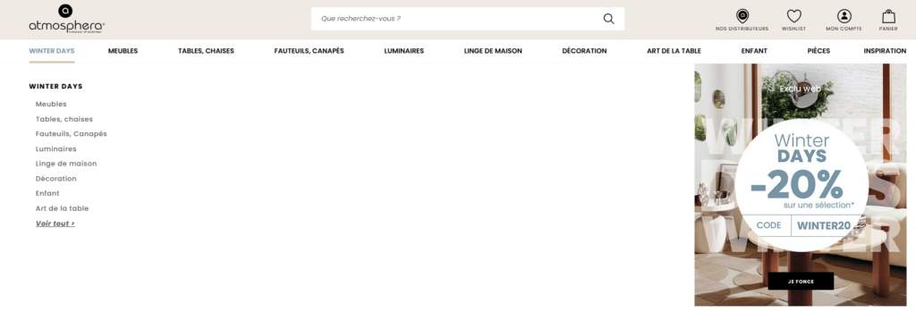
Simplify website navigation
We have designed a simpler navigation bar, with highlights including:
Clear product category names
Allow users to quickly understand the content corresponding to different entrances.
Reasonable classification logic
Group according to product type and user usage scenario.
Quickly enter the product range
Reduce unnecessary page jumps and make it easier for users to find target products.
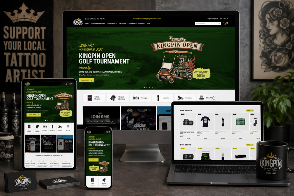
Mobile-first optimization
Considering that a large number of users of Shopify stores come from mobile devices, we focused on the mobile experience during the design process.
Page structure suitable for vertical scrolling
Allow users to browse content naturally by swiping up and down.
Interaction design suitable for thumb operation
Buttons, menus and operating areas all maintain enough click space.
Simplify the mobile menu
Reduce complex navigation levels so users can enter the target page more quickly.
The overall visual appearance of the mobile terminal remains consistent with that of the desktop terminal, while further improving operational convenience for small screen environments.
Assisted page design
In addition to the homepage and product detail page, we also extend the overall design system to other key pages to maintain a complete and consistent brand experience.
About Us page – enhance brand trust
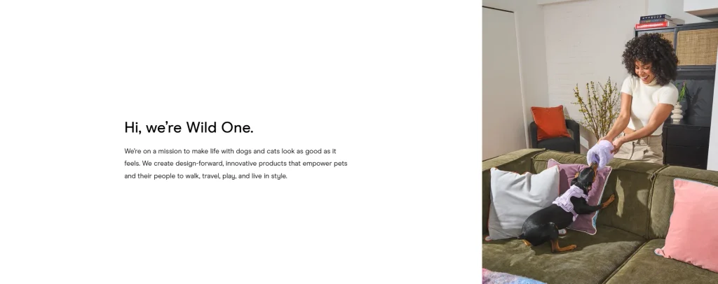
We help users further understand the brand through brand stories and visual content.
Demonstrate brand mission
Explain to users the value of the brand and the problems it hopes to solve.
Emphasis on design concepts
Further establish differentiated recognition through brand design concepts.
Build emotional connections with users
Increase brand affinity through authentic stories and lifestyle content.
Product Collection Pages – Be Consistent and Clear
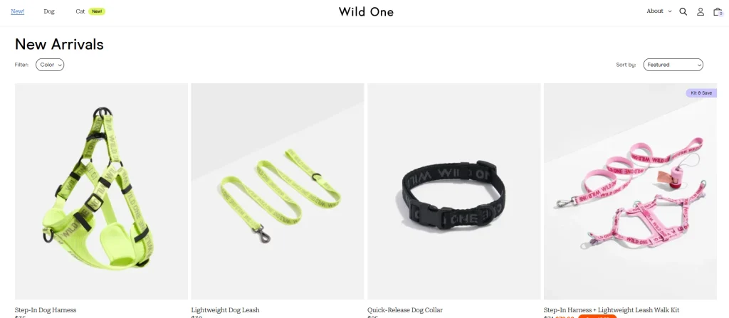
Collection pages continue to use unified design logic.
Unified product grid layout
Keep different products neatly organized on the page.
Consistent spacing design
Improve page texture through standardized white space and spacing.
Clear product classification
Help users quickly understand the differences between different products.
Shopping cart and checkout experience
During the shopping process, we try to reduce unnecessary visual distractions so that users can focus on completing their purchases.
Clearly display price information
Let users quickly understand product prices, quantities and order amounts.
Reduce interference from irrelevant elements
Avoid overstuffing your shopping cart and checkout process.
Enhance visual hierarchy
Highlight order information, amounts, and key action buttons.
This simple design can reduce user friction during the checkout process and improve order completion rates.