Focusing on the baby swimming float, we organized the dual color matching and structural details into a set of English product pictures. The entire set of works adopts the visual language of aqua blue and purple, swimming pool scenes, and circular partial frames. Through the division of labor in different pictures, the product appearance, partial information, and usage situations are gradually presented.
| Dienstleistungen | Industry | Plattform |
|---|---|---|
| Amazon primary and secondary product images design | Maternity and baby products | Amazon |
| Project requirements | target market | design style |
| Dual colorways and structural details | English content display | Aqua blue and purple, swimming pool scene, circular partial frame |
| Project quotation | Delivery content | Delivery time |
| ¥1,000 | 14 product primary and secondary product images (including dual color extensions) | 4 days |
Design Challenge: Let different information have its place
This set of pictures includes two colors: aqua blue and purple. It is necessary to explain the relationship between fabrics, fasteners, canopies and postures while maintaining the consistency of the series. We reused common layouts to keep color changes consistent, and then used partial images to complement the product structure.
Our design strategy
The two color combinations share title location and scene logic, with series recognition taking precedence over decorative changes.
Separate the structure, fasteners, gestures and parent-child interaction, and retain the spatial relationship between the product and the characters in the picture.
Overview of purple structure: local materials are expanded in layers
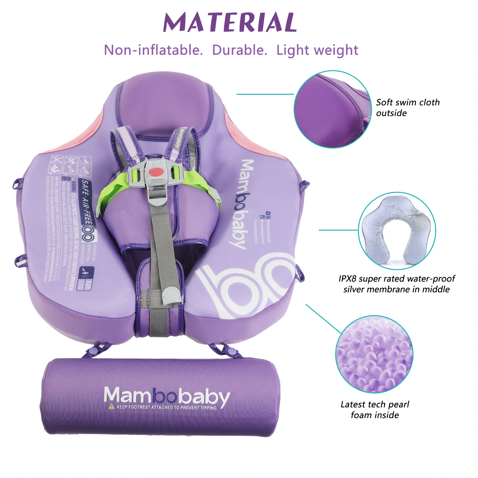
We display the overall shape with an inclined product, and three circular windows on the side complement the fabric and internal layers. The purple main body remains clear on the light base, and the local frame size is consistent, allowing the structural information to have a stable rhythm.
Aqua blue color extension: use the same information position
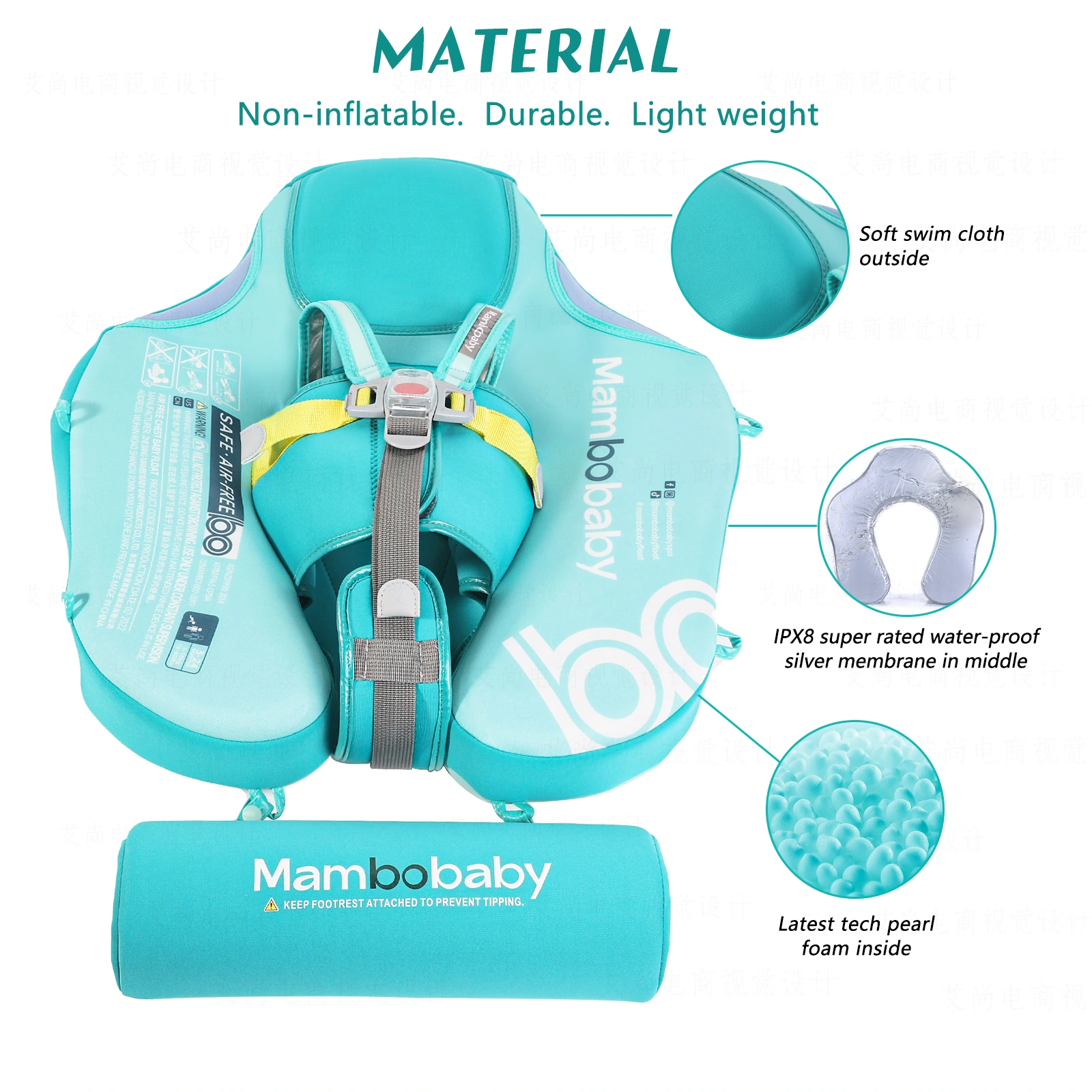
We continue the same main body angle and partial frame structure on the aqua blue model. The two colors share a visual grammar, so readers can focus on color matching and details, and series switching will not cause reading jumps.
Buckle position: allows marking to fit the real structure
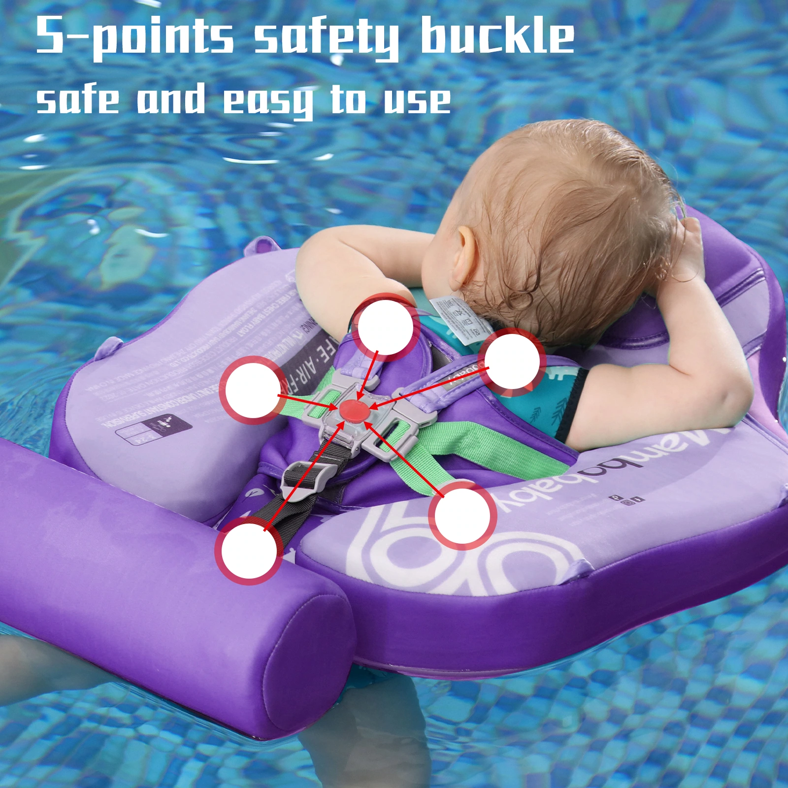
We zoom in on the overhead view and use red and white numbers to locate the locations of multiple buckles. The numbers are kept close to the corresponding parts, and no additional text is stacked in the center of the picture, making the structural observation more direct.
Four grid details: Unify the scale of fabrics and connectors
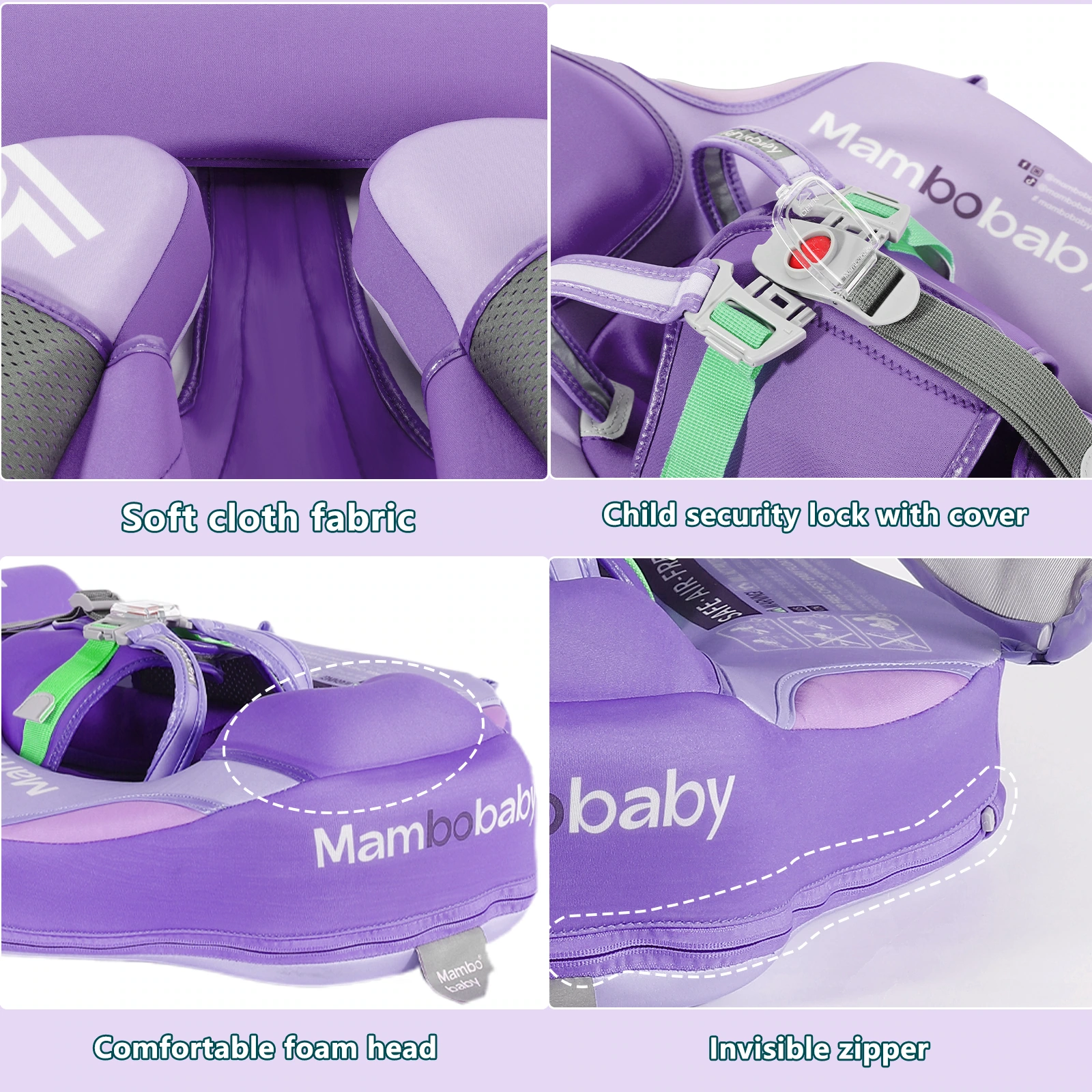
We divided the fabric, headrest, fastener and zipper sections into four sections and displayed them in similar cutting sizes. The blank space between the grids allows materials and hardware to be separated into separate areas, preventing different types of details from being mixed into one collage.
Gesture indication: Use angle lines to illustrate spatial relationships
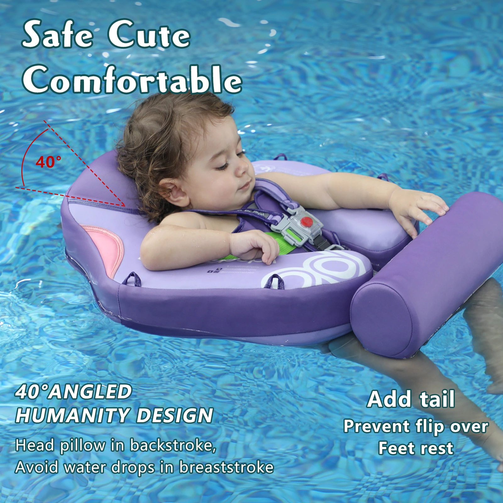
We add angle lines and local indications to strabismus products, and separate instructions for the tail and support parts. The lines are spread out along the outer edge of the main body to preserve the visibility of the product’s internal form as much as possible.
Awning theme: let the environment and components come into view together
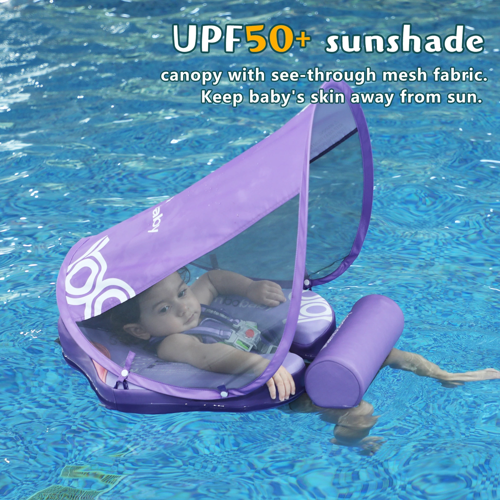
We used a canopy scene in the pool to present the covering structure above, leaving the title in the cleaner water area. The characters, tent body and text remain misaligned, and the focus is on the relationship between the visible parts and the scene.
Purple posture combination: upper and lower rows of organizational status
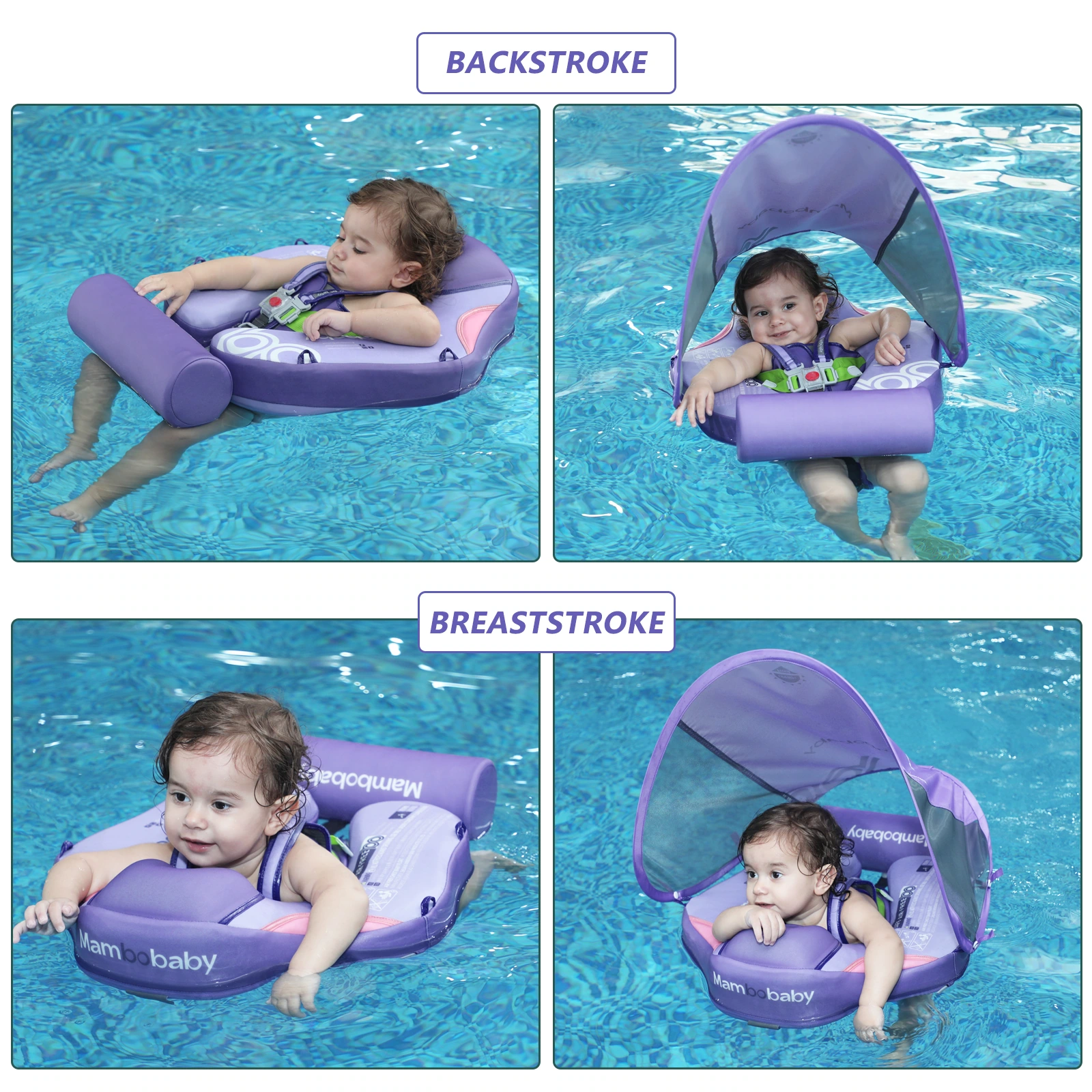
We divide different poses and canopy states into upper and lower rows, and each area retains similar image proportions. With consistent margins, multiple states can be compared item by item in a single graph.
Aqua Blue Stance Combination: Maintain Comparability Between Color Matches
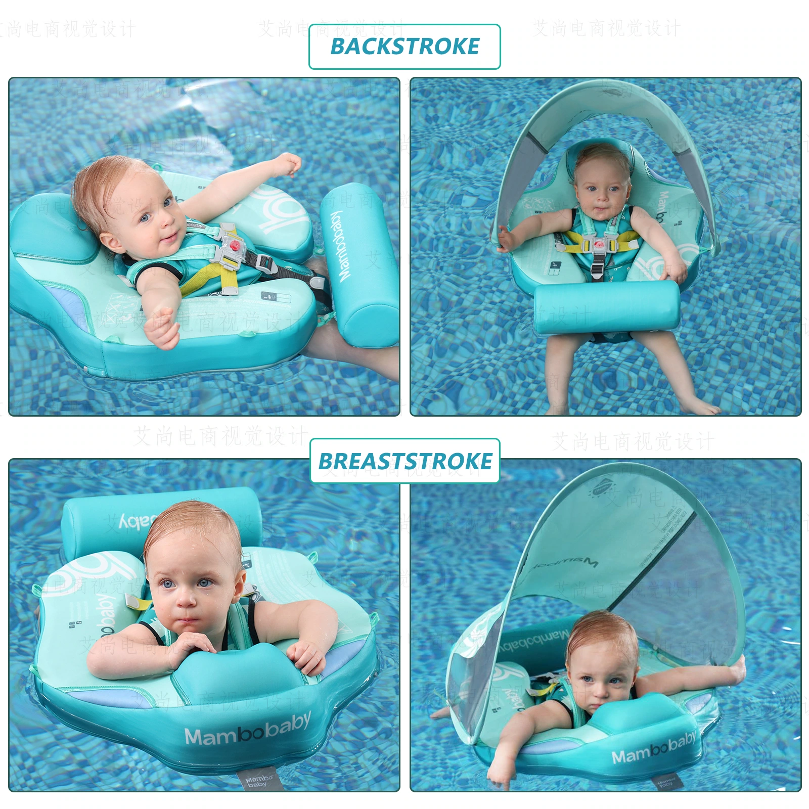
We continue to use a two-line layout on the aqua model, and the positions of the title and photo echo the purple version. A shared structure allows color palettes to be expanded into a complete series, rather than individual images that are unrelated to each other.
Purple swimming pool scene: characters become the focus of the scene
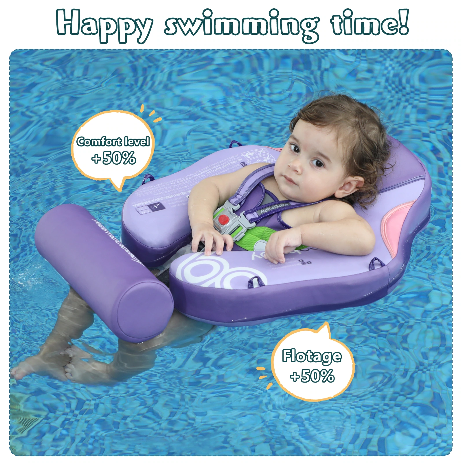
We use a close-up view of the baby and the float to establish a sense of scene, with graphics and titles placed on the periphery. Leave out character expressions and product outlines so that the screen can first present interactive emotions and then receive auxiliary information.
Aqua blue swimming pool picture: continuing the same visual rhythm
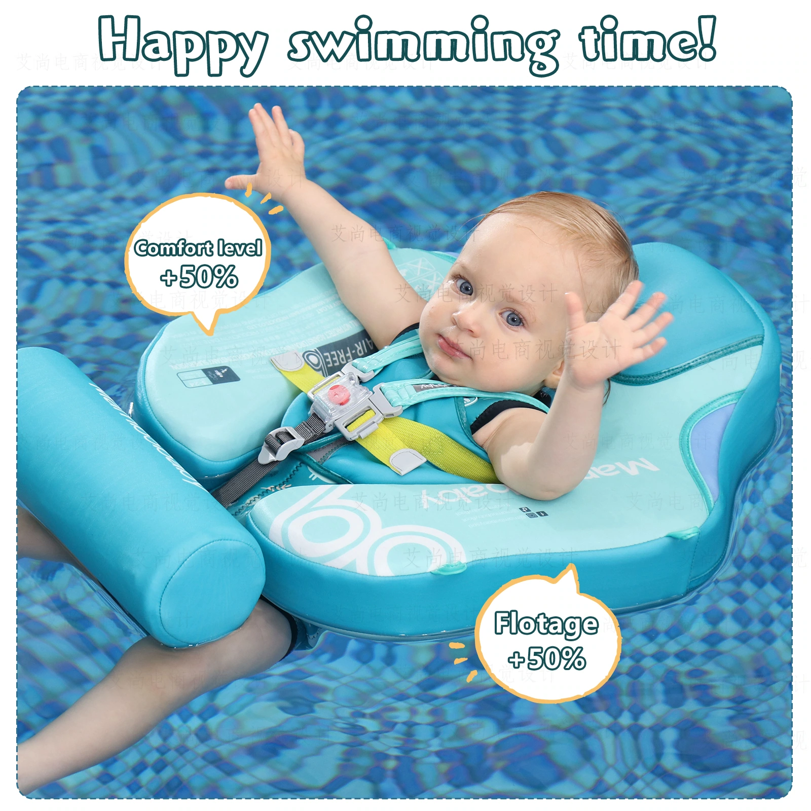
We maintain a similar framing relationship in the aqua version, and the distribution of text and decoration continues the rules of the series. The water background is connected to the product color, making the overall picture more focused.
Adults in the same frame: retain interactive relationships
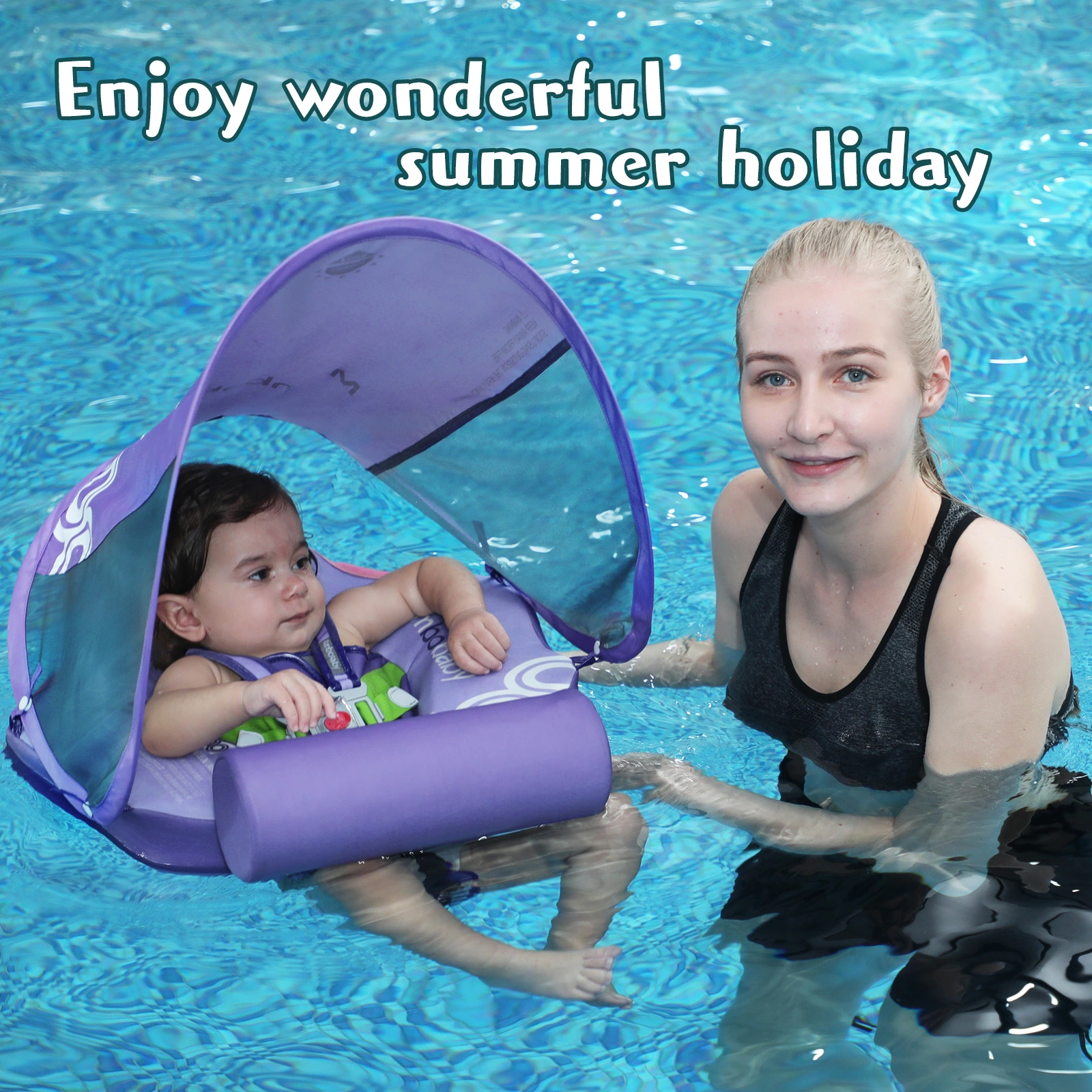
We put adults and babies in the same swimming pool scene to connect sight and action. The title avoids the character interaction area, so that both the product and the surrounding space can be seen clearly.
Aqua Blue Interactive Scene: Unifying the Subject and Blank Space
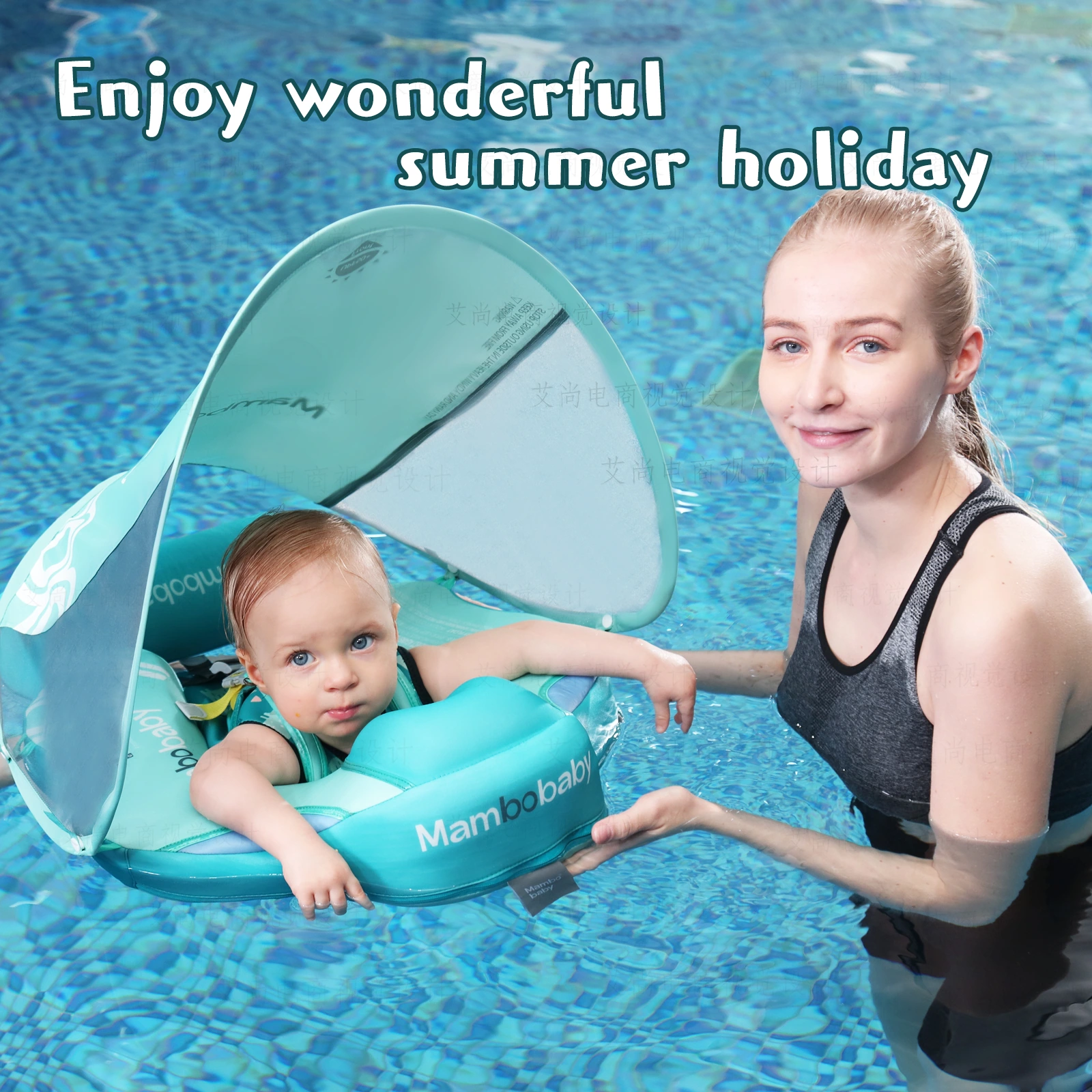
We continue the composition of adults in the same frame and retain natural white space near the characters. The aqua blue main body and the water surface are distinguished by outlines and light and shade, and the text only occupies a relatively clean edge area.
Purple parent-child close-up: shorten the reading distance of the screen
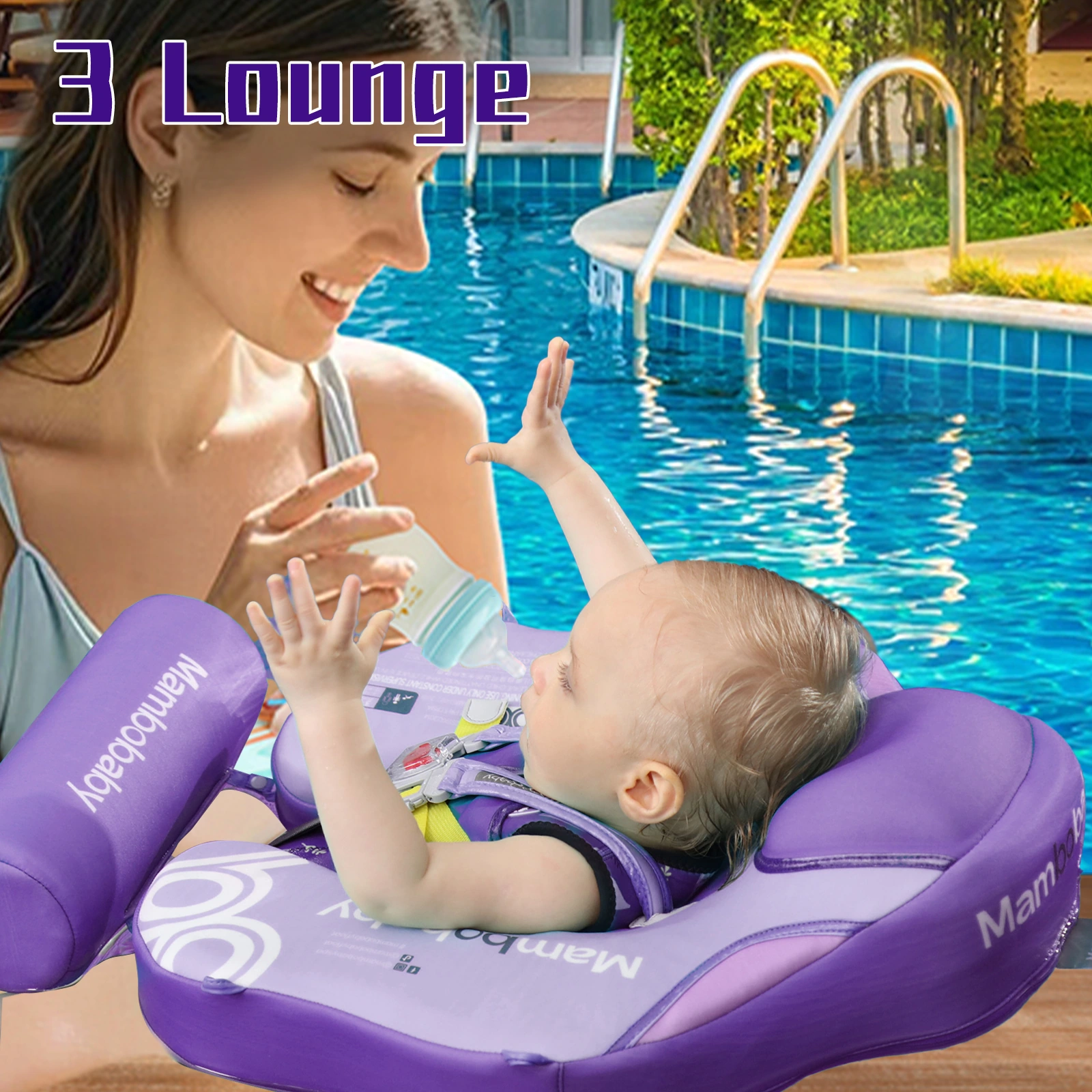
We wrap up the purple group of images with closer interaction between people, and the product remains fully identifiable in the foreground. Less decoration allows movements and expressions to become the core, and the information in the picture is more concentrated.
Close-up view of aqua blue parent-child: Completed dual-color picture set
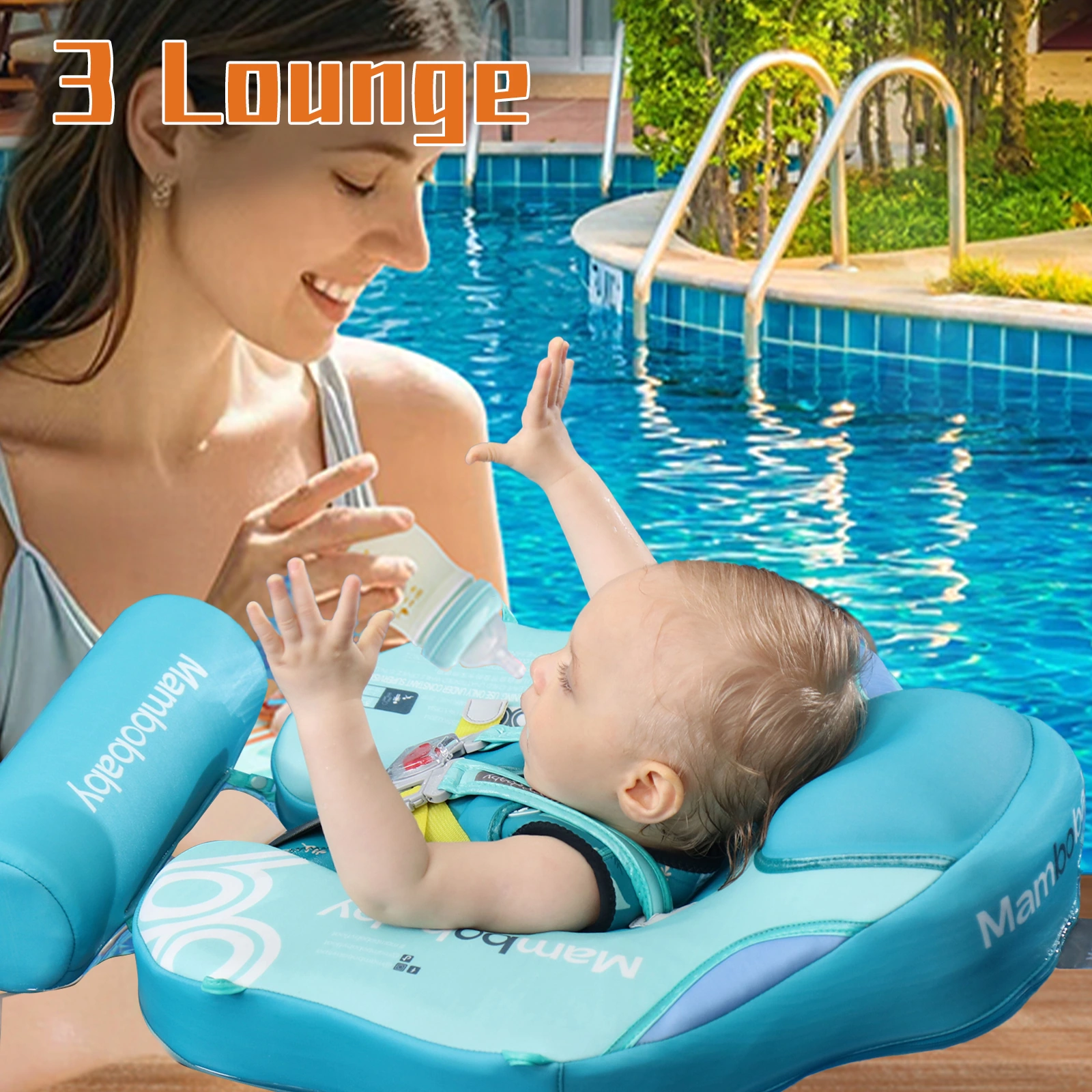
We completed the aqua extension with the same interactive theme, maintaining the proportion between product, character and title. The entire set controls consistency through shared typography while retaining the identity of both colorways.
Deliver and design value
This set of works contains a total of 14 product pictures. We arranged the responsibilities of different pictures around the dual color scheme and structural details, using aqua blue and purple, swimming pool scenes, and circular partial frames to maintain the visual consistency of the entire set. The two colors share part of the layout, and the positions of the title, image and detail area are kept consistent during the extension. From overall identification to partial explanation, the pictures complement each other, allowing readers to find information based on their own concerns.
Develop a clear visual expression for your products
You can provide us with existing product information, physical photos and key points to be displayed. We will combine the product structure, style differences and usage scenarios to plan image content and layout suitable for Amazon product display.