Project overview
The client is a professional retail brand focusing on drones, aerial photography equipment, accessories and industry solutions. Its products cover consumer drones, professional equipment, parts and enterprise applications. Its target customers include drone enthusiasts, professional photographers and corporate purchasing users. As the number of products and business scale continue to expand, the original website is gradually unable to meet the needs in terms of category navigation, product information level, and brand professionalism. Therefore, customers come to us and hope to reorganize the entire site visual and shopping experience based on the Shopify platform. The project focuses on the home page visual design, product classification structure, product detail page information display, brand trust content and overall visual specifications. Through clearer page hierarchy and professional technology-sense design, it reduces the user’s understanding cost when browsing complex products, while strengthening brand credibility and conversion capabilities.
| الخدمات | Industry | منصة |
| Website design and decoration | Digital 3C | shopify |
| Project requirements | target market | design style |
| Improve the overall visual quality and brand recognition of the website | عالمي | Professional Technology | Tough Business | Product Orientation |
| project budget | Delivery content | Delivery time |
| ¥16000 | Website construction and full-site page design | 23 working days |
Project Challenges
The biggest challenge of this project is that there are many drone product models, complex parameters, and numerous accessories categories. If the page structure is not clear enough, it will easily burden users with information and affect product search and purchase decisions. At the same time, professional drone users pay great attention to performance parameters, compatibility, and application scenarios. The website must not only reflect a sense of technology, but also maintain high information readability. Before starting the project, we first sorted out the customer’s existing product system, core sales categories and target user groups, and conducted visual and structural research on similar drone brands and e-commerce websites. Subsequently, we re-planned the Shopify website’s information structure, homepage content sequence, product classification logic and key conversion paths, and organized picture materials, product selling points and page content in advance to establish a unified design direction for the subsequent visual design of the entire site.
Understand brand positioning and market position
Before starting on page layout or visual design, we first focus on understanding the brand’s market positioning.
Drone Nerds operates in an industry with the following characteristics:
- The product has strong technical attributes and usually has a high unit price per customer.
- Customers need to establish sufficient trust before purchasing
- Product education and message clarity are critical to conversion
Key observations
- The product catalog is relatively large, covering drones, accessories, parts and combination kits
- The user group spans a wide range, from beginners to enterprise-level purchasing users.
- The differences between different products are often not easy to intuitively judge just by looking at them.
Design inspiration
We need to focus on solving the following issues:
- Simplify users’ purchasing decision-making process
- Strengthen the brand’s professionalism, credibility and industry authority
- Reduce the information understanding burden on users when browsing different pages
Homepage design: quickly build trust and clear understanding
The homepage usually determines the user’s first impression of the brand. Therefore, our design focus was to create a page with a clear structure and clear information, so that visitors can immediately feel the professionalism of the brand after entering the website.
First screen area: replace information stacking with a sense of professionalism
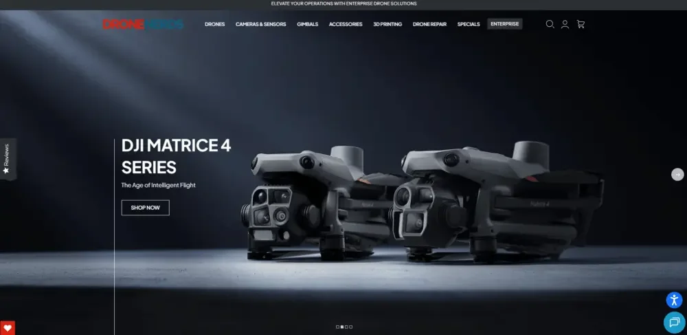
Instead of using a lot of promotional information, we designed the first screen to be more concise, mainly including:
- Demonstrate high-quality drone product vision
- Use concise, confident brand copy
- Prioritize guiding users into product categories rather than highlighting discounts and promotions
Why is it designed this way?
Users in the drone industry typically do not make immediate purchasing decisions based on strong promotional messages.
In contrast, they pay more attention to whether the product is professional, whether the message is clear, and whether the brand is trustworthy.
Category Navigation: Reduce browsing friction
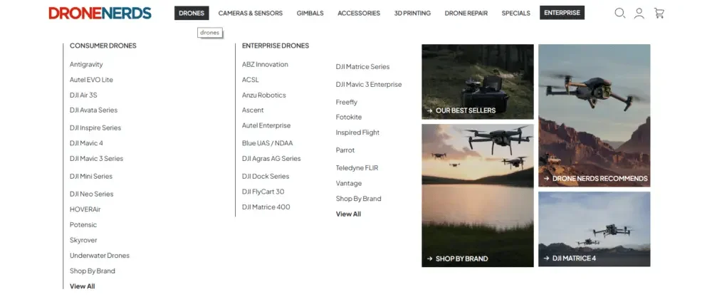
We have clearly divided the product entrances on the homepage around different user needs, including:
- Consumer drone
- Professional grade drone
- Accessories & Parts
- Enterprise level solutions
Each classification module uses:
- unified visual framework
- Concise and clear classification description
- Avoid displaying too much complex information at once
trust building module
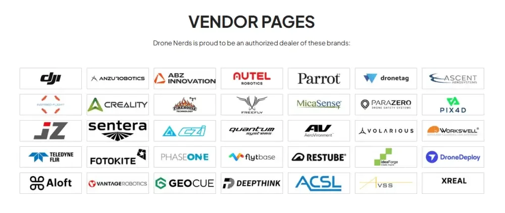
We have added multiple modular trust contents to the homepage to further strengthen brand credibility, such as:
- brand partners
- Product Certification and Warranty Information
- Customer service and after-sales support
These modules are kept visually simple and do not steal the attention of the product content, but will be placed in key browsing nodes to continue to build trust for users.
Product product detail page design: transform complex information into clear experience
The product detail page is where purchase conversions actually occur, and it is also the page where many drone websites are most prone to problems.
Since there are many product parameters, if the information is not properly planned, it can easily cause serious information overload.
Establish a clear information hierarchy
We have re-planned the order of information display on the product detail page so that users can gradually understand the product according to natural browsing logic:
- Picture display area with product vision as the core
- Summary of core parameters visible above the fold
- Detailed specifications module for easy quick navigation
- Product content combined with actual application scenarios
Use visual expression to replace accumulation of technical information
Rather than displaying all parameters together in a long text, we have adopted a more readable approach:
- Split complex information into independent modules
- Guide users to read through icons and white space
- Highlight the application value of products in real scenarios
This makes it easier for ordinary consumers to understand the product, while not affecting professional users’ ability to view key parameters.
Page elements that target conversions
In order to reduce user hesitation during the purchase process, we have further strengthened key conversion elements, including:
- Ceiling or fixed add to cart area
- Clearly display prices and inventory status
- Simplify product model and specification selection
The core goal is to minimize user hesitation at every step of the purchase process.
Product Collection Pages: Transform from Product Catalog to Guided Shopping Experience
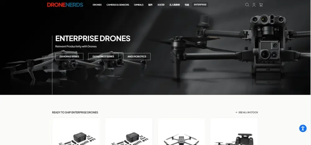
For websites with a large number of products, the collection page can easily become a simple product accumulation page.
Our design focused on transforming the collection page from a traditional product catalog into a more guided shopping experience.
Core optimization
The main optimization contents include:
- Use a clean and unified product grid layout
- Maintain consistent spacing and visual discipline between product cards
- Reduce unnecessary labels, badges and supporting information
Filtering and browsing experience
In terms of filtering functions, we did not add too many complicated options, but instead prioritized ensuring:
- Product classification is clear
- Product grouping is logical and reasonable
- Page content is easy to browse quickly
This allows users to find products that meet their needs faster and reduces resistance during the browsing process.
Design system: maintain consistency throughout the mall
An important task in this project is to establish a complete and unified website design system.
By unifying visual standards, we can ensure a consistent brand experience across homepage, product pages, collection pages, and other pages.
Font system
Fonts mainly follow the following principles:
- Use clean, modern sans-serif fonts
- Establish a clear hierarchy of titles and text
- Maintain consistent text spacing and reading rhythm
color strategy
The overall color is based on neutral colors:
- white
- gray
- black
Accent colors are only used sparingly in strategic locations, leaving more visual focus to the product itself rather than using too many decorative colors.
Component unification
We’ve further unified common components across the site, including:
- button
- product card
- Module spacing
- icon style
By unifying these foundational elements, the entire website can create a smoother, more professional, and consistent user experience across pages.