Around the folding hair dryer, we organized the structural control and travel scenarios into a set of English product pictures. The entire set of works adopts the visual language of rose gold products, white gray background, and orange airflow graphics. Through the division of labor in different pictures, the product appearance, local information and usage scenarios are gradually presented.
| Services | Industry | Platform |
|---|---|---|
| Amazon primary and secondary product images design | Beauty and personal care | Amazon |
| Project requirements | target market | design style |
| Structural control and travel scenarios | English content display | Rose gold product, white gray base, orange airflow graphics |
| Project quotation | Delivery content | Delivery time |
| ¥600 | 8 product primary and secondary product images | 4 days |
Design Challenge: Let different information have its place
The folding hair dryer needs to present the appearance, control method and travel storage at the same time. We first establish a clean product identification, and then supplement the information with structure, buttons and scene diagrams to avoid the entire set of pictures remaining in the portrait use screen.
Our design strategy
The rose gold body is used as a unified color anchor, and the technical diagram uses a white gray background and orange accent.
Separate the structural diagram, size reference, control instructions and life scenes to reduce the number of topics in one picture.
White background overview: let the body and accessories be recognized first
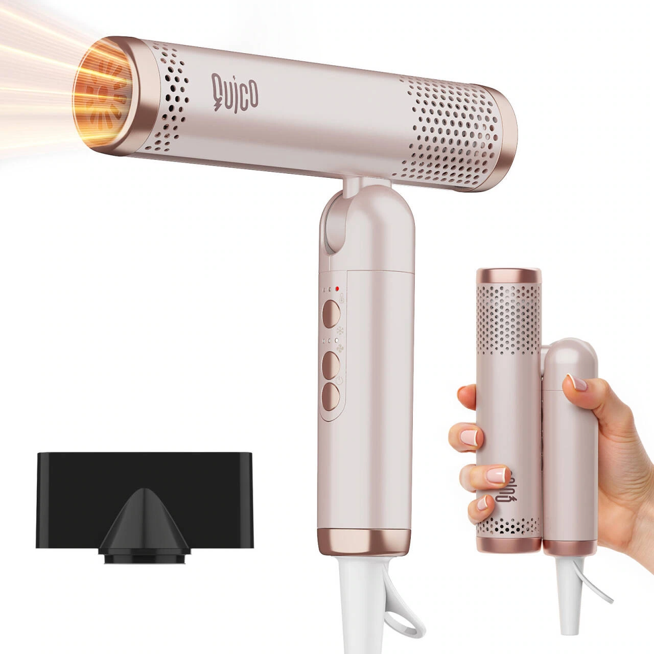
We zoom in on the fuselage on a white background and use the hand reference to explain the holding scale. The vent is presented separately from the main body, leaving enough space around it so that the rose gold outline can remain clear in the thumbnail.
Structural Breakdown: Using Airflow Directions to Create Hierarchy
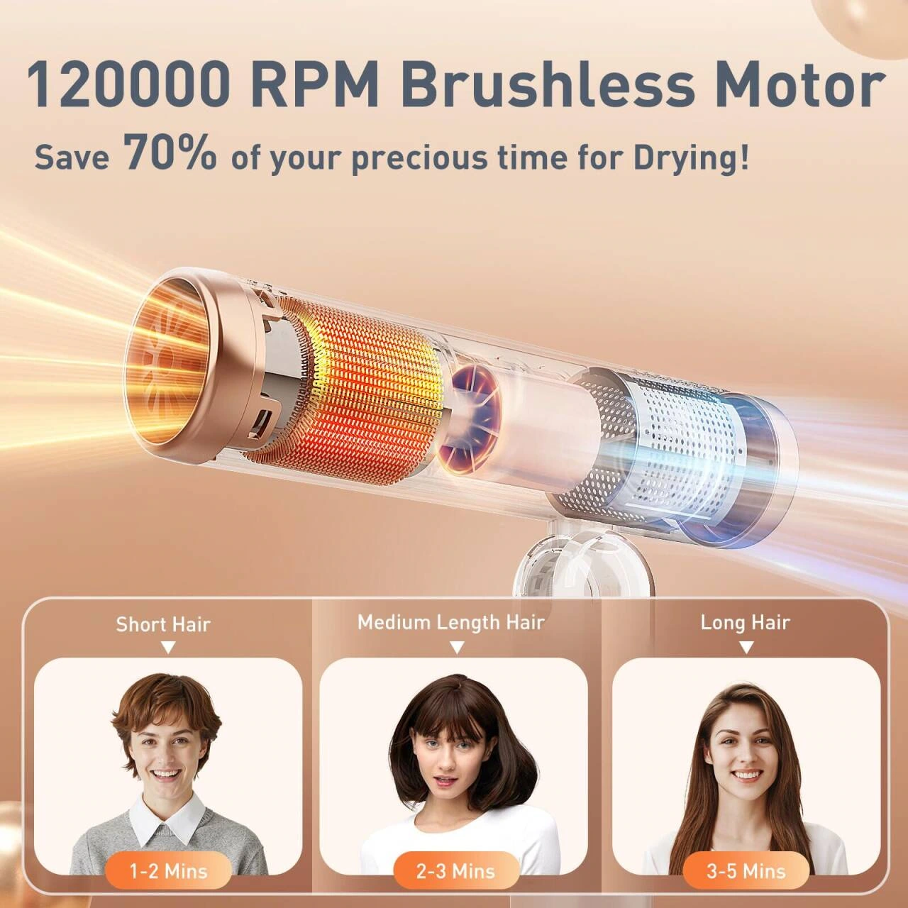
We placed the internal structure and orange airflow line in the main position, placed the bold number title at the top, and arranged three small cards of hair length below. Graphics, titles and supplementary information are organized into three layers, with structural descriptions not interrupted by photos of scenes.
Control instructions: Temperature and wind speed zone reading
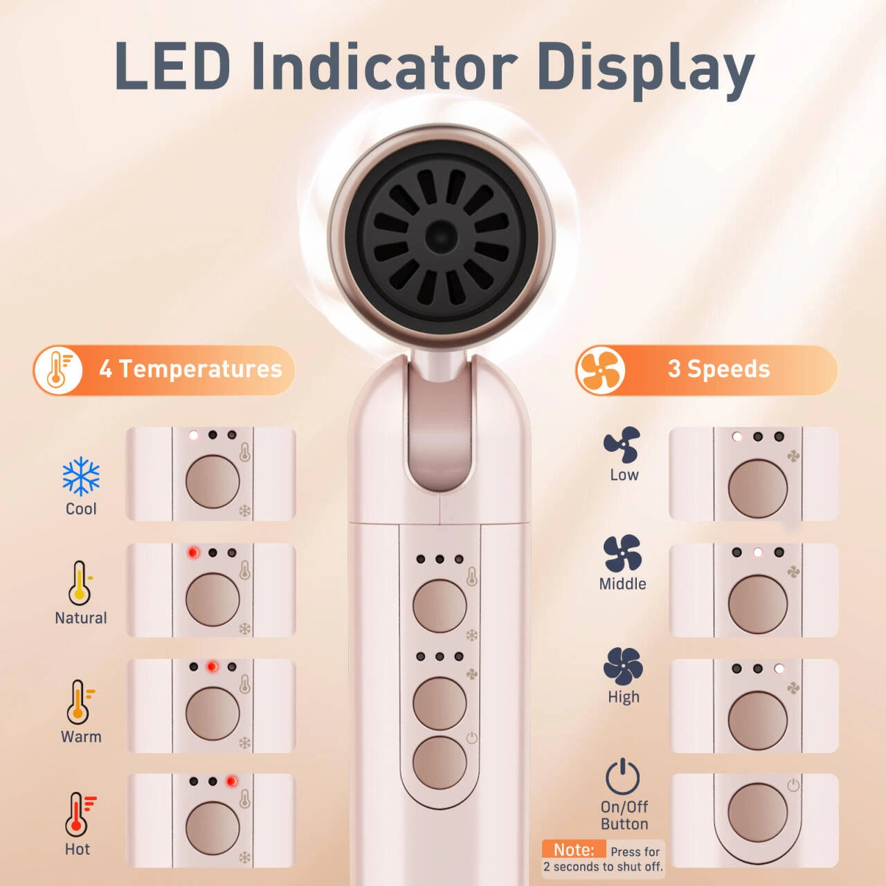
We use a close-up of the rear grille to establish product details, and the temperature and wind speed legends are divided into two columns below. The same size logos and neat line spacing help readers to correspond one by one without having to look for small letters scattered around the fuselage.
Folded size: use mobile phone to provide visual reference
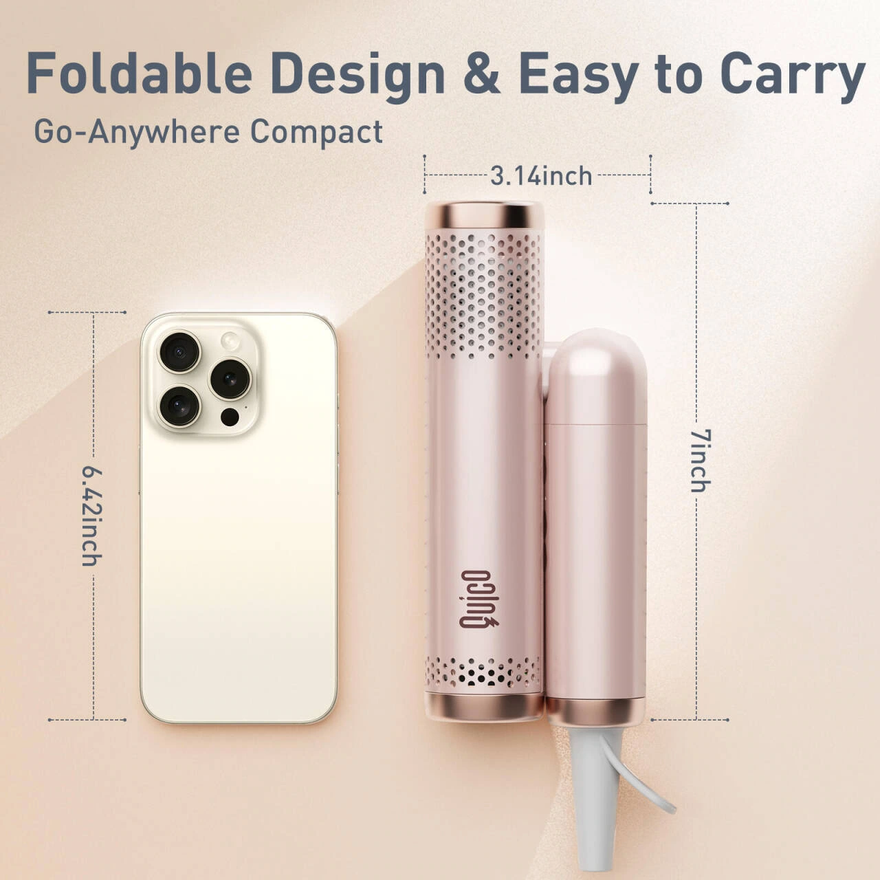
We put the folded state and the mobile phone on the same screen, and use dimension lines to supplement the directional relationship. With clear spacing between the subjects and a light base contrasting with the dark outlines, the theme of portability is expressed through the relationship of volumes.
Travel theme: combination of characters, scenes and maps
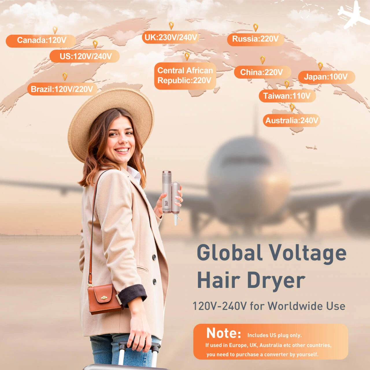
We use images of airport characters to create travel scenarios, and then use world maps and regional text to organize the voltage theme. The map is responsible for information indexing, and the characters are responsible for situations. The two are laid out separately to prevent background elements from weighing down the fuselage.
Curves and hair: visualizing technical themes
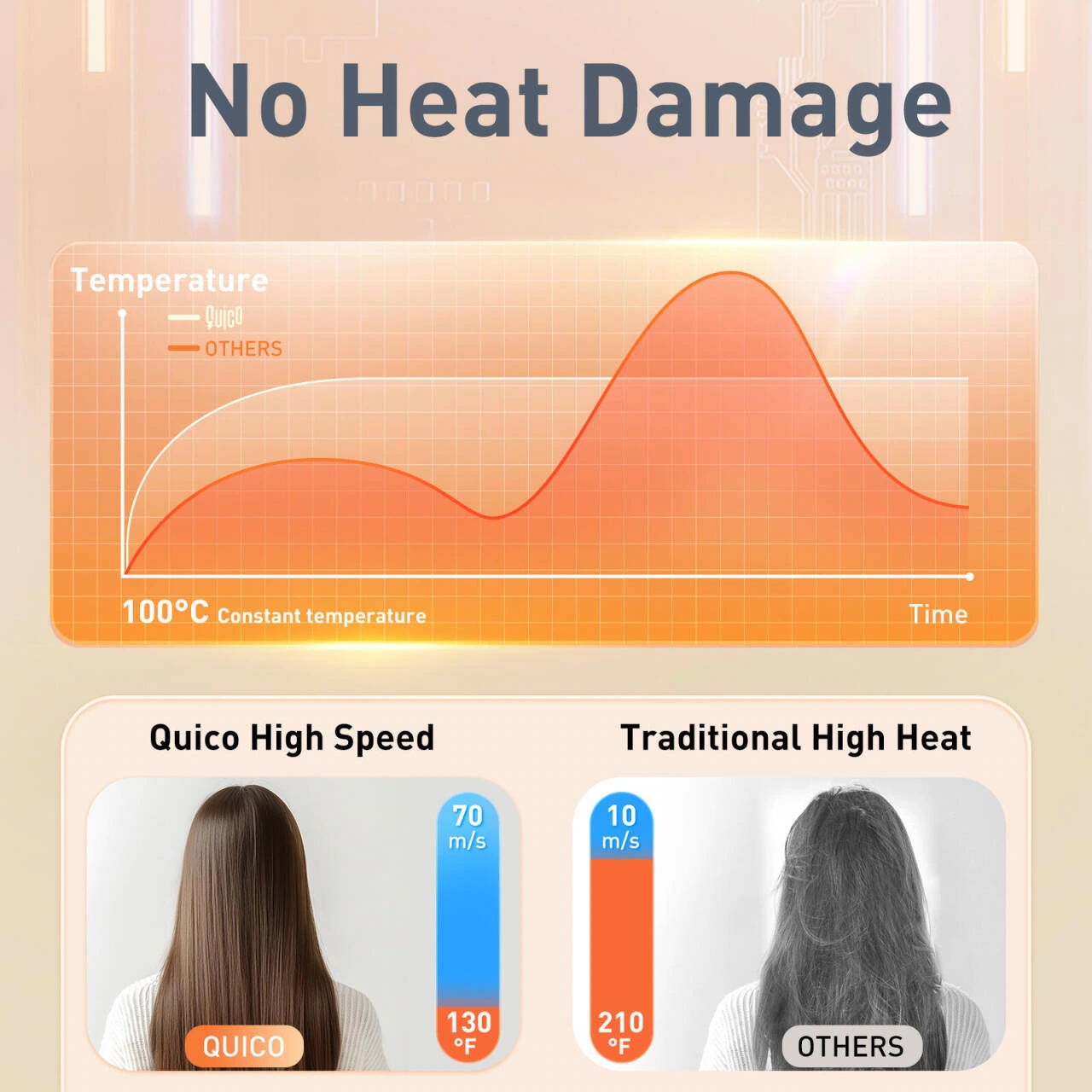
We place the temperature curve at the top and the hair picture as a control area at the bottom. Curved lines, photo borders, and captions each have space, making the reading of this image focus on information organization and visual comparison.
Use close-ups: transition from characters to local details

We combined the image of a woman blowing her hair with the enlargement of the hair, and used local frames to extract microscopic information from the photos of people. The light background and thin captions maintain a light feel and prevent detailed images from ruining the overall beauty.
Multi-scene combination: use cards to maintain a unified rhythm

We organized the character situations such as home and travel into divided pictures, and used the gift scene in the middle to connect the whole picture. The white space and photo proportions in each area echo each other, so that different backgrounds still belong to the same visual system.
Deliver and design value
This set of works contains a total of 8 product pictures. We arranged the responsibilities of different pictures around structural control and travel scenarios, and maintained the visual consistency of the entire set with rose gold products, white gray background, and orange airflow graphics. From overall identification to partial explanation, the pictures complement each other, allowing readers to find information based on their own concerns.
Develop a clear visual expression for your products
You can provide us with existing product information, physical photos and key points to be displayed. We will combine the product structure, style differences and usage scenarios to plan image content and layout suitable for Amazon product display.