


Giỏ hàng hiện không có sản phẩm nào.

In the highly competitive fitness category on Ozon, a main image does far more than display a product. It must instantly communicate strength, credibility, functionality, and emotional appeal—all within a single visual frame. When we designed the main image and supporting visuals for this exercise bike, our objective was clear: position the product as a powerful, reliable, and premium home fitness solution while maximizing click-through rate and conversion performance.
This article breaks down our design thinking behind each image, from the hero main image to the feature-focused supporting visuals. Every composition, color choice, and layout decision was intentional, engineered to stand out within Ozon’s marketplace ecosystem.
| Thời gian giao hàng | Loại | Nền tảng ứng dụng |
| 9 ngày | exercise bike | Ozon |
| Các nhà thiết kế tham gia | Trị giá | Tác dụng |
| Lin Zhang | $110 | Store traffic📈174% |
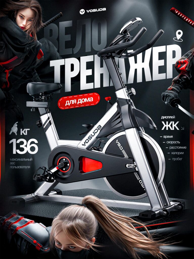
The first image is the primary Ozon main image, and it must perform three critical functions simultaneously:
We placed the exercise bike at the center of the composition with a slightly dynamic perspective to give it dimensional presence. Instead of presenting a flat side profile, we used depth and angled lighting to emphasize the bike’s structural strength and premium materials.
The dark, high-contrast background ensures the metallic frame and red accent details stand out sharply. On Ozon, users scroll quickly. A high-contrast image increases stopping power dramatically.
Red communicates intensity, strength, and action. In fitness equipment design, red signals performance and power. By integrating red highlights around the flywheel and graphic elements, we reinforced the idea that this exercise bike is built for serious training.
Red also creates urgency and improves click-through performance in marketplace environments.
We prominently displayed “136 kg maximum user weight.” This is not just a specification—it is a trust signal.
Consumers subconsciously associate higher weight capacity with:
By emphasizing this number, we increase perceived value and reduce purchase hesitation.
We visually separated the LCD display information to communicate smart tracking capabilities:
Fitness buyers want measurable results. By calling out these metrics directly on the main image, we eliminate uncertainty about performance tracking.
We incorporated stylized athletic figures around the composition to elevate the emotional tone. This approach transforms the product from “just a bike” into a symbol of training discipline and strength.
On Ozon, products that communicate lifestyle and aspiration outperform static catalog-style images.
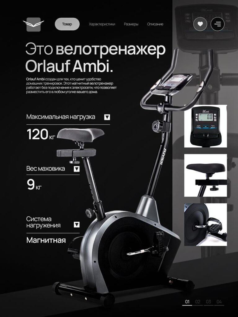
The second image shifts from emotional intensity to technical credibility.
Here, we introduce the product model more formally and focus on key performance data.
We used a minimal black background to create a premium, high-tech atmosphere. Dark backgrounds increase perceived product value, especially for fitness equipment.
This visual style positions the exercise bike closer to commercial-grade equipment rather than entry-level home fitness.
In this version, we highlight a 120 kg maximum load rating as part of the product specification presentation. The typography is large, clear, and intentionally spaced to feel authoritative.
We placed numeric values in oversized typography to draw immediate attention. Numbers convert.
Flywheel weight directly correlates with ride smoothness. Many buyers understand that heavier flywheels provide:
By clearly presenting the 9 kg flywheel specification, we communicate performance quality without needing long explanations.
We emphasized “Magnetic resistance” as a clean and silent technology feature.
Magnetic resistance suggests:
In apartment environments, noise reduction is a major buying factor. Highlighting magnetic resistance increases relevance for urban buyers.
On the right side, we included detailed close-up images of:
These inserts answer potential questions before the buyer scrolls further. When customers can visually inspect details, they feel more confident in build quality.
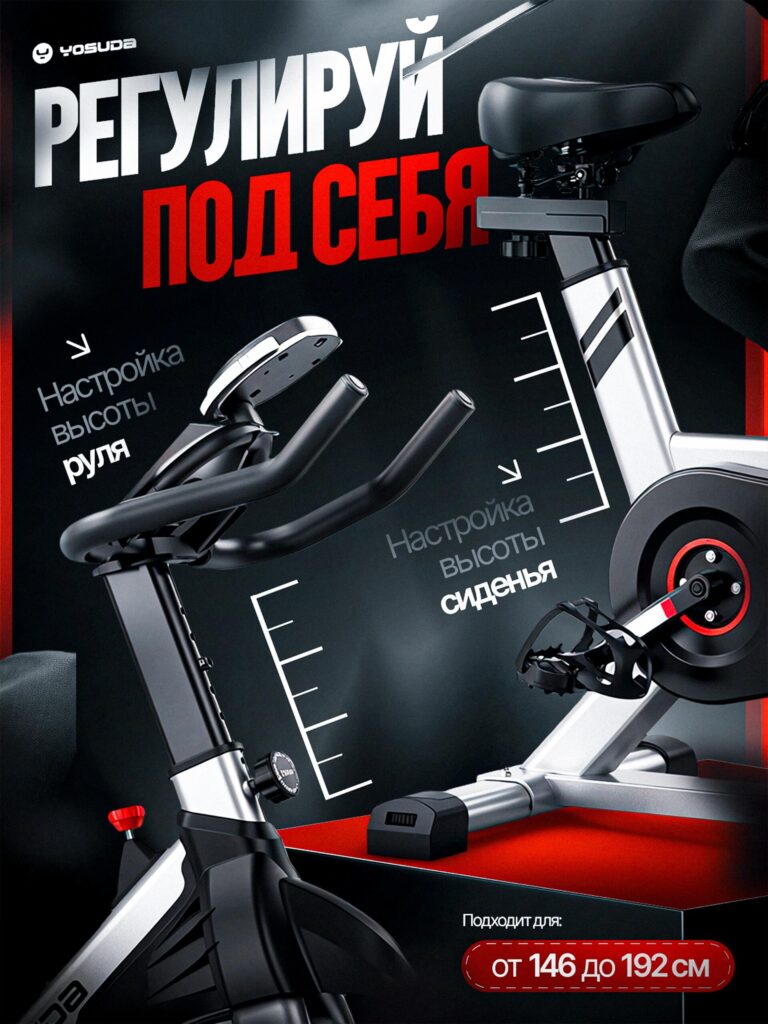
This image focuses entirely on adjustability and user fit.
One of the most important selling points of any exercise bike is how well it adapts to different body types.
The headline is bold and dynamic. Instead of describing adjustment in passive language, we use commanding typography that suggests control and personalization.
Consumers do not want fixed equipment. They want customizable comfort.
We visually marked the handlebar adjustment mechanism using measurement-style graphics. This transforms an invisible functional feature into a visible advantage.
Buyers immediately understand:
We used measurement indicators alongside the seat column to demonstrate adjustable range visually.
This removes ambiguity. Rather than saying “adjustable,” we show the adjustable scale.
We prominently display compatibility range (146–192 cm). This reduces pre-purchase anxiety.
When shoppers see their height range clearly listed, they feel included and validated as potential users.
From a conversion perspective, this reduces product page bounce rate caused by uncertainty.
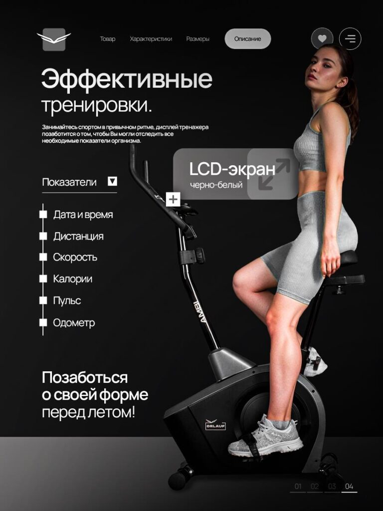
This image introduces human context to reinforce real-world usability.
Marketplace buyers want to visualize usage. A product shown alone feels abstract. A product shown in use feels attainable.
We positioned a fit female model on the exercise bike to communicate:
This transforms the product from object to experience.
The athletic body shape reinforces:
Fitness equipment is not purchased for its hardware. It is purchased for transformation.
We created a soft overlay callout to emphasize the LCD screen.
We visually suggest that tracking metrics is intuitive and accessible. The screen is positioned at eye level, which communicates ergonomic design.
The metrics list (time, distance, speed, calories, pulse, odometer) reinforces functionality again—but in a more lifestyle-oriented layout.
This pairing of emotional imagery with technical credibility creates balance.
Ozon is a visually competitive marketplace. To succeed, a main image must:
Our design follows a layered strategy:
This structured narrative guides buyers from attraction to assurance.
Every element was built around conversion psychology principles:
Instead of overwhelming users with long paragraphs, we turned specifications into visual anchors.
This improves readability and speeds decision-making.
The biggest challenge in fitness equipment marketing is differentiation. Many exercise bikes look similar.
To stand out, we:
This transforms the bike from a commodity into a statement piece.
It becomes not just equipment—but an investment in personal discipline and home performance.
Designing a set of outstanding Ozon main images for exercise bikes requires more than just aesthetic skills; it also requires an understanding of market behavior, buyer psychology, and conversion triggers.
Each image in this series was crafted to support a specific stage in the customer’s decision journey—from initial attention to final trust.
We approach every marketplace project with the same philosophy: strategic visuals convert better than decorative ones.
If you are building or optimizing your marketplace presence and want professional-level visual strategy, this is exactly the type of work we deliver at AIRSANG.


