


Giỏ hàng hiện không có sản phẩm nào.

Trong các thị trường có tính cạnh tranh cao như Ozon, customers make decisions within seconds. For professional tools such as leveling instruments, the main image must do far more than display the product — it must instantly communicate precision, durability, and real-world usability. Our design approach focuses on transforming complex technical features into clear, visually digestible information that builds trust and encourages clicks.
For this project, we created a complete main image system for a 16-line 4D green laser level, optimized specifically for Ozon’s visual standards and buyer behavior. Each image in the set plays a distinct role, guiding customers from first impression to feature understanding and finally to purchase confidence. Below, we break down the design logic behind every image and explain how each contributes to higher clarity, professionalism, and conversion.
| Thời gian giao hàng | Loại | Nền tảng ứng dụng |
| 7 ngày | Leveling instruments | Ozon |
| Các nhà thiết kế tham gia | Trị giá | Tác dụng |
| Nancy | $110 | Sales📈279% |
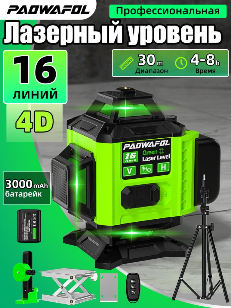
The first image serves as the core hero image for the Ozon listing. Our primary goal here was to establish authority and product value at a glance.
We positioned the leveling instrument at a three-quarter angle to reveal its full structure while avoiding visual clutter. This angle clearly shows the 4D design, reinforced housing, and multi-emitter layout — instantly signaling that this is a professional-grade tool, not a basic consumer gadget.
The green color palette was intentionally amplified. Green lasers are widely associated with superior visibility and accuracy, and we enhanced that perception by integrating subtle light flares and glow effects. These visual cues reinforce the idea of precision without overwhelming the product.
Key specifications such as “16 Lines,” “4D,” operating range, and working time appear in bold, high-contrast typography. We carefully controlled hierarchy so the product remains dominant while technical data supports it, rather than competing for attention. This structure ensures that even a quick glance delivers the product’s core value.
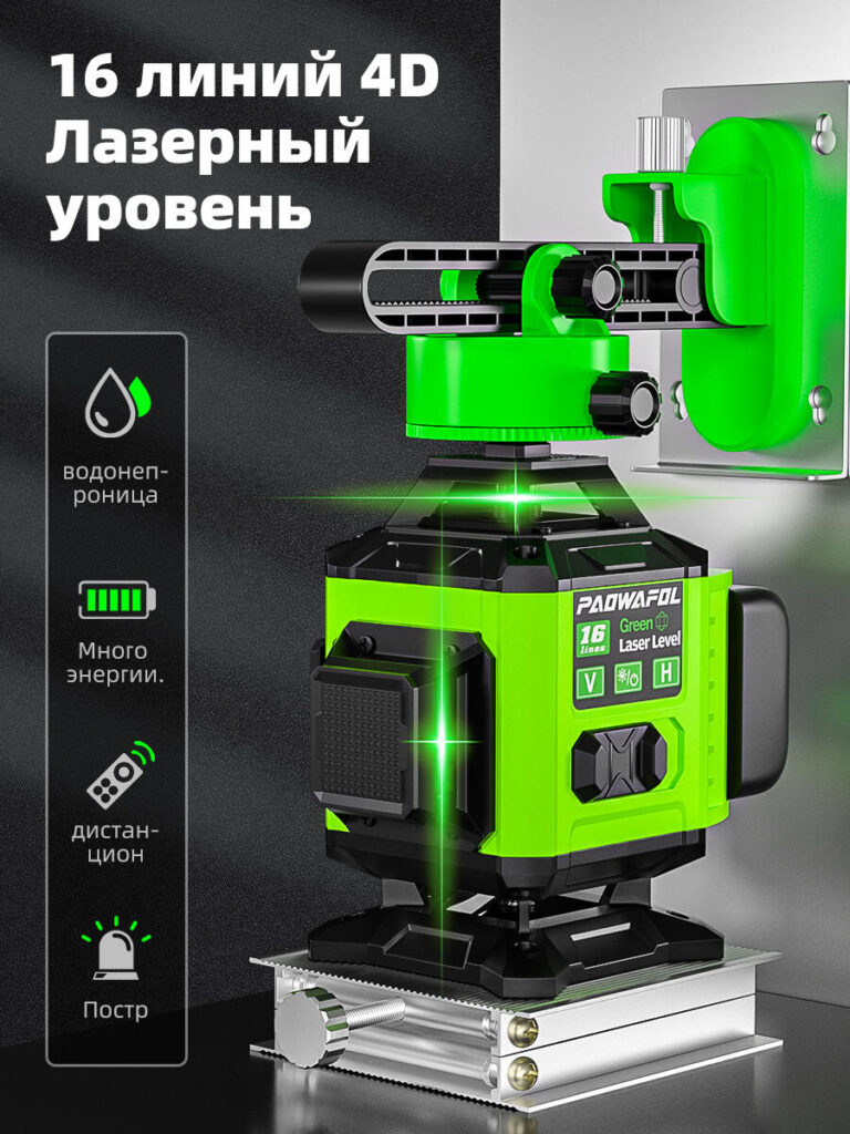
The second image shifts focus from branding to mechanical reliability. Leveling instruments are often judged by how stable and adjustable they are in real working environments, and this visual directly addresses that concern.
We showcased the laser level mounted securely on a precision adjustment base and wall bracket. This setup communicates versatility — the tool works equally well on floors, walls, and elevated surfaces. The close-up angle highlights adjustment knobs and rails, reinforcing fine-tuning capability.
The background remains neutral and industrial, keeping attention on the mechanics rather than aesthetics. Minimal text supports the image, allowing the hardware itself to tell the story. This approach resonates strongly with professional buyers who value function over decoration.
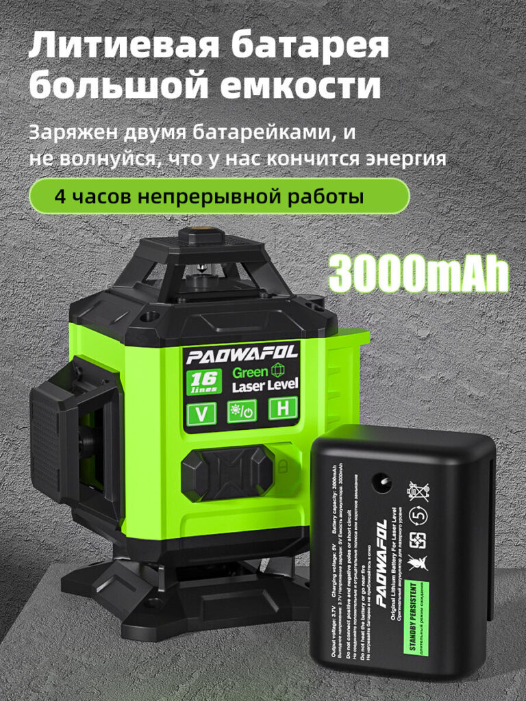
Power reliability is a major decision factor for professional tools. In this image, we isolated the battery system to make energy performance easy to understand.
We visually separated the lithium battery from the main unit while keeping both in frame. This design choice clearly communicates that the battery is removable and replaceable — a practical advantage for extended work sessions.
Text overlays highlight capacity and continuous working time using bold, rounded labels that contrast against the textured background. We avoided overly technical language and instead focused on real benefits: longer operation, less downtime, and higher efficiency on site.
The lighting emphasizes the battery’s solid construction, reinforcing durability and safety. This image reassures buyers that the tool is built for real work, not short demonstrations.
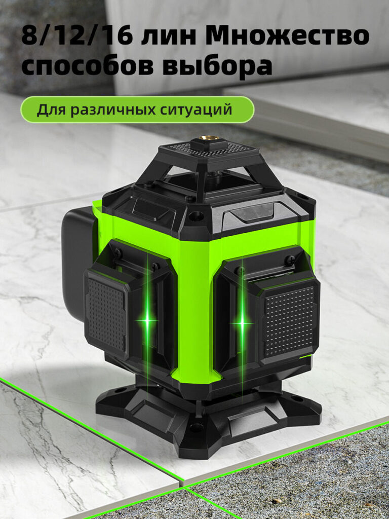
Professional users rarely need all laser lines at once. This image explains flexibility without requiring long descriptions.
We presented the laser level projecting multiple line configurations across tiled surfaces, clearly demonstrating selectable modes such as 8, 12, or 16 lines. The crossing green laser lines create a strong visual grid that instantly communicates accuracy and adaptability.
The environment was intentionally chosen to resemble common construction and renovation settings. This contextual background helps users imagine real applications such as tile alignment, wall leveling, and layout marking.
By pairing simple text with strong visual geometry, this image transforms a complex feature into an instantly understandable benefit.
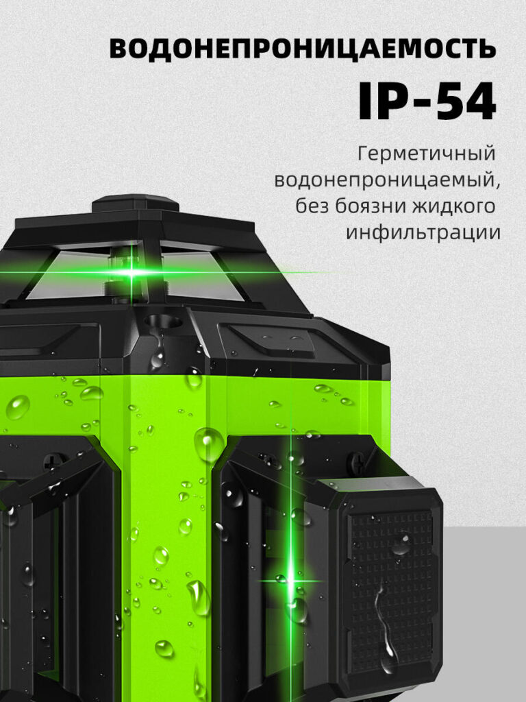
Durability is critical for tools used in unpredictable environments. This image focuses entirely on environmental resistance.
We introduced water droplets directly on the product surface to visually represent IP54 protection. Rather than relying on icons alone, the physical presence of moisture creates immediate trust and realism.
The lighting highlights seals, casing joints, and surface texture, subtly reinforcing build quality. Text placement remains minimal and confident, ensuring the message feels factual rather than exaggerated.
This image reassures buyers that the leveling instrument can handle dust, splashes, and daily jobsite conditions without compromise.
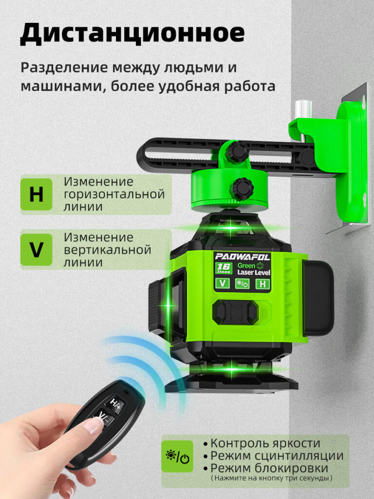
Ease of operation often separates premium tools from average ones. In this image, we emphasized user convenience and precision control.
We included a hand-held remote in the foreground while keeping the laser level active in the background. This composition visually connects human interaction with machine response.
Icons and labels explain horizontal and vertical adjustments in a clear, modular layout. We avoided dense paragraphs and instead used structured blocks to guide the eye naturally from control to result.
This image appeals strongly to professional users who value efficiency, especially when working alone or adjusting alignment from a distance.
Ozon buyers expect clarity, professionalism, and transparency. Our design strategy aligns perfectly with those expectations by:
Each image serves a specific purpose while contributing to a cohesive system. Together, they guide the buyer from awareness to understanding and finally to confidence.
Một thành công Ozon main image design is not about visual decoration — it is about communication. For leveling instruments, clarity equals trust, and trust drives conversion.
By translating engineering features into intuitive visuals, this image set ensures that buyers understand not only what the product is, but why it deserves their attention. This approach turns a technical tool into a compelling, professional solution that stands out in crowded search results.
This is exactly how we approach conversion-focused product visuals for cross-border marketplaces at AIRSANG.


