


Giỏ hàng hiện không có sản phẩm nào.

A great Shopify storefront does more than display products. It shapes emotion, guides attention, and turns a brand story into a shopping experience people can feel. That was the design challenge behind Vivinook: create a homepage that communicates calm, symbolism, craftsmanship, and gift value while still supporting product discovery and purchase intent. The live site combines jewelry, incense-related storytelling, category-led navigation, a ritual-inspired aesthetic, and multiple trust-building sections that frame the brand as both personal and giftable.
For this project, the goal was not to make the website louder or more crowded. It was the opposite. We needed to design a Shopify experience that felt quiet, intentional, and emotionally resonant. Vivinook sells more than accessories. Its homepage language centers on meaning, harmony, protection, balance, confidence, handcrafted creation, and a sanctuary-like feeling. That kind of positioning requires strong visual restraint, cohesive page flow, and a design system that supports mood as much as merchandise.
This article explains how we approached the page design, what problems we solved, the thinking behind the structure, and why thoughtful Shopify design played such an important role in shaping the final result. It also shows how strategic ecommerce design can help a niche lifestyle brand look more premium, feel more trustworthy, and become easier to shop without relying on technical complexity.
When we reviewed Vivinook, one thing stood out immediately: the brand was not presenting its products as ordinary fashion items. The site grouped its offer around bracelets, necklaces, earrings, incense sticks, and collections, while the homepage copy emphasized meaning, intention, gifting, inner peace, and ritual. That told us the design needed to do two jobs at once. First, it had to support ecommerce clarity. Second, it had to preserve a softer brand world built around serenity and symbolism.
A standard product-grid-first homepage would have undersold the brand. If everything felt too transactional, the emotional promise would disappear. On the other hand, if we pushed the site too far into storytelling without structure, the shopping journey would become vague. So our design strategy centered on balance: build a calm editorial-style layout that still keeps products visible, categories recognizable, and calls to action easy to find.
The visual cues on the site already suggested the right direction: warm beige tones, parchment-like textures, soft photography, handmade details, and earthy product imagery. We leaned into that sensory mood because it matched the brand message. Instead of using a slick luxury ecommerce style with sharp contrast and heavy UI elements, we favored a softer presentation that made the products feel spiritual, tactile, and giftable.
That choice influenced everything from spacing and image hierarchy to section rhythm and content sequencing. The design had to feel natural and ceremonial, not aggressive. Every section needed enough breathing room to let the imagery and message settle. That is especially important for brands that sell emotion, ritual, or lifestyle identity rather than pure utility.
Before shaping the page, we defined a clear set of design goals.
The hero section had to immediately communicate atmosphere. Vivinook’s opening message speaks to meaning in daily life and introduces an aspirational lifestyle visual rather than a hard-sell product pitch. That told us the homepage needed to lead with emotion first, then guide visitors into collections and product discovery.
The site includes a four-step custom process: choosing intention, selecting materials, handcrafted creation, and delivery. We recognized this as a major design opportunity. Instead of leaving customization as a vague concept, the homepage could visually explain how the brand works. Good design reduces uncertainty, and in this case, process storytelling helped make the offer feel personal and credible.
Vivinook explicitly frames its bracelets as meaningful gifts. That meant the design had to support emotional purchase triggers such as care, symbolism, and occasion-based shopping. We needed to create sections that felt generous and heartfelt, not merely decorative.
The homepage includes featured products, themed product groupings, a brand story, customer testimonials, and multiple calls to action. Our role as designers was to connect these moments in a way that feels seamless. A shopper should never feel lost between inspiration and action.
We began by asking a simple question: what does a customer need to feel before purchasing from a brand like this? With a product rooted in symbolism and lifestyle, shoppers often need more than price and photos. They need emotional clarity. They want to know what the product represents, whether it suits gifting, how it is made, and what kind of experience the brand promises.
That insight shaped the homepage architecture. We knew the site should not jump directly from banner to dense product listings. It needed a progression: emotional entry, curated highlights, gifting context, custom process explanation, thematic categorization, founder-style story cues, customer reassurance, and then footer-level trust signals.
The strongest Shopify homepages often feel like guided journeys. For Vivinook, we designed the narrative in stages.
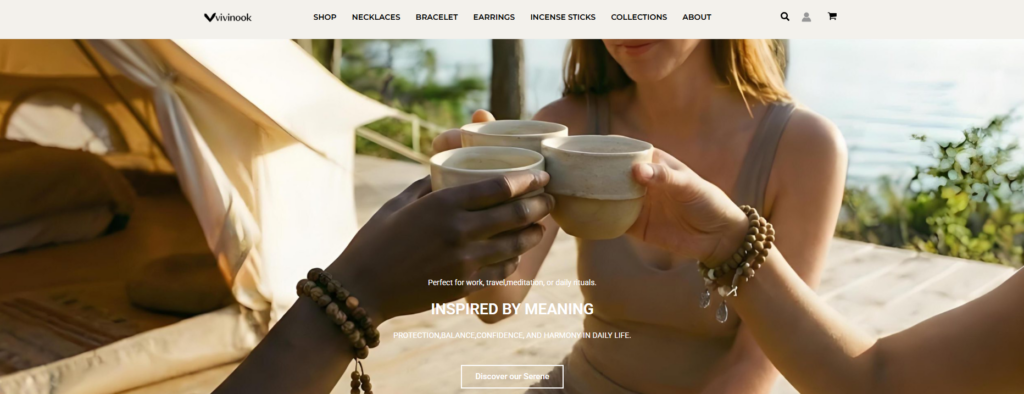
The hero image and copy establish an aspirational lifestyle feeling. This is where shoppers first understand that the brand sits at the intersection of adornment, calm, and daily ritual. The aim is not just to impress visually. It is to tell the shopper, “This is what life with this brand feels like.”
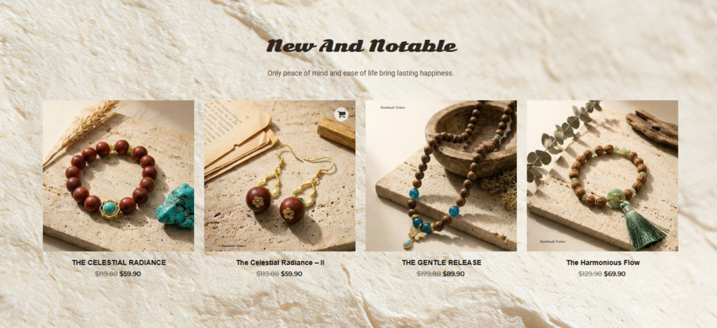
After the hero, the “New and notable” section introduces featured items. This transition matters. It prevents the homepage from becoming purely atmospheric. Once the emotional tone is set, products appear early enough to maintain commercial clarity.
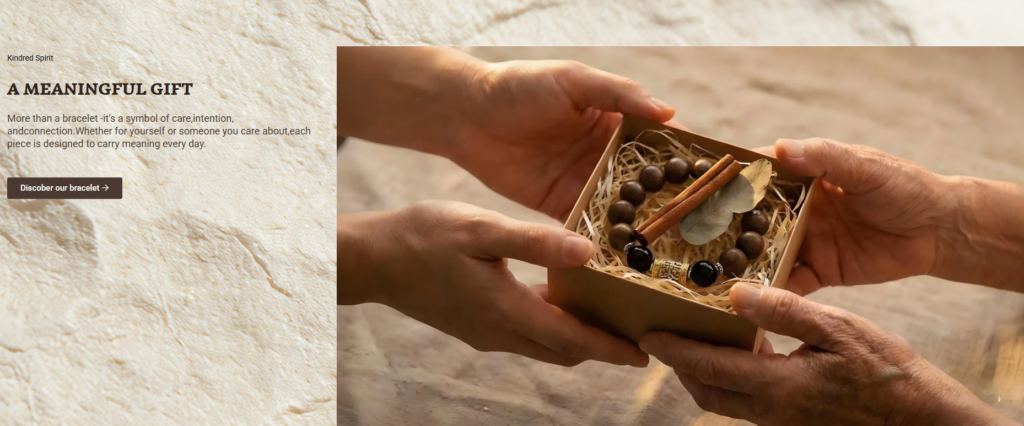
The “A Meaningful Gift” section shifts the framing from shopping to intention. That move helps expand the customer’s reason to buy. Instead of asking only, “Do I like this bracelet?” the page encourages, “Who is this for, and what does it symbolize?”
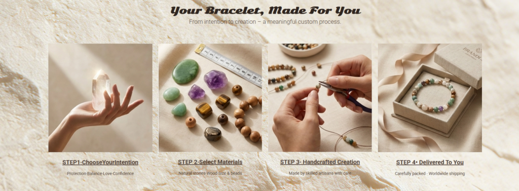
The four-step customization area is one of the homepage’s most valuable design components. We used it to translate the brand promise into a clear visual sequence. Process design is especially effective for products that are personal, handcrafted, or made-to-order because it adds perceived value and reduces hesitation.
The scent-related section and the brand story area deepen the world around the products. Categories such as inner peace, vitality boost, deep sleep ritual, and skin radiance add emotional vocabulary to the storefront. They help customers browse by desired feeling, not just by product type.
The testimonials and story-led imagery work together to make the brand feel more human. In design terms, this prevents the page from reading like a flat catalog. Instead, it feels like a brand with memory, ritual, and user connection.
Vivinook is not a one-note storefront. The navigation and homepage reveal a mix of jewelry categories and incense-related language. That creates a brand complexity that can easily become confusing if the page lacks cohesion.
Our solution was to unify everything through mood rather than through product mechanics. Instead of forcing the site to explain every category in a technical way, we used visual consistency, copy flow, and thematic grouping to create one emotional universe. Jewelry, scent, gifting, and ritual all felt part of the same story.
Story-driven brands often try to say too much on the homepage. They add history, product features, customer benefits, trust messaging, and collections all at once. The result is clutter. We wanted to avoid that.
So we treated each section as a clear design chapter. The visual texture remained consistent, but the content purpose changed from block to block. One section inspired. Another showcased products. Another educated. Another reassured. This structure allowed the homepage to feel rich without becoming noisy.
Minimal, elegant design can sometimes hide the buying journey. We addressed that by making sure each emotional section still pointed toward action. Calls to action such as discovering bracelets, shopping new arrivals, or learning about the brand were placed in ways that felt natural rather than pushy.
This is one of the most important skills in Shopify design: preserving the brand mood while still supporting the flow toward purchase.
We created a unified visual rhythm around warm neutrals, natural textures, artisan-style photography, and generous white space. This gave the storefront a recognizable identity across product grids, editorial sections, and story blocks. Because the brand message centers on calm and symbolism, the soft visual language helped reinforce trust and consistency.
Rather than isolating product cards as purely commercial elements, we positioned them inside a broader emotional environment. That is why the featured products feel connected to the surrounding narrative. Customers are not just browsing items. They are browsing meanings, occasions, and moods.
One reason the homepage feels memorable is that it does not look like a generic template filled with interchangeable widgets. The sections are staged with editorial intention. Large imagery breaks up product-heavy moments. Supporting copy introduces emotional context. Process visuals create educational clarity. Story sections slow the pace in a deliberate way.
This kind of page choreography is where strong design creates value. It changes the site from a storefront into a branded experience.
The brand story section, customer reviews, handcrafted imagery, and footer content all contribute to perceived credibility. For niche product categories, trust often comes from emotional specificity. When a brand feels thoughtful and consistent, customers are more likely to believe in its product quality and intention. Vivinook’s site uses this principle effectively through narrative-led design.
Many brands think Shopify success comes from simply choosing a theme and adding products. In reality, the strongest stores succeed because they understand visual hierarchy, content sequencing, emotional positioning, and user attention. Design determines what people notice first, how they interpret the brand, and whether they continue scrolling.
Vì Vivinook, the design work mattered because the products rely heavily on feeling and meaning. Without strong page design, the brand could have looked generic or unclear. With the right design structure, the same products feel elevated, giftable, and distinct.
A customer who quickly understands the brand, the offer, the emotional value, and the purchase path is more likely to stay engaged. The four-step custom process, curated product sections, and themed browsing areas all reduce uncertainty through design. They answer questions visually before the customer has to ask them.
Design also affects how customers judge price, craftsmanship, and quality. A handmade bracelet displayed in a disorganized layout feels less valuable than that same bracelet presented in a calm, premium, story-rich environment. This is why design is not just an aesthetic layer. It is part of the product perception itself.
The finished direction supports the emotional identity of Vivinook while keeping the shopping experience clear. The homepage now reads as a connected brand world rather than a series of unrelated ecommerce blocks. Hero imagery, product highlights, gift-led messaging, customization steps, story moments, and social proof all support the same brand impression.
In a crowded ecommerce space, many jewelry websites look interchangeable. Vivinook stands apart by leaning into ritual, symbolism, and serenity. Our design approach strengthened that differentiation rather than diluting it. Instead of copying mainstream jewelry storefront conventions, we helped shape a more distinctive visual identity.
Most importantly, the site does not force customers to choose between inspiration and usability. It gives them both. They can connect with the message, understand the process, explore featured pieces, and move toward purchase in one cohesive experience. That balance is exactly what strong Shopify design should accomplish.
Designing the Vivinook Shopify website was about translating emotion into structure. We shaped a storefront that feels calm, intentional, and premium while still supporting product discovery, gifting behavior, and brand trust. From the hero section to the product highlights, from the customization story to the testimonials, every part of the page was built to strengthen the connection between visual identity and ecommerce performance.
This kind of work reflects the way AIRSANG approaches Shopify design: not as code-first execution, but as brand-led visual strategy. We help ecommerce businesses create pages that look cohesive, feel meaningful, and support real customer engagement through design thinking, layout planning, content hierarchy, and conversion-aware storytelling. For brands that want a Shopify store with stronger visual identity and a more intentional shopping experience, this is exactly the kind of service AIRSANG is built to provide.


