


Giỏ hàng hiện không có sản phẩm nào.

In today’s competitive beauty eCommerce landscape, a website must do more than just display products—it needs to tell a story, build trust, and guide users toward confident purchase decisions. For wig brands in particular, visual clarity, lifestyle relevance, and intuitive navigation are critical to success.
This case study explores how we designed a Shopify-based experience for CurlyMe—a fast-growing wig brand focused on style, versatility, and accessibility. Our goal was to transform their online presence into a conversion-driven platform that balances aesthetic appeal with seamless usability.
Rather than focusing on technical implementation, this article highlights our design strategy, creative direction, and the thinking behind every visual and structural decision.
| Thời gian giao hàng | Loại | Nền tảng ứng dụng |
| 24 ngày | tóc giả | shopify |
| Các nhà thiết kế tham gia | Trị giá | Tác dụng |
| Nancy | $2600 | Turnover📈254% |
Wigs are inherently experiential products. Customers want to understand texture, volume, fit, and real-life appearance before making a purchase. Unlike standardized products, wigs require:
Vì CurlyMe, the challenge was to elevate their brand from a product catalog into a style destination.
CurlyMe targets a global audience of fashion-conscious women who value:
Our design needed to reflect energy, diversity, and self-expression, while maintaining clarity and usability.
We defined three primary goals:
Create a visually engaging homepage that instantly communicates brand identity.
Make it easy for users to find the right wig through intuitive navigation.
Use social proof, clear messaging, and visual validation to increase conversions.
Our approach was rooted in three principles:
This allowed us to design not just a website—but a guided shopping experience.
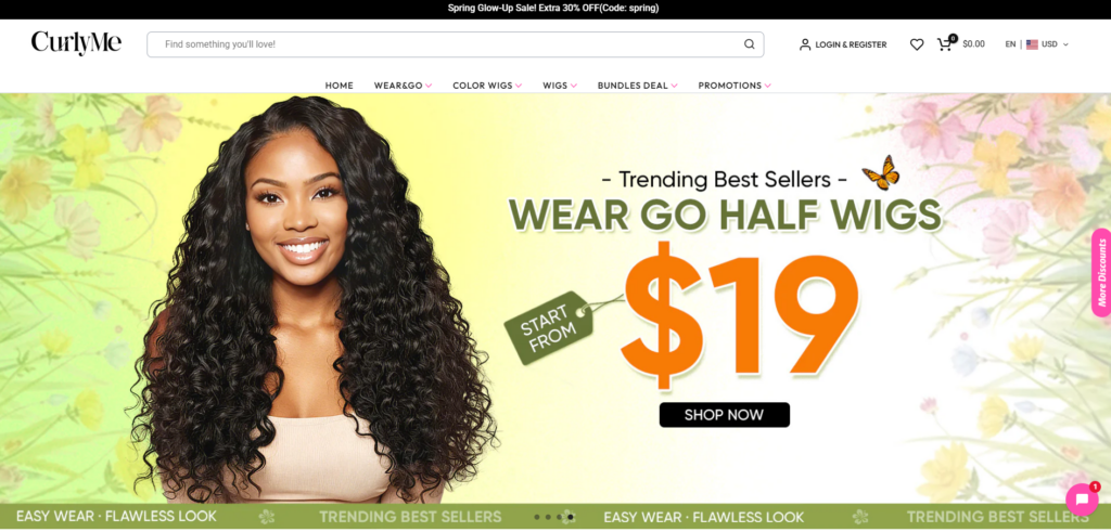
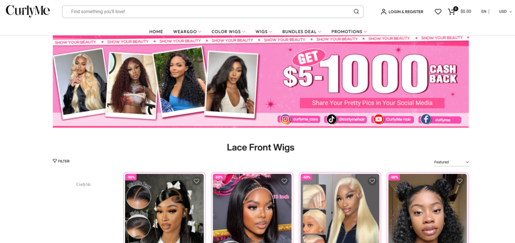
The hero section serves as the emotional entry point. We designed it to:
This ensures users instantly understand the brand’s value proposition.
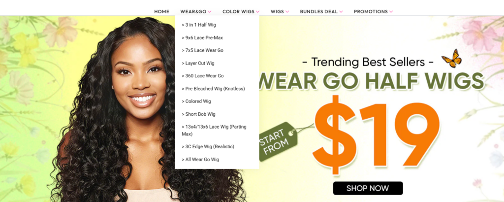
Instead of overwhelming users with too many options, we structured navigation around how customers actually shop:
This reduces friction and shortens the path to purchase.
We implemented a clean but dynamic layout:
The goal was to guide users naturally from exploration to action.
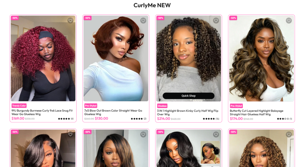
We prioritized diverse image types:
This helps users “experience” the product digitally.
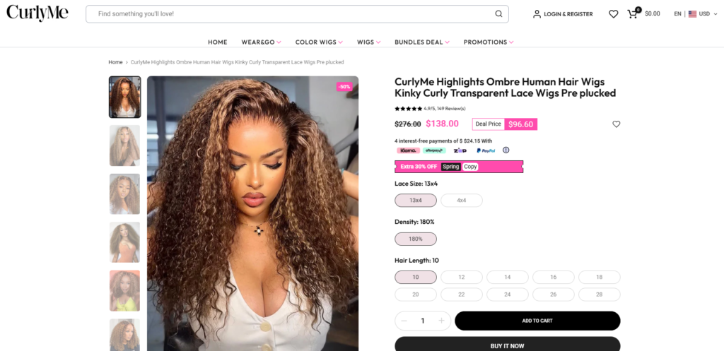
Instead of overwhelming users, we structured product information into digestible sections:
This reduces cognitive load and increases confidence.
We designed CTAs to be:
This ensures users always know the next step.
Collection pages were designed to function as curated galleries:
This allows users to browse efficiently.
One of the most impactful design decisions was integrating Instagram-style content:
This transforms the site from a store into a community-driven experience.
We strategically placed trust signals across the site:
These elements reduce hesitation and improve conversion rates.
We analyzed:
This informed our design direction.
We mapped out:
This ensured logical structure before visual design.
Chúng tôi tập trung vào:
Every element was designed to support clarity and engagement.
We continuously refined:
This iterative approach ensured optimal results.
Many wigs look similar at first glance.
Giải pháp:
We emphasized differentiation through:
New users often hesitate.
Giải pháp:
We integrated:
Too much design can hurt usability.
Giải pháp:
We maintained:
The redesigned experience delivered:
More importantly, it positioned CurlyMe as a modern, lifestyle-driven beauty brand, not just a wig retailer.
An effective Shopify wig store design focuses on strong visual storytelling, clear product categorization, and user-friendly navigation. High-quality lifestyle images, detailed product visuals, and trust-building elements like reviews and FAQs help customers make confident purchase decisions.
Design improves conversion rates by reducing friction and guiding users toward key actions. Clear layouts, prominent call-to-action buttons, and intuitive navigation make it easier for customers to find products and complete purchases, increasing overall sales performance.
Visual storytelling helps customers understand how products look and perform in real life. For wig stores, showing different styles, textures, and real-user scenarios builds trust and emotional connection, which directly impacts buying decisions.
A high-converting Shopify product page includes multiple product images, clear benefit highlights, concise descriptions, customer reviews, and easy-to-find purchase buttons. These elements work together to reduce uncertainty and encourage faster decision-making.
This project reinforces a key principle:
Great design is not decoration—it is a conversion tool.
Một cửa hàng Shopify được thiết kế tốt:
And ultimately, it drives sales.
Designing for a beauty-focused Shopify store requires more than aesthetics—it demands a deep understanding of user psychology, product presentation, and brand storytelling.
Through strategic layout planning, visual storytelling, and user-centered thinking, we transformed CurlyMe’s website into a high-performing eCommerce experience.
Tại AIRSANG, we specialize in creating design-driven Shopify experiences for cross-border brands—helping businesses turn their websites into powerful sales engines through thoughtful, conversion-focused design.


