


Giỏ hàng hiện không có sản phẩm nào.

A fine jewelry website needs to do more than display beautiful products. It must create emotion, build trust, guide shoppers through meaningful decisions, and make high-value purchases feel personal and secure. For La More Design, the page design needed to reflect the romance of engagement rings, wedding bands, bridal sets, and handcrafted jewelry while still supporting a clean, intuitive Shopify shopping journey.
La More Design presents a highly visual jewelry catalog with categories such as bridal sets, engagement rings, women’s wedding bands, men’s wedding bands, ready-to-ship rings, and one-of-a-kind pieces. The brand also highlights ethical craftsmanship, handcrafted jewelry in the USA, showroom appointments, financing options, and thousands of customer reviews, which gave the design direction a strong foundation for both emotion and conversion.
Our design work focused on shaping this Shopify website into a refined, romantic, and conversion-friendly online experience. Instead of treating the site as a simple product catalog, we approached it as a digital jewelry showroom where every page needed to support discovery, confidence, and purchase intent.
| Thời gian giao hàng | Loại | Nền tảng ứng dụng |
| 19 ngày | Jewelry | shopify |
| Các nhà thiết kế tham gia | Trị giá | Tác dụng |
| Nancy | $1600 | Sales📈214% |
La More Design operates in the fine jewelry and bridal jewelry market, where customers often compare styles carefully before making a decision. The website needed to feel elegant, trustworthy, emotional, and easy to browse.
The project was designed around Shopify, which made the visual shopping experience especially important. Since Shopify stores rely heavily on product presentation, collection organization, mobile usability, and clear calls to action, the design needed to help customers move smoothly from inspiration to product detail pages and checkout.
The main goal was to create a page design system that could support:
The homepage needed to introduce the brand mood quickly, highlight key collections, and encourage shoppers to explore.
Jewelry shoppers often begin by browsing categories. Clear collection cards and visual hierarchy helped customers understand where to go next.
Because engagement rings and bridal jewelry are high-consideration purchases, the design needed to support trust, product education, and emotional reassurance.
The homepage, collection pages, showroom page, testimonials page, financing page, and contact page all needed to feel connected under one visual language.
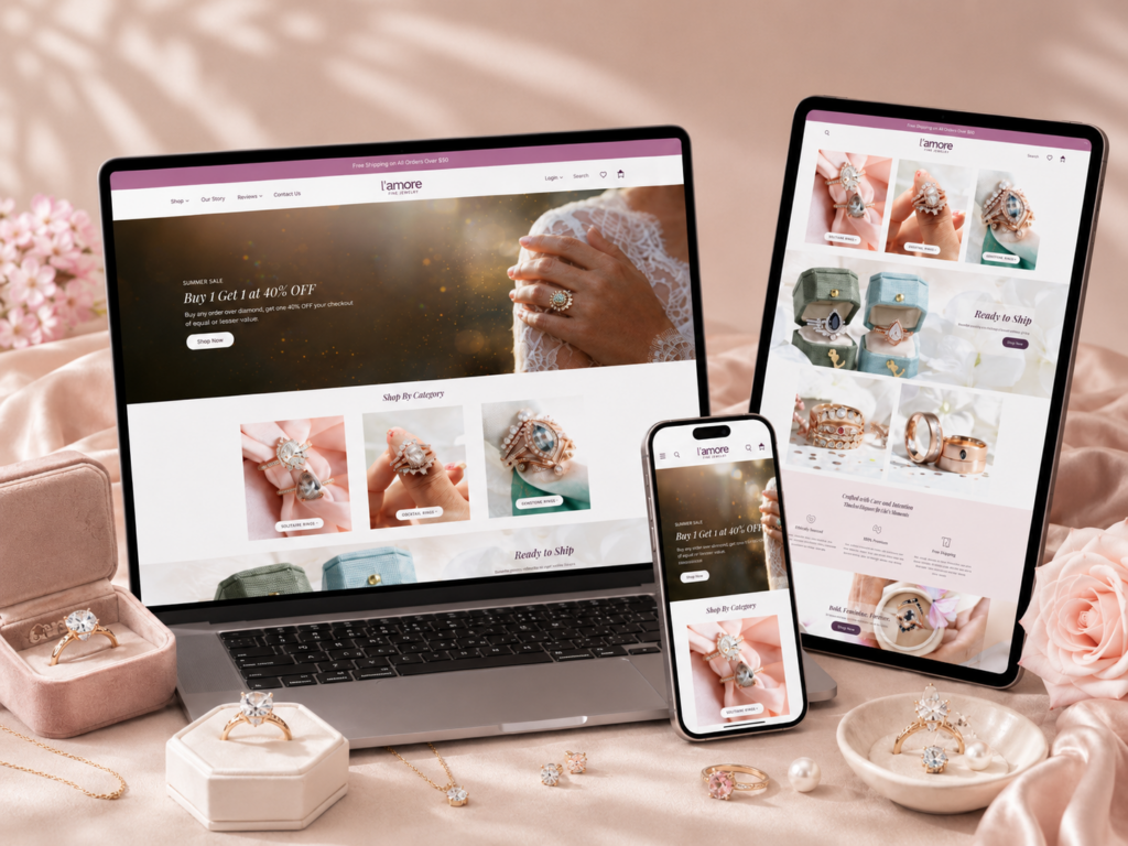
The homepage needed to immediately communicate romance, craftsmanship, and elegance. Jewelry shoppers are not only buying a product; they are choosing a symbol of love, commitment, and personal style. The design had to support that emotional decision.
We used a soft, polished visual direction that allowed the jewelry photography to lead. Instead of overcrowding the page with heavy graphics, the design emphasized space, imagery, and clear calls to action. This helped the homepage feel refined rather than commercial.
La More Design offers many product types, including engagement rings, bridal sets, wedding bands, ready-to-ship jewelry, and one-of-a-kind rings. A major design goal was to make these categories easy to understand.
The homepage structure needed to work like a guided shopping path. Customers should be able to arrive on the site and quickly choose whether they want to browse engagement rings, wedding bands, bridal sets, or inspiration-based collections.
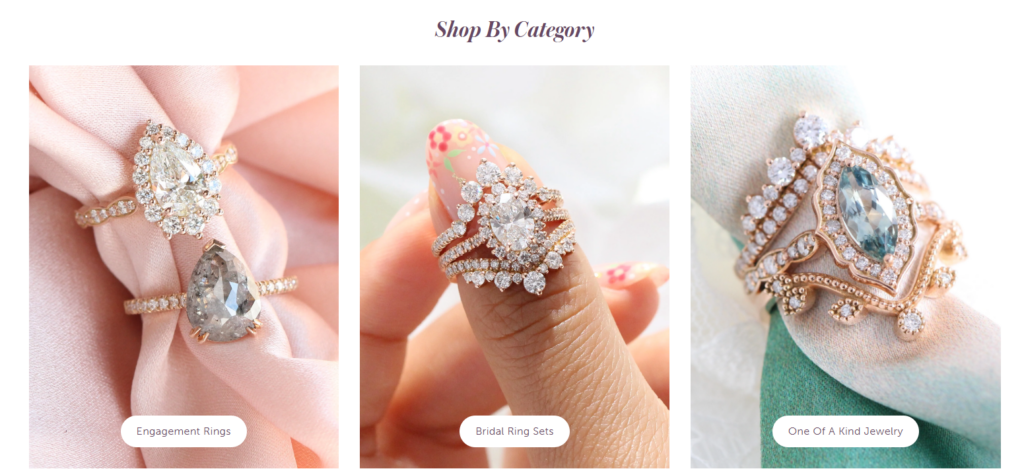
Fine jewelry shoppers need reassurance before they buy. They want to know the products are crafted with care, the brand is reliable, and support is available if they have questions.
The website already communicates important trust signals, including ethical craftsmanship, U.S. handcrafting, showroom appointments, financing options, insured shipping, and strong customer reviews. Our design approach placed these messages into a clearer visual flow so they could support the shopping journey naturally.
A jewelry website must avoid looking generic. The page design needed to feel custom, elegant, and emotionally aligned with the brand. Even though the project focused on Shopify design rather than deep custom development, the final experience still needed to feel thoughtful and brand-specific.
The homepage became the strongest entry point for the brand. We treated it as a curated journey rather than a static landing page.
The hero area needed to create instant attraction. A bridal-inspired visual direction helped introduce the brand’s romantic identity, while a direct call to action encouraged shoppers to begin browsing.
The homepage also promotes seasonal shopping moments, such as wedding sale messaging and collection highlights, which made the top of the page more action-oriented while still keeping the design elegant.
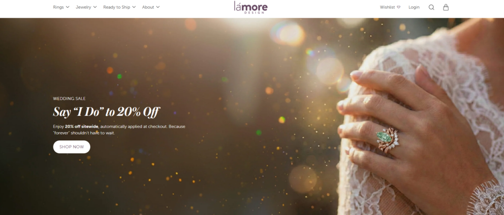
The category section played a key role in improving navigation. Large visual cards made the experience more intuitive because customers could browse by product type rather than relying only on menu links.
For a jewelry brand, category cards are especially important. A shopper may not know the exact ring name they want, but they can quickly recognize “engagement rings,” “bridal sets,” or “wedding bands” through strong imagery.
We designed the page flow to introduce different product worlds. Instead of showing every item at once, the homepage could guide customers through selected collections, favorites, new arrivals, or style-based categories.
This approach helped reduce decision fatigue and made the store feel more curated.
Jewelry products require careful visual hierarchy because details matter. Rings, gemstones, bands, and settings all depend on close-up photography and clean presentation.
Chúng tôi tập trung vào:
Each section needed a clear title so customers could understand the purpose of the content immediately.
White space helped the jewelry photography stand out. It also made the page feel more premium and less crowded.
The copy needed to support the product story without overwhelming the visual layout. Short, emotional, and benefit-driven text worked best for homepage sections, while deeper explanations could live on product, collection, showroom, or education pages.
Buttons such as “Shop Now,” “Shop Your Ring,” or appointment-focused actions needed to be visually clear without feeling aggressive. For luxury and bridal categories, a softer but confident CTA style often works better than loud promotional design.
We first studied the brand’s visual identity, product categories, and customer expectations. La More Design sits in a niche where romance, individuality, and craftsmanship all matter. Many products are not basic jewelry items; they include unique engagement rings, vintage-inspired styles, alternative gemstones, moissanite, sapphires, black diamonds, and one-of-a-kind designs.
This meant the design could not feel cold or purely transactional. It needed to feel emotional, personal, and boutique-like.
Next, we considered how a customer might move through the site.
A typical visitor may begin on the homepage, browse a category, compare rings, read reviews, check financing, look at showroom information, and then contact the brand or complete a purchase.
The design needed to support this natural path. We treated each page as part of a larger journey:
Create desire and guide browsing.
Help customers compare styles and narrow choices.
Support decision-making through images, details, and trust elements.
Build confidence for customers who want in-person support.
Reinforce trust through social proof.
Make questions, consultations, and customer support easy to access.
A Shopify jewelry store needs consistency across pages. If the homepage feels romantic but the collection page feels plain, the brand experience becomes weaker.
We focused on maintaining consistent:
The text style needed to feel elegant, readable, and refined.
Product photography needed room to breathe. Close-ups and lifestyle images had to feel connected rather than random.
Consistent padding and spacing helped the site feel polished.
Calls to action needed a unified look across homepage, collection, showroom, and contact areas.
Soft, neutral, bridal-friendly tones helped support the jewelry aesthetic without distracting from the products.
Many jewelry shoppers browse on mobile before making a decision. A mobile layout cannot simply shrink the desktop design. It needs to prioritize fast scanning, easy tapping, clear product images, and simple navigation.
For the mobile experience, we emphasized:
Each section needed to flow naturally from image to text to CTA.
Rings and jewelry details must remain visible on smaller screens.
Customers should be able to reach key collections without unnecessary scrolling or confusion.
Mobile CTAs need enough space to tap easily.
Reviews, financing, showroom support, and contact options work best when they appear close to moments of hesitation.
La More Design offers a wide range of jewelry types and styles. Without careful structure, the homepage could easily become overwhelming.
We organized the homepage around visual discovery. Instead of forcing shoppers to read long explanations, we used strong section titles, large category cards, and product-led layouts. This helped customers quickly understand the store’s main paths.
A jewelry website needs emotional storytelling, but it also needs to sell. If the design becomes too editorial, shoppers may admire the page but fail to take action. If it becomes too sales-heavy, the brand may lose its premium feeling.
We balanced soft visuals with clear CTAs. Romantic imagery created desire, while buttons and category links gave users a simple next step. This made the website feel beautiful and practical at the same time.
High-value jewelry purchases require trust, but too many trust badges or messages can make a luxury website feel cluttered.
We placed trust-building content into the page flow naturally. Instead of making the site feel like a list of claims, we connected trust with the shopping journey. Customer reviews, showroom appointments, ethical craftsmanship, financing, and contact support each had a role on the right page.
Some Shopify stores look template-based because they rely too heavily on default layouts. For La More Design, the goal was to create a more refined, brand-led experience.
We focused on design direction, page structure, visual rhythm, and content hierarchy. The result was a Shopify experience that feels more curated and premium without needing to shift the discussion into complex development work.
The homepage is the emotional center of the website. It introduces the brand, promotes key shopping moments, and helps customers choose a browsing direction.
We used the homepage to create a boutique jewelry experience. The page needed to feel romantic, polished, and easy to navigate. Large imagery, clear collection sections, and direct CTAs helped turn the homepage into a guided shopping path.
Collection pages are essential for Shopify jewelry stores because they help customers compare products visually.
We focused on clean grids, simple filtering expectations, readable product names, and product imagery that lets customers compare ring styles quickly. For jewelry, the product card must feel elegant but also practical. Customers need to see shape, setting, gemstone type, and overall mood at a glance.
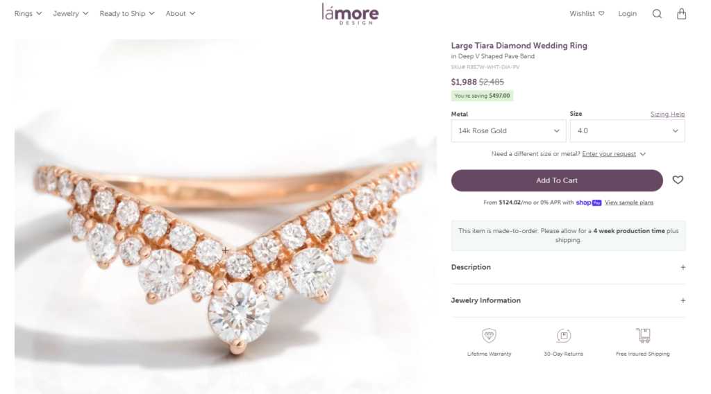
Product pages carry the most decision-making weight. Customers want detail, confidence, and reassurance.
The design direction needed to support product photography, pricing visibility, product information, and trust-building content. For a jewelry product, the page should help customers understand beauty, quality, and purchase security without making the layout feel crowded.
La More Design’s New York City showroom adds an important offline trust layer. The showroom page invites visitors to book appointments and learn about consultation services, ring size measuring, and in-person support.
We treated the showroom page as a confidence-building page. It needed to feel welcoming, personal, and service-oriented. The layout should help visitors understand that expert guidance is available, especially for customers making important bridal jewelry decisions.
The testimonials page supports social proof. La More Design highlights thousands of positive reviews across platforms, which is a strong trust signal for new customers.
We designed this type of page to feel warm and human. Testimonials should not look like generic blocks of text. They should feel connected to real love stories, real purchases, and real customer confidence.
High-value jewelry purchases often require flexible payment options. La More Design communicates financing and installment options to make purchases more approachable.
The design needed to make payment information feel clear and reassuring. Financing content should reduce hesitation, not create confusion. Clean hierarchy, simple sectioning, and direct language help customers understand their options quickly.
The contact page supports customers who need help before purchasing. La More Design provides phone and email support and states its goal of making the jewelry shopping process seamless.
We focused on clarity and approachability. For jewelry shoppers, contact options should feel personal and easy to use. The page should make customers feel that they can ask questions without pressure.
The design helped the Shopify store communicate romance, individuality, and craftsmanship more clearly. Instead of relying only on product listings, the site used visual storytelling to make the brand more memorable.
Clear category design helped visitors find the right shopping path faster. This is especially useful for jewelry brands with many product types and styles.
Trust elements were positioned as part of the shopping experience. Reviews, showroom support, ethical craftsmanship, financing, and contact access all helped reduce hesitation.
The refined spacing, soft visual mood, and product-first layout helped the store feel more elevated. This matters because premium jewelry shoppers expect a polished online experience.
The design supported Shopify’s natural strengths: product browsing, collection navigation, visual merchandising, and a direct path to purchase. We kept the focus on page design and user experience rather than unnecessary technical complexity.
The final design direction created a Shopify jewelry website that feels romantic, elegant, and conversion-focused. The homepage introduces the brand with emotion, the collection structure supports product discovery, and supporting pages such as showroom, testimonials, financing, and contact help customers feel more confident before purchasing.
This project shows how thoughtful Shopify page design can turn a jewelry website into more than a digital storefront. It can become a brand experience that guides customers from inspiration to trust, from browsing to decision-making, and from interest to purchase.
La More Design needed a Shopify website experience that could express beauty, romance, trust, and product clarity at the same time. Through a design-led approach, we helped shape a refined shopping journey that highlights the brand’s jewelry collections, supports customer confidence, and creates a smoother path across homepage, collection, product, showroom, testimonial, financing, and contact pages.
For brands that want to build a stronger Shopify presence without focusing on deep development or complex code, design makes the difference. AIRSANG brings this same page design mindset to cross-border eCommerce businesses, helping brands create visually compelling, conversion-focused Shopify websites that feel professional, memorable, and ready for real customers.


