Giới thiệu
In the fast-growing retro gaming market, design plays a critical role in shaping user perception, engagement, and ultimately, conversion. When working on the Shopify store for LITNXT, our primary objective was to create a seamless digital experience that bridges nostalgia with modern usability.
Rather than overwhelming users with excessive features or complex interactions, we focused on clarity, emotional storytelling, and structured navigation. The result is a Shopify store that not only showcases products effectively but also builds trust and encourages purchase decisions across global audiences.
This case study explores how we approached the design of the LITNXT store—from homepage structure to product presentation—highlighting our design methodology, challenges, and outcomes.
| Thời gian giao hàng | Loại | Nền tảng ứng dụng |
| 26days | máy chơi game | shopify |
| Các nhà thiết kế tham gia | Trị giá | Tác dụng |
| Nancy | $2800 | flow📈272% |
Understanding the Brand and Objectives
Defining the Core Direction
LITNXT operates in a niche that blends retro gaming culture with modern handheld technology. This meant the design needed to achieve two things simultaneously:
- Evoke nostalgia for classic gaming
- Deliver a clean, high-performance shopping experience
We identified early on that the site should not feel outdated or overly “retro-themed.” Instead, it needed a balanced aesthetic—modern layout with subtle nostalgic cues.
Key Goals
- Improve product discoverability
- Giảm ma sát trong quá trình điều hướng
- Strengthen brand trust through visual clarity
- Optimize the mobile shopping experience
- Support global conversion behavior
Our Design Approach
Designing for Clarity Over Complexity
One of the most common issues in niche eCommerce stores is overloading the interface with too much content. For LITNXT, we intentionally simplified the layout to guide users through a clear journey:
- Immediate visual impact
- Quick understanding of product categories
- Easy access to best-selling products
- Strong call-to-action pathways
Visual Hierarchy and Focus
We structured the page using a strong visual hierarchy:
- Bold hero section to capture attention
- Clear section separation using whitespace
- Consistent typography for readability
- Strategic use of product imagery to drive engagement
This approach ensures users always know where to look and what to do next.
Chiến lược thiết kế trang chủ
Hero Section: First Impression Matters
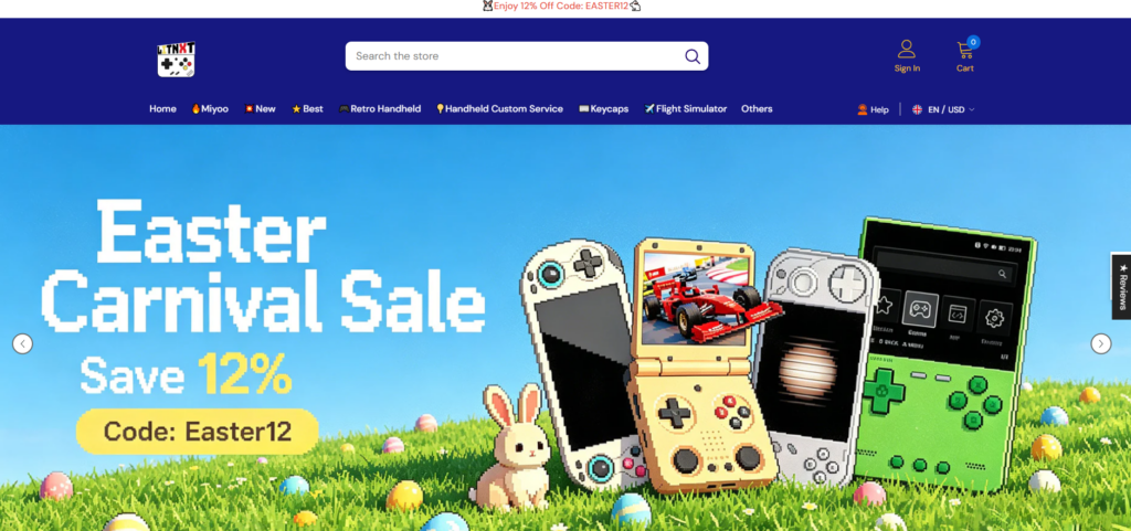
The homepage hero plays a critical role in setting expectations.
We designed the hero section to:
- Highlight flagship products like handheld consoles
- Use immersive visuals that resonate with gaming culture
- Include concise messaging that communicates value instantly
Rather than adding multiple sliders or distractions, we kept the hero focused and impactful.
Category Navigation: Simplifying Exploration

We implemented a clean category structure that allows users to quickly browse:
- Handheld consoles
- Phụ kiện
- Bundles
- Hàng mới về
Each category is visually distinct, making scanning effortless.
Best Sellers and Featured Products
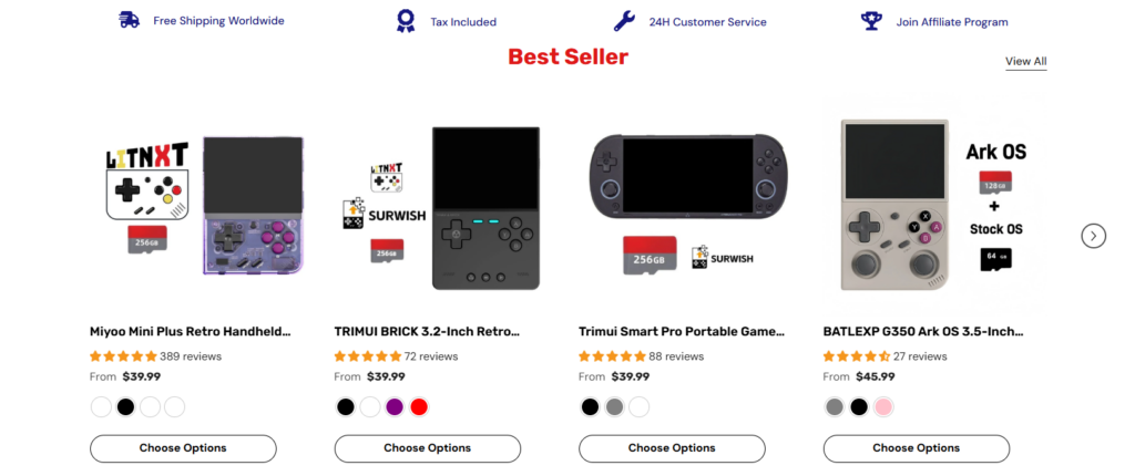
Instead of overwhelming users with all products, we curated sections like:
- Best Sellers
- Trending Products
- Recommended Items
This reduces decision fatigue and increases conversion likelihood.
Thiết kế trang sản phẩm
Emphasizing Product Experience
The product page is where decisions happen. Our design focused on:
- High-quality product imagery
- Clear pricing and purchase options
- Simplified product descriptions
- Easy-to-read specifications
We avoided clutter and ensured the most important information appears first.
Xây dựng niềm tin thông qua thiết kế
To improve credibility, we incorporated:
- Customer reviews and ratings
- Clean layout for product details
- Khoảng cách và sự căn chỉnh nhất quán
- Visual cues for reliability (badges, guarantees)
These elements help users feel confident in their purchase.
Các yếu tố cần cân nhắc khi thiết kế ưu tiên thiết bị di động
Why Mobile Matters
A significant portion of traffic for gaming products comes from mobile devices. Therefore, mobile optimization was not an afterthought—it was a priority.
Key Mobile Enhancements
- Menu điều hướng được đơn giản hóa
- Optimized image ratios for smaller screens
- Larger tap targets for buttons
- Faster loading layouts with minimal visual clutter
We ensured the mobile experience mirrors the desktop experience in quality, while being tailored for usability.
Những thách thức và giải pháp trong thiết kế
Challenge 1: Balancing Nostalgia and Modern UI
Vấn đề: Too much retro styling can feel outdated.
Giải pháp: We used modern layouts with subtle retro-inspired visuals, such as color accents and product imagery.
Challenge 2: Avoiding Product Overload
Vấn đề: Large product catalogs can overwhelm users.
Giải pháp: We structured content into curated sections like “Best Sellers” and “Featured,” reducing cognitive load.
Challenge 3: Maintaining Visual Consistency
Vấn đề: Inconsistent layouts reduce trust.
Giải pháp: We established a consistent design system for spacing, typography, and component structure.
Challenge 4: Enhancing Conversion Without Aggressive Tactics
Vấn đề: Overusing pop-ups and promotions can harm user experience.
Giải pháp: We relied on clean design, strong visuals, and clear CTAs instead of intrusive elements.
Quy trình thiết kế của chúng tôi
Step 1: Research and Benchmarking
Chúng tôi đã phân tích:
- Trang web của đối thủ cạnh tranh
- User behavior patterns in gaming niches
- Conversion-focused Shopify store structures
This helped us define what works—and what to avoid.
Step 2: Wireframing and Layout Planning
We created structured layouts that prioritize:
- Luồng người dùng
- Thứ bậc nội dung
- Visual balance
This stage ensures the foundation is strong before moving into visual design.
Step 3: Visual Design Execution
We translated the wireframes into a polished interface:
- Clean typography
- Balanced color usage
- High-impact imagery
Every design decision was made with conversion in mind.
Step 4: Iteration and Refinement
After initial deployment, we reviewed:
- User interaction behavior
- Visual clarity
- Section effectiveness
We refined layouts based on real-world usage.
Kết quả và tác động
Trải nghiệm người dùng được cải thiện
- Faster navigation
- Clearer product discovery
- Reduced confusion during browsing
Increased Engagement
- Users spend more time exploring products
- Higher interaction with featured sections
Stronger Conversion Potential
- Simplified purchase journey
- Better trust through clean design
- Mobile-friendly experience driving sales
Why Design Matters in Shopify Stores
This project reinforces a key principle:
Good design is not about decoration—it’s about decision-making.
For Shopify stores, especially in niche markets like retro gaming, design directly impacts:
- Niềm tin của người dùng
- Product perception
- Tỷ lệ chuyển đổi
- Nhận diện thương hiệu
A well-structured store can outperform competitors—even with similar products.
Phần kết luận
Designing the LITNXT Shopify store was about more than aesthetics—it was about creating a focused, conversion-driven experience that aligns with both the brand and its audience.
By prioritizing clarity, usability, and emotional engagement, we transformed the store into a platform that not only showcases products but also builds trust and drives action.
At the end of the day, successful eCommerce design comes down to understanding users and guiding them effortlessly toward a purchase.
If you’re looking to build or improve a high-performing Shopify store with a strong focus on design, brand positioning, and conversion strategy, this is exactly where AIRSANG delivers value—helping brands turn ideas into results-driven digital experiences.