Giỏ hàng hiện không có sản phẩm nào.

Trong thị trường trang trí nội thất cạnh tranh khốc liệt, nhận diện thương hiệu không chỉ đơn thuần là vấn đề thẩm mỹ mà còn ảnh hưởng trực tiếp đến lòng tin, hành vi tìm kiếm thông tin và quyết định mua hàng. Đối với các thương hiệu phong cách sống đã có tên tuổi, nhận diện thương hiệu là một yếu tố quan trọng. Shopify Trang web không chỉ cần hiển thị sản phẩm. Nó cần truyền tải được không khí, hướng dẫn người dùng một cách trực quan và biến cảm hứng thành hành động.
Nghiên cứu trường hợp này khám phá cách chúng tôi hỗ trợ việc thiết kế lại và tối ưu hóa... Shopify mặt tiền cửa hàng cho Khí quyển, một thương hiệu trang trí nội thất nổi tiếng của châu Âu. Vai trò của chúng tôi tập trung hoàn toàn vào thiết kế trang, cấu trúc hình ảnh và trải nghiệm người dùng, giúp thương hiệu chuyển đổi bản sắc ngoại tuyến và các bộ sưu tập theo mùa thành một hình ảnh kỹ thuật số tinh tế, hướng đến chuyển đổi khách hàng.
Thay vì tiếp cận dự án này như một công việc tái cấu trúc kỹ thuật, chúng tôi coi nó như một thách thức về hệ thống thiết kế—cân bằng giữa sự ấm áp của thương hiệu, sự rõ ràng về mặt thương mại và khả năng kể chuyện bằng hình ảnh có thể mở rộng trong khuôn khổ của Shopify.
| Thời gian giao hàng | Loại | Nền tảng ứng dụng |
| 24 ngày | nội thất | Shopify |
| Các nhà thiết kế tham gia | Trị giá | Tác dụng |
| Lin Zhang, Peifon FU | $2700 | Doanh thu bán hàng📈230% |
Atmosphera hoạt động trong lĩnh vực mà yếu tố cảm xúc đóng vai trò trung tâm. Khách hàng không chỉ mua đồ nội thất hay đồ trang trí; họ mua cả tâm trạng, phong cách sống và cảm giác ấm cúng như ở nhà. Bản sắc thương hiệu ngoại tuyến nhấn mạnh:
Thử thách đặt ra là làm sao chuyển đổi trải nghiệm phong phú, trực quan này sang định dạng kỹ thuật số sao cho vẫn mang lại cảm giác sống động tương tự mà không gây choáng ngợp cho người dùng.
Từ góc độ thiết kế, mục tiêu chính rất rõ ràng:
Hãy tạo một trang chủ Shopify và các trang hỗ trợ mang lại cảm giác nhẹ nhàng, trực quan và truyền cảm hứng—đồng thời vẫn thúc đẩy việc khám phá sản phẩm và chuyển đổi khách hàng.
Điều này đòi hỏi sự kiểm soát cẩn thận về mật độ bố cục, nhịp điệu thị giác và thứ bậc.
Với hàng trăm SKU thuộc nhiều danh mục khác nhau, trang chủ rất dễ trở nên rối mắt. Quá nhiều thương hiệu mắc phải sai lầm "hiển thị mọi thứ cùng một lúc", điều này thường dẫn đến tình trạng khách hàng mệt mỏi khi phải đưa ra quyết định.
Rủi ro thiết kế:
Hình ảnh của Atmosphera hướng đến phong cách sống, nhưng một trang thương mại điện tử vẫn phải hướng người dùng đến những hành động cụ thể.
Căng thẳng trong thiết kế:
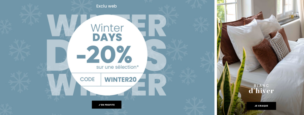
Thương hiệu này thường xuyên tổ chức các chương trình khuyến mãi và chiến dịch theo mùa (ví dụ: Ngày hội mùa đông, giảm giá, bộ sưu tập). Những chương trình này cần phải mang lại cảm giác mới mẻ—nhưng không bao giờ tách rời khỏi bản sắc cốt lõi của thương hiệu.
Chúng tôi bắt đầu với một kiểm toán trực quan và cấu trúc, Không phải là thay đổi mẫu. Trước khi chỉnh sửa bố cục, chúng tôi đã hỏi:
Điều này cho phép chúng tôi thiết kế một cách có chủ đích, thay vì chỉ đơn thuần ghép các phần của Shopify lại với nhau mà không có sự liên kết.
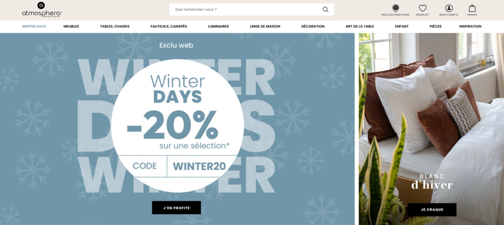
Thay vì sử dụng các banner quảng cáo rầm rộ, chúng tôi thiết kế khu vực chính (hero area) sao cho tạo cảm giác:
Thông điệp chính truyền tải giá trị một cách tinh tế mà không cần phải khoa trương. Kiểu chữ vẫn mềm mại và dễ đọc, trong khi hình ảnh tạo nên phong cách cho toàn bộ trải nghiệm duyệt web.
Các nguyên tắc thiết kế được áp dụng:
Thay vì tràn ngập trang chủ bằng các sản phẩm, chúng tôi đã chọn lọc những sản phẩm tiêu biểu:
Mỗi nhóm sản phẩm đều tuân theo một hệ thống hình ảnh nhất quán:
Cách tiếp cận này giúp người dùng quét nhanh chóng mà vẫn cảm thấy được hướng dẫn.
Các khu vực trưng bày sản phẩm theo phong cách sống được bố trí xen kẽ giữa các khu vực trưng bày sản phẩm chính. Những khu vực này phục vụ hai mục đích:
Chúng cũng khéo léo hướng người dùng khám phá các danh mục sản phẩm thay vì gây áp lực thanh toán ngay lập tức.
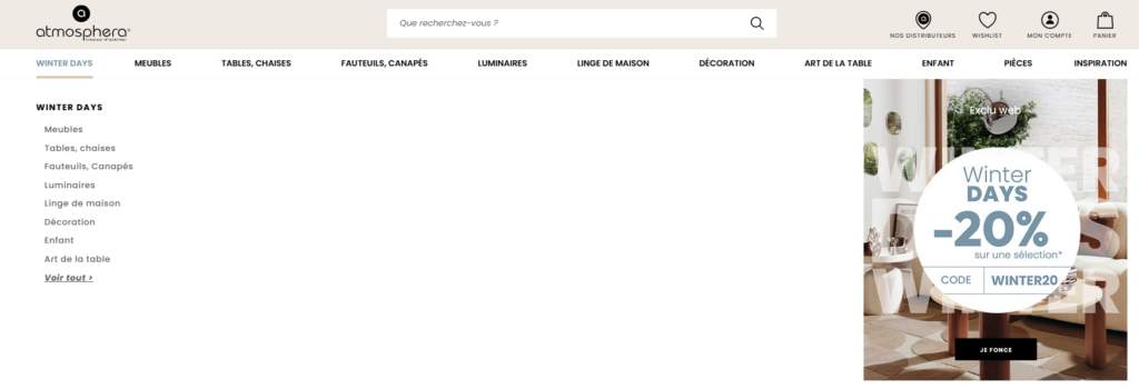
Các trang danh mục được coi là không gian khám phá, chứ không chỉ đơn thuần là bảng hiển thị sản phẩm.
Các yếu tố cần cân nhắc chính trong thiết kế:
Bằng cách duy trì bố cục dễ đoán, người dùng sẽ cảm thấy tự tin hơn khi khám phá sâu hơn vào danh mục sản phẩm.
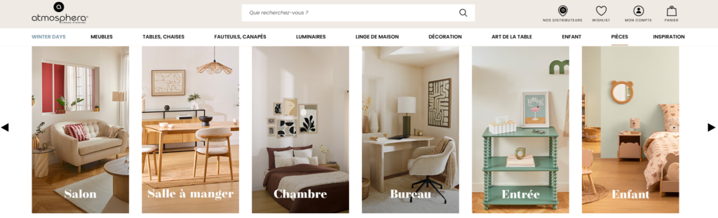
Danh mục sản phẩm của Atmosphera bao gồm nội thất phòng khách, phòng ngủ, phòng ăn, phòng trẻ em và nhiều không gian khác. Chúng tôi đã thống nhất tất cả các sản phẩm này thông qua:
Điều này đảm bảo rằng ngay cả khi phong cách thay đổi, trải nghiệm trên trang web vẫn nhất quán.
Người dùng Shopify hiện đại cuộn trang rất nhanh. Thiết kế của chúng tôi đã tính đến điều này bằng cách:
Điều này tạo ra một nhịp điệu cuộn tự nhiên, khuyến khích người dùng dành nhiều thời gian hơn cho mỗi phiên sử dụng.
Lời kêu gọi hành động được cố ý truyền tải một cách tinh tế:
Các nút kêu gọi hành động này hỗ trợ hành vi duyệt web chứ không làm gián đoạn nó.
Những lựa chọn thiết kế nhỏ giúp xây dựng lòng tin:
Các thành phần này giúp giảm ma sát mà không làm tăng tiếng ồn.
Chúng tôi tránh thiết kế quá cầu kỳ. Không có hoạt ảnh không cần thiết, không có huy hiệu thừa thãi. Sự tự tin đến từ sự rõ ràng, chứ không phải từ trang trí.
Một trong những kết quả quan trọng nhất của dự án này là tạo ra một logic thiết kế có thể lặp lại. Giờ đây, thương hiệu có thể:
Khả năng mở rộng thiết kế này rất cần thiết cho sự phát triển lâu dài của Shopify.
Sau khi áp dụng phương pháp thiết kế mới, trang web đã đạt được những kết quả sau:
Mặc dù các chỉ số có thể thay đổi theo thời gian, nhưng tác động tức thời đã thể hiện rõ ở:
Dự án này chứng minh một sự thật quan trọng:
Hiệu năng mạnh mẽ của Shopify bắt đầu từ thiết kế chu đáo—chứ không phải từ việc thêm nhiều tính năng hơn.
Bằng cách tập trung vào:
Các thương hiệu có thể nâng tầm cửa hàng trực tuyến của mình mà không cần phải động đến quá trình phát triển phức tạp hay mã lập trình tùy chỉnh.
Thiết kế một sản phẩm thành công Shopify Website không chỉ đơn thuần là chạy theo xu hướng hay thêm nhiều mục. Điều quan trọng là hiểu rõ thương hiệu, tôn trọng sự chú ý của người dùng và tạo ra một hệ thống hình ảnh hỗ trợ cả việc kể chuyện và bán hàng.
Dự án này cho thấy cách tiếp cận thiết kế điềm tĩnh, có chủ đích có thể biến một danh mục đồ trang trí nhà cửa khổng lồ thành một trải nghiệm mua sắm liền mạch, hấp dẫn—một trải nghiệm truyền cảm hứng, đáng tin cậy và dễ điều hướng.
Tóm lại, đây chính xác là loại công việc thiết kế Shopify mà chúng tôi tập trung vào. AIRSANGGiúp các thương hiệu chuyển hóa bản sắc của mình thành những cửa hàng trực tuyến hiệu quả cao, chú trọng thiết kế và có khả năng mở rộng linh hoạt theo thời gian.
Nếu bạn muốn hoàn thiện trang web Shopify của mình thông qua thiết kế trang chiến lược, cấu trúc trực quan và trải nghiệm người dùng—chứ không phải là phát triển phần mềm chuyên sâu—thì đây là phương pháp mà chúng tôi tin tưởng.