


ไม่มีสินค้าในตะกร้า.

In โอโซน’s highly competitive marketplace, the main image does far more than display a product. It determines click-through rate, shapes perceived value, and immediately positions a brand within a specific price and performance tier. When designing main images for various watch models, we approach each product strategically—balancing clarity, technical emphasis, lifestyle aspiration, and marketplace compliance.
Below, we break down how we designed each watch main image, why we structured the composition the way we did, and how each visual element contributes to conversion performance on Ozon.
| ระยะเวลาจัดส่ง | หมวดหมู่ | แพลตฟอร์มแอปพลิเคชัน |
| 9 วัน | watch | โอโซน |
| นักออกแบบที่เกี่ยวข้อง | ค่าใช้จ่าย | ผล |
| Nancy、Peifon FU | $160 | Store traffic📈173% |
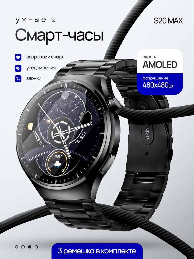
For the first smart watch model (S20 MAX), we focused on clean technical authority.
The watch features an AMOLED display with 480×480 resolution, health tracking, notifications, and call functions. Instead of cluttering the image with excessive text, we emphasized three primary selling points:
We placed the watch at a three-quarter angle to enhance depth and realism. This angle shows both the case thickness and the premium metal strap, reinforcing build quality.
The background is light gray and minimal. On Ozon, this matters: neutral backgrounds increase focus on the product while improving mobile readability. Blue accent blocks highlight the AMOLED and resolution specifications. Blue signals technology and trust, which aligns with electronics positioning.
The curved black elements crossing the background add movement without distracting from the product. They subtly suggest durability and dynamic performance.
Most importantly, we kept the hierarchy clear:
This structured hierarchy ensures that even in thumbnail size, the key value—AMOLED clarity—is visible.
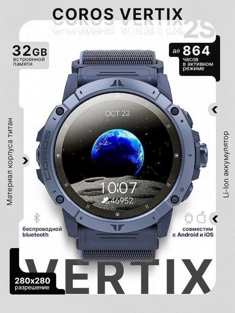
The COROS VERTIX design takes a completely different direction: extreme endurance and outdoor capability.
This model emphasizes:
For this watch, we used a front-facing symmetrical composition. This creates stability and authority—ideal for an outdoor performance watch.
The screen displays a space-earth visual. That choice was intentional. It visually reinforces endurance and exploration. The message becomes aspirational: this watch is built for adventure.
We framed specifications around the watch in modular blocks:
This modular layout mimics technical spec sheets while remaining visually engaging. On Ozon, buyers often scan for performance numbers quickly. By isolating “864 hours” and “32GB” in high-contrast blocks, we improve scannability.
The typography remains bold and industrial, aligning with titanium and outdoor durability.
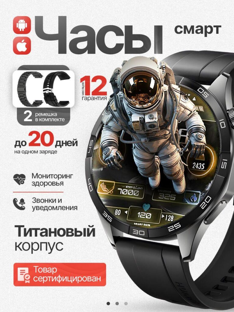
In this design, we leaned heavily into emotional storytelling.
The astronaut emerging from the watch face creates a 3D illusion. This technique dramatically increases stop-scroll power. On Ozon’s feed-based browsing system, dynamic imagery outperforms static layouts.
Key selling points emphasized:
We used warm highlights and dimensional lighting to separate the watch from the background. The astronaut concept visually reinforces exploration, performance, and futuristic technology.
Red accent typography highlights warranty and battery claims. Red increases urgency and draws the eye to conversion-focused details.
The watch face UI appears functional and layered, suggesting advanced system capability.
This design is intentionally more dramatic than the previous two. Not every model should look identical. Differentiation across listings prevents brand cannibalization and creates visual segmentation.
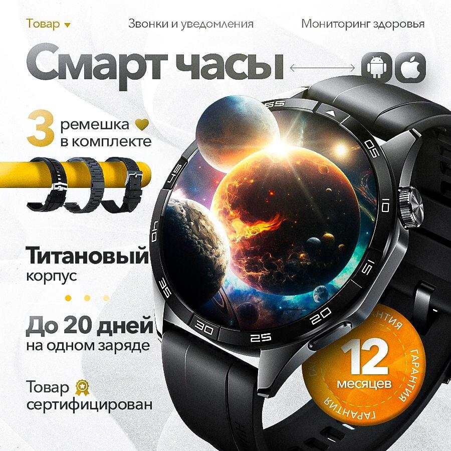
In this layout, the priority shifts to bundle value.
The watch includes:
We positioned the watch slightly angled but kept it dominant. To the left, we displayed the three straps clearly. Ozon shoppers react strongly to bundle value. Showing all included components directly increases perceived savings.
The planetary display theme continues here but appears more luminous and premium. We added a circular gold warranty badge at the lower right. Gold signals premium assurance.
Spacing and hierarchy remain controlled:
This keeps the eye moving in a Z-pattern across the image.
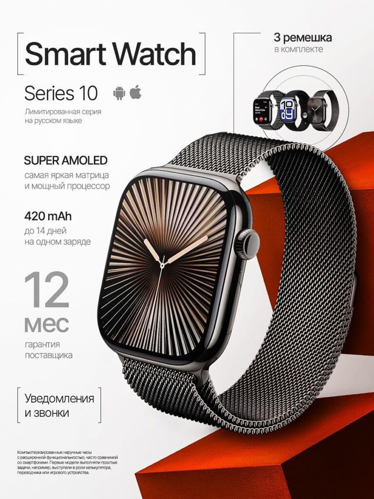
For the Series 10 model, we transitioned into luxury minimalism.
This version highlights:
The square watch design required a different visual strategy. Instead of bold dramatic lighting, we used structured red geometric shapes in the background. These angular forms contrast the soft metal mesh strap.
White space plays a major role here. Minimal negative space increases perceived price positioning. On Ozon, clutter often reduces premium perception. This layout feels more “Apple-inspired”—clean and controlled.
Typography remains thin and modern, supporting the refined feel. The strap texture is sharp and detailed, emphasizing craftsmanship.
This model targets urban users rather than outdoor adventurers.
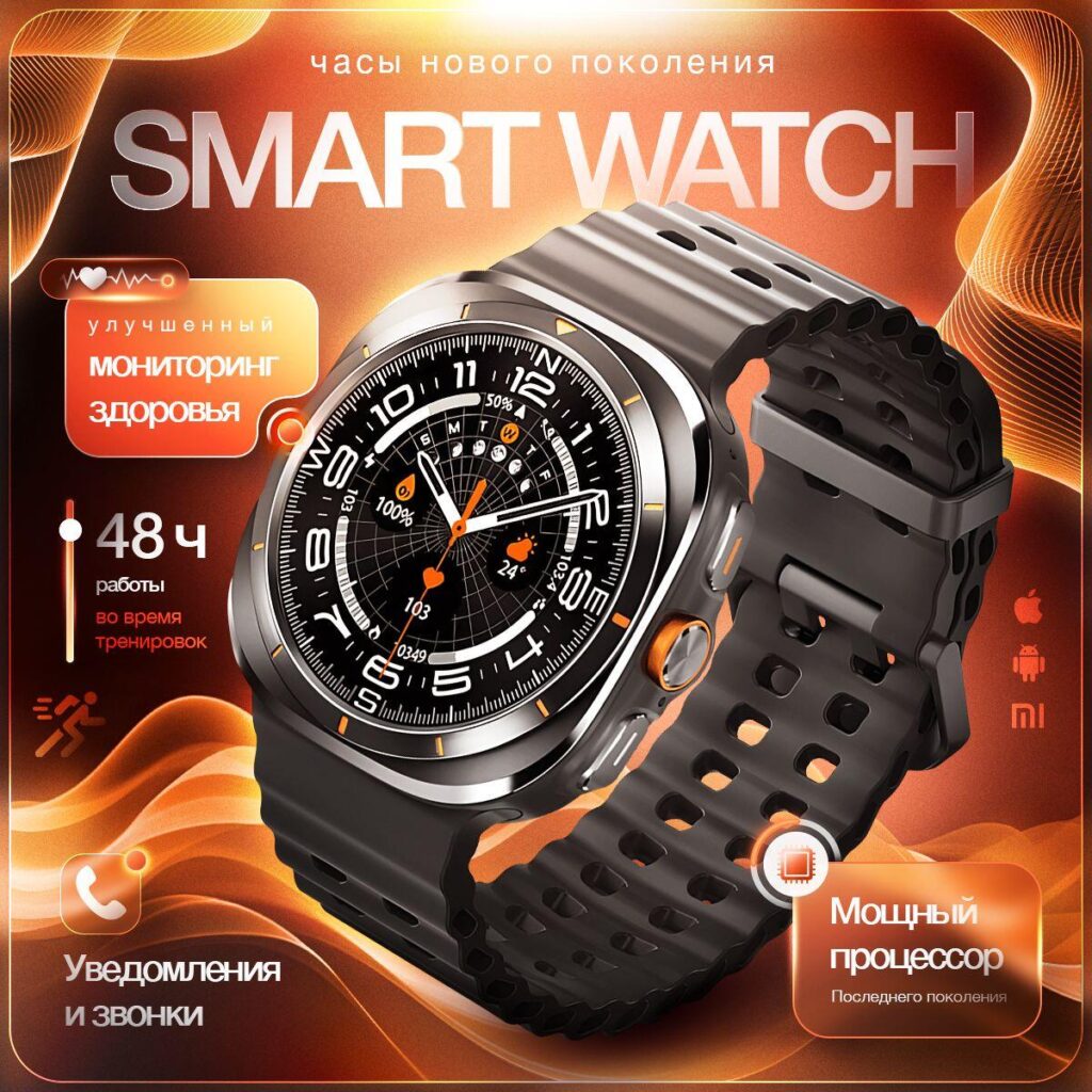
The sixth design uses an intense orange gradient background with flowing wave elements.
Here we emphasize:
Orange communicates energy and fitness. This model targets sport-oriented buyers.
We introduced glowing UI callouts to highlight:
The watch sits angled, and lighting creates strong edge highlights. Motion lines in the background reinforce dynamic activity.
Unlike minimal designs, this composition intentionally creates visual intensity. It aims to dominate the Ozon category feed.
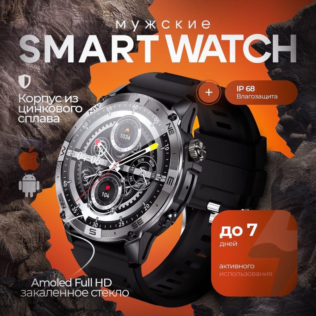
This final model focuses on rugged durability.
Highlighted features:
We used rocky textures in the background to communicate strength and resilience.
Orange accent blocks contrast against dark tones to ensure key claims—like IP68 and 7 days usage—stand out immediately.
The watch is positioned prominently at an angle, showing case screws and crown detailing. This detail supports the “tactical durability” narrative.
The combination of rock textures and industrial typography reinforces the protective build.
Although each watch uses a different visual identity, several core principles remain consistent:
Product first. Performance numbers second. Supporting features third.
Blue = technology
Red = urgency
Gold = warranty assurance
Orange = sport energy
Each color was used intentionally.
Ozon compresses thumbnails significantly. Therefore:
Every watch has a unique buyer persona:
Main images reflect these psychological segments.
We used 3D lighting and shadow depth to increase realism. Flat images underperform in electronics categories.
Designing effective watch main images for โอโซน requires more than placing a product on a white background. It demands strategic hierarchy, emotional positioning, clear performance emphasis, and marketplace-specific optimization.
Across these various watch models, we structured each layout to highlight its strongest conversion driver—whether that is AMOLED resolution, extreme battery life, titanium durability, or bundle value.
The result is a differentiated yet cohesive visual system designed to increase click-through rates and elevate brand perception within Ozon’s competitive electronics category.
At the end of every project like this, we refine, test, and optimize performance data. That is how we ensure our main image design strategy translates into measurable growth.
This is the approach we continue to apply at AIRSANG.


