


การแนะนำ
ในโลกของการค้าสินค้าสะสมออนไลน์ โดยเฉพาะอย่างยิ่งในตลาดการ์ดเกมโปเกมอน (TCG) เว็บไซต์ที่ดีต้องทำมากกว่าแค่แสดงรายการสินค้า ต้องสร้างความน่าเชื่อถือได้ทันที สื่อสารถึงความถูกต้อง จัดระเบียบหมวดหมู่สินค้าที่ซับซ้อน และนำทางผู้ใช้ได้อย่างราบรื่นตั้งแต่การค้นหาไปจนถึงการซื้อ.
เดอะ ช็อปฟี่ เว็บไซต์ pokemoncardcn.com เว็บไซต์นี้สร้างขึ้นเพื่อตอบสนองความต้องการของกลุ่มลูกค้าทั่วโลกที่สนใจการ์ดโปเกมอนภาษาจีนและภาษาจีนตัวย่อ สินค้าที่บรรจุในซอง และการ์ดหายากต่างๆ บทบาทของเราในโครงการนี้มุ่งเน้นไปที่การออกแบบเว็บไซต์ Shopify โดยเฉพาะ ตั้งแต่โครงสร้างหน้าเว็บและลำดับชั้นทางสายตา ไปจนถึงการไหลของเนื้อหาและการจัดวางที่เน้นการเพิ่มยอดขาย.
แทนที่จะมองโครงการนี้ในฐานะโครงการพัฒนาทางเทคนิค เรามองว่ามันเป็นความท้าทายด้านการออกแบบและประสบการณ์ผู้ใช้: จะนำเสนอหมวดหมู่ผลิตภัณฑ์ที่น่าสะสมอย่างยิ่งในรูปแบบที่น่าเชื่อถือ ใช้งานง่าย และเหมาะสมที่สุดสำหรับการเปลี่ยนผู้เข้าชมให้เป็นลูกค้าได้อย่างไร.
กรณีศึกษาชิ้นนี้จะอธิบายขั้นตอนการออกแบบของเรา ความท้าทายที่เราได้เผชิญ และวิธีที่การออกแบบหน้าเว็บ Shopify อย่างรอบคอบช่วยสร้างร้านค้าออนไลน์ที่ปรับขนาดได้และน่าเชื่อถือ.
| ระยะเวลาจัดส่ง | หมวดหมู่ | แพลตฟอร์มแอปพลิเคชัน |
| 23 วัน | การ์ดโปเกมอน | ช็อปฟี่ |
| นักออกแบบที่เกี่ยวข้อง | ค่าใช้จ่าย | ผล |
| แนนซี่ | $2800 | อัตราการทำธุรกรรม📈208% |
ภาพรวมโครงการ
ความเข้าใจเกี่ยวกับแบรนด์และตลาด
Pokémoncardcn.com ดำเนินธุรกิจในตลาดเฉพาะกลุ่มแต่มีการแข่งขันสูงมาก:
- นักสะสมการ์ดเกมโปเกมอน
- ผู้ซื้อต่างประเทศที่จัดหาสินค้าการ์ดจากจีน
- ลูกค้าที่ต้องการทั้งกล่องที่ปิดผนึกและบัตรสะสมมูลค่าสูง
กลุ่มเป้าหมายนี้ใส่ใจในรายละเอียดอย่างมาก พวกเขาสนใจในเรื่องต่อไปนี้:
- ความถูกต้องของผลิตภัณฑ์
- การจัดหมวดหมู่ที่ชัดเจน (กล่องปิดผนึกเทียบกับการ์ดเดี่ยว)
- ความคมชัดของภาพบนการ์ด
- ราคาและความพร้อมจำหน่ายโปร่งใส
ในแง่ของการออกแบบ เว็บไซต์จึงต้องดูสะอาดตา เป็นระเบียบ และเป็นมืออาชีพ ในขณะเดียวกันก็ยังคงรักษาความตื่นเต้นและดึงดูดสายตาที่นักสะสมโปเกมอนคาดหวังไว้.
เป้าหมายการออกแบบ
ก่อนเริ่มงานออกแบบใดๆ เราได้กำหนดวัตถุประสงค์การออกแบบที่ชัดเจนหลายประการ:
- สร้างความไว้วางใจได้ทันทีสำหรับผู้มาเยือนครั้งแรก
- จัดระเบียบแคตตาล็อกที่ซับซ้อนโดยไม่ทำให้ผู้ใช้รู้สึกสับสน
- เน้นการสั่งซื้อล่วงหน้าและสินค้าใหม่ให้มีประสิทธิภาพ
- รองรับทั้งพฤติกรรมการเรียกดูสินค้าและการซื้อสินค้าตามเป้าหมาย
- สร้างความสม่ำเสมอในการใช้งานทั้งบนเดสก์ท็อปและมือถือ
ทุกการตัดสินใจด้านการออกแบบถูกพิจารณาเทียบกับเป้าหมายเหล่านี้.
แนวทางการออกแบบ Shopify ของเรา
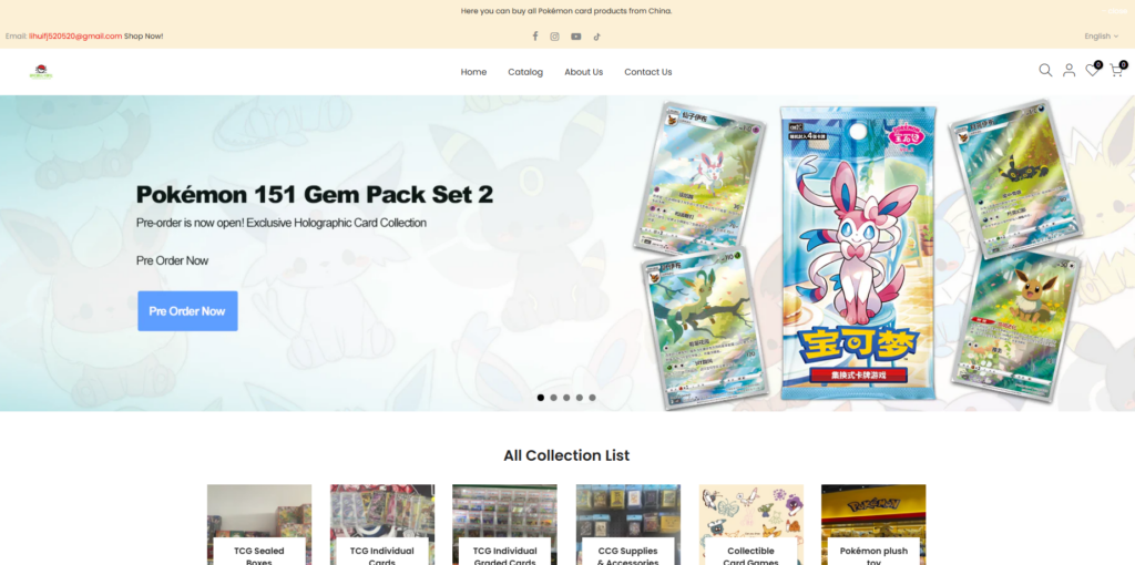
1. หน้าแรกเป็นจุดเริ่มต้นที่ดึงดูดสายตา
หน้าแรกทำหน้าที่เป็นศูนย์กลางของร้านค้า Shopify ทั้งหมด แทนที่จะมองว่าเป็นเพียงหน้าแรกแบบคงที่ เราออกแบบให้เป็นประสบการณ์การเรียกดูแบบมีคำแนะนำ.
ปัจจัยสำคัญในการออกแบบ ได้แก่:
- ส่วนเด่นที่แสดงสินค้าใหม่และสินค้าที่เปิดให้สั่งจองล่วงหน้า
- ปุ่มกระตุ้นการดำเนินการที่ชัดเจน เช่น “สั่งซื้อล่วงหน้าตอนนี้”
- เน้นการออกแบบบรรจุภัณฑ์และภาพประกอบบนการ์ดให้สวยงาม
แบนเนอร์หลักจะสื่อสารให้ทราบทันทีว่าร้านค้าจำหน่ายอะไรและเหมาะสำหรับใคร พร้อมทั้งดึงดูดความสนใจไปยังสินค้าที่มีความสำคัญสูงด้วย.
2. การนำเสนอชุดข้อมูลอย่างเป็นระบบ
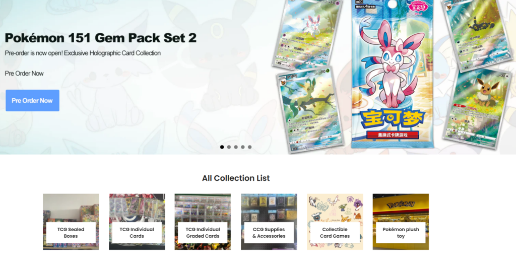
หนึ่งในความท้าทายด้านการออกแบบที่ใหญ่ที่สุดคือความหลากหลายของผลิตภัณฑ์ที่มีอยู่มากมาย:
- กล่องบูสเตอร์ที่ปิดผนึก
- การ์ดที่ได้รับการประเมินรายบุคคล
- อุปกรณ์และเครื่องใช้
- ของเล่นตุ๊กตาและของสะสม
เพื่อแก้ไขปัญหานี้ เราจึงออกแบบโครงสร้างที่เน้นการรวบรวมข้อมูลเป็นหลัก.
ส่วนรายการคอลเลกชันทั้งหมด
ส่วนนี้แสดงสินค้าของร้านโดยแบ่งเป็นหมวดหมู่ที่ชัดเจนและสามารถคลิกได้ การ์ดแต่ละคอลเลกชันใช้ข้อมูลดังนี้:
- ภาพประกอบที่เรียบง่าย
- การติดฉลากที่ชัดเจน
- ระยะห่างและการจัดเรียงที่สม่ำเสมอ
วิธีนี้ช่วยให้ผู้ใช้สามารถเลือกสิ่งที่ตนสนใจได้อย่างรวดเร็วโดยไม่ต้องอ่านคำอธิบายยาวๆ.
3. สั่งซื้อล่วงหน้าโดยเน้นการออกแบบเป็นพิเศษ
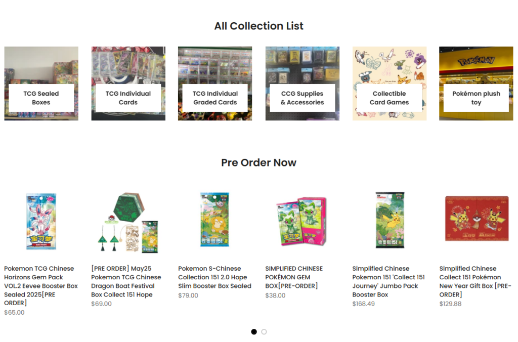
สินค้าพรีออร์เดอร์เป็นปัจจัยสำคัญที่สร้างรายได้ให้กับตลาดการ์ดเกมโปเกมอน แทนที่จะรวมไว้ในรายการสินค้าทั่วไป เราจึงสร้างส่วนเฉพาะสำหรับสินค้าพรีออร์เดอร์ขึ้นมา.
กลยุทธ์การออกแบบที่ใช้ในที่นี้ ได้แก่:
- รูปแบบการ์ดผลิตภัณฑ์ที่เป็นมาตรฐาน
- ติดป้าย "สั่งจองล่วงหน้า" อย่างชัดเจน
- แสดงราคาอย่างชัดเจนโดยไม่ทำให้ภาพรกตา
แนวทางการออกแบบนี้สร้างความเร่งด่วนไปพร้อมกับการรักษาความโปร่งใส ซึ่งทั้งสองอย่างนี้มีความสำคัญอย่างยิ่งต่อความไว้วางใจของนักสะสม.
4. การออกแบบตารางผลิตภัณฑ์สำหรับนักสะสม
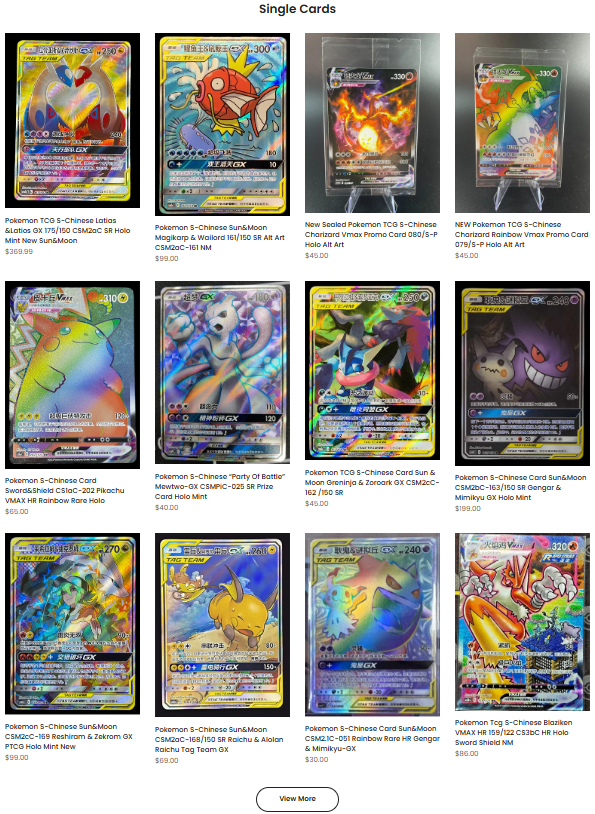
นักสะสมมีพฤติกรรมการซื้อที่แตกต่างจากผู้ซื้อทั่วไป ผู้ใช้หลายคนจะเปรียบเทียบงานศิลปะ ความหายาก และสภาพของสินค้าก่อนตัดสินใจซื้อ.
เพื่อสนับสนุนพฤติกรรมนี้ เราจึงออกแบบตารางผลิตภัณฑ์ที่เน้นสิ่งต่อไปนี้:
- ภาพสินค้าขนาดใหญ่ ความคมชัดสูง
- อัตราส่วนการ์ดที่สม่ำเสมอ
- ลดสิ่งรบกวนเกี่ยวกับราคาและชื่อสินค้าให้น้อยที่สุด
สิ่งนี้ทำให้ภาพประกอบบนการ์ดกลายเป็นจุดสนใจหลัก ซึ่งเป็นสิ่งสำคัญในตลาดของสะสมที่เน้นภาพลักษณ์เป็นหลัก.
ส่วนบัตรเดี่ยว: การออกแบบสำหรับสินค้ามูลค่าสูง
โดยทั่วไปแล้ว บัตรเครดิตแบบบัตรเดี่ยวจะมีมูลค่าในสายตาที่สูงกว่า และต้องอาศัยความเชื่อมั่นจากผู้ซื้อมากกว่า.
ความไว้วางใจที่มองเห็นได้ผ่านการออกแบบ
แทนที่จะใส่ข้อความจำนวนมากเกินไปในหน้าเว็บ เราเลือกใช้วิธีการดังต่อไปนี้:
- พื้นหลังสีขาวสะอาดตา
- ภาพไพ่ที่คมชัด
- การจัดระยะห่างที่สมดุลระหว่างผลิตภัณฑ์
รูปแบบการออกแบบนี้สะท้อนให้เห็นถึงแพลตฟอร์มการให้คะแนนระดับมืออาชีพและเว็บไซต์ประมูล ซึ่งช่วยเสริมสร้างความน่าเชื่อถือและคุณภาพอย่างแยบยล.
ข้อควรพิจารณาในการออกแบบโดยคำนึงถึงอุปกรณ์พกพาเป็นหลัก
ผู้ซื้อของสะสมจำนวนมากเลือกดูสินค้าผ่านอุปกรณ์มือถือ โดยเฉพาะอย่างยิ่งผ่านการแนะนำจากโซเชียลมีเดีย.
ลำดับความสำคัญในการออกแบบแอปพลิเคชันบนมือถือของเรา ได้แก่:
- เป้าหมายการแตะที่ชัดเจน
- เมนูนำทางที่เรียบง่าย
- ตารางแสดงสินค้าแนวตั้งที่ปรับให้เหมาะสมสำหรับการเลื่อนดู
แทนที่จะลดขนาดดีไซน์บนเดสก์ท็อป เราได้ปรับลำดับความสำคัญของเนื้อหาสำหรับหน้าจอขนาดเล็กใหม่ เพื่อให้มั่นใจว่าการดำเนินการหลักยังคงเข้าถึงได้ง่ายโดยไม่ติดขัด.
ความท้าทายที่เราพบเจอ
1. การสร้างสมดุลระหว่างความตื่นเต้นและความเป็นมืออาชีพ
โปเกมอน การสร้างแบรนด์นั้นมีสีสันและดูสนุกสนาน แต่ในขณะเดียวกัน นักสะสมก็คาดหวังถึงความจริงจังและความน่าเชื่อถือด้วย.
วิธีแก้ปัญหาของเรา:
เราใช้ภาพสินค้าสีสันสดใสตัดกับพื้นหลังสีกลางๆ เพื่อดึงดูดความสนใจไปที่ตัวสินค้าเอง ไม่ใช่ที่การจัดวางภาพ.
2. การจัดการปริมาณผลิตภัณฑ์
เมื่อร้านค้าเติบโตขึ้น จำนวนสินค้าก็จะเพิ่มขึ้นเรื่อยๆ.
วิธีแก้ปัญหาของเรา:
เราออกแบบโครงสร้างที่ปรับขนาดได้และกฎเกณฑ์ด้านภาพที่สอดคล้องกัน เพื่อให้สามารถเพิ่มผลิตภัณฑ์ใหม่ได้โดยไม่ทำให้ความสวยงามหรือการใช้งานโดยรวมเสียหาย.
3. สร้างความไว้วางใจโดยไม่ต้องใช้ข้อความเยอะเกินไป
ผู้ซื้อจากต่างประเทศอาจลังเลเมื่อซื้อของสะสมจากร้านค้าในต่างประเทศ.
วิธีแก้ปัญหาของเรา:
เราใช้สัญญาณแสดงความไว้วางใจด้วยภาพ:
- ดีไซน์สะอาดตา
- การเว้นระยะห่างอย่างมืออาชีพ
- การนำทางที่ชัดเจน
- คอลเลกชันที่จัดระเบียบ
การออกแบบที่ดีช่วยลดความสงสัยตั้งแต่ยังไม่เริ่มอ่านแม้แต่คำเดียว.
ผลลัพธ์และผลกระทบ
การออกแบบขั้นสุดท้ายของ Shopify ประกอบด้วย:
- หน้าแรกที่ชัดเจนและน่าดึงดูดใจ
- มีการจัดลำดับความสำคัญทางภาพอย่างชัดเจนในทุกคอลเลกชัน
- การค้นหาผลิตภัณฑ์ทำได้ง่ายขึ้น
- สร้างภาพลักษณ์แบรนด์ที่ดูเป็นมืออาชีพและน่าเชื่อถือ
ที่สำคัญที่สุดคือ การออกแบบนี้รองรับการขยายขนาดในระยะยาว เช่นเดียวกับรุ่นใหม่ๆ โปเกมอน เมื่อมีการเปิดตัวชุดสินค้า การสั่งซื้อล่วงหน้า และการ์ดซีรีส์ต่างๆ เว็บไซต์ก็สามารถพัฒนาต่อไปได้โดยไม่ต้องออกแบบใหม่ทั้งหมด.
เหตุใดโครงการนี้จึงสะท้อนถึงปรัชญาการออกแบบของเรา
โครงการ Shopify นี้แสดงให้เห็นถึงความเชื่อของเราที่ว่า:
- การออกแบบคือกลยุทธ์ ไม่ใช่แค่การตกแต่ง
- การตัดสินใจเกี่ยวกับการจัดวางเลย์เอาต์ส่งผลโดยตรงต่ออัตราการแปลง
- ความชัดเจนย่อมดีกว่าความซับซ้อนเสมอ
ด้วยการมุ่งเน้นที่โครงสร้าง ลำดับชั้น และความตั้งใจของผู้ใช้ เราจึงช่วยเปลี่ยนแคตตาล็อกที่มีสินค้ามากมายให้กลายเป็นประสบการณ์การช้อปปิ้งที่ราบรื่นและเหมาะสมกับนักสะสม.
บทสรุป
การออกแบบ pokemoncardcn.com มันไม่ได้เกี่ยวกับเอฟเฟกต์ที่ฉูดฉาดหรือโค้ดที่เขียนขึ้นเอง แต่เป็นเรื่องของการเข้าใจกลุ่มเป้าหมาย การเคารพในผลิตภัณฑ์ และการใช้งาน ช็อปฟี่ ออกแบบแนวทางปฏิบัติที่ดีที่สุดเพื่อสร้างความไว้วางใจและความชัดเจน.
โครงการนี้สะท้อนให้เห็นถึงงานออกแบบบน Shopify ที่เราเชี่ยวชาญ ซึ่งทุกส่วน ทุกตาราง และทุกการตัดสินใจด้านภาพล้วนมีจุดประสงค์ทางธุรกิจ.
ที่ AIRSANG, เราช่วยแบรนด์ระดับโลกออกแบบ เว็บไซต์ Shopify ที่ไม่เพียงแต่มีรูปลักษณ์ที่สวยงามเท่านั้น แต่ยังได้รับการออกแบบโครงสร้างเพื่อส่งเสริมการเติบโต ความน่าเชื่อถือ และการเปลี่ยนลูกค้าเป้าหมายให้เป็นลูกค้า หากคุณกำลังมองหาวิธียกระดับธุรกิจของคุณ ร้านค้า Shopify ด้วยการออกแบบอย่างพิถีพิถัน ทีมงานของเราจึงนำทั้งข้อมูลเชิงกลยุทธ์และประสบการณ์ตรงมาใช้ในทุกโครงการ.


ออกแบบและสร้างเว็บไซต์ WordPress หรือเว็บไซต์องค์กรพร้อมระบบอีคอมเมิร์ซครบวงจรสำหรับคุณ.
ช่วงราคา: $200.00 ถึง $2,500.00ข้อกำหนดเฉพาะหรือใบเสนอราคาพิเศษ
ราคาเดิมคือ: $2.00.$1.00ราคาปัจจุบันคือ: $1.00. ภาพหลักสำหรับการออกแบบอุปกรณ์กายภาพบำบัดที่บ้านของ Amazon (อธิบายรายละเอียด)
บทนำ: การสร้างภาพลักษณ์ที่น่าเชื่อถือสำหรับอุปกรณ์บำบัดที่บ้านบน Amazon เมื่อออกแบบภาพหลักสำหรับอุปกรณ์บำบัดที่บ้านบน Amazon สิ่งสำคัญอันดับแรกของเราคือ...

ภาพหลักสำหรับการแปลงลิปสติกเป็นสินค้าสำหรับ Amazon
บทนำ: การออกแบบภาพหลักลิปสติกที่ขายได้บน Amazon เมื่อเราออกแบบภาพหลักสำหรับลิปสติกบน Amazon ความรับผิดชอบของเราไม่ได้จำกัดอยู่แค่...

อะไรทำให้รองพื้นชนิดเหลวของ Amazon (ภาพหลัก) ขายดี?
บทนำ การออกแบบภาพหลักสำหรับรองพื้นชนิดเหลวบน Amazon ไม่ใช่แค่การทำให้ผลิตภัณฑ์ดูสวยงามเท่านั้น บน Amazon ภาพหลักและ...

การออกแบบภาพหลัก Amazon ที่มีประสิทธิภาพสำหรับตลับกรอง
บทนำ การออกแบบภาพหลักสำหรับ Amazon ไม่ใช่แค่การทำให้สินค้าดูน่าดึงดูดเท่านั้น แต่ยังเกี่ยวกับความชัดเจน ความน่าเชื่อถือ และความเข้าใจได้ในทันที โดยเฉพาะอย่างยิ่งสำหรับ...

เปรียบเทียบธีม WordPress สำหรับสัตว์เลี้ยง 5 แบบ
บทนำ การเลือกธีม WordPress ที่เหมาะสมสำหรับธุรกิจเกี่ยวกับสัตว์เลี้ยงนั้นไม่ใช่แค่เรื่องของการออกแบบเท่านั้น แต่ยังส่งผลโดยตรงต่อการใช้งาน ความสามารถในการขยายขนาด และการเติบโตของธุรกิจในระยะยาว การดูแลสัตว์เลี้ยงและ...

การสร้างเว็บไซต์ WordPress ที่ปรับขนาดได้สำหรับแบรนด์ที่ขับเคลื่อนด้วยวิทยาศาสตร์: โครงการ AminoUSA
บทนำ ในยุคดิจิทัลปัจจุบัน เว็บไซต์เป็นมากกว่าแค่สถานที่สำหรับแสดงรายการสินค้า สำหรับแบรนด์ที่ขับเคลื่อนด้วยวิทยาศาสตร์ซึ่งดำเนินงานในอุตสาหกรรมที่มีการควบคุมหรือเน้นการวิจัย...

สร้างร้านค้า Shopify ที่ปรับขนาดได้สำหรับแบรนด์ใบมีดระดับโลก: โครงการ CoolKatana
บทนำ ในธุรกิจอีคอมเมิร์ซข้ามพรมแดน เว็บไซต์ Shopify เป็นมากกว่าแค่หน้าร้าน สำหรับแบรนด์ที่ดำเนินธุรกิจในกลุ่มเฉพาะหรือกลุ่มที่ขับเคลื่อนด้วยวัฒนธรรม เว็บไซต์ต้องทำมากกว่านั้น...

ดีไซน์ Shopify ที่เพิ่มยอดขายสำหรับแบรนด์อิฐสั่งทำพิเศษ
บทนำ ในสภาพแวดล้อมการแข่งขันอีคอมเมิร์ซในปัจจุบัน โดยเฉพาะอย่างยิ่งในตลาดของขวัญส่วนบุคคลและของสะสม เว็บไซต์ Shopify ต้องทำมากกว่าแค่แสดงสินค้า...

กรณีศึกษาการออกแบบเว็บไซต์ Shopify สำหรับแบรนด์ดอกไม้ระดับพรีเมียม
บทนำ ในสภาพแวดล้อมการแข่งขันอีคอมเมิร์ซในปัจจุบัน เว็บไซต์ Shopify ต้องทำมากกว่าแค่แสดงสินค้า มันต้องสื่อสารคุณค่าของแบรนด์ได้ทันที และแนะนำผู้ใช้...

กรณีศึกษาการออกแบบร้านค้า Shopify: ร้านค้าเกมย้อนยุค
บทนำ ในสภาพแวดล้อมอีคอมเมิร์ซที่มีการแข่งขันสูง ความชัดเจนทางด้านภาพและการเชื่อมโยงทางอารมณ์มักเป็นตัวกำหนดว่าผู้เยี่ยมชมจะกลายเป็นลูกค้าหรือไม่ โดยเฉพาะอย่างยิ่งใน...

กรณีศึกษาการออกแบบบน Shopify: แบรนด์ Tactical Rescue
บทนำ เว็บไซต์ Shopify ที่แข็งแกร่งนั้นทำมากกว่าแค่แสดงสินค้า—มันยังสื่อสารจุดประสงค์ สร้างความไว้วางใจ และชี้นำผู้ใช้ไปสู่การตัดสินใจซื้ออย่างมั่นใจ โดยเฉพาะอย่างยิ่ง...

กรณีศึกษาการออกแบบเว็บไซต์ Shopify สำหรับแบรนด์จักรยานไฟฟ้า
บทนำ ในตลาดจักรยานไฟฟ้าที่มีการแข่งขันสูงในปัจจุบัน เว็บไซต์ Shopify ต้องทำมากกว่าแค่แสดงสินค้า—ต้องเล่าเรื่องราว สร้างความน่าเชื่อถือ และให้คำแนะนำแก่ผู้ใช้งาน...

แพลตฟอร์มอีคอมเมิร์ซ Shopify ที่ปรับขนาดได้สำหรับแบรนด์สร้างสรรค์
บทนำ เมื่อแบรนด์สร้างสรรค์เติบโตขึ้น เว็บไซต์ของพวกเขามักประสบปัญหาในการปรับตัวให้ทัน เนื่องจากสายผลิตภัณฑ์ขยายตัว เนื้อหาเพิ่มขึ้น และปริมาณการเข้าชมสูงขึ้น แบรนด์ที่เน้นภาพเป็นหลักหลายแห่ง...

กรณีศึกษาการออกแบบเว็บไซต์ Shopify สำหรับแบรนด์สินค้าตกแต่งบ้าน
บทนำ ในตลาดสินค้าตกแต่งบ้านที่มีการแข่งขันสูง ภาพลักษณ์ของแบรนด์ไม่ได้เป็นเพียงแค่เรื่องของความสวยงามอีกต่อไป แต่ยังส่งผลโดยตรงต่อความไว้วางใจ พฤติกรรมการเลือกชมสินค้า และการตัดสินใจซื้อสินค้า สำหรับ...

กรณีศึกษาการสร้างเว็บไซต์สมัครสมาชิก WordPress ที่ปรับขนาดได้
บทนำ สำหรับแบรนด์อีคอมเมิร์ซสมัยใหม่ เว็บไซต์ไม่ได้เป็นเพียงแค่หน้าร้านดิจิทัลอีกต่อไปแล้ว มันคือกลไกสำคัญที่สนับสนุนการสมัครรับข้อมูล การเล่าเรื่องราวผ่านเนื้อหา การสร้างความไว้วางใจ...

ดีไซน์ WordPress ที่เพิ่มอัตราการแปลงสูงสำหรับแบรนด์สำหรับผู้ใหญ่
บทนำ ในตลาดอีคอมเมิร์ซที่มีการแข่งขันสูง ภาพลักษณ์ที่สวยงามเพียงอย่างเดียวไม่เพียงพอ เว็บไซต์ WordPress ที่ประสบความสำเร็จต้องนำทางผู้เข้าชมผ่านเส้นทางที่ชัดเจนและตั้งใจไว้ ซึ่ง...

เว็บไซต์อีคอมเมิร์ซตุ๊กตาเซ็กส์ WordPress ที่ปรับขนาดได้
บทนำ การเปิดตัวเว็บไซต์อีคอมเมิร์ซข้ามพรมแดนที่มีประสิทธิภาพสูงนั้นไม่ใช่แค่การนำสินค้าขึ้นออนไลน์เท่านั้น สำหรับแบรนด์ที่ดำเนินธุรกิจในตลาดที่มีการแข่งขันสูงและเน้นภาพลักษณ์เป็นหลัก เว็บไซต์...
ออกแบบเว็บไซต์ Shopify สำหรับแบรนด์ตุ๊กตาซิลิโคน
บทนำ ในตลาดอีคอมเมิร์ซที่มีการแข่งขันสูงและมีความละเอียดอ่อนทางด้านภาพ การออกแบบเว็บไซต์ไม่ได้เป็นเพียงแค่เรื่องของความสวยงามเท่านั้น แต่ยังเกี่ยวข้องกับความน่าเชื่อถือ ความชัดเจน การสร้างความประทับใจทางอารมณ์ และ...