


การแนะนำ
ในตลาดที่มีการแข่งขันสูงเช่นนี้ โอโซน, ภาพหลักไม่ใช่แค่ภาพประกอบที่แสดงตำแหน่งสินค้าเท่านั้น แต่เป็นจุดตัดสินใจแรก ผู้ซื้อจะเลื่อนดูอย่างรวดเร็ว เปรียบเทียบโดยสัญชาตญาณ และพึ่งพาความชัดเจนของภาพมากกว่าคำอธิบายที่ยาวเหยียด ในฐานะนักออกแบบ เราจึงออกแบบภาพหลักของ Ozon โดยมีเป้าหมายที่ชัดเจน คือ ช่วยให้ลูกค้าเข้าใจผลิตภัณฑ์ได้ทันที เชื่อมั่นในคุณภาพ และรู้สึกมั่นใจเมื่อคลิกเข้าไปดูรายละเอียดเพิ่มเติม.
บทความนี้จะวิเคราะห์ชุดภาพหลักของ Ozon ที่สร้างขึ้นสำหรับสินค้าอุปโภคบริโภคประเภทต่างๆ อย่างครบถ้วน รวมถึงเครื่องใช้ในบ้าน อุปกรณ์ห้องน้ำ อุปกรณ์อิเล็กทรอนิกส์ เครื่องมือ สินค้าไลฟ์สไตล์ และผลิตภัณฑ์สำหรับสัตว์เลี้ยง ภาพแต่ละภาพเป็นไปตามหลักการของแพลตฟอร์ม Ozon โดยปรับลำดับความสำคัญของภาพ ภาษาของสี และความหนาแน่นของข้อมูลให้เหมาะสมกับการใช้งานเฉพาะของผลิตภัณฑ์นั้นๆ.
แทนที่จะใช้เทมเพลตเดียว เราตั้งใจออกแบบภาพแต่ละภาพโดยคำนึงถึงวิธีการที่ผู้ใช้จริงประเมินผลิตภัณฑ์ในหมวดหมู่นั้นๆ ด้านล่างนี้ เราจะอธิบายเหตุผลเบื้องหลังการตัดสินใจด้านภาพทุกอย่าง ตั้งแต่โครงสร้างเค้าโครงและการจัดวางตัวอักษร ไปจนถึงระบบไอคอนและสภาพแวดล้อมพื้นหลัง เพื่อให้คุณเห็นได้อย่างชัดเจนว่าการออกแบบเชิงกลยุทธ์สนับสนุนการเพิ่มยอดขายได้อย่างไร.
| ระยะเวลาจัดส่ง | หมวดหมู่ | แพลตฟอร์มแอปพลิเคชัน |
| 8 วัน | ภาพหลักของผลิตภัณฑ์ | โอโซน |
| นักออกแบบที่เกี่ยวข้อง | ค่าใช้จ่าย | ผล |
| หลิน จาง | $130 | อัตราการซื้อสินค้าในร้าน📈210% |
พัดลมตั้งโต๊ะไร้สาย — ผสานความสะดวกในการพกพาและการควบคุมเข้าด้วยกัน
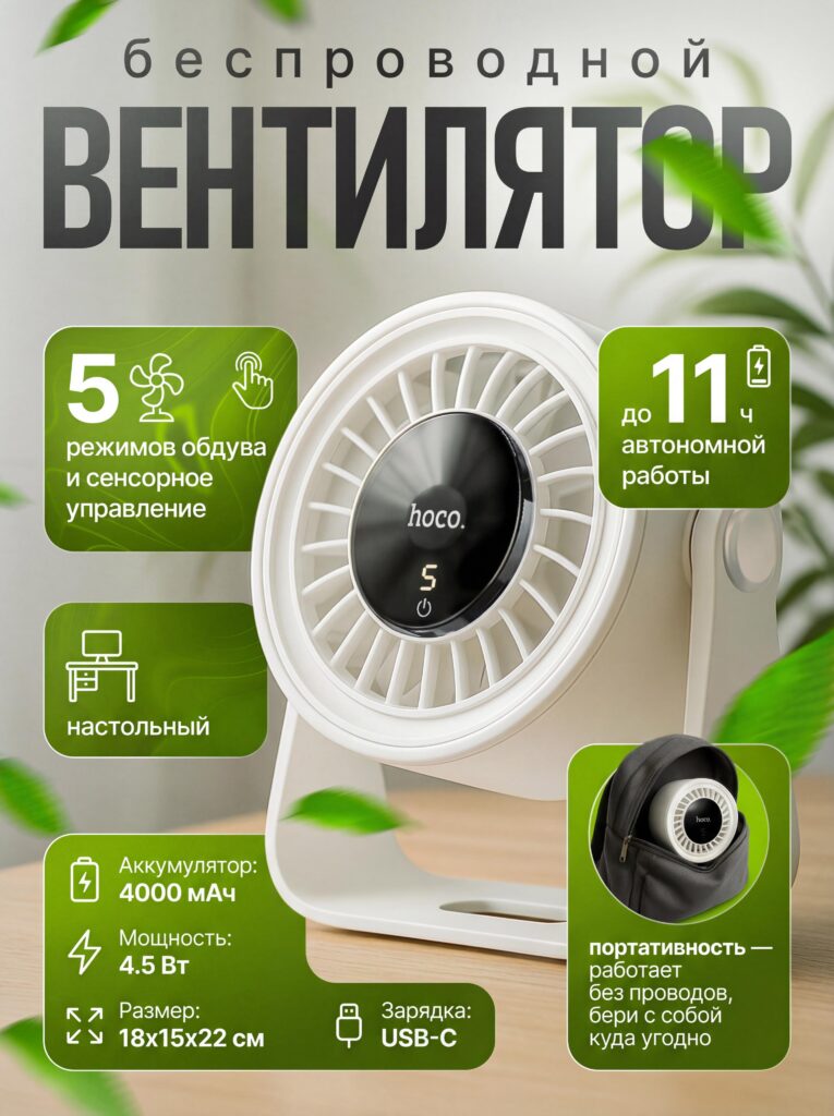
สำหรับภาพหลักของพัดลมตั้งโต๊ะไร้สาย เราเน้นการออกแบบโดยคำนึงถึงจุดขายหลักสามประการ ได้แก่ ความสะดวกในการพกพา อายุการใช้งานแบตเตอรี่ และความง่ายในการควบคุม เราวางผลิตภัณฑ์ในมุมสามในสี่ส่วนเพื่อแสดงความลึกและโครงสร้าง ในขณะที่ยังคงมองเห็นตะแกรงด้านหน้าและจอแสดงผลดิจิทัลได้อย่างชัดเจน ซึ่งสื่อให้เห็นได้ทันทีว่าพัดลมมีขนาดกะทัดรัดแต่ใช้งานได้ดี.
พื้นหลังสีเขียวอ่อนที่มีใบไม้ลอยอยู่ช่วยเสริมความสดชื่นและการไหลเวียนของอากาศโดยไม่ดึงดูดความสนใจไปจากตัวผลิตภัณฑ์ เราเลือกใช้สีเขียวโดยตั้งใจ เพราะมันสอดคล้องกับแนวคิดเรื่องความเย็นสบาย ความสะดวกสบาย และความเป็นมิตรต่อสิ่งแวดล้อม ซึ่งเป็นสัญญาณทางอารมณ์ที่สำคัญสำหรับสินค้าที่เกี่ยวข้องกับฤดูร้อน.
ข้อมูลต่างๆ จะปรากฏในรูปแบบการ์ดโค้งมนพร้อมไอคอนที่ชัดเจน ช่วยให้ผู้ซื้อสามารถดูคุณสมบัติต่างๆ เช่น “5 โหมด” “ระบบควบคุมแบบสัมผัส” และ “แบตเตอรี่ใช้งานได้นานสูงสุด 11 ชั่วโมง” ได้ภายในไม่กี่วินาที บน Ozon ลูกค้ามักเปรียบเทียบผลิตภัณฑ์ที่คล้ายกันหลายๆ รายการพร้อมกัน ดังนั้นรูปแบบการจัดวางข้อมูลแบบนี้จึงช่วยให้ผู้ใช้งานได้เปรียบอย่างชัดเจนในการเปรียบเทียบภาพอย่างรวดเร็ว.
หัวฝักบัวนวดตัว — แสดงประสิทธิภาพผ่านการเคลื่อนไหว
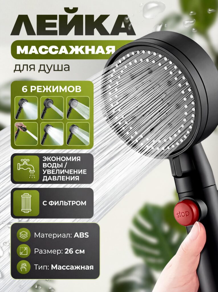
สำหรับหัวฝักบัวนวดตัวนั้น ภาพนิ่งเพียงอย่างเดียวไม่สามารถสื่อถึงคุณค่าได้ เราจำเป็นต้องแสดงให้เห็นถึงแรงดันน้ำ รูปแบบการฉีดน้ำ และความสบาย นั่นคือเหตุผลที่เราเน้นสายน้ำที่เคลื่อนไหวอย่างต่อเนื่องเป็นองค์ประกอบภาพหลัก.
เราจัดวางผลิตภัณฑ์ในแนวทแยงเพื่อสร้างการเคลื่อนไหวและพลังงาน โดยให้สายน้ำนำสายตาของผู้ดูไปยังภาพ โหมดการฉีดพ่นทั้งหกแบบแสดงเป็นภาพขนาดย่อ ทำให้คุณสมบัติจับต้องได้แทนที่จะเป็นนามธรรม วิธีนี้ช่วยลดความลังเลใจโดยให้ลูกค้า "เห็น" ฟังก์ชันการทำงานก่อนที่จะอ่านรายละเอียด.
โทนสีที่ใช้มีความสมดุลระหว่างสีเข้มของอุปกรณ์ฮาร์ดแวร์กับสีเขียวสดใส ซึ่งสื่อถึงทั้งความทนทานและสุขภาพที่ดี ไอคอนต่างๆ เน้นคุณสมบัติการประหยัดน้ำและการกรองน้ำ ซึ่งเป็นสองปัจจัยสำคัญในการตัดสินใจเลือกซื้อผลิตภัณฑ์ห้องน้ำบนแพลตฟอร์ม Ozon.
สาย USB-C แบบแม่เหล็ก — เผยให้เห็นคุณสมบัติที่มองไม่เห็น
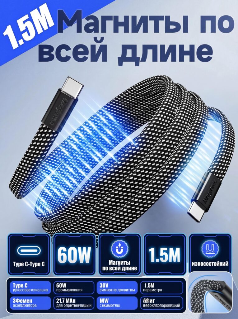
การอธิบายแม่เหล็กด้วยข้อความเพียงอย่างเดียวนั้นทำได้ยาก ดังนั้นภาพหลักนี้จึงอาศัยการเล่าเรื่องด้วยภาพ เราใช้เอฟเฟ็กต์แสงสีฟ้าเรืองรองตลอดความยาวของสายเคเบิลเพื่อแสดงถึงแรงดึงดูดของแม่เหล็กอย่างต่อเนื่อง ซึ่งทำให้ผลิตภัณฑ์นี้แตกต่างจากสายชาร์จทั่วไปอย่างเห็นได้ชัด.
สายเคเบิลถูกจัดวางในลักษณะโค้งมนคล้ายลอยตัว เพื่อเน้นทั้งความยืดหยุ่นและความแข็งแรงไปพร้อมๆ กัน เราแสดงความยาว 1.5 เมตร และกำลังไฟ 60 วัตต์ไว้อย่างชัดเจนด้วยตัวอักษรหนาและคอนทราสต์สูง เพื่อให้มั่นใจว่าข้อมูลจำเพาะเหล่านี้ยังคงอ่านได้ชัดเจนแม้บนหน้าจอมือถือ.
บนแพลตฟอร์ม Ozon ผู้ซื้อสินค้าอิเล็กทรอนิกส์มักมองหาการยืนยันอย่างรวดเร็วเกี่ยวกับความเข้ากันได้และความทนทาน การแสดงภาพแม่เหล็กแทนการติดป้ายกำกับเพียงอย่างเดียว ช่วยลดภาระทางความคิดและทำให้คุณสมบัตินี้จดจำได้ง่ายขึ้น.
สว่านไร้สาย — พลัง ความเสถียร และความมั่นใจระดับมืออาชีพ
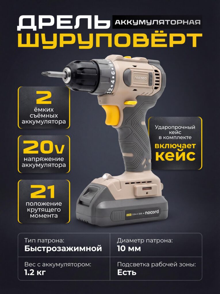
สำหรับภาพหลักของสว่านไร้สายนั้น สิ่งสำคัญอันดับแรกคือความน่าเชื่อถือและอำนาจ เราเลือกพื้นหลังสีเข้มที่เป็นกลางเพื่อให้รูปทรงและสีของเครื่องมือโดดเด่นอย่างชัดเจน สว่านปรากฏตั้งตรงและอยู่ตรงกลาง ซึ่งช่วยเสริมความมั่นคงและการควบคุม.
เราจัดโครงสร้างเลย์เอาต์เพื่อนำทางผู้ดูจากบนลงล่าง: ชื่อผลิตภัณฑ์ ข้อมูลจำเพาะด้านกำลังไฟ รายละเอียดแบตเตอรี่ และคุณสมบัติเสริม เช่น การตั้งค่าแรงบิดและหัวจับแบบปลดเร็ว ลำดับชั้นแนวตั้งนี้สะท้อนให้เห็นถึงวิธีการที่ผู้ใช้สแกนรายการเครื่องมือบน Ozon โดยธรรมชาติ.
บล็อกไฮไลต์สีเหลืองช่วยดึงดูดความสนใจไปยังจุดขายสำคัญโดยไม่ทำให้ภาพดูรกจนเกินไป เป้าหมายไม่ใช่การแสดงทุกอย่าง แต่เป็นการแสดงสิ่งที่ถูกต้อง—เพียงพอที่จะโน้มน้าวทั้งผู้ใช้งานทั่วไปและมืออาชีพว่าเครื่องมือนี้มีประสิทธิภาพที่เชื่อถือได้.
คีย์บอร์ดเชิงกลไร้สาย — ผสานความสวยงามและความแม่นยำอย่างลงตัว
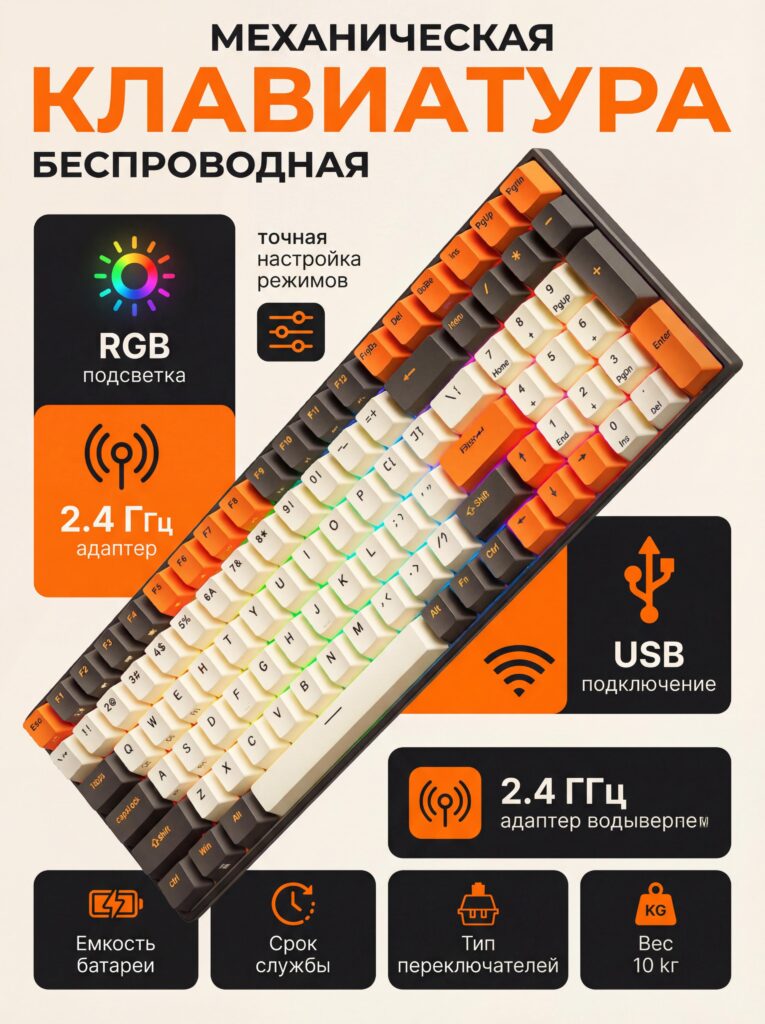
คีย์บอร์ดเชิงกลเป็นทั้งผลิตภัณฑ์ไลฟ์สไตล์และเครื่องมือใช้งาน ในการออกแบบนี้ เราเน้นบุคลิกภาพทางด้านภาพควบคู่ไปกับการรักษาความชัดเจนทางเทคนิค คีย์บอร์ดถูกจัดแสดงในมุมที่แสดงให้เห็นรูปทรงของปุ่มกด แสงไฟ RGB และเค้าโครงไปพร้อมกัน.
เราใช้สีส้มโทนอบอุ่นเป็นจุดเด่นตัดกับพื้นหลังที่เรียบง่ายเพื่อสร้างความแตกต่างและพลัง สีที่เลือกใช้นี้ดึงดูดความสนใจในรายการสินค้า Ozon ที่มีการแข่งขันสูง ในขณะเดียวกันก็เสริมสร้างเอกลักษณ์ที่ทันสมัยและมุ่งเน้นกลุ่มผู้ใช้งานระดับสูงของคีย์บอร์ดนี้.
ไอคอนแสดงคุณสมบัติ เช่น ไฟ RGB การเชื่อมต่อไร้สาย และการรองรับ USB จะปรากฏในรูปแบบบล็อกแยกส่วนรอบๆ ผลิตภัณฑ์ การจัดวางแบบนี้ช่วยให้ผู้ใช้ตรวจสอบความเข้ากันได้และตัวเลือกการปรับแต่งได้อย่างรวดเร็วโดยไม่ต้องค้นหาผ่านคำอธิบายที่มีข้อความมากมาย.
ขวดน้ำ Tritan — สะอาด ดีต่อสุขภาพ ใช้งานได้ทุกวัน
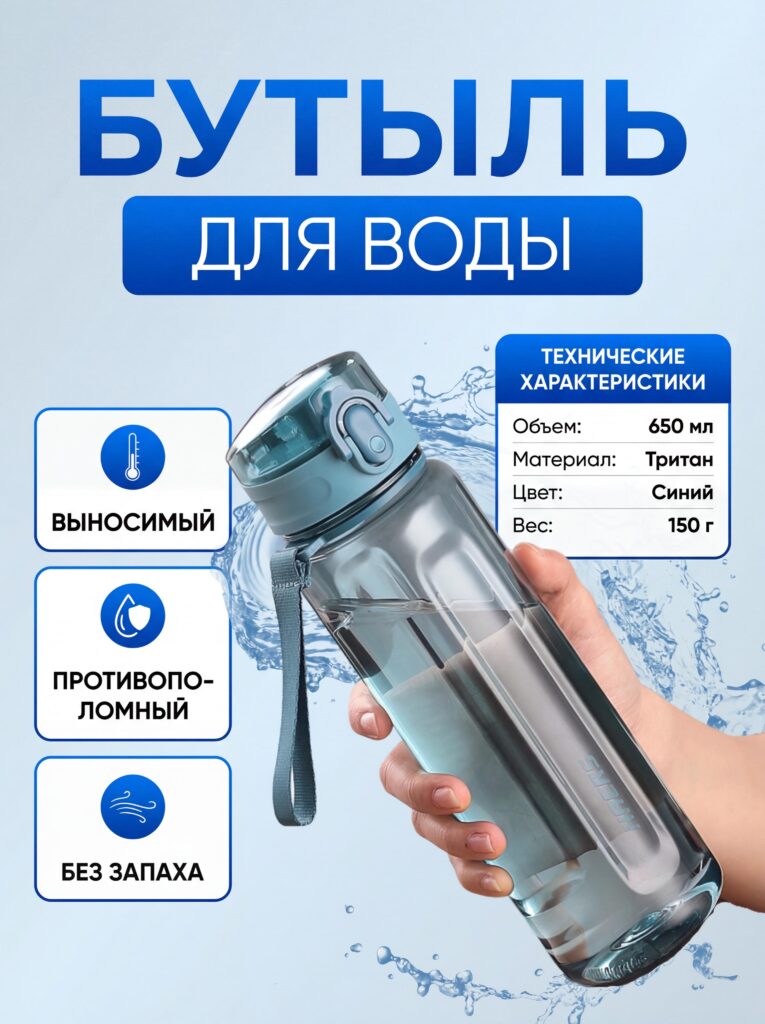
สำหรับภาพหลักของขวดน้ำ ความชัดเจนและความน่าเชื่อถือเป็นสิ่งสำคัญ เราใช้พื้นหลังสีฟ้าอ่อนและองค์ประกอบของละอองน้ำเพื่อสื่อถึงความสดชื่น ความชุ่มชื้น และความปลอดภัย ขวดน้ำถูกถืออยู่ในมือของมนุษย์อย่างเป็นธรรมชาติเพื่อให้เห็นขนาดที่แท้จริงได้ทันที.
แทนที่จะใส่ข้อมูลทางเทคนิคมากเกินไปในภาพ เราเน้นคุณสมบัติที่สำคัญ ได้แก่ วัสดุปลอดสาร BPA ป้องกันกลิ่น และพกพาสะดวก ประโยชน์เหล่านี้มีความสำคัญที่สุดสำหรับผู้ใช้ที่เลือกซื้อสินค้าสำหรับใช้ในชีวิตประจำวัน.
การจัดวางตัวอักษรยังคงสะอาดตาและกว้างขวาง เสริมสร้างภาพลักษณ์ที่ถูกสุขอนามัยและเรียบง่ายของผลิตภัณฑ์ บนแพลตฟอร์ม Ozon ผู้ซื้อสินค้าไลฟ์สไตล์มักตอบสนองอย่างมากต่อภาพที่ดูจริงใจและไม่ซับซ้อน ซึ่งการออกแบบนี้สนับสนุนความคาดหวังดังกล่าว.
เสื้อกันหนาวสำหรับสุนัข — เน้นอารมณ์ความรู้สึกเป็นหลัก ค่อยให้ข้อมูลทีหลัง
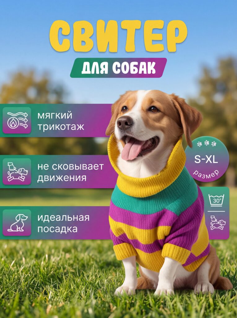
ผลิตภัณฑ์สำหรับสัตว์เลี้ยงขายได้ด้วยอารมณ์มากกว่าเหตุผล สำหรับภาพหลักของเสื้อกันหนาวสุนัข สุนัขที่ยิ้มแย้มขณะสวมใส่ผลิตภัณฑ์จึงกลายเป็นจุดสนใจหลัก ฉากกลางแจ้งช่วยเน้นย้ำถึงความสบาย ความคล่องตัว และการใช้งานในชีวิตประจำวัน.
เราใช้แบบอักษรที่มีสีสันแต่สมดุลเพื่อสื่อถึงความนุ่มนวล ความพอดี และช่วงขนาด ป้ายกำกับคุณสมบัติปรากฏควบคู่กับไอคอน ทำให้โทนโดยรวมเป็นมิตรและเข้าถึงง่ายมากกว่าที่จะดูเป็นเชิงเทคนิค.
ด้วยการปล่อยให้สีหน้าของสุนัขสื่อสารอารมณ์ เราจึงลดความต้านทานและช่วยให้เจ้าของสัตว์เลี้ยงจินตนาการถึงสุนัขของตนเองที่กำลังเพลิดเพลินกับผลิตภัณฑ์ได้ ความชัดเจนทางอารมณ์นี้มีความสำคัญอย่างยิ่งสำหรับหมวดหมู่สินค้าเครื่องแต่งกายบน Ozon.
ความสม่ำเสมอของระบบการออกแบบในทุกหมวดหมู่
แม้ว่าผลิตภัณฑ์แต่ละประเภทจะต้องการกลยุทธ์ด้านภาพที่แตกต่างกัน แต่เราก็ยังคงรักษาหลักการออกแบบที่สอดคล้องกันในทุกภาพ:
- ลำดับชั้นทางภาพที่ชัดเจน
- ความสามารถในการอ่านที่เน้นการใช้งานบนมือถือเป็นหลัก
- คำอธิบายคุณสมบัติที่รองรับด้วยไอคอน
- จิตวิทยาของสีที่เหมาะสมกับหมวดหมู่
- การจดจำผลิตภัณฑ์ได้ทันที
ความสมดุลระหว่างความสม่ำเสมอและการปรับแต่งนี้ช่วยให้แต่ละรายการดูเป็นมืออาชีพ ในขณะเดียวกันก็ยังคงเหมาะสมกับกลุ่มเป้าหมายในตลาด.
เหตุใดการออกแบบภาพหลักเชิงกลยุทธ์จึงมีความสำคัญบน Ozon
ลูกค้าของ Ozon ไม่ได้อ่านรายละเอียดก่อนซื้อ แต่พวกเขาจะสแกนดู ภาพหลักจึงต้องสื่อถึงคุณค่าได้ทันทีโดยไม่ทำให้เกิดความสับสน ทุกการตัดสินใจด้านการออกแบบที่แสดงไว้ที่นี่ล้วนมีจุดประสงค์เฉพาะ: ลดความลังเล เพิ่มความไว้วางใจ และดึงดูดความสนใจไปสู่การตัดสินใจซื้อ.
ภาพหลักที่ออกแบบมาอย่างดีจะช่วยลดอัตราการคืนสินค้าได้ด้วยการสร้างความคาดหวังที่ถูกต้อง เมื่อผู้ใช้เข้าใจอย่างชัดเจนว่ากำลังซื้ออะไร ความพึงพอใจหลังการซื้อก็จะเพิ่มขึ้น.
บทสรุป
มีประสิทธิภาพ โอโซน การออกแบบภาพหลักไม่ได้เน้นแค่การตกแต่ง แต่เน้นความชัดเจน จิตวิทยา และการสื่อสารเชิงกลยุทธ์ ด้วยการปรับภาษาภาพให้สอดคล้องกับพฤติกรรมบนแพลตฟอร์มและความคาดหวังของลูกค้า เราจึงเปลี่ยนภาพสินค้าให้เป็นเครื่องมือในการเพิ่มยอดขายได้.
การออกแบบเหล่านี้แสดงให้เห็นว่าโครงสร้างที่คิดมาอย่างรอบคอบ ความหนาแน่นของข้อมูลที่ได้รับการควบคุม และการเล่าเรื่องเฉพาะหมวดหมู่ ช่วยยกระดับรายการสินค้าให้เหนือกว่าการปฏิบัติตามกฎระเบียบขั้นพื้นฐาน เมื่อการออกแบบสื่อสารได้อย่างชัดเจน ลูกค้าก็จะรับฟัง และคลิก.
นี่คือแนวทางที่เราใช้ที่นี่อย่างแท้จริง AIRSANG, โดยเราเชี่ยวชาญด้านการออกแบบที่เน้นการเพิ่มยอดขายสำหรับอีคอมเมิร์ซข้ามพรมแดน ช่วยให้แบรนด์ต่างๆ โดดเด่นบนแพลตฟอร์มอย่าง Ozon ด้วยภาพลักษณ์เชิงกลยุทธ์ ไม่ใช่การคาดเดา.


ออกแบบและสร้างเว็บไซต์ WordPress หรือเว็บไซต์องค์กรพร้อมระบบอีคอมเมิร์ซครบวงจรสำหรับคุณ.
ช่วงราคา: $200.00 ถึง $2,500.00ข้อกำหนดเฉพาะหรือใบเสนอราคาพิเศษ
ราคาเดิมคือ: $2.00.$1.00ราคาปัจจุบันคือ: $1.00. ภาพหลักสำหรับการออกแบบอุปกรณ์กายภาพบำบัดที่บ้านของ Amazon (อธิบายรายละเอียด)
บทนำ: การสร้างภาพลักษณ์ที่น่าเชื่อถือสำหรับอุปกรณ์บำบัดที่บ้านบน Amazon เมื่อออกแบบภาพหลักสำหรับอุปกรณ์บำบัดที่บ้านบน Amazon สิ่งสำคัญอันดับแรกของเราคือ...

ภาพหลักสำหรับการแปลงลิปสติกเป็นสินค้าสำหรับ Amazon
บทนำ: การออกแบบภาพหลักลิปสติกที่ขายได้บน Amazon เมื่อเราออกแบบภาพหลักสำหรับลิปสติกบน Amazon ความรับผิดชอบของเราไม่ได้จำกัดอยู่แค่...

อะไรทำให้รองพื้นชนิดเหลวของ Amazon (ภาพหลัก) ขายดี?
บทนำ การออกแบบภาพหลักสำหรับรองพื้นชนิดเหลวบน Amazon ไม่ใช่แค่การทำให้ผลิตภัณฑ์ดูสวยงามเท่านั้น บน Amazon ภาพหลักและ...

การออกแบบภาพหลัก Amazon ที่มีประสิทธิภาพสำหรับตลับกรอง
บทนำ การออกแบบภาพหลักสำหรับ Amazon ไม่ใช่แค่การทำให้สินค้าดูน่าดึงดูดเท่านั้น แต่ยังเกี่ยวกับความชัดเจน ความน่าเชื่อถือ และความเข้าใจได้ในทันที โดยเฉพาะอย่างยิ่งสำหรับ...

เปรียบเทียบธีม WordPress สำหรับสัตว์เลี้ยง 5 แบบ
บทนำ การเลือกธีม WordPress ที่เหมาะสมสำหรับธุรกิจเกี่ยวกับสัตว์เลี้ยงนั้นไม่ใช่แค่เรื่องของการออกแบบเท่านั้น แต่ยังส่งผลโดยตรงต่อการใช้งาน ความสามารถในการขยายขนาด และการเติบโตของธุรกิจในระยะยาว การดูแลสัตว์เลี้ยงและ...

การสร้างเว็บไซต์ WordPress ที่ปรับขนาดได้สำหรับแบรนด์ที่ขับเคลื่อนด้วยวิทยาศาสตร์: โครงการ AminoUSA
บทนำ ในยุคดิจิทัลปัจจุบัน เว็บไซต์เป็นมากกว่าแค่สถานที่สำหรับแสดงรายการสินค้า สำหรับแบรนด์ที่ขับเคลื่อนด้วยวิทยาศาสตร์ซึ่งดำเนินงานในอุตสาหกรรมที่มีการควบคุมหรือเน้นการวิจัย...

สร้างร้านค้า Shopify ที่ปรับขนาดได้สำหรับแบรนด์ใบมีดระดับโลก: โครงการ CoolKatana
บทนำ ในธุรกิจอีคอมเมิร์ซข้ามพรมแดน เว็บไซต์ Shopify เป็นมากกว่าแค่หน้าร้าน สำหรับแบรนด์ที่ดำเนินธุรกิจในกลุ่มเฉพาะหรือกลุ่มที่ขับเคลื่อนด้วยวัฒนธรรม เว็บไซต์ต้องทำมากกว่านั้น...

การออกแบบร้านค้า Shopify ที่มีอัตราการแปลงสูงสำหรับขายการ์ดโปเกมอน
บทนำ ในโลกของอีคอมเมิร์ซสินค้าสะสม โดยเฉพาะอย่างยิ่งในตลาดเกมการ์ดโปเกมอน (TCG) เว็บไซต์จะต้องทำมากกว่าแค่แสดงรายการสินค้า...

ดีไซน์ Shopify ที่เพิ่มยอดขายสำหรับแบรนด์อิฐสั่งทำพิเศษ
บทนำ ในสภาพแวดล้อมการแข่งขันอีคอมเมิร์ซในปัจจุบัน โดยเฉพาะอย่างยิ่งในตลาดของขวัญส่วนบุคคลและของสะสม เว็บไซต์ Shopify ต้องทำมากกว่าแค่แสดงสินค้า...

กรณีศึกษาการออกแบบเว็บไซต์ Shopify สำหรับแบรนด์ดอกไม้ระดับพรีเมียม
บทนำ ในสภาพแวดล้อมการแข่งขันอีคอมเมิร์ซในปัจจุบัน เว็บไซต์ Shopify ต้องทำมากกว่าแค่แสดงสินค้า มันต้องสื่อสารคุณค่าของแบรนด์ได้ทันที และแนะนำผู้ใช้...

กรณีศึกษาการออกแบบร้านค้า Shopify: ร้านค้าเกมย้อนยุค
บทนำ ในสภาพแวดล้อมอีคอมเมิร์ซที่มีการแข่งขันสูง ความชัดเจนทางด้านภาพและการเชื่อมโยงทางอารมณ์มักเป็นตัวกำหนดว่าผู้เยี่ยมชมจะกลายเป็นลูกค้าหรือไม่ โดยเฉพาะอย่างยิ่งใน...

กรณีศึกษาการออกแบบบน Shopify: แบรนด์ Tactical Rescue
บทนำ เว็บไซต์ Shopify ที่แข็งแกร่งนั้นทำมากกว่าแค่แสดงสินค้า—มันยังสื่อสารจุดประสงค์ สร้างความไว้วางใจ และชี้นำผู้ใช้ไปสู่การตัดสินใจซื้ออย่างมั่นใจ โดยเฉพาะอย่างยิ่ง...

กรณีศึกษาการออกแบบเว็บไซต์ Shopify สำหรับแบรนด์จักรยานไฟฟ้า
บทนำ ในตลาดจักรยานไฟฟ้าที่มีการแข่งขันสูงในปัจจุบัน เว็บไซต์ Shopify ต้องทำมากกว่าแค่แสดงสินค้า—ต้องเล่าเรื่องราว สร้างความน่าเชื่อถือ และให้คำแนะนำแก่ผู้ใช้งาน...

แพลตฟอร์มอีคอมเมิร์ซ Shopify ที่ปรับขนาดได้สำหรับแบรนด์สร้างสรรค์
บทนำ เมื่อแบรนด์สร้างสรรค์เติบโตขึ้น เว็บไซต์ของพวกเขามักประสบปัญหาในการปรับตัวให้ทัน เนื่องจากสายผลิตภัณฑ์ขยายตัว เนื้อหาเพิ่มขึ้น และปริมาณการเข้าชมสูงขึ้น แบรนด์ที่เน้นภาพเป็นหลักหลายแห่ง...

กรณีศึกษาการออกแบบเว็บไซต์ Shopify สำหรับแบรนด์สินค้าตกแต่งบ้าน
บทนำ ในตลาดสินค้าตกแต่งบ้านที่มีการแข่งขันสูง ภาพลักษณ์ของแบรนด์ไม่ได้เป็นเพียงแค่เรื่องของความสวยงามอีกต่อไป แต่ยังส่งผลโดยตรงต่อความไว้วางใจ พฤติกรรมการเลือกชมสินค้า และการตัดสินใจซื้อสินค้า สำหรับ...

กรณีศึกษาการสร้างเว็บไซต์สมัครสมาชิก WordPress ที่ปรับขนาดได้
บทนำ สำหรับแบรนด์อีคอมเมิร์ซสมัยใหม่ เว็บไซต์ไม่ได้เป็นเพียงแค่หน้าร้านดิจิทัลอีกต่อไปแล้ว มันคือกลไกสำคัญที่สนับสนุนการสมัครรับข้อมูล การเล่าเรื่องราวผ่านเนื้อหา การสร้างความไว้วางใจ...

ดีไซน์ WordPress ที่เพิ่มอัตราการแปลงสูงสำหรับแบรนด์สำหรับผู้ใหญ่
บทนำ ในตลาดอีคอมเมิร์ซที่มีการแข่งขันสูง ภาพลักษณ์ที่สวยงามเพียงอย่างเดียวไม่เพียงพอ เว็บไซต์ WordPress ที่ประสบความสำเร็จต้องนำทางผู้เข้าชมผ่านเส้นทางที่ชัดเจนและตั้งใจไว้ ซึ่ง...

เว็บไซต์อีคอมเมิร์ซตุ๊กตาเซ็กส์ WordPress ที่ปรับขนาดได้
บทนำ การเปิดตัวเว็บไซต์อีคอมเมิร์ซข้ามพรมแดนที่มีประสิทธิภาพสูงนั้นไม่ใช่แค่การนำสินค้าขึ้นออนไลน์เท่านั้น สำหรับแบรนด์ที่ดำเนินธุรกิจในตลาดที่มีการแข่งขันสูงและเน้นภาพลักษณ์เป็นหลัก เว็บไซต์...