


การแนะนำ
Designing a high-performing main image set for โอโซน requires much more than placing a product on a blue background. For children’s products in particular, visual communication must balance emotional appeal, functional clarity, and platform compliance.
In this project, we designed a complete Ozon main image sequence for a Children’s instant print camera, focusing on how parents browse, how children respond visually, and how Ozon’s product grid rewards clarity over decoration. Every image in this set plays a precise role: attracting attention, explaining features, building trust, and finally removing purchase hesitation.
Below, we walk through each image one by one, explaining the design logic, layout decisions, and conversion strategy behind every visual choice.
| ระยะเวลาจัดส่ง | หมวดหมู่ | แพลตฟอร์มแอปพลิเคชัน |
| 7 วัน | Children’s instant print camera | โอโซน |
| นักออกแบบที่เกี่ยวข้อง | ค่าใช้จ่าย | ผล |
| หลิน จาง | $110 | Sales📈243% |
Image 1: Product Identity and Category Recognition
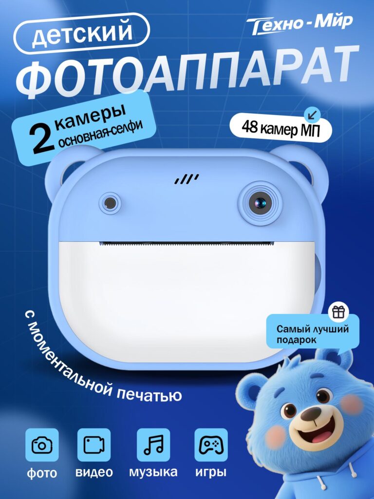
The first image establishes instant category recognition.
We deliberately present the camera alone, centered, and enlarged, allowing shoppers to immediately understand what the product is without distraction. On Ozon, users scroll quickly through dense product listings, so the primary task of the first image is speed of recognition.
The large Russian headline clearly states “Children’s Camera”, removing any ambiguity about the target audience. Supporting callouts highlight key selling points such as dual cameras and 48 MP resolution, which parents associate with real functionality rather than toy-like limitations.
The soft blue color palette was chosen intentionally. Blue communicates safety, calmness, and trust—qualities parents subconsciously look for in children’s electronics. Rounded shapes and bear-ear details reinforce friendliness and child-safe design, while clean typography ensures the image still feels modern and technical.
This image does not attempt to explain everything. Its role is simple: stop the scroll and confirm relevance.
Image 2: Emotional Connection Through Real-Life Use
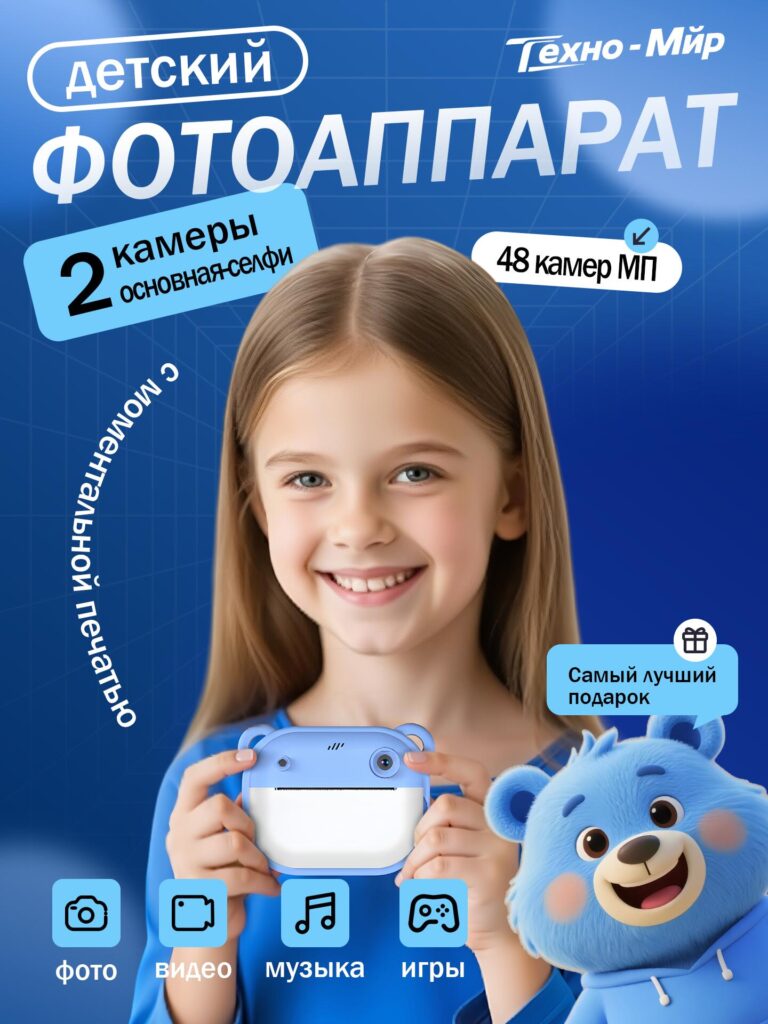
Once interest is captured, the second image introduces human context.
We show a smiling child holding the camera naturally, creating an immediate emotional bridge between the product and its real user. Parents shopping on Ozon are not only buying a device; they are buying a moment, an experience, and a memory. This image answers the unspoken question: “Will my child enjoy this?”
The camera remains clearly visible and proportionally accurate, avoiding exaggeration. The child’s relaxed posture communicates ease of use, while the consistent blue background maintains visual continuity with the first image.
By including both the child and the product, we shift from abstract features to tangible lifestyle value. This image reassures parents that the camera is lightweight, intuitive, and suitable for small hands.
Image 3: Core Performance and Print Functionality
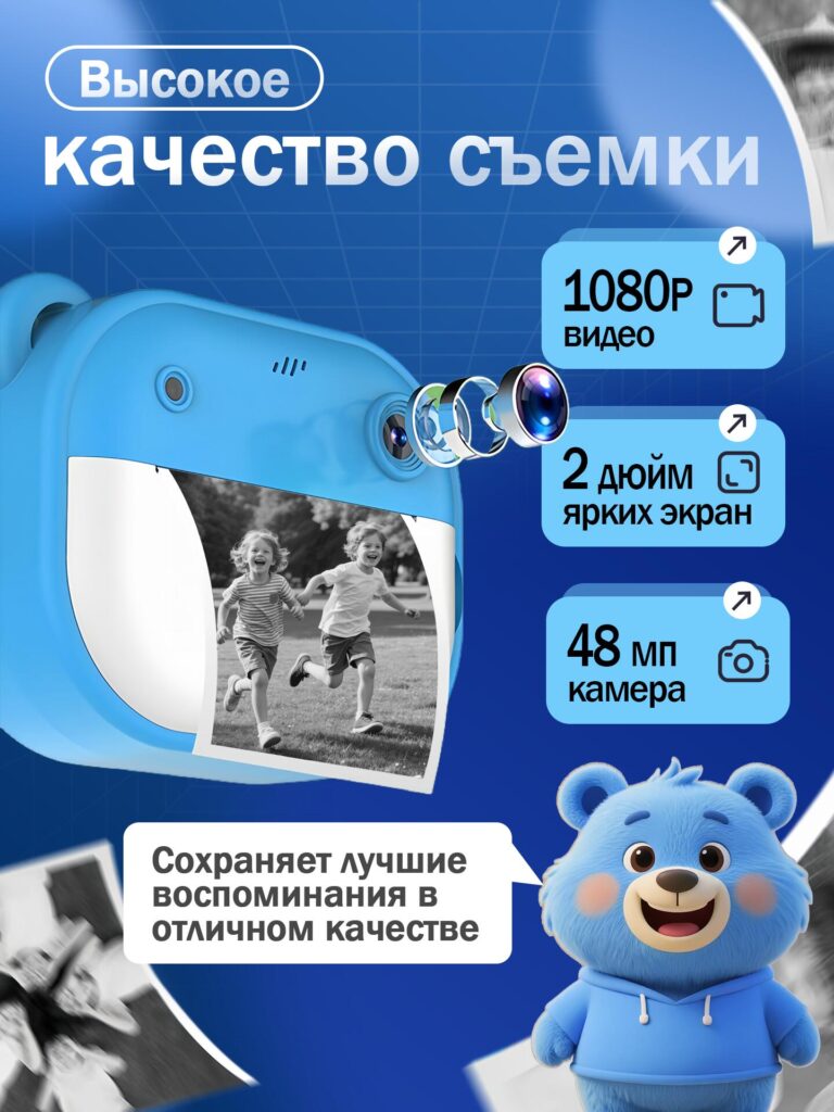
The third image focuses on technical credibility.
Here, we visually break down the camera’s lens structure and instant print output. The exploded lens graphic is not decorative—it signals optical quality and seriousness, reassuring parents that this is more than a novelty toy.
We highlight three critical features:
- 1080P video recording
- 2-inch bright display
- 48 MP camera resolution
The printed black-and-white photo emerging from the camera reinforces the instant print function visually, eliminating the need for long explanations. Parents immediately understand how the product works and what their child will receive physically.
This image bridges emotion and logic. It validates the purchase decision by showing that fun is supported by real performance.
Image 4: Creativity, Filters, and Learning Value
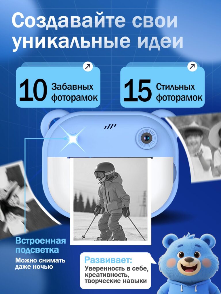
Children’s products must justify their educational value, especially in family purchasing decisions.
In this image, we focus on creativity and cognitive development. We highlight the availability of photo frames and filters, emphasizing how the camera encourages self-expression rather than passive consumption.
The printed photo examples floating around the camera create a sense of motion and imagination. The built-in light feature is clearly indicated, addressing low-light usability and expanding usage scenarios beyond daytime.
We intentionally included educational messaging that connects creativity with confidence and skill development. This reframes the camera as a learning tool rather than just entertainment, aligning with parental expectations.
Image 5: Entertainment Beyond Photography
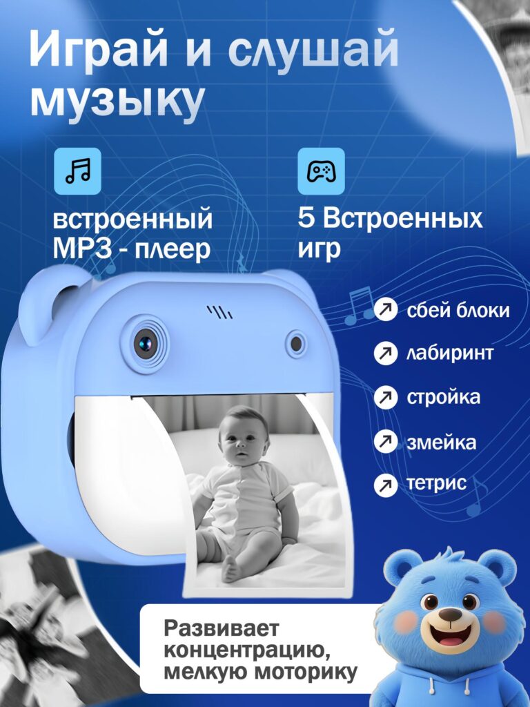
The fifth image expands the product’s value proposition.
We introduce the built-in MP3 player and five pre-installed games, clearly listed for transparency. Instead of presenting these features as distractions, the design frames them as tools for improving concentration and fine motor skills.
The clean icon system allows parents to scan information quickly without reading long paragraphs. Each game name is displayed clearly, reinforcing honesty and completeness.
This image ensures parents understand that the camera remains useful even when children are not actively taking photos, increasing perceived value and daily usage frequency.
Image 6: Complete Package and What’s Included
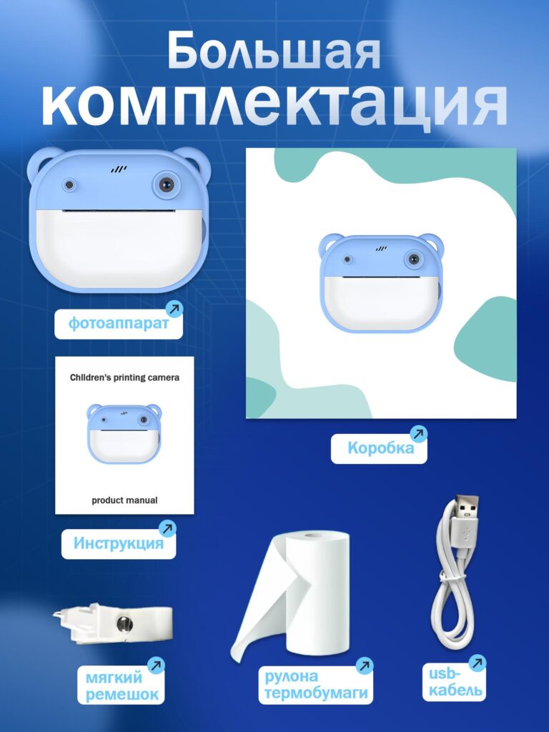
One of the most important conversion moments on Ozon is eliminating uncertainty.
In this image, we clearly present everything included in the box:
- The instant print camera
- Instruction manual
- Soft strap
- Roll of thermal paper
- USB charging cable
- บรรจุภัณฑ์สำหรับขายปลีก
This transparency builds trust and reduces post-purchase disappointment. Parents know exactly what they will receive, and there is no ambiguity about hidden accessories or additional costs.
The clean layout ensures each item is recognizable and proportionally accurate, reinforcing professionalism and reliability.
เหตุใดการออกแบบภาพหลักนี้จึงได้ผลบน Ozon
This image set succeeds because it aligns with how Ozon users browse and decide:
- It prioritizes clarity over decoration
- It balances emotional appeal with factual transparency
- It guides users from interest → trust → decision
- It respects Ozon’s visual and informational standards
Every image answers a specific question parents subconsciously ask while scrolling:
- มันคืออะไร?
- Who is it for?
- How does it work?
- Is it useful?
- Is it worth the price?
- What exactly do I get?
When these questions are answered visually, conversion becomes a natural outcome rather than a forced one.
ข้อคิดส่งท้าย
Designing an effective Main image design for โอโซน Children’s instant print camera is not about making the product look louder—it is about making it easier to understand, trust, and choose.
This project demonstrates how thoughtful structure, platform-specific strategy, and user-centered design can transform a simple product into a compelling offer in a competitive marketplace.
This is the same design philosophy we apply across all cross-border eCommerce projects at AIRSANG, where every visual decision is made to serve both the platform and the customer.


ออกแบบและสร้างเว็บไซต์ WordPress หรือเว็บไซต์องค์กรพร้อมระบบอีคอมเมิร์ซครบวงจรสำหรับคุณ.
ช่วงราคา: $200.00 ถึง $2,500.00ข้อกำหนดเฉพาะหรือใบเสนอราคาพิเศษ
ราคาเดิมคือ: $2.00.$1.00ราคาปัจจุบันคือ: $1.00. ภาพหลักสำหรับการออกแบบอุปกรณ์กายภาพบำบัดที่บ้านของ Amazon (อธิบายรายละเอียด)
บทนำ: การสร้างภาพลักษณ์ที่น่าเชื่อถือสำหรับอุปกรณ์บำบัดที่บ้านบน Amazon เมื่อออกแบบภาพหลักสำหรับอุปกรณ์บำบัดที่บ้านบน Amazon สิ่งสำคัญอันดับแรกของเราคือ...

ภาพหลักสำหรับการแปลงลิปสติกเป็นสินค้าสำหรับ Amazon
บทนำ: การออกแบบภาพหลักลิปสติกที่ขายได้บน Amazon เมื่อเราออกแบบภาพหลักสำหรับลิปสติกบน Amazon ความรับผิดชอบของเราไม่ได้จำกัดอยู่แค่...

อะไรทำให้รองพื้นชนิดเหลวของ Amazon (ภาพหลัก) ขายดี?
บทนำ การออกแบบภาพหลักสำหรับรองพื้นชนิดเหลวบน Amazon ไม่ใช่แค่การทำให้ผลิตภัณฑ์ดูสวยงามเท่านั้น บน Amazon ภาพหลักและ...

การออกแบบภาพหลัก Amazon ที่มีประสิทธิภาพสำหรับตลับกรอง
บทนำ การออกแบบภาพหลักสำหรับ Amazon ไม่ใช่แค่การทำให้สินค้าดูน่าดึงดูดเท่านั้น แต่ยังเกี่ยวกับความชัดเจน ความน่าเชื่อถือ และความเข้าใจได้ในทันที โดยเฉพาะอย่างยิ่งสำหรับ...

เปรียบเทียบธีม WordPress สำหรับสัตว์เลี้ยง 5 แบบ
บทนำ การเลือกธีม WordPress ที่เหมาะสมสำหรับธุรกิจเกี่ยวกับสัตว์เลี้ยงนั้นไม่ใช่แค่เรื่องของการออกแบบเท่านั้น แต่ยังส่งผลโดยตรงต่อการใช้งาน ความสามารถในการขยายขนาด และการเติบโตของธุรกิจในระยะยาว การดูแลสัตว์เลี้ยงและ...

การสร้างเว็บไซต์ WordPress ที่ปรับขนาดได้สำหรับแบรนด์ที่ขับเคลื่อนด้วยวิทยาศาสตร์: โครงการ AminoUSA
บทนำ ในยุคดิจิทัลปัจจุบัน เว็บไซต์เป็นมากกว่าแค่สถานที่สำหรับแสดงรายการสินค้า สำหรับแบรนด์ที่ขับเคลื่อนด้วยวิทยาศาสตร์ซึ่งดำเนินงานในอุตสาหกรรมที่มีการควบคุมหรือเน้นการวิจัย...

สร้างร้านค้า Shopify ที่ปรับขนาดได้สำหรับแบรนด์ใบมีดระดับโลก: โครงการ CoolKatana
บทนำ ในธุรกิจอีคอมเมิร์ซข้ามพรมแดน เว็บไซต์ Shopify เป็นมากกว่าแค่หน้าร้าน สำหรับแบรนด์ที่ดำเนินธุรกิจในกลุ่มเฉพาะหรือกลุ่มที่ขับเคลื่อนด้วยวัฒนธรรม เว็บไซต์ต้องทำมากกว่านั้น...

การออกแบบร้านค้า Shopify ที่มีอัตราการแปลงสูงสำหรับขายการ์ดโปเกมอน
บทนำ ในโลกของอีคอมเมิร์ซสินค้าสะสม โดยเฉพาะอย่างยิ่งในตลาดเกมการ์ดโปเกมอน (TCG) เว็บไซต์จะต้องทำมากกว่าแค่แสดงรายการสินค้า...

ดีไซน์ Shopify ที่เพิ่มยอดขายสำหรับแบรนด์อิฐสั่งทำพิเศษ
บทนำ ในสภาพแวดล้อมการแข่งขันอีคอมเมิร์ซในปัจจุบัน โดยเฉพาะอย่างยิ่งในตลาดของขวัญส่วนบุคคลและของสะสม เว็บไซต์ Shopify ต้องทำมากกว่าแค่แสดงสินค้า...

กรณีศึกษาการออกแบบเว็บไซต์ Shopify สำหรับแบรนด์ดอกไม้ระดับพรีเมียม
บทนำ ในสภาพแวดล้อมการแข่งขันอีคอมเมิร์ซในปัจจุบัน เว็บไซต์ Shopify ต้องทำมากกว่าแค่แสดงสินค้า มันต้องสื่อสารคุณค่าของแบรนด์ได้ทันที และแนะนำผู้ใช้...

กรณีศึกษาการออกแบบร้านค้า Shopify: ร้านค้าเกมย้อนยุค
บทนำ ในสภาพแวดล้อมอีคอมเมิร์ซที่มีการแข่งขันสูง ความชัดเจนทางด้านภาพและการเชื่อมโยงทางอารมณ์มักเป็นตัวกำหนดว่าผู้เยี่ยมชมจะกลายเป็นลูกค้าหรือไม่ โดยเฉพาะอย่างยิ่งใน...

กรณีศึกษาการออกแบบบน Shopify: แบรนด์ Tactical Rescue
บทนำ เว็บไซต์ Shopify ที่แข็งแกร่งนั้นทำมากกว่าแค่แสดงสินค้า—มันยังสื่อสารจุดประสงค์ สร้างความไว้วางใจ และชี้นำผู้ใช้ไปสู่การตัดสินใจซื้ออย่างมั่นใจ โดยเฉพาะอย่างยิ่ง...

กรณีศึกษาการออกแบบเว็บไซต์ Shopify สำหรับแบรนด์จักรยานไฟฟ้า
บทนำ ในตลาดจักรยานไฟฟ้าที่มีการแข่งขันสูงในปัจจุบัน เว็บไซต์ Shopify ต้องทำมากกว่าแค่แสดงสินค้า—ต้องเล่าเรื่องราว สร้างความน่าเชื่อถือ และให้คำแนะนำแก่ผู้ใช้งาน...

แพลตฟอร์มอีคอมเมิร์ซ Shopify ที่ปรับขนาดได้สำหรับแบรนด์สร้างสรรค์
บทนำ เมื่อแบรนด์สร้างสรรค์เติบโตขึ้น เว็บไซต์ของพวกเขามักประสบปัญหาในการปรับตัวให้ทัน เนื่องจากสายผลิตภัณฑ์ขยายตัว เนื้อหาเพิ่มขึ้น และปริมาณการเข้าชมสูงขึ้น แบรนด์ที่เน้นภาพเป็นหลักหลายแห่ง...

กรณีศึกษาการออกแบบเว็บไซต์ Shopify สำหรับแบรนด์สินค้าตกแต่งบ้าน
บทนำ ในตลาดสินค้าตกแต่งบ้านที่มีการแข่งขันสูง ภาพลักษณ์ของแบรนด์ไม่ได้เป็นเพียงแค่เรื่องของความสวยงามอีกต่อไป แต่ยังส่งผลโดยตรงต่อความไว้วางใจ พฤติกรรมการเลือกชมสินค้า และการตัดสินใจซื้อสินค้า สำหรับ...

กรณีศึกษาการสร้างเว็บไซต์สมัครสมาชิก WordPress ที่ปรับขนาดได้
บทนำ สำหรับแบรนด์อีคอมเมิร์ซสมัยใหม่ เว็บไซต์ไม่ได้เป็นเพียงแค่หน้าร้านดิจิทัลอีกต่อไปแล้ว มันคือกลไกสำคัญที่สนับสนุนการสมัครรับข้อมูล การเล่าเรื่องราวผ่านเนื้อหา การสร้างความไว้วางใจ...

ดีไซน์ WordPress ที่เพิ่มอัตราการแปลงสูงสำหรับแบรนด์สำหรับผู้ใหญ่
บทนำ ในตลาดอีคอมเมิร์ซที่มีการแข่งขันสูง ภาพลักษณ์ที่สวยงามเพียงอย่างเดียวไม่เพียงพอ เว็บไซต์ WordPress ที่ประสบความสำเร็จต้องนำทางผู้เข้าชมผ่านเส้นทางที่ชัดเจนและตั้งใจไว้ ซึ่ง...

เว็บไซต์อีคอมเมิร์ซตุ๊กตาเซ็กส์ WordPress ที่ปรับขนาดได้
บทนำ การเปิดตัวเว็บไซต์อีคอมเมิร์ซข้ามพรมแดนที่มีประสิทธิภาพสูงนั้นไม่ใช่แค่การนำสินค้าขึ้นออนไลน์เท่านั้น สำหรับแบรนด์ที่ดำเนินธุรกิจในตลาดที่มีการแข่งขันสูงและเน้นภาพลักษณ์เป็นหลัก เว็บไซต์...