


การแนะนำ
When designing a main image set for a cycling helmet on โอโซน, the primary goal is not visual impact alone, but clarity, trust, and fast comprehension. Ozon users scroll quickly, compare aggressively, and rely heavily on visual cues to judge safety, comfort, and value within seconds.
For this cycling helmet project, we approached the design with a clear strategy: every image must answer one key user question. Instead of overwhelming the buyer with technical text, we used structured layouts, clean typography, and realistic product rendering to guide the customer through features step by step. Each image plays a distinct role in reducing hesitation and increasing confidence.
This article breaks down the design logic behind every image in the Ozon main image set and explains how visual decisions directly support higher click-through rates and better conversion.
| ระยะเวลาจัดส่ง | หมวดหมู่ | แพลตฟอร์มแอปพลิเคชัน |
| 8 วัน | Cycling helmet | โอโซน |
| นักออกแบบที่เกี่ยวข้อง | ค่าใช้จ่าย | ผล |
| แนนซี่ | $150 | Sales volume📈196% |
Image 1: Magnetic Visor as the Core Visual Hook
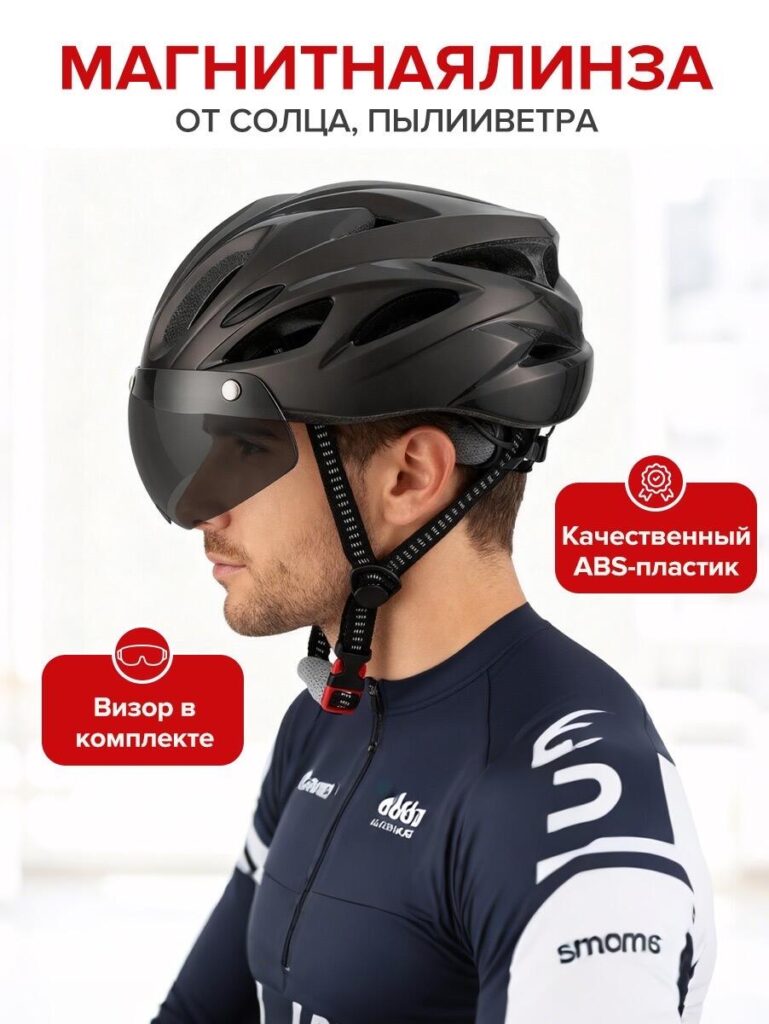
The first image introduces the helmet worn by a real cyclist in a clean, bright environment. This image focuses on the magnetic visor, clearly labeled as protection from sun, dust, and wind.
From a design perspective, we placed the visor at the center of attention for a reason. On Ozon, differentiation is critical. Many helmets look similar at first glance, but a magnetic visor instantly communicates added value. Showing it in real-world use helps users immediately understand its purpose without reading long descriptions.
We chose a neutral background and realistic lighting to emphasize the product rather than distract from it. The helmet’s contours, visor transparency, and fit on the rider’s head are all clearly visible, reinforcing trust and authenticity. The red callout elements are intentionally bold to guide the eye and ensure readability even on mobile screens.
Image 2: Ventilation and Airflow Visualization
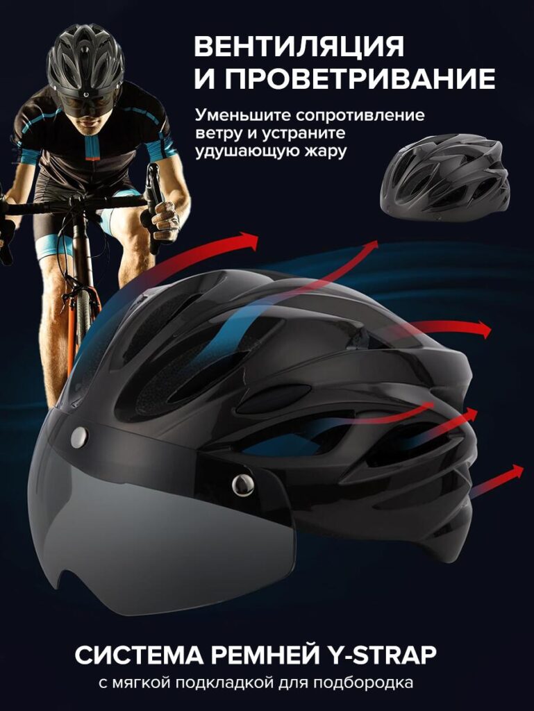
The second image shifts from lifestyle to functional performance. Here, we visually explain ventilation and airflow using directional arrows and layered graphics.
Instead of listing airflow numbers or technical jargon, we chose a visual metaphor that instantly communicates cooling and reduced wind resistance. Cyclists care deeply about heat buildup, especially during long rides, so this image answers a critical concern: “Will this helmet feel hot?”
The darker background creates contrast, allowing the airflow arrows and helmet shape to stand out. This design choice increases visual clarity while also giving the image a more technical, performance-driven feel. By showing both a rider in motion and a close-up helmet render, we bridge emotional appeal and technical reassurance in a single frame.
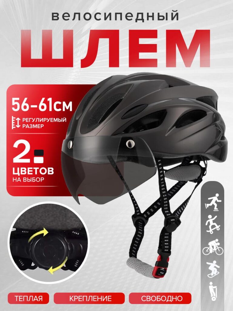
Image 3: Y-Strap System and Secure Fit
In the third image, the focus moves to fit and stability, specifically the Y-strap system and chin padding.
From a UX standpoint, strap systems are often overlooked in product photos, yet they strongly influence comfort perception. We designed this image to highlight how the straps sit naturally along the face, with soft padding under the chin to prevent irritation.
The clean text hierarchy ensures users can instantly identify the benefit without reading dense copy. By pairing the strap close-up with a helmet render, we show both micro details and the overall structure, reinforcing quality and thoughtful engineering.
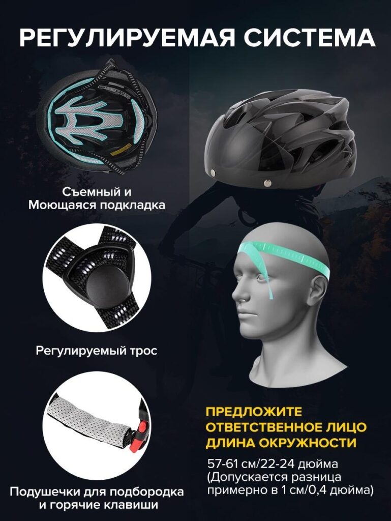
Image 4: Adjustable System and Internal Comfort
This image dives deeper into internal helmet design, showing the adjustable fit system, removable padding, and washable lining.
Cycling helmets are personal items, and hygiene matters. By visually isolating the padding and adjustment dial, we communicate ease of maintenance and long-term comfort. The exploded-style layout helps users understand how the helmet adapts to different head shapes without feeling complicated.
We intentionally avoided clutter and used clear spacing so each feature remains legible. This approach aligns with Ozon’s preference for clean, information-first visuals and helps reduce doubts around sizing and usability.
Image 5: Comparison with Standard Helmets
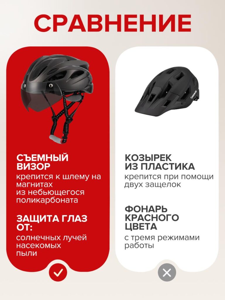
The final image is a direct comparison, a powerful conversion tool on Ozon.
On the left, we present the featured helmet with a removable magnetic visor and eye protection. On the right, a standard helmet shows limited features. The contrasting background colors help users instantly distinguish advantages without reading complex text.
This side-by-side layout taps into decision psychology. Instead of asking users to imagine the difference, we show it clearly. The visual checkmark and cross symbols reinforce the conclusion intuitively: the featured helmet offers more protection, more comfort, and better value.
Visual Consistency and Brand Trust
Across all images, we maintained consistent color language, typography, and spacing. Red accent elements guide attention, while dark and neutral backgrounds support clarity and professionalism.
This consistency builds subconscious trust. When users scroll through the image set, the experience feels structured and intentional rather than random. That sense of order directly influences perceived product quality.
Every image follows a single-message rule: one image, one key idea. This design principle is essential for Ozon, where attention spans are short and visual overload leads to skipped listings.
Why This Image Strategy Works on Ozon
Ozon shoppers rely heavily on images to make fast decisions. Unlike brand-driven platforms, Ozon prioritizes functionality, clarity, and comparison. This cycling helmet image set aligns perfectly with that behavior.
By guiding users from feature discovery to comfort assurance and finally to competitive comparison, the image sequence mirrors the buyer’s decision journey. Each visual reduces uncertainty and answers objections before they arise.
This is not decorative design. It is conversion-driven visual communication, tailored specifically for how Ozon users browse and buy.
ข้อคิดส่งท้าย
Designing a high-performing โอโซน main image set requires more than attractive visuals. It demands a deep understanding of user psychology, platform behavior, and product storytelling.
This cycling helmet project demonstrates how thoughtful image planning, clear hierarchy, and feature-focused layouts can significantly improve product perception and conversion. Every design choice—from lighting and angles to text placement—serves a strategic purpose.
นี่คือแนวทางที่เราใช้ที่นี่อย่างแท้จริง AIRSANG, where we help brands turn complex products into clear, compelling visual stories that perform across global marketplaces.


ออกแบบและสร้างเว็บไซต์ WordPress หรือเว็บไซต์องค์กรพร้อมระบบอีคอมเมิร์ซครบวงจรสำหรับคุณ.
ช่วงราคา: $200.00 ถึง $2,500.00ข้อกำหนดเฉพาะหรือใบเสนอราคาพิเศษ
ราคาเดิมคือ: $2.00.$1.00ราคาปัจจุบันคือ: $1.00. ภาพหลักสำหรับการออกแบบอุปกรณ์กายภาพบำบัดที่บ้านของ Amazon (อธิบายรายละเอียด)
บทนำ: การสร้างภาพลักษณ์ที่น่าเชื่อถือสำหรับอุปกรณ์บำบัดที่บ้านบน Amazon เมื่อออกแบบภาพหลักสำหรับอุปกรณ์บำบัดที่บ้านบน Amazon สิ่งสำคัญอันดับแรกของเราคือ...

ภาพหลักสำหรับการแปลงลิปสติกเป็นสินค้าสำหรับ Amazon
บทนำ: การออกแบบภาพหลักลิปสติกที่ขายได้บน Amazon เมื่อเราออกแบบภาพหลักสำหรับลิปสติกบน Amazon ความรับผิดชอบของเราไม่ได้จำกัดอยู่แค่...

อะไรทำให้รองพื้นชนิดเหลวของ Amazon (ภาพหลัก) ขายดี?
บทนำ การออกแบบภาพหลักสำหรับรองพื้นชนิดเหลวบน Amazon ไม่ใช่แค่การทำให้ผลิตภัณฑ์ดูสวยงามเท่านั้น บน Amazon ภาพหลักและ...

การออกแบบภาพหลัก Amazon ที่มีประสิทธิภาพสำหรับตลับกรอง
บทนำ การออกแบบภาพหลักสำหรับ Amazon ไม่ใช่แค่การทำให้สินค้าดูน่าดึงดูดเท่านั้น แต่ยังเกี่ยวกับความชัดเจน ความน่าเชื่อถือ และความเข้าใจได้ในทันที โดยเฉพาะอย่างยิ่งสำหรับ...

เปรียบเทียบธีม WordPress สำหรับสัตว์เลี้ยง 5 แบบ
บทนำ การเลือกธีม WordPress ที่เหมาะสมสำหรับธุรกิจเกี่ยวกับสัตว์เลี้ยงนั้นไม่ใช่แค่เรื่องของการออกแบบเท่านั้น แต่ยังส่งผลโดยตรงต่อการใช้งาน ความสามารถในการขยายขนาด และการเติบโตของธุรกิจในระยะยาว การดูแลสัตว์เลี้ยงและ...

การสร้างเว็บไซต์ WordPress ที่ปรับขนาดได้สำหรับแบรนด์ที่ขับเคลื่อนด้วยวิทยาศาสตร์: โครงการ AminoUSA
บทนำ ในยุคดิจิทัลปัจจุบัน เว็บไซต์เป็นมากกว่าแค่สถานที่สำหรับแสดงรายการสินค้า สำหรับแบรนด์ที่ขับเคลื่อนด้วยวิทยาศาสตร์ซึ่งดำเนินงานในอุตสาหกรรมที่มีการควบคุมหรือเน้นการวิจัย...

สร้างร้านค้า Shopify ที่ปรับขนาดได้สำหรับแบรนด์ใบมีดระดับโลก: โครงการ CoolKatana
บทนำ ในธุรกิจอีคอมเมิร์ซข้ามพรมแดน เว็บไซต์ Shopify เป็นมากกว่าแค่หน้าร้าน สำหรับแบรนด์ที่ดำเนินธุรกิจในกลุ่มเฉพาะหรือกลุ่มที่ขับเคลื่อนด้วยวัฒนธรรม เว็บไซต์ต้องทำมากกว่านั้น...

การออกแบบร้านค้า Shopify ที่มีอัตราการแปลงสูงสำหรับขายการ์ดโปเกมอน
บทนำ ในโลกของอีคอมเมิร์ซสินค้าสะสม โดยเฉพาะอย่างยิ่งในตลาดเกมการ์ดโปเกมอน (TCG) เว็บไซต์จะต้องทำมากกว่าแค่แสดงรายการสินค้า...

ดีไซน์ Shopify ที่เพิ่มยอดขายสำหรับแบรนด์อิฐสั่งทำพิเศษ
บทนำ ในสภาพแวดล้อมการแข่งขันอีคอมเมิร์ซในปัจจุบัน โดยเฉพาะอย่างยิ่งในตลาดของขวัญส่วนบุคคลและของสะสม เว็บไซต์ Shopify ต้องทำมากกว่าแค่แสดงสินค้า...

กรณีศึกษาการออกแบบเว็บไซต์ Shopify สำหรับแบรนด์ดอกไม้ระดับพรีเมียม
บทนำ ในสภาพแวดล้อมการแข่งขันอีคอมเมิร์ซในปัจจุบัน เว็บไซต์ Shopify ต้องทำมากกว่าแค่แสดงสินค้า มันต้องสื่อสารคุณค่าของแบรนด์ได้ทันที และแนะนำผู้ใช้...

กรณีศึกษาการออกแบบร้านค้า Shopify: ร้านค้าเกมย้อนยุค
บทนำ ในสภาพแวดล้อมอีคอมเมิร์ซที่มีการแข่งขันสูง ความชัดเจนทางด้านภาพและการเชื่อมโยงทางอารมณ์มักเป็นตัวกำหนดว่าผู้เยี่ยมชมจะกลายเป็นลูกค้าหรือไม่ โดยเฉพาะอย่างยิ่งใน...

กรณีศึกษาการออกแบบบน Shopify: แบรนด์ Tactical Rescue
บทนำ เว็บไซต์ Shopify ที่แข็งแกร่งนั้นทำมากกว่าแค่แสดงสินค้า—มันยังสื่อสารจุดประสงค์ สร้างความไว้วางใจ และชี้นำผู้ใช้ไปสู่การตัดสินใจซื้ออย่างมั่นใจ โดยเฉพาะอย่างยิ่ง...

กรณีศึกษาการออกแบบเว็บไซต์ Shopify สำหรับแบรนด์จักรยานไฟฟ้า
บทนำ ในตลาดจักรยานไฟฟ้าที่มีการแข่งขันสูงในปัจจุบัน เว็บไซต์ Shopify ต้องทำมากกว่าแค่แสดงสินค้า—ต้องเล่าเรื่องราว สร้างความน่าเชื่อถือ และให้คำแนะนำแก่ผู้ใช้งาน...

แพลตฟอร์มอีคอมเมิร์ซ Shopify ที่ปรับขนาดได้สำหรับแบรนด์สร้างสรรค์
บทนำ เมื่อแบรนด์สร้างสรรค์เติบโตขึ้น เว็บไซต์ของพวกเขามักประสบปัญหาในการปรับตัวให้ทัน เนื่องจากสายผลิตภัณฑ์ขยายตัว เนื้อหาเพิ่มขึ้น และปริมาณการเข้าชมสูงขึ้น แบรนด์ที่เน้นภาพเป็นหลักหลายแห่ง...

กรณีศึกษาการออกแบบเว็บไซต์ Shopify สำหรับแบรนด์สินค้าตกแต่งบ้าน
บทนำ ในตลาดสินค้าตกแต่งบ้านที่มีการแข่งขันสูง ภาพลักษณ์ของแบรนด์ไม่ได้เป็นเพียงแค่เรื่องของความสวยงามอีกต่อไป แต่ยังส่งผลโดยตรงต่อความไว้วางใจ พฤติกรรมการเลือกชมสินค้า และการตัดสินใจซื้อสินค้า สำหรับ...

กรณีศึกษาการสร้างเว็บไซต์สมัครสมาชิก WordPress ที่ปรับขนาดได้
บทนำ สำหรับแบรนด์อีคอมเมิร์ซสมัยใหม่ เว็บไซต์ไม่ได้เป็นเพียงแค่หน้าร้านดิจิทัลอีกต่อไปแล้ว มันคือกลไกสำคัญที่สนับสนุนการสมัครรับข้อมูล การเล่าเรื่องราวผ่านเนื้อหา การสร้างความไว้วางใจ...

ดีไซน์ WordPress ที่เพิ่มอัตราการแปลงสูงสำหรับแบรนด์สำหรับผู้ใหญ่
บทนำ ในตลาดอีคอมเมิร์ซที่มีการแข่งขันสูง ภาพลักษณ์ที่สวยงามเพียงอย่างเดียวไม่เพียงพอ เว็บไซต์ WordPress ที่ประสบความสำเร็จต้องนำทางผู้เข้าชมผ่านเส้นทางที่ชัดเจนและตั้งใจไว้ ซึ่ง...

เว็บไซต์อีคอมเมิร์ซตุ๊กตาเซ็กส์ WordPress ที่ปรับขนาดได้
บทนำ การเปิดตัวเว็บไซต์อีคอมเมิร์ซข้ามพรมแดนที่มีประสิทธิภาพสูงนั้นไม่ใช่แค่การนำสินค้าขึ้นออนไลน์เท่านั้น สำหรับแบรนด์ที่ดำเนินธุรกิจในตลาดที่มีการแข่งขันสูงและเน้นภาพลักษณ์เป็นหลัก เว็บไซต์...