


การแนะนำ
การออกแบบภาพหลักที่มีประสิทธิภาพสูงสำหรับ โอโซน is never about making something look “pretty” alone. It is about clarity, hierarchy, trust, and speed of understanding. When users scroll through Ozon listings, they decide in seconds which product deserves attention. For this Bluetooth headset project, our goal as designers was to translate technical advantages into instantly readable visual language — without overwhelming the buyer.
The uploaded image set shows a complete visual system built specifically for Ozon: from exploded-view technology breakdowns to lifestyle scenes, comparison charts, and packaging shots. Every frame serves a precise function in the conversion journey. Below, we explain each image from a designer’s perspective and why these decisions matter for Ozon performance.
| ระยะเวลาจัดส่ง | หมวดหมู่ | แพลตฟอร์มแอปพลิเคชัน |
| 7 วัน | Bluetooth headsets | โอโซน |
| นักออกแบบที่เกี่ยวข้อง | ค่าใช้จ่าย | ผล |
| แนนซี่ | $160 | Sales📈243% |
Image 1: Sound Focus & Acoustic Structure Visualization
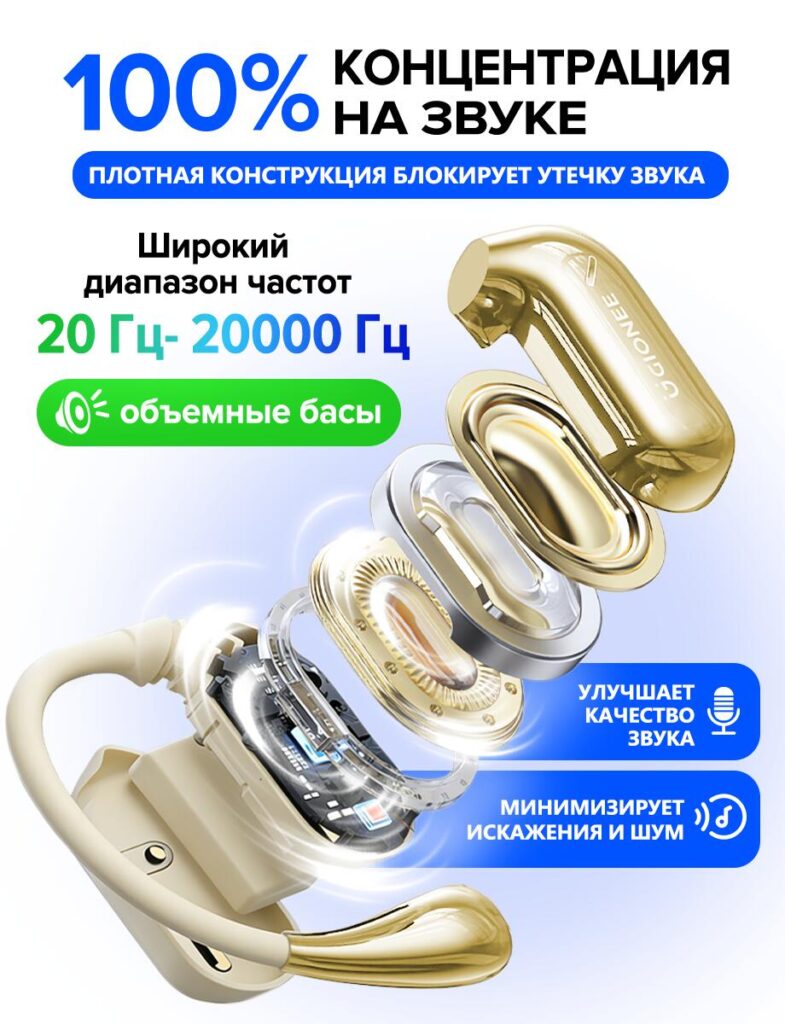
The first image leads with a bold promise: total concentration on sound. We deliberately placed the exploded internal structure of the Bluetooth headset front and center. This design choice immediately signals “technology inside,” which is crucial for electronics buyers on Ozon.
By visually separating the acoustic chamber, diaphragm, and electronic components, we allow users to see sound quality rather than just read about it. The frequency range (20 Hz–20,000 Hz) is highlighted because it is a universally recognized benchmark for audio performance. Large typography ensures readability on mobile devices, which dominate Ozon traffic.
The green and blue accents are not random — they are used to subconsciously associate bass depth (green) and clarity (blue). This color logic helps buyers intuitively understand the product’s sound profile without technical knowledge.
Image 2: Product Identity & Core Specifications
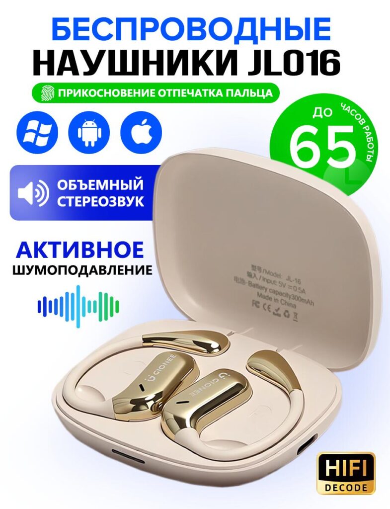
This image establishes the product as a wireless Bluetooth headset designed for daily use across platforms. Compatibility icons (Windows, Android, iOS) are positioned prominently to remove hesitation instantly. Ozon buyers value reassurance — this visual answers compatibility questions before they are asked.
We included touch control and extended battery life (up to 65 hours) as visual badges rather than paragraphs of text. On marketplaces like Ozon, icons outperform long descriptions because they reduce cognitive load. The charging case is shown open to communicate realism and transparency — buyers see exactly what they will receive.
Typography hierarchy here is essential: product name first, function second, benefits third. This mirrors how users scan marketplace images.
Image 3: Hi-Fi Sound Technology Breakdown
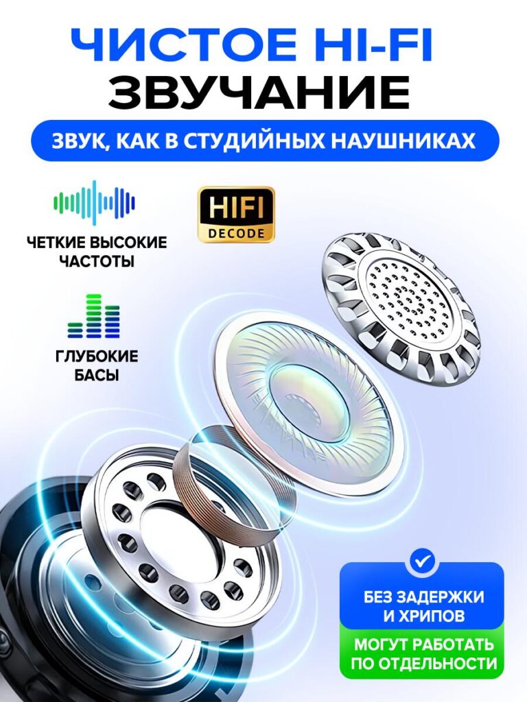
In this image, we leaned into technical credibility. The exploded speaker design is paired with clean, glowing rings to suggest energy flow and sound precision. This is especially important for convincing buyers that “Hi-Fi” is not just a marketing word.
High frequencies, deep bass, and low distortion are separated into individual visual elements. This modular structure mirrors the internal engineering and reinforces the idea of balance. The “no delay, no noise” message supports users who plan to use the headset for calls, videos, or gaming — a key Ozon buying motivation.
This image is intentionally more technical than emotional. It speaks to rational decision-making and product comparison.
Image 4: Connectivity & Daily Functionality
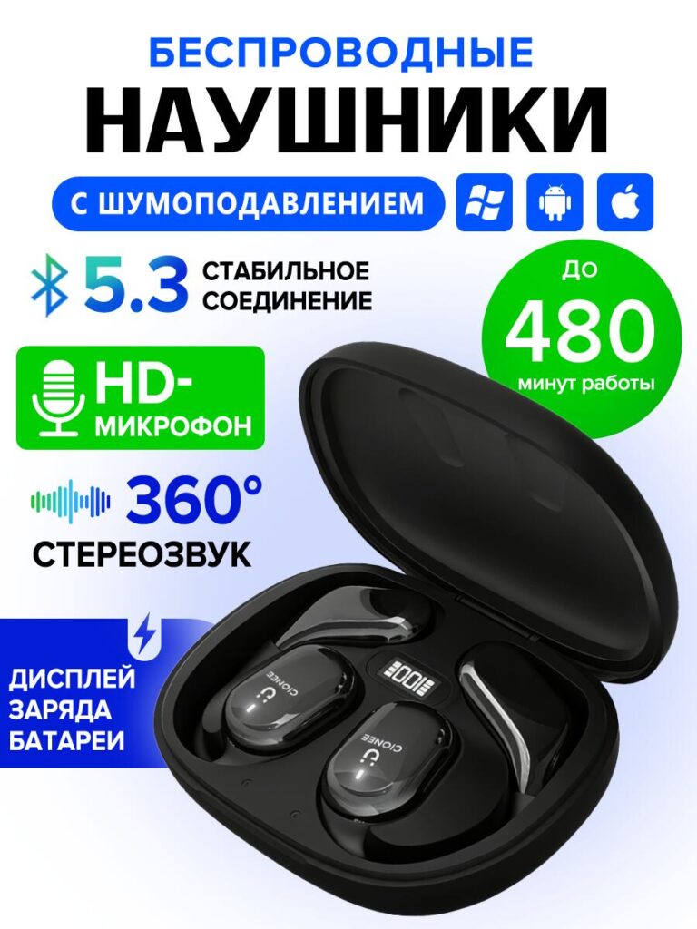
Bluetooth 5.3 is highlighted in this visual because connection stability is one of the most common buyer concerns. We used large numeric typography (“5.3”) to create instant recognition and authority.
Battery life is translated into minutes (480 minutes) rather than abstract hours. This was a conscious choice: concrete numbers feel more honest and measurable. The HD microphone icon reinforces call quality, which expands the product’s use cases beyond music.
The charging display on the case is clearly shown to differentiate this product from competitors that lack real-time battery indicators. On Ozon, visible differentiation directly impacts click-through rates.
Image 5: Packaging & What’s Included
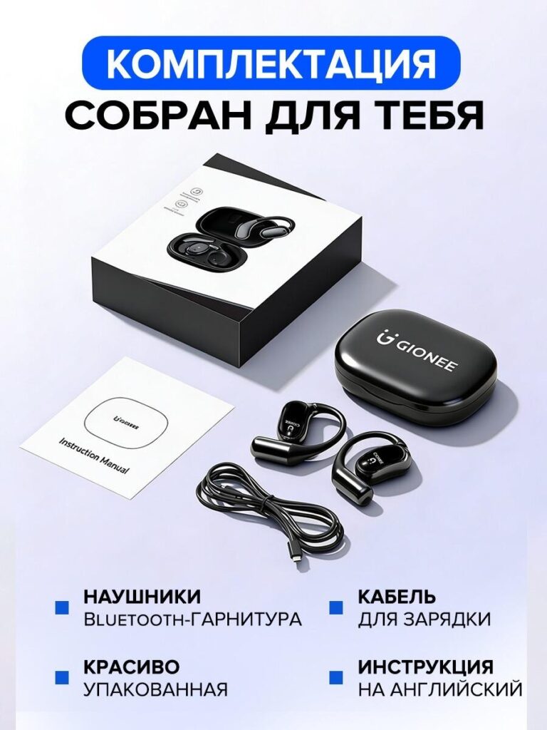
Trust is built when buyers know exactly what they are getting. This image answers that question clearly. We arranged the packaging, headset, charging cable, and instruction manual in a clean, minimalist layout.
The decision to show premium packaging is intentional. Ozon buyers often associate packaging quality with product reliability. The message here is simple: this is not a random factory product — it is thoughtfully prepared.
Clear labels eliminate ambiguity and reduce return risk, which is a critical factor for marketplace sellers.
Image 6: Comparison With Competitors
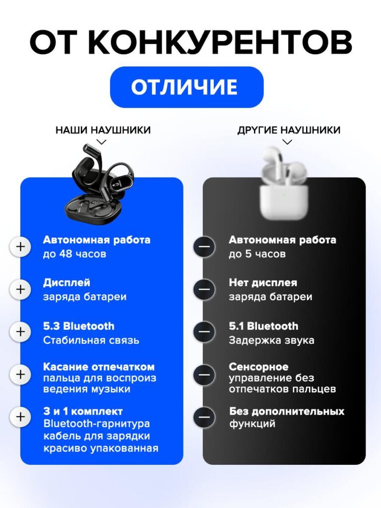
Comparison images are powerful on Ozon, but they must be handled carefully. We designed this layout to highlight advantages without appearing aggressive or misleading.
On the left, our headset’s strengths are clearly structured: longer battery life, Bluetooth 5.3, charging display, fingerprint touch control, and complete packaging. On the right, competitors are shown as lacking these features.
The visual contrast (blue vs. dark gray) helps users process information faster. This image is especially effective for buyers who are already comparing multiple listings and need a final nudge to decide.
Image 7: Lifestyle Fit & Stability in Use (Female Model)
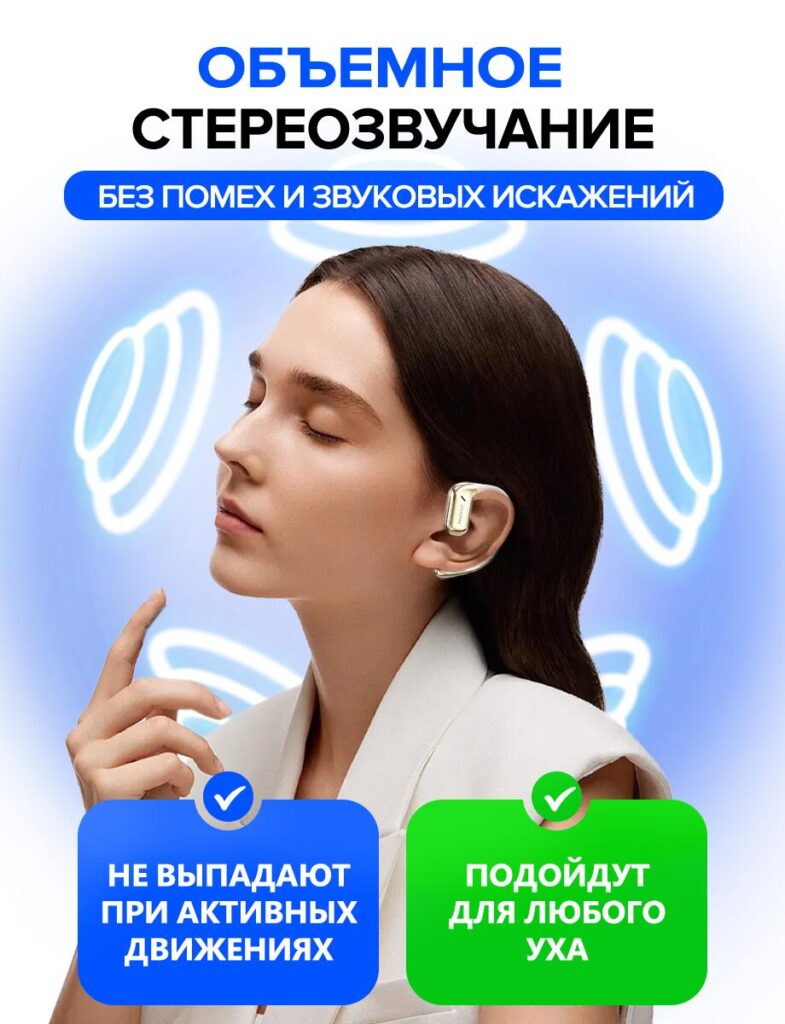
This lifestyle image introduces emotional reassurance. The headset is shown worn naturally, with visual sound waves reinforcing immersion. We intentionally avoided clutter to keep the focus on comfort and stability.
Text highlights that the headset does not fall out during active movement and fits different ear shapes. This addresses one of the most common objections for Bluetooth headsets.
Lifestyle imagery humanizes the product and helps buyers imagine ownership — a key conversion trigger.
Image 8: Ergonomic Design & Universal Fit (Male Model)
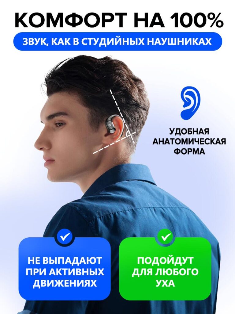
The final image reinforces ergonomics and long-term comfort. The anatomical outline visually explains how the headset aligns with the ear, making the benefit immediately understandable.
Repeating the “secure fit” and “universal ear compatibility” messages across different models strengthens trust through consistency. It shows that the product is suitable for a wide audience, not just a specific demographic.
This image closes the visual story by combining function, comfort, and confidence.
สรุปกลยุทธ์การออกแบบ
From a designer’s perspective, this Ozon main image set follows a deliberate structure:
- Attract attention with sound and technology.
- สร้างความไว้วางใจ through specifications and transparency.
- Differentiate clearly from competitors.
- Remove objections with lifestyle and ergonomic proof.
- Reassure value with packaging and completeness.
Each image serves a unique role while maintaining consistent color language, typography, and visual rhythm. This consistency is critical for professional marketplace branding and long-term conversion performance.
ข้อคิดส่งท้าย
การออกแบบภาพหลักที่มีประสิทธิภาพสำหรับ โอโซน Bluetooth headsets is not about adding more text or effects — it is about strategic storytelling through visuals. By aligning technical information, emotional reassurance, and marketplace psychology, this design system turns features into confidence and confidence into sales.
If you are looking to create conversion-focused marketplace visuals that balance clarity, aesthetics, and performance, this is exactly the type of approach we develop at AIRSANG.


ออกแบบและสร้างเว็บไซต์ WordPress หรือเว็บไซต์องค์กรพร้อมระบบอีคอมเมิร์ซครบวงจรสำหรับคุณ.
ช่วงราคา: $200.00 ถึง $2,500.00ข้อกำหนดเฉพาะหรือใบเสนอราคาพิเศษ
ราคาเดิมคือ: $2.00.$1.00ราคาปัจจุบันคือ: $1.00. ภาพหลักสำหรับการออกแบบอุปกรณ์กายภาพบำบัดที่บ้านของ Amazon (อธิบายรายละเอียด)
บทนำ: การสร้างภาพลักษณ์ที่น่าเชื่อถือสำหรับอุปกรณ์บำบัดที่บ้านบน Amazon เมื่อออกแบบภาพหลักสำหรับอุปกรณ์บำบัดที่บ้านบน Amazon สิ่งสำคัญอันดับแรกของเราคือ...

ภาพหลักสำหรับการแปลงลิปสติกเป็นสินค้าสำหรับ Amazon
บทนำ: การออกแบบภาพหลักลิปสติกที่ขายได้บน Amazon เมื่อเราออกแบบภาพหลักสำหรับลิปสติกบน Amazon ความรับผิดชอบของเราไม่ได้จำกัดอยู่แค่...

อะไรทำให้รองพื้นชนิดเหลวของ Amazon (ภาพหลัก) ขายดี?
บทนำ การออกแบบภาพหลักสำหรับรองพื้นชนิดเหลวบน Amazon ไม่ใช่แค่การทำให้ผลิตภัณฑ์ดูสวยงามเท่านั้น บน Amazon ภาพหลักและ...

การออกแบบภาพหลัก Amazon ที่มีประสิทธิภาพสำหรับตลับกรอง
บทนำ การออกแบบภาพหลักสำหรับ Amazon ไม่ใช่แค่การทำให้สินค้าดูน่าดึงดูดเท่านั้น แต่ยังเกี่ยวกับความชัดเจน ความน่าเชื่อถือ และความเข้าใจได้ในทันที โดยเฉพาะอย่างยิ่งสำหรับ...

เปรียบเทียบธีม WordPress สำหรับสัตว์เลี้ยง 5 แบบ
บทนำ การเลือกธีม WordPress ที่เหมาะสมสำหรับธุรกิจเกี่ยวกับสัตว์เลี้ยงนั้นไม่ใช่แค่เรื่องของการออกแบบเท่านั้น แต่ยังส่งผลโดยตรงต่อการใช้งาน ความสามารถในการขยายขนาด และการเติบโตของธุรกิจในระยะยาว การดูแลสัตว์เลี้ยงและ...

การสร้างเว็บไซต์ WordPress ที่ปรับขนาดได้สำหรับแบรนด์ที่ขับเคลื่อนด้วยวิทยาศาสตร์: โครงการ AminoUSA
บทนำ ในยุคดิจิทัลปัจจุบัน เว็บไซต์เป็นมากกว่าแค่สถานที่สำหรับแสดงรายการสินค้า สำหรับแบรนด์ที่ขับเคลื่อนด้วยวิทยาศาสตร์ซึ่งดำเนินงานในอุตสาหกรรมที่มีการควบคุมหรือเน้นการวิจัย...

สร้างร้านค้า Shopify ที่ปรับขนาดได้สำหรับแบรนด์ใบมีดระดับโลก: โครงการ CoolKatana
บทนำ ในธุรกิจอีคอมเมิร์ซข้ามพรมแดน เว็บไซต์ Shopify เป็นมากกว่าแค่หน้าร้าน สำหรับแบรนด์ที่ดำเนินธุรกิจในกลุ่มเฉพาะหรือกลุ่มที่ขับเคลื่อนด้วยวัฒนธรรม เว็บไซต์ต้องทำมากกว่านั้น...

การออกแบบร้านค้า Shopify ที่มีอัตราการแปลงสูงสำหรับขายการ์ดโปเกมอน
บทนำ ในโลกของอีคอมเมิร์ซสินค้าสะสม โดยเฉพาะอย่างยิ่งในตลาดเกมการ์ดโปเกมอน (TCG) เว็บไซต์จะต้องทำมากกว่าแค่แสดงรายการสินค้า...

ดีไซน์ Shopify ที่เพิ่มยอดขายสำหรับแบรนด์อิฐสั่งทำพิเศษ
บทนำ ในสภาพแวดล้อมการแข่งขันอีคอมเมิร์ซในปัจจุบัน โดยเฉพาะอย่างยิ่งในตลาดของขวัญส่วนบุคคลและของสะสม เว็บไซต์ Shopify ต้องทำมากกว่าแค่แสดงสินค้า...

กรณีศึกษาการออกแบบเว็บไซต์ Shopify สำหรับแบรนด์ดอกไม้ระดับพรีเมียม
บทนำ ในสภาพแวดล้อมการแข่งขันอีคอมเมิร์ซในปัจจุบัน เว็บไซต์ Shopify ต้องทำมากกว่าแค่แสดงสินค้า มันต้องสื่อสารคุณค่าของแบรนด์ได้ทันที และแนะนำผู้ใช้...

กรณีศึกษาการออกแบบร้านค้า Shopify: ร้านค้าเกมย้อนยุค
บทนำ ในสภาพแวดล้อมอีคอมเมิร์ซที่มีการแข่งขันสูง ความชัดเจนทางด้านภาพและการเชื่อมโยงทางอารมณ์มักเป็นตัวกำหนดว่าผู้เยี่ยมชมจะกลายเป็นลูกค้าหรือไม่ โดยเฉพาะอย่างยิ่งใน...

กรณีศึกษาการออกแบบบน Shopify: แบรนด์ Tactical Rescue
บทนำ เว็บไซต์ Shopify ที่แข็งแกร่งนั้นทำมากกว่าแค่แสดงสินค้า—มันยังสื่อสารจุดประสงค์ สร้างความไว้วางใจ และชี้นำผู้ใช้ไปสู่การตัดสินใจซื้ออย่างมั่นใจ โดยเฉพาะอย่างยิ่ง...

กรณีศึกษาการออกแบบเว็บไซต์ Shopify สำหรับแบรนด์จักรยานไฟฟ้า
บทนำ ในตลาดจักรยานไฟฟ้าที่มีการแข่งขันสูงในปัจจุบัน เว็บไซต์ Shopify ต้องทำมากกว่าแค่แสดงสินค้า—ต้องเล่าเรื่องราว สร้างความน่าเชื่อถือ และให้คำแนะนำแก่ผู้ใช้งาน...

แพลตฟอร์มอีคอมเมิร์ซ Shopify ที่ปรับขนาดได้สำหรับแบรนด์สร้างสรรค์
บทนำ เมื่อแบรนด์สร้างสรรค์เติบโตขึ้น เว็บไซต์ของพวกเขามักประสบปัญหาในการปรับตัวให้ทัน เนื่องจากสายผลิตภัณฑ์ขยายตัว เนื้อหาเพิ่มขึ้น และปริมาณการเข้าชมสูงขึ้น แบรนด์ที่เน้นภาพเป็นหลักหลายแห่ง...

กรณีศึกษาการออกแบบเว็บไซต์ Shopify สำหรับแบรนด์สินค้าตกแต่งบ้าน
บทนำ ในตลาดสินค้าตกแต่งบ้านที่มีการแข่งขันสูง ภาพลักษณ์ของแบรนด์ไม่ได้เป็นเพียงแค่เรื่องของความสวยงามอีกต่อไป แต่ยังส่งผลโดยตรงต่อความไว้วางใจ พฤติกรรมการเลือกชมสินค้า และการตัดสินใจซื้อสินค้า สำหรับ...

กรณีศึกษาการสร้างเว็บไซต์สมัครสมาชิก WordPress ที่ปรับขนาดได้
บทนำ สำหรับแบรนด์อีคอมเมิร์ซสมัยใหม่ เว็บไซต์ไม่ได้เป็นเพียงแค่หน้าร้านดิจิทัลอีกต่อไปแล้ว มันคือกลไกสำคัญที่สนับสนุนการสมัครรับข้อมูล การเล่าเรื่องราวผ่านเนื้อหา การสร้างความไว้วางใจ...

ดีไซน์ WordPress ที่เพิ่มอัตราการแปลงสูงสำหรับแบรนด์สำหรับผู้ใหญ่
บทนำ ในตลาดอีคอมเมิร์ซที่มีการแข่งขันสูง ภาพลักษณ์ที่สวยงามเพียงอย่างเดียวไม่เพียงพอ เว็บไซต์ WordPress ที่ประสบความสำเร็จต้องนำทางผู้เข้าชมผ่านเส้นทางที่ชัดเจนและตั้งใจไว้ ซึ่ง...

เว็บไซต์อีคอมเมิร์ซตุ๊กตาเซ็กส์ WordPress ที่ปรับขนาดได้
บทนำ การเปิดตัวเว็บไซต์อีคอมเมิร์ซข้ามพรมแดนที่มีประสิทธิภาพสูงนั้นไม่ใช่แค่การนำสินค้าขึ้นออนไลน์เท่านั้น สำหรับแบรนด์ที่ดำเนินธุรกิจในตลาดที่มีการแข่งขันสูงและเน้นภาพลักษณ์เป็นหลัก เว็บไซต์...