


ไม่มีสินค้าในตะกร้า.

In the highly competitive โอโซน marketplace, a data cable is no longer just a functional accessory—it is a performance-driven product that must communicate speed, safety, compatibility, and durability within seconds. When we designed this series of Ozon main images for multiple data cable variations, we focused on clarity, conversion hierarchy, and strong visual storytelling.
Every visual decision—from typography scale to color contrast, from connector close-ups to power indicators—was structured to increase click-through rate and improve buyer confidence. Below, we break down the design logic behind each uploaded image and explain how we translated technical specifications into high-converting marketplace visuals.
| ระยะเวลาจัดส่ง | หมวดหมู่ | แพลตฟอร์มแอปพลิเคชัน |
| 9 วัน | Data cable | โอโซน |
| นักออกแบบที่เกี่ยวข้อง | ค่าใช้จ่าย | ผล |
| หลิน จาง | $150 | Store traffic📈254% |
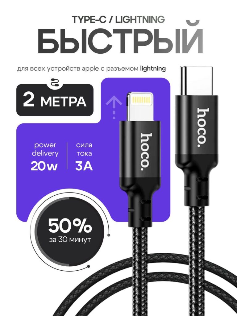
The first image emphasizes a Type-C to Lightning fast charging cable. We structured the layout around three primary selling points:
We placed the bold “FAST” headline (translated from Russian) at the top to immediately anchor the speed narrative. On Ozon, buyers scroll quickly. Large typography ensures instant comprehension.
We used a purple gradient panel behind the Lightning connector to create contrast against the neutral background. This technique visually isolates the product and highlights the fast-charging positioning. The upward arrow icon subtly reinforces speed and energy flow.
The circular “50% in 30 minutes” badge functions as a trust trigger. Rounded shapes feel authoritative yet approachable, and the radial progress style suggests measurable performance.
The braided cable texture is rendered sharply to communicate durability. By enlarging the connector heads, we emphasize build quality and precision molding—important for Apple users concerned about compatibility and longevity.
This image prioritizes speed and Apple ecosystem alignment, targeting users searching for fast PD charging solutions.
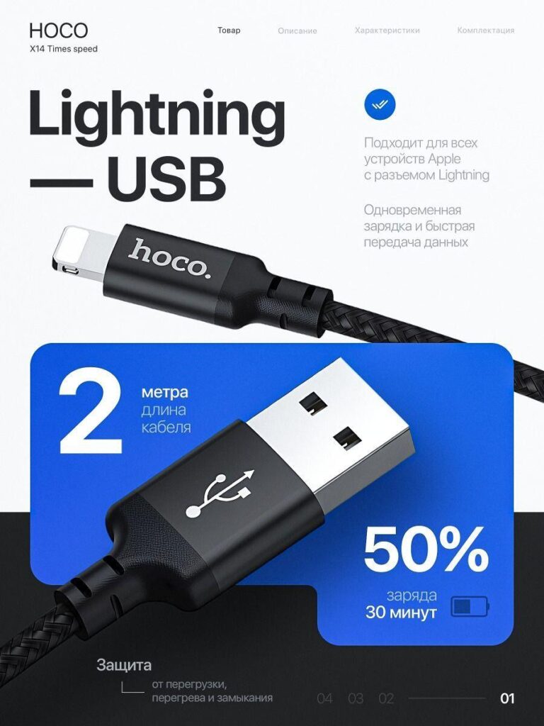
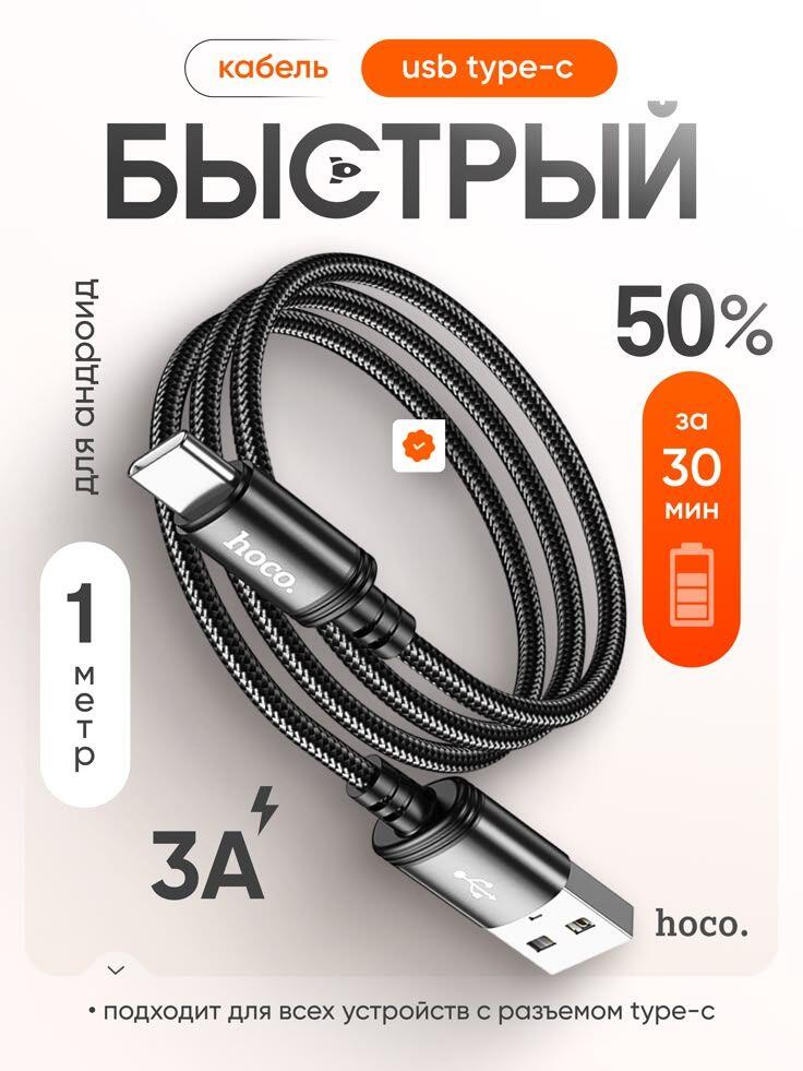
The second image shifts positioning to a Lightning–USB configuration.
Key highlights:
Here, we introduced a blue gradient block to create technical credibility. Blue often signals reliability and performance in tech design. The USB-A head is shown large and angled, giving dimensional depth.
We structured the text hierarchy carefully:
The angled cable presentation adds movement. Static layouts reduce engagement; dynamic diagonal compositions increase perceived energy.
At the bottom, the protection claim builds security. Ozon buyers often worry about cable overheating. By explicitly mentioning protection against overload and short circuit, we reduce purchase hesitation.
This image balances speed with safety—an essential conversion tactic.
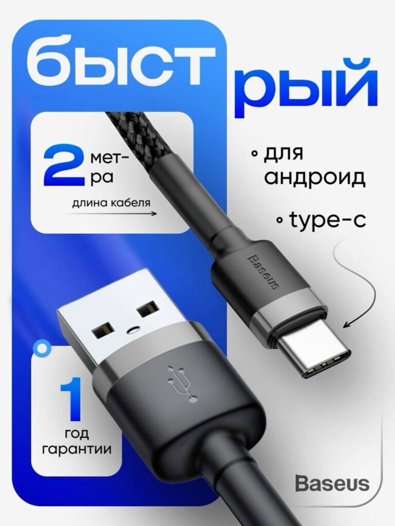
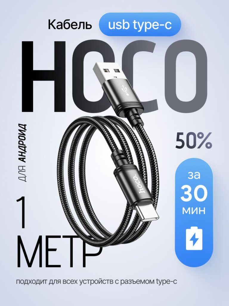
In the third image, we shift to a USB-A to Type-C cable for Android devices.
Core features:
We designed a strong blue frame that encloses the product. Framing increases focus and creates a structured retail aesthetic.
The cable is displayed diagonally with both connector heads visible. Buyers want confirmation of interface type instantly. Showing both ends clearly reduces cognitive friction.
The “1-year warranty” badge adds authority. Warranty labels in marketplace design function as risk-reduction tools. When customers compare similar listings, warranty visibility influences decisions.
We also included simple bullet points (“for Android,” “Type-C”) to ensure clarity. Ozon search behavior often includes device-type keywords. Reinforcing compatibility visually improves relevance.
This image targets practical Android users who value durability and reliability.
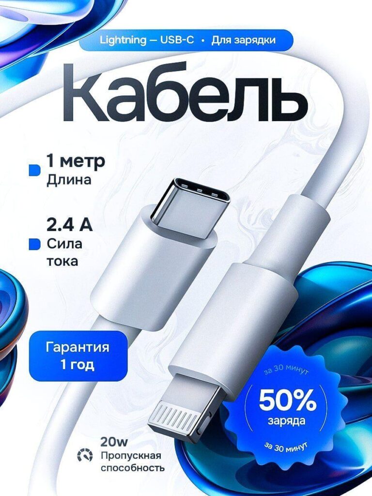
This variation presents a white Lightning cable with softer gradients.
Key specs:
We deliberately softened the color palette to white and light blue. This aesthetic appeals to users who prefer minimalist or Apple-style accessories.
The swirling abstract shapes behind the cable add visual texture without cluttering the composition. Marketplace images must stay clean; excessive elements reduce clarity.
We positioned specifications vertically on the left side to guide eye movement from top to bottom. This structured reading path increases comprehension speed.
By showing the Lightning connector close-up, we emphasize precision finishing and alignment accuracy—details that Apple users care about.
This image focuses on elegance and simplicity rather than aggressive power messaging.
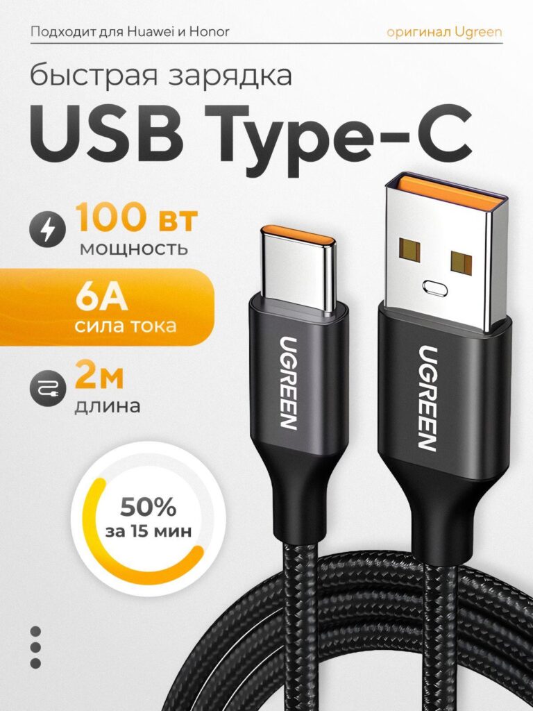
This image introduces a high-power 100W Type-C cable with 6A current and 2-meter length.
Main claims:
Here, we pivot to a yellow accent color to signal high power. Yellow communicates energy and strength. It visually separates this version from lower-wattage models.
The 100W specification is large and bold. On Ozon, wattage is a primary filtering factor. We ensure it dominates the composition.
The circular charging indicator again communicates measurable performance. Consistency across images builds brand cohesion.
By enlarging both USB-A and Type-C heads, we show build integrity and connector thickness—important for high-current cables.
This version targets power users, laptop chargers, and fast-charge enthusiasts.
This variation presents the cable in a coiled shape.
Highlighted features:
A coiled layout serves two purposes:
The orange badge draws attention to charging speed. Orange is associated with urgency and action.
We use negative space generously here. Clean spacing improves premium perception and avoids visual fatigue.
This composition feels balanced and retail-ready.
The final image strengthens brand visibility with a bold background headline and prominent cable placement.
Features:
We enlarged the brand name in the background to reinforce recognition. In crowded marketplaces, repeated brand exposure increases memorability.
The vertical battery icon reinforces the fast-charge claim. Icons improve scanning speed and make specifications more digestible.
We allowed more breathing room around the product to elevate perceived value.
This image functions as both a product detail and a brand-building asset.
We prioritize wattage, current, length, and charging speed. These are the four decision-driving metrics for cables.
Gradient blocks isolate text from background noise and improve mobile readability.
We always show both ends clearly. Ozon buyers want instant confirmation of compatibility.
Warranty badges, protection claims, and measurable charging percentages reduce risk perception.
“50% in 30 minutes” appears repeatedly because repetition builds credibility.
Different color accents separate product tiers:
This visual coding helps customers differentiate variants quickly.
Ozon is a visually competitive platform. Buyers compare multiple listings side by side. We designed these main images to:
By transforming technical parameters into structured visual storytelling, we convert a basic data cable into a high-performance accessory.
Every composition is optimized for marketplace scanning behavior, mobile readability, and purchase psychology.
High-converting marketplace visuals are never accidental. They are structured around buyer intent, hierarchy, and trust reinforcement.
This is how we approach โอโซน main image design—turning specifications into persuasive visuals and turning simple data cables into competitive listings.
Crafted with precision by AIRSANG.


