


การแนะนำ
In the highly competitive โอโซน marketplace, a motorcycle helmet is not sold by specifications alone. It is sold through clarity, structure, and immediate visual trust. When users scroll quickly through dozens of similar products, the main image sequence must do far more than look attractive — it must communicate safety, comfort, functionality, and value within seconds.
This article presents a professional breakdown of the main image design strategy for an Ozon motorcycle helmet, created from a designer’s point of view. Each image in the sequence was deliberately structured to reduce cognitive load, answer buyer concerns in a logical order, and comply with Ozon’s visual behavior patterns. Rather than relying on exaggerated effects or cluttered layouts, the design focuses on precision, legibility, and controlled visual impact.
Below, we explain why each image exists, what problem it solves, and how it contributes to conversion performance on Ozon.
| ระยะเวลาจัดส่ง | หมวดหมู่ | แพลตฟอร์มแอปพลิเคชัน |
| 8 วัน | Motorcycle helmet | โอโซน |
| นักออกแบบที่เกี่ยวข้อง | ค่าใช้จ่าย | ผล |
| แนนซี่ | $150 | Sales volume📈214% |
ภาพที่ 1: เอกลักษณ์ของผลิตภัณฑ์และความประทับใจแรกพบ
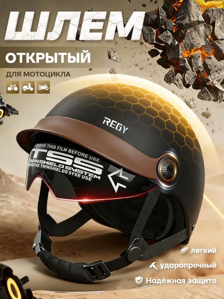
The first image establishes the helmet’s core identity.
We designed this frame to immediately communicate that this is an open-face motorcycle helmet intended for urban and casual riding. The helmet is presented at a three-quarter angle, which allows users to see the shell shape, visor system, and chin strap simultaneously. This angle creates depth while preserving realism, helping buyers understand the actual proportions of the product.
The background uses controlled motion elements and warm tones to suggest durability and impact resistance without overwhelming the product. The typography is bold but restrained, ensuring legibility even on mobile screens. Icons indicating compatibility with different vehicle types help users quickly confirm relevance.
This image answers one critical question instantly:
“Is this the helmet I’m looking for?”
Image 2: Functional Details and Wearing Comfort
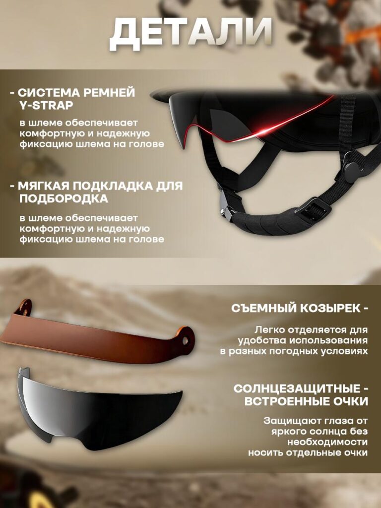
The second image zooms into wearing-related details, focusing on how the helmet feels in use rather than how it looks on a shelf.
Here, we highlight the Y-strap system and the soft chin padding. These are components riders care about after purchase, often mentioned in reviews when missing or poorly designed. By visualizing them early, we reduce uncertainty and increase perceived quality.
The layout separates text and visuals clearly, ensuring the user can read benefits without scanning the entire image. The lighting emphasizes material softness and flexibility, reinforcing comfort and stability.
We separated and displayed the removable visor and built-in sun protection glasses as individual elements. Instead of showing them attached, we intentionally presented them floating in space to clarify that these parts are detachable and functional on their own.
This approach prevents misinterpretation — a common issue in Ozon listings where buyers are unsure whether accessories are included. Clear labeling and spacing reduce returns and negative feedback.
The visual hierarchy leads the eye from top to bottom, mirroring how users scan vertically on mobile.
ภาพนี้ให้คำตอบว่า:
“How stable and comfortable is this helmet during actual riding, and what parts can be removed, adjusted, or customized?”
Image 3: Internal Structure and Safety Composition
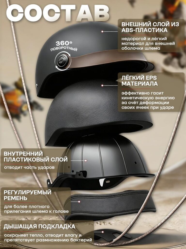
Safety is a non-negotiable concern for helmet buyers, but technical explanations often feel abstract. This image solves that problem through exploded structure visualization.
We separated the helmet into layers:
- External ABS shell
- EPS impact-absorbing layer
- Internal plastic structure
- Adjustable strap system
- Breathable inner padding
Each layer is labeled clearly, with concise explanations focusing on function rather than engineering jargon. The exploded view allows users to visually understand impact absorption and protection logic without reading a long description.
This image builds trust by showing transparency in construction.
The message here is simple:
“This helmet protects you through structure, not promises.”
Image 4: Size, Dimensions, and Weight Transparency
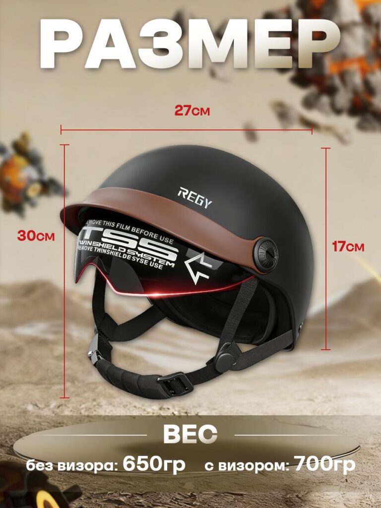
Uncertainty about size and weight is a major cause of hesitation in helmet purchases. This image eliminates that doubt.
We displayed exact physical dimensions and clearly differentiated weight with and without the visor. Measurements are shown in a neutral, technical style, avoiding exaggeration or misleading scaling.
The helmet remains centered and proportional, ensuring measurements feel credible rather than decorative. This approach aligns with Ozon’s preference for factual clarity.
This image reassures buyers by answering:
“Will this helmet fit my needs and feel comfortable over time?”
Image 5: Core Advantages and Certification
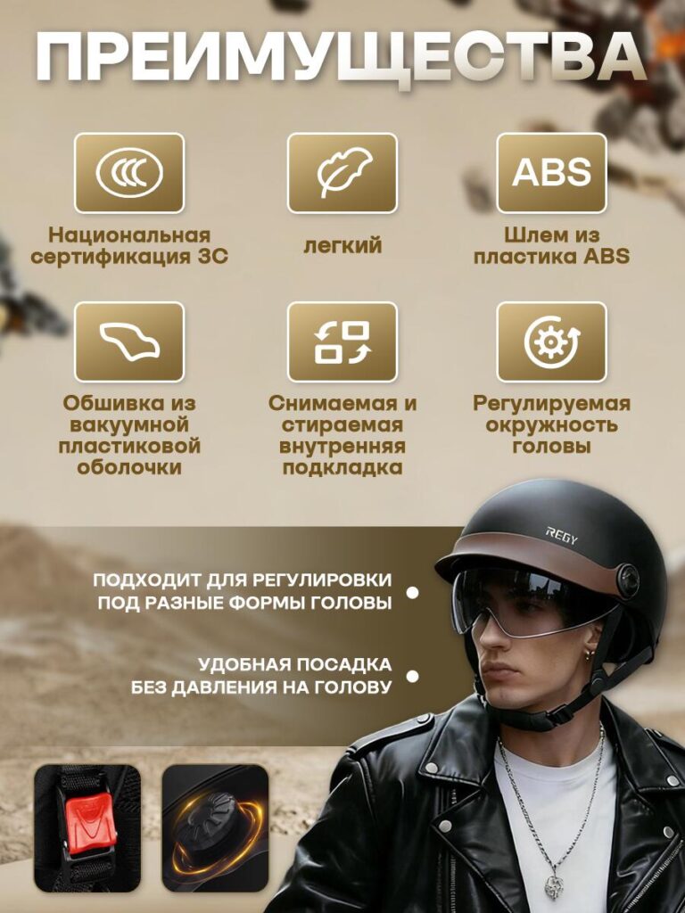
The final image summarizes key selling points using a clean icon-based system.
Instead of repeating earlier information, this frame consolidates the helmet’s strengths:
- Lightweight design
- ABS shell material
- Adjustable fit system
- Removable and washable padding
- Certified safety compliance
We intentionally minimized text length and relied on visual symbols to support quick comprehension. A lifestyle shot of the helmet being worn reinforces real-world use and scale without distracting from the information.
This image serves as the final confirmation before purchase.
It answers:
“Why should I choose this helmet over others?”
Design Logic Behind the Image Sequence
The image order follows a deliberate psychological flow:
- Recognition – What is this product?
- Comfort – How does it feel to wear?
- ฟังก์ชันการทำงาน – What features does it include?
- ความปลอดภัย – How does it protect me?
- Practicality – Will it fit and feel right?
- Reassurance – Is it worth buying now?
This structure mirrors how buyers evaluate motorcycle helmets mentally, reducing friction at each step.
บทสรุป
A high-performing โอโซน motorcycle helmet listing depends on more than attractive visuals. It requires a structured storytelling approach that transforms images into a guided decision-making process.
By designing each main image with a clear role — from first impression to final reassurance — this helmet listing communicates safety, comfort, and value without overwhelming the buyer. The result is a clean, professional, and conversion-focused presentation that aligns with Ozon’s marketplace behavior and user expectations.
This is the design philosophy we apply when creating product visuals for competitive e-commerce environments. At AIRSANG, we specialize in turning complex products into clear visual stories that build trust and drive results.


ออกแบบและสร้างเว็บไซต์ WordPress หรือเว็บไซต์องค์กรพร้อมระบบอีคอมเมิร์ซครบวงจรสำหรับคุณ.
ช่วงราคา: $200.00 ถึง $2,500.00custom-requirements-or-special-quotations
ราคาเดิมคือ: $2.00.$1.00ราคาปัจจุบันคือ: $1.00. ภาพหลักสำหรับการออกแบบอุปกรณ์กายภาพบำบัดที่บ้านของ Amazon (อธิบายรายละเอียด)
บทนำ: การสร้างภาพลักษณ์ที่น่าเชื่อถือสำหรับอุปกรณ์บำบัดที่บ้านบน Amazon เมื่อออกแบบภาพหลักสำหรับอุปกรณ์บำบัดที่บ้านบน Amazon สิ่งสำคัญอันดับแรกของเราคือ...

ภาพหลักสำหรับการแปลงลิปสติกเป็นสินค้าสำหรับ Amazon
บทนำ: การออกแบบภาพหลักลิปสติกที่ขายได้บน Amazon เมื่อเราออกแบบภาพหลักสำหรับลิปสติกบน Amazon ความรับผิดชอบของเราไม่ได้จำกัดอยู่แค่...

อะไรทำให้รองพื้นชนิดเหลวของ Amazon (ภาพหลัก) ขายดี?
บทนำ การออกแบบภาพหลักสำหรับรองพื้นชนิดเหลวบน Amazon ไม่ใช่แค่การทำให้ผลิตภัณฑ์ดูสวยงามเท่านั้น บน Amazon ภาพหลักและ...

การออกแบบภาพหลัก Amazon ที่มีประสิทธิภาพสำหรับตลับกรอง
บทนำ การออกแบบภาพหลักสำหรับ Amazon ไม่ใช่แค่การทำให้สินค้าดูน่าดึงดูดเท่านั้น แต่ยังเกี่ยวกับความชัดเจน ความน่าเชื่อถือ และความเข้าใจได้ในทันที โดยเฉพาะอย่างยิ่งสำหรับ...

เปรียบเทียบธีม WordPress สำหรับสัตว์เลี้ยง 5 แบบ
บทนำ การเลือกธีม WordPress ที่เหมาะสมสำหรับธุรกิจเกี่ยวกับสัตว์เลี้ยงนั้นไม่ใช่แค่เรื่องของการออกแบบเท่านั้น แต่ยังส่งผลโดยตรงต่อการใช้งาน ความสามารถในการขยายขนาด และการเติบโตของธุรกิจในระยะยาว การดูแลสัตว์เลี้ยงและ...

การสร้างเว็บไซต์ WordPress ที่ปรับขนาดได้สำหรับแบรนด์ที่ขับเคลื่อนด้วยวิทยาศาสตร์: โครงการ AminoUSA
บทนำ ในยุคดิจิทัลปัจจุบัน เว็บไซต์เป็นมากกว่าแค่สถานที่สำหรับแสดงรายการสินค้า สำหรับแบรนด์ที่ขับเคลื่อนด้วยวิทยาศาสตร์ซึ่งดำเนินงานในอุตสาหกรรมที่มีการควบคุมหรือเน้นการวิจัย...

สร้างร้านค้า Shopify ที่ปรับขนาดได้สำหรับแบรนด์ใบมีดระดับโลก: โครงการ CoolKatana
บทนำ ในธุรกิจอีคอมเมิร์ซข้ามพรมแดน เว็บไซต์ Shopify เป็นมากกว่าแค่หน้าร้าน สำหรับแบรนด์ที่ดำเนินธุรกิจในกลุ่มเฉพาะหรือกลุ่มที่ขับเคลื่อนด้วยวัฒนธรรม เว็บไซต์ต้องทำมากกว่านั้น...

การออกแบบร้านค้า Shopify ที่มีอัตราการแปลงสูงสำหรับขายการ์ดโปเกมอน
บทนำ ในโลกของอีคอมเมิร์ซสินค้าสะสม โดยเฉพาะอย่างยิ่งในตลาดเกมการ์ดโปเกมอน (TCG) เว็บไซต์จะต้องทำมากกว่าแค่แสดงรายการสินค้า...

ดีไซน์ Shopify ที่เพิ่มยอดขายสำหรับแบรนด์อิฐสั่งทำพิเศษ
บทนำ ในสภาพแวดล้อมการแข่งขันอีคอมเมิร์ซในปัจจุบัน โดยเฉพาะอย่างยิ่งในตลาดของขวัญส่วนบุคคลและของสะสม เว็บไซต์ Shopify ต้องทำมากกว่าแค่แสดงสินค้า...

กรณีศึกษาการออกแบบเว็บไซต์ Shopify สำหรับแบรนด์ดอกไม้ระดับพรีเมียม
บทนำ ในสภาพแวดล้อมการแข่งขันอีคอมเมิร์ซในปัจจุบัน เว็บไซต์ Shopify ต้องทำมากกว่าแค่แสดงสินค้า มันต้องสื่อสารคุณค่าของแบรนด์ได้ทันที และแนะนำผู้ใช้...

กรณีศึกษาการออกแบบร้านค้า Shopify: ร้านค้าเกมย้อนยุค
บทนำ ในสภาพแวดล้อมอีคอมเมิร์ซที่มีการแข่งขันสูง ความชัดเจนทางด้านภาพและการเชื่อมโยงทางอารมณ์มักเป็นตัวกำหนดว่าผู้เยี่ยมชมจะกลายเป็นลูกค้าหรือไม่ โดยเฉพาะอย่างยิ่งใน...

กรณีศึกษาการออกแบบบน Shopify: แบรนด์ Tactical Rescue
บทนำ เว็บไซต์ Shopify ที่แข็งแกร่งนั้นทำมากกว่าแค่แสดงสินค้า—มันยังสื่อสารจุดประสงค์ สร้างความไว้วางใจ และชี้นำผู้ใช้ไปสู่การตัดสินใจซื้ออย่างมั่นใจ โดยเฉพาะอย่างยิ่ง...

กรณีศึกษาการออกแบบเว็บไซต์ Shopify สำหรับแบรนด์จักรยานไฟฟ้า
บทนำ ในตลาดจักรยานไฟฟ้าที่มีการแข่งขันสูงในปัจจุบัน เว็บไซต์ Shopify ต้องทำมากกว่าแค่แสดงสินค้า—ต้องเล่าเรื่องราว สร้างความน่าเชื่อถือ และให้คำแนะนำแก่ผู้ใช้งาน...

แพลตฟอร์มอีคอมเมิร์ซ Shopify ที่ปรับขนาดได้สำหรับแบรนด์สร้างสรรค์
บทนำ เมื่อแบรนด์สร้างสรรค์เติบโตขึ้น เว็บไซต์ของพวกเขามักประสบปัญหาในการปรับตัวให้ทัน เนื่องจากสายผลิตภัณฑ์ขยายตัว เนื้อหาเพิ่มขึ้น และปริมาณการเข้าชมสูงขึ้น แบรนด์ที่เน้นภาพเป็นหลักหลายแห่ง...

กรณีศึกษาการออกแบบเว็บไซต์ Shopify สำหรับแบรนด์สินค้าตกแต่งบ้าน
บทนำ ในตลาดสินค้าตกแต่งบ้านที่มีการแข่งขันสูง ภาพลักษณ์ของแบรนด์ไม่ได้เป็นเพียงแค่เรื่องของความสวยงามอีกต่อไป แต่ยังส่งผลโดยตรงต่อความไว้วางใจ พฤติกรรมการเลือกชมสินค้า และการตัดสินใจซื้อสินค้า สำหรับ...

กรณีศึกษาการสร้างเว็บไซต์สมัครสมาชิก WordPress ที่ปรับขนาดได้
บทนำ สำหรับแบรนด์อีคอมเมิร์ซสมัยใหม่ เว็บไซต์ไม่ได้เป็นเพียงแค่หน้าร้านดิจิทัลอีกต่อไปแล้ว มันคือกลไกสำคัญที่สนับสนุนการสมัครรับข้อมูล การเล่าเรื่องราวผ่านเนื้อหา การสร้างความไว้วางใจ...

ดีไซน์ WordPress ที่เพิ่มอัตราการแปลงสูงสำหรับแบรนด์สำหรับผู้ใหญ่
บทนำ ในตลาดอีคอมเมิร์ซที่มีการแข่งขันสูง ภาพลักษณ์ที่สวยงามเพียงอย่างเดียวไม่เพียงพอ เว็บไซต์ WordPress ที่ประสบความสำเร็จต้องนำทางผู้เข้าชมผ่านเส้นทางที่ชัดเจนและตั้งใจไว้ ซึ่ง...

เว็บไซต์อีคอมเมิร์ซตุ๊กตาเซ็กส์ WordPress ที่ปรับขนาดได้
บทนำ การเปิดตัวเว็บไซต์อีคอมเมิร์ซข้ามพรมแดนที่มีประสิทธิภาพสูงนั้นไม่ใช่แค่การนำสินค้าขึ้นออนไลน์เท่านั้น สำหรับแบรนด์ที่ดำเนินธุรกิจในตลาดที่มีการแข่งขันสูงและเน้นภาพลักษณ์เป็นหลัก เว็บไซต์...