


การแนะนำ
เมื่อลูกค้ากำลังเลือกดูสินค้า โอโซน, การตัดสินใจเกิดขึ้นในไม่กี่วินาที ภาพผลิตภัณฑ์ต้องสื่อสารฟังก์ชัน อารมณ์ และคุณค่าได้ทันทีโดยไม่ต้องมีคำอธิบาย สำหรับนาฬิกาปลุกอิเล็กทรอนิกส์ RGB นี้ เป้าหมายการออกแบบของเราชัดเจน: เปลี่ยนอุปกรณ์ข้างเตียงขนาดกะทัดรัดให้กลายเป็นผลิตภัณฑ์ไลฟ์สไตล์ที่ดึงดูดสายตาอย่างไม่อาจต้านทานได้ ในขณะเดียวกันก็ต้องสอดคล้องกับหลักการสร้างภาพและแกลเลอรี่หลักของ Ozon อย่างครบถ้วน.
แทนที่จะพึ่งพาข้อมูลจำเพาะทางเทคนิคเพียงอย่างเดียว เราสร้างเรื่องราวเชิงภาพที่เน้นแสง ความเรียบง่าย และการใช้งานได้จริงในชีวิตประจำวัน ภาพแต่ละภาพได้รับการออกแบบมาเพื่อตอบคำถามเฉพาะของผู้ซื้อ: มันทำอะไรได้บ้าง? มันดูเป็นอย่างไรในชีวิตจริง? ใช้งานง่ายแค่ไหน? มันจะเข้ากับพื้นที่ของฉันหรือไม่? บทความนี้จะวิเคราะห์ว่าภาพแต่ละภาพมีส่วนช่วยในเรื่องราวนั้นอย่างไร และเหตุใดการตัดสินใจเหล่านี้จึงมีความสำคัญต่อการเพิ่มยอดขายบน Ozon.
| ระยะเวลาจัดส่ง | หมวดหมู่ | แพลตฟอร์มแอปพลิเคชัน |
| 7 วัน | นาฬิกาปลุกอิเล็กทรอนิกส์ RGB | โอโซน |
| นักออกแบบที่เกี่ยวข้อง | ค่าใช้จ่าย | ผล |
| แนนซี่ | $100 | อัตราการซื้อ📈279% |
ภาพที่ 1: ภาพหลัก — แสง RGB คือจุดขายหลัก
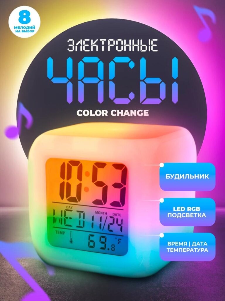
ภาพแรกทำหน้าที่เป็นภาพหลักของ Ozon และมีหน้าที่หยุดการเลื่อนภาพ.
เราจัดวางนาฬิกาปลุกอิเล็กทรอนิกส์ RGB ไว้ตรงกลางโดยใช้ฉากหลังสีเข้มที่มีการไล่ระดับสีเพื่อเน้นเอฟเฟกต์การเปลี่ยนสีของ LED แทนที่จะแสดงผลิตภัณฑ์สีขาวเรียบๆ เราเน้นที่นาฬิกาที่เปล่งแสงหลากสีสัน ทั้งสีฟ้า สีชมพู สีเหลือง และสีเขียว ที่ผสมผสานกันอย่างราบรื่นทั่วตัวเรือน ซึ่งสื่อถึงคุณสมบัติ RGB ได้ทันทีโดยไม่ต้องอธิบายด้วยข้อความมากมาย.
หน้าปัดนาฬิกายังคงคมชัดและอ่านง่าย แสดงเวลา วันที่ และอุณหภูมิพร้อมกัน ความสมดุลระหว่างแสงสว่างโดยรอบและความคมชัดของตัวเลขดิจิทัลนี้ทำให้ผู้ซื้อมั่นใจได้ว่าผลิตภัณฑ์นี้ไม่ใช่แค่ของตกแต่ง แต่ใช้งานได้จริง คำอธิบายประกอบช่วยเน้นฟังก์ชันหลัก เช่น นาฬิกาปลุก ไฟแบ็คไลท์ LED RGB และการแสดงเวลา/วันที่ โดยจัดวางตำแหน่งเพื่อนำสายตาโดยไม่ทำให้ผลิตภัณฑ์ดูรกจนเกินไป.
ภาพนี้แสดงให้เห็นสามสิ่งได้ทันที:
- ผลิตภัณฑ์นี้ทันสมัยและขับเคลื่อนด้วยเทคโนโลยี
- แสงไฟ RGB นุ่มนวล ไม่แสบตา
- นาฬิกาเรือนนี้ได้รับการออกแบบมาเพื่อวางบนโต๊ะข้างเตียง
สำหรับ Ozon ซึ่งภาพขนาดย่อมีความสำคัญ ภาพนี้จึงรับประกันความคมชัดแม้ในขนาดที่ย่อลง.
ภาพที่ 2: ขนาดและสัดส่วน — รูปทรงกะทัดรัด ขนาดชัดเจน
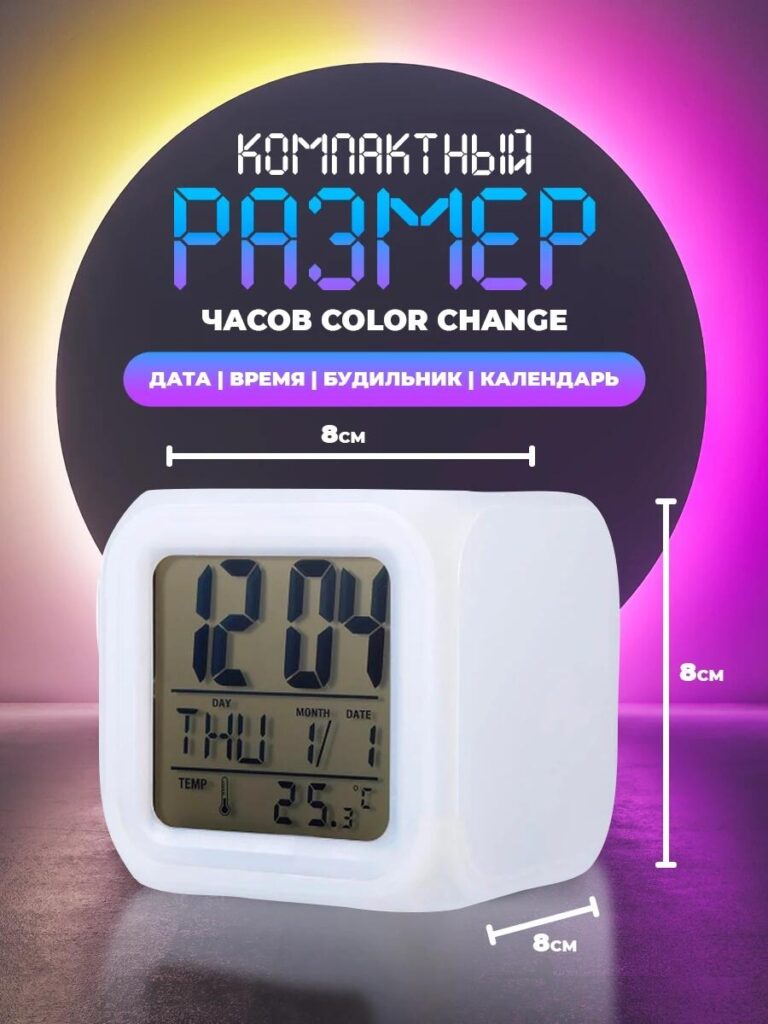
ภาพที่สองตอบคำถามสำคัญที่ผู้ซื้อสงสัย: มันใหญ่แค่ไหน?
เราใช้การวัดขนาดที่แม่นยำ—8 เซนติเมตรในแต่ละด้าน—บนพื้นหลังที่เรียบง่ายและเป็นกลาง นาฬิกาถูกแสดงจากมุมเอียงเล็กน้อยเพื่อเผยให้เห็นความลึกในขณะที่ยังคงรักษาอัตราส่วนที่ถูกต้อง ซึ่งจะช่วยป้องกันความคาดหวังที่ผิดพลาดและลดความเสี่ยงในการคืนสินค้า ซึ่งมีความสำคัญอย่างยิ่งในตลาดออนไลน์อย่าง Ozon.
แทนที่จะทำให้ภาพดูรกด้วยองค์ประกอบที่ไม่จำเป็น เราเน้นที่ขนาดเป็นหลัก รูปทรงลูกบาศก์ขนาดกะทัดรัดสื่อถึงความสะดวกในการพกพาและความอเนกประสงค์ เหมาะสำหรับโต๊ะทำงาน โต๊ะข้างเตียง ชั้นวางของ หรือแม้แต่ห้องเด็ก.
การเน้นย้ำด้วยภาพว่านาฬิกามีขนาดเล็กแต่ใช้งานได้จริง ช่วยสร้างความน่าเชื่อถือและวางตำแหน่งผลิตภัณฑ์ให้เป็นโซลูชันที่ประหยัดพื้นที่สำหรับตกแต่งภายในสไตล์โมเดิร์น.
ภาพที่ 3: ตรรกะการโต้ตอบและการควบคุมของผู้ใช้ — ความเรียบง่ายในการใช้งาน
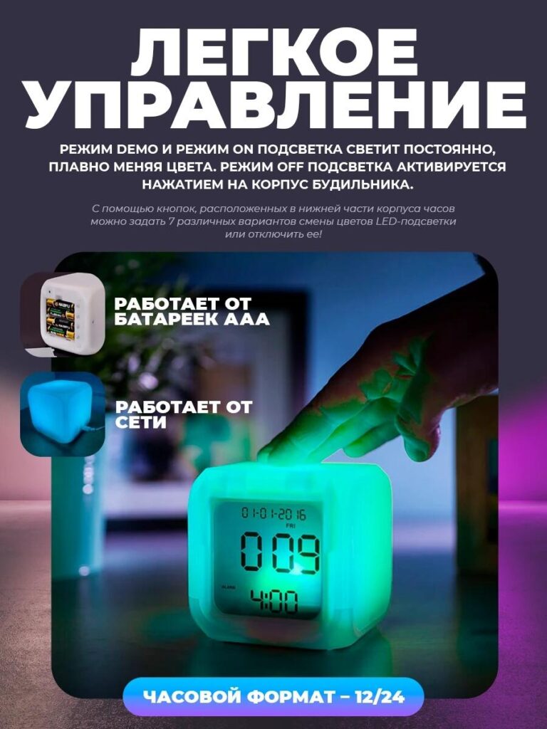
ภาพนี้เปลี่ยนจากการนำเสนอผลิตภัณฑ์แบบคงที่ไปสู่การมีปฏิสัมพันธ์ในโลกแห่งความเป็นจริง.
เราบันทึกภาพมือที่แตะเบาๆ บนส่วนบนของนาฬิกา เพื่อแสดงให้เห็นว่าสามารถควบคุมโหมดแสงไฟได้โดยตรงจากตัวนาฬิกา โทนสีเขียวเรืองแสงเน้นการตอบสนอง ในขณะที่สภาพแวดล้อมบ่งบอกถึงบรรยากาศสงบในยามค่ำคืน.
ข้อความซ้อนทับจะอธิบายโหมดแสงสว่างต่างๆ:
- โหมดสาธิตพร้อมการเปลี่ยนสีที่ราบรื่น
- โหมดเปิดตลอดเวลา
- โหมดปิดเครื่องผ่านระบบสัมผัส
นอกจากนี้ เรายังแสดงตัวเลือกการใช้พลังงานสองแบบอย่างชัดเจน ได้แก่ แบตเตอรี่ AAA และสายไฟ โดยใช้ไอคอนขนาดเล็กที่ฝังอยู่ด้านใน ซึ่งช่วยให้ผู้ซื้อมั่นใจได้ว่านาฬิกามีความยืดหยุ่นและเชื่อถือได้ในการใช้งานในรูปแบบต่างๆ.
ภาพนี้มีความสำคัญอย่างยิ่ง เพราะช่วยลดความยุ่งยากในการใช้งาน แสดงให้เห็นว่านาฬิกาปลุกอิเล็กทรอนิกส์ RGB ไม่จำเป็นต้องใช้เมนูหรือแอปพลิเคชันที่ซับซ้อน การใช้งานนั้นใช้งานง่ายและเป็นธรรมชาติ ซึ่งเป็นจุดขายที่สำคัญสำหรับทุกกลุ่มอายุ.
ภาพที่ 4: ไลฟ์สไตล์และความลงตัวภายใน — ดีไซน์ที่เข้ากับทุกพื้นที่
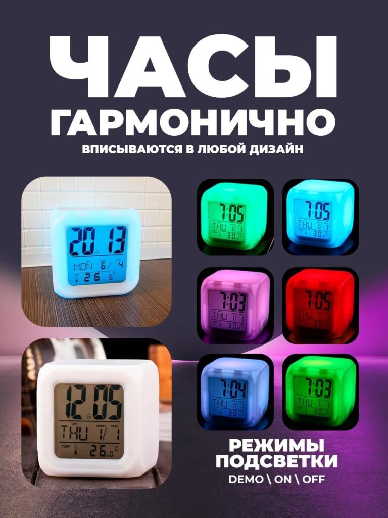
ในภาพนี้ เราเน้นที่ความสามารถในการปรับตัวทางด้านสุนทรียศาสตร์เป็นหลัก.
เราจัดวางนาฬิกาในสภาพแวดล้อมภายในที่สมจริง และจับคู่กับตารางสี RGB ที่หลากหลาย ได้แก่ สีฟ้า สีเขียว สีชมพู สีแดง และสีขาวนวล ซึ่งสื่อสารได้ทันทีว่าผลิตภัณฑ์นี้ไม่ได้จำกัดอยู่แค่เพียงอารมณ์หรือสไตล์เดียว.
หัวข้อข่าวเน้นความกลมกลืนกับการออกแบบตกแต่งภายในทุกสไตล์ แทนที่จะใช้ภาษาทางเทคนิค ข้อความกลับเน้นอารมณ์ความรู้สึก: นาฬิกาเรือนนี้ปรับตัวเข้ากับคุณได้ ไม่ว่าจะใช้เป็นโคมไฟกลางคืน โคมไฟตกแต่ง หรือนาฬิกาปลุกแบบเรียบง่าย ก็กลมกลืนเข้ากับบ้านสไตล์โมเดิร์นได้อย่างลงตัว.
สำหรับลูกค้าของ Ozon ที่มักเปรียบเทียบผลิตภัณฑ์หลายรายการอย่างรวดเร็ว ภาพนี้แสดงให้เห็นถึงความโดดเด่นของนาฬิกาเรือนนี้ ทั้งในแง่ของฟังก์ชันการใช้งานและความสวยงาม ซึ่งเป็นการเชื่อมโยงเทคโนโลยีและไลฟ์สไตล์เข้าด้วยกัน.
ภาพที่ 5: บรรจุภัณฑ์และสิ่งที่อยู่ภายใน — ความโปร่งใสสร้างความไว้วางใจ
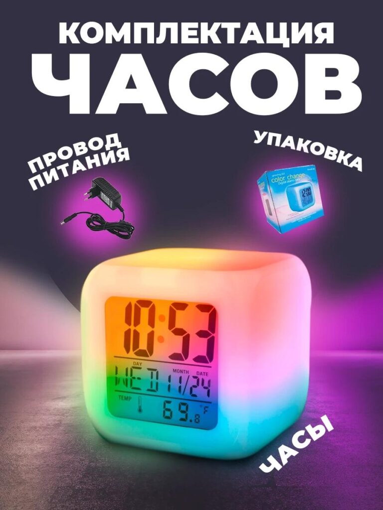
ภาพสุดท้ายตอบคำถามสุดท้ายที่ผู้ซื้อสงสัยก่อนตัดสินใจซื้อ: ฉันจะได้รับอะไรบ้าง?
เราได้แสดงให้เห็นอย่างชัดเจนว่า:
- นาฬิกาปลุกอิเล็กทรอนิกส์ RGB
- สายไฟ
- บรรจุภัณฑ์สำหรับขายปลีก
แต่ละชิ้นถูกแยกออกจากกันอย่างชัดเจนและติดป้ายกำกับ การออกแบบบรรจุภัณฑ์ช่วยเน้นย้ำว่านี่คือผลิตภัณฑ์สำเร็จรูปสำหรับผู้บริโภค ไม่ใช่แกดเจ็ตทั่วไป การแสดงกล่องยังช่วยเพิ่มมูลค่าและทำให้ผลิตภัณฑ์ดูพร้อมสำหรับการเป็นของขวัญ.
ภาพนี้ช่วยขจัดความไม่แน่นอนและลดจำนวนคำถามจากฝ่ายบริการลูกค้า ซึ่งมีความสำคัญอย่างยิ่งสำหรับการขายสินค้าในตลาดออนไลน์ขนาดใหญ่.
เหตุใดระบบภาพนี้จึงใช้งานได้บน Ozon
ลำดับภาพนี้แสดงขั้นตอนการแปลงที่ตั้งใจไว้:
- ดึงดูดความสนใจด้วยแสงไฟ RGB
- สร้างความไว้วางใจด้วยขนาดและความชัดเจน
- แสดงให้เห็นถึงความง่ายในการใช้งาน
- แสดงให้เห็นถึงความเหมาะสมของไลฟ์สไตล์
- ตรวจสอบสิ่งของในกล่อง
ภาพแต่ละภาพมีหน้าที่เฉพาะเจาะจงเพียงอย่างเดียว เมื่อรวมกันแล้วจะสร้างเรื่องราวการขายด้วยภาพที่สมบูรณ์แบบ ซึ่งสอดคล้องกับพฤติกรรมการท่องเว็บและข้อกำหนดของแพลตฟอร์ม Ozon อย่างลงตัว.
บทสรุป
การออกแบบภาพหลักที่มีประสิทธิภาพบน โอโซน ไม่ใช่การเพิ่มเอฟเฟกต์ให้มากขึ้น แต่เป็นการทำให้ผลิตภัณฑ์เข้าใจง่ายและดึงดูดใจในทันที สำหรับนาฬิกาปลุกอิเล็กทรอนิกส์ RGB นี้ เราได้แปลงคุณสมบัติทางเทคนิคให้เป็นประสบการณ์ทางภาพที่ให้ความรู้สึกใช้งานง่าย สงบ และทันสมัย.
ด้วยการจัดโครงสร้างชุดภาพโดยอิงจากคำถามของผู้ใช้และสถานการณ์การใช้งานจริง เราจึงช่วยให้ผลิตภัณฑ์โดดเด่นในตลาดที่มีการแข่งขันสูง ในขณะเดียวกันก็รักษาความชัดเจนและความน่าเชื่อถือ นี่คือวิธีการที่เราใช้ในการออกแบบภาพสำหรับตลาดออนไลน์อย่างมีกลยุทธ์ ตั้งใจ และคำนึงถึงการเปลี่ยนลูกค้าเป้าหมายเป็นสำคัญ.
หากคุณต้องการยกระดับรายการสินค้าของคุณบน Ozon ด้วยการออกแบบภาพหลักระดับมืออาชีพและการเล่าเรื่องด้วยภาพอย่างเป็นระบบ นี่คือผลลัพธ์ที่เราสร้างสรรค์ให้คุณได้ AIRSANG.


ออกแบบและสร้างเว็บไซต์ WordPress หรือเว็บไซต์องค์กรพร้อมระบบอีคอมเมิร์ซครบวงจรสำหรับคุณ.
ช่วงราคา: $200.00 ถึง $2,500.00custom-requirements-or-special-quotations
ราคาเดิมคือ: $2.00.$1.00ราคาปัจจุบันคือ: $1.00. ภาพหลักสำหรับการออกแบบอุปกรณ์กายภาพบำบัดที่บ้านของ Amazon (อธิบายรายละเอียด)
บทนำ: การสร้างภาพลักษณ์ที่น่าเชื่อถือสำหรับอุปกรณ์บำบัดที่บ้านบน Amazon เมื่อออกแบบภาพหลักสำหรับอุปกรณ์บำบัดที่บ้านบน Amazon สิ่งสำคัญอันดับแรกของเราคือ...

ภาพหลักสำหรับการแปลงลิปสติกเป็นสินค้าสำหรับ Amazon
บทนำ: การออกแบบภาพหลักลิปสติกที่ขายได้บน Amazon เมื่อเราออกแบบภาพหลักสำหรับลิปสติกบน Amazon ความรับผิดชอบของเราไม่ได้จำกัดอยู่แค่...

อะไรทำให้รองพื้นชนิดเหลวของ Amazon (ภาพหลัก) ขายดี?
บทนำ การออกแบบภาพหลักสำหรับรองพื้นชนิดเหลวบน Amazon ไม่ใช่แค่การทำให้ผลิตภัณฑ์ดูสวยงามเท่านั้น บน Amazon ภาพหลักและ...

การออกแบบภาพหลัก Amazon ที่มีประสิทธิภาพสำหรับตลับกรอง
บทนำ การออกแบบภาพหลักสำหรับ Amazon ไม่ใช่แค่การทำให้สินค้าดูน่าดึงดูดเท่านั้น แต่ยังเกี่ยวกับความชัดเจน ความน่าเชื่อถือ และความเข้าใจได้ในทันที โดยเฉพาะอย่างยิ่งสำหรับ...

เปรียบเทียบธีม WordPress สำหรับสัตว์เลี้ยง 5 แบบ
บทนำ การเลือกธีม WordPress ที่เหมาะสมสำหรับธุรกิจเกี่ยวกับสัตว์เลี้ยงนั้นไม่ใช่แค่เรื่องของการออกแบบเท่านั้น แต่ยังส่งผลโดยตรงต่อการใช้งาน ความสามารถในการขยายขนาด และการเติบโตของธุรกิจในระยะยาว การดูแลสัตว์เลี้ยงและ...

การสร้างเว็บไซต์ WordPress ที่ปรับขนาดได้สำหรับแบรนด์ที่ขับเคลื่อนด้วยวิทยาศาสตร์: โครงการ AminoUSA
บทนำ ในยุคดิจิทัลปัจจุบัน เว็บไซต์เป็นมากกว่าแค่สถานที่สำหรับแสดงรายการสินค้า สำหรับแบรนด์ที่ขับเคลื่อนด้วยวิทยาศาสตร์ซึ่งดำเนินงานในอุตสาหกรรมที่มีการควบคุมหรือเน้นการวิจัย...

สร้างร้านค้า Shopify ที่ปรับขนาดได้สำหรับแบรนด์ใบมีดระดับโลก: โครงการ CoolKatana
บทนำ ในธุรกิจอีคอมเมิร์ซข้ามพรมแดน เว็บไซต์ Shopify เป็นมากกว่าแค่หน้าร้าน สำหรับแบรนด์ที่ดำเนินธุรกิจในกลุ่มเฉพาะหรือกลุ่มที่ขับเคลื่อนด้วยวัฒนธรรม เว็บไซต์ต้องทำมากกว่านั้น...

การออกแบบร้านค้า Shopify ที่มีอัตราการแปลงสูงสำหรับขายการ์ดโปเกมอน
บทนำ ในโลกของอีคอมเมิร์ซสินค้าสะสม โดยเฉพาะอย่างยิ่งในตลาดเกมการ์ดโปเกมอน (TCG) เว็บไซต์จะต้องทำมากกว่าแค่แสดงรายการสินค้า...

ดีไซน์ Shopify ที่เพิ่มยอดขายสำหรับแบรนด์อิฐสั่งทำพิเศษ
บทนำ ในสภาพแวดล้อมการแข่งขันอีคอมเมิร์ซในปัจจุบัน โดยเฉพาะอย่างยิ่งในตลาดของขวัญส่วนบุคคลและของสะสม เว็บไซต์ Shopify ต้องทำมากกว่าแค่แสดงสินค้า...

กรณีศึกษาการออกแบบเว็บไซต์ Shopify สำหรับแบรนด์ดอกไม้ระดับพรีเมียม
บทนำ ในสภาพแวดล้อมการแข่งขันอีคอมเมิร์ซในปัจจุบัน เว็บไซต์ Shopify ต้องทำมากกว่าแค่แสดงสินค้า มันต้องสื่อสารคุณค่าของแบรนด์ได้ทันที และแนะนำผู้ใช้...

กรณีศึกษาการออกแบบร้านค้า Shopify: ร้านค้าเกมย้อนยุค
บทนำ ในสภาพแวดล้อมอีคอมเมิร์ซที่มีการแข่งขันสูง ความชัดเจนทางด้านภาพและการเชื่อมโยงทางอารมณ์มักเป็นตัวกำหนดว่าผู้เยี่ยมชมจะกลายเป็นลูกค้าหรือไม่ โดยเฉพาะอย่างยิ่งใน...

กรณีศึกษาการออกแบบบน Shopify: แบรนด์ Tactical Rescue
บทนำ เว็บไซต์ Shopify ที่แข็งแกร่งนั้นทำมากกว่าแค่แสดงสินค้า—มันยังสื่อสารจุดประสงค์ สร้างความไว้วางใจ และชี้นำผู้ใช้ไปสู่การตัดสินใจซื้ออย่างมั่นใจ โดยเฉพาะอย่างยิ่ง...

กรณีศึกษาการออกแบบเว็บไซต์ Shopify สำหรับแบรนด์จักรยานไฟฟ้า
บทนำ ในตลาดจักรยานไฟฟ้าที่มีการแข่งขันสูงในปัจจุบัน เว็บไซต์ Shopify ต้องทำมากกว่าแค่แสดงสินค้า—ต้องเล่าเรื่องราว สร้างความน่าเชื่อถือ และให้คำแนะนำแก่ผู้ใช้งาน...

แพลตฟอร์มอีคอมเมิร์ซ Shopify ที่ปรับขนาดได้สำหรับแบรนด์สร้างสรรค์
บทนำ เมื่อแบรนด์สร้างสรรค์เติบโตขึ้น เว็บไซต์ของพวกเขามักประสบปัญหาในการปรับตัวให้ทัน เนื่องจากสายผลิตภัณฑ์ขยายตัว เนื้อหาเพิ่มขึ้น และปริมาณการเข้าชมสูงขึ้น แบรนด์ที่เน้นภาพเป็นหลักหลายแห่ง...

กรณีศึกษาการออกแบบเว็บไซต์ Shopify สำหรับแบรนด์สินค้าตกแต่งบ้าน
บทนำ ในตลาดสินค้าตกแต่งบ้านที่มีการแข่งขันสูง ภาพลักษณ์ของแบรนด์ไม่ได้เป็นเพียงแค่เรื่องของความสวยงามอีกต่อไป แต่ยังส่งผลโดยตรงต่อความไว้วางใจ พฤติกรรมการเลือกชมสินค้า และการตัดสินใจซื้อสินค้า สำหรับ...

กรณีศึกษาการสร้างเว็บไซต์สมัครสมาชิก WordPress ที่ปรับขนาดได้
บทนำ สำหรับแบรนด์อีคอมเมิร์ซสมัยใหม่ เว็บไซต์ไม่ได้เป็นเพียงแค่หน้าร้านดิจิทัลอีกต่อไปแล้ว มันคือกลไกสำคัญที่สนับสนุนการสมัครรับข้อมูล การเล่าเรื่องราวผ่านเนื้อหา การสร้างความไว้วางใจ...

ดีไซน์ WordPress ที่เพิ่มอัตราการแปลงสูงสำหรับแบรนด์สำหรับผู้ใหญ่
บทนำ ในตลาดอีคอมเมิร์ซที่มีการแข่งขันสูง ภาพลักษณ์ที่สวยงามเพียงอย่างเดียวไม่เพียงพอ เว็บไซต์ WordPress ที่ประสบความสำเร็จต้องนำทางผู้เข้าชมผ่านเส้นทางที่ชัดเจนและตั้งใจไว้ ซึ่ง...

เว็บไซต์อีคอมเมิร์ซตุ๊กตาเซ็กส์ WordPress ที่ปรับขนาดได้
บทนำ การเปิดตัวเว็บไซต์อีคอมเมิร์ซข้ามพรมแดนที่มีประสิทธิภาพสูงนั้นไม่ใช่แค่การนำสินค้าขึ้นออนไลน์เท่านั้น สำหรับแบรนด์ที่ดำเนินธุรกิจในตลาดที่มีการแข่งขันสูงและเน้นภาพลักษณ์เป็นหลัก เว็บไซต์...