


การแนะนำ
เมื่อลูกค้ากำลังเลือกดูสินค้า โอโซน, พวกเขาไม่ได้อ่านก่อน แต่จะสแกนดู.
การตัดสินใจของพวกเขาเกิดขึ้นในเวลาเพียงไม่กี่วินาที โดยอาศัยโครงสร้าง ความแตกต่าง ความชัดเจน และตรรกะทางภาพ มากกว่าคำอธิบายที่ยาวเหยียด สำหรับอุปกรณ์ครัวที่ใช้งานได้จริงอย่างกรรไกร ความท้าทายไม่ได้อยู่ที่การสร้างความประทับใจด้วยความแปลกใหม่ แต่เป็นการสื่อสารถึงความสามารถได้ในทันที.
ในโครงการนี้ เราได้ออกแบบระบบภาพหลักของ Ozon สำหรับกรรไกรครัวอเนกประสงค์อย่างสมบูรณ์ เป้าหมายนั้นชัดเจน: แปลงคุณสมบัติที่ซับซ้อนมากมาย เช่น ความแข็งแรงในการตัด ความปลอดภัย ความอเนกประสงค์ ความทนทาน และขนาด ให้เป็นลำดับภาพที่สร้างความไว้วางใจทีละขั้นตอน.
ภาพแต่ละภาพในชุดนี้มีบทบาทที่เฉพาะเจาะจง เมื่อรวมกันแล้ว ภาพเหล่านี้จะสร้างเรื่องราวเชิงภาพที่มีโครงสร้าง ซึ่งสะท้อนให้เห็นถึงวิธีการที่ผู้ใช้ประเมินผลิตภัณฑ์บน Ozon ตั้งแต่คุณค่าโดยรวม ฟังก์ชัน การใช้งาน ไปจนถึงรายละเอียดทางเทคนิค ด้านล่างนี้คือรายละเอียดเชิงลึกของแต่ละภาพและตรรกะการออกแบบที่อยู่เบื้องหลัง.
| ระยะเวลาจัดส่ง | หมวดหมู่ | แพลตฟอร์มแอปพลิเคชัน |
| 7 วัน | กรรไกร | โอโซน |
| นักออกแบบที่เกี่ยวข้อง | ค่าใช้จ่าย | ผล |
| แนนซี่ | $120 | อัตราการซื้อ📈356% |
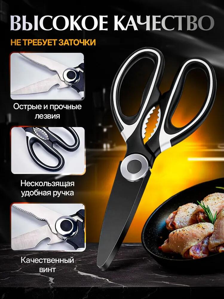
ภาพที่ 1: เอกลักษณ์ของผลิตภัณฑ์และคุณค่าหลัก
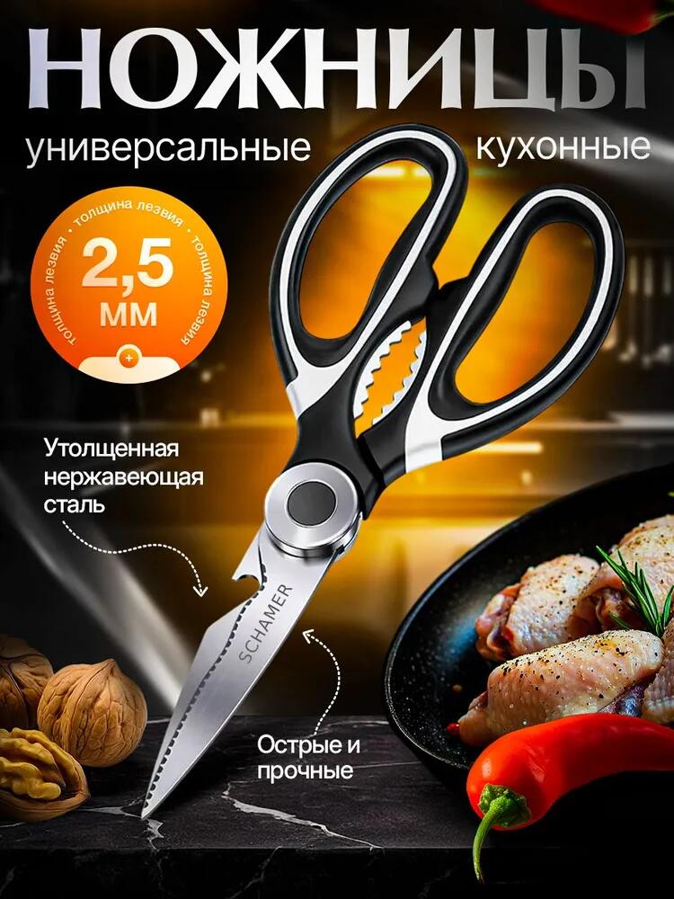
ภาพแรกแสดงให้เห็นว่าผลิตภัณฑ์คืออะไรและมีความสำคัญอย่างไร.
เราจัดวางกรรไกรให้เป็นจุดเด่น โดยเอียงเล็กน้อยเพื่อให้เห็นใบมีดทั้งสอง โครงสร้างด้ามจับ และฟังก์ชันการทำงานต่างๆ มุมนี้สื่อถึงฟังก์ชันการใช้งานได้ดีกว่าการนำเสนอแบบแบนราบเหมือนในแคตตาล็อก พื้นหลังเป็นภาพห้องครัวสีเข้มที่มีแสงสว่างอบอุ่น ซึ่งสร้างความแตกต่างและวางตำแหน่งผลิตภัณฑ์ในบริบทการทำอาหารระดับพรีเมียมที่สมจริง.
การตัดสินใจด้านการออกแบบที่สำคัญในภาพนี้:
- แสงที่มีความคมชัดสูงช่วยเน้นความหนาของใบมีดและผิวโลหะให้เด่นชัดยิ่งขึ้น
- สีส้มที่ใช้เป็นจุดเด่นช่วยดึงดูดความสนใจไปที่ความหนาของใบมีด 2.5 มม. โดยไม่ทำให้ผลิตภัณฑ์ดูรกจนเกินไป
- องค์ประกอบของอาหาร (เนื้อสัตว์ พริก ถั่ว) ช่วยสื่อถึงการใช้งานได้อย่างชัดเจนโดยไม่ต้องอาศัยข้อความ
แทนที่จะกล่าวถึงคุณภาพอย่างเป็นนามธรรม ภาพนี้แสดงให้เห็นถึงน้ำหนัก ความแข็งแกร่ง และความจริงจัง สำหรับผู้ใช้ Ozon ภาษาภาพนี้บ่งบอกถึงความน่าเชื่อถือได้ทันที.
ภาพที่ 2: เคสป้องกันและระบบความปลอดภัย
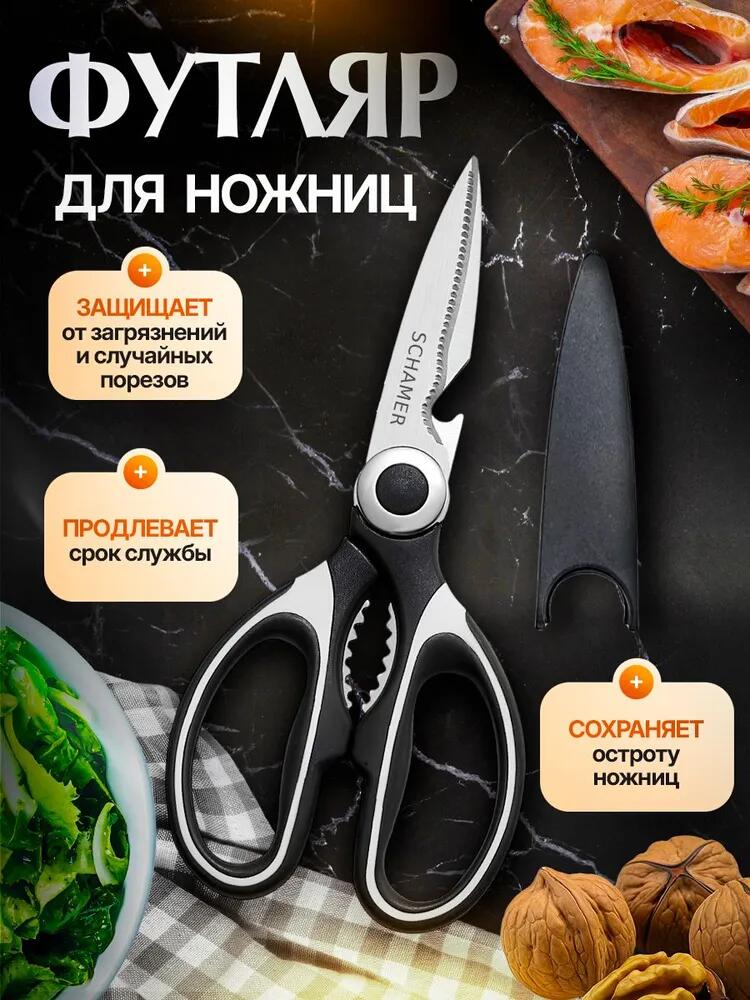
ภาพที่สองแสดงให้เห็นถึงปลอกป้องกัน ซึ่งเป็นคุณสมบัติที่คำนึงถึงความปลอดภัยและอายุการใช้งานที่ยาวนาน ซึ่งเป็นสองข้อกังวลหลักสำหรับอุปกรณ์ในครัว.
เราจัดวางกรรไกรไว้ข้างๆ กล่องในลักษณะมองจากด้านบนลงล่างบนพื้นผิวหินอ่อน การจัดวางแบบนี้ช่วยให้มองเห็นได้ชัดเจนและหลีกเลี่ยงความรกตา กล่องถูกแสดงแยกต่างหากเพื่อให้ผู้ใช้เข้าใจว่าเป็นส่วนประกอบที่รวมอยู่ในชุด ไม่ใช่อุปกรณ์เสริมที่ต้องซื้อเพิ่ม.
หลักการออกแบบเบื้องหลังภาพนี้:
- บล็อกข้อมูลสีส้มอ่อนสื่อถึงประโยชน์โดยไม่ทำให้รู้สึกแสบตา
- รูปทรงของฝักดาบนั้นมองเห็นได้อย่างชัดเจนเพื่อแสดงให้เห็นถึงการปกคลุมของใบมีด
- องค์ประกอบด้านอาหารที่สนับสนุนจะช่วยเสริมความสำคัญของห้องครัว
ภาพนี้ช่วยสร้างความมั่นใจให้กับผู้ซื้อที่ระมัดระวัง มันตอบคำถามที่ไม่ได้ถามไว้ในใจ เช่น:
- การเก็บรักษาปลอดภัยหรือไม่?
- มันจะทำให้เครื่องใช้ในครัวอื่นๆ เสียหายหรือไม่?
- ใบมีดจะทื่อเร็วไหม?
ด้วยการสร้างภาพให้เห็นถึงการปกป้องและอายุยืนยาว เราจึงลดความเสี่ยงที่รับรู้ได้ลงได้.
ภาพที่ 3: พลังการตัดข้ามวัสดุ
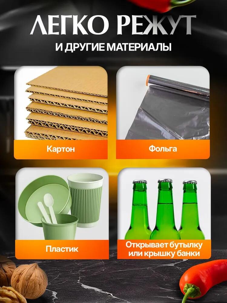
ภาพนี้เน้นที่ความสามารถ ไม่ใช่ความสวยงาม.
เราแบ่งโครงสร้างออกเป็นสี่โมดูลที่ชัดเจน โดยแต่ละโมดูลแสดงถึงงานที่แตกต่างกัน:
- กระดาษแข็ง
- ฟอยล์
- พลาสติก
- การเปิดขวดหรือโถ
วัสดุแต่ละชนิดจะถูกจัดแสดงแยกกัน ถ่ายภาพอย่างคมชัด และมีป้ายกำกับสั้นๆ กำกับไว้ วิธีการแบบแยกส่วนนี้สอดคล้องกับพฤติกรรมการสแกนที่รวดเร็วของ Ozon ผู้ใช้สามารถตรวจสอบได้ทันทีว่ากรรไกรนั้นเหมาะสมกับความต้องการเฉพาะของตนหรือไม่.
หลักการออกแบบที่นำมาใช้:
- การจัดวางองค์ประกอบภาพให้สอดคล้องกันในสื่อต่างๆ เพื่อสร้างจังหวะทางสายตา
- ติดฉลากสีส้มเพื่อรักษาความต่อเนื่องของแบรนด์
- ใช้วัสดุจริงในโลกแห่งความเป็นจริง แทนที่จะใช้สัญลักษณ์นามธรรม
ภาพนี้แสดงให้เห็นว่ากรรไกรเป็นเครื่องมือ ไม่ใช่แค่เพียงอุปกรณ์ในครัว มันช่วยขยายขอบเขตการใช้งานและเพิ่มมูลค่าโดยไม่เพิ่มความซับซ้อน.
ภาพที่ 4: การใช้งานอเนกประสงค์ในครัว
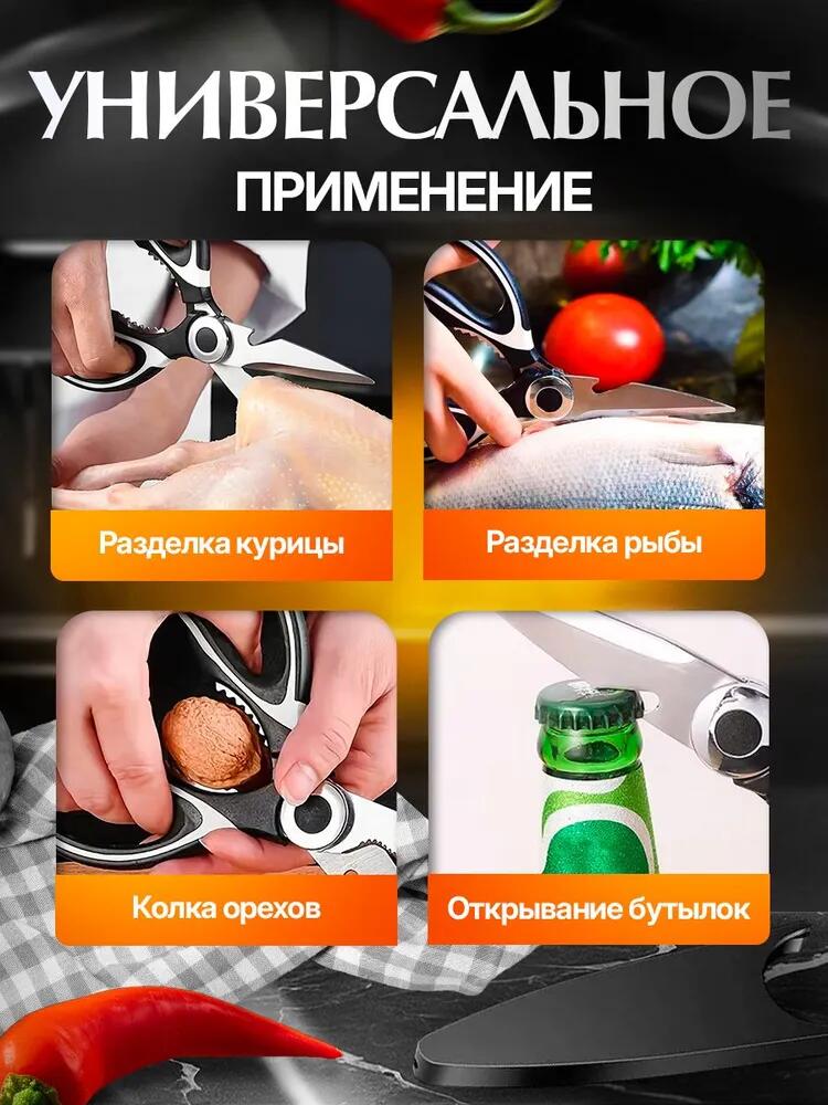
ต่อไปนี้เราจะเปลี่ยนจากการศึกษาเนื้อหามาเป็นการลงมือปฏิบัติในชีวิตจริง.
เราใช้ภาพถ่ายระยะใกล้แบบถือในมือเพื่อแสดงให้เห็นการใช้งานกรรไกร:
- การหั่นสัตว์ปีก
- การเตรียมปลา
- กะเทาะเปลือกถั่ว
- การเปิดขวด
มือมีบทบาทสำคัญอย่างยิ่งในภาพนี้ มือช่วยกำหนดขนาด หลักสรีรศาสตร์ และความสมจริง ผู้ใช้จะทดสอบโดยไม่รู้ตัวว่าการจับนั้นดูสบายและควบคุมได้ดีหรือไม่.
เจตนาในการออกแบบ:
- แต่ละสถานการณ์ตอบสนองความต้องการของผู้ใช้ที่แตกต่างกัน
- การจัดเฟรมภาพแบบกระชับช่วยดึงความสนใจไปที่การปฏิสัมพันธ์ ไม่ใช่ฉากหลัง
- การจัดวางแบบตารางช่วยรักษาความเป็นระเบียบและความอ่านง่าย
ภาพนี้ช่วยให้ผู้ใช้จินตนาการถึงกรรไกรในกิจวัตรประจำวันในครัวของตนเอง ซึ่งเป็นกุญแจสำคัญในการเปลี่ยนพฤติกรรมการใช้กรรไกรให้เป็นการใช้ชีวิตประจำวัน.
ภาพที่ 5: คุณภาพการผลิตและรายละเอียดทางวิศวกรรม
ภาพนี้กล่าวถึงข้อกังวลในระยะยาว ได้แก่ ความทนทานและความสะดวกสบาย.
เราใช้รูปแบบแบ่งหน้าจอ:
- ทางด้านซ้าย ภาพระยะใกล้แสดงรายละเอียดของใบมีด พื้นผิวของด้ามจับ และโครงสร้างของสกรูอย่างละเอียด
- ทางด้านขวาเป็นภาพผลิตภัณฑ์แบบเต็มรูปที่เน้นรูปทรงโดยรวม
จุดเด่นด้านการออกแบบ:
- รายละเอียดระดับมาโครแสดงให้เห็นถึงความคมชัดและคุณภาพของวัสดุ
- พื้นผิวกันลื่นของด้ามจับนั้นมองเห็นได้อย่างชัดเจน
- สกรูแกนหมุนบ่งบอกถึงความน่าเชื่อถือทางกลไก
แทนที่จะระบุว่า "คุณภาพสูง" ภาพนี้กลับปล่อยให้รายละเอียดการก่อสร้างเป็นตัวบ่งบอกคุณภาพเอง แนวทางนี้โดนใจผู้ซื้อที่เน้นความคุ้มค่าเป็นอย่างมาก.
ภาพที่ 6: ขนาด สัดส่วน และความกะทัดรัด
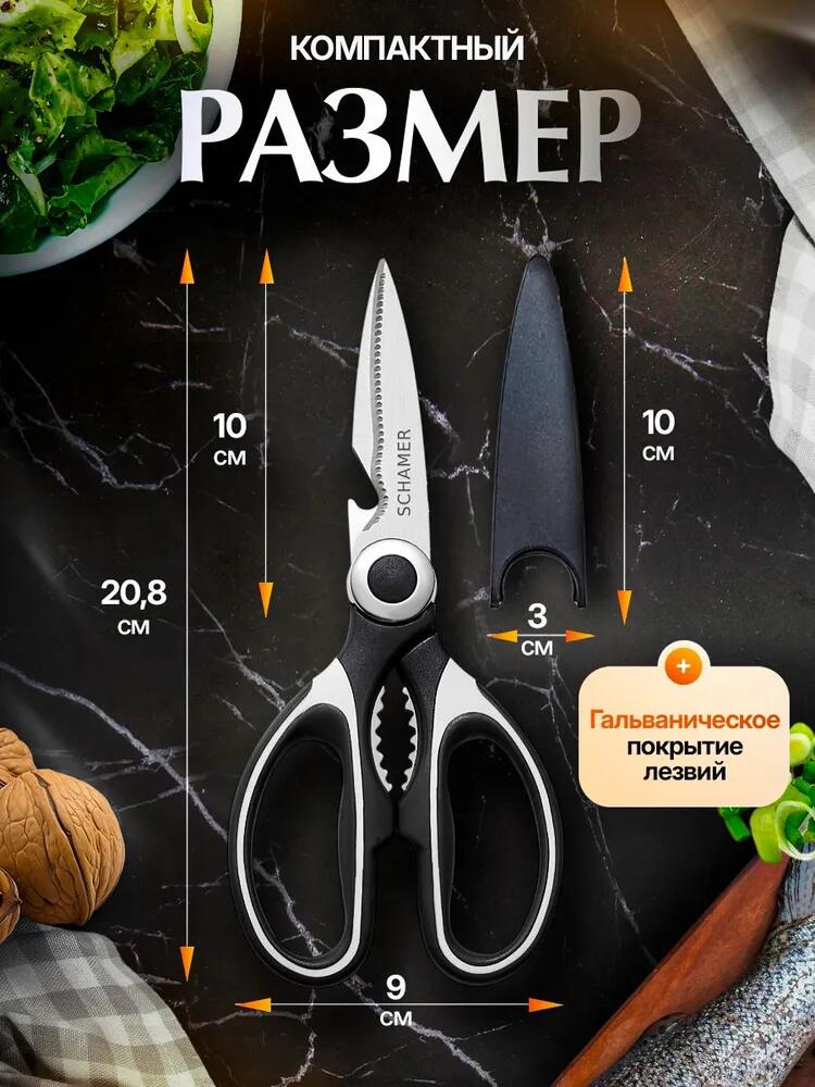
การระบุขนาดอย่างชัดเจนช่วยลดความลังเล ในภาพนี้ เราได้ระบุขนาดที่แม่นยำโดยใช้ลูกศรและมาตรวัด.
เราได้แสดงสิ่งต่อไปนี้:
- ความยาวทั้งหมด
- ความยาวใบมีด
- ความกว้างของด้ามจับ
- ขนาดของเคส
หลักการออกแบบ:
- พื้นหลังที่เป็นกลางช่วยป้องกันการรบกวนสมาธิ
- ตัวเลขบอกขนาดชัดเจนและอ่านง่ายบนมือถือ
- กรรไกรและกล่องใส่กรรไกรปรากฏอยู่เคียงข้างกันเพื่อช่วยให้เข้าใจถึงมิติของพื้นที่
ภาพนี้ช่วยตอบคำถามเชิงปฏิบัติก่อนที่คำถามเหล่านั้นจะกลายเป็นข้อโต้แย้ง:
- มันจะใส่ในลิ้นชักได้ไหม?
- มันใหญ่เกินไปหรือเล็กเกินไป?
- สะดวกในการจัดเก็บหรือไม่?
ความโปร่งใสสร้างความเชื่อมั่น.
ความสอดคล้องของระบบภาพตลอดทั้งชุด
นอกเหนือจากภาพแต่ละภาพแล้ว จุดแข็งของการออกแบบภาพหลักของ Ozon นี้อยู่ที่การคิดเชิงระบบ.
เราคงไว้ซึ่งสิ่งต่อไปนี้ในภาพทั้งหมด:
- สุนทรียภาพในครัวโทนสีเข้มที่สอดคล้องกัน
- องค์ประกอบสีส้มโทนอบอุ่นช่วยเน้นให้เห็นเด่นชัด
- มีการจัดลำดับความสำคัญที่ชัดเจนระหว่างผลิตภัณฑ์ ข้อความ และพื้นหลัง
- การจัดวางระยะห่างที่สมดุลและเหมาะสมสำหรับการรับชมบนมือถือ
แต่ละภาพเชื่อมโยงกันอย่างเป็นธรรมชาติ ผู้ใช้จะเคลื่อนที่จากข้อมูลประจำตัว → ความปลอดภัย → ความสามารถ → การใช้งาน → คุณภาพ → คุณสมบัติ โดยไม่สับสน ลำดับขั้นตอนที่เป็นระบบนี้สะท้อนให้เห็นถึงวิธีคิดของผู้ใช้ ไม่ใช่การโฆษณาของแบรนด์.
เหตุใดการออกแบบนี้จึงได้ผลสำหรับโอโซน
Ozon ไม่ใช่แพลตฟอร์มสำหรับการเล่าเรื่อง แต่เป็นแพลตฟอร์มสำหรับการตัดสินใจ.
ชุดภาพนี้เคารพความเป็นจริงนั้นโดย:
- ให้ความสำคัญกับความชัดเจนมากกว่าการตกแต่ง
- เน้นการทำงานก่อนอารมณ์
- ลดภาระทางความคิดบนแต่ละหน้าจอ
- ช่วยให้เปรียบเทียบกับคู่แข่งได้อย่างรวดเร็ว
แทนที่จะพึ่งพาภาพ "สมบูรณ์แบบ" เพียงภาพเดียว เราสร้างข้อโต้แย้งเชิงภาพโดยใช้ภาพหลายเฟรม แต่ละภาพตอบคำถามสำคัญหนึ่งข้อ แล้วนำผู้ใช้ไปยังขั้นตอนต่อไป.
นี่คือวิธีการที่การออกแบบภาพหลักของ Ozon มีประสิทธิภาพ.
บทสรุป
ภาพสินค้าที่ดึงดูดสายตาไม่ได้แค่เพียงดูดีเท่านั้น แต่ยังช่วยขายเหตุผลได้ด้วย.
สำหรับโครงการกรรไกรนี้ เราออกแบบภาพทุกภาพเพื่อขจัดความสงสัย แสดงให้เห็นถึงคุณค่า และนำทางผู้ใช้ไปสู่การตัดสินใจอย่างมั่นใจ ตั้งแต่ความหนาของใบมีดไปจนถึงกล่องเก็บความปลอดภัย ตั้งแต่กำลังการตัดไปจนถึงการจัดเก็บที่กะทัดรัด องค์ประกอบภาพแต่ละอย่างมีเหตุผล.
นี่คือระบบภาพที่เน้นการเพิ่มยอดขายและปรับให้เหมาะสมกับแต่ละแพลตฟอร์ม ซึ่งเป็นระบบที่เราสร้างขึ้นสำหรับแบรนด์อีคอมเมิร์ซระดับโลก.
หากคุณกำลังมองหาวิธียกระดับภาพลักษณ์ผลิตภัณฑ์ของคุณ โอโซน หรือแพลตฟอร์มข้ามพรมแดนอื่นๆ ผ่านการออกแบบภาพหลักที่มีโครงสร้าง นี่คือแนวทางที่เราใช้ทุกวัน AIRSANG.


ออกแบบและสร้างเว็บไซต์ WordPress หรือเว็บไซต์องค์กรพร้อมระบบอีคอมเมิร์ซครบวงจรสำหรับคุณ.
ช่วงราคา: $200.00 ถึง $2,500.00custom-requirements-or-special-quotations
ราคาเดิมคือ: $2.00.$1.00ราคาปัจจุบันคือ: $1.00. ภาพหลักสำหรับการออกแบบอุปกรณ์กายภาพบำบัดที่บ้านของ Amazon (อธิบายรายละเอียด)
บทนำ: การสร้างภาพลักษณ์ที่น่าเชื่อถือสำหรับอุปกรณ์บำบัดที่บ้านบน Amazon เมื่อออกแบบภาพหลักสำหรับอุปกรณ์บำบัดที่บ้านบน Amazon สิ่งสำคัญอันดับแรกของเราคือ...

ภาพหลักสำหรับการแปลงลิปสติกเป็นสินค้าสำหรับ Amazon
บทนำ: การออกแบบภาพหลักลิปสติกที่ขายได้บน Amazon เมื่อเราออกแบบภาพหลักสำหรับลิปสติกบน Amazon ความรับผิดชอบของเราไม่ได้จำกัดอยู่แค่...

อะไรทำให้รองพื้นชนิดเหลวของ Amazon (ภาพหลัก) ขายดี?
บทนำ การออกแบบภาพหลักสำหรับรองพื้นชนิดเหลวบน Amazon ไม่ใช่แค่การทำให้ผลิตภัณฑ์ดูสวยงามเท่านั้น บน Amazon ภาพหลักและ...

การออกแบบภาพหลัก Amazon ที่มีประสิทธิภาพสำหรับตลับกรอง
บทนำ การออกแบบภาพหลักสำหรับ Amazon ไม่ใช่แค่การทำให้สินค้าดูน่าดึงดูดเท่านั้น แต่ยังเกี่ยวกับความชัดเจน ความน่าเชื่อถือ และความเข้าใจได้ในทันที โดยเฉพาะอย่างยิ่งสำหรับ...

เปรียบเทียบธีม WordPress สำหรับสัตว์เลี้ยง 5 แบบ
บทนำ การเลือกธีม WordPress ที่เหมาะสมสำหรับธุรกิจเกี่ยวกับสัตว์เลี้ยงนั้นไม่ใช่แค่เรื่องของการออกแบบเท่านั้น แต่ยังส่งผลโดยตรงต่อการใช้งาน ความสามารถในการขยายขนาด และการเติบโตของธุรกิจในระยะยาว การดูแลสัตว์เลี้ยงและ...

การสร้างเว็บไซต์ WordPress ที่ปรับขนาดได้สำหรับแบรนด์ที่ขับเคลื่อนด้วยวิทยาศาสตร์: โครงการ AminoUSA
บทนำ ในยุคดิจิทัลปัจจุบัน เว็บไซต์เป็นมากกว่าแค่สถานที่สำหรับแสดงรายการสินค้า สำหรับแบรนด์ที่ขับเคลื่อนด้วยวิทยาศาสตร์ซึ่งดำเนินงานในอุตสาหกรรมที่มีการควบคุมหรือเน้นการวิจัย...

สร้างร้านค้า Shopify ที่ปรับขนาดได้สำหรับแบรนด์ใบมีดระดับโลก: โครงการ CoolKatana
บทนำ ในธุรกิจอีคอมเมิร์ซข้ามพรมแดน เว็บไซต์ Shopify เป็นมากกว่าแค่หน้าร้าน สำหรับแบรนด์ที่ดำเนินธุรกิจในกลุ่มเฉพาะหรือกลุ่มที่ขับเคลื่อนด้วยวัฒนธรรม เว็บไซต์ต้องทำมากกว่านั้น...

การออกแบบร้านค้า Shopify ที่มีอัตราการแปลงสูงสำหรับขายการ์ดโปเกมอน
บทนำ ในโลกของอีคอมเมิร์ซสินค้าสะสม โดยเฉพาะอย่างยิ่งในตลาดเกมการ์ดโปเกมอน (TCG) เว็บไซต์จะต้องทำมากกว่าแค่แสดงรายการสินค้า...

ดีไซน์ Shopify ที่เพิ่มยอดขายสำหรับแบรนด์อิฐสั่งทำพิเศษ
บทนำ ในสภาพแวดล้อมการแข่งขันอีคอมเมิร์ซในปัจจุบัน โดยเฉพาะอย่างยิ่งในตลาดของขวัญส่วนบุคคลและของสะสม เว็บไซต์ Shopify ต้องทำมากกว่าแค่แสดงสินค้า...

กรณีศึกษาการออกแบบเว็บไซต์ Shopify สำหรับแบรนด์ดอกไม้ระดับพรีเมียม
บทนำ ในสภาพแวดล้อมการแข่งขันอีคอมเมิร์ซในปัจจุบัน เว็บไซต์ Shopify ต้องทำมากกว่าแค่แสดงสินค้า มันต้องสื่อสารคุณค่าของแบรนด์ได้ทันที และแนะนำผู้ใช้...

กรณีศึกษาการออกแบบร้านค้า Shopify: ร้านค้าเกมย้อนยุค
บทนำ ในสภาพแวดล้อมอีคอมเมิร์ซที่มีการแข่งขันสูง ความชัดเจนทางด้านภาพและการเชื่อมโยงทางอารมณ์มักเป็นตัวกำหนดว่าผู้เยี่ยมชมจะกลายเป็นลูกค้าหรือไม่ โดยเฉพาะอย่างยิ่งใน...

กรณีศึกษาการออกแบบบน Shopify: แบรนด์ Tactical Rescue
บทนำ เว็บไซต์ Shopify ที่แข็งแกร่งนั้นทำมากกว่าแค่แสดงสินค้า—มันยังสื่อสารจุดประสงค์ สร้างความไว้วางใจ และชี้นำผู้ใช้ไปสู่การตัดสินใจซื้ออย่างมั่นใจ โดยเฉพาะอย่างยิ่ง...

กรณีศึกษาการออกแบบเว็บไซต์ Shopify สำหรับแบรนด์จักรยานไฟฟ้า
บทนำ ในตลาดจักรยานไฟฟ้าที่มีการแข่งขันสูงในปัจจุบัน เว็บไซต์ Shopify ต้องทำมากกว่าแค่แสดงสินค้า—ต้องเล่าเรื่องราว สร้างความน่าเชื่อถือ และให้คำแนะนำแก่ผู้ใช้งาน...

แพลตฟอร์มอีคอมเมิร์ซ Shopify ที่ปรับขนาดได้สำหรับแบรนด์สร้างสรรค์
บทนำ เมื่อแบรนด์สร้างสรรค์เติบโตขึ้น เว็บไซต์ของพวกเขามักประสบปัญหาในการปรับตัวให้ทัน เนื่องจากสายผลิตภัณฑ์ขยายตัว เนื้อหาเพิ่มขึ้น และปริมาณการเข้าชมสูงขึ้น แบรนด์ที่เน้นภาพเป็นหลักหลายแห่ง...

กรณีศึกษาการออกแบบเว็บไซต์ Shopify สำหรับแบรนด์สินค้าตกแต่งบ้าน
บทนำ ในตลาดสินค้าตกแต่งบ้านที่มีการแข่งขันสูง ภาพลักษณ์ของแบรนด์ไม่ได้เป็นเพียงแค่เรื่องของความสวยงามอีกต่อไป แต่ยังส่งผลโดยตรงต่อความไว้วางใจ พฤติกรรมการเลือกชมสินค้า และการตัดสินใจซื้อสินค้า สำหรับ...

กรณีศึกษาการสร้างเว็บไซต์สมัครสมาชิก WordPress ที่ปรับขนาดได้
บทนำ สำหรับแบรนด์อีคอมเมิร์ซสมัยใหม่ เว็บไซต์ไม่ได้เป็นเพียงแค่หน้าร้านดิจิทัลอีกต่อไปแล้ว มันคือกลไกสำคัญที่สนับสนุนการสมัครรับข้อมูล การเล่าเรื่องราวผ่านเนื้อหา การสร้างความไว้วางใจ...

ดีไซน์ WordPress ที่เพิ่มอัตราการแปลงสูงสำหรับแบรนด์สำหรับผู้ใหญ่
บทนำ ในตลาดอีคอมเมิร์ซที่มีการแข่งขันสูง ภาพลักษณ์ที่สวยงามเพียงอย่างเดียวไม่เพียงพอ เว็บไซต์ WordPress ที่ประสบความสำเร็จต้องนำทางผู้เข้าชมผ่านเส้นทางที่ชัดเจนและตั้งใจไว้ ซึ่ง...

เว็บไซต์อีคอมเมิร์ซตุ๊กตาเซ็กส์ WordPress ที่ปรับขนาดได้
บทนำ การเปิดตัวเว็บไซต์อีคอมเมิร์ซข้ามพรมแดนที่มีประสิทธิภาพสูงนั้นไม่ใช่แค่การนำสินค้าขึ้นออนไลน์เท่านั้น สำหรับแบรนด์ที่ดำเนินธุรกิจในตลาดที่มีการแข่งขันสูงและเน้นภาพลักษณ์เป็นหลัก เว็บไซต์...