


การแนะนำ
ในตลาดสินค้าตกแต่งบ้านที่มีการแข่งขันสูง ภาพลักษณ์ของแบรนด์ไม่ได้เป็นเพียงแค่เรื่องของความสวยงามอีกต่อไป แต่ยังส่งผลโดยตรงต่อความไว้วางใจ พฤติกรรมการเลือกชมสินค้า และการตัดสินใจซื้อ สำหรับแบรนด์ไลฟ์สไตล์ที่มีชื่อเสียงอยู่แล้วนั้น... ช็อปฟี่ เว็บไซต์ต้องทำมากกว่าแค่แสดงสินค้า มันต้องสื่อถึงบรรยากาศ นำทางผู้ใช้ได้อย่างเป็นธรรมชาติ และเปลี่ยนแรงบันดาลใจให้เป็นการกระทำ.
กรณีศึกษาชิ้นนี้จะสำรวจว่าเราให้การสนับสนุนการออกแบบใหม่และการเพิ่มประสิทธิภาพของอย่างไร ช็อปฟี่ หน้าร้านค้าสำหรับ บรรยากาศ, แบรนด์ตกแต่งบ้านชื่อดังจากยุโรป บทบาทของเรามุ่งเน้นไปที่การออกแบบหน้าเว็บ โครงสร้างภาพ และประสบการณ์ผู้ใช้ ช่วยให้แบรนด์สามารถถ่ายทอดเอกลักษณ์แบบออฟไลน์และคอลเลกชันตามฤดูกาลไปสู่การนำเสนอทางดิจิทัลที่ประณีตและมุ่งเน้นการสร้างยอดขาย.
แทนที่จะมองโครงการนี้ในฐานะการปรับปรุงทางเทคนิค เรามองว่ามันเป็นความท้าทายด้านระบบการออกแบบ โดยมุ่งเน้นการสร้างสมดุลระหว่างความอบอุ่นของแบรนด์ ความชัดเจนทางการค้า และการเล่าเรื่องด้วยภาพที่ปรับขนาดได้ภายในกรอบการทำงานของ Shopify.
| ระยะเวลาจัดส่ง | หมวดหมู่ | แพลตฟอร์มแอปพลิเคชัน |
| 24 วัน | เฟอร์นิเจอร์ | ช็อปฟี่ |
| นักออกแบบที่เกี่ยวข้อง | ค่าใช้จ่าย | ผล |
| หลิน จาง、เป่ยฟอน ฟู่ | $2700 | รายได้จากการขาย📈230% |
ทำความเข้าใจแบรนด์และดีเอ็นเอการออกแบบของแบรนด์
แบรนด์ไลฟ์สไตล์ที่สร้างขึ้นจากบรรยากาศ
Atmosphera ดำเนินธุรกิจในกลุ่มสินค้าที่เน้นอารมณ์ความรู้สึกเป็นหลัก ลูกค้าไม่ได้แค่ซื้อเฟอร์นิเจอร์หรือของตกแต่งบ้าน แต่พวกเขาซื้ออารมณ์ ไลฟ์สไตล์ และความรู้สึกเหมือนอยู่บ้าน เอกลักษณ์ของแบรนด์ในโลกออฟไลน์จึงเน้นย้ำถึง:
- โทนสีอ่อนๆ เป็นกลาง
- การเล่าเรื่องราวตามฤดูกาล (ความอบอุ่นในฤดูหนาว ความเบาบางในฤดูร้อน การตกแต่งภายในที่อบอุ่นสบาย)
- ดีไซน์ราคาไม่แพงแต่ให้ความรู้สึกหรูหรา
- แคตตาล็อกสินค้าที่หลากหลาย ครอบคลุมห้อง สไตล์ และช่วงราคาต่างๆ
ความท้าทายคือการแปลงประสบการณ์สัมผัสที่เข้มข้นนี้ให้เป็นรูปแบบดิจิทัลที่ให้ความรู้สึกดื่มด่ำไม่แพ้กัน โดยไม่ทำให้ผู้ใช้รู้สึกหนักใจจนเกินไป.
วัตถุประสงค์หลักของการออกแบบ
จากมุมมองด้านการออกแบบ เป้าหมายหลักนั้นชัดเจน:
สร้างหน้าแรกและหน้าสนับสนุนของ Shopify ที่ให้ความรู้สึกสงบ ใช้งานง่าย และสร้างแรงบันดาลใจ พร้อมทั้งกระตุ้นการค้นหาสินค้าและการเปลี่ยนลูกค้าให้เป็นผู้ซื้อ.
สิ่งนี้จำเป็นต้องมีการควบคุมอย่างระมัดระวังในเรื่องความหนาแน่นของเค้าโครง จังหวะทางสายตา และลำดับชั้น.
ความท้าทายด้านการออกแบบที่เราต้องแก้ไข
1. การจัดการแคตตาล็อกสินค้าขนาดใหญ่ด้วยภาพ
ด้วยจำนวนสินค้าหลายร้อยรายการในหลายหมวดหมู่ ทำให้หน้าแรกของเว็บไซต์ดูรกได้ง่าย แบรนด์จำนวนมากมักตกอยู่ในกับดักของการ "แสดงทุกอย่างพร้อมกัน" ซึ่งมักนำไปสู่ความเหนื่อยล้าในการตัดสินใจ.
ความเสี่ยงด้านการออกแบบ:
- เลย์เอาต์ที่โอเวอร์โหลด
- ข้อความภาพที่แข่งขันกัน
- ขาดความมุ่งเน้นที่ผลิตภัณฑ์
2. การสร้างสมดุลระหว่างแรงบันดาลใจและการค้า
ภาพลักษณ์ของ Atmosphera เน้นไลฟ์สไตล์ แต่เว็บไซต์อีคอมเมิร์ซก็ยังต้องชี้นำผู้ใช้ไปสู่การกระทำที่เป็นรูปธรรมอยู่ดี.
ความตึงเครียดในการออกแบบ:
- การเล่าเรื่องเชิงบรรณาธิการเทียบกับความชัดเจนเชิงพาณิชย์
- ภาพที่กระตุ้นอารมณ์เทียบกับการนำทางที่เน้นการใช้งาน
3. แคมเปญตามฤดูกาลโดยไม่ทำให้เสียความสม่ำเสมอ
แบรนด์นี้จัดโปรโมชั่นและแคมเปญตามฤดูกาลเป็นประจำ (เช่น Winter Days, ส่วนลด, คอลเลกชันใหม่) ซึ่งต้องดูสดใหม่ แต่ก็ต้องไม่ตัดขาดจากเอกลักษณ์หลักของแบรนด์.
แนวทางการออกแบบโดยยึดหลัก "การออกแบบเป็นอันดับแรก" ของเราบน Shopify
ออกแบบก่อนจัดวาง วางกลยุทธ์ก่อนแบ่งส่วน
เราเริ่มต้นด้วย การตรวจสอบด้านภาพและโครงสร้าง, ไม่ใช่การสลับเทมเพลต ก่อนที่จะเริ่มปรับแต่งเลย์เอาต์ เราได้ถามคำถามเหล่านี้:
- แบรนด์ต้องการให้ผู้ใช้รู้สึกอย่างไรภายใน 5 วินาทีแรก?
- จังหวะการเลื่อนหน้าจอที่เหมาะสมควรเป็นอย่างไร?
- องค์ประกอบใดควรเป็นผู้นำ และองค์ประกอบใดควรเป็นส่วนสนับสนุน?
วิธีนี้ทำให้เราสามารถออกแบบได้อย่างมีเป้าหมาย แทนที่จะนำส่วนต่างๆ ของ Shopify มาวางซ้อนกันโดยไม่มีความสอดคล้องกัน.
กลยุทธ์การออกแบบหน้าแรก
ส่วนเด่น: สงบ ไม่เสียงดัง
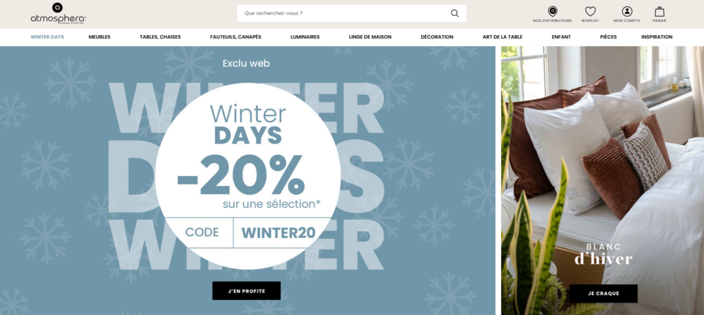
แทนที่จะใช้แบนเนอร์โฆษณาที่ดุดัน เราออกแบบพื้นที่ส่วนกลางให้ให้ความรู้สึกดังนี้:
- กว้างขวาง
- ตามฤดูกาล
- สอดคล้องทางอารมณ์
ข้อความหลักสื่อถึงคุณค่าโดยไม่ตะโกนโหวกเหวก การจัดวางตัวอักษรดูนุ่มนวลและอ่านง่าย ในขณะที่ภาพประกอบกำหนดโทนโดยรวมของประสบการณ์การท่องเว็บ.
หลักการออกแบบที่นำมาใช้:
- ข้อความที่ชัดเจนหนึ่งข้อความต่อหนึ่งหน้าจอ
- คอนทราสต์ที่ควบคุมได้
- ปุ่มกระตุ้นการดำเนินการขั้นต่ำ
จุดเด่นของผลิตภัณฑ์: คัดสรรมาอย่างดี ไม่แออัด
แทนที่จะนำสินค้าจำนวนมากมาแสดงบนหน้าแรก เราเลือกสินค้าที่คัดสรรมาเป็นพิเศษ:
- โปรโมชั่นเด่น
- หนังสือขายดี
- สินค้าแนะนำประจำฤดูกาล
ผลิตภัณฑ์แต่ละกลุ่มจะใช้ระบบการจัดวางภาพที่สอดคล้องกัน:
- ระยะห่างที่สมดุล
- โครงสร้างไพ่ที่คาดเดาได้
- ราคาและเรทติ้งแสดงไว้อย่างชัดเจน
วิธีการนี้ช่วยให้ผู้ใช้สแกนได้อย่างรวดเร็วในขณะที่ยังคงรู้สึกว่าได้รับการชี้นำอยู่.
แบนเนอร์ไลฟ์สไตล์เป็นจุดพักสายตาที่สวยงาม
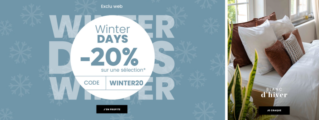
พื้นที่จัดแสดงไลฟ์สไตล์ขนาดใหญ่ถูกจัดวางไว้ระหว่างโซนที่เน้นสินค้าเป็นหลัก โดยตั้งใจให้มีพื้นที่จัดแสดงสองวัตถุประสงค์:
- เสริมสร้างบรรยากาศของแบรนด์
- ลดอาการเมื่อยล้าทางสายตาขณะเลื่อนหน้าจอ
นอกจากนี้ ยังช่วยชี้นำผู้ใช้ให้สำรวจหมวดหมู่สินค้าอย่างแยบยล แทนที่จะกดดันให้รีบชำระเงินทันที.
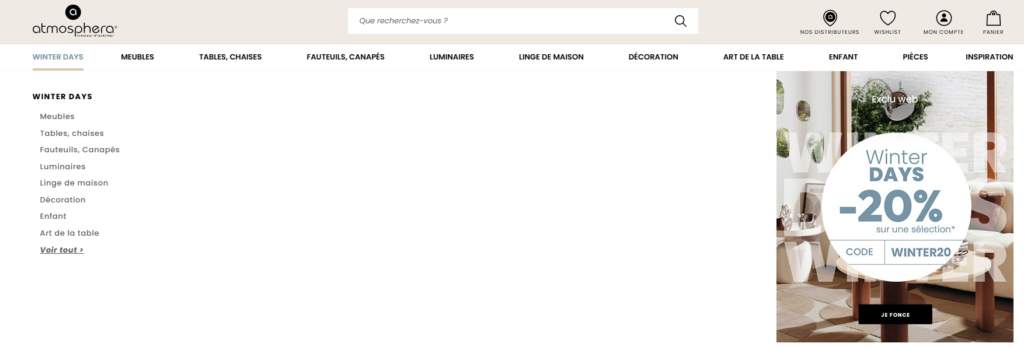
การออกแบบหน้าหมวดหมู่และคอลเลกชัน
ออกแบบเพื่อการสำรวจ
หน้าหมวดหมู่ถูกออกแบบให้เป็นพื้นที่สำหรับการค้นหาข้อมูล ไม่ใช่แค่ตารางแสดงสินค้าเท่านั้น.
ข้อควรพิจารณาหลักในการออกแบบ:
- การตั้งชื่อหมวดหมู่ที่ชัดเจน
- ภาพฮีโร่ที่โดดเด่นในแต่ละหมวดหมู่
- การจัดวาง UI การกรองที่สม่ำเสมอ
การจัดวางเลย์เอาต์ให้คาดเดาได้ จะช่วยให้ผู้ใช้รู้สึกมั่นใจที่จะสำรวจแคตตาล็อกอย่างละเอียดมากขึ้น.
ความสอดคล้องทางด้านภาพในห้องต่างๆ และธีมต่างๆ
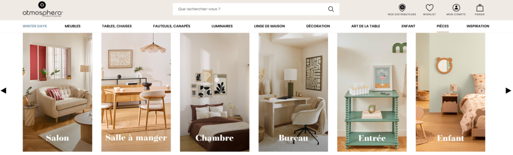
แคตตาล็อกของ Atmosphera ครอบคลุมห้องนั่งเล่น ห้องนอน ห้องรับประทานอาหาร ห้องเด็ก และอื่นๆ อีกมากมาย เราได้รวมสิ่งเหล่านี้เข้าด้วยกันผ่าน:
- ตรรกะตารางที่สอดคล้องกัน
- รูปแบบตัวอักษรที่ซ้ำกัน
- กฎการเว้นระยะห่างที่เป็นเอกภาพ
วิธีนี้ช่วยให้แม้ว่ารูปแบบจะเปลี่ยนไป ประสบการณ์การใช้งานเว็บไซต์ก็ยังคงมีความสอดคล้องกัน.
ลำดับชั้นเชิงภาพและการไหลของประสบการณ์ผู้ใช้
การออกแบบเพื่อพฤติกรรมการเลื่อนหน้าจอ
ผู้ใช้งาน Shopify ในปัจจุบันเลื่อนหน้าจออย่างรวดเร็ว การออกแบบของเราจึงคำนึงถึงเรื่องนี้โดย:
- การใช้หัวข้อส่วนที่ชัดเจน
- สร้างจุดยึดภาพในทุกหน้าจอ
- พื้นหลังที่มีทั้งแสงและพื้นผิวสลับกันไป
สิ่งนี้สร้างจังหวะการเลื่อนที่เป็นธรรมชาติ ซึ่งส่งเสริมให้ใช้งานได้นานขึ้น.
CTA ที่ชัดเจนโดยไม่ก้าวร้าว
การเรียกร้องให้ลงมือทำนั้นตั้งใจให้เป็นไปอย่างแนบเนียน:
- “เลือกซื้อเลย”
- “"ค้นพบ"”
- “สำรวจคอลเลกชัน”
ปุ่มกระตุ้นการดำเนินการ (CTA) เหล่านี้ช่วยสนับสนุนพฤติกรรมการท่องเว็บมากกว่าที่จะขัดจังหวะ.
เสริมสร้างความไว้วางใจผ่านรายละเอียดการออกแบบ
องค์ประกอบ UX ขนาดเล็กที่สำคัญ
การเลือกใช้ดีไซน์เล็กๆ น้อยๆ ช่วยสร้างความไว้วางใจได้:
- สัญลักษณ์ที่สอดคล้องกัน
- ข้อความแจ้งการจัดส่งและการส่งคืนที่ชัดเจน
- การสร้างความมั่นใจทางสายตาใกล้กับส่วนต่างๆ ของผลิตภัณฑ์
องค์ประกอบเหล่านี้ช่วยลดแรงเสียดทานโดยไม่ทำให้เกิดเสียงรบกวนเพิ่มขึ้น.
ความน่าเชื่อถือของแบรนด์ผ่านการควบคุมตนเอง
เราหลีกเลี่ยงการออกแบบที่มากเกินไป ไม่มีแอนิเมชั่นที่ไม่จำเป็น ไม่มีตราสัญลักษณ์มากเกินไป ความมั่นใจมาจากความชัดเจน ไม่ใช่การตกแต่ง.
การคิดเชิงระบบด้านการออกแบบเพื่อความสามารถในการขยายขนาด
กรอบการทำงานที่ยืดหยุ่น ไม่ใช่แค่หน้าเว็บเดียวจบ
หนึ่งในผลลัพธ์ที่สำคัญที่สุดของโครงการนี้คือการสร้างตรรกะการออกแบบที่สามารถทำซ้ำได้ แบรนด์จึงสามารถ:
- เปิดตัวคอลเลกชันใหม่ได้อย่างง่ายดาย
- เปลี่ยนภาพประกอบตามฤดูกาลโดยไม่ต้องออกแบบเลย์เอาต์ใหม่
- รักษาความสม่ำเสมอในทุกแคมเปญ
ความสามารถในการปรับขนาดได้นี้เป็นสิ่งสำคัญสำหรับการเติบโตของ Shopify ในระยะยาว.
ผลลัพธ์และผลกระทบ
ประสบการณ์การใช้งานที่เน้นเป้าหมายมากขึ้น
หลังจากนำแนวทางการออกแบบใหม่มาใช้ เว็บไซต์ก็ประสบความสำเร็จดังนี้:
- เส้นทางการค้นหาผลิตภัณฑ์ที่ชัดเจนยิ่งขึ้น
- การเล่าเรื่องแบรนด์ที่แข็งแกร่งยิ่งขึ้น
- ปรับปรุงความสอดคล้องทางภาพระหว่างหน้าต่างๆ ให้ดียิ่งขึ้น
แม้ว่าตัวชี้วัดจะมีการเปลี่ยนแปลงไปตามกาลเวลา แต่ผลกระทบในทันทีนั้นเห็นได้ชัดเจนในด้านต่างๆ ดังนี้:
- การใช้งานเบราว์เซอร์เป็นเวลานานขึ้น
- ลดความรกตา
- การเชื่อมโยงที่แข็งแกร่งยิ่งขึ้นระหว่างภาพลักษณ์ของแบรนด์และประสบการณ์ออนไลน์
เหตุใดแนวทางการออกแบบนี้จึงได้ผลสำหรับแบรนด์ Shopify
โครงการนี้แสดงให้เห็นถึงความจริงที่สำคัญประการหนึ่ง:
ประสิทธิภาพที่ดีของ Shopify เริ่มต้นจากการออกแบบที่รอบคอบ ไม่ใช่การเพิ่มฟีเจอร์มากมาย.
โดยมุ่งเน้นที่:
- ลำดับชั้นทางภาพ
- ความสม่ำเสมอทางอารมณ์
- การตัดสินใจจัดวางเลย์เอาต์โดยคำนึงถึงผู้ใช้เป็นหลัก
แบรนด์ต่างๆ สามารถยกระดับหน้าร้านของตนได้โดยไม่ต้องยุ่งเกี่ยวกับการพัฒนาที่ซับซ้อนหรือโค้ดที่เขียนขึ้นเอง.
บทสรุป
การออกแบบที่ประสบความสำเร็จ ช็อปฟี่ การสร้างเว็บไซต์ไม่ใช่เรื่องของการตามกระแสหรือเพิ่มส่วนต่างๆ มากขึ้น แต่เป็นเรื่องของการเข้าใจแบรนด์ การเคารพความสนใจของผู้ใช้ และการสร้างระบบภาพที่สนับสนุนทั้งการเล่าเรื่องและการขาย.
โครงการนี้แสดงให้เห็นว่าวิธีการออกแบบที่เรียบง่ายและรอบคอบสามารถเปลี่ยนแคตตาล็อกสินค้าตกแต่งบ้านขนาดใหญ่ให้กลายเป็นประสบการณ์การช้อปปิ้งที่ราบรื่นและน่าดึงดูดใจ ซึ่งให้ความรู้สึกที่สร้างแรงบันดาลใจ น่าเชื่อถือ และใช้งานง่าย.
ท้ายที่สุดแล้ว นี่คือรูปแบบงานออกแบบ Shopify ที่เราให้ความสำคัญเป็นอย่างยิ่ง AIRSANGช่วยแบรนด์ต่างๆ แปลงเอกลักษณ์ของตนให้เป็นหน้าร้านค้าออนไลน์ที่มีประสิทธิภาพสูงและเน้นการออกแบบ ซึ่งสามารถขยายขนาดได้อย่างลงตัวในระยะยาว.
หากคุณต้องการปรับปรุงเว็บไซต์ Shopify ของคุณให้ดียิ่งขึ้นด้วยการออกแบบหน้าเว็บ โครงสร้างภาพ และประสบการณ์ผู้ใช้เชิงกลยุทธ์ โดยไม่เน้นการพัฒนาอย่างหนัก นี่คือแนวทางที่เราเชื่อมั่น.


ออกแบบและสร้างเว็บไซต์ WordPress หรือเว็บไซต์องค์กรพร้อมระบบอีคอมเมิร์ซครบวงจรสำหรับคุณ.
ช่วงราคา: $200.00 ถึง $2,500.00ข้อกำหนดเฉพาะหรือใบเสนอราคาพิเศษ
ราคาเดิมคือ: $2.00.$1.00ราคาปัจจุบันคือ: $1.00. ภาพหลักสำหรับการออกแบบอุปกรณ์กายภาพบำบัดที่บ้านของ Amazon (อธิบายรายละเอียด)
บทนำ: การสร้างภาพลักษณ์ที่น่าเชื่อถือสำหรับอุปกรณ์บำบัดที่บ้านบน Amazon เมื่อออกแบบภาพหลักสำหรับอุปกรณ์บำบัดที่บ้านบน Amazon สิ่งสำคัญอันดับแรกของเราคือ...

ภาพหลักสำหรับการแปลงลิปสติกเป็นสินค้าสำหรับ Amazon
บทนำ: การออกแบบภาพหลักลิปสติกที่ขายได้บน Amazon เมื่อเราออกแบบภาพหลักสำหรับลิปสติกบน Amazon ความรับผิดชอบของเราไม่ได้จำกัดอยู่แค่...

อะไรทำให้รองพื้นชนิดเหลวของ Amazon (ภาพหลัก) ขายดี?
บทนำ การออกแบบภาพหลักสำหรับรองพื้นชนิดเหลวบน Amazon ไม่ใช่แค่การทำให้ผลิตภัณฑ์ดูสวยงามเท่านั้น บน Amazon ภาพหลักและ...

การออกแบบภาพหลัก Amazon ที่มีประสิทธิภาพสำหรับตลับกรอง
บทนำ การออกแบบภาพหลักสำหรับ Amazon ไม่ใช่แค่การทำให้สินค้าดูน่าดึงดูดเท่านั้น แต่ยังเกี่ยวกับความชัดเจน ความน่าเชื่อถือ และความเข้าใจได้ในทันที โดยเฉพาะอย่างยิ่งสำหรับ...

เปรียบเทียบธีม WordPress สำหรับสัตว์เลี้ยง 5 แบบ
บทนำ การเลือกธีม WordPress ที่เหมาะสมสำหรับธุรกิจเกี่ยวกับสัตว์เลี้ยงนั้นไม่ใช่แค่เรื่องของการออกแบบเท่านั้น แต่ยังส่งผลโดยตรงต่อการใช้งาน ความสามารถในการขยายขนาด และการเติบโตของธุรกิจในระยะยาว การดูแลสัตว์เลี้ยงและ...

การสร้างเว็บไซต์ WordPress ที่ปรับขนาดได้สำหรับแบรนด์ที่ขับเคลื่อนด้วยวิทยาศาสตร์: โครงการ AminoUSA
บทนำ ในยุคดิจิทัลปัจจุบัน เว็บไซต์เป็นมากกว่าแค่สถานที่สำหรับแสดงรายการสินค้า สำหรับแบรนด์ที่ขับเคลื่อนด้วยวิทยาศาสตร์ซึ่งดำเนินงานในอุตสาหกรรมที่มีการควบคุมหรือเน้นการวิจัย...

สร้างร้านค้า Shopify ที่ปรับขนาดได้สำหรับแบรนด์ใบมีดระดับโลก: โครงการ CoolKatana
บทนำ ในธุรกิจอีคอมเมิร์ซข้ามพรมแดน เว็บไซต์ Shopify เป็นมากกว่าแค่หน้าร้าน สำหรับแบรนด์ที่ดำเนินธุรกิจในกลุ่มเฉพาะหรือกลุ่มที่ขับเคลื่อนด้วยวัฒนธรรม เว็บไซต์ต้องทำมากกว่านั้น...

การออกแบบร้านค้า Shopify ที่มีอัตราการแปลงสูงสำหรับขายการ์ดโปเกมอน
บทนำ ในโลกของอีคอมเมิร์ซสินค้าสะสม โดยเฉพาะอย่างยิ่งในตลาดเกมการ์ดโปเกมอน (TCG) เว็บไซต์จะต้องทำมากกว่าแค่แสดงรายการสินค้า...

ดีไซน์ Shopify ที่เพิ่มยอดขายสำหรับแบรนด์อิฐสั่งทำพิเศษ
บทนำ ในสภาพแวดล้อมการแข่งขันอีคอมเมิร์ซในปัจจุบัน โดยเฉพาะอย่างยิ่งในตลาดของขวัญส่วนบุคคลและของสะสม เว็บไซต์ Shopify ต้องทำมากกว่าแค่แสดงสินค้า...

กรณีศึกษาการออกแบบเว็บไซต์ Shopify สำหรับแบรนด์ดอกไม้ระดับพรีเมียม
บทนำ ในสภาพแวดล้อมการแข่งขันอีคอมเมิร์ซในปัจจุบัน เว็บไซต์ Shopify ต้องทำมากกว่าแค่แสดงสินค้า มันต้องสื่อสารคุณค่าของแบรนด์ได้ทันที และแนะนำผู้ใช้...

กรณีศึกษาการออกแบบร้านค้า Shopify: ร้านค้าเกมย้อนยุค
บทนำ ในสภาพแวดล้อมอีคอมเมิร์ซที่มีการแข่งขันสูง ความชัดเจนทางด้านภาพและการเชื่อมโยงทางอารมณ์มักเป็นตัวกำหนดว่าผู้เยี่ยมชมจะกลายเป็นลูกค้าหรือไม่ โดยเฉพาะอย่างยิ่งใน...

กรณีศึกษาการออกแบบบน Shopify: แบรนด์ Tactical Rescue
บทนำ เว็บไซต์ Shopify ที่แข็งแกร่งนั้นทำมากกว่าแค่แสดงสินค้า—มันยังสื่อสารจุดประสงค์ สร้างความไว้วางใจ และชี้นำผู้ใช้ไปสู่การตัดสินใจซื้ออย่างมั่นใจ โดยเฉพาะอย่างยิ่ง...

กรณีศึกษาการออกแบบเว็บไซต์ Shopify สำหรับแบรนด์จักรยานไฟฟ้า
บทนำ ในตลาดจักรยานไฟฟ้าที่มีการแข่งขันสูงในปัจจุบัน เว็บไซต์ Shopify ต้องทำมากกว่าแค่แสดงสินค้า—ต้องเล่าเรื่องราว สร้างความน่าเชื่อถือ และให้คำแนะนำแก่ผู้ใช้งาน...

แพลตฟอร์มอีคอมเมิร์ซ Shopify ที่ปรับขนาดได้สำหรับแบรนด์สร้างสรรค์
บทนำ เมื่อแบรนด์สร้างสรรค์เติบโตขึ้น เว็บไซต์ของพวกเขามักประสบปัญหาในการปรับตัวให้ทัน เนื่องจากสายผลิตภัณฑ์ขยายตัว เนื้อหาเพิ่มขึ้น และปริมาณการเข้าชมสูงขึ้น แบรนด์ที่เน้นภาพเป็นหลักหลายแห่ง...

กรณีศึกษาการสร้างเว็บไซต์สมัครสมาชิก WordPress ที่ปรับขนาดได้
บทนำ สำหรับแบรนด์อีคอมเมิร์ซสมัยใหม่ เว็บไซต์ไม่ได้เป็นเพียงแค่หน้าร้านดิจิทัลอีกต่อไปแล้ว มันคือกลไกสำคัญที่สนับสนุนการสมัครรับข้อมูล การเล่าเรื่องราวผ่านเนื้อหา การสร้างความไว้วางใจ...

ดีไซน์ WordPress ที่เพิ่มอัตราการแปลงสูงสำหรับแบรนด์สำหรับผู้ใหญ่
บทนำ ในตลาดอีคอมเมิร์ซที่มีการแข่งขันสูง ภาพลักษณ์ที่สวยงามเพียงอย่างเดียวไม่เพียงพอ เว็บไซต์ WordPress ที่ประสบความสำเร็จต้องนำทางผู้เข้าชมผ่านเส้นทางที่ชัดเจนและตั้งใจไว้ ซึ่ง...

เว็บไซต์อีคอมเมิร์ซตุ๊กตาเซ็กส์ WordPress ที่ปรับขนาดได้
บทนำ การเปิดตัวเว็บไซต์อีคอมเมิร์ซข้ามพรมแดนที่มีประสิทธิภาพสูงนั้นไม่ใช่แค่การนำสินค้าขึ้นออนไลน์เท่านั้น สำหรับแบรนด์ที่ดำเนินธุรกิจในตลาดที่มีการแข่งขันสูงและเน้นภาพลักษณ์เป็นหลัก เว็บไซต์...
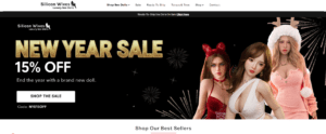
ออกแบบเว็บไซต์ Shopify สำหรับแบรนด์ตุ๊กตาซิลิโคน
บทนำ ในตลาดอีคอมเมิร์ซที่มีการแข่งขันสูงและมีความละเอียดอ่อนทางด้านภาพ การออกแบบเว็บไซต์ไม่ได้เป็นเพียงแค่เรื่องของความสวยงามเท่านั้น แต่ยังเกี่ยวข้องกับความน่าเชื่อถือ ความชัดเจน การสร้างความประทับใจทางอารมณ์ และ...