


Введение
In the highly competitive Озон marketplace, a motorcycle helmet is not sold by specifications alone. It is sold through clarity, structure, and immediate visual trust. When users scroll quickly through dozens of similar products, the main image sequence must do far more than look attractive — it must communicate safety, comfort, functionality, and value within seconds.
This article presents a professional breakdown of the main image design strategy for an Ozon motorcycle helmet, created from a designer’s point of view. Each image in the sequence was deliberately structured to reduce cognitive load, answer buyer concerns in a logical order, and comply with Ozon’s visual behavior patterns. Rather than relying on exaggerated effects or cluttered layouts, the design focuses on precision, legibility, and controlled visual impact.
Below, we explain why each image exists, what problem it solves, and how it contributes to conversion performance on Ozon.
| Срок доставки | Категория | Платформа приложений |
| 8 дней | Motorcycle helmet | Озон |
| Участники проекта (дизайнеры) | Расходы | Эффект |
| Нэнси | $150 | Sales volume📈214% |
Изображение 1: Идентификация продукта и первое впечатление
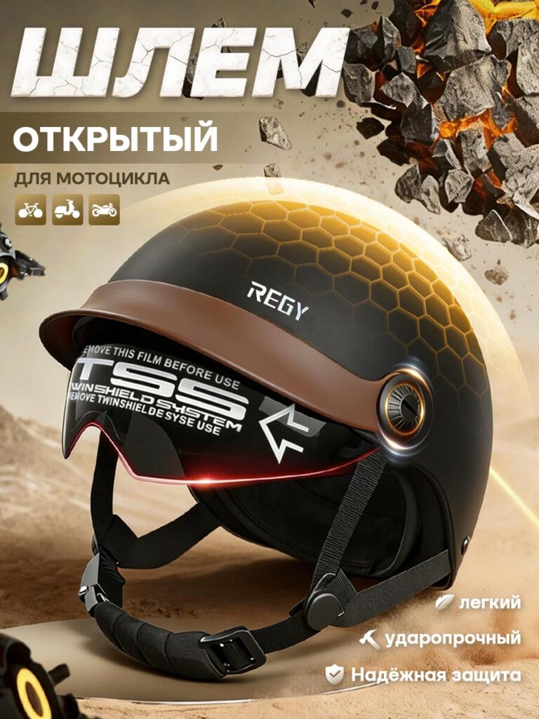
The first image establishes the helmet’s core identity.
We designed this frame to immediately communicate that this is an open-face motorcycle helmet intended for urban and casual riding. The helmet is presented at a three-quarter angle, which allows users to see the shell shape, visor system, and chin strap simultaneously. This angle creates depth while preserving realism, helping buyers understand the actual proportions of the product.
The background uses controlled motion elements and warm tones to suggest durability and impact resistance without overwhelming the product. The typography is bold but restrained, ensuring legibility even on mobile screens. Icons indicating compatibility with different vehicle types help users quickly confirm relevance.
This image answers one critical question instantly:
“Is this the helmet I’m looking for?”
Image 2: Functional Details and Wearing Comfort
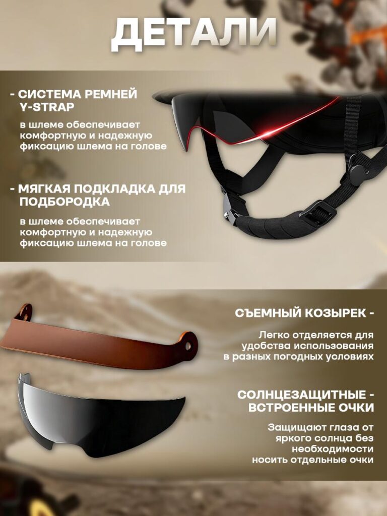
The second image zooms into wearing-related details, focusing on how the helmet feels in use rather than how it looks on a shelf.
Here, we highlight the Y-strap system and the soft chin padding. These are components riders care about after purchase, often mentioned in reviews when missing or poorly designed. By visualizing them early, we reduce uncertainty and increase perceived quality.
The layout separates text and visuals clearly, ensuring the user can read benefits without scanning the entire image. The lighting emphasizes material softness and flexibility, reinforcing comfort and stability.
We separated and displayed the removable visor and built-in sun protection glasses as individual elements. Instead of showing them attached, we intentionally presented them floating in space to clarify that these parts are detachable and functional on their own.
This approach prevents misinterpretation — a common issue in Ozon listings where buyers are unsure whether accessories are included. Clear labeling and spacing reduce returns and negative feedback.
The visual hierarchy leads the eye from top to bottom, mirroring how users scan vertically on mobile.
Это изображение отвечает на следующие вопросы:
“How stable and comfortable is this helmet during actual riding, and what parts can be removed, adjusted, or customized?”
Image 3: Internal Structure and Safety Composition
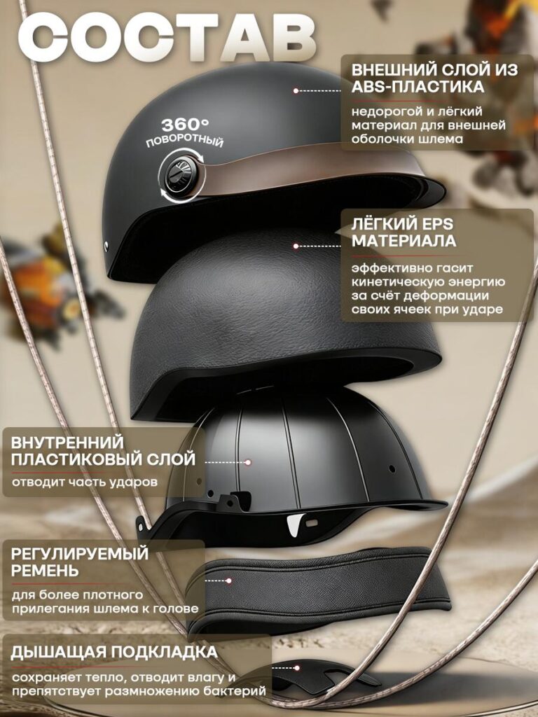
Safety is a non-negotiable concern for helmet buyers, but technical explanations often feel abstract. This image solves that problem through exploded structure visualization.
We separated the helmet into layers:
- External ABS shell
- EPS impact-absorbing layer
- Internal plastic structure
- Adjustable strap system
- Breathable inner padding
Each layer is labeled clearly, with concise explanations focusing on function rather than engineering jargon. The exploded view allows users to visually understand impact absorption and protection logic without reading a long description.
This image builds trust by showing transparency in construction.
The message here is simple:
“This helmet protects you through structure, not promises.”
Image 4: Size, Dimensions, and Weight Transparency
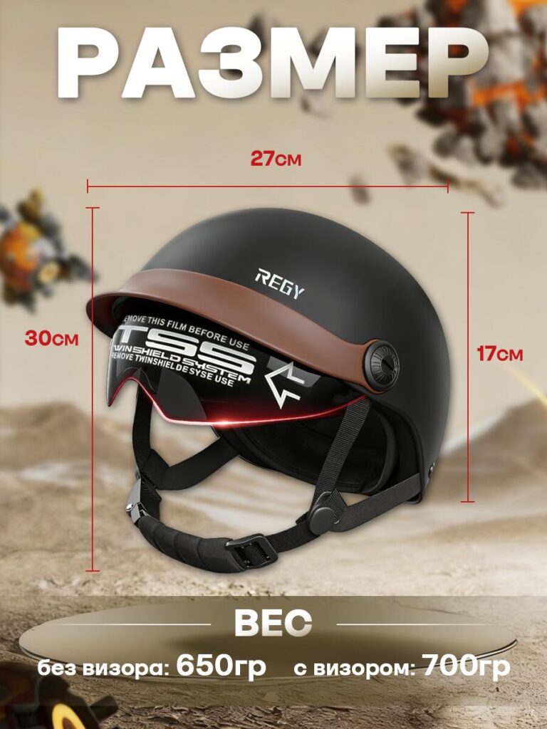
Uncertainty about size and weight is a major cause of hesitation in helmet purchases. This image eliminates that doubt.
We displayed exact physical dimensions and clearly differentiated weight with and without the visor. Measurements are shown in a neutral, technical style, avoiding exaggeration or misleading scaling.
The helmet remains centered and proportional, ensuring measurements feel credible rather than decorative. This approach aligns with Ozon’s preference for factual clarity.
This image reassures buyers by answering:
“Will this helmet fit my needs and feel comfortable over time?”
Image 5: Core Advantages and Certification
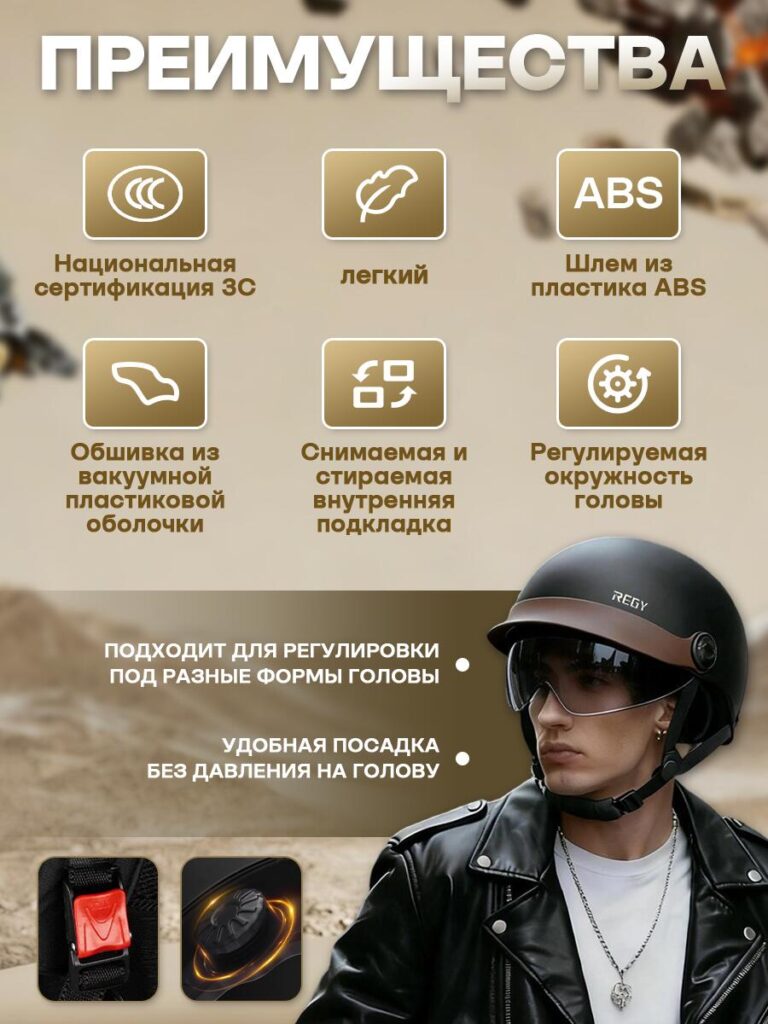
The final image summarizes key selling points using a clean icon-based system.
Instead of repeating earlier information, this frame consolidates the helmet’s strengths:
- Lightweight design
- ABS shell material
- Adjustable fit system
- Removable and washable padding
- Certified safety compliance
We intentionally minimized text length and relied on visual symbols to support quick comprehension. A lifestyle shot of the helmet being worn reinforces real-world use and scale without distracting from the information.
This image serves as the final confirmation before purchase.
It answers:
“Why should I choose this helmet over others?”
Design Logic Behind the Image Sequence
The image order follows a deliberate psychological flow:
- Recognition – What is this product?
- Comfort – How does it feel to wear?
- Функциональность – What features does it include?
- Безопасность – How does it protect me?
- Practicality – Will it fit and feel right?
- Reassurance – Is it worth buying now?
This structure mirrors how buyers evaluate motorcycle helmets mentally, reducing friction at each step.
Заключение
A high-performing Озон motorcycle helmet listing depends on more than attractive visuals. It requires a structured storytelling approach that transforms images into a guided decision-making process.
By designing each main image with a clear role — from first impression to final reassurance — this helmet listing communicates safety, comfort, and value without overwhelming the buyer. The result is a clean, professional, and conversion-focused presentation that aligns with Ozon’s marketplace behavior and user expectations.
This is the design philosophy we apply when creating product visuals for competitive e-commerce environments. At АИРСАНГ, we specialize in turning complex products into clear visual stories that build trust and drive results.


Спроектируем и создадим для вас WordPress-сайт или корпоративный сайт с полной системой электронной коммерции.
Ценовой диапазон: от $200.00 до $2,500.00Нестандартные требования или специальные предложения
Первоначальная цена составляла: $2.00.$1.00Текущая цена: $1.00. Дизайн главного изображения для домашнего физиотерапевтического устройства Amazon: пояснения.
Введение: Создание достоверного изображения для домашних терапевтических приборов на Amazon При разработке главного изображения для домашнего терапевтического прибора на Amazon мы в первую очередь...

Дизайн основного изображения для конвертации помады на Amazon.
Введение: Разработка главного образа помады, которая продается на Amazon Когда мы разрабатываем главный образ для помады Amazon, наша ответственность выходит далеко за рамки...

Что делает основное изображение жидкой тональной основы Amazon конвертируемым?
Введение. Разработка дизайна основного изображения для жидкой тональной основы на Amazon — это не просто создание красивого внешнего вида продукта. На Amazon основное изображение и...

Разработка эффективного основного изображения Amazon для фильтрующих картриджей
Введение. Разработка основного изображения для Amazon — это не просто создание привлекательного внешнего вида товара. Речь идёт о ясности, доверии и мгновенном понимании, особенно для...

Сравнение пяти тем WordPress для сайтов о домашних животных
Введение. Выбор подходящей темы WordPress для сайтов, посвященных домашним животным, — это не просто решение, связанное с дизайном; оно напрямую влияет на удобство использования, масштабируемость и долгосрочный рост бизнеса. Уход за домашними животными и...

Создание масштабируемого веб-сайта на WordPress для научно-ориентированного бренда: проект AminoUSA
Введение. В современном цифровом пространстве веб-сайт — это больше, чем просто место для размещения информации о товарах. Для научно-ориентированных брендов, работающих в регулируемых или научно-исследовательских отраслях, это….

Создание масштабируемого магазина Shopify для глобального бренда ножей: проект CoolKatana
Введение. В трансграничной электронной коммерции веб-сайт Shopify — это больше, чем просто витрина магазина. Для брендов, работающих в нишевых, ориентированных на культуру категориях, веб-сайт должен делать гораздо больше, чем...

Разработка высокоэффективного магазина Shopify для карточек Pokémon.
Введение. В мире электронной коммерции коллекционных товаров, особенно на рынке коллекционных карточных игр Pokémon, веб-сайт должен делать больше, чем просто перечислять товары...

Высокоэффективный дизайн Shopify для индивидуального бренда стационарной торговой точки.
Введение. В условиях современной конкурентной среды электронной коммерции, особенно в сегменте персонализированных подарков и коллекционных товаров, веб-сайт на платформе Shopify должен делать гораздо больше, чем просто отображать товары. Он...

Пример разработки веб-сайта на платформе Shopify для премиального цветочного бренда.
Введение. В условиях современной конкурентной среды электронной коммерции веб-сайт на платформе Shopify должен делать гораздо больше, чем просто отображать товары. Он должен мгновенно передавать ценность бренда, направлять пользователей...

Пример проекта дизайна на Shopify: магазин ретро-игр
Введение. В условиях высокой конкуренции в сфере электронной коммерции визуальная ясность и эмоциональная связь часто определяют, станет ли посетитель клиентом. Это особенно актуально в...

Пример проекта по дизайну на Shopify: Tactical Rescue Brand
Введение. Эффективный веб-сайт на Shopify делает больше, чем просто отображает товары — он передает цель, укрепляет доверие и помогает пользователям принимать уверенные решения о покупке. Это особенно важно...

Пример разработки веб-сайта на платформе Shopify для бренда электровелосипедов.
Введение. На современном конкурентном рынке электровелосипедов веб-сайт на платформе Shopify должен делать больше, чем просто демонстрировать товары — он должен рассказывать историю, вызывать доверие и направлять пользователей...

Масштабируемая платформа электронной коммерции Shopify для креативного бренда.
Введение. Когда креативные бренды растут, их веб-сайты часто с трудом успевают за развитием. По мере расширения ассортимента продукции, увеличения объема контента и роста трафика многие бренды, ориентированные на визуальное оформление...

Пример разработки веб-сайта на платформе Shopify для бренда товаров для дома.
Введение. На высококонкурентном рынке товаров для дома визуальная идентичность — это уже не просто эстетика, она напрямую влияет на доверие, поведение покупателей при просмотре товаров и принятие решений о покупке. Для...

Пример создания масштабируемого сайта с платной подпиской на WordPress.
Введение. Для современных брендов электронной коммерции веб-сайт — это уже не просто цифровая витрина. Это движок, поддерживающий подписки, создание контента, построение доверия и т.д.

Высокоэффективный дизайн WordPress для брендов, ориентированных на взрослую аудиторию.
Введение. На высококонкурентных рынках электронной коммерции одних лишь ярких визуальных элементов недостаточно. Успешный веб-сайт на WordPress должен направлять посетителей по четкому и целенаправленному маршруту, который….

Масштабируемый веб-сайт электронной коммерции по продаже секс-кукол на WordPress
Введение. Запуск высокоэффективного веб-сайта для трансграничной электронной коммерции — это не просто размещение товаров в интернете. Для брендов, работающих на высококонкурентных рынках, ориентированных на визуальный контент, веб-сайт...