В корзине нет товаров.
Shopify is built for selling. That is one of the platform’s biggest strengths. Product pages, collection pages, checkout flows, and themes are all designed to move a visitor from discovery to purchase as smoothly as possible. But not every store owner wants every product to be instantly purchasable.
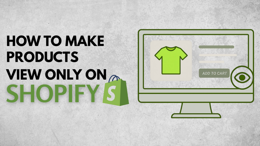
Sometimes you want visitors to browse without buying. Sometimes you need a digital catalog for wholesale clients. Sometimes you want to launch a “coming soon” collection, showcase custom work, or display sold-out items as part of your brand story. In these situations, learning how to make products view only on Shopify becomes incredibly useful.
The good news is that Shopify can absolutely support this kind of setup. The limitation is that it does not offer a simple built-in switch that says “make this product view only.” Instead, store owners usually achieve the same result through theme edits, template customization, or store structure decisions.
This guide explains the concept in a practical, beginner-friendly way. Rather than treating it like a purely technical task, we will look at the business reasons behind it, the most common implementation methods, and the pros and cons of each approach. By the end, you will have a clearer understanding of how to turn Shopify into a view-only product catalog when your business model calls for it.
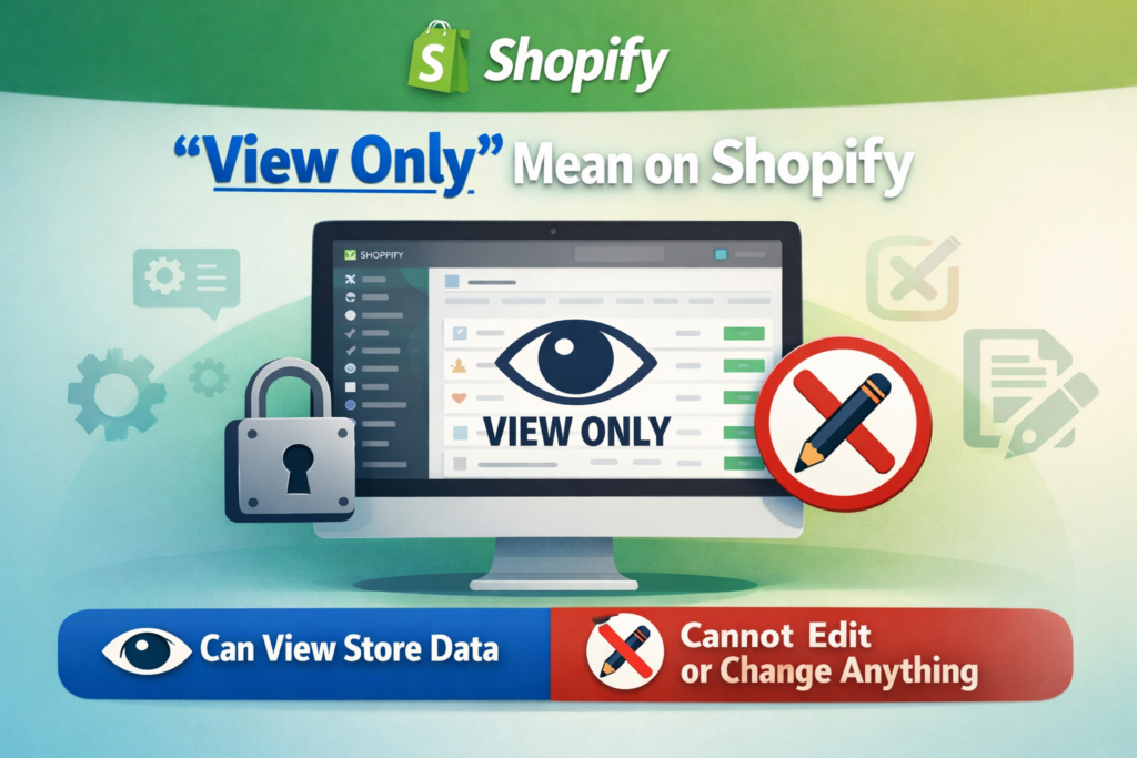
A view-only product is a product that customers can see, read about, and explore, but cannot directly purchase through the normal add-to-cart flow.
In most Shopify stores, a product page includes:
When a product is made view only, the page usually still keeps the visual and informational parts, but removes or changes the purchase action. Instead of buying immediately, the visitor may simply view the item, contact the seller, request a quote, or wait for the product to become available later.
This is especially valuable for businesses that use Shopify as more than a simple retail storefront. A modern ecommerce site can also function as a catalog, a lead-generation tool, a B2B showroom, or a presentation layer for custom services and made-to-order products.
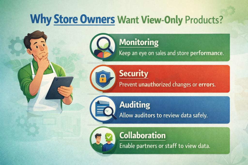
Before talking about methods, it helps to understand why this setup matters. The answer depends on the type of store you run.
Many brands want a polished online catalog without opening the door to direct checkout. This is common in wholesale, manufacturing, industrial supply, furniture, custom goods, and premium product categories where pricing depends on volume, location, or negotiation.
In that case, the product page becomes a presentation page. The goal is not to trigger instant conversion, but to inform the buyer and start a conversation.
Wholesale buyers often do not behave like regular retail customers. They may need custom pricing, minimum order quantities, shipping discussions, or sales support before placing an order.
For that reason, many B2B-focused Shopify merchants prefer to show the products while removing the retail purchase path. This creates a more controlled experience and makes the store feel like a trade catalog rather than a consumer storefront.
New product launches benefit from anticipation. If a product is not ready for sale yet, you may still want to show it to build awareness, grow an email list, or gather early interest.
A view-only page works well here because it lets customers explore the product without creating confusion at checkout.
Some products cannot be sold through a normal Shopify checkout because each order is unique. That might include custom packaging, bespoke jewelry, tailored clothing, print projects, industrial components, or large wholesale bundles.
In these cases, replacing Add to Cart with a “Contact Us” or “Request a Quote” button often makes more sense than pretending the product can be bought like a standard retail item.
Not every item on a Shopify site needs to be active inventory. Some brands use product pages to showcase previous collections, one-off pieces, finished client projects, or sold-out designs.
This is especially useful for creative studios, makers, artists, and design-led brands that want to prove capability, style, and craftsmanship.
This is the first question most merchants ask, and the honest answer is no.
Shopify does not include a default product-level setting that instantly turns a product into “view only.” There is no simple checkbox in the admin that says “disable purchase but keep visible.”
That means store owners usually need to create the effect themselves. Fortunately, that does not mean the process is overly difficult. In many cases, it is simply a matter of adjusting theme logic and deciding how you want the user journey to work.
The best method depends on one important question:
Do you want all products to be view only, or only some products?
Once you know the answer, the right approach becomes much easier to choose.
The most direct method is to hide the Add to Cart button from the product page.
This is often the cleanest approach if your main goal is to let customers browse products without purchasing them. The page still looks like a product page, but the final purchase action disappears.
From a user-experience perspective, this works well when the purpose of the page is purely informational.
Every Shopify theme includes code that controls how the product form appears. Inside that code is the logic for the Add to Cart button. By editing the relevant theme file, you can remove or comment out that button.
In simple terms, you are telling the theme not to display the purchasing action.
This method is popular because it is:
You are not adding extra apps or creating complicated workarounds. You are simply changing what the product page shows.
If you remove the Add to Cart button directly from the main product template, the change may affect every product using that template. For some stores, that is fine. For others, that is too broad.
That is why store owners should first decide whether the view-only mode should apply store-wide or only to selected products.
This method works best when:
If your goal is not just to hide purchasing, but to generate inquiries, then the next method is often stronger.
Sometimes hiding the purchase button is not enough. You may still want customers to take action, just not through checkout.
In that case, instead of removing Add to Cart completely, you can replace it with a different button such as:
This turns the product page into a lead-generation page instead of a transactional page.
A completely button-free page can sometimes feel incomplete. Visitors may understand the product, but not know what to do next.
Replacing the purchase button with an inquiry button solves that problem. It gives the shopper a clear path forward and aligns the page with your sales process.
For businesses that sell wholesale, custom products, or high-ticket items, this is often the most practical approach.
This method is especially effective for:
A manufacturer may want to show specifications, finishes, dimensions, and product photos, but handle pricing offline.
If every project requires discussion before ordering, the inquiry button becomes the logical next step.
Products with shipping restrictions, installation requirements, or volume-based pricing are often better handled through inquiry than instant checkout.
This method keeps the product page active and useful. Instead of creating a dead end, it transforms the page into the start of a conversation.
That matters because many Shopify stores are not only trying to “sell online.” They are also trying to educate buyers, qualify leads, and support longer decision cycles.
Another smart method is to create a collection that is technically live but not linked in the store navigation.
This allows you to build a hidden catalog that only certain people can access through a direct URL.
A private collection is ideal when you want to share products with a specific audience without making them part of the main public browsing experience.
Примеры включают:
You create the collection, add the relevant products, and simply avoid placing it in the main menu or footer. As a result, casual visitors are unlikely to discover it through normal navigation, but anyone with the link can browse it.
This method is useful for segmentation. It gives you a flexible way to present curated product groups to specific customers.
It is not the same thing as fully locking down a page with advanced permissions, but for many brands, it is enough. It creates a lighter version of private access without dramatically changing the store architecture.
This works well when you want:
It is especially appealing for merchants who want to test B2B or special collections without rebuilding the whole storefront.
This is one of the most powerful methods for stores with mixed inventory.
A mixed-inventory store may sell some items normally while keeping other items as inquiry-only, preview-only, or catalog-only. In that situation, changing the default product template for the entire store is usually not the right move.
Instead, you create a separate product template specifically for view-only products.
This method gives you control.
Instead of forcing one behavior across all products, you create two different product experiences:
You then assign the custom template only to the products that need it.
This is often the best long-term option for stores that are growing and becoming more operationally complex.
For example, you may have:
A custom template lets all of these coexist inside one Shopify store without creating a confusing customer journey.
From a design and store-management perspective, this is often the most scalable method because it separates product behavior intentionally.
That means your team can manage product strategy more clearly, and your storefront feels more polished. Customers are less likely to feel confused when each product page behaves according to the business logic behind that specific product.
There is no single best answer for every store. The right choice depends on how you sell.
Here is the simplest way to think about it.
You want a fast, simple way to remove purchasing from products and turn pages into display-only product pages.
You want the page to generate leads, quotes, or conversations rather than sales at checkout.
You want hidden or semi-private product browsing for a specific audience through shared links.
You want some products to remain sellable while others become view only.
For most growing brands, Method 4 is the most flexible. For most service-driven or B2B brands, Method 2 is usually the most effective. For simple catalogs, Method 1 can be enough.

In most cases, no.
If the product pages remain live, indexable, and accessible to search engines, they can still contribute to your SEO. Product titles, descriptions, images, and metadata still matter even if the page does not include an active Add to Cart button.
In fact, for catalog-based businesses, view-only pages can be a strong SEO asset. They let you publish more product-focused content, target long-tail search queries, and attract buyers earlier in the research process.
The key is to avoid treating the page as incomplete. A view-only page should still be useful. It should include:
SEO performance depends on the value of the page, not just whether checkout is enabled.
When merchants try to learn how to make products view only on Shopify, they sometimes focus too much on the technical change and forget the user experience.
That leads to a few common mistakes.
If the Add to Cart button disappears and nothing replaces it, some customers may assume the page is broken.
A short message can help, such as:
“This product is currently available by inquiry only.”
“Contact us for pricing and ordering.”
“This collection is for preview purposes only.”
Not every item in your catalog needs the same behavior. A store with mixed inventory should avoid one-size-fits-all logic.
A view-only setup should still feel polished on mobile. If you replace Add to Cart with another button, make sure spacing, visibility, and tap behavior work well on smaller screens.
A view-only experience should feel intentional, not temporary. Good design makes the difference between “this store looks unfinished” and “this store clearly uses a catalog-first strategy.”
This topic is not only about hiding a button. It is really about controlling the buying journey.
Shopify is flexible enough to support many business models, but the default setup assumes you want instant retail conversion. When your business works differently, your storefront should reflect that.
A wholesale brand should not behave like a standard DTC brand. A custom design studio should not force customers through a generic cart flow. A pre-launch collection should not look identical to a ready-to-ship product line.
Making products view only is one way to align the site with the real business model behind it.
That is why this decision should involve both functionality and design. You are not just editing code. You are shaping the way people understand your brand, your offer, and the next step they should take.
If you have been wondering how to make products view only on Shopify, the important thing to remember is that Shopify can do it, even though it does not provide a simple built-in toggle.
You can remove the Add to Cart button, replace it with an inquiry action, create private collection experiences, or build custom templates for selected products. The best solution depends on whether your goal is catalog presentation, wholesale access, lead generation, pre-launch visibility, or a mixed product strategy.
The real opportunity is bigger than the technical change itself. A well-executed view-only setup can make your Shopify store more aligned with your customers, your sales process, and your brand positioning. It can turn a basic storefront into a more strategic ecommerce tool.
На сайте АИРСАНГ, this is exactly the kind of cross-border ecommerce work we help clients with. We do not just build pages that look good. We help brands create website experiences that match how they actually sell, whether that means direct checkout, inquiry-based sales, wholesale catalog structures, or conversion-focused Shopify design. If your business needs a smarter Shopify setup or a stronger ecommerce website design direction, АИРСАНГ is ready to help.