


Введение
In the fast-growing retro gaming market, design plays a critical role in shaping user perception, engagement, and ultimately, conversion. When working on the Shopify store for LITNXT, our primary objective was to create a seamless digital experience that bridges nostalgia with modern usability.
Rather than overwhelming users with excessive features or complex interactions, we focused on clarity, emotional storytelling, and structured navigation. The result is a Shopify store that not only showcases products effectively but also builds trust and encourages purchase decisions across global audiences.
This case study explores how we approached the design of the LITNXT store—from homepage structure to product presentation—highlighting our design methodology, challenges, and outcomes.
| Срок доставки | Категория | Платформа приложений |
| 26days | игровая консоль | shopify |
| Участники проекта (дизайнеры) | Расходы | Эффект |
| Нэнси | $2800 | flow📈272% |
Understanding the Brand and Objectives
Defining the Core Direction
LITNXT operates in a niche that blends retro gaming culture with modern handheld technology. This meant the design needed to achieve two things simultaneously:
- Evoke nostalgia for classic gaming
- Deliver a clean, high-performance shopping experience
We identified early on that the site should not feel outdated or overly “retro-themed.” Instead, it needed a balanced aesthetic—modern layout with subtle nostalgic cues.
Key Goals
- Improve product discoverability
- Снизить трение при навигации
- Strengthen brand trust through visual clarity
- Optimize the mobile shopping experience
- Support global conversion behavior
Our Design Approach
Designing for Clarity Over Complexity
One of the most common issues in niche eCommerce stores is overloading the interface with too much content. For LITNXT, we intentionally simplified the layout to guide users through a clear journey:
- Immediate visual impact
- Quick understanding of product categories
- Easy access to best-selling products
- Strong call-to-action pathways
Visual Hierarchy and Focus
We structured the page using a strong visual hierarchy:
- Bold hero section to capture attention
- Clear section separation using whitespace
- Consistent typography for readability
- Strategic use of product imagery to drive engagement
This approach ensures users always know where to look and what to do next.
Стратегия дизайна главной страницы
Hero Section: First Impression Matters
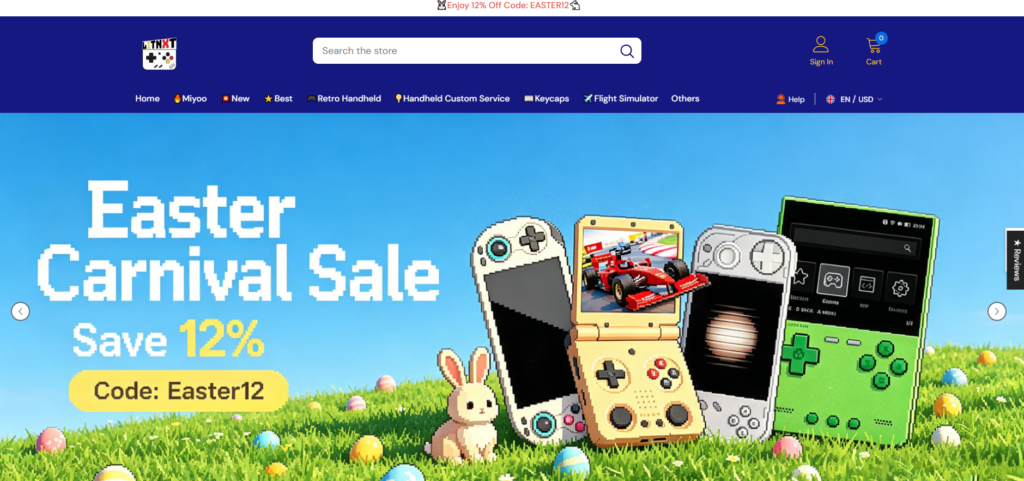
The homepage hero plays a critical role in setting expectations.
We designed the hero section to:
- Highlight flagship products like handheld consoles
- Use immersive visuals that resonate with gaming culture
- Include concise messaging that communicates value instantly
Rather than adding multiple sliders or distractions, we kept the hero focused and impactful.
Category Navigation: Simplifying Exploration

We implemented a clean category structure that allows users to quickly browse:
- Handheld consoles
- Аксессуары
- Bundles
- Новые поступления
Each category is visually distinct, making scanning effortless.
Best Sellers and Featured Products
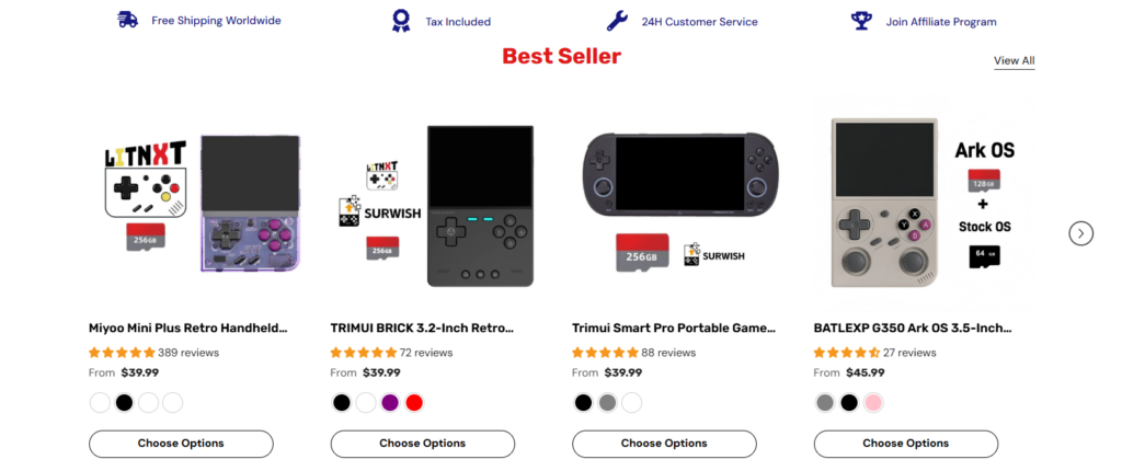
Instead of overwhelming users with all products, we curated sections like:
- Бестселлеры
- Trending Products
- Recommended Items
This reduces decision fatigue and increases conversion likelihood.
Дизайн страницы товара
Emphasizing Product Experience
The product page is where decisions happen. Our design focused on:
- High-quality product imagery
- Clear pricing and purchase options
- Simplified product descriptions
- Easy-to-read specifications
We avoided clutter and ensured the most important information appears first.
Укрепление доверия посредством дизайна
To improve credibility, we incorporated:
- Customer reviews and ratings
- Clean layout for product details
- Равномерное расстояние и выравнивание
- Visual cues for reliability (badges, guarantees)
These elements help users feel confident in their purchase.
Вопросы проектирования с учетом приоритета мобильных устройств
Why Mobile Matters
A significant portion of traffic for gaming products comes from mobile devices. Therefore, mobile optimization was not an afterthought—it was a priority.
Key Mobile Enhancements
- Упрощенные навигационные меню
- Optimized image ratios for smaller screens
- Larger tap targets for buttons
- Faster loading layouts with minimal visual clutter
We ensured the mobile experience mirrors the desktop experience in quality, while being tailored for usability.
Проблемы проектирования и их решения
Challenge 1: Balancing Nostalgia and Modern UI
Проблема: Too much retro styling can feel outdated.
Решение: We used modern layouts with subtle retro-inspired visuals, such as color accents and product imagery.
Challenge 2: Avoiding Product Overload
Проблема: Large product catalogs can overwhelm users.
Решение: We structured content into curated sections like “Best Sellers” and “Featured,” reducing cognitive load.
Challenge 3: Maintaining Visual Consistency
Проблема: Inconsistent layouts reduce trust.
Решение: We established a consistent design system for spacing, typography, and component structure.
Challenge 4: Enhancing Conversion Without Aggressive Tactics
Проблема: Overusing pop-ups and promotions can harm user experience.
Решение: We relied on clean design, strong visuals, and clear CTAs instead of intrusive elements.
Наш процесс проектирования
Step 1: Research and Benchmarking
Мы провели анализ:
- Веб-сайты конкурентов
- User behavior patterns in gaming niches
- Conversion-focused Shopify store structures
This helped us define what works—and what to avoid.
Step 2: Wireframing and Layout Planning
We created structured layouts that prioritize:
- Пользовательский сценарий
- Иерархия содержимого
- Visual balance
This stage ensures the foundation is strong before moving into visual design.
Step 3: Visual Design Execution
We translated the wireframes into a polished interface:
- Clean typography
- Balanced color usage
- High-impact imagery
Every design decision was made with conversion in mind.
Step 4: Iteration and Refinement
After initial deployment, we reviewed:
- User interaction behavior
- Visual clarity
- Section effectiveness
We refined layouts based on real-world usage.
Результаты и влияние
Улучшенный пользовательский опыт
- Faster navigation
- Clearer product discovery
- Reduced confusion during browsing
Increased Engagement
- Users spend more time exploring products
- Higher interaction with featured sections
Stronger Conversion Potential
- Simplified purchase journey
- Better trust through clean design
- Mobile-friendly experience driving sales
Why Design Matters in Shopify Stores
This project reinforces a key principle:
Good design is not about decoration—it’s about decision-making.
For Shopify stores, especially in niche markets like retro gaming, design directly impacts:
- Доверие пользователей
- Product perception
- Коэффициенты конверсии
- Фирменный стиль
A well-structured store can outperform competitors—even with similar products.
Заключение
Designing the LITNXT Shopify store was about more than aesthetics—it was about creating a focused, conversion-driven experience that aligns with both the brand and its audience.
By prioritizing clarity, usability, and emotional engagement, we transformed the store into a platform that not only showcases products but also builds trust and drives action.
At the end of the day, successful eCommerce design comes down to understanding users and guiding them effortlessly toward a purchase.
If you’re looking to build or improve a high-performing Shopify store with a strong focus on design, brand positioning, and conversion strategy, this is exactly where АИРСАНГ delivers value—helping brands turn ideas into results-driven digital experiences.


Спроектируем и создадим для вас WordPress-сайт или корпоративный сайт с полной системой электронной коммерции.
Ценовой диапазон: от $200.00 до $2,500.00Нестандартные требования или специальные предложения
Первоначальная цена составляла: $2.00.$1.00Текущая цена: $1.00. Дизайн главного изображения для домашнего физиотерапевтического устройства Amazon: пояснения.
Введение: Создание достоверного изображения для домашних терапевтических приборов на Amazon При разработке главного изображения для домашнего терапевтического прибора на Amazon мы в первую очередь...

Дизайн основного изображения для конвертации помады на Amazon.
Введение: Разработка главного образа помады, которая продается на Amazon Когда мы разрабатываем главный образ для помады Amazon, наша ответственность выходит далеко за рамки...

Как хакеры крадут электронные письма администраторов WordPress (и как им это предотвратить)
Начнем с неприятной истины: ваша электронная почта администратора WordPress, вероятно, гораздо более публична, чем вы думаете. А хакеры? Им это нравится. Для них ваш...

Что делает основное изображение жидкой тональной основы Amazon конвертируемым?
Введение. Разработка дизайна основного изображения для жидкой тональной основы на Amazon — это не просто создание красивого внешнего вида продукта. На Amazon основное изображение и...

Разработка эффективного основного изображения Amazon для фильтрующих картриджей
Введение. Разработка основного изображения для Amazon — это не просто создание привлекательного внешнего вида товара. Речь идёт о ясности, доверии и мгновенном понимании, особенно для...

Повторные атаки на WordPress: реальная угроза или преувеличенный миф?
Давайте сначала кое-что проясним. Атаки повторного воспроизведения не выглядят страшно. Они не взламывают пароли. Они не внедряют вредоносный код с зелёным хакерским текстом, разлетающимся повсюду. Они действуют коварно...

Как скопировать страницы WordPress, ничего не сломав
Давайте посмотрим правде в глаза. Иногда вам не хочется создавать новую страницу. Вам нужна та же самая страница… но немного другая. Тот же макет. Те же блоки. Те же настройки. Потому что….

Сравнение пяти тем WordPress для сайтов о домашних животных
Введение. Выбор подходящей темы WordPress для сайтов, посвященных домашним животным, — это не просто решение, связанное с дизайном; оно напрямую влияет на удобство использования, масштабируемость и долгосрочный рост бизнеса. Уход за домашними животными и...

Сравнение пяти тем оформления для интернет-магазинов купальников
Введение. Выбор правильной тематики для независимого магазина купальников или нижнего белья — это не просто визуальное решение, оно напрямую влияет на коэффициент конверсии, масштабируемость и долгосрочную перспективу...

Как отключить комментарии в WordPress (не сойдя с ума)
Давайте поговорим о комментариях в WordPress. В теории комментарии — это здорово. Они стимулируют дискуссии. Они создают сообщество. Они делают ваш сайт “живым”. А на практике? Зачастую они притягивают...

Создание масштабируемого веб-сайта на WordPress для научно-ориентированного бренда: проект AminoUSA
Введение. В современном цифровом пространстве веб-сайт — это больше, чем просто место для размещения информации о товарах. Для научно-ориентированных брендов, работающих в регулируемых или научно-исследовательских отраслях, это….

Создание масштабируемого магазина Shopify для глобального бренда ножей: проект CoolKatana
Введение. В трансграничной электронной коммерции веб-сайт Shopify — это больше, чем просто витрина магазина. Для брендов, работающих в нишевых, ориентированных на культуру категориях, веб-сайт должен делать гораздо больше, чем...

Разработка высокоэффективного магазина Shopify для карточек Pokémon.
Введение. В мире электронной коммерции коллекционных товаров, особенно на рынке коллекционных карточных игр Pokémon, веб-сайт должен делать больше, чем просто перечислять товары...

Высокоэффективный дизайн Shopify для индивидуального бренда стационарной торговой точки.
Введение. В условиях современной конкурентной среды электронной коммерции, особенно в сегменте персонализированных подарков и коллекционных товаров, веб-сайт на платформе Shopify должен делать гораздо больше, чем просто отображать товары. Он...

Как связаться со службой поддержки Shopify: простое и понятное руководство
Управление магазином Shopify должно приносить удовольствие, а не путаницу. Когда возникают вопросы или проблемы замедляют вашу работу, Shopify предлагает несколько вариантов поддержки в зависимости от ситуации...

Как деактивировать магазин Shopify: понятное и практичное руководство
Деактивация магазина Shopify — несложная процедура, но она влечет за собой последствия, которые многие продавцы упускают из виду. В этом руководстве процесс описан простым и понятным языком...

Пример разработки веб-сайта на платформе Shopify для премиального цветочного бренда.
Введение. В условиях современной конкурентной среды электронной коммерции веб-сайт на платформе Shopify должен делать гораздо больше, чем просто отображать товары. Он должен мгновенно передавать ценность бренда, направлять пользователей...

Пример проекта дизайна на Shopify: магазин ретро-игр
Введение. В условиях высокой конкуренции в сфере электронной коммерции визуальная ясность и эмоциональная связь часто определяют, станет ли посетитель клиентом. Это особенно актуально в...