


Введение
Building a successful eCommerce website for a niche outdoor brand requires more than clean visuals—it demands a deep understanding of user intent, product storytelling, and conversion-focused structure. When working on the website for YakAttack, a premium kayak fishing accessories brand powered by BigCommerce, our primary focus was to elevate the design experience while preserving the rugged authenticity of the brand.
This project centered on creating a seamless, intuitive, and visually compelling journey that aligns with how real fishing enthusiasts explore, evaluate, and purchase gear online. Rather than simply redesigning a homepage, we approached the entire site as a connected system—where every page contributes to trust, clarity, and conversion.
| Срок доставки | Категория | Платформа приложений |
| 24 дня | Outdoor fishing gear | BigCommerce |
| Участники проекта (дизайнеры) | Расходы | Эффект |
| Линь Чжан | $2100 | flow📈342% |
Понимание бренда и его целевой аудитории
Who Are We Designing For?
YakAttack serves a very specific audience: passionate kayak anglers who value durability, modular gear systems, and real-world performance. These users are:
- Highly product-aware
- Detail-oriented in their purchasing decisions
- Motivated by functionality over aesthetics—but influenced by strong visuals
Design Objective
Our goal was to bridge two worlds:
- The raw, outdoor identity of fishing culture
- The clean, structured clarity of modern eCommerce design
We needed to ensure the site felt both authentic and premium, without overwhelming users with technical complexity.
Стратегия дизайна главной страницы
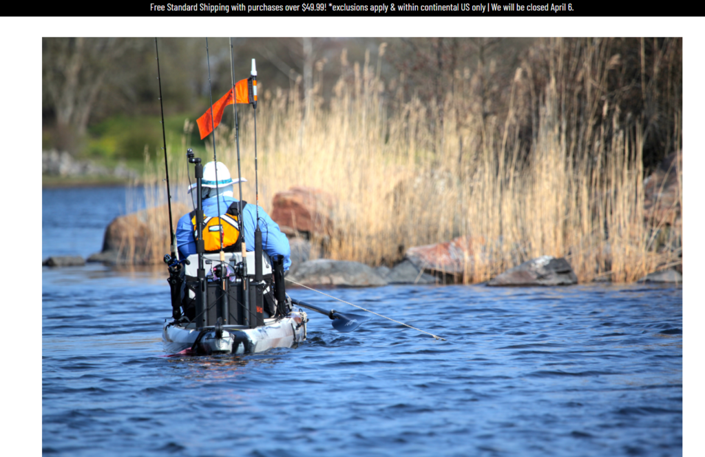
Создание сильного первого впечатления
The homepage acts as the entry point into the brand’s ecosystem. We designed it to immediately communicate three key ideas:
- Lifestyle immersion (kayak fishing in action)
- Product ecosystem clarity (modular gear categories)
- Brand authority and trust
Hero Section Approach
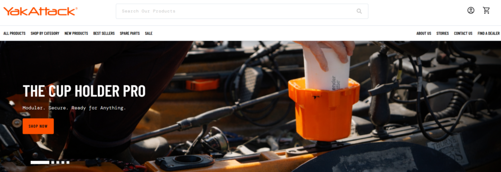
- Full-width lifestyle imagery showcasing real fishing scenarios
- Minimal but impactful headline messaging
- Clear primary CTA guiding users into product exploration
This approach avoids clutter and instead pulls users into an emotional context—helping them visualize themselves using the gear.
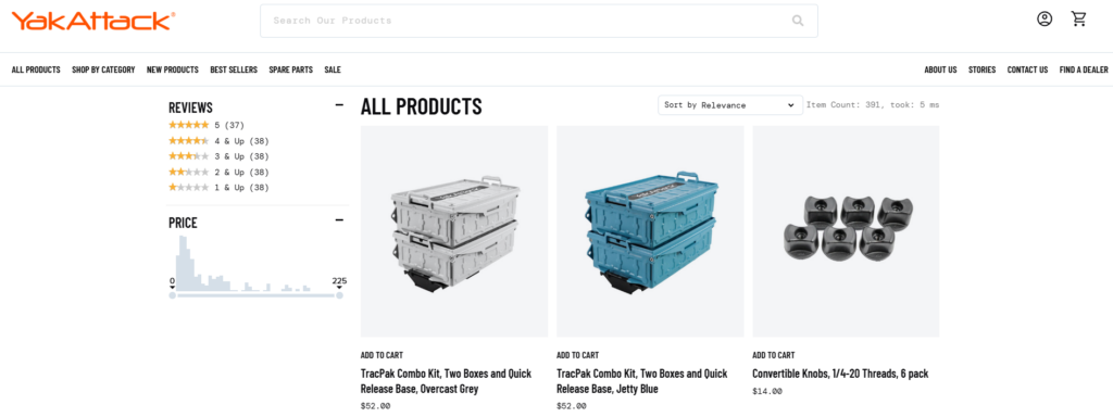
Structuring Product Discovery
One of the biggest challenges in fishing gear websites is complexity. There are multiple product types, compatibility concerns, and technical variations.
We addressed this through structured category navigation:
Category Blocks
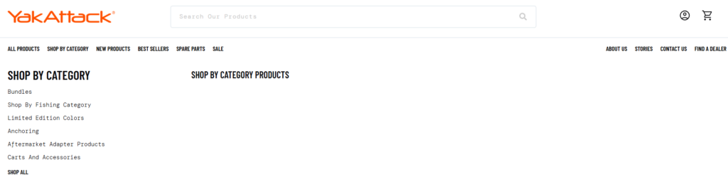
- Rod holders
- Mounting systems
- Storage solutions
- Аксессуары
Each category is visually represented with:
- Clean product imagery
- Short, benefit-driven descriptions
- Clear navigation hierarchy
This reduces cognitive load and allows users to quickly find what they need.
Balancing Visual Impact with Clarity
Outdoor brands often rely heavily on imagery, but too much visual noise can hurt usability.
Наше дизайнерское решение:
- Controlled use of high-quality visuals
- Strong spacing and grid alignment
- Consistent typography hierarchy
This ensures the site feels premium without sacrificing readability.
Product Page Design Optimization
Designing for Decision-Making
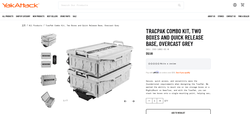
Product pages are where conversions happen. Instead of overwhelming users with technical data, we structured content to guide decision-making naturally.
Key Design Elements
- Above-the-fold clarity
- Product name, key benefits, and pricing visible immediately
- Visual storytelling
- Lifestyle images + close-up product details
- Structured information hierarchy
- Features → Benefits → Use cases
- Clear CTA positioning
- Prominent and always accessible
Simplifying Complex Product Systems
YakAttack products often work as part of a modular system. This can confuse users if not clearly explained.
We introduced:
- Visual compatibility cues
- Related product groupings
- Simple explanatory sections
This transforms complexity into clarity—helping users understand how products work together.
Collection Page Experience
Improving Browsing Efficiency
Collection pages were designed to support both:
- Quick scanning
- Deeper exploration
Design Enhancements
- Clean grid layout with consistent spacing
- Multi-line product titles with controlled truncation
- Subtle hover interactions for engagement
We avoided excessive filters or distractions, focusing instead on clarity and speed.
Visual Consistency Across Listings
Consistency builds trust. We ensured:
- Uniform product image ratios
- Balanced spacing between elements
- Predictable layout behavior
This makes the browsing experience feel stable and professional.
Supporting Pages and Brand Storytelling
About and Brand Pages
Rather than treating these as secondary pages, we designed them as trust-building assets.
Key Focus Areas
- Brand origin and mission
- Real-world product usage
- Community-driven identity
В оформлении акцент делается на:
- Storytelling sections
- Lifestyle imagery
- Clean typography
Content and Educational Sections
Fishing enthusiasts often research before buying. We supported this behavior by structuring content areas that:
- Educate users on gear usage
- Showcase real applications
- Reinforce expertise
This approach positions the brand as both a product provider and a knowledge source.
Наш процесс проектирования
Step 1: Research and Analysis
We began by analyzing:
- Веб-сайты конкурентов
- User behavior patterns in outdoor niches
- Existing site structure and pain points
This helped us identify gaps in clarity, navigation, and visual hierarchy.
Step 2: Information Architecture
We restructured the site to:
- Simplify navigation paths
- Group related products logically
- Reduce unnecessary friction
The goal was to make every click feel intentional.
Step 3: Visual System Design
We established a consistent design language:
- Иерархия типографики
- Color usage aligned with outdoor branding
- Spacing and layout grids
This ensures visual coherence across all pages.
Step 4: Conversion-Focused Layouts
Every section was designed with a purpose:
- Guide users
- Уменьшить путаницу
- Encourage action
We focused on clarity over decoration.
Трудности, с которыми мы столкнулись
1. Complex Product Relationships
YakAttack’s modular system can be difficult to explain visually.
Наше решение:
We simplified communication through layout structure and visual grouping instead of technical explanations.
2. Balancing Rugged Branding with Modern UX
Outdoor brands often lean heavily into rugged aesthetics, which can conflict with clean UX design.
Наше решение:
We retained authentic imagery while applying modern layout principles to maintain usability.
3. Avoiding Information Overload
Too much product detail can overwhelm users.
Наше решение:
We prioritized key selling points and structured additional details progressively.
Our Design Approach and Philosophy
Customer-First Experience
We design for how users think—not how brands want to present information.
Это означает:
- Очистить навигацию
- Логический поток содержимого
- Reduced decision friction
Visual Clarity Over Complexity
Instead of adding more elements, we focus on:
- Better spacing
- Strong hierarchy
- Intentional design choices
Scalable Design Systems
We build designs that:
- Work across multiple pages
- Maintain consistency
- Adapt as the product catalog grows
Результаты и влияние
Улучшенный пользовательский опыт
- Easier navigation across categories
- Faster product discovery
- Clearer understanding of product systems
Более сильное восприятие бренда
- More premium visual identity
- Increased trust through consistency
- Better storytelling across pages
Enhanced Conversion Potential
- Clear CTAs
- Reduced confusion
- More confident purchasing decisions
Заключение
Designing an eCommerce website for a specialized outdoor brand like YakAttack requires more than aesthetics—it requires strategic thinking, user empathy, and a deep understanding of how design drives behavior.
By focusing on clarity, structure, and storytelling, we transformed the site into a cohesive digital experience that supports both exploration and conversion. Every page—from homepage to product detail—was designed to guide users naturally while reinforcing the brand’s identity.
At the end of the day, great eCommerce design is not about making things look better—it’s about making them work better.
На сайте АИРСАНГ, we specialize in crafting high-converting, design-driven independent websites for global brands. If you’re looking to elevate your eCommerce experience through strategic design, our team is ready to help you build a site that not only looks premium—but performs.


Спроектируем и создадим для вас WordPress-сайт или корпоративный сайт с полной системой электронной коммерции.
Ценовой диапазон: от $200.00 до $2,500.00custom-requirements-or-special-quotations
Первоначальная цена составляла: $2.00.$1.00Текущая цена: $1.00. Дизайн главного изображения для домашнего физиотерапевтического устройства Amazon: пояснения.
Введение: Создание достоверного изображения для домашних терапевтических приборов на Amazon При разработке главного изображения для домашнего терапевтического прибора на Amazon мы в первую очередь...

Дизайн основного изображения для конвертации помады на Amazon.
Введение: Разработка главного образа помады, которая продается на Amazon Когда мы разрабатываем главный образ для помады Amazon, наша ответственность выходит далеко за рамки...

Как хакеры крадут электронные письма администраторов WordPress (и как им это предотвратить)
Начнем с неприятной истины: ваша электронная почта администратора WordPress, вероятно, гораздо более публична, чем вы думаете. А хакеры? Им это нравится. Для них ваш...

Что делает основное изображение жидкой тональной основы Amazon конвертируемым?
Введение. Разработка дизайна основного изображения для жидкой тональной основы на Amazon — это не просто создание красивого внешнего вида продукта. На Amazon основное изображение и...

Разработка эффективного основного изображения Amazon для фильтрующих картриджей
Введение. Разработка основного изображения для Amazon — это не просто создание привлекательного внешнего вида товара. Речь идёт о ясности, доверии и мгновенном понимании, особенно для...

Повторные атаки на WordPress: реальная угроза или преувеличенный миф?
Давайте сначала кое-что проясним. Атаки повторного воспроизведения не выглядят страшно. Они не взламывают пароли. Они не внедряют вредоносный код с зелёным хакерским текстом, разлетающимся повсюду. Они действуют коварно...

Как скопировать страницы WordPress, ничего не сломав
Давайте посмотрим правде в глаза. Иногда вам не хочется создавать новую страницу. Вам нужна та же самая страница… но немного другая. Тот же макет. Те же блоки. Те же настройки. Потому что….

Сравнение пяти тем WordPress для сайтов о домашних животных
Введение. Выбор подходящей темы WordPress для сайтов, посвященных домашним животным, — это не просто решение, связанное с дизайном; оно напрямую влияет на удобство использования, масштабируемость и долгосрочный рост бизнеса. Уход за домашними животными и...

Сравнение пяти тем оформления для интернет-магазинов купальников
Введение. Выбор правильной тематики для независимого магазина купальников или нижнего белья — это не просто визуальное решение, оно напрямую влияет на коэффициент конверсии, масштабируемость и долгосрочную перспективу...

Как отключить комментарии в WordPress (не сойдя с ума)
Давайте поговорим о комментариях в WordPress. В теории комментарии — это здорово. Они стимулируют дискуссии. Они создают сообщество. Они делают ваш сайт “живым”. А на практике? Зачастую они притягивают...

Создание масштабируемого веб-сайта на WordPress для научно-ориентированного бренда: проект AminoUSA
Введение. В современном цифровом пространстве веб-сайт — это больше, чем просто место для размещения информации о товарах. Для научно-ориентированных брендов, работающих в регулируемых или научно-исследовательских отраслях, это….

Создание масштабируемого магазина Shopify для глобального бренда ножей: проект CoolKatana
Введение. В трансграничной электронной коммерции веб-сайт Shopify — это больше, чем просто витрина магазина. Для брендов, работающих в нишевых, ориентированных на культуру категориях, веб-сайт должен делать гораздо больше, чем...

Разработка высокоэффективного магазина Shopify для карточек Pokémon.
Введение. В мире электронной коммерции коллекционных товаров, особенно на рынке коллекционных карточных игр Pokémon, веб-сайт должен делать больше, чем просто перечислять товары...

Высокоэффективный дизайн Shopify для индивидуального бренда стационарной торговой точки.
Введение. В условиях современной конкурентной среды электронной коммерции, особенно в сегменте персонализированных подарков и коллекционных товаров, веб-сайт на платформе Shopify должен делать гораздо больше, чем просто отображать товары. Он...

Как связаться со службой поддержки Shopify: простое и понятное руководство
Управление магазином Shopify должно приносить удовольствие, а не путаницу. Когда возникают вопросы или проблемы замедляют вашу работу, Shopify предлагает несколько вариантов поддержки в зависимости от ситуации...

Как деактивировать магазин Shopify: понятное и практичное руководство
Деактивация магазина Shopify — несложная процедура, но она влечет за собой последствия, которые многие продавцы упускают из виду. В этом руководстве процесс описан простым и понятным языком...

Пример разработки веб-сайта на платформе Shopify для премиального цветочного бренда.
Введение. В условиях современной конкурентной среды электронной коммерции веб-сайт на платформе Shopify должен делать гораздо больше, чем просто отображать товары. Он должен мгновенно передавать ценность бренда, направлять пользователей...

Пример проекта дизайна на Shopify: магазин ретро-игр
Введение. В условиях высокой конкуренции в сфере электронной коммерции визуальная ясность и эмоциональная связь часто определяют, станет ли посетитель клиентом. Это особенно актуально в...