


Введение
In today’s competitive beauty eCommerce landscape, a website must do more than just display products—it needs to tell a story, build trust, and guide users toward confident purchase decisions. For wig brands in particular, visual clarity, lifestyle relevance, and intuitive navigation are critical to success.
This case study explores how we designed a Shopify-based experience for CurlyMe—a fast-growing wig brand focused on style, versatility, and accessibility. Our goal was to transform their online presence into a conversion-driven platform that balances aesthetic appeal with seamless usability.
Rather than focusing on technical implementation, this article highlights our design strategy, creative direction, and the thinking behind every visual and structural decision.
| Срок доставки | Категория | Платформа приложений |
| 24 дня | парик | shopify |
| Участники проекта (дизайнеры) | Расходы | Эффект |
| Нэнси | $2600 | Turnover📈254% |
Понимание бренда и рынка
The Challenge of Selling Wigs Online
Wigs are inherently experiential products. Customers want to understand texture, volume, fit, and real-life appearance before making a purchase. Unlike standardized products, wigs require:
- Strong visual storytelling
- Clear categorization
- Trust-building elements
- Lifestyle-driven presentation
Для CurlyMe, the challenge was to elevate their brand from a product catalog into a style destination.
Brand Positioning and Audience
CurlyMe targets a global audience of fashion-conscious women who value:
- Convenience (glueless wigs, easy wear)
- Variety (styles, lengths, textures)
- Confidence (natural look, real-life validation)
Our design needed to reflect energy, diversity, and self-expression, while maintaining clarity and usability.
Design Goals and Strategy
Основные цели
We defined three primary goals:
1. Enhance First-Impression Impact
Create a visually engaging homepage that instantly communicates brand identity.
2. Simplify Product Discovery
Make it easy for users to find the right wig through intuitive navigation.
3. Build Trust and Reduce Purchase Anxiety
Use social proof, clear messaging, and visual validation to increase conversions.
Design Philosophy
Our approach was rooted in three principles:
- Visual-first storytelling
- Category-driven UX structure
- Emotion + function balance
This allowed us to design not just a website—but a guided shopping experience.
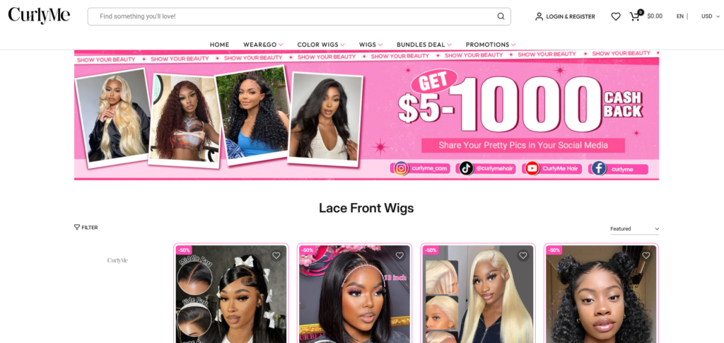
Homepage Design: Creating a Strong First Impression
Hero Section: Immediate Visual Engagement
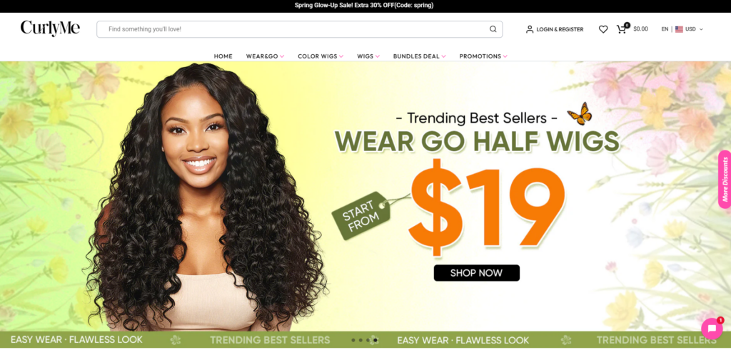
The hero section serves as the emotional entry point. We designed it to:
- Showcase vibrant wig styles in real-life scenarios
- Use bold, seasonal banners (e.g., summer campaigns)
- Highlight key selling points like “Glueless” and “Beginner Friendly”
This ensures users instantly understand the brand’s value proposition.
Navigation: Category-First Thinking
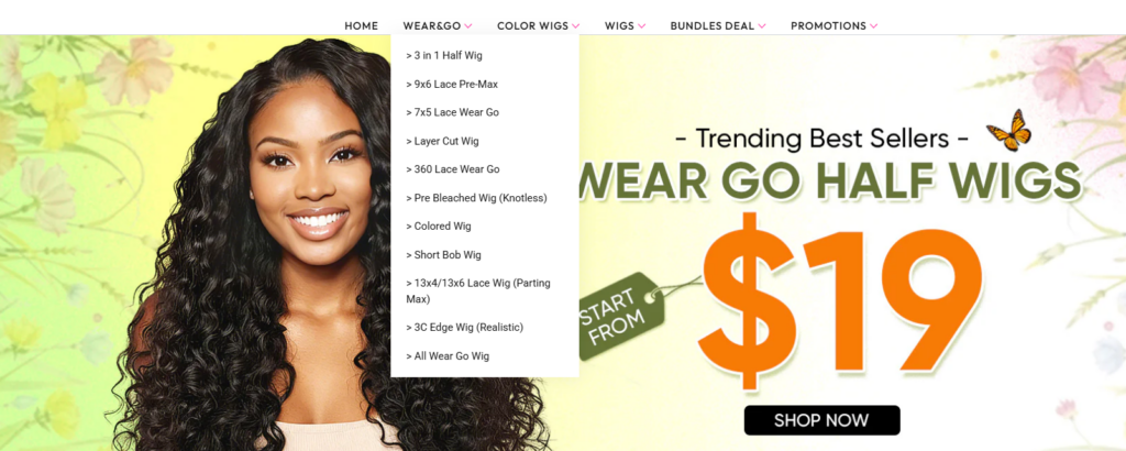
Instead of overwhelming users with too many options, we structured navigation around how customers actually shop:
- By wig type (360 Glueless, Lace Front, Bob)
- By occasion (Wedding, Work, Daily Wear)
- By trend or promotion
This reduces friction and shortens the path to purchase.
Visual Hierarchy and Layout
We implemented a clean but dynamic layout:
- Large, high-quality imagery
- Clear spacing between sections
- Bold typography for key messages
The goal was to guide users naturally from exploration to action.
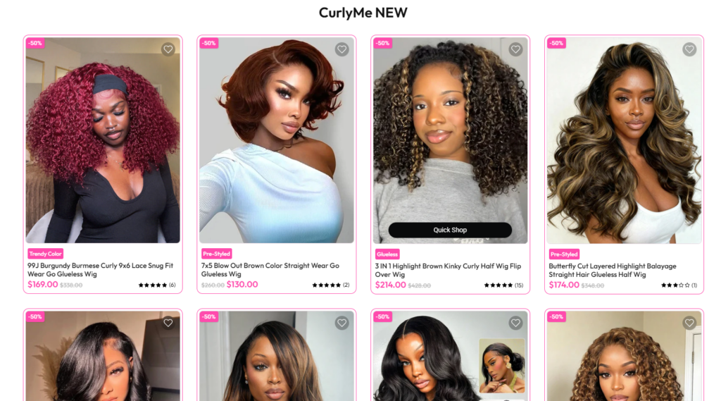
Product Page Design: Driving Conversion Through Clarity
Product Imagery Strategy
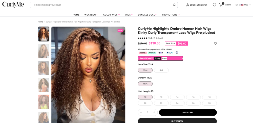
We prioritized diverse image types:
- Lifestyle photos (real-world usage)
- Close-up details (lace, texture, hairline)
- Before-and-after comparisons
- Installation guidance visuals
This helps users “experience” the product digitally.
Information Architecture
Instead of overwhelming users, we structured product information into digestible sections:
- Key benefits (highlighted visually)
- Product specifications (clear and concise)
- FAQs and care instructions
This reduces cognitive load and increases confidence.
Call-to-Action Optimization
We designed CTAs to be:
- Visually prominent
- Consistently placed
- Reinforced by trust elements
This ensures users always know the next step.
Supporting Pages: Extending the Experience
Collection Pages
Collection pages were designed to function as curated galleries:
- Clean grid layouts
- Quick visual scanning
- Minimal distractions
This allows users to browse efficiently.
Social Proof Integration
One of the most impactful design decisions was integrating Instagram-style content:
- Real customer photos
- Influencer styling examples
- Authentic usage scenarios
This transforms the site from a store into a community-driven experience.
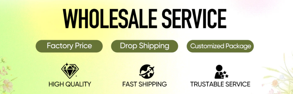
Разделы, посвященные укреплению доверия
We strategically placed trust signals across the site:
- Return policies
- Shipping clarity
- Wholesale options
- Customer reviews
These elements reduce hesitation and improve conversion rates.
Design Process
Step 1: Research and Benchmarking
Мы провели анализ:
- Competitor wig brands
- Beauty eCommerce trends
- модели поведения пользователей
This informed our design direction.
Step 2: Wireframing and Structure Planning
Мы составили план:
- Homepage flow
- User journey paths
- Key conversion touchpoints
This ensured logical structure before visual design.
Step 3: Visual Design Execution
Мы сосредоточились на:
- Color harmony (vibrant yet balanced)
- Иерархия типографики
- Image consistency
Every element was designed to support clarity and engagement.
Step 4: Iteration and Refinement
We continuously refined:
- Layout spacing
- Image selection
- Messaging clarity
This iterative approach ensured optimal results.
Challenges and Solutions
Challenge 1: High Product Similarity
Many wigs look similar at first glance.
Решение:
We emphasized differentiation through:
- Lifestyle imagery
- Четкая маркировка
- Visual storytelling
Challenge 2: Building Trust Quickly
New users often hesitate.
Решение:
We integrated:
- Социальное доказательство
- Clear policies
- Authentic visuals
Challenge 3: Balancing Style and Usability
Too much design can hurt usability.
Решение:
We maintained:
- Чистая планировка
- Logical structure
- Consistent design language
Результаты и влияние
The redesigned experience delivered:
- Улучшенное взаимодействие с пользователями
- Faster product discovery
- Более сильное восприятие бренда
- Higher conversion potential
More importantly, it positioned CurlyMe as a modern, lifestyle-driven beauty brand, not just a wig retailer.
Часто задаваемые вопросы
An effective Shopify wig store design focuses on strong visual storytelling, clear product categorization, and user-friendly navigation. High-quality lifestyle images, detailed product visuals, and trust-building elements like reviews and FAQs help customers make confident purchase decisions.
Design improves conversion rates by reducing friction and guiding users toward key actions. Clear layouts, prominent call-to-action buttons, and intuitive navigation make it easier for customers to find products and complete purchases, increasing overall sales performance.
Visual storytelling helps customers understand how products look and perform in real life. For wig stores, showing different styles, textures, and real-user scenarios builds trust and emotional connection, which directly impacts buying decisions.
A high-converting Shopify product page includes multiple product images, clear benefit highlights, concise descriptions, customer reviews, and easy-to-find purchase buttons. These elements work together to reduce uncertainty and encourage faster decision-making.
Why Design Matters in Shopify eCommerce
This project reinforces a key principle:
Great design is not decoration—it is a conversion tool.
Хорошо спроектированный магазин Shopify:
- Guides user behavior
- Builds emotional connection
- Reduces friction
- Increases trust
And ultimately, it drives sales.
Заключение
Designing for a beauty-focused Shopify store requires more than aesthetics—it demands a deep understanding of user psychology, product presentation, and brand storytelling.
Through strategic layout planning, visual storytelling, and user-centered thinking, we transformed CurlyMe’s website into a high-performing eCommerce experience.
На сайте АИРСАНГ, we specialize in creating design-driven Shopify experiences for cross-border brands—helping businesses turn their websites into powerful sales engines through thoughtful, conversion-focused design.


Спроектируем и создадим для вас WordPress-сайт или корпоративный сайт с полной системой электронной коммерции.
Ценовой диапазон: от $200.00 до $2,500.00custom-requirements-or-special-quotations
Первоначальная цена составляла: $2.00.$1.00Текущая цена: $1.00. Дизайн главного изображения для домашнего физиотерапевтического устройства Amazon: пояснения.
Введение: Создание достоверного изображения для домашних терапевтических приборов на Amazon При разработке главного изображения для домашнего терапевтического прибора на Amazon мы в первую очередь...

Дизайн основного изображения для конвертации помады на Amazon.
Введение: Разработка главного образа помады, которая продается на Amazon Когда мы разрабатываем главный образ для помады Amazon, наша ответственность выходит далеко за рамки...

Как хакеры крадут электронные письма администраторов WordPress (и как им это предотвратить)
Начнем с неприятной истины: ваша электронная почта администратора WordPress, вероятно, гораздо более публична, чем вы думаете. А хакеры? Им это нравится. Для них ваш...

Что делает основное изображение жидкой тональной основы Amazon конвертируемым?
Введение. Разработка дизайна основного изображения для жидкой тональной основы на Amazon — это не просто создание красивого внешнего вида продукта. На Amazon основное изображение и...

Разработка эффективного основного изображения Amazon для фильтрующих картриджей
Введение. Разработка основного изображения для Amazon — это не просто создание привлекательного внешнего вида товара. Речь идёт о ясности, доверии и мгновенном понимании, особенно для...

Повторные атаки на WordPress: реальная угроза или преувеличенный миф?
Давайте сначала кое-что проясним. Атаки повторного воспроизведения не выглядят страшно. Они не взламывают пароли. Они не внедряют вредоносный код с зелёным хакерским текстом, разлетающимся повсюду. Они действуют коварно...

Как скопировать страницы WordPress, ничего не сломав
Давайте посмотрим правде в глаза. Иногда вам не хочется создавать новую страницу. Вам нужна та же самая страница… но немного другая. Тот же макет. Те же блоки. Те же настройки. Потому что….

Сравнение пяти тем WordPress для сайтов о домашних животных
Введение. Выбор подходящей темы WordPress для сайтов, посвященных домашним животным, — это не просто решение, связанное с дизайном; оно напрямую влияет на удобство использования, масштабируемость и долгосрочный рост бизнеса. Уход за домашними животными и...

Сравнение пяти тем оформления для интернет-магазинов купальников
Введение. Выбор правильной тематики для независимого магазина купальников или нижнего белья — это не просто визуальное решение, оно напрямую влияет на коэффициент конверсии, масштабируемость и долгосрочную перспективу...

Как отключить комментарии в WordPress (не сойдя с ума)
Давайте поговорим о комментариях в WordPress. В теории комментарии — это здорово. Они стимулируют дискуссии. Они создают сообщество. Они делают ваш сайт “живым”. А на практике? Зачастую они притягивают...

Создание масштабируемого веб-сайта на WordPress для научно-ориентированного бренда: проект AminoUSA
Введение. В современном цифровом пространстве веб-сайт — это больше, чем просто место для размещения информации о товарах. Для научно-ориентированных брендов, работающих в регулируемых или научно-исследовательских отраслях, это….

Создание масштабируемого магазина Shopify для глобального бренда ножей: проект CoolKatana
Введение. В трансграничной электронной коммерции веб-сайт Shopify — это больше, чем просто витрина магазина. Для брендов, работающих в нишевых, ориентированных на культуру категориях, веб-сайт должен делать гораздо больше, чем...

Разработка высокоэффективного магазина Shopify для карточек Pokémon.
Введение. В мире электронной коммерции коллекционных товаров, особенно на рынке коллекционных карточных игр Pokémon, веб-сайт должен делать больше, чем просто перечислять товары...

Высокоэффективный дизайн Shopify для индивидуального бренда стационарной торговой точки.
Введение. В условиях современной конкурентной среды электронной коммерции, особенно в сегменте персонализированных подарков и коллекционных товаров, веб-сайт на платформе Shopify должен делать гораздо больше, чем просто отображать товары. Он...

Как связаться со службой поддержки Shopify: простое и понятное руководство
Управление магазином Shopify должно приносить удовольствие, а не путаницу. Когда возникают вопросы или проблемы замедляют вашу работу, Shopify предлагает несколько вариантов поддержки в зависимости от ситуации...

Как деактивировать магазин Shopify: понятное и практичное руководство
Деактивация магазина Shopify — несложная процедура, но она влечет за собой последствия, которые многие продавцы упускают из виду. В этом руководстве процесс описан простым и понятным языком...

Пример разработки веб-сайта на платформе Shopify для премиального цветочного бренда.
Введение. В условиях современной конкурентной среды электронной коммерции веб-сайт на платформе Shopify должен делать гораздо больше, чем просто отображать товары. Он должен мгновенно передавать ценность бренда, направлять пользователей...

Пример проекта дизайна на Shopify: магазин ретро-игр
Введение. В условиях высокой конкуренции в сфере электронной коммерции визуальная ясность и эмоциональная связь часто определяют, станет ли посетитель клиентом. Это особенно актуально в...