


Введение
In today’s competitive eCommerce landscape, design is no longer just about aesthetics—it’s about guiding user behavior, building trust, and driving conversions. For furniture-focused brands, especially those offering functional lifestyle products like slipcovers, the challenge becomes even more nuanced: how do you visually communicate comfort, durability, and style—within seconds?
This case study explores how we approached the design of a premium Shopify website for a furniture covers brand, focusing on user experience, visual storytelling, and conversion-oriented layout strategy. Rather than relying on technical complexity, the project was driven entirely by thoughtful design decisions—ensuring that every visual element served a purpose.
| Срок доставки | Категория | Платформа приложений |
| 29 дней | Furniture Covers | shopify |
| Участники проекта (дизайнеры) | Расходы | Эффект |
| Линь Чжан | $3200 | Turnover📈263% |
Understanding the Brand and Market Position
Defining the Core Identity
Before any design work began, we first clarified the brand’s positioning:
- Премиальный, но доступный
- Pet-friendly and family-oriented
- Italian-inspired craftsmanship
- Practical solutions for modern homes
This positioning informed every design decision—from typography and color palette to layout structure and image direction.
Target Audience Insights
We identified key audience segments:
- Pet owners seeking protection for furniture
- Families looking for easy maintenance solutions
- Design-conscious homeowners who value aesthetics
These users are highly visual and emotionally driven. They don’t just buy products—they buy lifestyle upgrades.
Homepage Design Strategy: First Impressions That Convert
Visual Hierarchy and Layout Flow
The homepage was structured to guide users through a natural journey:
- Hero Section – Emotional Hook
- Value Proposition – Quick Clarity
- Product Categories – Easy Navigation
- Lifestyle Imagery – Emotional Engagement
- Social Proof – Trust Building
- Product Highlights – Rational Justification
- Call-to-Action – Conversion Push
Every section was intentionally placed to answer a specific user question.
Hero Section: Selling a Lifestyle, Not a Product
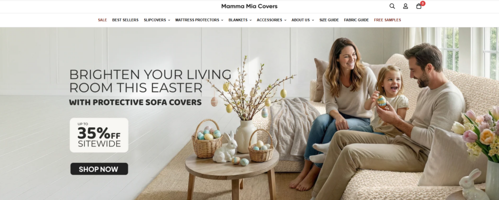
Instead of focusing purely on product features, the hero section emphasizes real-life scenarios:
- Cozy living rooms
- Pets lounging on sofas
- Natural lighting and warm tones
This approach immediately answers the subconscious question:
“Will this fit into my life?”
Design Choices:
- Full-width imagery for immersion
- Soft, neutral color palette to evoke comfort
- Clear headline with benefit-driven messaging
- Minimal distractions to keep focus on the product
Typography and Color System
We selected a combination of:
- Modern sans-serif fonts for readability
- Elegant serif accents for a premium feel
The color palette focused on:
- Warm beige and soft gray tones
- Subtle contrasts to maintain clarity
- Avoiding overly saturated colors to preserve a calm, home-like atmosphere
This balance ensures the site feels both premium and welcoming.
Product Presentation: Clarity Meets Emotion
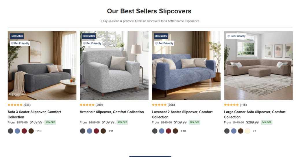
Lifestyle-Driven Product Displays
Instead of isolated product shots, we used:
- Real home environments
- Before-and-after comparisons
- Close-up textures showing fabric quality
This helps users visualize the product in context.
Conversion-Focused Product Cards
Каждая карточка товара была разработана для того, чтобы:
- Highlight key benefits (e.g., pet-friendly, washable)
- Maintain visual consistency
- Снижение когнитивной нагрузки
Key Elements:
- Clean spacing
- Clear pricing visibility
- Subtle hover interactions (design-led, not technical-heavy)
Navigation and User Experience Design
Simplified Navigation Structure
We avoided overwhelming users with too many options. Instead, we focused on:
- Четкая сегментация по категориям
- Logical grouping of products
- Sticky navigation for easy access
Smart Filtering Experience
Rather than complex filtering systems, we designed a visually intuitive filtering flow:
- Fabric type
- Color options
- Sofa compatibility
This allows users to quickly narrow down choices without friction.
Укрепление доверия посредством дизайна
Social Proof Integration
Trust is critical in eCommerce, especially for higher-ticket home products.
We incorporated:
- Customer testimonials
- Lifestyle user-generated content
- Subtle review highlights
These elements were integrated seamlessly into the design—not as intrusive blocks, but as natural parts of the browsing experience.
Визуальные сигналы доверия
Instead of overwhelming users with badges, we used:
- Чистая иконография
- Minimal trust indicators
- Consistent styling
This maintains a premium feel while still reinforcing credibility.
Supporting Pages: Extending the Design System
While the homepage sets the tone, supporting pages reinforce consistency.
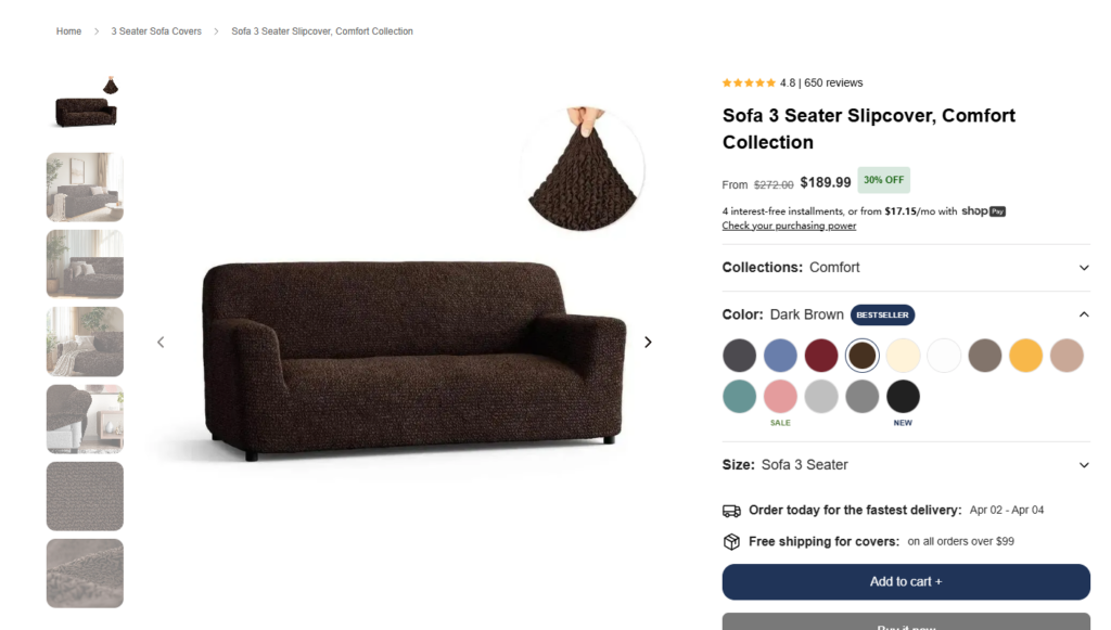
Product Detail Pages (PDP)
The PDP design focused on:
- Clear product storytelling
- Step-by-step feature explanation
- Четкая визуальная иерархия
Key Sections:
- Fabric benefits explained visually
- Size and fit guidance
- Lifestyle imagery to reinforce usage scenarios
About Page: Humanizing the Brand
The About page was designed to:
- Highlight craftsmanship
- Communicate brand values
- Build emotional connection
Instead of long text blocks, we used:
- Visual storytelling
- Short, impactful copy
- Clean layouts for readability
Collection Pages: Balancing Choice and Clarity
Collection pages were designed to:
- Showcase variety without overwhelming users
- Maintain consistent spacing and alignment
- Use visual cues to guide selection
Наш процесс проектирования
1. Research and Discovery
Мы провели анализ:
- Веб-сайты конкурентов
- модели поведения пользователей
- Industry trends
The goal was to identify gaps and opportunities.
2. Wireframing and Structure Planning
Before visual design, we mapped:
- User journeys
- Иерархия содержимого
- Conversion pathways
This ensured that the design would be both functional and intuitive.
3. Visual Direction and Mood Development
We defined:
- Цветовые палитры
- Typography systems
- Image style guidelines
This created a cohesive visual identity.
4. Iteration and Refinement
We continuously refined:
- Layout spacing
- Image selection
- Copy placement
Every iteration focused on improving clarity and conversion potential.
Трудности, с которыми мы столкнулись
Communicating Function Through Design
Furniture covers are practical products, but functionality alone isn’t enough.
Challenge:
How to visually communicate durability, flexibility, and ease of use—without relying on technical explanations?
Balancing Aesthetic and Usability
A premium look can sometimes conflict with usability.
Challenge:
Maintaining a high-end feel while ensuring the site remains easy to navigate.
Avoiding Visual Clutter
With multiple product variations and features, there’s a risk of overwhelming users.
Challenge:
Keeping the design clean while still delivering all necessary information.
Наши дизайнерские решения
Visual Storytelling Over Technical Explanation
Мы использовали:
- Lifestyle imagery
- Before-and-after visuals
- Texture close-ups
This communicates product value instantly.
Minimalist Layout with Strong Hierarchy
Мы обеспечили:
- Clear section separation
- Равномерное расстояние
- Focused content blocks
This improves readability and user flow.
Emotion-Driven Design Approach
Instead of selling features, we focused on:
- Comfort
- Convenience
- Lifestyle enhancement
This aligns with how users actually make purchasing decisions.
Часто задаваемые вопросы
A high-converting Shopify furniture store design focuses on clear visual hierarchy, lifestyle-driven imagery, and intuitive navigation. Instead of overwhelming users with features, it highlights key benefits like comfort, durability, and ease of use. Strong product storytelling and trust elements—such as reviews and real-life scenarios—also play a crucial role in guiding users toward purchase decisions.
Lifestyle imagery helps customers visualize how products fit into their daily lives. For furniture covers, showing real homes, pets, and cozy environments builds emotional connection and trust. This approach reduces uncertainty and makes the product feel more relevant, which significantly increases engagement and conversion rates.
Good design improves user experience by simplifying navigation, organizing content clearly, and reducing cognitive load. Elements like clean layouts, consistent spacing, and easy-to-use filters help users find what they need quickly. A well-structured design ensures users move smoothly from browsing to purchasing without confusion.
An effective Shopify homepage typically includes a strong hero section, clear value propositions, organized product categories, lifestyle visuals, and trust-building elements like testimonials. Each section should serve a specific purpose, guiding users step-by-step toward understanding the product and taking action.
Balancing aesthetics and functionality means creating a visually appealing interface without sacrificing usability. This involves using clean layouts, readable typography, and a consistent color system while ensuring all key information remains easy to access. The goal is to create a premium feel that still allows users to navigate effortlessly and make quick decisions.
Результаты и влияние
Improved User Engagement
The design led to:
- Longer session durations
- Higher interaction with product pages
- Increased exploration of collections
Более сильное восприятие бренда
Users perceived the brand as:
- Премиум
- Trustworthy
- Lifestyle-oriented
Enhanced Conversion Potential
By simplifying navigation and improving clarity, the design:
- Reduced friction in decision-making
- Made product benefits instantly understandable
- Encouraged faster purchasing decisions
Why Design Matters More Than Ever
This project reinforces a key principle:
Good design is not decoration—it’s strategy.
In eCommerce, especially on platforms like Shopify, design directly influences:
- Доверие пользователей
- Product understanding
- Коэффициенты конверсии
A well-designed store doesn’t just look good—it performs.
Заключение
Designing a high-performing Shopify store requires more than templates or visual polish. It demands a deep understanding of user behavior, brand positioning, and conversion psychology.
From homepage structure to product storytelling, every element of this project was crafted with intention—ensuring that users not only understand the product but also feel confident purchasing it.
На сайте АИРСАНГ, we specialize in design-driven eCommerce experiences. From independent site design to product visual strategy, we help brands turn ideas into high-converting digital storefronts. If you’re looking to elevate your Shopify presence through thoughtful design, our team is here to help.


Спроектируем и создадим для вас WordPress-сайт или корпоративный сайт с полной системой электронной коммерции.
Ценовой диапазон: от $200.00 до $2,500.00custom-requirements-or-special-quotations
Первоначальная цена составляла: $2.00.$1.00Текущая цена: $1.00. Дизайн главного изображения для домашнего физиотерапевтического устройства Amazon: пояснения.
Введение: Создание достоверного изображения для домашних терапевтических приборов на Amazon При разработке главного изображения для домашнего терапевтического прибора на Amazon мы в первую очередь...

Дизайн основного изображения для конвертации помады на Amazon.
Введение: Разработка главного образа помады, которая продается на Amazon Когда мы разрабатываем главный образ для помады Amazon, наша ответственность выходит далеко за рамки...

Как хакеры крадут электронные письма администраторов WordPress (и как им это предотвратить)
Начнем с неприятной истины: ваша электронная почта администратора WordPress, вероятно, гораздо более публична, чем вы думаете. А хакеры? Им это нравится. Для них ваш...

Что делает основное изображение жидкой тональной основы Amazon конвертируемым?
Введение. Разработка дизайна основного изображения для жидкой тональной основы на Amazon — это не просто создание красивого внешнего вида продукта. На Amazon основное изображение и...

Разработка эффективного основного изображения Amazon для фильтрующих картриджей
Введение. Разработка основного изображения для Amazon — это не просто создание привлекательного внешнего вида товара. Речь идёт о ясности, доверии и мгновенном понимании, особенно для...

Повторные атаки на WordPress: реальная угроза или преувеличенный миф?
Давайте сначала кое-что проясним. Атаки повторного воспроизведения не выглядят страшно. Они не взламывают пароли. Они не внедряют вредоносный код с зелёным хакерским текстом, разлетающимся повсюду. Они действуют коварно...

Как скопировать страницы WordPress, ничего не сломав
Давайте посмотрим правде в глаза. Иногда вам не хочется создавать новую страницу. Вам нужна та же самая страница… но немного другая. Тот же макет. Те же блоки. Те же настройки. Потому что….

Сравнение пяти тем WordPress для сайтов о домашних животных
Введение. Выбор подходящей темы WordPress для сайтов, посвященных домашним животным, — это не просто решение, связанное с дизайном; оно напрямую влияет на удобство использования, масштабируемость и долгосрочный рост бизнеса. Уход за домашними животными и...

Сравнение пяти тем оформления для интернет-магазинов купальников
Введение. Выбор правильной тематики для независимого магазина купальников или нижнего белья — это не просто визуальное решение, оно напрямую влияет на коэффициент конверсии, масштабируемость и долгосрочную перспективу...

Как отключить комментарии в WordPress (не сойдя с ума)
Давайте поговорим о комментариях в WordPress. В теории комментарии — это здорово. Они стимулируют дискуссии. Они создают сообщество. Они делают ваш сайт “живым”. А на практике? Зачастую они притягивают...

Создание масштабируемого веб-сайта на WordPress для научно-ориентированного бренда: проект AminoUSA
Введение. В современном цифровом пространстве веб-сайт — это больше, чем просто место для размещения информации о товарах. Для научно-ориентированных брендов, работающих в регулируемых или научно-исследовательских отраслях, это….

Создание масштабируемого магазина Shopify для глобального бренда ножей: проект CoolKatana
Введение. В трансграничной электронной коммерции веб-сайт Shopify — это больше, чем просто витрина магазина. Для брендов, работающих в нишевых, ориентированных на культуру категориях, веб-сайт должен делать гораздо больше, чем...

Разработка высокоэффективного магазина Shopify для карточек Pokémon.
Введение. В мире электронной коммерции коллекционных товаров, особенно на рынке коллекционных карточных игр Pokémon, веб-сайт должен делать больше, чем просто перечислять товары...

Высокоэффективный дизайн Shopify для индивидуального бренда стационарной торговой точки.
Введение. В условиях современной конкурентной среды электронной коммерции, особенно в сегменте персонализированных подарков и коллекционных товаров, веб-сайт на платформе Shopify должен делать гораздо больше, чем просто отображать товары. Он...

Как связаться со службой поддержки Shopify: простое и понятное руководство
Управление магазином Shopify должно приносить удовольствие, а не путаницу. Когда возникают вопросы или проблемы замедляют вашу работу, Shopify предлагает несколько вариантов поддержки в зависимости от ситуации...

Как деактивировать магазин Shopify: понятное и практичное руководство
Деактивация магазина Shopify — несложная процедура, но она влечет за собой последствия, которые многие продавцы упускают из виду. В этом руководстве процесс описан простым и понятным языком...

Пример разработки веб-сайта на платформе Shopify для премиального цветочного бренда.
Введение. В условиях современной конкурентной среды электронной коммерции веб-сайт на платформе Shopify должен делать гораздо больше, чем просто отображать товары. Он должен мгновенно передавать ценность бренда, направлять пользователей...

Пример проекта дизайна на Shopify: магазин ретро-игр
Введение. В условиях высокой конкуренции в сфере электронной коммерции визуальная ясность и эмоциональная связь часто определяют, станет ли посетитель клиентом. Это особенно актуально в...