


When we design a main image set for Озон, we never treat it as a simple product display. We treat it as a structured conversion system. Every visual layer, typography choice, color block, icon, and background environment must work together to answer three critical questions: What is the product? Why is it better? Why should the buyer trust it?
In this vacuum cleaner project, we created multiple visual directions based on different product structures—upright washing models, cordless stick models, cyclone canister types, and 2-in-1 handheld designs. Each image is engineered not only to meet Ozon’s visual standards but also to increase clarity, trust, and click-through rate in a highly competitive category.
Below is a professional breakdown of each image and the strategic thinking behind it.
| Срок доставки | Категория | Платформа приложений |
| 8 дней | Vacuum cleaner | Озон |
| Участники проекта (дизайнеры) | Расходы | Эффект |
| Нэнси | $110 | Sales volume📈235% |
Image 1: Washing Vacuum Cleaner with 17000Pa Suction
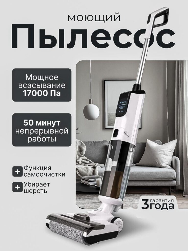
The first image focuses on a washing vacuum cleaner positioned in a modern living room environment. The product is tilted slightly forward to create a sense of action and dynamism, while still maintaining structural clarity.
Почему мы разработали его именно так:
1. Strong Hierarchical Typography
We made “Моющий Пылесос” (Washing Vacuum Cleaner) the dominant headline. On Ozon, buyers scroll fast. The product category must be readable within half a second. Large, bold typography ensures immediate recognition.
2. Key Data Blocks for Performance Anchoring
Мы выделили:
- 17000 Pa suction power
- 50 minutes continuous work
- Self-cleaning function
- Pet hair removal
Performance metrics like “17000 Pa” function as trust triggers. Russian buyers are highly data-driven in electronics categories. By placing the number inside a dark rounded box, we create contrast and draw attention.
3. Lifestyle Background for Context
Instead of isolating the product on a white background, we placed it in a premium interior setting. This elevates perceived value. The living room scene suggests comfort, cleanliness, and modernity.
4. 3-Year Warranty Badge
The “3 года гарантия” badge reinforces reliability. Warranty messaging reduces hesitation and supports higher price positioning.
This image balances technical strength with emotional reassurance.
Image 2: Vertical Cordless Vacuum with Structured Information Layout
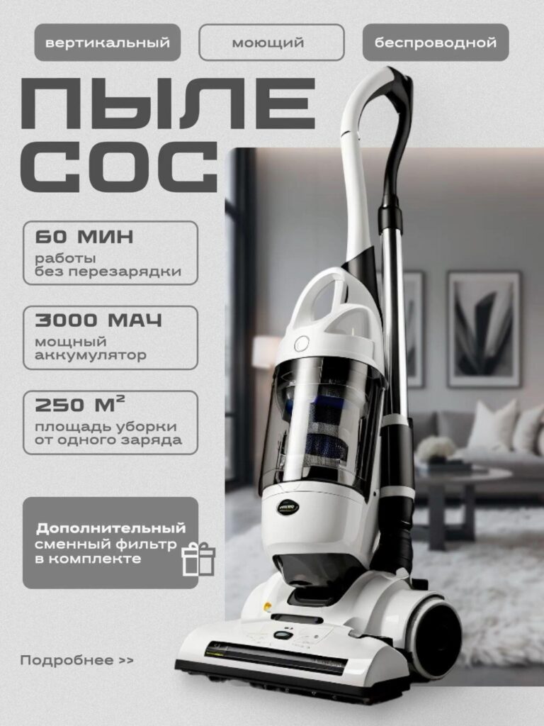
The second design uses a softer neutral background and a structured feature column layout.
Strategic design decisions:
1. Three-Tag Positioning at the Top
“Вертикальный / Моющий / Беспроводной”
These tags communicate product category segmentation. Buyers instantly understand this is:
- Vertical
- Washing
- Cordless
It prevents confusion and increases relevance in search results.
2. Clean Left-Side Feature Stack
We aligned feature boxes vertically:
- 60 minutes runtime
- 3000 mAh battery
- 250 m² cleaning coverage
- Extra filter included
The vertical stacking mimics a spec sheet. This appeals to rational buyers and gives the design a professional catalog feeling.
3. Neutral Palette for Premium Tone
Unlike more colorful competitors, this version uses muted grays. This design strategy targets buyers who associate minimalism with higher quality.
This image is conversion-focused for mid-to-high price segments.
Image 3: High-Impact Cordless Stick Vacuum with Pet Scenario
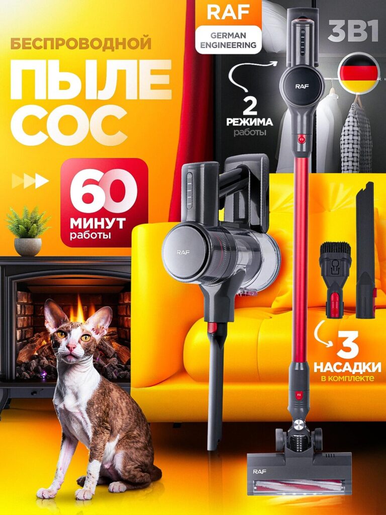
This design shifts to a bold yellow-orange palette with a visible cat near a fireplace.
Why we made this version bold:
1. Emotional Hook Through Pet Scenario
Pet hair is one of the biggest drivers in vacuum purchases. Including a cat creates instant relevance. Buyers with pets immediately feel targeted.
2. Color Psychology
Orange and yellow signal energy and performance. This approach is optimized for high visibility in Ozon search grids.
3. “60 Minutes” Red Badge
The large red square with “60 минут” acts as a visual anchor. Red increases urgency and memorability.
4. 3 Attachments Visual Display
We showed the attachments clearly on the right side. This eliminates uncertainty about included accessories.
This version prioritizes attention-grabbing and scroll-stopping power.
Image 4: Cleaning Vacuum with Transparent Dust Container
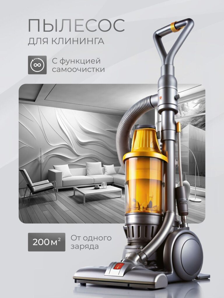
In this design, the vacuum features a large transparent dust container with warm amber lighting.
Обоснование проекта:
1. Transparency Equals Technology
Showing the dust container interior visually communicates filtration and cyclone power without lengthy explanation.
2. 200m² From One Charge
We positioned “200 м²” in a strong isolated box. Cleaning coverage is a practical metric that supports family-size homes.
3. Futuristic Interior Background
The sculptural wall design elevates brand perception. This version targets buyers who associate design with innovation.
The amber tone inside the container contrasts against the cool gray background, creating visual drama.
Image 5: 1400W High-Power Cyclone Model
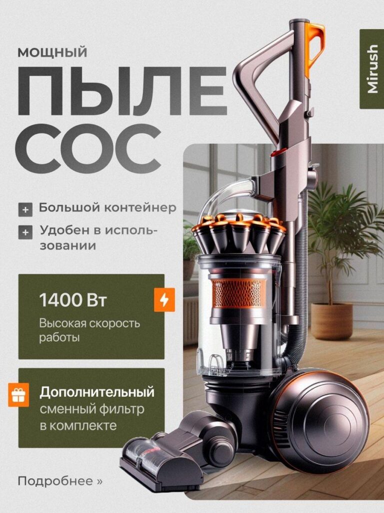
This upright model emphasizes raw motor power.
Key visual logic:
1. 1400W Highlight Block
We used a green block with a lightning icon to emphasize wattage. Wattage communicates strength directly.
2. Large Container + Usability Messaging
“Большой контейнер” and “Удобен в использовании” reassure practicality.
3. Balanced Composition
The product sits slightly to the right, allowing space for structured text on the left. This ensures the vacuum remains dominant while information remains digestible.
This version targets buyers prioritizing power over portability.
Image 6: 2-in-1 Handheld + Vertical Vacuum
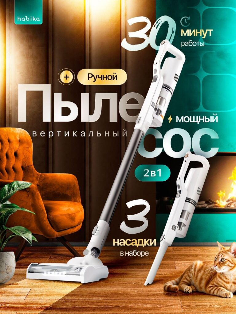
This image emphasizes flexibility.
Why flexibility sells:
1. Dual Product Display
We show both full-length and handheld versions in one frame. This eliminates doubt about conversion between modes.
2. “2в1” Highlight
The turquoise badge visually separates the feature from the main typography.
3. Warm Home Environment
The fireplace and wooden floor introduce emotional warmth. This connects technology to daily life.
4. 30 Minutes Runtime Badge
We presented runtime boldly in the top-right to ensure clarity.
This image is designed to convert apartment dwellers who need compact solutions.
Design Strategy Across All Images
Although each image uses a different tone and layout, several consistent principles guide the entire series:
1. Immediate Category Recognition
We always prioritize “Пылесос” visibility. On Ozon, clarity beats decoration.
2. Data-Led Selling
Runtime, suction power, wattage, battery capacity, coverage area—these metrics reduce buyer hesitation.
3. Emotional + Rational Balance
Pet scenarios and lifestyle interiors build emotional resonance.
Spec boxes build rational confidence.
4. Visual Hierarchy
Large headline → Key number → Supporting features → Secondary benefits.
We never overload information. We guide the eye deliberately.
5. Contrast Optimization for Marketplace Thumbnails
High-contrast badges, colored feature blocks, and bold numerics ensure the design remains readable even in small preview mode.
How This Improves Conversion on Ozon
A strong Ozon main image does more than look attractive. It:
- Increases click-through rate from search results
- Reduces bounce rate on product pages
- Builds trust before buyers read descriptions
- Positions the product within a clear performance tier
When we structure main images strategically, we transform them into silent sales representatives.
Заключительные мысли
Designing a vacuum cleaner main image set for Озон requires more than aesthetic skill. It requires marketplace psychology, structured information architecture, and visual persuasion strategy.
Every version we created serves a specific buyer type:
- Performance-focused buyers
- Pet owners
- Minimalist premium shoppers
- Compact apartment users
- Power-driven buyers
By combining bold data presentation, lifestyle integration, and clear visual hierarchy, we ensure that each image not only informs but converts.
At the end of the day, strong marketplace design is about clarity, trust, and differentiation. That is exactly the approach we apply at АИРСАНГ—where strategy meets visual execution for cross-border e-commerce success.


Спроектируем и создадим для вас WordPress-сайт или корпоративный сайт с полной системой электронной коммерции.
Ценовой диапазон: от $200.00 до $2,500.00custom-requirements-or-special-quotations
Первоначальная цена составляла: $2.00.$1.00Текущая цена: $1.00. Дизайн главного изображения для домашнего физиотерапевтического устройства Amazon: пояснения.
Введение: Создание достоверного изображения для домашних терапевтических приборов на Amazon При разработке главного изображения для домашнего терапевтического прибора на Amazon мы в первую очередь...

Дизайн основного изображения для конвертации помады на Amazon.
Введение: Разработка главного образа помады, которая продается на Amazon Когда мы разрабатываем главный образ для помады Amazon, наша ответственность выходит далеко за рамки...

Что делает основное изображение жидкой тональной основы Amazon конвертируемым?
Введение. Разработка дизайна основного изображения для жидкой тональной основы на Amazon — это не просто создание красивого внешнего вида продукта. На Amazon основное изображение и...

Разработка эффективного основного изображения Amazon для фильтрующих картриджей
Введение. Разработка основного изображения для Amazon — это не просто создание привлекательного внешнего вида товара. Речь идёт о ясности, доверии и мгновенном понимании, особенно для...

Сравнение пяти тем WordPress для сайтов о домашних животных
Введение. Выбор подходящей темы WordPress для сайтов, посвященных домашним животным, — это не просто решение, связанное с дизайном; оно напрямую влияет на удобство использования, масштабируемость и долгосрочный рост бизнеса. Уход за домашними животными и...

Создание масштабируемого веб-сайта на WordPress для научно-ориентированного бренда: проект AminoUSA
Введение. В современном цифровом пространстве веб-сайт — это больше, чем просто место для размещения информации о товарах. Для научно-ориентированных брендов, работающих в регулируемых или научно-исследовательских отраслях, это….

Создание масштабируемого магазина Shopify для глобального бренда ножей: проект CoolKatana
Введение. В трансграничной электронной коммерции веб-сайт Shopify — это больше, чем просто витрина магазина. Для брендов, работающих в нишевых, ориентированных на культуру категориях, веб-сайт должен делать гораздо больше, чем...

Разработка высокоэффективного магазина Shopify для карточек Pokémon.
Введение. В мире электронной коммерции коллекционных товаров, особенно на рынке коллекционных карточных игр Pokémon, веб-сайт должен делать больше, чем просто перечислять товары...

Высокоэффективный дизайн Shopify для индивидуального бренда стационарной торговой точки.
Введение. В условиях современной конкурентной среды электронной коммерции, особенно в сегменте персонализированных подарков и коллекционных товаров, веб-сайт на платформе Shopify должен делать гораздо больше, чем просто отображать товары. Он...

Пример разработки веб-сайта на платформе Shopify для премиального цветочного бренда.
Введение. В условиях современной конкурентной среды электронной коммерции веб-сайт на платформе Shopify должен делать гораздо больше, чем просто отображать товары. Он должен мгновенно передавать ценность бренда, направлять пользователей...

Пример проекта дизайна на Shopify: магазин ретро-игр
Введение. В условиях высокой конкуренции в сфере электронной коммерции визуальная ясность и эмоциональная связь часто определяют, станет ли посетитель клиентом. Это особенно актуально в...

Пример проекта по дизайну на Shopify: Tactical Rescue Brand
Введение. Эффективный веб-сайт на Shopify делает больше, чем просто отображает товары — он передает цель, укрепляет доверие и помогает пользователям принимать уверенные решения о покупке. Это особенно важно...

Пример разработки веб-сайта на платформе Shopify для бренда электровелосипедов.
Введение. На современном конкурентном рынке электровелосипедов веб-сайт на платформе Shopify должен делать больше, чем просто демонстрировать товары — он должен рассказывать историю, вызывать доверие и направлять пользователей...

Масштабируемая платформа электронной коммерции Shopify для креативного бренда.
Введение. Когда креативные бренды растут, их веб-сайты часто с трудом успевают за развитием. По мере расширения ассортимента продукции, увеличения объема контента и роста трафика многие бренды, ориентированные на визуальное оформление...

Пример разработки веб-сайта на платформе Shopify для бренда товаров для дома.
Введение. На высококонкурентном рынке товаров для дома визуальная идентичность — это уже не просто эстетика, она напрямую влияет на доверие, поведение покупателей при просмотре товаров и принятие решений о покупке. Для...

Пример создания масштабируемого сайта с платной подпиской на WordPress.
Введение. Для современных брендов электронной коммерции веб-сайт — это уже не просто цифровая витрина. Это движок, поддерживающий подписки, создание контента, построение доверия и т.д.

Высокоэффективный дизайн WordPress для брендов, ориентированных на взрослую аудиторию.
Введение. На высококонкурентных рынках электронной коммерции одних лишь ярких визуальных элементов недостаточно. Успешный веб-сайт на WordPress должен направлять посетителей по четкому и целенаправленному маршруту, который….

Масштабируемый веб-сайт электронной коммерции по продаже секс-кукол на WordPress
Введение. Запуск высокоэффективного веб-сайта для трансграничной электронной коммерции — это не просто размещение товаров в интернете. Для брендов, работающих на высококонкурентных рынках, ориентированных на визуальный контент, веб-сайт...