


Введение
Когда покупатели просматривают товары Озон, Решения принимаются за секунды. Изображение продукта должно мгновенно передавать функциональность, настроение и ценность — без объяснений. Для этих электронных будильников с RGB-подсветкой наша цель была ясна: превратить компактное прикроватное устройство в визуально привлекательный предмет интерьера, оставаясь при этом полностью соответствующим основному изображению и логике галереи Ozon.
Вместо того чтобы полагаться только на технические характеристики, мы создали визуальную концепцию, основанную на свете, простоте и удобстве повседневного использования. Каждое изображение было разработано для ответа на конкретный вопрос покупателя: Что это делает? Как это выглядит в реальной жизни? Насколько легко это использовать? Подойдет ли это для моего пространства? В этой статье подробно рассматривается, как каждое изображение способствует этой истории и почему эти решения важны для конверсии на Ozon.
| Срок доставки | Категория | Платформа приложений |
| 7 дней | Электронный будильник с RGB-подсветкой | Озон |
| Участники проекта (дизайнеры) | Расходы | Эффект |
| Нэнси | $100 | Коэффициент покупки📈279% |
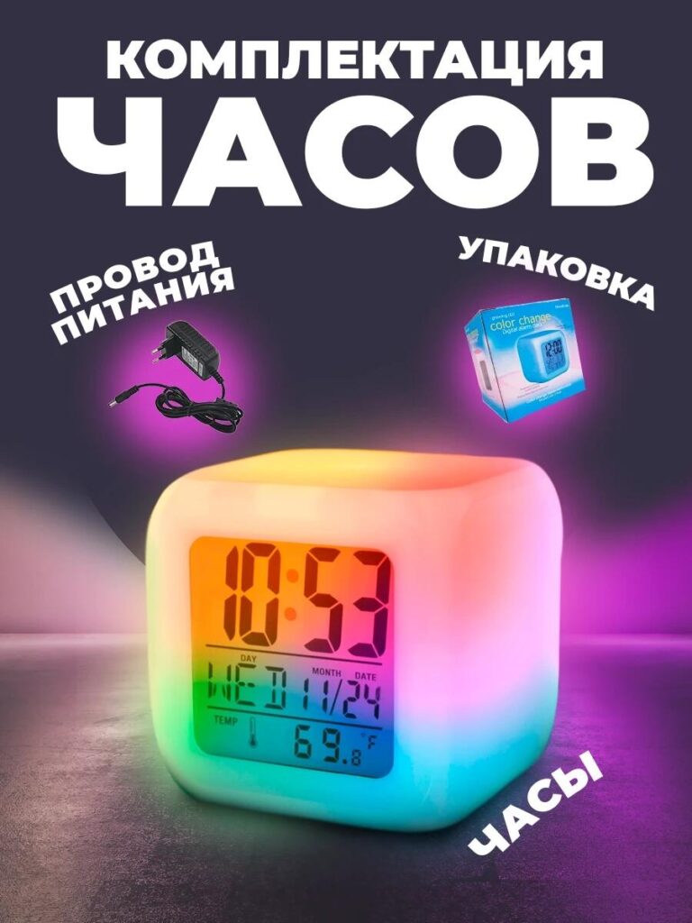
Изображение 1: Главное изображение — RGB-подсветка как ключевой элемент продаж.
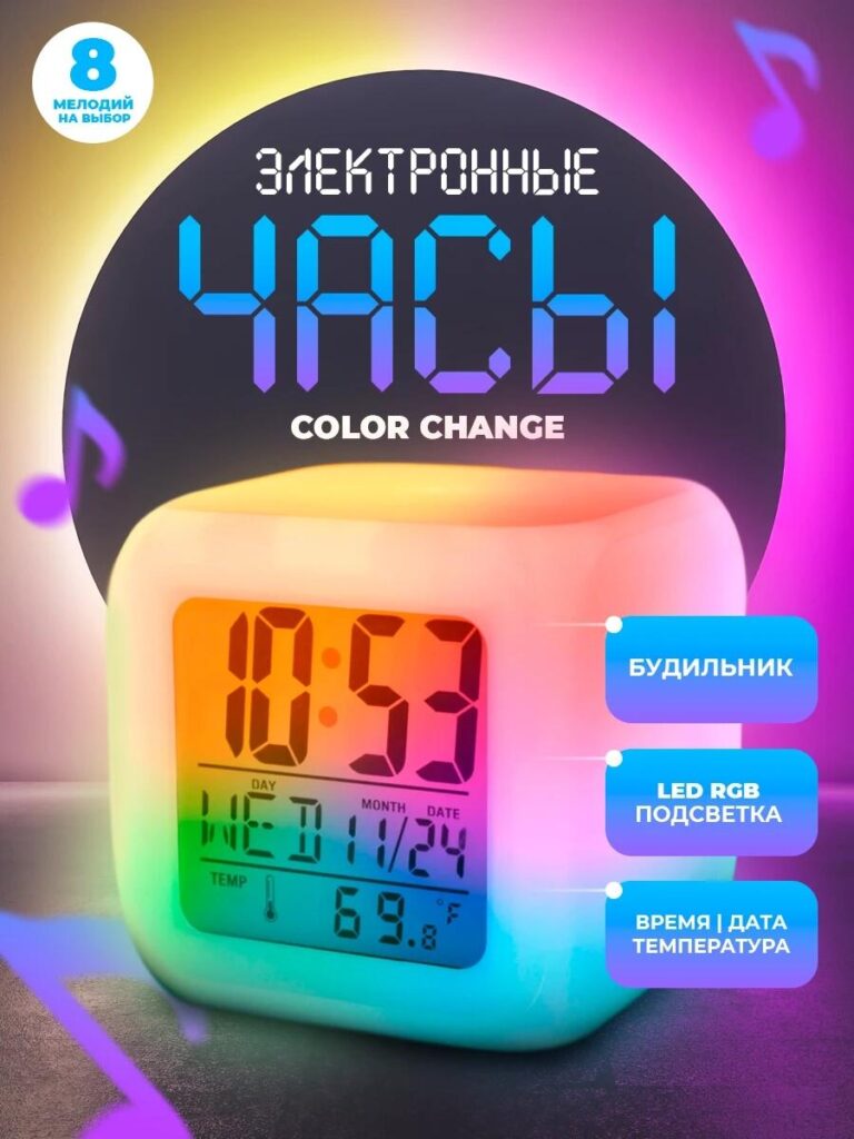
Первое изображение служит основным изображением Ozon, и его задача — остановить прокрутку.
Мы разместили электронный будильник с RGB-подсветкой на темном фоне с градиентной подсветкой, чтобы усилить эффект изменения цвета светодиодов. Вместо того чтобы показывать однородный белый продукт, мы выделили часы, светящиеся несколькими оттенками — голубым, розовым, желтым и зеленым — плавно перетекающими по всему корпусу. Это сразу же демонстрирует функцию RGB без лишних текстовых пояснений.
Циферблат часов остается четким и хорошо читаемым, одновременно отображая время, дату и температуру. Такой баланс между окружающим освещением и четкостью цифрового изображения убеждает покупателей в том, что продукт не просто декоративный, но и практичный. Дополнительные надписи подчеркивают ключевые функции — будильник, светодиодную RGB-подсветку и отображение времени/даты — и расположены таким образом, чтобы направлять взгляд, не перегружая изображение.
Это изображение мгновенно позволяет сделать три вывода:
- Продукт современный и технологичный.
- RGB-подсветка мягкая, не резкая.
- Часы предназначены для использования на прикроватной тумбочке.
Для компании Ozon, где важны миниатюры, это изображение обеспечивает четкость даже при уменьшенном размере.
Изображение 2: Размер и пропорции — Компактная форма, четкие измерения
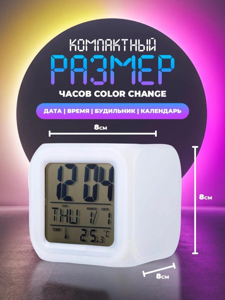
Второе изображение отвечает на важный для покупателя вопрос: каковы его размеры?
Мы использовали точные размеры — 8 см с каждой стороны — на чистом нейтральном фоне. Часы показаны под небольшим углом, чтобы подчеркнуть глубину, сохраняя при этом точные пропорции. Это предотвращает ложные ожидания и снижает риск возврата товара, что особенно важно на таких торговых площадках, как Ozon.
Вместо того чтобы загромождать изображение ненужными элементами, мы сосредоточились на масштабе. Компактная кубическая форма подчеркивает портативность и универсальность: подходит для письменных столов, прикроватных тумбочек, полок или даже детских комнат.
Визуально подчеркивая, что часы небольшие, но функциональные, это изображение вызывает доверие и позиционирует продукт как компактное решение для современных интерьеров.
Изображение 3: Взаимодействие с пользователем и логика управления — простота в действии
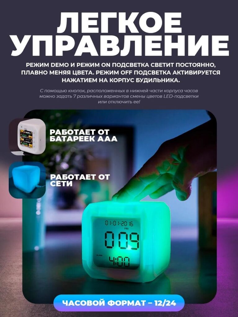
Это изображение переходит от статичной презентации продукта к взаимодействию с реальным миром.
Мы запечатлели руку, нежно касающуюся верхней части часов, демонстрируя, как режимы подсветки можно регулировать непосредственно с тела. Светящийся зеленый оттенок подчеркивает отзывчивость, а окружающая обстановка создает ощущение спокойной ночной обстановки.
Текстовые наложения поясняют режимы освещения:
- Демонстрационный режим с плавными цветовыми переходами.
- Режим постоянного включения
- Выключенный режим с помощью сенсорного управления
Мы также визуально демонстрируем два варианта питания — от батареек AAA и от сети — с помощью небольших встроенных значков. Это убеждает покупателей в том, что часы универсальны и надежны в различных конфигурациях.
Это изображение имеет решающее значение, поскольку оно устраняет препятствия. Оно показывает, что электронный будильник с RGB-подсветкой не требует сложных меню или приложений. Взаимодействие с ним интуитивно понятно, что является сильным аргументом в пользу покупки для всех возрастных групп.
Изображение 4: Совместимость с образом жизни и интерьером — дизайн, который подойдет куда угодно
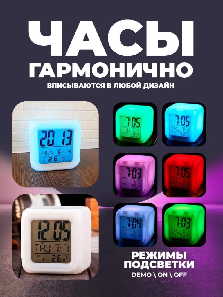
В этом изображении мы сосредоточились на эстетической адаптивности.
Мы разместили часы в реалистичных интерьерах и подобрали к ним цветовую гамму RGB: синий, зеленый, розовый, красный и мягкий белый. Это сразу же дает понять, что продукт подходит не только для определенного настроения или стиля.
Заголовок подчеркивает гармонию с любым дизайном интерьера. Вместо технических терминов, сообщение носит эмоциональный характер: часы адаптируются к вам. Используемые в качестве ночника, акцентной лампы или минималистичного будильника, они органично вписываются в современный дом.
Для покупателей Ozon, которые часто быстро сравнивают несколько товаров, это изображение подчеркивает функциональность и декоративность часов, объединяя технологии и стиль жизни.
Изображение 5: Упаковка и содержимое — Прозрачность укрепляет доверие
На последнем изображении дается ответ на последний вопрос покупателя перед покупкой: что я получу?
Мы наглядно продемонстрировали:
- Электронный будильник с RGB-подсветкой
- Кабель питания
- Розничная упаковка
Каждый элемент визуально отделен и промаркирован. Дизайн упаковки подчеркивает, что это готовый потребительский продукт, а не обычный гаджет. Демонстрация коробки также повышает воспринимаемую ценность и создает впечатление, что продукт готов к подарку.
Это изображение помогает устранить неопределенность и сократить количество запросов в службу поддержки клиентов, что особенно важно для масштабных продаж на маркетплейсе.
Почему эта система обработки изображений работает на Ozon
Данная последовательность изображений создана с учетом преднамеренного процесса преобразования:
- Привлеките внимание с помощью RGB-подсветки.
- Укрепляйте доверие за счет масштаба и ясности.
- Продемонстрировать простоту использования
- Демонстрировать соответствие образу жизни
- Подтвердите содержимое посылки.
Каждое изображение выполняет одну единственную, целенаправленную задачу. Вместе они образуют целостную визуальную историю продаж, которая идеально соответствует особенностям поведения пользователей Ozon и требованиям платформы.
Заключение
Эффективный дизайн основного изображения Озон Речь идёт не о добавлении новых эффектов, а о том, чтобы сделать продукт мгновенно понятным и эмоционально привлекательным. Для этих электронных будильников с RGB-подсветкой мы перевели технические характеристики в визуальные образы, которые воспринимаются интуитивно, спокойно и современно.
Построив набор изображений вокруг вопросов пользователей и реальных сценариев использования, мы помогли продукту выделиться на конкурентном рынке, сохранив при этом ясность и доверие. Именно так мы подходим к визуальному дизайну маркетплейсов — стратегически, целенаправленно и с учетом конверсии.
Если вы хотите улучшить внешний вид ваших товаров на Ozon с помощью профессионального дизайна основного изображения и структурированного визуального повествования, то именно таких результатов мы и добиваемся. АИРСАНГ.


Спроектируем и создадим для вас WordPress-сайт или корпоративный сайт с полной системой электронной коммерции.
Ценовой диапазон: от $200.00 до $2,500.00custom-requirements-or-special-quotations
Первоначальная цена составляла: $2.00.$1.00Текущая цена: $1.00. Дизайн главного изображения для домашнего физиотерапевтического устройства Amazon: пояснения.
Введение: Создание достоверного изображения для домашних терапевтических приборов на Amazon При разработке главного изображения для домашнего терапевтического прибора на Amazon мы в первую очередь...

Дизайн основного изображения для конвертации помады на Amazon.
Введение: Разработка главного образа помады, которая продается на Amazon Когда мы разрабатываем главный образ для помады Amazon, наша ответственность выходит далеко за рамки...

Что делает основное изображение жидкой тональной основы Amazon конвертируемым?
Введение. Разработка дизайна основного изображения для жидкой тональной основы на Amazon — это не просто создание красивого внешнего вида продукта. На Amazon основное изображение и...

Разработка эффективного основного изображения Amazon для фильтрующих картриджей
Введение. Разработка основного изображения для Amazon — это не просто создание привлекательного внешнего вида товара. Речь идёт о ясности, доверии и мгновенном понимании, особенно для...

Сравнение пяти тем WordPress для сайтов о домашних животных
Введение. Выбор подходящей темы WordPress для сайтов, посвященных домашним животным, — это не просто решение, связанное с дизайном; оно напрямую влияет на удобство использования, масштабируемость и долгосрочный рост бизнеса. Уход за домашними животными и...

Создание масштабируемого веб-сайта на WordPress для научно-ориентированного бренда: проект AminoUSA
Введение. В современном цифровом пространстве веб-сайт — это больше, чем просто место для размещения информации о товарах. Для научно-ориентированных брендов, работающих в регулируемых или научно-исследовательских отраслях, это….

Создание масштабируемого магазина Shopify для глобального бренда ножей: проект CoolKatana
Введение. В трансграничной электронной коммерции веб-сайт Shopify — это больше, чем просто витрина магазина. Для брендов, работающих в нишевых, ориентированных на культуру категориях, веб-сайт должен делать гораздо больше, чем...

Разработка высокоэффективного магазина Shopify для карточек Pokémon.
Введение. В мире электронной коммерции коллекционных товаров, особенно на рынке коллекционных карточных игр Pokémon, веб-сайт должен делать больше, чем просто перечислять товары...

Высокоэффективный дизайн Shopify для индивидуального бренда стационарной торговой точки.
Введение. В условиях современной конкурентной среды электронной коммерции, особенно в сегменте персонализированных подарков и коллекционных товаров, веб-сайт на платформе Shopify должен делать гораздо больше, чем просто отображать товары. Он...

Пример разработки веб-сайта на платформе Shopify для премиального цветочного бренда.
Введение. В условиях современной конкурентной среды электронной коммерции веб-сайт на платформе Shopify должен делать гораздо больше, чем просто отображать товары. Он должен мгновенно передавать ценность бренда, направлять пользователей...

Пример проекта дизайна на Shopify: магазин ретро-игр
Введение. В условиях высокой конкуренции в сфере электронной коммерции визуальная ясность и эмоциональная связь часто определяют, станет ли посетитель клиентом. Это особенно актуально в...

Пример проекта по дизайну на Shopify: Tactical Rescue Brand
Введение. Эффективный веб-сайт на Shopify делает больше, чем просто отображает товары — он передает цель, укрепляет доверие и помогает пользователям принимать уверенные решения о покупке. Это особенно важно...

Пример разработки веб-сайта на платформе Shopify для бренда электровелосипедов.
Введение. На современном конкурентном рынке электровелосипедов веб-сайт на платформе Shopify должен делать больше, чем просто демонстрировать товары — он должен рассказывать историю, вызывать доверие и направлять пользователей...

Масштабируемая платформа электронной коммерции Shopify для креативного бренда.
Введение. Когда креативные бренды растут, их веб-сайты часто с трудом успевают за развитием. По мере расширения ассортимента продукции, увеличения объема контента и роста трафика многие бренды, ориентированные на визуальное оформление...

Пример разработки веб-сайта на платформе Shopify для бренда товаров для дома.
Введение. На высококонкурентном рынке товаров для дома визуальная идентичность — это уже не просто эстетика, она напрямую влияет на доверие, поведение покупателей при просмотре товаров и принятие решений о покупке. Для...

Пример создания масштабируемого сайта с платной подпиской на WordPress.
Введение. Для современных брендов электронной коммерции веб-сайт — это уже не просто цифровая витрина. Это движок, поддерживающий подписки, создание контента, построение доверия и т.д.

Высокоэффективный дизайн WordPress для брендов, ориентированных на взрослую аудиторию.
Введение. На высококонкурентных рынках электронной коммерции одних лишь ярких визуальных элементов недостаточно. Успешный веб-сайт на WordPress должен направлять посетителей по четкому и целенаправленному маршруту, который….

Масштабируемый веб-сайт электронной коммерции по продаже секс-кукол на WordPress
Введение. Запуск высокоэффективного веб-сайта для трансграничной электронной коммерции — это не просто размещение товаров в интернете. Для брендов, работающих на высококонкурентных рынках, ориентированных на визуальный контент, веб-сайт...