


Введение
На высококонкурентных рынках, таких как Озон, the main image is not just a visual placeholder — it is the first decision point. Shoppers scroll quickly, compare instinctively, and rely on visual clarity more than lengthy descriptions. As designers, we approach Ozon main image design with a clear goal: help customers instantly understand the product, trust its quality, and feel confident clicking into the listing.
This article breaks down a complete set of Ozon main image designs created for different consumer product categories, including home appliances, bathroom accessories, electronics, tools, lifestyle items, and pet products. Each image follows Ozon’s platform logic while adapting visual hierarchy, color language, and information density to the product’s specific use case.
Rather than applying a single template, we intentionally designed each image around how real users evaluate products in that category. Below, we explain the reasoning behind every visual decision — from layout structure and typography to icon systems and background environments — so you can clearly see how strategic design directly supports conversion.
| Срок доставки | Категория | Платформа приложений |
| 8 дней | Product main image | Озон |
| Участники проекта (дизайнеры) | Расходы | Эффект |
| Линь Чжан | $130 | Store purchase rate📈210% |
Wireless Desk Fan — Communicating Portability and Control
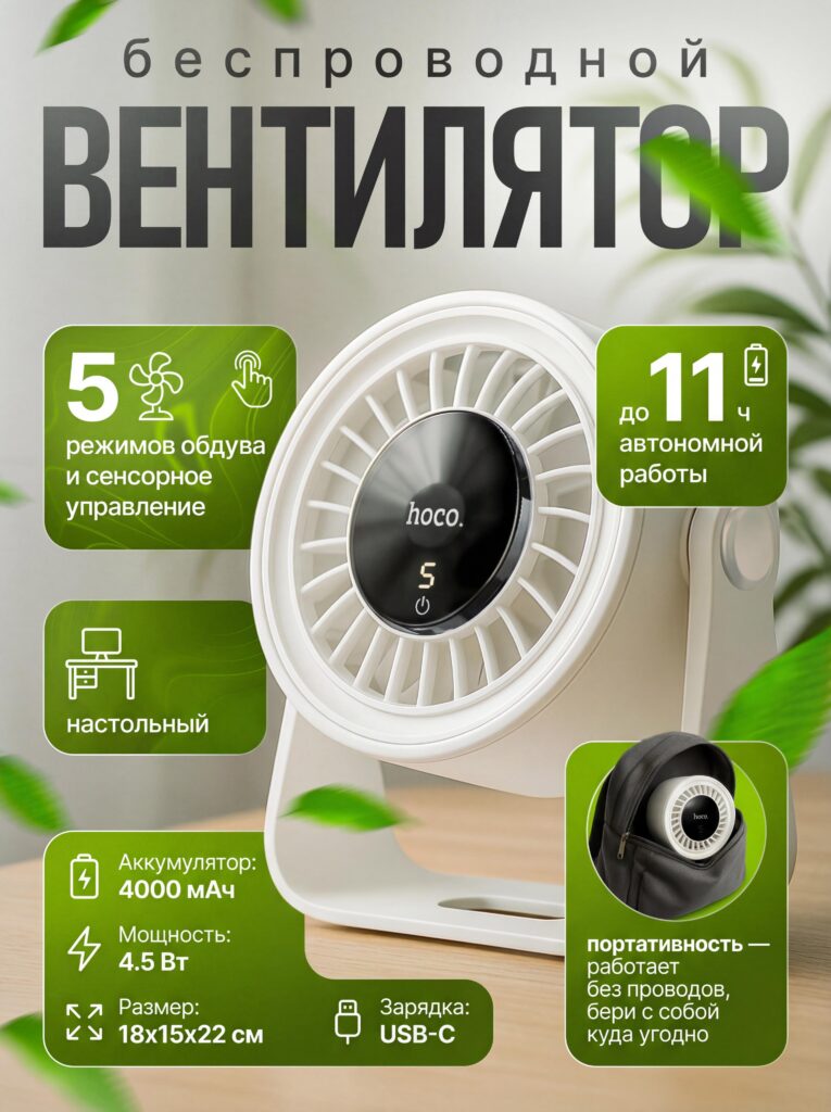
For the wireless desk fan main image, we centered the design around three key selling points: portability, battery life, and ease of control. We placed the product at a three-quarter angle to show depth and structure, while keeping the front grill and digital display clearly visible. This instantly communicates that the fan is compact yet functional.
The soft green background with floating leaves reinforces freshness and airflow without distracting from the product. We chose green intentionally because it visually aligns with concepts of cooling, comfort, and eco-friendliness — a strong emotional cue for summer-related items.
Information blocks appear as rounded cards with clear icons, allowing shoppers to scan features such as “5 modes,” “touch control,” and “up to 11 hours of battery life” within seconds. On Ozon, customers often compare multiple similar products side by side, so this structured information layout gives the fan a clear advantage during fast visual comparison.
Massage Shower Head — Showing Performance Through Motion
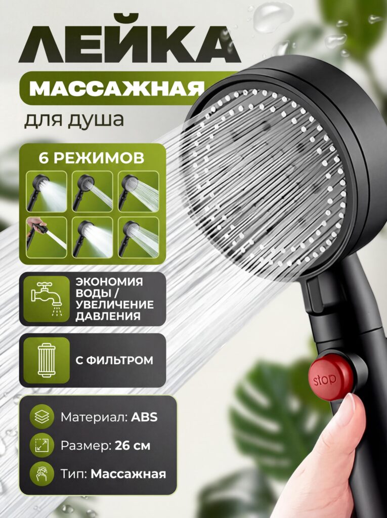
With the massage shower head, static imagery alone would not communicate value. We needed to visually represent water pressure, spray modes, and comfort. That is why we emphasized dynamic water streams as the central visual element.
We positioned the product diagonally to create motion and energy, allowing the water flow to guide the viewer’s eye across the image. The six spray modes are presented as small visual thumbnails, making the feature tangible instead of abstract. This approach reduces hesitation by letting customers “see” the functionality before reading details.
The color palette balances dark hardware tones with fresh green accents, signaling both durability and wellness. Icons highlight water-saving and filtration features — two decision-making factors that matter strongly in bathroom product categories on Ozon.
Magnetic USB-C Cable — Visualizing an Invisible Feature
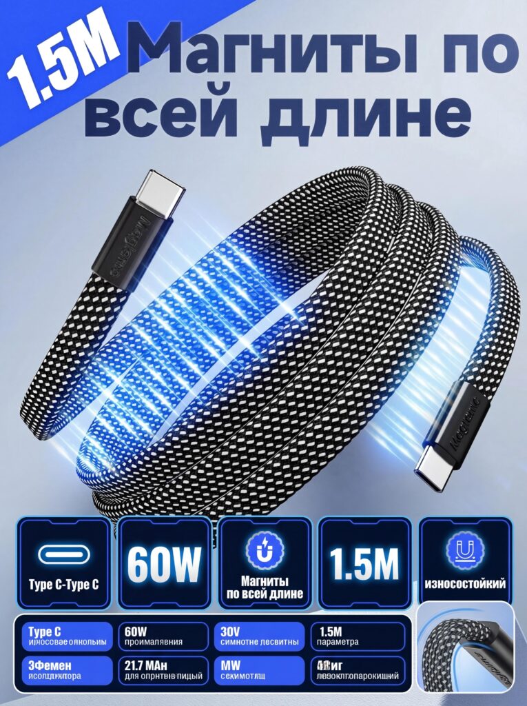
Magnets are difficult to explain through text alone, so this main image relies on visual storytelling. We used glowing blue light effects along the cable length to represent continuous magnetic attraction. This instantly differentiates the product from standard charging cables.
The cable is arranged in a curved, floating position to emphasize flexibility and strength at the same time. We clearly displayed the 1.5-meter length and 60W power capability in bold, high-contrast blocks, ensuring these specs remain readable even on mobile screens.
On Ozon, electronics shoppers often look for quick reassurance of compatibility and durability. By visualizing magnetism instead of simply labeling it, we reduce cognitive load and make the feature memorable.
Cordless Drill — Power, Stability, and Professional Confidence
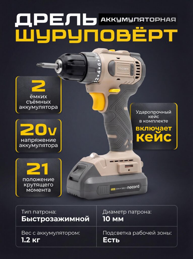
For the cordless drill main image, the priority was authority and reliability. We chose a dark, neutral background to let the tool’s shape and color accents stand out sharply. The drill appears upright and centered, reinforcing stability and control.
We structured the layout to guide the viewer from top to bottom: product name, power specifications, battery details, and supporting features such as torque settings and quick-release chuck. This vertical hierarchy mirrors how users naturally scan tool listings on Ozon.
Yellow highlight blocks draw attention to key selling points without overwhelming the image. The goal was not to show everything, but to show the right things — enough to convince both DIY users and professionals that this tool delivers dependable performance.
Wireless Mechanical Keyboard — Balancing Aesthetics and Precision
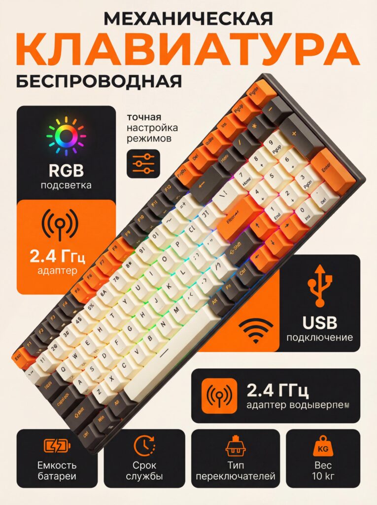
Mechanical keyboards are lifestyle products as much as functional tools. For this design, we emphasized visual personality while maintaining technical clarity. The keyboard is displayed at an angle that shows keycap profiles, RGB lighting, and layout simultaneously.
We used warm orange accents against a clean background to create contrast and energy. This color choice attracts attention in crowded Ozon listings while reinforcing the keyboard’s modern, enthusiast-oriented identity.
Feature icons — such as RGB lighting, wireless connectivity, and USB support — appear in modular blocks around the product. This layout allows users to quickly confirm compatibility and customization options without searching through text-heavy descriptions.
Tritan Water Bottle — Clean, Healthy, Everyday Utility
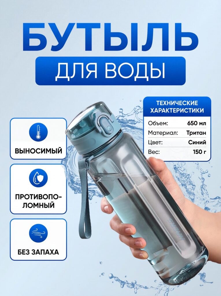
For the water bottle main image, clarity and trust were essential. We used a light blue background and water splash elements to visually communicate freshness, hydration, and safety. The bottle is held naturally in a human hand to provide instant scale reference.
Instead of overwhelming the image with technical data, we highlighted essential features: BPA-free material, odor resistance, and portability. These benefits matter most to users choosing a daily-use item.
Typography remains clean and spacious, reinforcing the product’s hygienic and minimal positioning. On Ozon, lifestyle shoppers respond strongly to visuals that feel honest and uncomplicated — this design supports that expectation.
Dog Sweater — Emotion First, Information Second
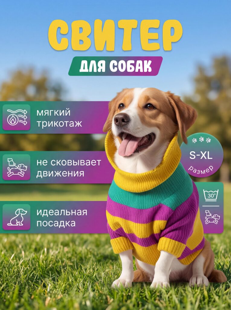
Pet products sell through emotion before logic. For the dog sweater main image, the smiling dog wearing the product becomes the focal point. The outdoor setting reinforces comfort, freedom of movement, and everyday usability.
We used colorful yet balanced typography to communicate softness, fit, and size range. Feature labels appear alongside icons, keeping the tone friendly and approachable rather than technical.
By letting the dog’s expression carry the emotional message, we reduce resistance and help pet owners imagine their own dog enjoying the product. This emotional clarity is critical for apparel categories on Ozon.
Design System Consistency Across Categories
Although each product category required a different visual strategy, we maintained consistent design principles across all images:
- Четкая визуальная иерархия
- Удобство чтения с учетом мобильных устройств
- Icon-supported feature explanation
- Category-appropriate color psychology
- Immediate product recognition
This balance between consistency and customization ensures each listing feels professional while remaining tailored to its market segment.
Why Strategic Main Image Design Matters on Ozon
Ozon shoppers do not read first — they scan. Main images must communicate value instantly, without confusion. Every design decision shown here serves a specific purpose: reduce hesitation, increase trust, and guide attention toward conversion.
Well-designed main images also reduce return rates by setting accurate expectations. When users clearly understand what they are buying, satisfaction increases after purchase.
Заключение
Эффективный Озон main image design is not about decoration. It is about clarity, psychology, and strategic communication. By aligning visual language with platform behavior and customer expectations, we transform product images into conversion tools.
These designs demonstrate how thoughtful structure, controlled information density, and category-specific storytelling elevate listings beyond basic compliance. When design speaks clearly, customers listen — and click.
This is exactly the approach we apply at АИРСАНГ, where we specialize in conversion-focused design for cross-border eCommerce, helping brands stand out on platforms like Ozon through strategic visuals, not guesswork.


Спроектируем и создадим для вас WordPress-сайт или корпоративный сайт с полной системой электронной коммерции.
Ценовой диапазон: от $200.00 до $2,500.00custom-requirements-or-special-quotations
Первоначальная цена составляла: $2.00.$1.00Текущая цена: $1.00. Дизайн главного изображения для домашнего физиотерапевтического устройства Amazon: пояснения.
Введение: Создание достоверного изображения для домашних терапевтических приборов на Amazon При разработке главного изображения для домашнего терапевтического прибора на Amazon мы в первую очередь...

Дизайн основного изображения для конвертации помады на Amazon.
Введение: Разработка главного образа помады, которая продается на Amazon Когда мы разрабатываем главный образ для помады Amazon, наша ответственность выходит далеко за рамки...

Что делает основное изображение жидкой тональной основы Amazon конвертируемым?
Введение. Разработка дизайна основного изображения для жидкой тональной основы на Amazon — это не просто создание красивого внешнего вида продукта. На Amazon основное изображение и...

Разработка эффективного основного изображения Amazon для фильтрующих картриджей
Введение. Разработка основного изображения для Amazon — это не просто создание привлекательного внешнего вида товара. Речь идёт о ясности, доверии и мгновенном понимании, особенно для...

Сравнение пяти тем WordPress для сайтов о домашних животных
Введение. Выбор подходящей темы WordPress для сайтов, посвященных домашним животным, — это не просто решение, связанное с дизайном; оно напрямую влияет на удобство использования, масштабируемость и долгосрочный рост бизнеса. Уход за домашними животными и...

Создание масштабируемого веб-сайта на WordPress для научно-ориентированного бренда: проект AminoUSA
Введение. В современном цифровом пространстве веб-сайт — это больше, чем просто место для размещения информации о товарах. Для научно-ориентированных брендов, работающих в регулируемых или научно-исследовательских отраслях, это….

Создание масштабируемого магазина Shopify для глобального бренда ножей: проект CoolKatana
Введение. В трансграничной электронной коммерции веб-сайт Shopify — это больше, чем просто витрина магазина. Для брендов, работающих в нишевых, ориентированных на культуру категориях, веб-сайт должен делать гораздо больше, чем...

Разработка высокоэффективного магазина Shopify для карточек Pokémon.
Введение. В мире электронной коммерции коллекционных товаров, особенно на рынке коллекционных карточных игр Pokémon, веб-сайт должен делать больше, чем просто перечислять товары...

Высокоэффективный дизайн Shopify для индивидуального бренда стационарной торговой точки.
Введение. В условиях современной конкурентной среды электронной коммерции, особенно в сегменте персонализированных подарков и коллекционных товаров, веб-сайт на платформе Shopify должен делать гораздо больше, чем просто отображать товары. Он...

Пример разработки веб-сайта на платформе Shopify для премиального цветочного бренда.
Введение. В условиях современной конкурентной среды электронной коммерции веб-сайт на платформе Shopify должен делать гораздо больше, чем просто отображать товары. Он должен мгновенно передавать ценность бренда, направлять пользователей...

Пример проекта дизайна на Shopify: магазин ретро-игр
Введение. В условиях высокой конкуренции в сфере электронной коммерции визуальная ясность и эмоциональная связь часто определяют, станет ли посетитель клиентом. Это особенно актуально в...

Пример проекта по дизайну на Shopify: Tactical Rescue Brand
Введение. Эффективный веб-сайт на Shopify делает больше, чем просто отображает товары — он передает цель, укрепляет доверие и помогает пользователям принимать уверенные решения о покупке. Это особенно важно...

Пример разработки веб-сайта на платформе Shopify для бренда электровелосипедов.
Введение. На современном конкурентном рынке электровелосипедов веб-сайт на платформе Shopify должен делать больше, чем просто демонстрировать товары — он должен рассказывать историю, вызывать доверие и направлять пользователей...

Масштабируемая платформа электронной коммерции Shopify для креативного бренда.
Введение. Когда креативные бренды растут, их веб-сайты часто с трудом успевают за развитием. По мере расширения ассортимента продукции, увеличения объема контента и роста трафика многие бренды, ориентированные на визуальное оформление...

Пример разработки веб-сайта на платформе Shopify для бренда товаров для дома.
Введение. На высококонкурентном рынке товаров для дома визуальная идентичность — это уже не просто эстетика, она напрямую влияет на доверие, поведение покупателей при просмотре товаров и принятие решений о покупке. Для...

Пример создания масштабируемого сайта с платной подпиской на WordPress.
Введение. Для современных брендов электронной коммерции веб-сайт — это уже не просто цифровая витрина. Это движок, поддерживающий подписки, создание контента, построение доверия и т.д.

Высокоэффективный дизайн WordPress для брендов, ориентированных на взрослую аудиторию.
Введение. На высококонкурентных рынках электронной коммерции одних лишь ярких визуальных элементов недостаточно. Успешный веб-сайт на WordPress должен направлять посетителей по четкому и целенаправленному маршруту, который….

Масштабируемый веб-сайт электронной коммерции по продаже секс-кукол на WordPress
Введение. Запуск высокоэффективного веб-сайта для трансграничной электронной коммерции — это не просто размещение товаров в интернете. Для брендов, работающих на высококонкурентных рынках, ориентированных на визуальный контент, веб-сайт...