


Введение
На высококонкурентном рынке товаров для дома визуальная идентичность — это уже не просто эстетика, она напрямую влияет на доверие, поведение покупателей и решения о покупке. Для устоявшихся брендов, работающих в сфере товаров для дома, это имеет важное значение. Shopify Веб-сайт должен делать больше, чем просто демонстрировать товары. Он должен передавать атмосферу, интуитивно направлять пользователей и превращать вдохновение в действие.
В этом тематическом исследовании рассматривается, как мы поддержали перепроектирование и оптимизацию. Shopify витрина для Атмосфера, — известный европейский бренд товаров для дома. Наша задача заключалась исключительно в разработке дизайна страниц, визуальной структуры и пользовательского опыта, помогая бренду перевести свою офлайн-идентичность и сезонные коллекции в изысканное, ориентированное на конверсию цифровое присутствие.
Вместо того чтобы рассматривать этот проект как техническую перестройку, мы подошли к нему как к задаче по созданию дизайн-системы — сбалансировать привлекательность бренда, коммерческую ясность и масштабируемое визуальное повествование в рамках платформы Shopify.
| Срок доставки | Категория | Платформа приложений |
| 24 дня | мебель | Shopify |
| Участники проекта (дизайнеры) | Расходы | Эффект |
| Линь Чжан, Пейфон ФУ | $2700 | Выручка от продаж📈230% |
Понимание бренда и его дизайнерской ДНК
Бренд, олицетворяющий стиль жизни и создающий особую атмосферу.
Компания Atmosphera работает в категории, где эмоциональное воздействие играет центральную роль. Клиенты покупают не просто мебель или предметы декора; они покупают настроение, образ жизни и ощущение дома. В офлайн-продажах бренда делается акцент на:
- Мягкая, нейтральная цветовая палитра
- Сезонные истории (зимнее тепло, летняя легкость, уютные интерьеры)
- Доступный дизайн с изысканным стилем.
- Широкий каталог продукции, охватывающий различные типы помещений, стили и ценовые категории.
Задача заключалась в том, чтобы перевести этот богатый, тактильный опыт в цифровой формат, который обеспечивал бы такое же полное погружение, не перегружая при этом пользователя информацией.
Основная цель проектирования
С точки зрения дизайна, основная цель была ясна:
Создайте главную страницу Shopify и вспомогательные страницы, которые будут спокойными, интуитивно понятными и вдохновляющими, одновременно способствуя поиску товаров и конверсии.
Это потребовало тщательного контроля над плотностью расположения элементов, визуальным ритмом и иерархией.
Проектные задачи, которые нам нужно было решить.
1. Визуальное управление большим каталогом товаров
При наличии сотен товаров в различных категориях главная страница легко могла стать перегруженной. Слишком многие бренды попадают в ловушку “показывать все сразу”, что часто приводит к усталости от принятия решений.
Риск проектирования:
- Перегруженные макеты
- Конкурирующие визуальные сообщения
- Слабая ориентация на продукт
2. Баланс между вдохновением и коммерцией
Визуальный ряд Atmosphera ориентирован на стиль жизни, но сайт электронной коммерции все равно должен направлять пользователей к конкретным действиям.
Конструктивное противоречие:
- Редакционный подход к повествованию против коммерческой ясности
- Эмоциональная визуализация против функциональной навигации
3. Сезонные кампании без нарушения последовательности.
Бренд регулярно проводит акции и сезонные кампании (например, «Зимние дни», скидки, коллекции). Они должны были быть свежими, но при этом никогда не отрываться от основной идентичности бренда.
Наш подход, ориентированный на дизайн, в Shopify
Сначала дизайн, потом верстка, потом стратегия, потом разделы.
Мы начали с визуальный и структурный аудит, Это не замена шаблона. Прежде чем трогать макеты, мы спросили:
- Какие чувства хочет вызвать у пользователей бренд в первые 5 секунд?
- Какой идеальный ритм прокрутки?
- Какие элементы должны быть ведущими, а какие — вспомогательными?
Это позволило нам проектировать целенаправленно, а не нагромождать разделы Shopify без должной согласованности.
Стратегия дизайна главной страницы
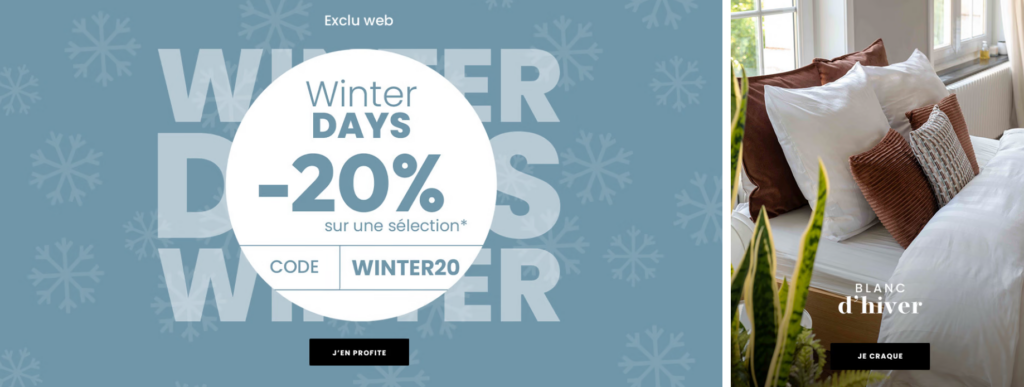
Раздел «Герои»: Спокойствие, но не шум
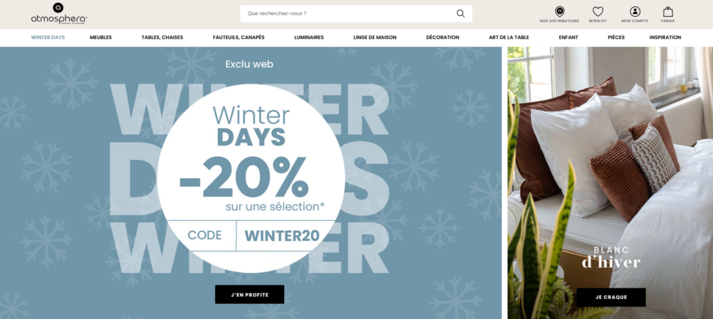
Вместо агрессивных рекламных баннеров мы оформили главную зону таким образом, чтобы она создавала ощущение:
- Просторный
- Сезонный
- Эмоционально согласованные
Главное сообщение передает ценность, не привлекая к себе лишнего внимания. Типографика остается мягкой и легко читаемой, а изображения задают тон всему процессу просмотра.
Примененные принципы проектирования:
- Одно четкое сообщение на экране
- Контролируемый контраст
- Минималистичные кнопки призыва к действию
Основные преимущества продукта: тщательно отобранный контент, без излишней перегруженности.
Вместо того чтобы заваливать главную страницу товарами, мы отобрали для вас конкретные подборки:
- Рекомендуемые акции
- Бестселлеры
- Сезонные предложения
Каждый блок товара выполнен в единой визуальной системе:
- Сбалансированное расстояние
- Предсказуемая структура карт
- Четкая информация о ценах и рейтингах.
Такой подход позволяет пользователям быстро просматривать информацию, сохраняя при этом ощущение направленности.
Баннеры, отражающие стиль жизни, как визуальные точки дыхания.
Большие секции, посвященные образу жизни, были намеренно размещены между зонами с большим количеством товаров. Эти секции выполняют две функции:
- Укрепить атмосферу бренда
- Снижение зрительной усталости при прокрутке
Они также ненавязчиво направляют пользователей к изучению категорий, а не к немедленному оформлению заказа.
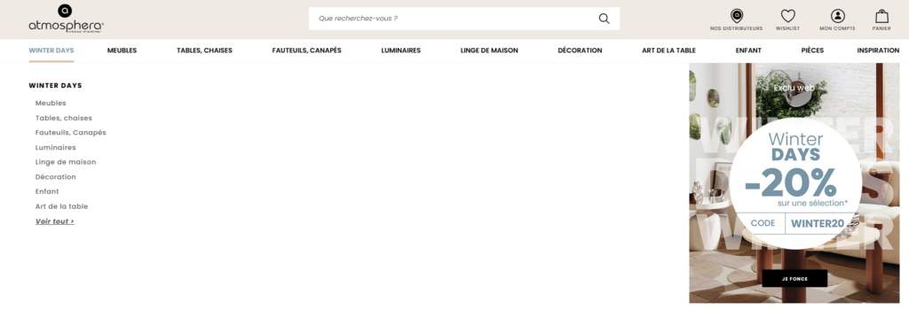
Дизайн страниц категорий и коллекций
Проектирование для исследовательских целей
Страницы категорий рассматривались как площадки для поиска информации, а не просто как сетки товаров.
Основные проектные решения:
- Четкое именование категорий
- Яркие образы героев в каждой категории
- Последовательное размещение элементов пользовательского интерфейса фильтрации
Благодаря предсказуемому интерфейсу пользователи чувствуют себя уверенно, изучая каталог более подробно.
Визуальная согласованность между помещениями и темами оформления.
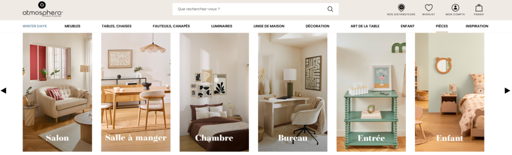
Каталог Atmosphera охватывает гостиные, спальни, столовые, детские комнаты и многое другое. Мы объединили их с помощью:
- Последовательная логика сетки
- Повторяющиеся типографические стили
- Единые правила межстрочного интервала
Это гарантирует, что даже при изменении стиля взаимодействие с сайтом останется целостным.
Визуальная иерархия и пользовательский интерфейс
Разработка дизайна с учетом поведения при прокрутке
Современные пользователи Shopify быстро прокручивают ленту. В нашем дизайне это учтено следующим образом:
- Использование сильных заголовков разделов
- Создание визуальных ориентиров на каждом экране
- Чередование светлых и фактурных фонов
Это создает естественный ритм прокрутки, который способствует более длительным сеансам.
Четкий призыв к действию без агрессии
Призывы к действию были намеренно ненавязчивыми:
- “Купить сейчас”
- “"Обнаружить"”
- “Ознакомьтесь с коллекцией”
Эти призывы к действию поддерживают процесс просмотра, а не прерывают его.
Укрепление доверия посредством детального проектирования.
Важные микроэлементы пользовательского опыта
Небольшие дизайнерские решения помогают укрепить доверие:
- Последовательная иконография
- Четкая информация о доставке и возврате товара.
- Визуальная поддержка вблизи секций с продукцией
Эти элементы уменьшают трение, не создавая при этом шума.
Укрепление доверия к бренду за счет сдержанности
Мы избежали излишнего дизайна. Никаких ненужных анимаций, никаких лишних значков. Уверенность возникает благодаря ясности, а не украшениям.
Системное проектирование для масштабируемости
Гибкая структура, а не отдельная страница.
Одним из важнейших результатов этого проекта стало создание повторяемой логики проектирования. Теперь бренд может:
- Легко запускайте новые коллекции
- Меняйте сезонные визуальные элементы без перепроектирования макетов.
- Обеспечьте единообразие во всех кампаниях.
Такая масштабируемость дизайна имеет решающее значение для долгосрочного роста Shopify.
Результаты и влияние
Более целенаправленный пользовательский опыт
После внедрения нового подхода к дизайну сайт достиг следующих результатов:
- Более понятные пути поиска продукции
- Более убедительное повествование о бренде
- Улучшена визуальная согласованность между страницами.
Хотя показатели со временем меняются, непосредственное влияние стало очевидным в следующих аспектах:
- Более длительные сеансы просмотра
- Уменьшение визуального беспорядка
- Более тесная взаимосвязь между имиджем бренда и опытом использования онлайн-сервисов.
Почему этот подход к дизайну работает для брендов, представленных на Shopify
Этот проект демонстрирует ключевую истину:
Высокая производительность Shopify начинается с продуманного дизайна, а не с увеличения количества функций.
Сосредоточившись на:
- Визуальная иерархия
- Эмоциональная стабильность
- Решения по планировке, ориентированные на пользователя
Бренды могут улучшить свой интернет-магазин, не прибегая к сложной разработке или написанию собственного кода.
Заключение
Разработка успешного Shopify Создание веб-сайта — это не следование трендам или добавление новых разделов. Это понимание бренда, уважение внимания пользователя и создание визуальной системы, которая поддерживает как повествование, так и продажи.
Этот проект демонстрирует, как спокойный, продуманный подход к дизайну может превратить большой каталог товаров для дома в удобный и привлекательный процесс покупок — такой, который вдохновляет, внушает доверие и прост в навигации.
В конечном счете, именно на таком типе дизайна для Shopify мы и специализируемся. АИРСАНГ: помогаем брендам воплотить свою идентичность в высокоэффективные, ориентированные на дизайн витрины магазинов, которые плавно масштабируются с течением времени.
Если вы хотите улучшить свой сайт на Shopify с помощью стратегического дизайна страниц, визуальной структуры и пользовательского опыта, а не за счет масштабной разработки, то мы считаем, что именно такой подход вам подходит.


Спроектируем и создадим для вас WordPress-сайт или корпоративный сайт с полной системой электронной коммерции.
Ценовой диапазон: от $200.00 до $2,500.00Нестандартные требования или специальные предложения
Первоначальная цена составляла: $2.00.$1.00Текущая цена: $1.00. Дизайн главного изображения для домашнего физиотерапевтического устройства Amazon: пояснения.
Введение: Создание достоверного изображения для домашних терапевтических приборов на Amazon При разработке главного изображения для домашнего терапевтического прибора на Amazon мы в первую очередь...

Дизайн основного изображения для конвертации помады на Amazon.
Введение: Разработка главного образа помады, которая продается на Amazon Когда мы разрабатываем главный образ для помады Amazon, наша ответственность выходит далеко за рамки...

Что делает основное изображение жидкой тональной основы Amazon конвертируемым?
Введение. Разработка дизайна основного изображения для жидкой тональной основы на Amazon — это не просто создание красивого внешнего вида продукта. На Amazon основное изображение и...

Разработка эффективного основного изображения Amazon для фильтрующих картриджей
Введение. Разработка основного изображения для Amazon — это не просто создание привлекательного внешнего вида товара. Речь идёт о ясности, доверии и мгновенном понимании, особенно для...

Сравнение пяти тем WordPress для сайтов о домашних животных
Введение. Выбор подходящей темы WordPress для сайтов, посвященных домашним животным, — это не просто решение, связанное с дизайном; оно напрямую влияет на удобство использования, масштабируемость и долгосрочный рост бизнеса. Уход за домашними животными и...

Создание масштабируемого веб-сайта на WordPress для научно-ориентированного бренда: проект AminoUSA
Введение. В современном цифровом пространстве веб-сайт — это больше, чем просто место для размещения информации о товарах. Для научно-ориентированных брендов, работающих в регулируемых или научно-исследовательских отраслях, это….

Создание масштабируемого магазина Shopify для глобального бренда ножей: проект CoolKatana
Введение. В трансграничной электронной коммерции веб-сайт Shopify — это больше, чем просто витрина магазина. Для брендов, работающих в нишевых, ориентированных на культуру категориях, веб-сайт должен делать гораздо больше, чем...

Разработка высокоэффективного магазина Shopify для карточек Pokémon.
Введение. В мире электронной коммерции коллекционных товаров, особенно на рынке коллекционных карточных игр Pokémon, веб-сайт должен делать больше, чем просто перечислять товары...

Высокоэффективный дизайн Shopify для индивидуального бренда стационарной торговой точки.
Введение. В условиях современной конкурентной среды электронной коммерции, особенно в сегменте персонализированных подарков и коллекционных товаров, веб-сайт на платформе Shopify должен делать гораздо больше, чем просто отображать товары. Он...

Пример разработки веб-сайта на платформе Shopify для премиального цветочного бренда.
Введение. В условиях современной конкурентной среды электронной коммерции веб-сайт на платформе Shopify должен делать гораздо больше, чем просто отображать товары. Он должен мгновенно передавать ценность бренда, направлять пользователей...

Пример проекта дизайна на Shopify: магазин ретро-игр
Введение. В условиях высокой конкуренции в сфере электронной коммерции визуальная ясность и эмоциональная связь часто определяют, станет ли посетитель клиентом. Это особенно актуально в...

Пример проекта по дизайну на Shopify: Tactical Rescue Brand
Введение. Эффективный веб-сайт на Shopify делает больше, чем просто отображает товары — он передает цель, укрепляет доверие и помогает пользователям принимать уверенные решения о покупке. Это особенно важно...

Пример разработки веб-сайта на платформе Shopify для бренда электровелосипедов.
Введение. На современном конкурентном рынке электровелосипедов веб-сайт на платформе Shopify должен делать больше, чем просто демонстрировать товары — он должен рассказывать историю, вызывать доверие и направлять пользователей...

Масштабируемая платформа электронной коммерции Shopify для креативного бренда.
Введение. Когда креативные бренды растут, их веб-сайты часто с трудом успевают за развитием. По мере расширения ассортимента продукции, увеличения объема контента и роста трафика многие бренды, ориентированные на визуальное оформление...

Пример создания масштабируемого сайта с платной подпиской на WordPress.
Введение. Для современных брендов электронной коммерции веб-сайт — это уже не просто цифровая витрина. Это движок, поддерживающий подписки, создание контента, построение доверия и т.д.

Высокоэффективный дизайн WordPress для брендов, ориентированных на взрослую аудиторию.
Введение. На высококонкурентных рынках электронной коммерции одних лишь ярких визуальных элементов недостаточно. Успешный веб-сайт на WordPress должен направлять посетителей по четкому и целенаправленному маршруту, который….

Масштабируемый веб-сайт электронной коммерции по продаже секс-кукол на WordPress
Введение. Запуск высокоэффективного веб-сайта для трансграничной электронной коммерции — это не просто размещение товаров в интернете. Для брендов, работающих на высококонкурентных рынках, ориентированных на визуальный контент, веб-сайт...
Разработка веб-сайта на Shopify для бренда силиконовых кукол.
Введение. В условиях высокой конкуренции и высокой визуальной чувствительности ниш электронной коммерции дизайн веб-сайта – это не только эстетика, но и доверие, ясность, эмоциональный отклик и...