A Shopify Custom Product Store Made For Anime Lovers

Введение

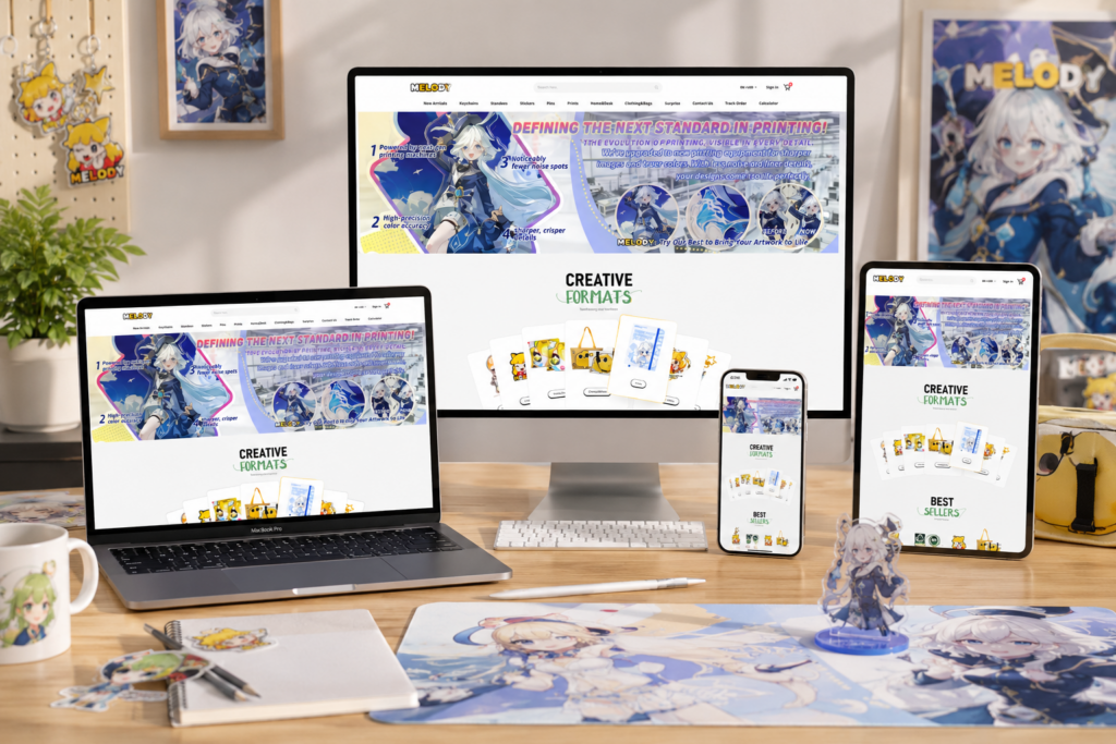
When people visit an online store, they form an impression in seconds. A thoughtful layout, clear hierarchy, and purposeful visual design help visitors make decisions faster and feel confident in their choices. For a custom product brand like a creative merchandise manufacturer, the website must balance artistic personality, clarity of information, and trust building. Every section — from promotional banners and product categories to trust badges and product details — plays a role in creating a seamless and inspiring user experience.

In this article, we walk through the design thinking behind a modern custom merchandise Shopify site. We explain why each section was structured in a certain way, how visual elements support usability, and how we intentionally guide users through a journey that feels intuitive, engaging, and reassuring.

Срок доставкиКатегорияWebsite Type
21daysAnime-style Custom Productsshopify
Участники проекта (дизайнеры)РасходыЭффект
Нэнси$2200Sales📈235%

Hero & Key Features Section: Setting Expectations from the Start

A Shopify Custom Product Store Made For Anime Lovers-Hero & Key Features Section: Setting Expectations from the Start

Leading with What Matters

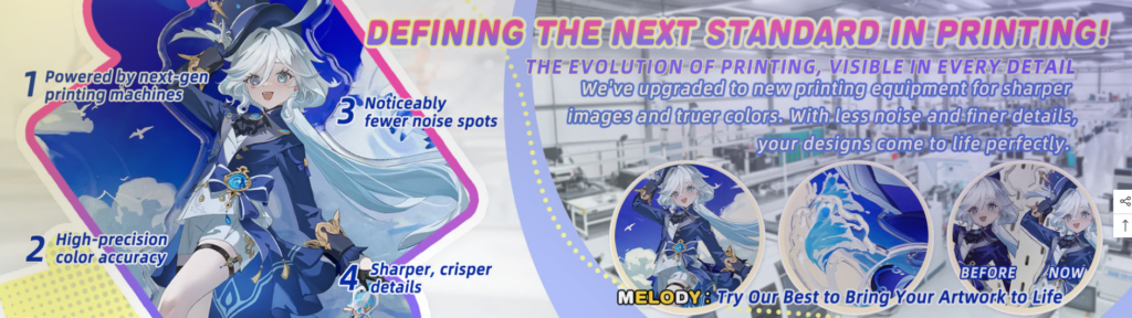
The first thing visitors see sets the tone for everything else. In the hero section of this site, the design puts forward clarity of value and visual vibrancy. Rather than showing generic stock imagery, the banner uses a unique character illustration combined with bold, performance-focused messaging.

Communicating the Technology

We intentionally highlight key technical benefits using numbered callouts:

  • Next-gen printing machines
  • High-precision color accuracy
  • Fewer noise spots
  • Sharper, crisper details

These benefits aren’t hidden in long paragraphs. Instead, they are directly placed over the character illustration, making them both visually accessible and memorable. The numbered list creates a natural flow, which guides the eye across the design and reinforces a sense of progression — from machine power to end result quality.

Visual Hierarchy and Engagement

The right side of the hero section displays circular comparison visuals titled “Before / Now” paired with supporting text. This layout serves three purposes:

  1. Demonstrates visible improvements
  2. Supports claims with visual proof
  3. Reduces cognitive load through familiar visual cues

Using circular imagery creates a break from the rectangular grid system used elsewhere, drawing attention and creating visual rhythm.

Creative Formats Collection: Making Discovery Joyful

A Shopify Custom Product Store Made For Anime Lovers-Creative Formats Collection: Making Discovery Joyful

Encouraging Exploration Through Design

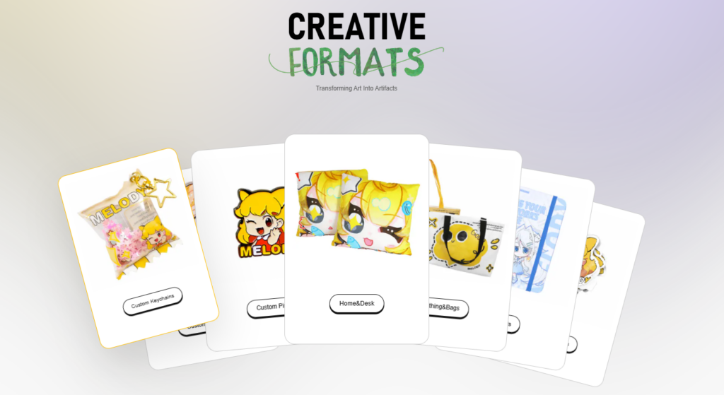
After the hero, visitors see the “Creative Formats” section. This isn’t just a standard product list — it’s an interactive visual exploration that visually represents product diversity.

Why We Use a Carousel-Like Visual

Instead of a typical grid, we arranged the product formats using a curved, overlapping card display. We chose this structure because:

  • It conveys a sense of motion and variety
  • It invites users to browse rather than just scroll
  • It reflects the creative nature of the products

Users visually associate different formats — from keychains and pins to home décor — without wasting screen space.

Balancing Playfulness with Clarity

Although the layout feels dynamic, each card still maintains a clean structure:

  • Product image
  • Clear label
  • Равномерное расстояние

This ensures visual fun doesn’t turn into confusion. Each card feels like part of a curated collection.

Best Sellers Display: Highlighting What Works

A Shopify Custom Product Store Made For Anime Lovers-Best Sellers Display: Highlighting What Works

Translating Social Proof into Design

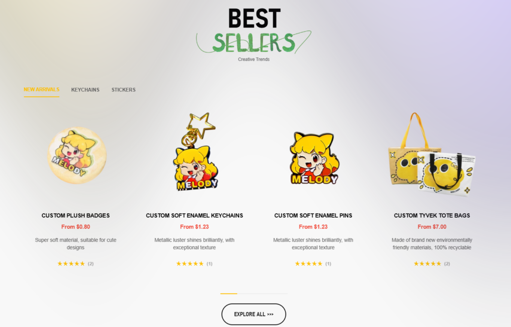
The “Best Sellers” section focuses on products with strong performance, but it also supports conversion in a subtle way.

Tab Filtering for Quick Segmentation

Tabs like:

  • New Arrivals
  • Keychains
  • Stickers

make browsing feel tailored. Users can choose what matters most instead of exploring everything at once.

Visual Centering and Product Spacing

Each bestselling product receives:

  • A clean white background
  • Ample spacing
  • Visible pricing and star ratings

This clear layout helps reduce hesitation by placing all critical decision-making cues — visuals, price, reviews — in close proximity.

Trust & Testimonial Section: Reinforcing Reliability

A Shopify Custom Product Store Made For Anime Lovers-Trust & Testimonial Section: Reinforcing Reliability

Turning Credibility into a Visual Asset

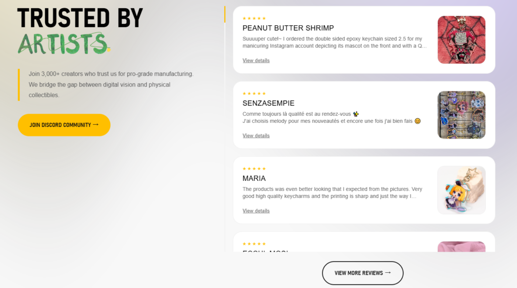
Trust is crucial, especially for sites that sell custom-made products. This section immediately follows the core offerings, reminding visitors that other real creators endorse the brand.

Headline with Emotional Resonance

The phrase “Trusted by Artists” uses a hand-written font for the word “Artists.” This stylistic choice tells visitors:

  • This brand is artist-centric
  • It isn’t just transactional
  • It privileges creativity over generic mass production

Strategic Placement of Social Proof

Customer reviews appear on the right with photos — these photos serve as real-world evidence that reinforces earlier product claims. On the left, a call-to-action button invites users to join the Discord community, emphasizing community and ongoing support rather than a one-time purchase.

Brand-Story Section: We Support Creators Behind the Scenes

A Shopify Custom Product Store Made For Anime Lovers-Brand-Story Section: We Support Creators Behind the Scenes

Humanizing the Manufacturer

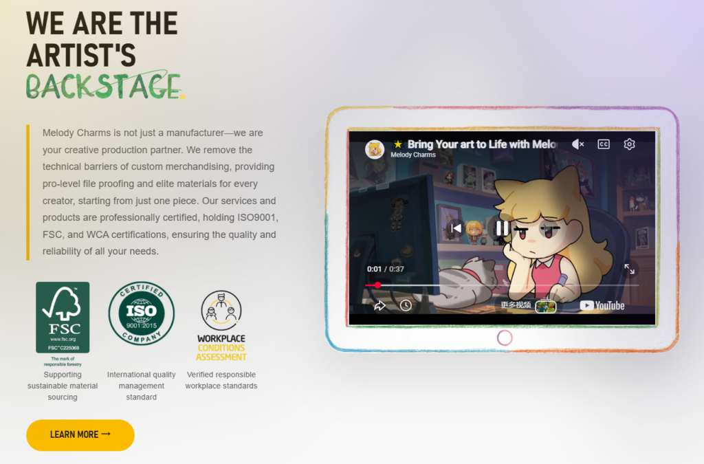
Rather than pushing sales messages, this section positions the company as the production partner behind the art.

Why Story Matters

A neutral-toned gradient background keeps the focus on:

  • A bold, artist-friendly headline: “We Are the Artist’s Backstage.”
  • A descriptive paragraph that explains:
    • Production expertise
    • Technical capability
    • Certifications and professional standards

Use of Certifications

Visual badges — ISO 9001, FSC, WCA — are displayed prominently to signal:

  • Responsible sourcing
  • International-standard processes
  • Ethical workplace conditions

This reassures customers that they aren’t ordering from a random supplier — they are partnering with a credible manufacturer.

Product Collection Page: Structure and User Control

A Shopify Custom Product Store Made For Anime Lovers-Product Collection Page: Structure and User Control

Designing for Browsing Flexibility

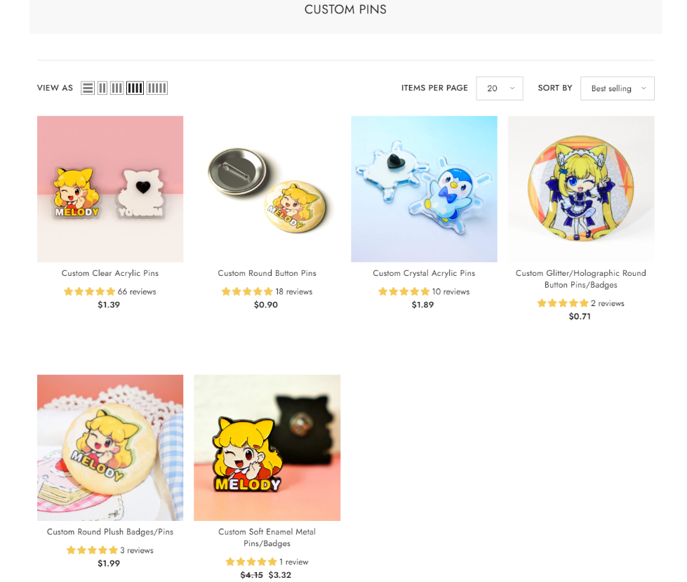
On the category page, we made intentional layout decisions to support efficient product exploration.

Filter and Sort for User Autonomy

Users can:

  • Change view modes
  • Adjust items per page
  • Sort by best selling, price, and more

Providing these controls acknowledges different browsing behaviors: some users know what they want, while others want to explore.

Visual Grid with Consistent Feedback

Each product card displays:

  • Clear product image
  • Product title
  • Star ratings
  • Цена

This consistency helps build a sense of rhythm and predictability, which speeds up scanning and decision-making.

Product Detail Page: Communicating Options Clearly

A Shopify Custom Product Store Made For Anime Lovers-Product Detail Page: Communicating Options Clearly

Building Confidence at the Moment of Choice

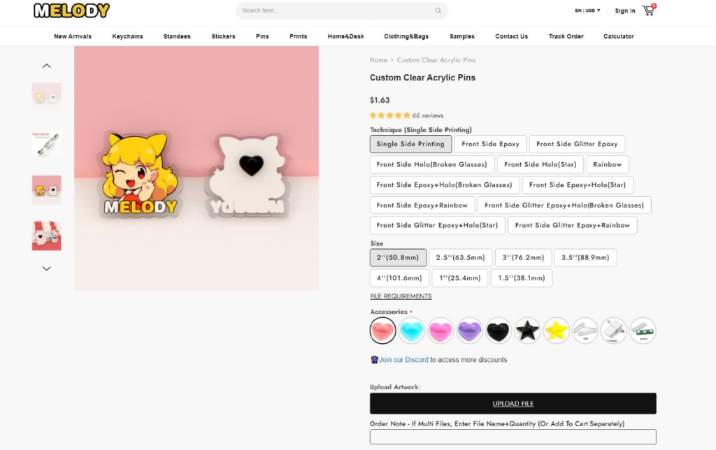
The product detail pages are where purchase decisions happen. This means clarity, visual proof, and structure are critical.

Why Left-Aligned Imagery

Left alignment draws the eye naturally because users:

  1. Look at the image first
  2. Then scan right for details and options

This flow mirrors established visual habits on e-commerce sites.

Structured Selection Options

Customers can choose:

  • Size
  • Clutch / Backing
  • Цвета
  • Special effects

We separated these into clickable groups so users aren’t overwhelmed. Color swatches and icons reduce ambiguity while making selection feel interactive.

Quantity Pricing Table

Bulk pricing is shown logically through a table that:

  • Highlights unit price
  • Shows discount tiers
  • Encourages bulk purchases

This transparent pricing builds trust and reduces sticker shock.

Customer Reviews and Related Products

Below the main product section, we included:

  • Long customer reviews with images
  • “What Customers Are Buying” recommendations
  • Related product carousel

This enhances upselling and trust reinforcement without disrupting the user journey.

Footer & Sitewide Elements: Consistency Meets Convenience

Repeating Core Reinforcements

The footer includes:

  • Shop links
  • Customer service
  • Certification badges
  • Accepted payment icons

These recurring visual anchors remind users that:

  1. Support is available
  2. Payment is secure
  3. The brand has global credibility

Newsletter and Social Engagement

Offering a newsletter signup and social icons gives users a reason to stay connected even if they don’t purchase immediately. This is essential for retention and long-term brand engagement.

Заключение

Every section on this Shopify site is designed with intention. We treat each block not merely as a static piece of content, but as a strategic touchpoint in the user’s decision-making journey.

From the hero banner that sets expectations, to the product detail page that removes uncertainty, the design:

  • Respects creativity
  • Supports browsing autonomy
  • Builds trust through transparency
  • Encourages conversion with clarity

This holistic approach helps the site not only look cohesive and friendly but function effectively as a high-performing online storefront for creative custom products.

By combining visual hierarchy, user familiarity, and purposeful layout decisions, the website offers a reliable, smooth experience for creators and buyers alike.

This design philosophy is inspired by the work of АИРСАНГ, whose user-centered design principles help brands create experiences that are both functional and beautiful.

Доставка по всему миру

АИРСАНГ Предоставляет экономически эффективные решения в области веб-дизайна, фирменного стиля и электронной коммерции. От Shopify и WordPress до изображений товаров для Amazon., Мы помогаем мировым брендам создавать, развивать и расширять свой онлайн-бизнес.

Спроектируем и создадим для вас WordPress-сайт или корпоративный сайт с полной системой электронной коммерции.
Нестандартные требования или специальные предложения

Нестандартные требования или специальные предложения

Первоначальная цена составляла: $2.00.Текущая цена: $1.00.
Дизайн главного изображения для домашнего физиотерапевтического устройства Amazon: пояснения.
Введение: Создание достоверного изображения для домашних терапевтических приборов на Amazon При разработке главного изображения для домашнего терапевтического прибора на Amazon мы в первую очередь...
Разработка эффективного основного изображения Amazon для фильтрующих картриджей
Введение. Разработка основного изображения для Amazon — это не просто создание привлекательного внешнего вида товара. Речь идёт о ясности, доверии и мгновенном понимании, особенно для...
Повторные атаки на WordPress: реальная угроза или преувеличенный миф?
Давайте сначала кое-что проясним. Атаки повторного воспроизведения не выглядят страшно. Они не взламывают пароли. Они не внедряют вредоносный код с зелёным хакерским текстом, разлетающимся повсюду. Они действуют коварно...
Сравнение пяти тем WordPress для сайтов о домашних животных
Введение. Выбор подходящей темы WordPress для сайтов, посвященных домашним животным, — это не просто решение, связанное с дизайном; оно напрямую влияет на удобство использования, масштабируемость и долгосрочный рост бизнеса. Уход за домашними животными и...
Сравнение пяти тем оформления для интернет-магазинов купальников
Введение. Выбор правильной тематики для независимого магазина купальников или нижнего белья — это не просто визуальное решение, оно напрямую влияет на коэффициент конверсии, масштабируемость и долгосрочную перспективу...
Создание масштабируемого веб-сайта на WordPress для научно-ориентированного бренда: проект AminoUSA
Введение. В современном цифровом пространстве веб-сайт — это больше, чем просто место для размещения информации о товарах. Для научно-ориентированных брендов, работающих в регулируемых или научно-исследовательских отраслях, это….
Создание масштабируемого магазина Shopify для глобального бренда ножей: проект CoolKatana
Введение. В трансграничной электронной коммерции веб-сайт Shopify — это больше, чем просто витрина магазина. Для брендов, работающих в нишевых, ориентированных на культуру категориях, веб-сайт должен делать гораздо больше, чем...
Высокоэффективный дизайн Shopify для индивидуального бренда стационарной торговой точки.
Введение. В условиях современной конкурентной среды электронной коммерции, особенно в сегменте персонализированных подарков и коллекционных товаров, веб-сайт на платформе Shopify должен делать гораздо больше, чем просто отображать товары. Он...
Как связаться со службой поддержки Shopify: простое и понятное руководство
Управление магазином Shopify должно приносить удовольствие, а не путаницу. Когда возникают вопросы или проблемы замедляют вашу работу, Shopify предлагает несколько вариантов поддержки в зависимости от ситуации...
Пример разработки веб-сайта на платформе Shopify для премиального цветочного бренда.
Введение. В условиях современной конкурентной среды электронной коммерции веб-сайт на платформе Shopify должен делать гораздо больше, чем просто отображать товары. Он должен мгновенно передавать ценность бренда, направлять пользователей...

Готовы преобразовать свой бизнес?

Закажите звонок, чтобы узнать больше о том, как наше агентство цифрового маркетинга может вывести ваш бизнес на новый уровень.