


소개
In the fast-growing retro gaming market, design plays a critical role in shaping user perception, engagement, and ultimately, conversion. When working on the 쇼피파이 store for LITNXT, our primary objective was to create a seamless digital experience that bridges nostalgia with modern usability.
Rather than overwhelming users with excessive features or complex interactions, we focused on clarity, emotional storytelling, and structured navigation. The result is a Shopify store that not only showcases products effectively but also builds trust and encourages purchase decisions across global audiences.
This case study explores how we approached the design of the LITNXT store—from homepage structure to product presentation—highlighting our design methodology, challenges, and outcomes.
| 배송 시간 | 범주 | 애플리케이션 플랫폼 |
| 26days | 게임 콘솔 | shopify |
| 참여 디자이너 | 비용 | 효과 |
| 낸시 | $2800 | flow📈272% |
Understanding the Brand and Objectives
Defining the Core Direction
LITNXT operates in a niche that blends retro gaming culture with modern handheld technology. This meant the design needed to achieve two things simultaneously:
- Evoke nostalgia for classic gaming
- Deliver a clean, high-performance shopping experience
We identified early on that the site should not feel outdated or overly “retro-themed.” Instead, it needed a balanced aesthetic—modern layout with subtle nostalgic cues.
Key Goals
- Improve product discoverability
- Reduce friction in navigation
- Strengthen brand trust through visual clarity
- Optimize the mobile shopping experience
- Support global conversion behavior
Our Design Approach
Designing for Clarity Over Complexity
One of the most common issues in niche eCommerce stores is overloading the interface with too much content. For LITNXT, we intentionally simplified the layout to guide users through a clear journey:
- Immediate visual impact
- Quick understanding of product categories
- Easy access to best-selling products
- Strong call-to-action pathways
Visual Hierarchy and Focus
We structured the page using a strong visual hierarchy:
- Bold hero section to capture attention
- Clear section separation using whitespace
- Consistent typography for readability
- Strategic use of product imagery to drive engagement
This approach ensures users always know where to look and what to do next.
홈페이지 디자인 전략
Hero Section: First Impression Matters
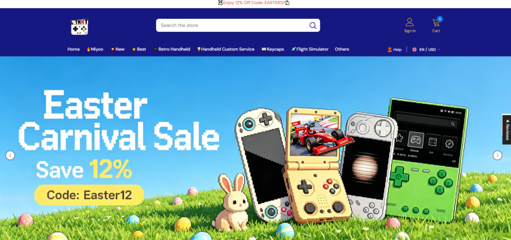
The homepage hero plays a critical role in setting expectations.
We designed the hero section to:
- Highlight flagship products like handheld consoles
- Use immersive visuals that resonate with gaming culture
- Include concise messaging that communicates value instantly
Rather than adding multiple sliders or distractions, we kept the hero focused and impactful.
Category Navigation: Simplifying Exploration

We implemented a clean category structure that allows users to quickly browse:
- Handheld consoles
- 부속품
- Bundles
- 신상품
Each category is visually distinct, making scanning effortless.
Best Sellers and Featured Products
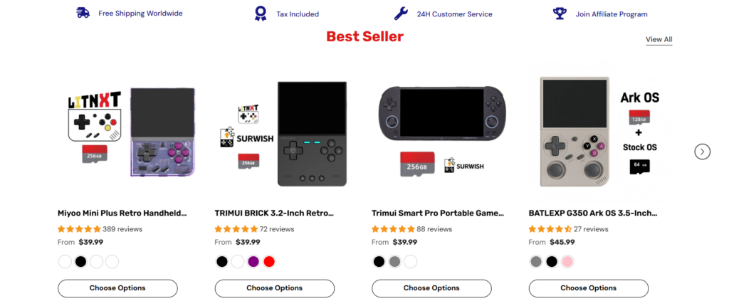
Instead of overwhelming users with all products, we curated sections like:
- Best Sellers
- Trending Products
- Recommended Items
This reduces decision fatigue and increases conversion likelihood.
Product Page Design
Emphasizing Product Experience
The product page is where decisions happen. Our design focused on:
- High-quality product imagery
- Clear pricing and purchase options
- Simplified product descriptions
- Easy-to-read specifications
We avoided clutter and ensured the most important information appears first.
디자인을 통해 신뢰를 구축하세요
To improve credibility, we incorporated:
- Customer reviews and ratings
- Clean layout for product details
- 일관된 간격 및 정렬
- Visual cues for reliability (badges, guarantees)
These elements help users feel confident in their purchase.
모바일 우선 디자인 고려 사항
Why Mobile Matters
A significant portion of traffic for gaming products comes from mobile devices. Therefore, mobile optimization was not an afterthought—it was a priority.
Key Mobile Enhancements
- 간소화된 탐색 메뉴
- Optimized image ratios for smaller screens
- Larger tap targets for buttons
- Faster loading layouts with minimal visual clutter
We ensured the mobile experience mirrors the desktop experience in quality, while being tailored for usability.
설계 과제 및 해결책
Challenge 1: Balancing Nostalgia and Modern UI
문제: Too much retro styling can feel outdated.
해결책: We used modern layouts with subtle retro-inspired visuals, such as color accents and product imagery.
Challenge 2: Avoiding Product Overload
문제: Large product catalogs can overwhelm users.
해결책: We structured content into curated sections like “Best Sellers” and “Featured,” reducing cognitive load.
Challenge 3: Maintaining Visual Consistency
문제: Inconsistent layouts reduce trust.
해결책: We established a consistent design system for spacing, typography, and component structure.
Challenge 4: Enhancing Conversion Without Aggressive Tactics
문제: Overusing pop-ups and promotions can harm user experience.
해결책: We relied on clean design, strong visuals, and clear CTAs instead of intrusive elements.
우리의 디자인 프로세스
Step 1: Research and Benchmarking
We analyzed:
- Competitor websites
- User behavior patterns in gaming niches
- Conversion-focused Shopify store structures
This helped us define what works—and what to avoid.
Step 2: Wireframing and Layout Planning
We created structured layouts that prioritize:
- 사용자 흐름
- Content hierarchy
- Visual balance
This stage ensures the foundation is strong before moving into visual design.
Step 3: Visual Design Execution
We translated the wireframes into a polished interface:
- Clean typography
- Balanced color usage
- High-impact imagery
Every design decision was made with conversion in mind.
Step 4: Iteration and Refinement
After initial deployment, we reviewed:
- User interaction behavior
- Visual clarity
- Section effectiveness
We refined layouts based on real-world usage.
결과 및 영향
사용자 경험 개선
- Faster navigation
- Clearer product discovery
- Reduced confusion during browsing
Increased Engagement
- Users spend more time exploring products
- Higher interaction with featured sections
Stronger Conversion Potential
- Simplified purchase journey
- Better trust through clean design
- Mobile-friendly experience driving sales
Why Design Matters in Shopify Stores
This project reinforces a key principle:
Good design is not about decoration—it’s about decision-making.
For Shopify stores, especially in niche markets like retro gaming, design directly impacts:
- 사용자 신뢰
- Product perception
- 전환율
- 브랜드 아이덴티티
A well-structured store can outperform competitors—even with similar products.
결론
Designing the LITNXT 쇼피파이 store was about more than aesthetics—it was about creating a focused, conversion-driven experience that aligns with both the brand and its audience.
By prioritizing clarity, usability, and emotional engagement, we transformed the store into a platform that not only showcases products but also builds trust and drives action.
At the end of the day, successful eCommerce design comes down to understanding users and guiding them effortlessly toward a purchase.
If you’re looking to build or improve a high-performing 쇼피파이 store with a strong focus on design, brand positioning, and conversion strategy, this is exactly where AIRSANG delivers value—helping brands turn ideas into results-driven digital experiences.


완전한 전자상거래 시스템을 갖춘 워드프레스 웹사이트 또는 기업 사이트를 디자인하고 구축하세요.
가격 범위: $200.00~$2,500.00사용자 지정 요구 사항 또는 특별 견적
원래 가격: $2.00.$1.00현재 가격: $1.00. 아마존 가정용 물리치료 기기 메인 이미지 디자인 설명
소개 소개: 아마존에서 홈 테라피 기기의 신뢰할 수 있는 이미지 구축 아마존에서 홈 테라피 기기의 기본 이미지를 디자인할 때 기본 ...

아마존 립스틱 전환을 위한 메인 이미지 디자인
소개: 소개: 아마존에서 판매되는 립스틱 메인 이미지 디자인하기 아마존 립스틱의 메인 이미지를 디자인할 때 우리의 책임은 그 이상입니다.

해커들이 워드프레스 관리자 이메일을 훔치는 방법(그리고 이를 막는 방법)
불편한 진실부터 말씀드리자면, 워드프레스 관리자 이메일은 생각보다 훨씬 더 많이 공개되어 있습니다. 그들은 그것을 좋아합니다. 해커에게 여러분의...

아마존 리퀴드 파운데이션 메인 이미지 변환의 특징은 무엇일까요?
서론 아마존 리퀴드 파운데이션의 메인 이미지 디자인은 단순히 제품을 아름답게 보이게 하는 것만이 아닙니다. 아마존에서 메인 이미지와...

필터 카트리지 제품을 위한 효과적인 아마존 메인 이미지 디자인하기
서론 아마존 메인 이미지 디자인은 단순히 제품을 매력적으로 보이게 하는 것만이 아닙니다. 명확성, 신뢰, 그리고 즉각적인 이해를 제공하는 것이 중요합니다. 특히...

워드프레스에 대한 리플레이 공격: 실제 위협인가, 과장된 신화인가?
먼저 한 가지를 분명히 해두죠. 리플레이 공격은 겉보기에 무섭지 않습니다. 비밀번호를 날려버리지도 않고, 초록색 해커 텍스트가 사방에 흩날리는 악성 코드를 주입하지도 않습니다. 그저 교묘하게 이루어질 뿐입니다.

WordPress 페이지를 손상 없이 복제하는 방법
솔직히 말해봅시다. 때로는 새 페이지를 만들고 싶지 않을 때가 있죠. 그냥 기존 페이지를 약간만 다르게 하고 싶을 때가 있어요. 레이아웃도, 블록도, 설정도 그대로요. 왜냐하면...

반려동물 관련 워드프레스 테마 5가지 비교
서론 반려동물 관련 워드프레스 테마를 선택하는 것은 단순한 디자인 결정 이상의 의미를 지닙니다. 사용성, 확장성, 그리고 장기적인 비즈니스 성장에 직접적인 영향을 미치기 때문입니다. 반려동물 관리 및 관련...

수영복 온라인 쇼핑몰 테마 5가지 비교
서론 수영복이나 란제리 독립 매장에 적합한 테마를 선택하는 것은 단순히 시각적인 결정에 그치는 것이 아니라, 전환율, 확장성, 그리고 장기적인 성공에 직접적인 영향을 미칩니다.

워드프레스에서 댓글 기능을 끄는 방법 (정신줄 놓지 않고)
워드프레스 댓글에 대해 이야기해 봅시다. 이론적으로 댓글은 훌륭합니다. 토론을 장려하고, 커뮤니티를 형성하며, 웹사이트에 생동감을 불어넣습니다. 하지만 현실은 어떨까요? 댓글은 종종 문제를 야기하기도 합니다...

과학 중심 브랜드를 위한 확장 가능한 워드프레스 웹사이트 구축: 아미노USA 프로젝트
서론 오늘날의 디지털 환경에서 웹사이트는 단순히 제품을 나열하는 공간 이상의 의미를 지닙니다. 규제 산업이나 연구 중심 산업에서 활동하는 과학 기반 브랜드에게 웹사이트는 더욱 중요한 역할을 합니다.

글로벌 블레이드 브랜드를 위한 확장 가능한 쇼피파이 스토어 구축: 쿨카타나 프로젝트
서론: 국경을 넘나드는 전자상거래에서 Shopify 웹사이트는 단순한 매장 이상의 의미를 지닙니다. 특정 문화권에서 사업을 운영하는 브랜드의 경우, 웹사이트는 단순한 판매 공간을 넘어 훨씬 더 많은 기능을 수행해야 합니다.

포켓몬 카드 판매를 위한 높은 전환율을 자랑하는 쇼피파이 스토어 디자인하기
서론 수집품 전자상거래, 특히 포켓몬 트레이딩 카드 게임(TCG) 시장에서 웹사이트는 단순히 제품 목록을 나열하는 것 이상의 역할을 해야 합니다.

맞춤형 오프라인 브랜드에 최적화된 전환율 높은 쇼피파이 디자인
서론 오늘날 경쟁이 치열한 전자상거래 환경, 특히 맞춤형 선물 및 수집품 분야에서 Shopify 웹사이트는 단순히 제품을 전시하는 것 이상의 역할을 해야 합니다. ...

Shopify 고객 지원팀에 문의하는 방법: 간단하고 스트레스 없는 가이드
쇼피파이 스토어 운영은 흥미진진해야지 혼란스러워서는 안 됩니다. 궁금한 점이 생기거나 문제가 발생하여 진행이 늦어질 때, 쇼피파이는 상황에 따라 다양한 지원 경로를 제공합니다.

쇼피파이 스토어 비활성화 방법: 명확하고 실용적인 가이드
쇼피파이 스토어를 비활성화하는 것은 복잡하지 않지만, 많은 판매자가 간과하는 몇 가지 결과가 따릅니다. 이 가이드에서는 비활성화 과정을 간단하고 유익하게 설명합니다.

프리미엄 꽃집 브랜드를 위한 쇼피파이 웹사이트 디자인 사례 연구
서론 오늘날 경쟁이 치열한 전자상거래 환경에서 Shopify 웹사이트는 단순히 제품을 보여주는 것 이상의 역할을 해야 합니다. 브랜드 가치를 즉시 전달하고 사용자를 안내해야 합니다...

Shopify 디자인 사례 연구: 레트로 게임 스토어
서론: 경쟁이 치열한 전자상거래 환경에서 시각적 명확성과 감정적 연결은 방문자가 고객이 될지 여부를 결정짓는 중요한 요소입니다. 특히 다음과 같은 경우에 더욱 그렇습니다...