


소개
Building a successful eCommerce website for a niche outdoor brand requires more than clean visuals—it demands a deep understanding of user intent, product storytelling, and conversion-focused structure. When working on the website for YakAttack, a premium kayak fishing accessories brand powered by BigCommerce, our primary focus was to elevate the design experience while preserving the rugged authenticity of the brand.
This project centered on creating a seamless, intuitive, and visually compelling journey that aligns with how real fishing enthusiasts explore, evaluate, and purchase gear online. Rather than simply redesigning a homepage, we approached the entire site as a connected system—where every page contributes to trust, clarity, and conversion.
| 배송 시간 | 범주 | 애플리케이션 플랫폼 |
| 24일 | Outdoor fishing gear | 빅커머스 |
| 참여 디자이너 | 비용 | 효과 |
| 린 장 | $2100 | flow📈342% |
브랜드와 고객층 이해하기
Who Are We Designing For?
YakAttack serves a very specific audience: passionate kayak anglers who value durability, modular gear systems, and real-world performance. These users are:
- Highly product-aware
- Detail-oriented in their purchasing decisions
- Motivated by functionality over aesthetics—but influenced by strong visuals
Design Objective
Our goal was to bridge two worlds:
- The raw, outdoor identity of fishing culture
- The clean, structured clarity of modern eCommerce design
We needed to ensure the site felt both authentic and premium, without overwhelming users with technical complexity.
홈페이지 디자인 전략
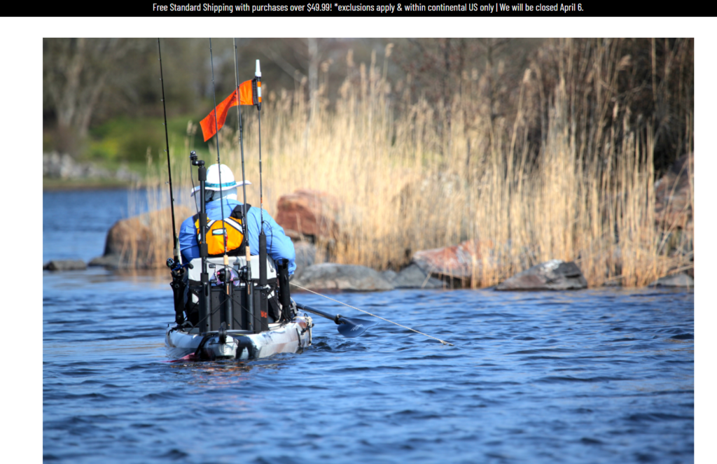
강렬한 첫인상 만들기
The homepage acts as the entry point into the brand’s ecosystem. We designed it to immediately communicate three key ideas:
- Lifestyle immersion (kayak fishing in action)
- Product ecosystem clarity (modular gear categories)
- Brand authority and trust
Hero Section Approach
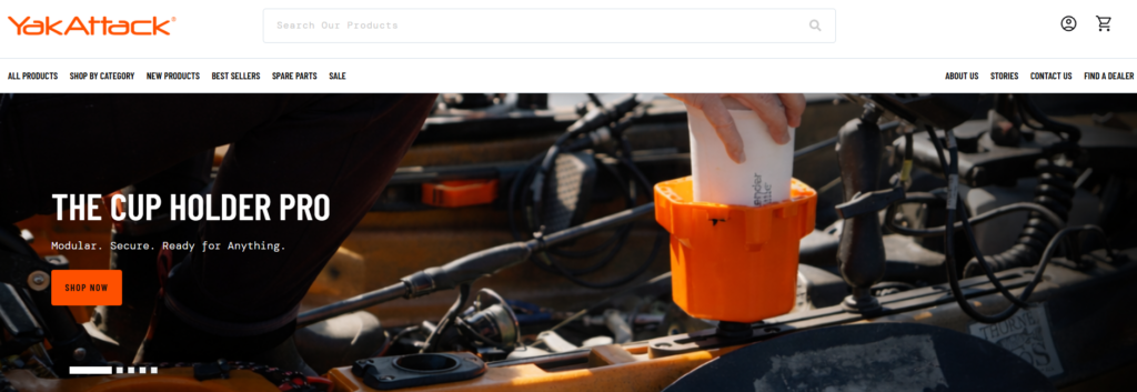
- Full-width lifestyle imagery showcasing real fishing scenarios
- Minimal but impactful headline messaging
- Clear primary CTA guiding users into product exploration
This approach avoids clutter and instead pulls users into an emotional context—helping them visualize themselves using the gear.
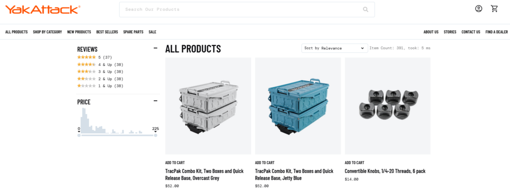
Structuring Product Discovery
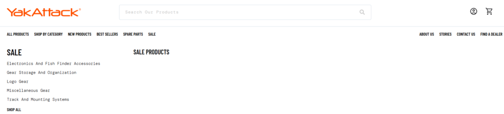
One of the biggest challenges in fishing gear websites is complexity. There are multiple product types, compatibility concerns, and technical variations.
We addressed this through structured category navigation:
Category Blocks
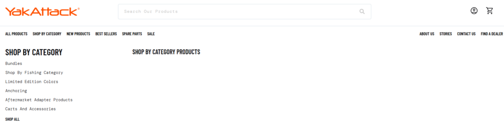
- Rod holders
- Mounting systems
- Storage solutions
- 부속품
Each category is visually represented with:
- Clean product imagery
- Short, benefit-driven descriptions
- Clear navigation hierarchy
This reduces cognitive load and allows users to quickly find what they need.
Balancing Visual Impact with Clarity
Outdoor brands often rely heavily on imagery, but too much visual noise can hurt usability.
저희의 디자인 솔루션은 다음과 같습니다.
- Controlled use of high-quality visuals
- Strong spacing and grid alignment
- Consistent typography hierarchy
This ensures the site feels premium without sacrificing readability.
Product Page Design Optimization
Designing for Decision-Making
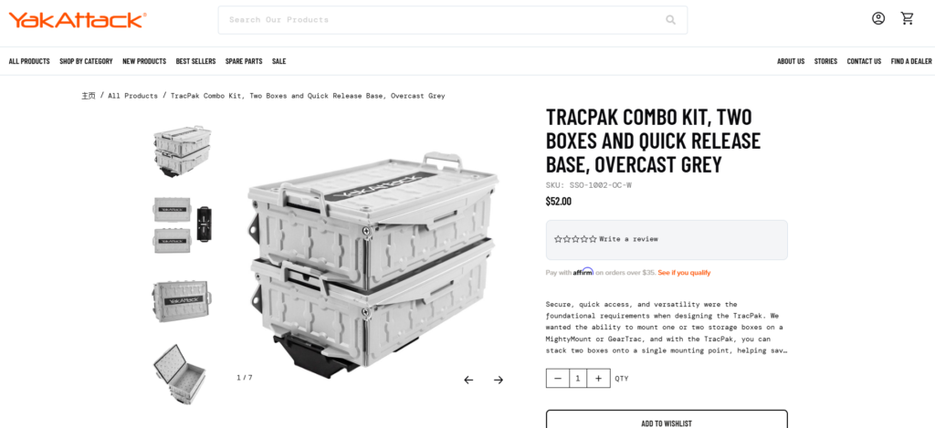
Product pages are where conversions happen. Instead of overwhelming users with technical data, we structured content to guide decision-making naturally.
Key Design Elements
- Above-the-fold clarity
- Product name, key benefits, and pricing visible immediately
- Visual storytelling
- Lifestyle images + close-up product details
- Structured information hierarchy
- Features → Benefits → Use cases
- Clear CTA positioning
- Prominent and always accessible
Simplifying Complex Product Systems
YakAttack products often work as part of a modular system. This can confuse users if not clearly explained.
We introduced:
- Visual compatibility cues
- Related product groupings
- Simple explanatory sections
This transforms complexity into clarity—helping users understand how products work together.
Collection Page Experience
Improving Browsing Efficiency
Collection pages were designed to support both:
- Quick scanning
- Deeper exploration
Design Enhancements
- Clean grid layout with consistent spacing
- Multi-line product titles with controlled truncation
- Subtle hover interactions for engagement
We avoided excessive filters or distractions, focusing instead on clarity and speed.
Visual Consistency Across Listings
Consistency builds trust. We ensured:
- Uniform product image ratios
- Balanced spacing between elements
- Predictable layout behavior
This makes the browsing experience feel stable and professional.
Supporting Pages and Brand Storytelling
About and Brand Pages
Rather than treating these as secondary pages, we designed them as trust-building assets.
Key Focus Areas
- Brand origin and mission
- Real-world product usage
- Community-driven identity
레이아웃은 다음을 강조합니다:
- Storytelling sections
- Lifestyle imagery
- Clean typography
Content and Educational Sections
Fishing enthusiasts often research before buying. We supported this behavior by structuring content areas that:
- Educate users on gear usage
- Showcase real applications
- Reinforce expertise
This approach positions the brand as both a product provider and a knowledge source.
우리의 디자인 프로세스
Step 1: Research and Analysis
We began by analyzing:
- Competitor websites
- User behavior patterns in outdoor niches
- Existing site structure and pain points
This helped us identify gaps in clarity, navigation, and visual hierarchy.
Step 2: Information Architecture
We restructured the site to:
- Simplify navigation paths
- Group related products logically
- Reduce unnecessary friction
The goal was to make every click feel intentional.
Step 3: Visual System Design
We established a consistent design language:
- 타이포그래피 계층 구조
- Color usage aligned with outdoor branding
- Spacing and layout grids
This ensures visual coherence across all pages.
Step 4: Conversion-Focused Layouts
Every section was designed with a purpose:
- Guide users
- 혼란을 줄이세요
- Encourage action
We focused on clarity over decoration.
우리가 직면했던 어려움
1. Complex Product Relationships
YakAttack’s modular system can be difficult to explain visually.
우리의 해결책은 다음과 같습니다.
We simplified communication through layout structure and visual grouping instead of technical explanations.
2. Balancing Rugged Branding with Modern UX
Outdoor brands often lean heavily into rugged aesthetics, which can conflict with clean UX design.
우리의 해결책은 다음과 같습니다.
We retained authentic imagery while applying modern layout principles to maintain usability.
3. Avoiding Information Overload
Too much product detail can overwhelm users.
우리의 해결책은 다음과 같습니다.
We prioritized key selling points and structured additional details progressively.
Our Design Approach and Philosophy
Customer-First Experience
We design for how users think—not how brands want to present information.
이는 다음을 의미합니다.
- 명확한 탐색
- 논리적인 콘텐츠 흐름
- Reduced decision friction
Visual Clarity Over Complexity
Instead of adding more elements, we focus on:
- Better spacing
- Strong hierarchy
- Intentional design choices
Scalable Design Systems
We build designs that:
- Work across multiple pages
- Maintain consistency
- Adapt as the product catalog grows
결과 및 영향
사용자 경험 개선
- Easier navigation across categories
- Faster product discovery
- Clearer understanding of product systems
Stronger Brand Perception
- More premium visual identity
- Increased trust through consistency
- Better storytelling across pages
Enhanced Conversion Potential
- Clear CTAs
- Reduced confusion
- More confident purchasing decisions
결론
Designing an eCommerce website for a specialized outdoor brand like YakAttack requires more than aesthetics—it requires strategic thinking, user empathy, and a deep understanding of how design drives behavior.
By focusing on clarity, structure, and storytelling, we transformed the site into a cohesive digital experience that supports both exploration and conversion. Every page—from homepage to product detail—was designed to guide users naturally while reinforcing the brand’s identity.
At the end of the day, great eCommerce design is not about making things look better—it’s about making them work better.
에서 AIRSANG, we specialize in crafting high-converting, design-driven independent websites for global brands. If you’re looking to elevate your eCommerce experience through strategic design, our team is ready to help you build a site that not only looks premium—but performs.


완전한 전자상거래 시스템을 갖춘 워드프레스 웹사이트 또는 기업 사이트를 디자인하고 구축하세요.
가격 범위: $200.00~$2,500.00사용자 지정 요구 사항 또는 특별 견적
원래 가격: $2.00.$1.00현재 가격: $1.00. 아마존 가정용 물리치료 기기 메인 이미지 디자인 설명
소개 소개: 아마존에서 홈 테라피 기기의 신뢰할 수 있는 이미지 구축 아마존에서 홈 테라피 기기의 기본 이미지를 디자인할 때 기본 ...

아마존 립스틱 전환을 위한 메인 이미지 디자인
소개: 소개: 아마존에서 판매되는 립스틱 메인 이미지 디자인하기 아마존 립스틱의 메인 이미지를 디자인할 때 우리의 책임은 그 이상입니다.

해커들이 워드프레스 관리자 이메일을 훔치는 방법(그리고 이를 막는 방법)
불편한 진실부터 말씀드리자면, 워드프레스 관리자 이메일은 생각보다 훨씬 더 많이 공개되어 있습니다. 그들은 그것을 좋아합니다. 해커에게 여러분의...

아마존 리퀴드 파운데이션 메인 이미지 변환의 특징은 무엇일까요?
서론 아마존 리퀴드 파운데이션의 메인 이미지 디자인은 단순히 제품을 아름답게 보이게 하는 것만이 아닙니다. 아마존에서 메인 이미지와...

필터 카트리지 제품을 위한 효과적인 아마존 메인 이미지 디자인하기
서론 아마존 메인 이미지 디자인은 단순히 제품을 매력적으로 보이게 하는 것만이 아닙니다. 명확성, 신뢰, 그리고 즉각적인 이해를 제공하는 것이 중요합니다. 특히...

워드프레스에 대한 리플레이 공격: 실제 위협인가, 과장된 신화인가?
먼저 한 가지를 분명히 해두죠. 리플레이 공격은 겉보기에 무섭지 않습니다. 비밀번호를 날려버리지도 않고, 초록색 해커 텍스트가 사방에 흩날리는 악성 코드를 주입하지도 않습니다. 그저 교묘하게 이루어질 뿐입니다.

WordPress 페이지를 손상 없이 복제하는 방법
솔직히 말해봅시다. 때로는 새 페이지를 만들고 싶지 않을 때가 있죠. 그냥 기존 페이지를 약간만 다르게 하고 싶을 때가 있어요. 레이아웃도, 블록도, 설정도 그대로요. 왜냐하면...

반려동물 관련 워드프레스 테마 5가지 비교
서론 반려동물 관련 워드프레스 테마를 선택하는 것은 단순한 디자인 결정 이상의 의미를 지닙니다. 사용성, 확장성, 그리고 장기적인 비즈니스 성장에 직접적인 영향을 미치기 때문입니다. 반려동물 관리 및 관련...

수영복 온라인 쇼핑몰 테마 5가지 비교
서론 수영복이나 란제리 독립 매장에 적합한 테마를 선택하는 것은 단순히 시각적인 결정에 그치는 것이 아니라, 전환율, 확장성, 그리고 장기적인 성공에 직접적인 영향을 미칩니다.

워드프레스에서 댓글 기능을 끄는 방법 (정신줄 놓지 않고)
워드프레스 댓글에 대해 이야기해 봅시다. 이론적으로 댓글은 훌륭합니다. 토론을 장려하고, 커뮤니티를 형성하며, 웹사이트에 생동감을 불어넣습니다. 하지만 현실은 어떨까요? 댓글은 종종 문제를 야기하기도 합니다...

과학 중심 브랜드를 위한 확장 가능한 워드프레스 웹사이트 구축: 아미노USA 프로젝트
서론 오늘날의 디지털 환경에서 웹사이트는 단순히 제품을 나열하는 공간 이상의 의미를 지닙니다. 규제 산업이나 연구 중심 산업에서 활동하는 과학 기반 브랜드에게 웹사이트는 더욱 중요한 역할을 합니다.

글로벌 블레이드 브랜드를 위한 확장 가능한 쇼피파이 스토어 구축: 쿨카타나 프로젝트
서론: 국경을 넘나드는 전자상거래에서 Shopify 웹사이트는 단순한 매장 이상의 의미를 지닙니다. 특정 문화권에서 사업을 운영하는 브랜드의 경우, 웹사이트는 단순한 판매 공간을 넘어 훨씬 더 많은 기능을 수행해야 합니다.

포켓몬 카드 판매를 위한 높은 전환율을 자랑하는 쇼피파이 스토어 디자인하기
서론 수집품 전자상거래, 특히 포켓몬 트레이딩 카드 게임(TCG) 시장에서 웹사이트는 단순히 제품 목록을 나열하는 것 이상의 역할을 해야 합니다.

맞춤형 오프라인 브랜드에 최적화된 전환율 높은 쇼피파이 디자인
서론 오늘날 경쟁이 치열한 전자상거래 환경, 특히 맞춤형 선물 및 수집품 분야에서 Shopify 웹사이트는 단순히 제품을 전시하는 것 이상의 역할을 해야 합니다. ...

Shopify 고객 지원팀에 문의하는 방법: 간단하고 스트레스 없는 가이드
쇼피파이 스토어 운영은 흥미진진해야지 혼란스러워서는 안 됩니다. 궁금한 점이 생기거나 문제가 발생하여 진행이 늦어질 때, 쇼피파이는 상황에 따라 다양한 지원 경로를 제공합니다.

쇼피파이 스토어 비활성화 방법: 명확하고 실용적인 가이드
쇼피파이 스토어를 비활성화하는 것은 복잡하지 않지만, 많은 판매자가 간과하는 몇 가지 결과가 따릅니다. 이 가이드에서는 비활성화 과정을 간단하고 유익하게 설명합니다.

프리미엄 꽃집 브랜드를 위한 쇼피파이 웹사이트 디자인 사례 연구
서론 오늘날 경쟁이 치열한 전자상거래 환경에서 Shopify 웹사이트는 단순히 제품을 보여주는 것 이상의 역할을 해야 합니다. 브랜드 가치를 즉시 전달하고 사용자를 안내해야 합니다...

Shopify 디자인 사례 연구: 레트로 게임 스토어
서론: 경쟁이 치열한 전자상거래 환경에서 시각적 명확성과 감정적 연결은 방문자가 고객이 될지 여부를 결정짓는 중요한 요소입니다. 특히 다음과 같은 경우에 더욱 그렇습니다...