


장바구니에 상품이 없습니다.

A premium jewelry website needs to do more than display products. It must translate brand emotion, craftsmanship, lifestyle, and customer trust into a clear digital shopping journey. For a Shopify jewelry brand inspired by the visual language of Nialaya, the design challenge was not simply to create attractive pages. The goal was to shape a complete luxury eCommerce experience that helped visitors understand the brand, explore the collections, and feel confident enough to purchase.
Nialaya presents itself as a designer jewelry brand with a strong connection to craftsmanship, natural materials, global inspiration, and personal style. This type of brand requires a website design approach that feels refined but not cold, emotional but not confusing, and premium but still easy to shop. Every page must balance storytelling with conversion.
For this project, our focus centered on page design, visual structure, user experience, and Shopify presentation strategy. We did not approach the website as a technical development case. Instead, we focused on how design decisions could make the brand feel stronger, the products more desirable, and the shopping path more natural.
The result was a Shopify design direction built around clarity, elegance, lifestyle appeal, and product confidence.
| 배송 시간 | 범주 | 애플리케이션 플랫폼 |
| 16days | Jewelry | shopify |
| 참여 디자이너 | 비용 | 효과 |
| 낸시 | $1500 | Sales📈214% |
The first step was to understand what makes a premium jewelry brand different from a standard online store. Jewelry is emotional. Customers do not only buy a bracelet, necklace, ring, or earring because of the material. They buy identity, taste, confidence, and personal meaning.
For a brand like Nialaya, the visual world needs to communicate handcrafted detail, luxury styling, modern fashion, and spiritual inspiration. The design must help customers feel that each piece carries intention. This is especially important for jewelry made with natural stones, gold-plated finishes, sterling silver, pearls, and other expressive materials.
The website design therefore needed to avoid a generic catalog feeling. Instead, each page had to create a sense of discovery.
The main goal was to create a Shopify website experience that looked premium at first glance and remained easy to use after the first impression. Luxury websites often fail when they become too artistic and too difficult to shop. On the other hand, many eCommerce sites become too commercial and lose the emotional value of the brand.
Our design approach balanced both sides.
We wanted the homepage to attract attention quickly, the collection pages to guide users clearly, the product pages to build confidence, and the supporting pages to strengthen brand credibility. Every design choice served one larger purpose: help the customer move from interest to trust, and from trust to purchase.
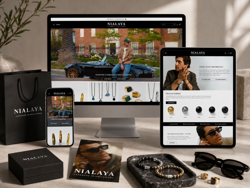
The homepage plays the most important role in the website experience. It introduces the brand before the customer reads any detailed copy. For a premium jewelry store, the first screen should instantly communicate style, quality, and desirability.
We designed the homepage around a bold visual hierarchy. Large lifestyle imagery helps customers imagine the jewelry in real life. Clean typography gives the brand a polished look. Simple navigation makes the store feel organized and easy to explore.
The hero section should not feel overloaded. A luxury Shopify homepage works best when it allows the product and mood to breathe. Instead of filling the first screen with too many offers, badges, or product blocks, we focused on a confident message, a strong visual, and clear calls to action.
The hero area should combine fashion-driven imagery with direct shopping paths. For example, a full-width banner can feature a model wearing layered bracelets, rings, or necklaces. The headline should express the brand’s attitude, while the call-to-action buttons guide users to men’s jewelry, women’s jewelry, new arrivals, or best sellers.
This structure works because it gives customers both inspiration and direction. They can feel the brand mood, then immediately choose where to go next.
A strong hero section for this type of Shopify website should include:
The image should show the jewelry in use, not only on a plain background. Jewelry becomes more desirable when customers see scale, styling, skin tone contrast, and outfit pairing.
The headline should feel premium and confident. It should avoid long explanations. A simple phrase can create more impact than a crowded paragraph.
The buttons should guide users to high-intent areas such as “Shop Men,” “Shop Women,” “New Arrivals,” or “Best Sellers.”
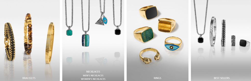
After the hero section, the homepage should quickly introduce major shopping categories. Nialaya-style jewelry stores usually carry different product types and gender-based collections, so the homepage needs clear entry points.
We designed category blocks that help customers choose quickly:
This block can feature bracelets, necklaces, rings, or styled stacks. The image direction should feel bold, clean, and fashion-forward.
This block can use softer but still confident styling, showing earrings, necklaces, rings, and layered pieces.
Best sellers create social proof. They help new visitors feel safer because other customers have already shown interest in these products.
New arrivals give returning visitors a reason to explore again. They also keep the homepage feeling current.
The design of these category blocks should stay consistent. Clean image cropping, simple labels, and subtle hover effects can make the shopping experience feel premium without adding visual clutter.
Product design on a jewelry website cannot rely only on grid images. A bracelet or necklace may look simple in a small thumbnail, but the story behind it can make it feel much more valuable. That is why we used design sections that show product close-ups, lifestyle styling, materials, and craftsmanship.
For example, a homepage section can highlight handcrafted details through macro photography. Another section can focus on natural stones and their visual richness. A third section can show how customers can layer pieces together.
This approach gives the customer more reasons to connect with the product emotionally.
A successful luxury homepage uses rhythm. It alternates between large emotional sections and practical shopping sections. If every section is a product grid, the page becomes boring. If every section is a lifestyle banner, the page becomes hard to shop.
Our design rhythm followed this logic:
Use a strong hero image and brand statement.
Show clear collection categories.
Feature best sellers, reviews, or product highlights.
Explain craftsmanship, materials, styling, or brand philosophy.
Return to clear shopping calls to action.
This rhythm keeps the homepage engaging while still supporting sales.
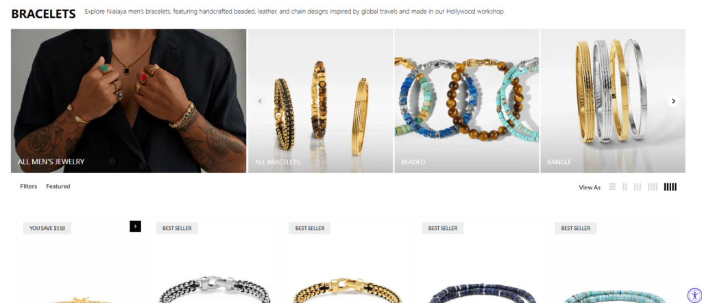
Collection pages are where many customers make their purchase decisions. A visitor may enter the site through a homepage banner, a Google search, a social post, or a product ad. Once they land on a collection page, the design must help them browse quickly.
For a Shopify jewelry site, collection pages should feel clean and structured. Product grids need enough spacing so each item feels valuable. Filters should help customers narrow choices by product type, material, color, or style. Sorting options should remain visible but not visually aggressive.
The goal is to reduce decision fatigue.
Nialaya-style collections often include bracelets, necklaces, rings, earrings, best sellers, and new arrivals. We designed collection navigation so customers could move between these categories without feeling lost.
A horizontal category menu near the top of the collection page can work well. It gives customers a quick overview of the store structure. For mobile, this can become a swipeable or stacked category list.
This type of navigation improves usability because jewelry customers often browse by product type before they browse by material or price.
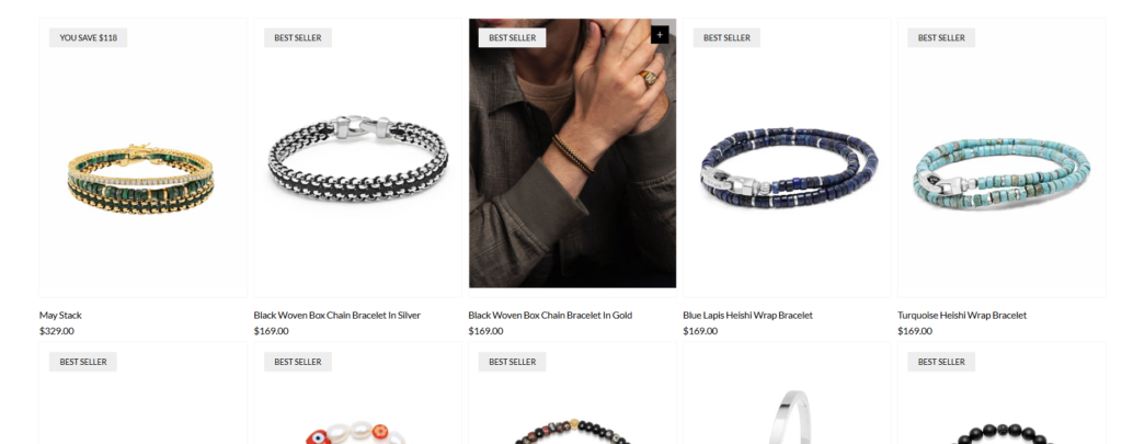
The product grid should look elegant and consistent. We recommend simple product cards with:
Use consistent backgrounds and image ratios. Jewelry products need sharp visuals and balanced spacing.
Product names should be readable, not overly small. Premium design does not mean hiding important information.
The price should be easy to find. Customers should not need to click into every product just to understand the price range.
A quick-view function can support browsing, but it should not interrupt the visual elegance of the page.
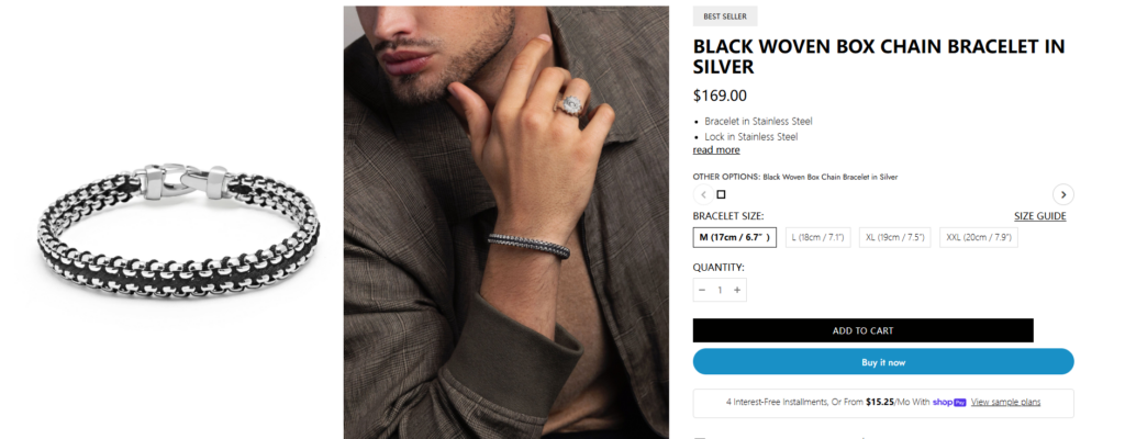
The product page has one job: help the customer feel confident enough to buy. For jewelry, customers often care about material, size, fit, meaning, styling, shipping, returns, and quality. The design must make this information easy to find.
We designed the product page around a strong balance between visual desire and practical details.
The product image gallery should be one of the strongest parts of the page. Jewelry needs multiple types of images:
This shows the item clearly.
This helps customers understand scale and styling.
This highlights texture, stone detail, clasp design, pearl finish, metal surface, or handcrafted elements.
This helps customers imagine how to wear the product with other pieces.
A premium Shopify product page should not depend on one image. It should create a visual buying experience.
The product title, price, variant options, and call-to-action button should remain clean and direct. We avoided unnecessary clutter around the add-to-cart area because too many distractions can weaken conversion.
The product information layout should include:
Readable, elegant, and positioned clearly.
Visible near the title.
Size, color, material, or style options should be simple to select.
The button should have strong contrast and a clear label.
Shipping, returns, warranty, or handcrafted notes can appear close to the purchase area.
Jewelry customers often want reassurance. We recommended organizing product details into clean accordion sections. This keeps the page elegant while still giving customers the information they need.
Suggested accordion sections include:
A short emotional description of the product.
Clear explanation of metal, stones, pearls, leather, or other materials.
Helpful sizing details reduce uncertainty.
This builds trust before checkout.
Jewelry care tips can make the product feel more premium and long-lasting.
A premium jewelry store needs more than product pages. Customers want to understand the brand’s world. A strong brand story page can explain inspiration, craftsmanship, founder vision, and design philosophy.
For a Nialaya-inspired Shopify website, the story page should feel cinematic but readable. Large visuals can show the studio, materials, hands, gemstones, or lifestyle moments. Short text sections can explain what the brand stands for.
The goal is not to write a long corporate history. The goal is to create emotional trust.
Start with a strong sentence that explains the brand’s design philosophy.
Show how the products are made or selected.
Explain the role of natural stones, metals, pearls, or spiritual design elements.
Show how the jewelry fits modern personal style.
End with a clear path back to collections.
This page supports conversion because it gives meaning to the products.
Luxury brands often want a minimal, editorial look. However, eCommerce customers still need clear navigation, readable text, visible prices, and easy buttons. The challenge was to create a premium design without making the site difficult to use.
Our solution was to keep the visual style refined while preserving standard shopping clarity. We used strong imagery, clean spacing, and elegant typography, but we kept the purchase path direct.
A jewelry brand may sell bracelets, necklaces, rings, earrings, and layered sets. Without a clear structure, the website can feel overwhelming.
Our solution was to divide the shopping experience into clear categories and repeat those categories across the homepage, navigation, and collection pages. This helped customers understand the store faster.
Jewelry products often need emotional presentation. A simple grid may not show why the pieces are special.
Our solution was to include storytelling sections throughout the website. Materials, styling, craftsmanship, and lifestyle visuals helped create desire beyond the product image.
Many fashion and jewelry customers browse from mobile devices. The mobile design needed to feel smooth, elegant, and quick.
Our solution focused on simplified navigation, strong image cropping, readable typography, clear buttons, and mobile-friendly collection browsing.
We began by reviewing the brand’s style, product range, customer expectations, and competitive positioning. A premium Shopify design must match the customer’s buying mindset. For jewelry, that mindset often includes inspiration, self-expression, gifting, and personal identity.
Before designing visuals, we planned the page structure. We mapped the homepage, collection pages, product pages, story page, and supporting content areas. This helped us build a complete design system instead of isolated page sections.
We then created a visual direction based on luxury spacing, fashion photography, refined typography, and clean product presentation. The goal was to make the website feel premium but still commercial enough to sell.
We placed calls to action, product categories, best sellers, and trust elements in the right positions. Every section needed a reason to exist. If a section did not support brand value, product discovery, or conversion, we simplified it.
We reviewed each major section for mobile. Jewelry images need careful cropping on smaller screens. Text must remain readable. Buttons must be easy to tap. Navigation must stay simple.
The design makes the brand feel more premium from the first screen. Large imagery, clean spacing, and elegant typography help customers associate the products with quality and style.
Customers can move from homepage to collection to product page without confusion. This matters because a beautiful website still fails if users cannot shop easily.
The design gives jewelry products more visual impact. Close-ups, lifestyle imagery, and styling sections help customers understand the product better.
Product details, material notes, shipping information, and trust elements reduce hesitation. This supports stronger conversion potential.
The page structure allows the brand to promote new arrivals, seasonal collections, best sellers, gift guides, and campaign visuals without redesigning the whole website.
The final design direction created a Shopify jewelry experience that felt premium, emotional, and easy to shop. The homepage introduced the brand with strong lifestyle visuals and clear category paths. The collection pages helped customers browse quickly. The product pages combined desire with practical purchase information. The story page strengthened the emotional connection behind the products.
Most importantly, the design supported the brand’s commercial goals without losing its luxury identity. It showed that premium Shopify design is not only about beautiful images. It is about building a complete customer journey that connects visual emotion with buying confidence.
A successful Shopify jewelry website needs design strategy, brand understanding, and eCommerce clarity. For a premium brand inspired by Nialaya’s handcrafted and fashion-led jewelry experience, the website must present products as personal style pieces, not just online inventory. Every homepage section, collection layout, product detail area, and brand story block should guide customers toward trust and action.
This is where AIRSANG’s Shopify design service fits naturally. We help cross-border brands create visually strong, conversion-focused Shopify pages that highlight product value, brand identity, and customer experience without relying on unnecessary technical complexity. For jewelry, fashion, lifestyle, and premium eCommerce brands, AIRSANG focuses on what matters most: design that looks refined, feels trustworthy, and helps customers move confidently from browsing to buying.


